Conducting Divi A/B testing? Choosing between several designs for your pages? Thinking about what version would your target customers enjoy the most when they visit your Divi website?
Luckily, the A/B testing process is invented to help you choose the best possible variant of any page, element, or design for your website.
Through data-based decisions, A/B testing can help you improve every aspect of your Divi website, turning data into more conversions and a better experience for target users as a result.
In this beginner’s guide, we’ll explore Divi A/B testing, what steps you need to take to start testing elements on your website, and the tool that you need to use to split test your way to success. Let’s begin!
Table of Contents
What is A/B Testing?
A/B testing is a data-driven comparison of two or more versions from the same element or page. The process segments the traffic into multiple parts and versions to gauge which page variation delivers the best result according to the pre-defined metrics.
Without conducting A/B tests, everything you’ll do will come down to assumptions and, in most cases, trial-and-error that won’t lead to better results for your website. Moreover, A/B testing allows you to change testing goals for each optimization you plan to make.
Depending on what type of A/B tests you want to conduct, you can use an A/B test to improve the site’s conversion rate, reduce bounce rate, uncover visitor pain points, and redesign according to users’ preferences.
Essentially, A/B testing helps you reduce chaos and develop a robust strategy through a data-driven approach that can only lead you toward a better conversion rate.
What Can You A/B Test?

How you set your website and content determines how your target audience will react when they open one of your pages. Thus, everything you do on your website must be optimized to its full potential, particularly when the elements of your page can influence your conversion rate.
Copywriting
Writing good copy is critical for conversion rate success. But how can you consistently deliver quality copywriting to your target readers? A/B testing can always resolve that dilemma.
For example, headings are the first thing visitors read when they open your pages. It is the aspect that gives them the first impression and helps them scan your content to determine if they’re in the right place.
This is why you need to ensure they’re on point. By A/B testing several versions of the headings and their writing style, you can analyze what catches users’ attention the most.
Furthermore, well-written content can make all the difference. With the right information, tonality, answers, and formatting of the relevant pieces of content, you can convince potential customers that you’re the right solution for them on the spot.

A/B testing different variations of your copy body can help you turn your website into a conversion magnet. The following is how you can effectively A/B test your copywriting:
- Identify the Goal of the Test: Define what you want to achieve with your copy. This could be increasing click-through rates, improving email open rates, boosting conversion rates, or enhancing engagement on a landing page.
- Select the Copy to Test: Choose the specific piece of copy you want to test. This could be an email subject line, a headline on your website, product descriptions, call-to-action (CTA) texts, or any other key piece of written content.
- Create Two Variants: Develop two versions of the copy. The variations could be in tone, wording, length, or structure. For example, one version might be more formal, while the other is conversational.
- Use a Controlled Environment: To get accurate results, change only one element of your copy at a time. Everything else on the page or in the email should remain the same so that you can be sure that any difference in performance is due to the copy change.
- Split Your Audience: Randomly divide your audience into two groups. Each group should be exposed to one version of the copy. It’s important that the groups are as similar as possible in terms of demographics and behavior to ensure the test’s validity.
- Run the Test Simultaneously: Launch both versions of your copy at the same time to avoid time-based bias. External factors like holidays, weekends, or special events can influence user behavior, so testing both versions simultaneously helps mitigate these effects.
By systematically testing and refining your copy, you can enhance its effectiveness in achieving your business objectives, whether that’s engaging users, driving sales, or building brand awareness.
Design and Page Layout

Every element of your page’s design can be equally important. But, sometimes, you may struggle to find the most critical aspects that can keep visitors on your Divi website.
For example, besides page copy, for most websites that want to convert, imagery, videos, and graphics are equally important design elements that can help convince the visitor of the quality that you offer.
A/B testing can help you discover what the most effective design elements for all of your pages are.
You can test practically every element or layout on your Divi website, experiment with various ideas, play around with white space and imagery, feature graphics and colors that accentuate the benefits of your offer, and try different layouts.
Website Navigation
Another website aspect that you can A/B test is navigation. It is perhaps the most critical way to plan your website structure, how the pages are linked, and how users can navigate each of them.

A/B testing can help you ensure that your Divi website is structured in a manner which allows users to easily find what they’re looking for with no more than few clicks. A fluid website navigation increases conversions because it creates a seamless experience for the target customers.
Here are the key elements to focus on when A/B testing website navigation:
- Menu Structure and Layout:
- Test different menu structures (e.g., horizontal vs. vertical, dropdowns vs. mega menus).
- Experiment with the number of items in the menu to avoid overwhelming users.
- Navigation Labels and Terminology:
- Try different wording for menu items to see which terms are more intuitive for your audience.
- Use clear, descriptive labels that accurately reflect the content they lead to.
- Placement of Navigation Elements:
- Test the placement of your navigation bar (top, side, bottom) to determine the most user-friendly position.
- Consider the visibility and accessibility of the navigation bar across different devices and screen sizes.
- Call-to-Action (CTA) Buttons within Navigation:
- Experiment with the size, color, and wording of CTA buttons to make them stand out.
- Test different locations for these buttons within your navigation layout.
- Breadcrumb Navigation:
- For websites with multiple layers of content, test the effectiveness of breadcrumb navigation in helping users understand their location on the site.
- Experiment with the display style and placement of breadcrumbs.
- Search Functionality:
- If your site has a search bar, test its placement and size.
- Experiment with features like auto-complete or search filters to enhance usability.
- Responsive Design for Mobile Navigation:
- Ensure that your navigation is mobile-friendly. Test different styles like hamburger menus or bottom navigation bars for mobile devices.
- Consider the thumb-friendly zone in mobile devices when placing navigation elements.
- Interactive Elements:
- If your navigation includes interactive elements like dropdowns or sliders, test their responsiveness and ease of use.
- Experiment with animation speeds and styles to ensure they enhance, rather than hinder, the user experience.
- Color Scheme and Contrast:
- Test different color schemes for your navigation to ensure good contrast and readability.
- Make sure that the navigation elements are easily distinguishable from the rest of the page content.
- User Flow and Navigation Paths:
- Track how users navigate through your site. Test different navigation paths to find the most efficient and user-friendly flow.
- Use heatmaps and user journey analysis tools to gain insights into navigation patterns.
Website Forms
Forms help prospective customers contact your business, download an eBook, or subscribe to your newsletter. They’re an integral part of any marketing funnel. However, not all website forms are the same, and perhaps your current website forms don’t address the audience as they should.

With A/B testing, you can unravel why forms style and copywriting works the best and detect any form problem that can appear in some of the version, optimizing it successfully afterward.
Here are key elements to focus on when A/B testing website forms:
- Form Length and Fields:
- Test the number of fields in your form. Generally, shorter forms tend to have higher conversion rates, but this can vary depending on the context.
- Experiment with which fields are necessary and which can be removed or made optional.
- Field Types and Input Methods:
- Try different field types (text, dropdown, radio buttons) to see which are more user-friendly and lead to higher completion rates.
- Test predictive text input or auto-fill functionalities to reduce user effort.
- Form Layout and Design:
- Experiment with different form layouts (single column vs. multiple columns) to find the most intuitive and easy-to-follow structure.
- Test variations in the size and color of input fields, spacing, and alignment to improve readability and usability.
- Call-to-Action (CTA) Buttons:
- The text, size, color, and placement of the submit button can impact conversion rates. Test different variations to see which are most effective.
- Ensure the CTA stands out but also fits seamlessly with the overall design of the form.
- Error Messages and Validation:
- Test the clarity and visibility of error messages. They should be helpful and guide users on how to correct their input.
- Experiment with real-time validation versus after-submit validation to see which yields better completion rates.
- Instructions and Labels:
- Test the wording and placement of instructions and labels for clarity and effectiveness.
- Ensure that labels are clear and positioned in a way that doesn’t confuse users.
- Progress Indicators for Multi-Step Forms:
- If your form has multiple steps, test the use of progress indicators to show users how much they have completed and how much is left.
- Experiment with different styles and placements of progress indicators.
- Trust Signals and Privacy Assurances:
- Test the inclusion of trust signals like security badges or privacy policy links to see if they increase form completion rates.
- Assure users of their privacy and the security of their data.
- Mobile Responsiveness:
- Ensure that forms are easy to fill out on mobile devices. Test different layouts and input methods for mobile users.
- Consider the ease of use on different screen sizes and touch inputs.
- Post-Submission Experience:
- Test different thank you messages or redirects after a form is submitted. This can affect user perception and future engagement.
- Experiment with offering additional value, like a resource or confirmation email, post-submission.
CTAs (Calls-to-action)
The call-to-action is where all the marketing ‘magic’ happens. It’s the point when visitors decide if they want to continue with your business and convert or bounce from the page.

A/B testing allows you to test different CTA copies, colors, designs, and page placement, which can help you understand which CTA version has the best potential to bring you most conversions.
Here are the key elements to focus on when A/B testing CTAs:
- CTA Text:
- Experiment with the wording of your CTA. The language should be action-oriented, clear, and compelling. Test variations like “Get Started” vs. “Join Now” to see which resonates more with your audience.
- Button Color and Design:
- The color of your CTA button can greatly impact its visibility and attractiveness. Test different colors while considering the psychology of colors and how they fit with your overall design.
- Experiment with button shapes and sizes to see which are more noticeable and encourage clicks.
- Button Placement:
- The placement of the CTA on your page is critical. Test different locations (above the fold, within the content, at the bottom of the page) to find the most effective position.
- Consider how the placement works in context with other page elements.
- Urgency and Incentives:
- Test adding elements of urgency or scarcity (like “Limited Offer” or “Only a Few Left”) to see if they increase the click-through rate.
- Experiment with different incentives like discounts or freebies that come with the CTA.
- CTA Size:
- The size of the CTA can affect its noticeability. Test larger vs. smaller buttons, keeping in mind that they should be prominent without overwhelming the rest of the page.
- Contrast and Visibility:
- Ensure your CTA stands out from the rest of the page. Test different contrast ratios and color combinations to enhance visibility.
- The CTA should be easily distinguishable but still fit harmoniously with the overall page design.
- Personalization:
- Personalizing CTAs based on user behavior or segmentation can be very effective. Experiment with personalized text or offers to see if they improve conversion rates.
- Secondary CTAs:
- If your page has a secondary CTA, test its placement and appearance to ensure it doesn’t overshadow the primary CTA but still remains visible.
- Animation or Special Effects:
- Subtle animations or effects (like hover effects) on CTAs can draw attention. Test these features to see if they enhance engagement without being distracting.
- Microcopy Around CTA:
- The copy surrounding the CTA can influence its effectiveness. Test different messages or value propositions near your CTA to provide context and encourage clicks.
- Mobile Responsiveness:
- Ensure that the CTA is easily clickable on mobile devices. Test different placements and sizes for mobile screens.
Try Divi Areas Pro today
Sounds interesting? Learn more about Divi Areas Pro and download your copy now!
Many pre-designed layouts. Automated triggers. No coding.
Click here for more details
Performing A/B Tests in Divi
Just like on every other WordPress website, practically everything can be tested on a Divi website as well. In most cases, Divi website owners use Divi Leads, Divi’s built-in split testing system that allows you to split test effortlessly for individual sections, rows or modules.
For the purpose, we’re going to use an example landing page for an agency.
Now, how can we really know that each element on our sample page is effective enough to convert visitors? This is where A/B testing comes in handy!
For example, we might insert a new text in the headline, since we already know that how compelling the headline is can be directly correlated with whether the visitors keep browsing or leaving the page.
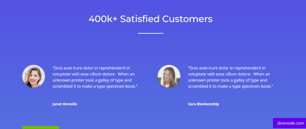
Furthermore, we can test different testimonials to see how each of them affects the conversion rate.
Also, we can test how different colors inside the CTA buttons and the surrounding area affect visitors’ desire to click on the button and proceed further with our business.
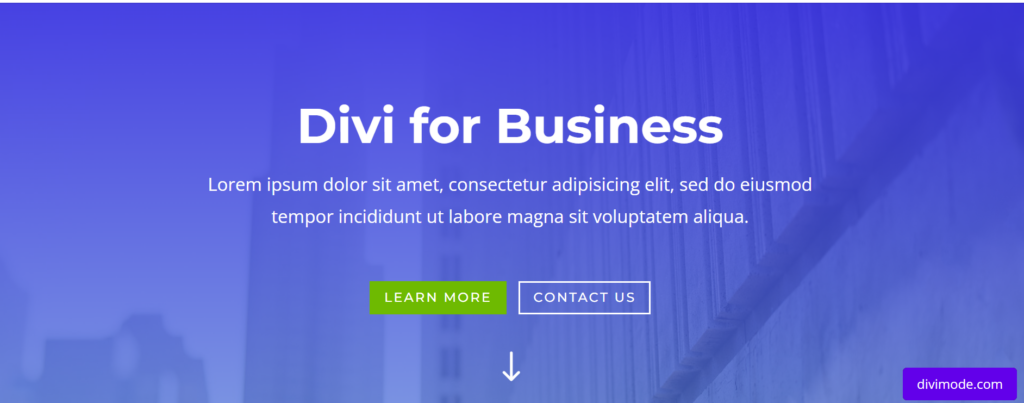
For the purpose, we’re going to test the most important part of our agency page that leaves the first impression on potential customers, the hero section copywriting.
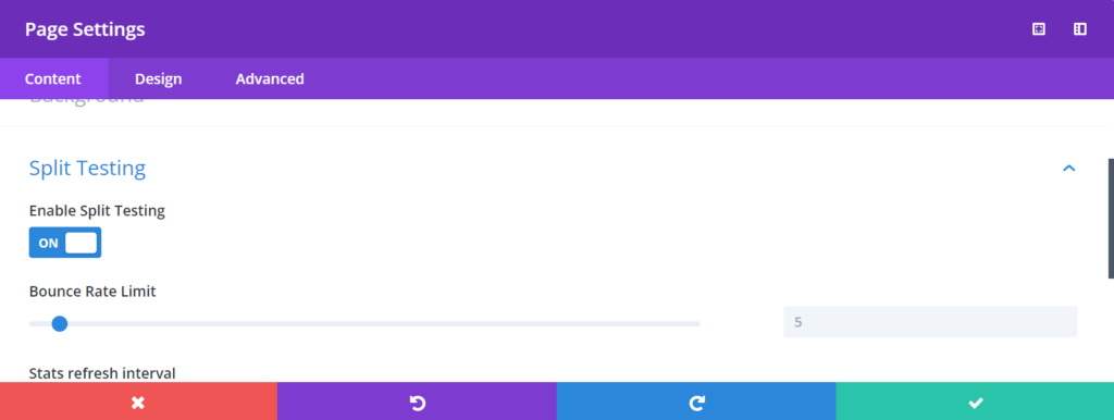
Choose Enable Split Testing ‘On’ and click the ‘Save’ button. Afterwards, click ‘Proceed’ to allow Divi to walk you through the split-testing process. Then, use the yellow cursor to click on the Page Header section. Next, Divi is going to ask you to choose your goal.
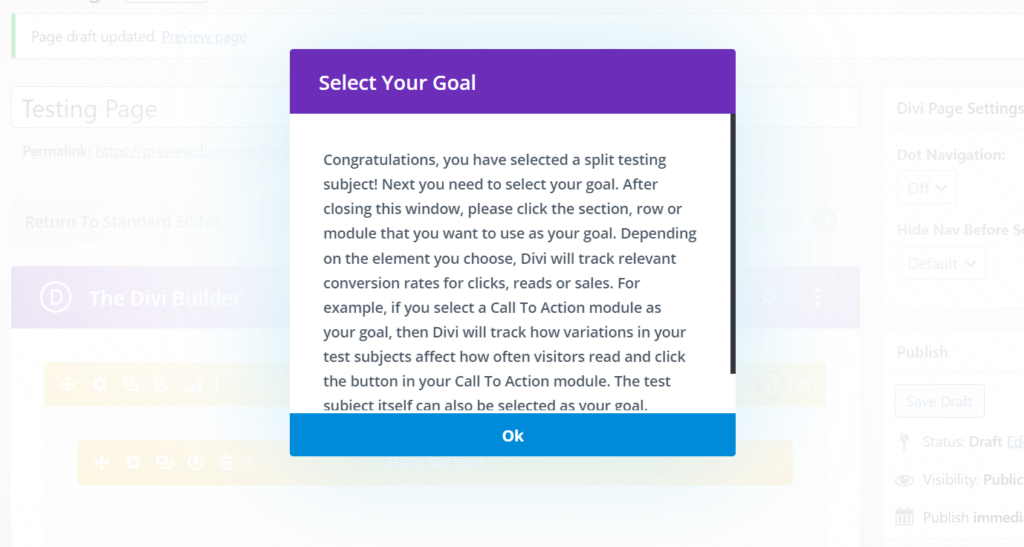
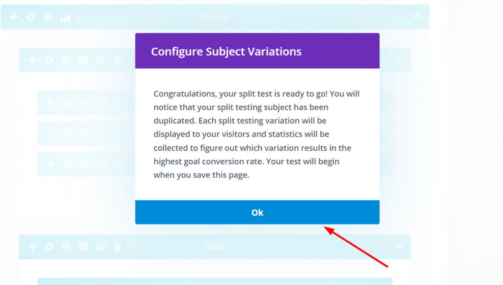
In our example, the goal would be for the page visitors to choose one of the plans at the bottom of the page. Click ‘Ok’ and choose the desired area of your goal with the blue circle cursor. Then, we can proceed by configuring our test variations.
Now, if you go to the page builder again, you can see that the test subjects of you’re A/B testing process has become yellow, and the testing goal has become blue instead of their default Divi builder colors.
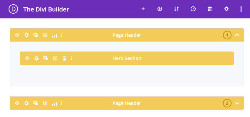
The above are the two different versions of the page header that will be shown to two different groups of visitors, which you can also duplicate further if you want to create more than two test subjects for the same goal.
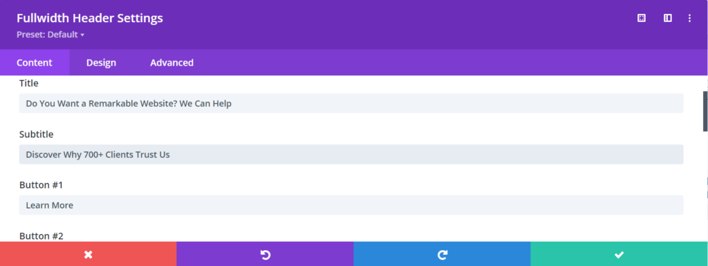
Let’s say you have two variations of the page header headline. One is more enticing for the visitors, and the other is more generic.
Thus, we will leave the first headline, ‘Divi for Business’ as it is, and we will go slightly more creative and actionable in our second version of the headline.
We click on ‘Save’, and now we’ve created our second, more compelling headline version. After this step, you can preview your page to see if both versions are being displayed, which means that you’ve configured your test subjects correctly.

After you save the page, the test is already running, and after users visit the page, they’d be shown one of the variations, and subsequently, Divi Leads is going to track and document which version is the most effective.
Divi knows that both header versions should lead users to the plans, the plans have buttons, and the clicks to those buttons are the most important metric of any given A/B test. Once the test is started, you can see that the stats icon appears in your builder, where the variations are defined.
Clicking on the icon will display the current test’s stats after real visitors visit your website. Once the visitors arrive on the page, the statistics will also start arriving in real-time.
After you’re satisfied with the collected data and you think that one of the versions of your testing variables has done better than the other, you can end the split test and pick your winner.
For a further breakdown of this example of A/B testing with Divi Leads and validated results, please visit and go through the detailed tutorial from Elegant Themes.
FAQs
What is statistical significance in A/B testing?
Statistical significance indicates whether the observed differences in performance between two versions are likely due to the changes made or are simply due to random chance. It helps determine if the results are reliable and not just coincidental.
How do I determine the sample size for an A/B test?
Sample size calculation depends on factors like desired statistical significance level, effect size, and baseline conversion rate. There are online calculators and statistical formulas available to help determine an appropriate sample size.
What are some common pitfalls to avoid in A/B testing?
Avoid changing multiple variables at once, testing for too short a period, not considering seasonality, ignoring outlier data, and failing to ensure proper randomization, as these can lead to inaccurate results.
Are there any ethical considerations with A/B testing?
Yes, ethical concerns may arise, such as exposing users to suboptimal experiences or potentially misleading content. It’s important to have clear guidelines and ensure that participants are informed and treated ethically throughout the testing process.
How long should an A/B test run?
The duration of an A/B test depends on factors like the baseline traffic, expected effect size, and desired level of statistical significance. It’s important to run tests long enough to capture different user behaviors and minimize the impact of external factors.
Over to You
A/B testing is not as complicated as it seems before you begin the process. It is arguably one of the most effective ways to improve the conversion rate of your Divi website!
Divi A/B testing with Divi Leads removes all the assumptions and provides you with all the data that you need to create headlines, calls-to-action, and landing pages that work and convert visitors faster than ever.
Using A/B testing will give you more opportunities to convert potential customers and a significant advantage over your competitors that still run their business on assumptions.
Try Divi Areas Pro today
Sounds interesting? Learn more about Divi Areas Pro and download your copy now!
Many pre-designed layouts. Automated triggers. No coding.
Click here for more details
More Articles You Will Like