Today we’re going to talk about how to use color psychology in popups like a boss!
When it comes to popups, they can play a massive role in whether users are motivated to take action. Besides offering exactly what users need, popups need to look appealing to them.
This is where the power of colors comes into play! They can influence our emotions and behavior, and this is why knowing how to use them wisely to achieve the desired effect is critical.
Thus, without further ado, here are some of the best ways to use color psychology in your website popups.
Table of Contents
- FAQs About Color Psychology
- The Power of Colors
- Use Red to Create Urgency
- Use Blue for Trust and Security
- Use Yellow for Happiness and Optimism
- Use Green for Growth and Harmony
- Use Orange for Action and Adventure
- Use Purple for Luxury and Sophistication
- BONUS: Additional Tips on Using Colors in Popups
- How Can We Help?
- Wrapping Up
FAQs About Color Psychology
- What is color psychology?
Color psychology is the study of how colors can affect human behavior, emotions, and perceptions. It explores the psychological effects of different colors on the human mind, and how they can be used to influence people’s behavior and decisions.
- How can color psychology impact website design?
Color psychology can play a crucial role in website design because it can influence the way users perceive and interact with your website. By strategically using colors, you can evoke specific emotions, create a sense of harmony and balance, and guide users towards certain actions or goals.
- What are the most popular colors used in website design and what do they represent?
Some of the most popular colors used in website design include blue, green, red, yellow, and black. Here’s what they typically represent:
- Blue: trust, reliability, calmness
- Green: growth, health, nature
- Red: excitement, urgency, passion
- Yellow: warmth, cheerfulness, optimism
- Black: sophistication, power, elegance
- How do I choose the right colors for my website?
Choosing the right colors for your website can depend on several factors, such as your brand personality, target audience, and the emotions or actions you want to evoke. It’s important to understand the meanings behind different colors and to choose a color palette that aligns with your brand values and goals.
- What are some common mistakes to avoid when using color psychology in website design?
Some common mistakes to avoid when using color psychology in website design include:
- Choosing colors that clash or create an unpleasant visual experience for users.
- Using too many colors that can overwhelm or confuse users.
- Ignoring the importance of contrast, which can affect the readability and accessibility of your website.
- Focusing too much on color psychology and neglecting other important design principles, such as usability and functionality.
- Can using color psychology in website design help increase conversions?
Yes, using color psychology in website design can help increase conversions by creating a more engaging and compelling user experience. By strategically using colors, you can encourage users to take specific actions or to feel a certain way about your brand, which can ultimately lead to higher conversion rates.
- How can I test the effectiveness of my color choices?
You can test the effectiveness of your color choices by conducting A/B tests or user surveys to gather feedback on different color palettes. You can also use analytics tools to track user behavior and engagement metrics, such as click-through rates, conversion rates, and bounce rates, to see how different color schemes impact user behavior.
- Is there a universal meaning to colors or does it vary across cultures?
While certain colors can have universal meanings, such as red representing passion or danger, the meanings of colors can also vary across different cultures and contexts. It’s important to consider cultural and regional differences when choosing colors for your website, especially if you’re targeting a global audience.
- How can I ensure my website is accessible to users with visual impairments while still using color psychology?
You can ensure your website is accessible to users with visual impairments by using high-contrast color schemes, providing alternative text for images and graphics, and avoiding color as the only means of conveying important information. You can also consult accessibility guidelines, such as the Web Content Accessibility Guidelines (WCAG), to ensure your website meets the necessary standards.
- How can I incorporate color psychology in my branding beyond just website design?
You can incorporate color psychology in your branding beyond just website design by using consistent color palettes across all your marketing materials, such as business cards, flyers, and social media posts. You can also use color to create a distinctive brand personality and to differentiate your brand from competitors.
The Power of Colors

Colors have the power to influence people’s emotions and behaviors, and for that reason you need to pay close attention when creating your Divi pages and popups.
The following are just some of the key reasons why color psychology matters in websites, marketing, and sales:
Colors Influence Purchasing Decisions
Colors can have a significant impact on our purchasing decisions. In fact, research has shown that up to 85% of purchasing decisions are based on colors!
This means that the colors used in Divi popups can directly affect your customers’ purchasing decisions.
Colors Create The Brand
Colors play a critical role in creating a brand identity, and there are countless brands that are recognized by their colors.
For example, when we think of brands such as Coca-Cola or McDonald’s, the colors red and yellow immediately come to mind.

By consistently using colors in your marketing and sales materials, you can create a strong brand identity that resonates with your audience.
Colors Affect Brand Perception
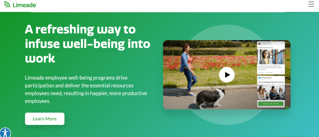
Colors can also affect how people perceive your brand. For example, if you’re promoting a health and wellness product, using green in your marketing materials can create a sense of trust and promote a natural, healthy lifestyle.
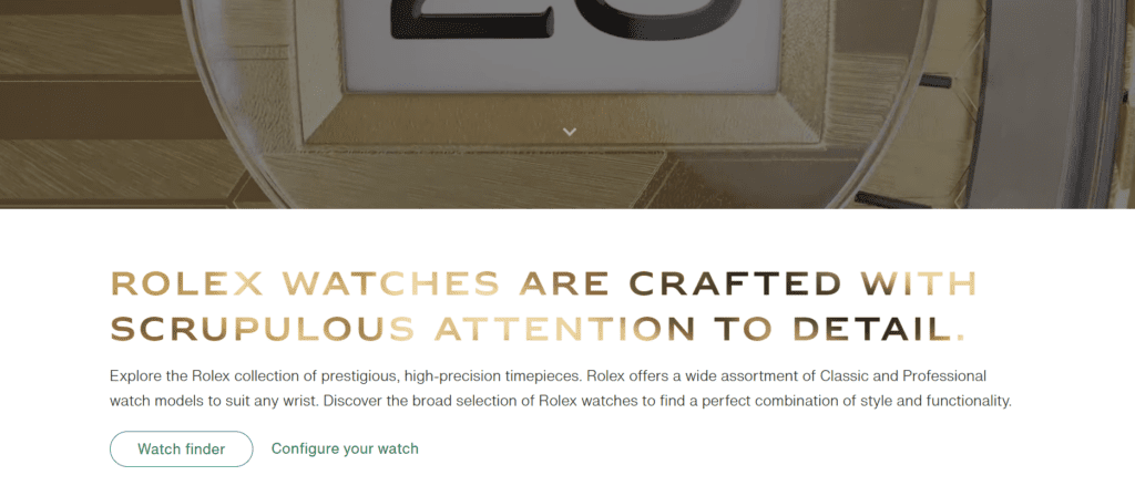
On the other hand, if you’re promoting a luxury product, using gold or purple can create a sense of exclusivity and sophistication.
Colors Form Emotional Bonds
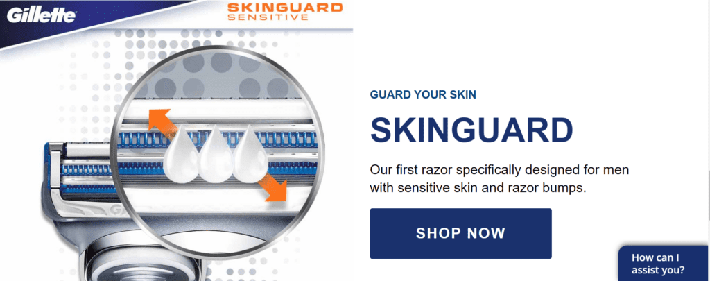
Colors have the power to evoke emotions and create emotional connections with your audience. For example, using red can create a sense of urgency and excitement, while using blue can create a sense of calm and trust.
By using the right colors, you can form an emotional connection with your audience which leads to an increased brand loyalty and repeat business.
Using consistent colors can also increase brand recognition. When people see your brand’s colors repeatedly, including in your popups, they start to associate those colors with your brand, making it easier for them to recognize your brand in the future.
Bottom line, color psychology is critical in marketing and sales, and businesses should pay attention to it when creating their strategies.
Now, let’s see how you can use different colors for your popups to crush conversion rates like a boss!
Use Red to Create Urgency
Red is a powerful color that can create a sense of urgency and increase the sense of importance among the visitors of your Divi website.
Therefore, you can use it in your website popups whenever you want to encourage your visitors to take action immediately. Whether it’s signing up for a newsletter or making a purchase, red can help you achieve the desired goal faster.
For instance, you might want to use a red “limited time offer” or “sale ends soon” popup to draw attention to a time-sensitive promotion. In this case, the use of the color red can help you convey a sense of urgency and encourage visitors to take action quickly.

This use of red helps to draw attention to the discount offer and encourage the user to take it.
Overall, using red in website popups can be effective in capturing attention, conveying urgency or importance, and indicating errors or warnings.
However, it’s important to use red judiciously and not overuse it, as too much red can become overwhelming and lead to negative reactions from users.
Use Blue for Trust and Security
Blue is a calming color that is often associated with trust and security, and you can use it in your Divi popups when you want to build trust with your visitors and make them feel safe.
This can be especially important if you’re asking for sensitive information, such as credit card details or personal data.
For example, if a user successfully completes a form or makes a purchase, a blue popup could appear, indicating that the action was successful.

Overall, the use of blue in your Divi popups can be effective in creating a sense of trust, reliability, and calmness.
However, it’s important to consider the context of the message and the overall design of the website to ensure that the use of blue is appropriate and effective.
Use Yellow for Happiness and Optimism
Yellow is a bright, cheerful color that can evoke feelings of happiness and optimism within people. The springtime sun is all you need to verify this feeling.
You can use yellow in your website popups when you want to create a positive, uplifting vibe, which can be especially effective when you’re promoting a new product or service that you want your visitors to feel excited about.

Overall, the use of yellow in website popups can be effective in creating a sense of warning or alertness.
However, it’s important to use yellow sparingly and in a way that does not overwhelm or distract the user from the main content of the website.
Use Green for Growth and Harmony
Green is a natural color that is often associated with growth and harmony. It’s the color of the grass, plants, and everything that looks positive.
You can use it in your Divi popups when you want to promote a sustainable, eco-friendly message or when you want to create a sense of balance and harmony.
For instance, if a user is waiting for a process to complete, a green popup could appear, indicating that the process has finished successfully. This use of green helps to convey a sense of progress and accomplishment.
Overall, the use of green in website popups can be effective in creating a sense of positivity, success, and progress.
However, it’s important to use green in a way that is consistent with the overall design of your Divi website and does not clash with other colors or elements on the page.
Use Orange for Action and Adventure
Orange is a vibrant color that can create a sense of action and adventure! You can use orange in your Divi popups if you want to encourage users to try something new!
This can be especially effective when you’re promoting a new product, offer, or sale that you want your visitors to feel excited about.

This use of orange helps to draw attention to the problem and encourage the user to take corrective action.
Overall, the use of orange in popups can be effective in creating a sense of urgency, excitement, and warning.
However, it’s important to use orange carefully and not overuse it, as too much orange can become overwhelming and lead to negative reactions from users.
Use Purple for Luxury and Sophistication
Purple is a color that is often associated with luxury, sophistication, and creativity. If you’re promoting high-end products or services, use purple in your website.
For instance, you might use a purple-colored popup with a message like “Exclusive offer for members only” to make visitors feel special and exclusive.

This use of purple helps to convey a sense of premium value and exclusivity in Divi popups, effective in creating a sense of luxury, sophistication, and exclusivity.
However, it’s important to use purple in a way that is consistent with the overall design of the website and does not clash with other colors or elements on the page.
BONUS: Additional Tips on Using Colors in Popups
As a bonus, the following are some additional tips for using colors in popups to effectively leverage color psychology:
- Black and White for Simplicity and Minimalism: Consider using a black and white color scheme for a clean and minimalist look. This can convey simplicity, elegance, and a sense of modernity. It works well when you want to focus on delivering a straightforward message without distractions.
- Gray for Neutrality and Balance: Gray is often associated with neutrality and balance. It can be used to create a calming effect and provide a backdrop that helps other colors stand out. Gray tones can be particularly useful for background elements or text, ensuring readability and reducing visual strain.
- Pink for Playfulness and Creativity: Pink is often linked to notions of playfulness, creativity, and youthful energy. When used strategically, it can help invoke a sense of whimsy or convey a lighthearted approach, making it suitable for certain types of promotions or creative content.
- Brown for Reliability and Earthiness: Brown tones can evoke feelings of reliability, stability, and a connection to nature. This can be effective when you want to establish trust and a sense of authenticity, especially for brands that focus on natural or organic products.
- Turquoise for Communication and Openness: Turquoise is a color that symbolizes communication, openness, and a willingness to engage. It can be used to encourage interaction, such as encouraging users to provide feedback or initiate a conversation through the popup.
- Gold for Prestige and Exclusivity: Gold is often associated with prestige, luxury, and exclusivity. Incorporating gold accents or highlights in your popup design can help create an impression of high value and sophistication, making it suitable for premium offerings or limited-time promotions.
- Silver for Modernity and Futuristic Vibes: Silver hues can convey a sense of modernity, innovation, and futuristic thinking. If your brand or product is cutting-edge or tech-focused, using silver elements in your popup design can reinforce that image.
- Multi-Color for Diversity and Inclusivity: A multi-color approach can symbolize diversity, inclusivity, and a vibrant community. This can be effective when promoting events, memberships, or initiatives that celebrate different cultures or groups.
- Contrasting Colors for Attention and Call-to-Action: Consider using contrasting colors for your call-to-action (CTA) buttons to make them stand out. A bold and contrasting color can draw the user’s attention and guide them toward the desired action, such as making a purchase or signing up for a newsletter.
- Gradient Effects for Visual Interest: Gradients, blending multiple colors seamlessly, can add visual interest and depth to your popups. They can create a sense of movement or transition, making the popup visually engaging and dynamic.
When using colors in your popups, remember to align the color choices with your brand identity, target audience, and the emotions you want to evoke. Keep in mind that color preferences and associations can vary across cultures, so consider your global audience when implementing color psychology in your popup designs.
How Can We Help?
As the founders of Popups for Divi – one of the most powerful popup plugins with 90,000+ installations on Divi websites, we also stand behind the ultimate solution for transforming every Divi section into a conversion-rate module or popup – Divi Areas Pro.

With Divi Areas Pro, you can build and customize campaigns with popups, fly-ins, hovers, mega menus, and conditional inline content, even if you’re a novice Divi user, creating truly interactive content, as never before!
Moreover, you can fine-tune the trigger of every Area, whether you like to show it after a few seconds, when scrolling down, on exit-intent, or when hovering a particular element, or even create complete custom triggers in JavaScript.
For a further breakdown of Divi Area Pro’s features and pricing, we invite you to read our detailed blog post: Divi Areas Pro: Features Overview & Benefits.
Try Divi Areas Pro today
Sounds interesting? Learn more about Divi Areas Pro and download your copy now!
Many pre-designed layouts. Automated triggers. No coding.
Click here for more details
Wrapping Up
Remember, when it comes to popups, colors can make a huge difference in how your visitors perceive your brand and whether or not they take action on your Divi website.
Colors play a significant role in our perception of brands and products, and have the power to evoke emotions, influence behavior, and shape our overall experience on a website.
That’s why it’s essential to use color psychology strategically when designing your website. Remember the above when designing a Divi website and popup marketing campaigns to achieve your business goals!
Try Divi Areas Pro today
Sounds interesting? Learn more about Divi Areas Pro and download your copy now!
Many pre-designed layouts. Automated triggers. No coding.
Click here for more details
More Articles You Will Like