
 Ria du Plessis
When building your website, you might be unsure of the perfect image sizes. Image sizing is important as it influences various aspects of your website. Things like your site’s loading speed, consistency, responsiveness, and more are influenced by the size of the images on your website. Now the question is, as a Divi Theme user, how do you know the correct Divi image sizes? Well, read on to find out!
This article will discuss the right image sizes and how to correctly optimize images for your Divi website. We will look at image dimensions and look at tips for getting better with images. This is the Divimode ultimate guide to Divi image sizes.
Table of Contents
- The Ultimate Divi Image Optimization Guidelines
- File Formats
- Image Dimension Guidelines Based on Divi’s Column Layouts
- Image Dimensions for Different Divi Modules
- Slider and Post-Slider Background Images
- Fullwidth Slider Background Images
- Images in Lightbox Displays
- Blog Module Featured Images with Fullwidth Layout
- Blog Module Featured Images with Grid Layout
- Conclusion
The Ultimate Divi Image Optimization Guidelines
Divi was built with three main aspect ratios in mind; 16:9, 4:3, and 3:4. These are the aspect ratios, we will focus on in this article.
Optimize Images Before You Upload
So, let’s start. As content writers or web developers, we know that it is always best to optimize images before uploading them to WordPress. Make sure you resize, compress, crop, your images, and more. Keeping your images between 60kb and 200kb is also a good idea.
Never Forget About SEO
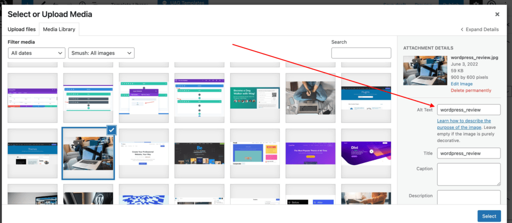
When it comes to images, search engines like Google read images by their filenames. Filenames like, ‘alt’ text, captions, file type, file size, etc are what tell search engines what and where images are. When uploading images to WordPress. make sure you add all of this info to your images.
File Formats
There are a lot of different image file formats out there. Most images on the internet are either in JPEG, PNG, or GIF format. For WordPress, we recommend uploading JPEGs.
JPEGs should be used for all of your full-color photographs like featured images and background images.
PNGs are mostly used for images that support transparent backgrounds such as logos or icons.
Image Dimension Guidelines Based on Divi’s Column Layouts
The following guidelines for image dimensions are based on Divi’s default layout settings. This includes a content width of 1080px and a gutter width of 3. Changing these settings may require you to adjust the dimensions of your images slightly.
Here is a list of dimensions according to the 4:3 and 16:9 aspect ratios. This is helpful to keep your images at a width and height that scales appropriately for mobile.
The following image dimensions follow the 16:9 aspect ratio standard
- 1 column: 1080 x 608
- ¾ column: 795 x 447
- ⅔ column: 700 x 394
- ½ column: 510 x 287
- ⅓ column: 320 x 181
- ¼ column: 225 x 128
The following image dimensions follow the 4:3 aspect ratio standard
- 1 column: 1080 x 810
- ¾ column: 795 x 597
- ⅔ column: 700 x 526
- ½ column: 510 x 384
- ⅓ column: 320 x 241
- ¼ column: 225 x 170
*Related Article – How To Create Images With AI
Image Dimensions for Different Divi Modules
Image Module
When using the image module, you can simply follow the 16:9 and 4:3 layouts to choose what image size you need for each column layout.
The upside to using the specific sizes for each column is that it gives you the exact image size you need without wasting image file size which may slow down your page load time.
The downside is that it doesn’t fill the column width on smaller screens like tablets. When the screen size drops below the 1080px breakpoint, the 4-column layout changes to a 2-column layout. This 2-column layout has room for an image size with a width of 370px. So if you want the image to fill the column width on tablet displays, you may want to start with an image size with a width of 370px instead of the 225px width.
So if you are looking to have your images fill the maximum width of the column on all devices, The following sizes for each column layout when using the image module are recommended.
For 4:3 aspect ratio:
- 1 column: 1080 x 810
- ⅔ column: 770 x 578
- ¾ column: 770 x 578
- ½ column: 770 x 578
- ⅓ column: 770 x 578
- ¼ column: 370 x 278
For 16:9 aspect ratio:
- 1 column: 1080 x 608
- ⅔ column: 770 x 433
- ¾ column: 770 x 433
- ½ column: 770 x 433
- ⅓ column: 770 x 433
- ¼ column: 370 x 208
Slider and Post-Slider Background Images
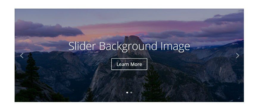
Slider background images should be at least the width of the column that it sits in. So deciding on image size is pretty straightforward.
The content of the slider will determine the height of your slider background image, so you may need to adjust the height.
The following image dimensions follow the 16:9 aspect ratio standard:
- 1 column: 1080 x 608
- ¾ column: 795 x 447
- ⅔ column: 700 x 394
- ½ column: 510 x 287
- ⅓ column: 320 x 181
- ¼ column: 225 x 128
The following image dimensions follow the 4:3 aspect ratio standard:
- 1 column: 1080 x 810
- ¾ column: 795 x 597
- ⅔ column: 700 x 526
- ½ column: 510 x 384
- ⅓ column: 320 x 241
- ¼ column: 225 x 170
If you want the slider to span the width of columns on mobile devices use these guidelines:
For 4:3 aspect ratio:
- 1 column: 1080 x 810
- ⅔ column: 770 x 578
- ¾ column: 770 x 578
- ½ column: 770 x 578
- ⅓ column: 770 x 578
- ¼ column: 370 x 278
For 16:9 aspect ratio:
- 1 column: 1080 x 608
- ⅔ column: 770 x 433
- ¾ column: 770 x 433
- ½ column: 770 x 433
- ⅓ column: 770 x 433
- ¼ column: 370 x 208
Fullwidth Slider Background Images
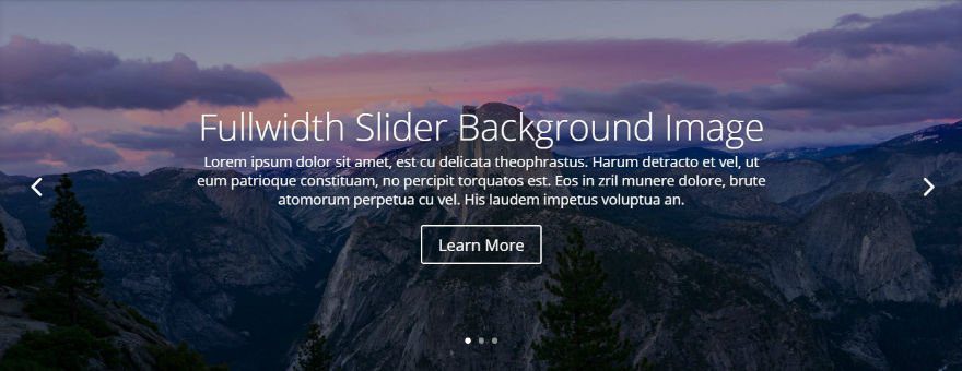
Recommended minimum width: 1920px
The width of your full-width slider background image is always determined by the browser width. Based on standard screen sizes we recommend that your images are at least 1280px wide. But for larger monitors, a safer bet would be to use an image that is 1920px wide.
Images in Lightbox Displays
If you are using the lightbox feature with your image, you may want to use a larger image. Usually, 1500 x 844 works well for a good full-screen image in a lightbox display for large monitors.
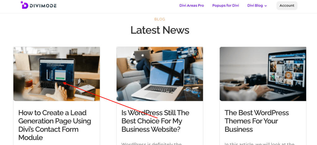
Blog Module Featured Images with Fullwidth Layout
The featured images should be as wide as the column it sits in. For example, if you are using a blog module in a two-thirds column with a right sidebar, you would need to use a featured image at least 700px width since that is the width of a two-thirds column in Divi.
Don’t forget that the featured image will also be used on your single post template (the page that displays your full post after you click on the post excerpt). So, make sure your single-page template is also using a two-thirds column to display your featured image.
- 1 column: 1080
- ¾ column: 795
- ⅔ column: 700
- ½ column: 510
- ⅓ column: 320
- ¼ column: 225
Blog Module Featured Images with Grid Layout
Width: Equal to the size of the single post column width (default 795px)
Blog Grid layout is that Divi uses a smaller version of the featured image uploaded to the media gallery (with a width of 400px). Since this smaller image is created and displayed automatically, there is no need to worry about your page loading an image file size that is too big for the grid column.
Conclusion
Using the Divi Builder is very easy, especially with images. The Divi theme is very adaptable, but if you need any more information on Divi image sizes, hop on over to the Elegant Themes Blog for lots of information on image optimization.
Try Divi Areas Pro today
Sounds interesting? Learn more about Divi Areas Pro and download your copy now!
Many pre-designed layouts. Automated triggers. No coding.
Click here for more details
More Articles You Will Like


