
 Martin Tolovski
Let’s explore the fascinating world of creating Divi hover effects! As one of the most popular WordPress themes, Divi boasts a range of customization options, with hover effects being a fantastic way to add interactivity and visual appeal to your website.
Whether you’re a web designer, developer, or simply someone who wants to enhance their Divi website, we will walk you through the process step by step. So, let’s dive in and discover how to create stunning Divi hover effects!
Table of Contents
- What are Divi Hover Effects?
- Exploring Divi’s Hover Choices
- Examples of Divi Hover Effects
- FAQs on Divi’s Hover Effects
- Additional Tips
- Wrapping Up
What are Divi Hover Effects?
Before we delve into the details, let’s quickly understand what Divi hover effects are.
Introduced in 2018, the Divi hover effects enabled Divi website owners to create all kinds of stunning hover effects and transform Divi modules into fun and interactive elements.
These effects can be applied to various elements, such as buttons, images, text, or even entire sections. Divi, with its intuitive visual Builder and extensive design options, makes it incredibly easy to create and customize these hover effects.
Exploring Divi’s Hover Choices
As we already mentioned before, the realm of Divi’s design components offers an abundance of hover options! These options extend to sections, rows, columns, and modules, offering a wide range of possibilities.
To access the hover options, you need to navigate to the same location where regular customization choices are found within the settings modal.
Note: If an option does not display the cursor icon, it does not have the ability to support hover options.
This user-friendly approach of easy access to the hover settings allows you to effortlessly customize the hover effects of an element, encompassing both the default desktop view and the hover state, all consolidated in one convenient location.
Examples of Divi Hover Effects
Changing call-to-action text on hover
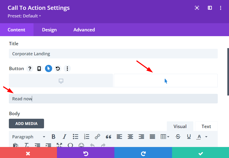
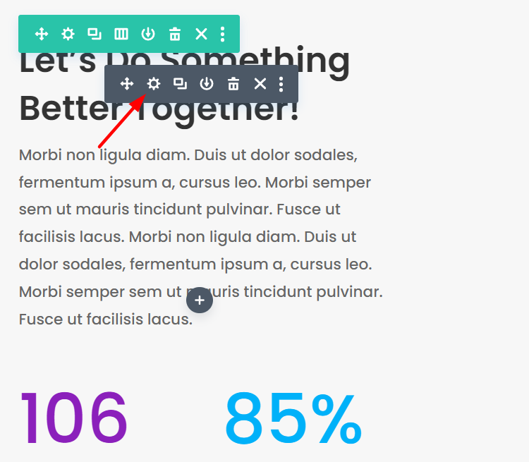
For example, let’s change the call-to-action text of the button on hover. First, hover over the button module and click the gear icon to bring up the module settings.
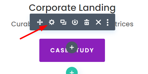
Then, navigate to the Content tab and click on the Text Settings. Go to the hover icon on the button text to open the Hover options.
Enter the text that you want to be displayed on hover.
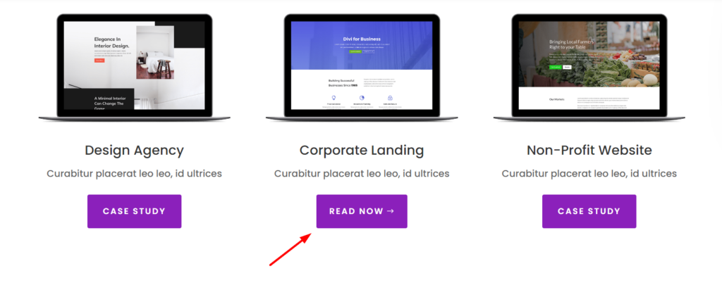
And there you go, as soon as someone hovers on the CTA button, the text will be different.
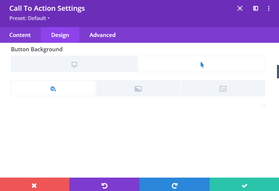
Now, let’s change the button’s background color on hover. To alter the hover effect of the button’s background, we need to perform the following steps:
- Open up the Button Design settings
- Click on the hover icon and into the hover tab.
- Select the background color you want to display on hover
- Click the ‘Save’ button at the bottom of the module to save changes
Changing text background on hover
Again, changing the background of a text or blurb on your Divi website when on hover is effortless in the Builder.
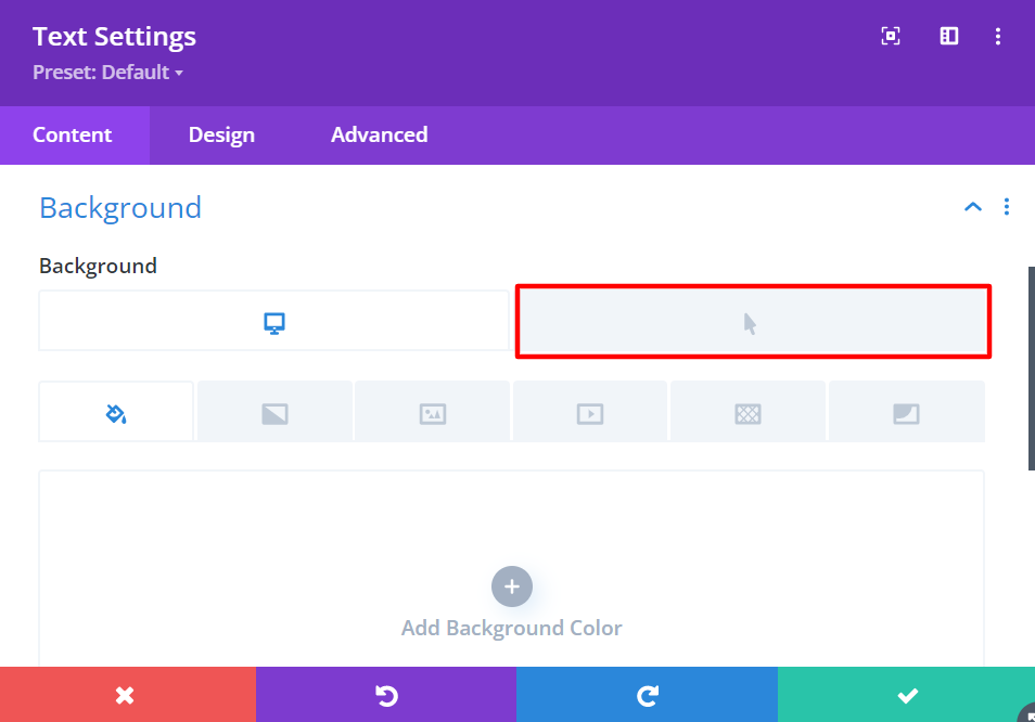
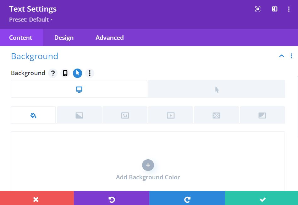
Open the Text module and click the gear icon to bring up the Settings.
In the Content tab, open the Background settings, click on the Hover icon, and set the background color.
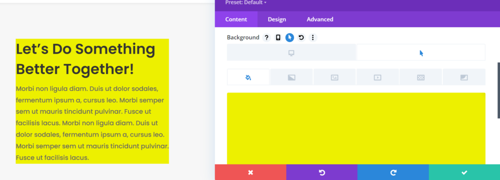
You can perform the same steps for changing the text and heading colors when on hover.
Controlling transitions on hover
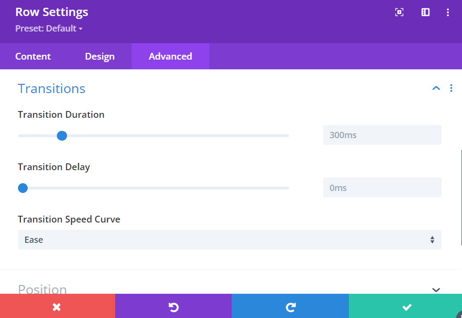
In the hover settings, you can also change the design, speed, and transitions of the elements to which you want to add the hover effect to.
Tweaking the hover effect’s speed and duration can be done by accessing the Advanced > Transitions settings and adjusting the controls available there.
You can adjust the duration, delay, and speed curve of the hover effect.
By seamlessly integrating hover options and captivating transition effects, you have the power to transform the behavior of your hover effects.
You can effortlessly customize the duration of these transitions by simply adjusting the duration slider to your desired preference.
Moreover, you can strategically introduce delays to your transitions, enabling them to initiate either before or after another engaging transition effect.
Lastly, you have the flexibility to select from a range of speed curve options, allowing you to create dynamic and visually stunning interactions on your website.
Applying hover effects on buttons
With the versatile features of Divi, you can incorporate both straightforward and imaginative hover effects to your icon buttons.
This not only applies to regular buttons but also extends to social media follow buttons, amplifying the visual appeal and interactivity of your website.
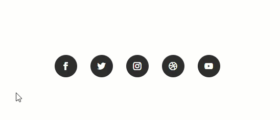
To explore the possibilities further, please take a look at this comprehensive tutorial from Elegant Themes that demonstrates how to craft distinctive hover effects for social media follow buttons specifically within the Divi framework.
FAQs on Divi’s Hover Effects
Can I apply multiple hover effects to the same element?
Yes, you can apply multiple hover effects to the same element. Divi allows you to combine different effects, such as fading, scaling, and color overlays, to create complex and visually appealing hover effects.
Are hover effects mobile-friendly?
Yes, Divi ensures that hover effects are mobile-friendly by providing options to configure the behavior on touch devices. You can choose to disable the hover effect or apply a different effect specifically for mobile users, ensuring a seamless experience across all devices.
Can I use custom images for the hover effect?
Absolutely! Divi allows you to use custom images for the hover effect. Simply upload your desired image within the module settings, and the hover effect will be applied accordingly.
Is coding knowledge required to create advanced hover effects?
While coding knowledge is not necessary to create impressive hover effects with Divi, having a basic understanding of CSS can help you unlock even more possibilities. Divi’s Visual Builder caters to users of all skill levels, allowing you to achieve stunning results with or without coding.
Additional Tips

To ensure the optimal utilization of hover options in Divi, here are a few more tips and best practices to consider:
→ Be purposeful: When applying hover effects, focus on elements that prompt user engagement or call-to-action. Buttons are commonly associated with hover effects, as they imply clickability. Divi offers the ability to add a link URL to any element, enhancing the interactive experience alongside hover effects.
→ Prioritize desktop: While hover effects can be implemented on mobile devices, it’s generally discouraged due to the double-tap requirement to trigger the effect. This can lead to confusion and frustration for visitors, potentially causing them to miss out on the intended effects.
→ Highlight elements: Employ hover effects to draw attention to crucial areas of your website. Micro-animation can convey their clickability effectively. You may also consider using hover effects to modify significant text lines or call-to-action modules.
→ Avoid overuse: While interactive elements enhance user engagement, it’s essential to strike a balance and avoid overwhelming visitors. Excessive use of animation and visual effects can confuse users and overshadow your intended message. Opt for a minimalistic approach, utilizing hover effects sparingly and focusing on highlighting the most crucial areas of your web pages.
Wrapping Up
Creating Divi hover effects is an excellent way to elevate the user experience and make your website visually stunning. With Divi’s powerful features and intuitive builder, you can easily bring your creative ideas to life.
Remember to experiment, try different effects, and let your imagination run wild. By adding captivating hover effects, you’ll captivate your audience and create an engaging website that stands out from the competition.
Try Divi Areas Pro today
Sounds interesting? Learn more about Divi Areas Pro and download your copy now!
Many pre-designed layouts. Automated triggers. No coding.
Click here for more details
More Articles You Will Like