Whatever you’ve signed up on the Internet recently, it’s because the offer was enticing, but most of all, the call-to-action was compelling enough to click through. Think about it. We download stuff all the time, buy something at a discount, and click to use the best offers before they expire.
The most successful websites that convert visitors into customers include a winning call-to-action (CTA). Do you want to learn how you can create high-converting CTA buttons for your Divi website?
If you do, you’re at the right place! This article will go over the best practices for setting up CTAs that can deliver better conversion rates for your website. Let’s begin.
CTAs and Their Importance
A call-to-action is a phrase, word, or an entire sentence that motivates users to take action. With the right CTA in place, you can motivate your target customers to buy your product, download your lead magnet, sign up for your newsletter, and share your content.
CTAs help potential customers decide and make the entire value that you provide sensible to them in a flash. They spark the sense of urgency among users and provide them with a route on what to do next, keeping them engaged with your product as a result.
Use Actionable Language
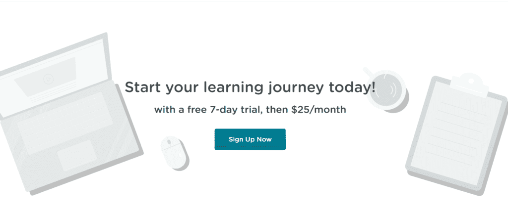
The best CTA buttons are actionable, and they use action words and phrases to motivate the users for the click. Let’s take Evernote’s CTA as an example:
You can tell that someone is doing their copywriting work right here. As soon as they open the home page, visitors immediately know what the CTA button is about and what action they should take. The benefits are expressed clearly, and there’s nothing else the users can do except click and organize.
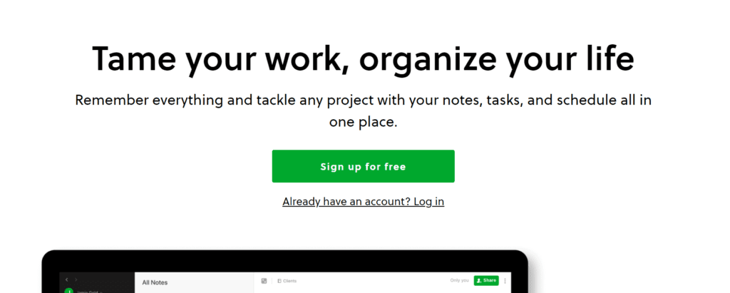
Present the Benefits
When you want users to click on your CTA button, you need to sell the benefit if they opt to do so, or your conversion rate will suffer. People are constantly looking for the best ‘bang for one’s buck’ when it comes to online products and getting the most benefit for what they pay for is where they decide whether to click on your CTA button or not.
Here’s an example from Netflix’s home page:
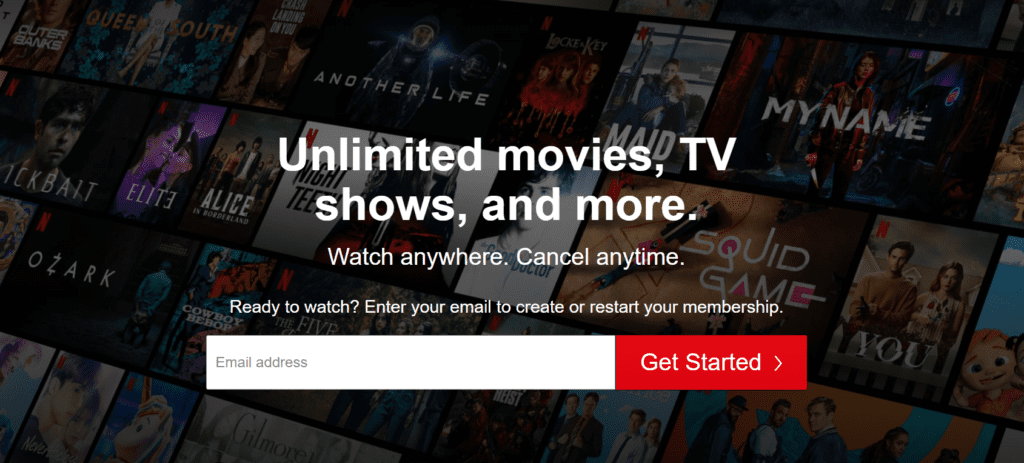
All of this is really tempting to sign up and ‘Get Started’. This is how you need to express the benefit of clicking on the CTA button. Letting users know that you allow unlimited product usage for a monthly subscription is a pretty awesome deal, and people will click on the button in seconds.
Spark People’s Curiosity
A powerful CTA button includes an element that revolves around people’s curiosity. The more people want to know, the more they’ll be inclined to click on your CTA button. Thus, if your CTA messages are formulated in such a manner that sparks people’s desire to know more about the value that you provide, the click-through rate will be much higher as a result.
Here’s an example from a Klientboost popup:

As you can tell, their promise sounds pretty tempting, and if you’re after annihilating competitors that are after the same target customers, that you must be really curious to click and discover how you can accomplish that. By writing a CTA copy that complements the button, users will be anxious to click and experience the benefits.
Include Your Privacy Policy
Placing your privacy policy under your CTA button can help you improve your credibility among your target customers and make them trust your value proposition more as a result.
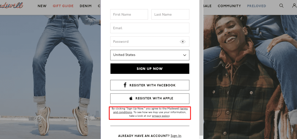
Besides improving the trustworthiness of your offer, Including the privacy policy is also considered an excellent SEO practice because according to VWO, it might contribute a great deal to your site’s credibility ranking factor when it undergoes Google’s crawling process and review.
Pay Attention to Placement
Do you know about Fitts law? The basic idea of the law is that the farther away a given target is, the smaller the target is, and thus, navigating towards that target is more challenging for the users. This is critical not only for the UX of your Divi website, but also, for the placement of your CTA buttons as well.
If you think about it in a logical manner, your CTA button should always be placed where consumers pay attention the most across the user journey, and where they’d be going next. Let’s take this page from SproutSocial as an example:
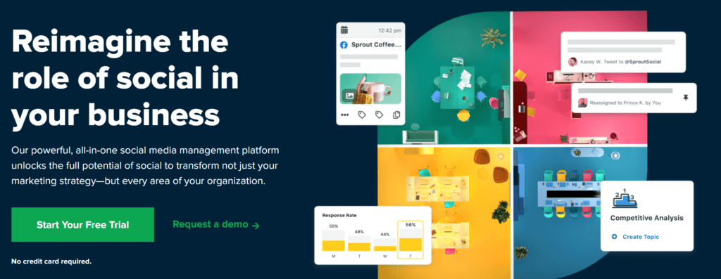
Users who’ve spent some time browsing similar pages and layouts are already familiar with what to expect and how to reach the CTA button as soon as they open the page. This type of predictability is pivotal when it comes to increasing CTA conversion rate, because if you make things too complex for the target customers, they won’t even attempt to reach the CTA button.
Use Complimentary Colors
Colors affect how we read and perceive content online, and thus, you need to keep the contrast and colors complementary and only use colors that spark the emotions that target users need to feel.
So, how can you make a CTA button more prominent with colors? Take Mint’s CTA as an example:

They use a mint green button with white typeface on a slightly green and white background, a great combination that highlights the button and the rest of the surrounding elements. Besides, the look and the feel of the entire homepage is not distracting at all, making users focus on the benefits even more.
A/B Test Your CTA Buttons
Oftentimes, creating and placing a CTA button on one of your pages is not enough. To make the CTA button a success, you must continuously iterate and test until you uncover the right text, design, and color. The best way to achieve that is through A/B testing. You must experiment with size, color, copy, form, and placement.
Start with one element and run different tests afterwards. A simple change can deliver drastically different results, and by identifying what elements impact your conversion rate the most, you’ll get better results over time. Read more about A/B testing in one of our recent guides.
Wrapping Up
Creating high-converting CTA buttons for your Divi website doesn’t have to be complex. The more logical your approach is, the better. Make sure to keep the target users in mind and make the path towards the buttons easier for them. Use compelling copywriting, and make sure that CTAs are in focus, especially if you’re creating them for your landing page. Put all of the practices above into action, and you’ll nail CTA button conversion rates in no time.
What is your experience with optimizing call-to-action buttons so far? Have you implemented some of the tactics above, and what were the results? Let us know in the comments below!
More Articles You Will Like