As passionate website designers and plugin developers, we’ve always believed that the real essence of a WordPress website starts straight from the header.
Thus, building a website header should be one of the Divi basics that anyone working with the Theme needs to handle in order to begin telling the brand’s story on a high note from the get-go.
The header is more than just a part of web design; it’s a canvas for creativity, the first handshake with your audience. With the Divi Theme Builder, this canvas becomes a playground for imaginative and functional design.
With the help from the Elegant Themes tutorials, let’s delve together into the basics of building website headers with Divi and create innovative header designs for your site.
Table of Contents
FAQs About Website Headers
Why is a website header important?
The website header is the first thing visitors see when they land on a page, so it plays a crucial role in making a good first impression. It helps users navigate the site, find important information, and understand the website’s brand and purpose.
What should be included in a website header?
A typical website header includes a logo that links back to the homepage, a navigation menu for easy site navigation, and sometimes additional elements like a search bar, contact information, or social media links. The content of the header can vary based on the website’s goals and design.
How can I make my website header stand out?
To make your website header stand out, consider using contrasting colors, a bold font for the logo and navigation menu, and strategic placement of elements. You can also use animation or interactive elements to grab attention, but be careful not to make the header too distracting.
Should my website header be sticky (fixed to the top of the page)?
Having a sticky header can improve user experience by keeping important navigation links accessible at all times, especially on long pages. However, it’s important to ensure that the header doesn’t take up too much vertical space or cover important content on smaller screens.
How can I optimize my website header for mobile devices?
For mobile devices, consider using a hamburger menu (three horizontal lines) to save space and make the navigation menu accessible. You can also simplify the header by removing non-essential elements or using collapsible sections to keep the design clean and user-friendly.
What is a Website Header
For those that are still learning the basics of website design with WordPress and Divi, let’s delve into what is a website header and what it is used for on websites.
In simple words, a website header is the uppermost section of a website that typically appears on every page.
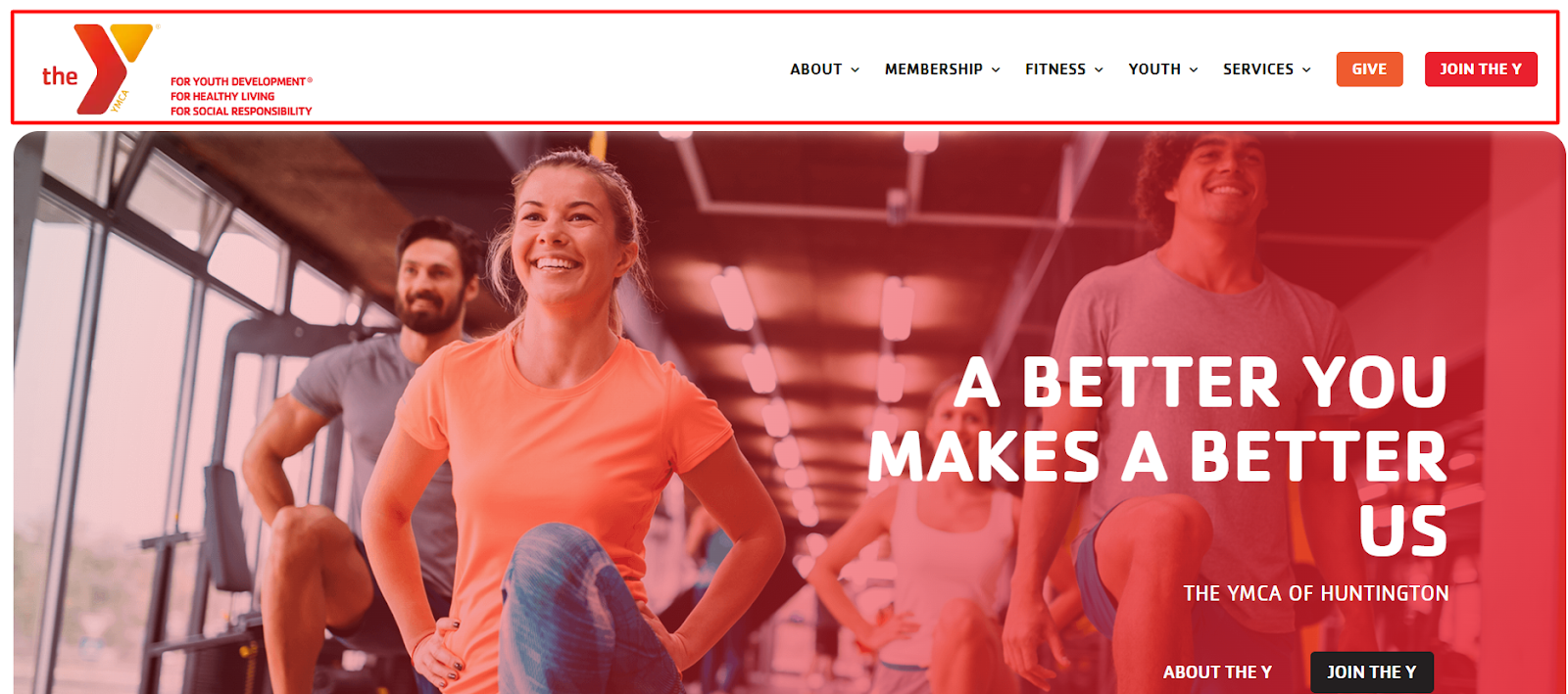
It’s the first visual element visitors encounter, including crucial components like the site’s logo, navigation menu, and sometimes contact information or call-to-action buttons. This part of the website sets the tone for the entire usability and experience on the pages.
Building Website Headers with Divi
1. The Dynamic Global Header
A staple in web design, the Global Header represents the brand consistently across all pages.
Divi allows for customizing this element, incorporating sticky features and intuitive navigation menus, adaptable for both desktop and mobile interfaces.
See our full Divi Global Header Tutorial here
See the full Elegant Themes Tutorial here
2. Sticky Header: A Touch of Elegance
Sticky Headers offer a sleek user experience, staying in place as visitors scroll. This design choice is perfect for ensuring constant access to navigation, morphing in color and size for added interactivity and style.
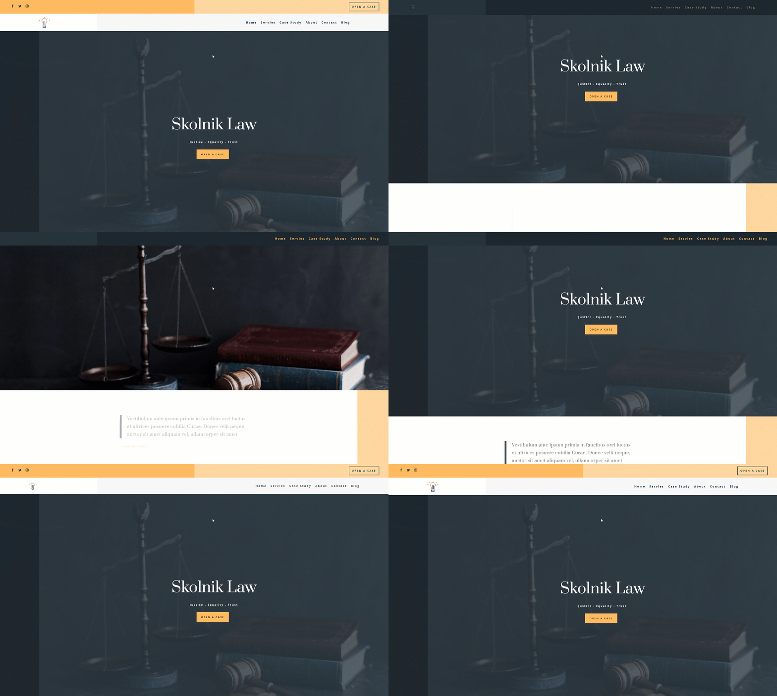
With Divi’s new sticky options, creating a sticky header has never been easier. Divi helps you turn any element sticky and assign custom styles to a sticky state, resulting in an endless design and UX possibilities.
See the full Elegant Themes Tutorial here
3. Fullscreen Global Header: Maximizing Impact
For a bold, immersive experience, the Fullscreen Global Header covers the entire screen with a stylish hamburger menu. It’s a modern approach that caters to both desktop and mobile users, offering a full-screen navigation experience.
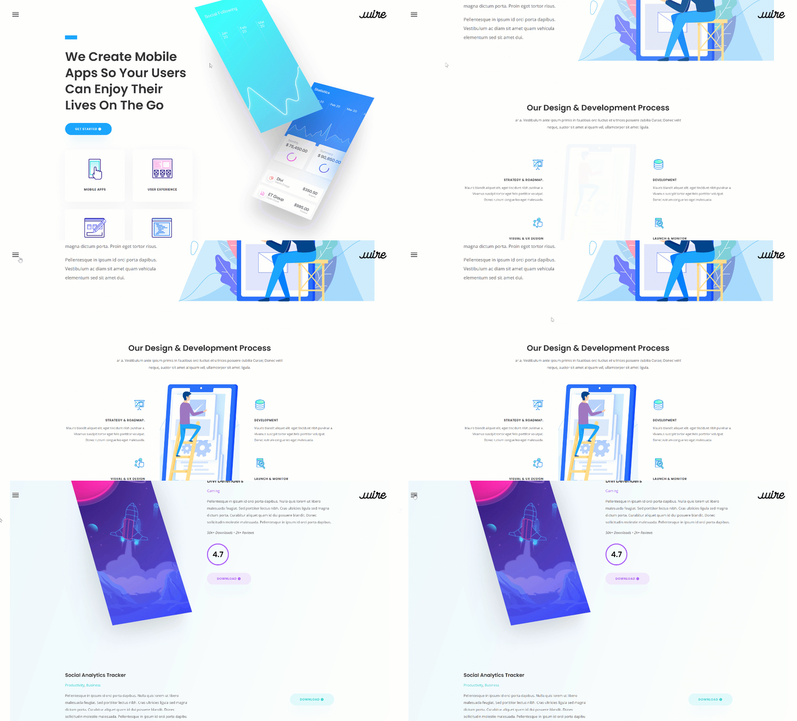
See the full Elegant Themes Tutorial here
4. Slide-In Menus: The Art of Subtlety
Adding a dash of sophistication, Slide-In Menus appear from the screen’s edge, often triggered by a minimalistic hamburger icon. This design is particularly effective in making the most of screen real estate while maintaining an uncluttered layout.
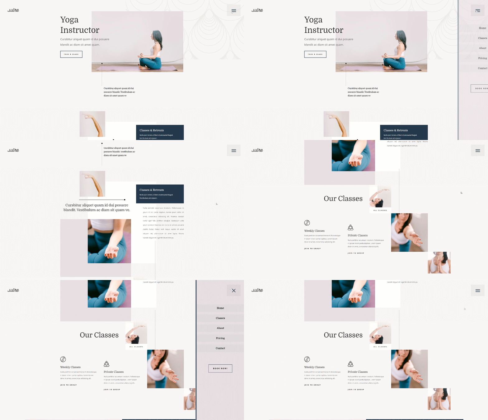
A slide-in menu can help you limit the space taken up by the global header. Rather than show each menu item, you can let a slide-in menu appear when your visitors click on the hamburger icon in the top right corner.
See the full Elegant Themes Tutorial here
5. Vertical Navigation: The Road Less Traveled
Breaking the horizontal norm, Vertical Navigation Menus stick to the screen’s side, offering a unique aesthetic. This style can include direct call-to-action buttons and social media links, enhancing functionality and engagement.
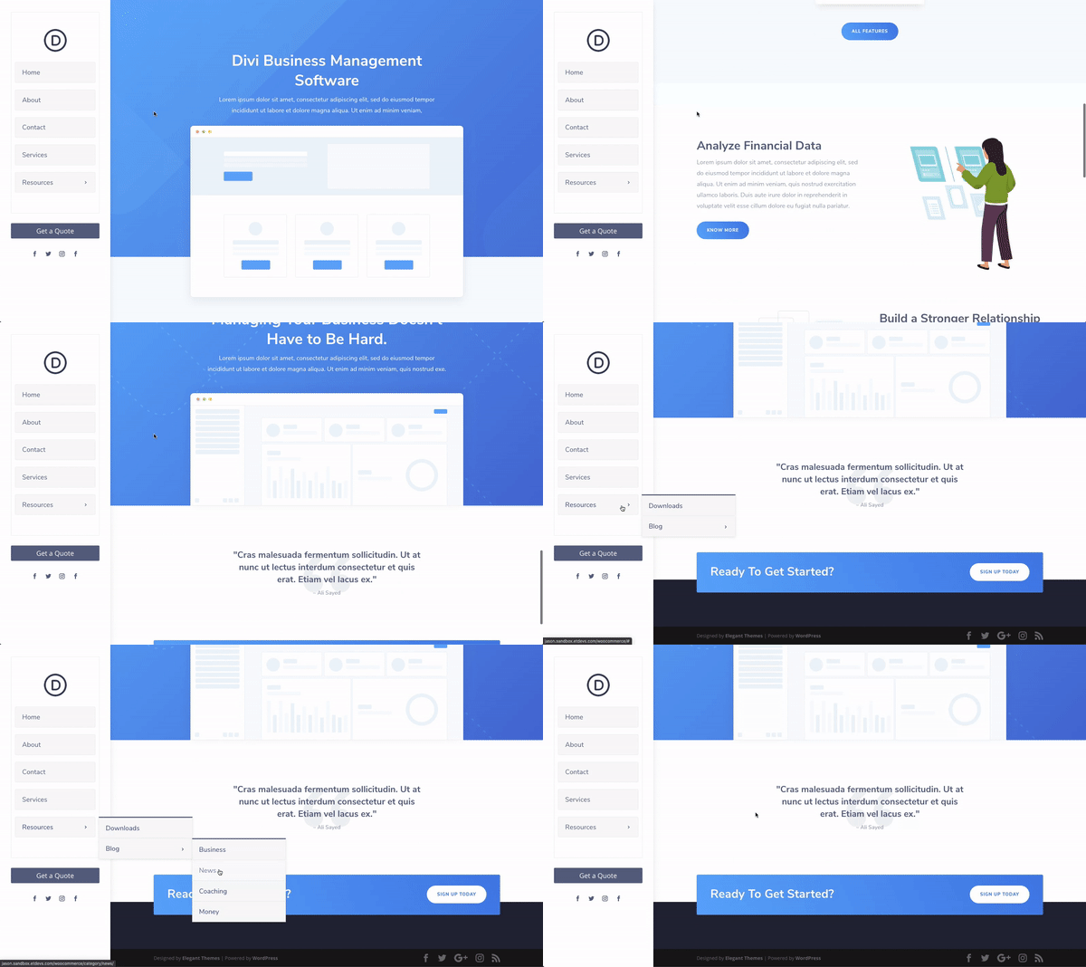
See the Full Elegant Themes Tutorial here
Wrapping Up
Bottom line, the header is more than just a functional component; it’s a digital storyteller, setting the stage for the user’s journey through a website.
With Divi Theme Builder, the possibilities for creating unique and engaging headers are limited only by imagination.
Whether you opt for the sleek sophistication of a sticky header, the bold statement of a fullscreen global header, or the nuanced elegance of a transparent floating menu bar, each design choice is an opportunity to leave a memorable imprint on your visitors.

Try Divi Areas Pro today
Sounds interesting? Learn more about Divi Areas Pro and download your copy now!
Many pre-designed layouts. Automated triggers. No coding.
Click here for more details

