
 Martin Tolovski
Creating a responsive menu that looks excellent on any screen can be challenging. But not with Divi!
Divi’s Theme and Builder options and the Divi Area Pro plugin allow you to customize popup menus regardless of the number of menu items, links, and pages where you want to enable the menu.
Today, we’re going to provide the Divi Theme Builder and the Divi Areas Pro plugin as two helpful solutions for creating mobile-responsive popup menus that can be triggered on a click, hover, or time delay triggers. Let’s get started.
Table of Contents
- Creating Popup Menus with the Theme Builder
- Creating a Responsive Popup Menu with Divi Areas Pro
- Over to You
Creating Popup Menus with the Theme Builder
To start creating awesome popup menus with the Divi Builder, Elegant Themes provides us all with another of their super-detailed tutorials, as always, and we’re thankful for the inspiration!
Log in to your WordPress Dashboard, and open the Divi Theme Builder, where you will add your new template for the popup menu.
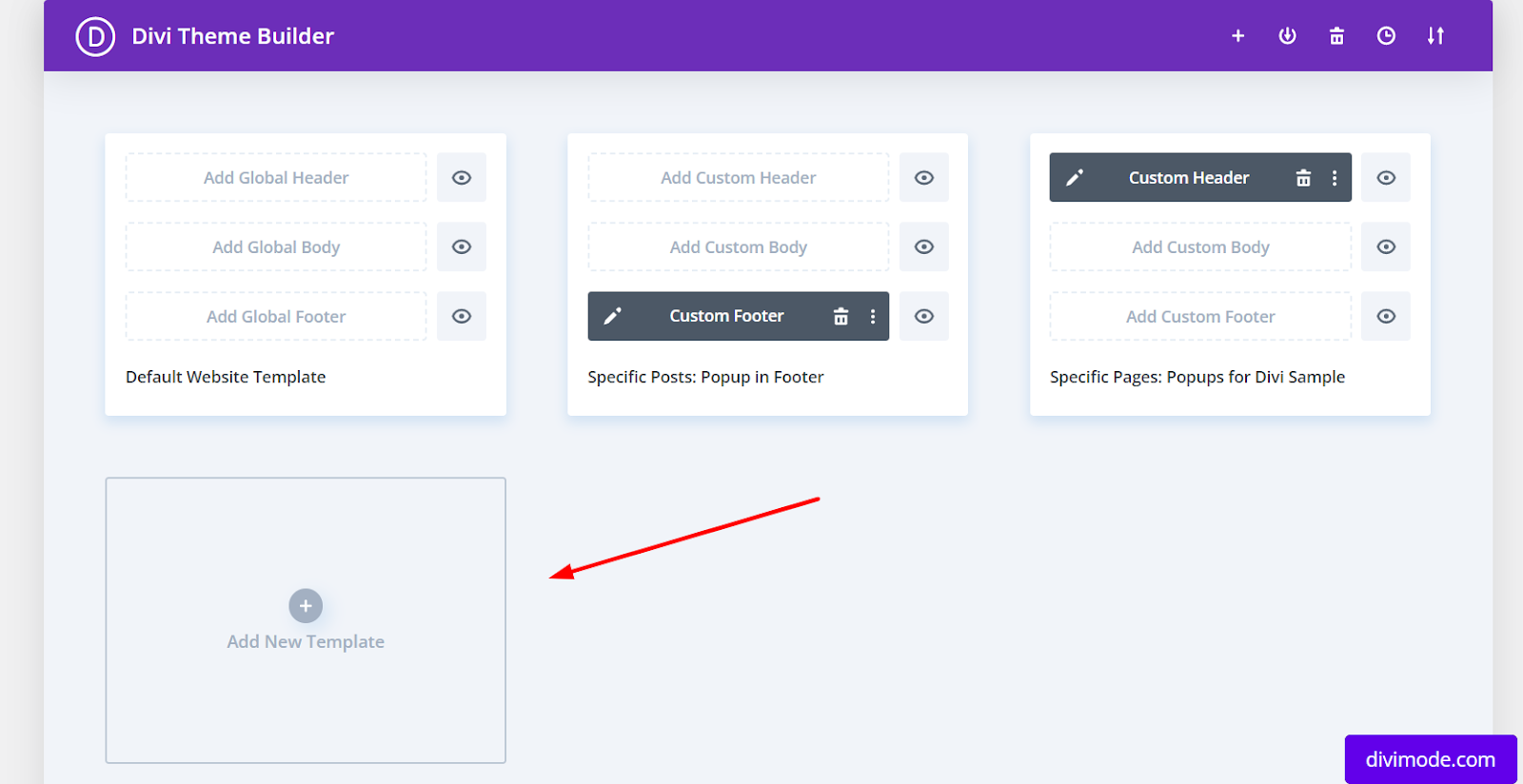
Choose the page where you want to include the popup menu and click on ‘Add a Custom Header’ > ‘Build Custom Header’ afterwards, which will open a header section on your page.

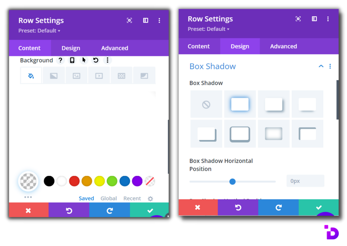
Now, the first thing that you’ll want to do is set the background to be transparent and use 0px for the top and bottom padding, which removes the default containers for the section’s padding.

Then, navigate to the ‘Advanced’ tab, and within the ‘Position’ settings, choose a fixed top center position, and click ‘Save’.

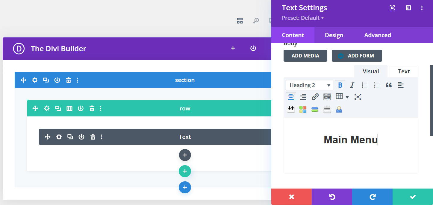
Next up, you need to add the row that will contain your logo and the hamburger icon for the menu.
Add a row with a 3-column structure, and within the row’s ‘Sizing’ settings, and increase the width to more than 90%, with a 100% max width, which could help us get a bigger size for the container.
In the first column, add your logo as an image module.

Then, in your third column, add a Text Module, which will actually represent your hamburger icon, with the following spans:

Set the Text Line Height to zero, and within the ‘Sizing’ settings, set the Width to 120px, and alight the module to the right.

The next thing that you’ll need to do is add a new 1-column row that will be dedicated to the side menu. In the row’s Sizing settings, select ‘Use Custom Gutter Width’, and enter the value of ‘1’, which removes all space between modules, and set the Width to ‘auto’ for all screen sizes.
Now, to continue creating a responsive popup menu in Divi with this method and to make things simpler for you and save you from looking at an excessive number of screenshots, we advise you to continue with the Elegant Themes tutorial and create the full-blown hamburger fly-in menu with their guidance:
Creating a Responsive Popup Menu with Divi Areas Pro
If you’re already familiar with the Divi Areas Pro plugin, our premium Divi extension, you probably know how easy it is to create super-cool mobile-responsive popups and fly-ins. If not, we invite you to subscribe for a yearly plan right away and get started for only $49!
Then, head to the Divi Areas Pro dashboard, add a new Divi Area, and name it accordingly. At this stage, the first thing that you’ll need to do is create the popup content.
So, let’s go over some quick steps to help you prepare the popup menu.
First, set the background and the box shadow for your Divi Area. If there’s a particular theme that you want to address with the menu, you can choose a related background color, graphic, or image.
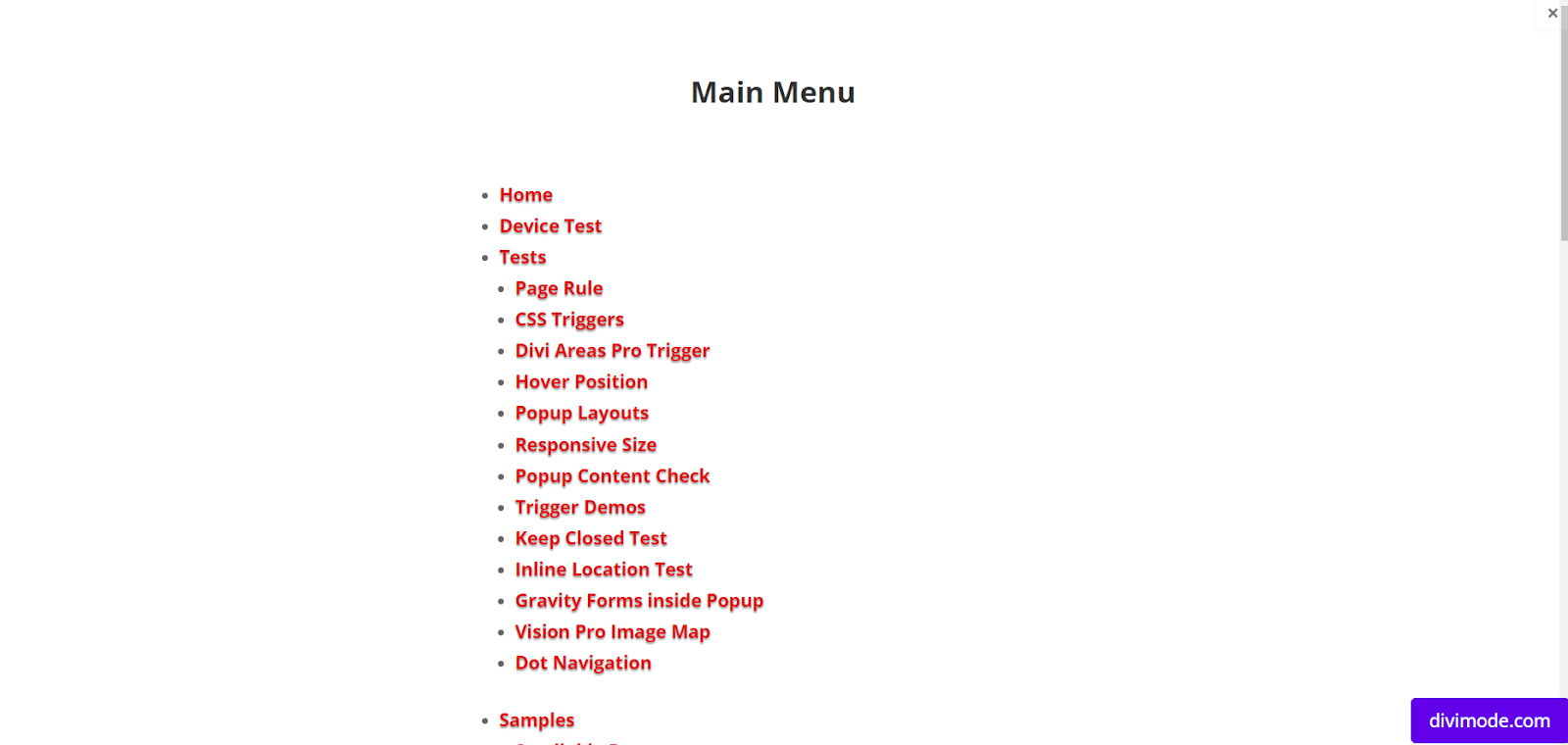
The next step would be to add content to your popup. Begin with the menu’s name/headline that highlights the items.
Now, add a new row, set the content position to the middle, and insert a Menu module.
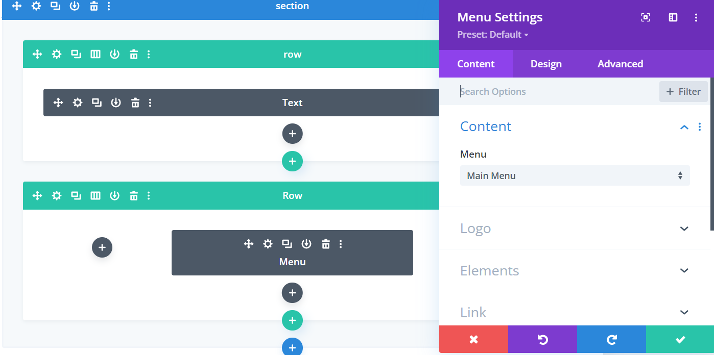
Now, you need to start customizing the menu. By default, the menu has a white background, but if you want to use a different color, you can choose it with the color picker.
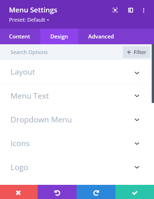
Within the design tab, the menu’s styling options are where you can change how each aspect of the menu looks, starting from the layout, then moving on to the spacing, text, icons, logo, border, filters, and animation.
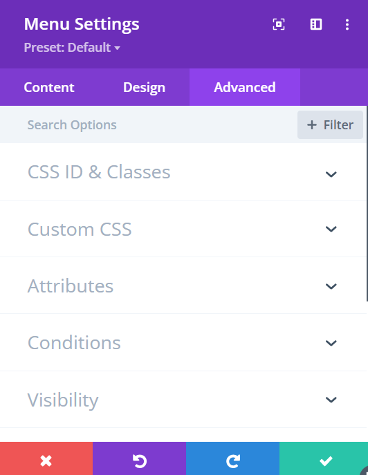
When you move on to the Advanced tab options, you will find the CSS & HTML features, which can be extremely beneficial if you want to take things to another level, especially for more experienced web designers.
Now, to use the countdown popup menu correctly, you’ll need to configure the Divi Area’s trigger that would display the popup menu after a certain action on the users’ end.
Inside your Divi Area dashboard, scroll down to the settings, and designate the Area as a Popup, Fly-In, Hover, or Inline.
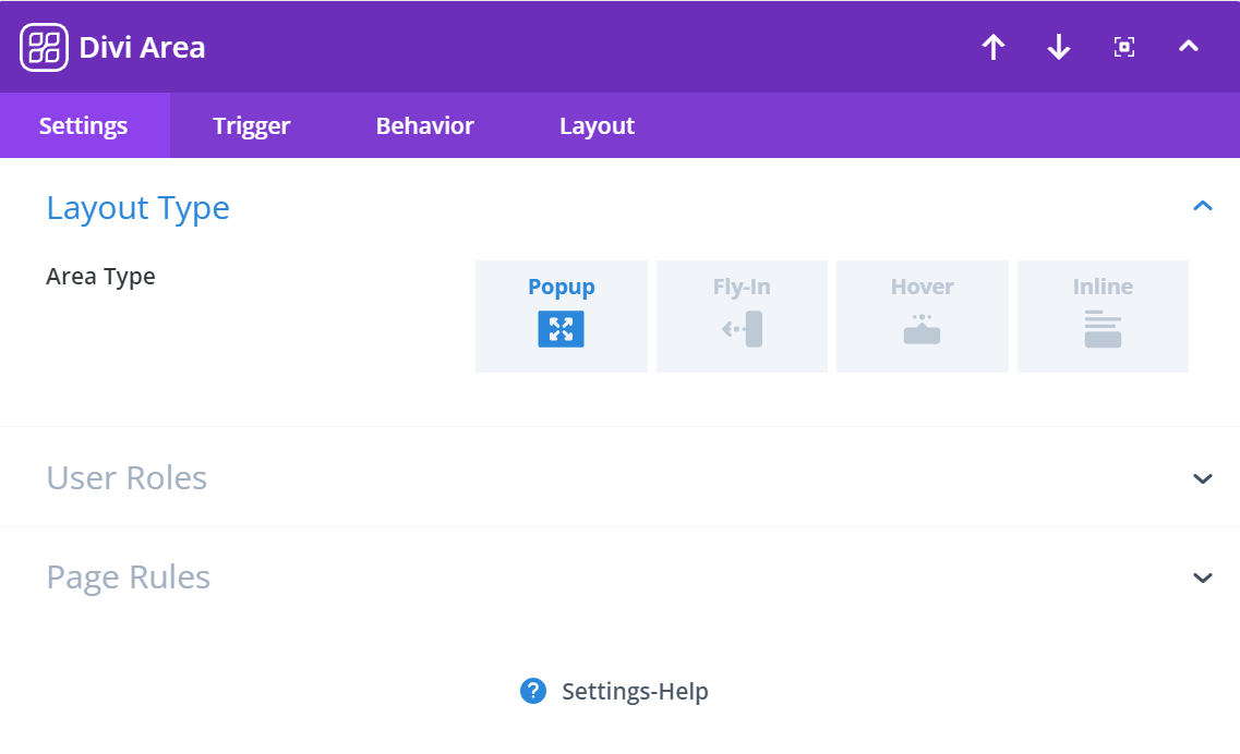
Next, navigate to the ‘Trigger’ options and navigate to ‘Automatic Triggers’, choose the desired trigger and designate on which user action you want the popup menu to appear.
Now, you’re all set and ready to publish the Area and use the popup menu. As soon as you click on the ‘Publish’ button, you can immediately test the popup on your Divi pages.
Make sure to open the page on a mobile screen to confirm that the menu is responsive as well.
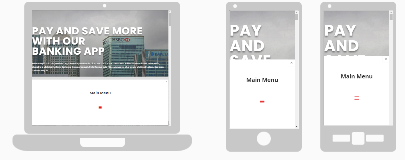
Creating a responsive popup menu with Divi Areas Pro is effortless. All you have to do is customize the content and the popup settings within the plugin, and you’re good to go.
Over to You
With Divi Areas Pro, you can add responsive popup menus on your Divi website easily. We hope you found this short tutorial useful.
Now that you know how to create great-looking popup menus, you can use Divi’s Theme Builder and Divi Areas Pro to boost website interactions with a mobile-ready popup menu.
Try Divi Areas Pro today
Sounds interesting? Learn more about Divi Areas Pro and download your copy now!
Many pre-designed layouts. Automated triggers. No coding.
Click here for more details
More Articles You Will Like