Divi remains one of the most powerful and customizable WordPress themes, and with endless possibilities and features available, and there are so many options to build the website that you like.
However, even though working with Divi is pretty straightforward, designing beautiful and usable websites is not always as easy as it seems. With up to 75% of users online trusting aesthetically pleasing websites, you just know that there are significant UX rules that you need to consider if you want to build empathy with the users and get high-converting traffic.
Thus, this article will outline the six critical UX principles for better Divi websites that you need to be aware of when designing your website.
Table of Contents
- 1. User-Centricity
- 2. Design Uniformity
- 3. Design Hierarchy
- 4. Better Accessibility
- 5. Excellent Performance
- 6. Mobile-Responsiveness
- Wrapping Up
1. User-Centricity
It is perhaps the most critical UX principle that you need to follow. This principle sits on top of the UX design pyramid simply because understanding your target users while trying to create a unique web experience is one of the hardest things that web designers must balance.

The best websites are always about stylish and smart combinations of elements and function and, most importantly, genuinely user-centric in their nature. User-centricity involves carefully thinking about how the users would want to interact with your Divi website, the tasks they must perform, and arranging the website elements accordingly.
Feedback is critical here, and arguably, the best way to apply user-centricity to your Divi website is to work closely with your target audience and audit the features they’d prefer. It’s an ongoing process of building and analysing data, where you become more informed on each subsequent iteration.
2. Design Uniformity
Staying consistent with the site’s functionality and executing a uniformed design across all of your pages is critical for creating a flowing user experience while maintaining your brand identity at the same time.


Moreover, most of the industry-related websites already have a ‘typical’ design that is familiar to the users that browse the website for more product information and content.
Whenever the users land on your Divi website, whether that’s for the hundredth or first time, they should know “how things work”, and your interface should feel natural. The more uniform the UX is, the easier it will be for the user to navigate your website.
Thus, when implementing design and UX uniformity, never go overboard with novelties. Innovation is far less important than the user experience and usability.
3. Design Hierarchy
Website hierarchy is one of the best UX concepts that serves designers and developers in helping them provide the users with better website navigation and moving through pages easily. When planning the information you want to present on your Divi website, the topmost level of the hierarchy is in most cases the navigational menu that leads to the site’s main sections.
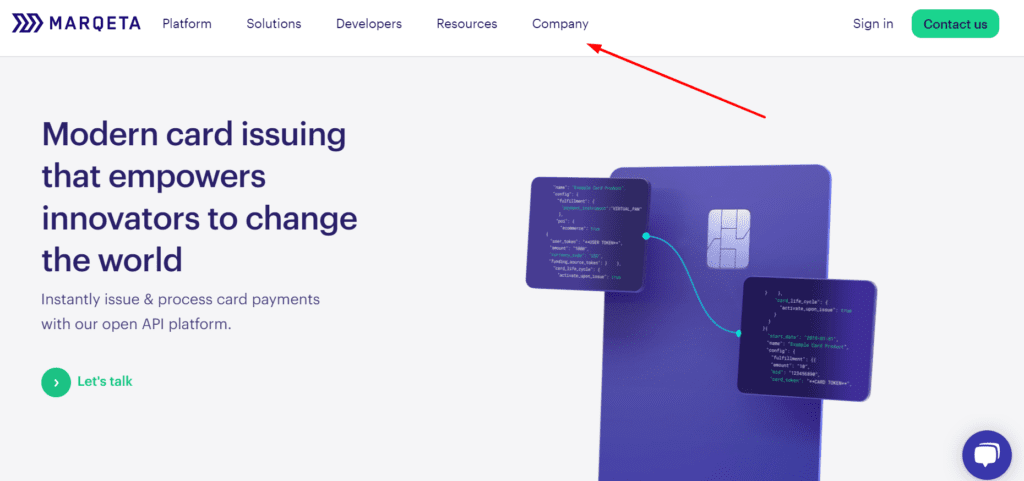
Hovering on each of the menu items, in lots of cases, opens a secondary menu that gets into the specific category, allowing users to move down the website’s hierarchy.
Furthermore, each blog post, image, or part of the content from the page represents the bottom of the information hierarchy.
When speaking about the visual aspect of the design hierarchy, we are talking about making the content stand out on each page but in a manner that helps the users navigate better on the site. Take headings as an example. In most cases, they appear larger than any other text on the page, and most frequently, they’re bold.

Furthermore, the rest of the interactive texts and elements use separate colors to highlight what they’re about on the page.

When thinking about design hierarchy, it’s important to consider how users search and use filters on your Divi website. If users know exactly what they want, they’ll want to locate it quickly without too much browsing.
Good information hierarchy makes the entire process easier for potential customers and readers of your site. The faster the users get to their desired goal, the greater their satisfaction.
4. Better Accessibility

What is accessible makes a better Internet for all of us! And what’s better for all of us means that it has an impeccable UX!
However, there are many aspects that you need to consider when designing your Divi website UX for better accessibility.
To start modelling your UX for better accessibility, Web Content Accessibility Guidelines (WCAG) is the best starting point. The detailed guidelines represent universal and technical rules that cover accessibility, from using texts to images and markups.
Staying aware of the WCAG will help you make better decisions about what to include, consider, or exclude from the UX of your Divi website.
For each stage of your UX design process, and for every new feature that you might add, you need to conduct specific tests in which you must determine how users that have impairments would learn to use the website, how efficiently they’d perform the tasks, and most importantly, how pleasant the entire UX would be for them.
To add more clarity, here are some helpful design rules that you need to consider:
- Make the size of the fonts a minimum of 16px, the recommended minimal font size.
- Create a distinctive difference between the elements on each page.
- Use the power of contrast to help users find information easily on your site.
- Repeat the elements on your website to help users memorize them.
- Pay attention to the proximity of all elements on your website.
- Arrange the content in a manner that highlights its importance.
By sticking to the WCAG guidelines, testing how usable is your Divi website to people with certain impairments, and use designs and technologies that help then navigate your website, you will make sure that the UX is improved for all.
5. Excellent Performance
If you’re already using Divi to build your website and improve its performance, the UX is perhaps the least of your worries.
However, to achieve even greater UX things through performance, there are lots of amazing Divi features already available to you to help you speed up your WordPress website, which makes the page builder one of the best in the marketplace. The following article from Elegant Themes contains all the features that make building a fast Divi website easier for you: Divi Speed Optimization: The Ultimate Guide:
6. Mobile-Responsiveness
Most website owners have already optimized their websites to fit mobile device traffic. It’s clear why – mobile accounts for more than half of the global Internet traffic, and by 2025, the number of active mobile devices is expected to reach over 18 billion!

However, most websites aren’t optimized beyond the default mobile responsiveness settings. In many cases, setting the layout to fit smaller screens is not enough when you need to consider site speed, UX, and design as a whole.
But luckily, Divi provides a multitude of responsive features for customizing the various aspects of your website:
- Responsive Editing and Hover: This feature enables you to display different types of content to your website visitors according to their device, providing you with extra control over the design of your Divi website as a result.
- Divi Mobile Customizer: The Divi Mobile Customizer, which can be found in the Theme Settings, allows you to develop specific global styles for mobile traffic.
- Srcset for Responsive Images: The native SRCSET support for Divi images means that the theme will automatically make your images responsive and display the right image size for every device, which also improves page load speed.
Wrapping Up
The fundamental concept of UX is that you’re designing for the users. Designing the Divi website for your target audience will constantly influence how they interact with your pages for the better.
Thus, by applying the fundamental principles above, you will undeniably develop a design that is user-friendly and appealing to the users.
P.S. You’ve just delved into the world of UX principles for Divi websites, and the potential for enhanced user experiences is at your fingertips. Take the next step toward UX perfection with Divi Areas Pro!
Why Divi Areas Pro?
- Seamless Integration: Effortlessly incorporate captivating popups into your Divi site without coding hassles.
- Customization at Your Fingertips: Craft stunning designs and messages that align perfectly with your brand and UX goals.
- Targeted Engagement: Showcase popups to the right users at the right moment, enhancing your site’s user experience.
- User-Friendly: An intuitive interface makes setup and management a breeze.
Unleash the full potential of your Divi website’s user experience and watch your audience satisfaction soar with Divi Areas Pro!

Try Divi Areas Pro today
Sounds interesting? Learn more about Divi Areas Pro and download your copy now!
Many pre-designed layouts. Automated triggers. No coding.
Click here for more details
