With 1400+ fonts included as a significant benefit from integrating with Google Fonts, Divi allows you to come up with a wide range of typography combinations that you can use to customize your website’s content successfully.
However, going through all those fonts can be a real challenge. After all, coming up with the right font pairing leads to a pleasant user experience, but the right combination is often hidden in plain sight, waiting for you to discover it.
To help you find the right Divi typography, in this blog post, we will talk about how to pair the right fonts for your website and the principles you need to follow for unravelling the right combination.
Table of Contents
- FAQs About Pairing Typography in Websites
- Why Do You Need to Pair Fonts?
- What Types of Fonts are Available?
- Consider Brand Style & Identity
- Choose for Legibility & Readability
- Examples of Perfect Font Pairings
- Over to You
FAQs About Pairing Typography in Websites
- What is typography pairing in websites? – Typography pairing is the practice of selecting and combining different typefaces on a website to create a harmonious and visually appealing design.
- Why is typography pairing important in website design? – Typography plays a vital role in shaping the visual identity of a website. Pairing typefaces appropriately can improve the readability, legibility, and aesthetic appeal of a site, making it more engaging and effective in conveying its message.
- What are some common principles of typography pairing? – Some common principles of typography pairing include using contrasting typefaces to create a visual hierarchy, selecting typefaces with similar x-heights to create balance, and avoiding using too many different typefaces to maintain consistency.
- What are some popular typeface pairing combinations? – Some popular typeface pairing combinations include serif and sans-serif combinations, such as Georgia and Helvetica, or pairing a display typeface with a more neutral body typeface.
- How many typefaces should be used in a website design? – As a general rule, it’s best to limit the number of typefaces used on a website to two or three to maintain consistency and avoid overwhelming the user with too many visual elements.
- How can I test different typeface pairings for my website design? – There are various online tools available that can help you test different typeface pairings, such as Typ.io, Font Pair, and Google Fonts.
- How can I ensure my chosen typeface pairing is accessible? – It’s essential to ensure that your chosen typeface pairing is accessible to all users, including those with visual impairments.
Why Do You Need to Pair Fonts?
The right font pairing consists of two different web fonts that contrast between one another but, at the same time, achieve a perfect balance and cohesiveness in the process.
To achieve the right hierarchy and create engaging content, you need more than one font on your Divi website.
Pairing fonts is more than just combining them to look great together. It complements your entire website content and design.
What Types of Fonts are Available?
Fonts can play a massive role in how consumers perceive your brand and can communicate your brand’s values, aligning perfectly with what your business is about.
When deciding which font to use for your Divi website, you need to ensure that it highlights what your brand is about and, moreover, that it’s readable, legible, and usable for any device.
There are four main types of typography that you can choose for your font pairs:
- Serif fonts
- Sans-serif fonts
- Script fonts
- Display fonts
Serif and sans-serif fonts for various types of websites because both types of fonts are perfectly readable and are always considered in trend, especially the sans-serif typefaces.

Display fonts are eye-catching typefaces that are mostly used for headlines and ads, which means that they’re not used as frequently as serif and sans-serif fonts.

Last but not least, script fonts are mostly used for decorative purposes, excellent for presenting quotes, headlines, and emulations of hand lettering on websites.
Consider Brand Style & Identity
One of the biggest mistakes that you can make when choosing typography for your Divi website is to pick fonts that don’t match with your brand or the industry that you’re working in. The key is always to pick fonts that convey your business.
For example, let’s say that you’ve launched an app and you want a professional and clean look, but at the same time, stay informative for the target users. For technology websites and related content, the Roboto font always looks great on websites.

The example above from Cosmos perfectly blends in the Roboto and Inter fonts to complement the overall space-like blockchain brand feel. The font pairing alone can tell a lot to customers about blockchain integrations, even without the additional designs around it.
This tells us that when correctly, font pairing can influence visitors’ perception on what the brand is about. That is why you need to pick font pairings that reflect your brand and business goals.
If your business is more traditional and serious, perhaps serif fonts would work better. But if you combine serif fonts with modern sans serif variations, you’ll add a modern and elegant feel to it.
Choose for Legibility & Readability
You can choose the most stylish typography for your website, which can look truly up-to-date. But will the text be clear and readable for visitors? Is it legible on all devices, including mobile?
Take the ‘ancient’ newspapers as an example. You would often see a combination of bolded serif font headlines and fonts that allow readers to grasp the texts, making the entire reading experience more pleasant.

The same principle should be applied to your Divi website typography. Each font that you’ll choose must be readable, with the proper amount of spacing and sizing suitable for the target readers.
The body font needs to be simple and legible, letting users focus on the content, while the headline fonts can be bolder and more distinguishable. A great legible combination of fonts would be the combination of League Spartan and Libre Baskerville fonts.

League Spartan is a modern typeface that has a strong structure, contrasting well with the rest of the website and the traditional feel of the Libre Baskerville font.
Examples of Perfect Font Pairings
When you want to put together the perfect typography pairs for your Divi website, there’s no need to waste too much time on it. The following are some of the best font pairings available to help you decide.
Karla Bold & Spectral Light

Karla and Spectral are an excellent pair of fonts that appear friendly and relatable to everyone on the Internet. Excellent if you’re creating content for the younger consumer base.
Libre Franklin & Libre Baskerville
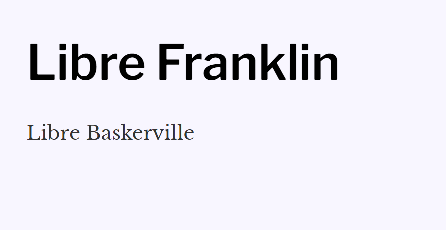
The combination of Libre typefaces from light to bold allows you to play around with your content, depending on how direct you want the headers to feel to the readers.
Open Sans & Source Sans
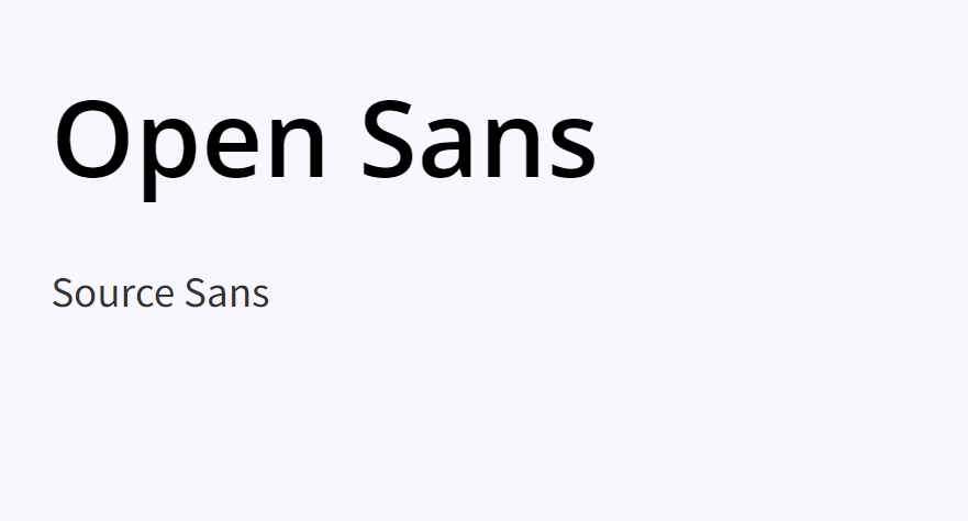
This font pairing offers a neutral and friendly presence, which is beneficial for any target visitor, regardless of your goal.
PT Sans & PT Serif
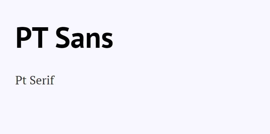
PT Sans and PT Serif are sister fonts that will always go well together. They’re clean and simple typefaces, which makes them versatile enough for any website that wants to offer great content or present products.
Over to You
When it comes to web design, pairing fonts can be tricky. However, making the right selection will help you provide the best possible experience for your website visitors.
Divi allows you to use the best typefaces to communicate with your target customers. Do not hesitate to experiment with different pairings, typeface sizes, colors, and placement to complement your Divi website.
Try Divi Areas Pro today
Sounds interesting? Learn more about Divi Areas Pro and download your copy now!
Many pre-designed layouts. Automated triggers. No coding.
Click here for more details
More Articles You Will Like