So, you want to improve your website’s conversion rates? The secret isn’t some complex, magic formula. It’s about making it dead simple and genuinely appealing for visitors to take that next step and become customers.
Real, lasting improvement comes from getting inside your users’ heads. You need to understand their behavior and then systematically knock down any barrier—or friction—that gets in their way. It all boils down to a few core pillars: site speed, user experience (UX), and trust signals.
Your Starting Point for Higher Website Conversions
Before you get lost in advanced A/B testing or complex sales funnels, it’s critical to nail the fundamentals that turn casual browsers into committed buyers.
Think of your website like a physical store. If it’s clean, easy to navigate, and the staff are helpful, people are far more likely to stick around and buy something. The exact same logic applies online. Every single element either contributes to a sale or actively pushes people away.
Boosting your conversion rate isn’t about guesswork. It’s a deliberate process of figuring out what your visitors are looking for and clearing the path for them. When you get this right, you create a smooth, intuitive journey that feels natural for your audience.
The Core Pillars of Conversion
To get started, let’s zero in on the areas that pack the biggest punch. Focusing your energy here will give you the most bang for your buck.
- Lightning-Fast Site Speed: A slow website is the ultimate conversion killer. Seriously. Even a one-second delay can send visitors bouncing before they ever see what you have to offer.
- Intuitive User Experience (UX): Your site has to be effortless to use. If people can’t find what they’re looking for almost instantly, they’ll get frustrated and head straight to a competitor.
- Compelling Calls-to-Action (CTAs): Your CTAs need to be clear, impossible to miss, and persuasive. They should tell the user exactly what to do next, leaving no room for confusion.
- Powerful Trust Signals: In the digital world, trust is everything. Things like customer reviews, security badges, and transparent policies are essential for reassuring hesitant buyers.
Before you start optimizing, it helps to know where you stand. The reality is that conversion rates swing wildly depending on the industry, device, and even the time of year. For instance, in the first quarter of this year, the beauty and skincare industry led the pack with an online conversion rate of roughly 3 percent. And while mobile shopping continues to grow, higher conversions still tend to happen on larger screens like tablets and desktops. You can always explore more e-commerce benchmarks to see how different industries stack up.
The single biggest challenge for any online store? Cart abandonment. It’s consistently hovering above a staggering 70%. One of the main culprits, especially in the U.S., is unexpected costs like taxes and shipping fees that suddenly appear at the very end of the checkout process. This just goes to show how crucial transparency is from the very beginning.
To get your CRO strategy right, it’s useful to see the big picture. Here are the core pillars we focus on and why they matter.
Key Focus Areas for Conversion Rate Optimization
| Focus Area | Primary Goal | Key Actions |
|---|---|---|
| User Experience (UX) | Make the website intuitive and effortless to navigate. | Simplify navigation, improve mobile design, streamline forms. |
| Site Speed & Performance | Ensure the website loads quickly for all users. | Optimize images, leverage caching, choose fast hosting. |
| Calls-to-Action (CTAs) | Guide visitors toward the desired conversion action. | Use clear, compelling language; test button colors and placement. |
| Content & Copywriting | Persuade visitors with clear and convincing messaging. | Write benefit-driven headlines, clarify value propositions. |
| Trust & Credibility | Build confidence and reduce visitor anxiety. | Display reviews, security badges, and transparent policies. |
| Checkout Process | Remove friction from the final step of the journey. | Minimize steps, offer guest checkout, be upfront about costs. |
Ultimately, a winning strategy for improving website conversions is built on a single, powerful idea: empathy. When you optimize for your user’s needs, you naturally guide them toward the actions you want them to take. It’s a win-win.
Turn Site Speed Into a Conversion Superpower

There’s an invisible force silently dictating your website’s success or failure, and it works in milliseconds. That force is your site’s speed. Long before a visitor even reads your headline or sees your stunning product photos, they’ve already made a snap judgment based on how quickly your page appears.
A slow, clunky experience sends a clear message: you don’t value their time. This isn’t just a technical problem; it’s a direct hit to your bottom line. Frustration and friction are conversion killers, and a sluggish website serves up both on a silver platter. Every fraction of a second you can shave off your load time smooths out that experience and directly improves your chances of making a sale.
The numbers are pretty stark. A website that loads in just one second can see conversion rates three times higher than a site that takes five seconds to appear. Wait ten seconds, and that one-second site is converting five times better. Thankfully, the trend is moving in the right direction, and you can dig into e-commerce conversion benchmarks to see just how critical speed has become.
Diagnose Your Speed Issues
Before you can start fixing things, you need to know exactly where the bottlenecks are. This is where tools like Google PageSpeed Insights become your best friend. Just plug in your URL, and it will give you a full diagnostic report, complete with a performance score and a prioritized list of fixes.
Don’t get bogged down by all the technical terms. Just focus on the big, red-flag warnings. These tools are great at pointing out the low-hanging fruit—things like massive image files or slow server response times—giving you a clear, actionable starting point. Think of it as a doctor’s checkup for your website; it tells you where it hurts so you can apply the right medicine.
Pro Tip: Always, always run tests for both mobile and desktop. Mobile performance is often the bigger problem area, yet that’s where a huge chunk of your traffic comes from. Neglecting mobile speed is like locking the front door on half your potential customers.
High-Impact Speed Optimizations
Once you have your report card, it’s time to get to work. The good news is that you don’t need a complete site overhaul to see major gains. Often, a few targeted tweaks can make a world of difference for your load times and, by extension, your conversion rate.
Here are the essentials that give you the biggest bang for your buck:
- Compress Your Images: This is hands-down the most common speed killer. High-resolution images are great for design but terrible for performance. Use tools like TinyPNG or a good image optimization plugin to slash file sizes without any noticeable loss in quality. This is non-negotiable.
- Leverage Browser Caching: Caching is like telling a visitor’s browser to “remember” parts of your website (your logo, CSS files, etc.). When they come back for a second visit, their browser doesn’t have to re-download everything from scratch, making your site feel almost instant.
- Implement a Content Delivery Network (CDN): A CDN is a network of servers spread across the globe that stores copies of your site. When someone from another country visits, the content is delivered from a server physically closer to them, dramatically cutting down load times for your international audience.
For those of us building with Divi, these optimizations are especially crucial. If you want a more detailed guide tailored specifically for this, our post on how to speed up your Divi website breaks it all down step-by-step.
The Real-World Impact of One Second
Let’s make this tangible. Picture an e-commerce store with a $500,000 annual revenue and a 4-second load time. By tackling the optimizations above, they manage to get their site loading in 3 seconds.
Just that one-second improvement can boost conversions by 7-10%, according to industry data. For this store, that’s an extra $35,000 to $50,000 in revenue every single year. All from focusing on speed. This isn’t just a technical metric; it’s a powerful business lever. To really master this, you need to learn how to speed up Divi. Your bottom line will thank you for it.
Designing a User Journey That Naturally Converts

A great website doesn’t feel like a rigid sales funnel; it feels more like a personalized, guided tour. Instead of forcing visitors down a predetermined path, the best online experiences gently lead them, making each next step feel like the most natural and helpful choice.
It all starts with a simple shift in perspective. Move away from thinking, “How do I sell to this person?” and start asking, “How can I help this person solve their problem?” When you see your site through your customer’s eyes, you’ll start spotting friction points and opportunities you never noticed before.
Map Your Visitor’s Path
Before you can improve the journey, you have to understand the roads people are already taking on your site. Where are they landing first? Which pages do they visit next? And, critically, where are they giving up and leaving? Your website analytics are the perfect tool for tracing these common routes.
Look for the “happy path”—the sequence of pages your highest-converting visitors tend to follow. What makes their journey different? Just as important, identify the “unhappy paths” where large groups of visitors abandon ship. These drop-off points are often where you’ll find your biggest opportunities for improvement.
A typical journey might look something like this:
- Awareness: A visitor lands on one of your blog posts from a Google search.
- Interest: They click an internal link from that post to a related product category.
- Consideration: They start browsing different product pages, comparing features and benefits.
- Decision: They finally add an item to their cart and head to the checkout.
Your job is to make the jump between each of these stages feel completely seamless. Every page should anticipate what the user is thinking and provide a clear, obvious path forward.
Key Insight: A successful user journey isn’t a single, rigid funnel. It’s a network of interconnected pathways that cater to different user intents. Some visitors are ready to buy immediately, while others need more information. Your site must serve both effectively.
Uncover Friction with User Behavior Tools
Analytics tell you what users are doing, but they rarely tell you why. To get that deeper layer of understanding, you need to watch their behavior up close. This is where tools like heatmaps and session recordings become absolute game-changers.
Heatmaps give you a visual breakdown of where people click, how they move their mouse, and how far down the page they actually scroll. You might discover users are clicking on something that isn’t a link, signaling a design flaw. Or you could see they aren’t scrolling far enough to even see your main call-to-action.
Session recordings are like watching a replay of a visitor’s entire time on your site. You see every mouse movement, every hesitation, and every point of frustration. I’ve learned more from watching just a handful of these recordings than from hours of staring at charts. You might see a user trying to fill out a form, only to get stuck on an error message they don’t understand.
Refine the Journey with Strategic Testing
Once you have a solid hypothesis about a problem area, it’s time to test a solution. This is where A/B testing comes in. Instead of just making a change and hoping for the best, you can scientifically prove whether your new version improves the user experience and, ultimately, your conversion rate.
But don’t just stop at testing button colors. The most powerful tests often involve bigger, more strategic changes that tap into core user motivations.
- Test Different Value Propositions: Does “Free Shipping on All Orders” work better than “15% Off Your First Purchase”? Your headline and sub-headline are prime real estate for testing which message truly resonates.
- Experiment with Page Layouts: On a product page, would moving customer reviews above the product description increase “add to cart” clicks? Try reordering entire sections to align with what your user behavior tools tell you is most important.
- Optimize Your Calls-to-Action (CTAs): A weak CTA can bring an otherwise perfect user journey to a dead stop. Instead of a generic “Submit,” try something more specific and benefit-focused, like “Get Your Free Quote” or “Start My Trial.”
For an even deeper dive into how your messaging can turn visitors into loyal customers, check out these proven email marketing copywriting tips to boost conversions.
Building a website that converts is a masterclass in empathy and precision. For Divi users aiming to nail this process, we’ve put together a complete guide with tips to create a high-converting Divi website to help you apply these principles directly. By mapping the journey, removing friction, and testing relentlessly, you create a path so smooth that converting feels like the most natural thing in the world.
Focusing on Traffic That Actually Converts
It’s an easy trap to fall into: pour more money into ads, get more traffic, and watch the sales roll in. But as many of us have learned the hard way, it’s rarely that simple. More traffic doesn’t automatically mean more conversions. The real secret to a better conversion rate is attracting the right kind of traffic—visitors who are already primed to be interested in what you’re offering.
This is all about quality over quantity. A thousand clicks from a broad, untargeted social media campaign might look good in a report, but if none of them convert, it’s just vanity. On the flip side, a hundred clicks from a super-specific email list or a long-tail search query can be pure gold, because those visitors show up with a clear goal in mind.
Find Your High-Value Channels
First things first, you need to roll up your sleeves and dig into your analytics. The goal isn’t just to see which channels send you the most traffic, but which ones deliver the most conversions. You’re on a treasure hunt for your best customers.
- Organic Search: Are people finding you through keywords that scream “I’m ready to buy”? For instance, a search for “buy Divi popup plugin” shows far more intent than a general query like “what are website popups.”
- Email Campaigns: Take a look at how different subscriber segments perform. A lead who just signed up for your “getting started” guide is in a different mindset than someone who clicked on a “last chance” special offer.
- Social Media: Which platforms are actually driving sales, not just likes and shares? A visitor from a professional network like LinkedIn might have a totally different conversion path than one from a visual discovery platform like Pinterest.
- Referral Traffic: Check if other blogs or websites are sending you traffic that converts well. This can be a goldmine for uncovering new partnership opportunities.
It’s no surprise that where your traffic comes from has a huge impact on whether it converts. The data backs this up consistently.
Average Conversion Rates by Traffic Source
A quick look at typical conversion rates across different channels can really help you prioritize where to focus your energy. As you can see, not all traffic is created equal.
| Traffic Source | Average Conversion Rate (%) |
|---|---|
| 5.9 | |
| Organic Search | 3.6 |
| Direct | 3.3 |
| Paid Search | 3.2 |
| Social Media | 2.0 |
This table makes it clear why channels like email and organic search are so valuable—they capture visitors who are already engaged or have a specific need. You can find more conversion benchmarks and insights to see how your own numbers compare.
From my own experience, a visitor who comes from a well-nurtured email list often converts at double or even triple the rate of someone who clicks a broad social media ad. They already know you, they trust your brand, and that removes a massive layer of friction from the buying process.
Tailor the Experience to Match Intent
Once you know where your best traffic is coming from, the next move is to make sure your landing pages and messaging are perfectly aligned with that visitor’s expectations. A one-size-fits-all landing page just won’t cut it.
This idea is often called “message match,” and it’s absolutely crucial for building immediate trust and keeping people from bouncing. If your ad promises a 20% discount, the headline on your landing page better shout that same offer loud and clear. If a visitor clicks a link from a blog post about creating mega menus, they should land on a page that talks specifically about that solution, not your generic homepage.
This infographic shows just how much small user experience details, like the complexity of your navigation menu, can influence a visitor’s journey and, ultimately, their decision to convert.
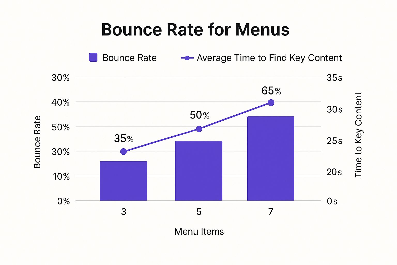
The data speaks for itself: as menu options grow, so does user frustration. People take longer to find what they need, get annoyed, and leave. That’s a conversion killer.
Double Down on What Works
Now that you’re armed with this data, you can make much smarter decisions with your marketing budget and your time. Instead of spreading your resources thin across a dozen different channels, you can go all-in on the one or two that actually deliver results.
- If organic search is your big winner, it’s time to invest more in creating content around those high-intent keywords.
- If a specific email segment is converting like crazy, build more campaigns tailored directly to that audience.
- If a particular referral partner keeps sending you amazing leads, reach out to them about guest posting or setting up an affiliate program.
Improving your website’s conversion rate isn’t just about on-page tweaks. It starts with being strategic about who you invite to your site in the first place. By focusing on traffic that actually wants what you have, you’re not just working harder—you’re working smarter.
Building the Trust That Wins the Sale

In the world of eCommerce, trust isn’t just a nice-to-have; it’s the currency that powers every transaction. Before a visitor will even think about pulling out their credit card, they need to feel completely confident that they’re making the right choice. Even a flicker of doubt can send them clicking away for good.
This is about more than just slapping a generic security badge in your footer and calling it a day. Real trust is woven into the very fabric of your site, from the first impression on your homepage to the final click on the checkout button. It’s about being transparent, authentic, and reassuring every step of the way.
Showcase Authentic Social Proof
One of the quickest ways to build that foundational trust is to let your happy customers do the selling for you. This is the magic of social proof. When new visitors see that real people have bought from you and had a great experience, it instantly eases their anxieties and validates their decision to stick around.
But just having reviews isn’t enough. Where you put them matters immensely.
- On Product Pages: This one is non-negotiable. Get those star ratings and customer reviews right up under the product title. The data is clear: adding reviews can boost conversion rates by as much as 270%. People need to see what actual buyers think before they commit.
- Near CTAs: Try placing a punchy, one-sentence testimonial directly next to your “Add to Cart” or “Buy Now” button. This can be the final nudge a hesitant user needs to take action.
- On Your Homepage: Your homepage is your storefront. Use it to feature logos of publications that have mentioned you or showcase your best overall reviews. This establishes credibility the moment someone lands on your site.
A powerful testimonial is worth a thousand words of your own marketing copy. It shifts the dynamic from you telling people your product is great to a peer showing them it is. This simple change can increase conversions by 34% or more when used effectively.
Embrace Radical Transparency
Few things kill a sale faster than a nasty surprise at checkout. Hidden shipping costs are infamous for this very reason—they shatter the trust you’ve spent the entire visit building. The fix? Be radically transparent about everything.
Don’t wait until the final step to reveal costs like shipping and taxes. Be upfront about them from the beginning. Even better, create a clear, simple shipping policy, like free shipping on orders over a certain amount, and display it prominently on a site-wide banner.
This transparency should extend to your policies, too.
- Return Policy: Your return policy shouldn’t be buried in the fine print. Make it easy to find and even easier to understand. A generous, no-hassle return policy removes the perceived risk for the buyer, making them far more likely to complete their purchase.
- Contact Information: Don’t make people hunt for your contact details. A visible phone number, email address, and physical address (if you have one) signals that you’re a legitimate business that stands behind its products.
Leverage Small but Powerful Trust Signals
Beyond the big-ticket items like reviews and policies, dozens of smaller signals work together to create an overwhelming sense of security for your visitors. These little details can make a huge difference.
One of the most effective ways to deploy these signals is with well-timed popups that actually help the user. Instead of being an annoyance, they can offer a discount, provide helpful information, or answer a question right when it’s needed most. Done right, they can be a major source of leads and sales. If you’re looking for pointers, we’ve got a great guide on how to create high-converting WordPress popups that build trust instead of breaking it.
And don’t forget these other critical elements:
- Professional ‘About Us’ Page: Tell your story. Who are you? A well-crafted About Us page humanizes your brand and forges a genuine connection with your audience.
- Security Badges: That little padlock icon and the “S” in “https://” are non-negotiable. During checkout, be sure to display familiar payment logos like Visa, Mastercard, and PayPal. These are instant visual cues that tell users their data is safe.
By combining authentic social proof with radical transparency and these subtle trust signals, you create an environment where visitors feel completely secure. That security is what gives them the confidence to go from being a hesitant browser to a loyal customer.
Turning Clicks into Customers: Your Ongoing Improvement Plan
Turning your website from a digital brochure into a conversion-generating machine isn’t a one-and-done project. It’s a continuous process of learning and refining. The real secret is to avoid getting bogged down by trying to fix everything at once. Instead, you need a simple, repeatable system for making improvements. This turns what feels like a monumental task into a manageable—and honestly, pretty exciting—part of growing your business.
Your first step is to build a prioritized checklist. The goal here is simple: tackle the tasks that will give you the biggest bang for your buck. Focus on the changes that will actually move the needle, without requiring a massive overhaul.
Where to Start? Your Immediate Action Checklist
Use this simple framework to figure out what to do first. I always recommend picking just one or two items from the highest-impact categories and focusing all your energy there before moving on.
Quick Wins (High Impact, Low Effort):
- Compress all the major images on your main pages. This is one of the fastest ways to boost site speed.
- Look at the main call-to-action (CTA) on your homepage. Is the language specific? Is it compelling? Or is it a generic “Learn More”?
- Add trust signals like customer reviews or security badges right next to your primary CTA buttons. It’s a small change that can make a huge difference.
Strategic Projects (High Impact, High Effort):
- Launch your very first A/B test on a critical page, like your product or pricing page.
- Dig into your traffic sources. Pinpoint your top-converting channel and then figure out how you can double down on it.
- Install a heatmap tool. This will literally show you where users are getting stuck or confused on your most important landing pages.
The most successful businesses I’ve seen treat conversion optimization not as a checklist, but as a core part of their operations. It’s a constant loop: Test, Learn, Refine, and Repeat. Every little adjustment you make gives you data that fuels the next smart decision.
You don’t need a bunch of complicated tools to track your progress, either. Start with Google Analytics to keep an eye on your overall conversion rate, bounce rates for key pages, and which traffic sources are bringing in the best customers. When you start A/B testing, the software you use will give you the direct results you need to make confident, data-backed choices.
By getting into this rhythm of testing and learning, you build a culture of continuous improvement. Every test—whether it “wins” or “loses”—teaches you something valuable about your audience. Over time, these small, consistent gains add up in a big way, driving real growth for your business and making you a much smarter marketer in the process.
Common Questions About Website Conversion Rates
If you’re diving into the world of conversion optimization, you’ve probably got questions. It’s a field where a lot of myths and “best practices” get thrown around, so getting clear, straight answers is key to focusing your energy where it actually counts.
Let’s cut through the noise and tackle a few of the most common questions that pop up.
What Is a Good Website Conversion Rate?
This is easily the most-asked question, and the honest answer is… it depends. While industry benchmarks often point to a 2% to 5% conversion rate as “good,” that number can be misleading.
Think about it: an e-commerce store selling $15 t-shirts is going to have a completely different conversion landscape than a B2B firm selling $50,000 software contracts. Your traffic source, device type, and industry all play a huge role. A visitor from a targeted email campaign is far more likely to convert than someone who stumbled across your site from a broad social media post.
Instead of chasing a universal number, the real goal is to establish your own baseline and improve upon it. Focus on beating your own numbers, month after month. That’s the only metric that truly matters.
How Long Does It Take to See Results?
The timeline for seeing a real impact from your CRO efforts depends entirely on what you change.
Some fixes deliver results almost instantly. If you find and repair a broken link in your checkout flow or rewrite a confusing call-to-action, you could see a positive lift in conversions within a day or two. These are the quick wins.
Bigger strategic moves, however, require patience. A complete homepage redesign or a major A/B test on your pricing page needs time to collect enough data to be statistically significant. You’ll likely need to wait anywhere from one to three months to get reliable results you can actually trust. Acting too soon is a classic rookie mistake.
Key Takeaway: The single biggest mistake you can make in conversion optimization is acting on a hunch. Never assume you know what your users want. Every meaningful change—from button colors to headline copy—should be validated with data from analytics, heatmaps, user surveys, or A/B testing. Data-driven decisions are the bedrock of successful CRO.
Should I Focus on Desktop or Mobile Conversions First?
Your analytics hold the answer. Don’t guess—go look at the data.
First, check where most of your traffic is coming from. If you see that 70% of your visitors are on mobile, but your mobile conversion rate is lagging far behind your desktop rate, you’ve just found your starting point. That gap is a massive red flag, signaling that something is creating friction for your mobile users.
It could be a clunky navigation menu, a form that’s impossible to fill out on a small screen, or slow-loading images. By tackling the biggest leak first, you’ll almost always see the fastest and most significant return on your optimization efforts.
Ready to turn these insights into action? Divimode provides the tools you need to build high-performing, interactive websites that convert. With Divi Areas Pro, you can create advanced popups, fly-ins, and targeted content based on user behavior like exit intent and scroll depth, giving you the power to engage visitors at the perfect moment.
Learn how Divimode can elevate your Divi website today.
More Articles You Will Like