You launch a Divi site with a clean contact page, a few polished modules, and a simple form. It works for about a week. Then the client asks for file uploads. Next they want a quote calculator. Then sales wants lead routing, better follow-up emails, and a popup form for abandoning visitors.
That’s the point where a basic form stops being a page element and starts becoming part of a system.
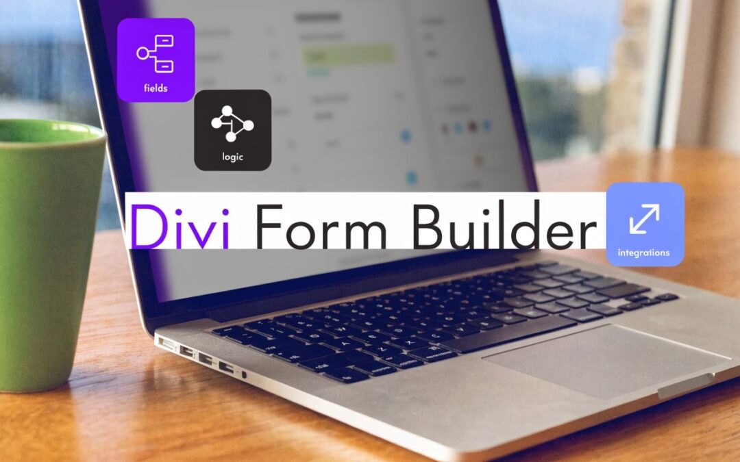
A good Divi workflow starts with the native tools because they’re already in your stack and they’re fast to deploy. But serious client work usually pushes past that comfort zone. If you build for agencies, local service businesses, membership sites, or WooCommerce stores, you need forms that can qualify leads, adapt to user input, and hand data off cleanly. That’s where a dedicated divi form builder plugin earns its place.
Why Your Divi Site Needs More Than a Basic Contact Form
Most Divi sites don’t stay simple for long. A plumber needs a job estimate form. A designer wants a project intake with file upload. A course creator needs a registration flow that feels lighter than a long single-page form. The built-in Contact Form module is fine for basic inquiries, but it starts to strain as soon as the form needs to do actual business logic.

The actual issue isn’t just missing features. It’s that modern forms need to respond to context. A good form should ask different questions based on the service selected, calculate rough pricing when useful, and reduce friction instead of adding it.
Where the native module hits a wall
Divi’s default form works best when your requirements look like this:
- Simple inquiries: name, email, message, and a straightforward notification email.
- Basic page-level styling: enough control to match your typography, spacing, and button styles.
- Low-complexity lead capture: a form that forwards messages to an inbox and little else.
That’s enough for brochure sites. It’s not enough when the form has to support operations.
Here’s where projects usually outgrow it:
- Conditional flows: a service business might need different follow-up questions for support, sales, and hiring.
- Structured intake: agencies often need deadlines, budget ranges, project type, and attachments.
- Interactive quoting: if users can configure options, you’ll want calculations instead of manual back-and-forth.
- User workflows: login, registration, and profile-related actions need field mapping and cleaner data handling.
Practical rule: If the form affects pricing, fulfillment, onboarding, or segmentation, treat it like application logic, not decoration.
There’s also a documentation gap in the wider Divi ecosystem. An analysis of user needs noted that while alternatives such as Caldera Forms were known for extensive customization, there’s still underserved demand for practical guidance on building advanced forms without leaving Divi’s ecosystem, as discussed in this review of Divi contact form alternatives.
The upgrade moment is usually obvious
You don’t need to upgrade because a plugin looks more powerful. You upgrade because the native module starts forcing workarounds.
Common warning signs include:
- You’re duplicating pages just to show slightly different forms to different audiences.
- You’re handling calculations manually through follow-up emails instead of inside the form.
- You’re adding custom code for routine tasks that should be plugin settings.
- The client wants a smoother lead journey from form submission into email, popup, or sales flow.
When those signs show up, it’s time to move from “contact form” thinking to “form system” thinking.
Mastering the Native Divi Contact Form Module
Before adding anything to your plugin stack, it’s worth squeezing the most out of the native Contact Form module. A lot of weak Divi forms aren’t weak because Divi can’t handle them. They’re weak because the module was dropped into a layout with almost no thought around structure, labels, spacing, or what happens after submission.
Start with the basics done properly. Add only the fields you need. Keep labels clear. Use the success message intentionally instead of leaving a generic confirmation. Set notification emails carefully so messages go to the right person or shared inbox.
What the native module does well
For simple projects, the native module still has value:
- Fast setup: you can build a solid contact form in minutes.
- Visual styling inside Divi: spacing, borders, typography, button states, and layout all stay in a familiar UI.
- Brand consistency: for lightweight forms, staying native keeps the build cleaner.
I usually recommend the native module when the form has one job: start a conversation.
A lean setup often works best:
| Use case | Native Divi fit |
|---|---|
| General contact page | Strong |
| Footer inquiry form | Strong |
| Short support request | Good |
| Multi-step intake | Weak |
| Quote calculator | Weak |
| Registration workflow | Weak |
How to build a better native form
A practical setup looks like this:
- Tight field set: ask only what the team will use. If nobody acts on “Company Size,” don’t ask for it.
- Clear labels over clever placeholders: placeholders disappear. Labels help users recover when they pause halfway through.
- Single call to action: “Request a Quote” converts better than a vague “Submit” when the intent is specific.
- Design for scanning: increase field spacing, make error messages easy to spot, and avoid cramped multi-column layouts on mobile.
If you want a solid design baseline, Divimode’s guide to better Divi forms is a useful companion for tightening layout and usability.
A form should feel easier than the action it asks the user to take. If it feels heavier, people delay it.
The native module’s limits are operational, not cosmetic
The common failure point isn’t appearance inside the builder. It’s what happens outside it. One poorly documented issue is that forms can display differently in the Visual Builder and on the live frontend, sometimes appearing unstyled because of CSS inheritance or conflicts, as reported in this Divi Help thread on forms looking different outside the builder.
That’s why I always check forms in the actual frontend across breakpoints before sign-off.
The bigger limitation is capability. Native Divi doesn’t give you the kind of conditional logic, multi-step behavior, or calculation workflow that many client projects need. You can style around a lot of things. You can’t style your way into better form logic.
Upgrading Your Toolkit with a Dedicated Divi Form Plugin
A client asks for a quote form that qualifies leads, routes the right inquiries to sales, and shows different questions based on service type. Divi’s native Contact Form module gets you through the first draft. It usually runs out of road once the form has to support an actual business process.
That’s the point where I stop patching the native module and switch to a dedicated Divi form plugin. For Divi-first projects, I usually choose Divi Form Builder by Divi Engine because it keeps the work inside the builder my clients already know. I can hand off a site without also handing over a second, unrelated form interface.

Why a dedicated plugin changes the build process
A significant upgrade is not just extra fields. It’s control over how the form behaves, how the data is structured, and how much custom work you need to maintain later.
A dedicated plugin lets the form become part of the site’s operating system instead of a styled email box. That matters on service sites, membership builds, directories, and any project where the form needs to do more than send one message to one inbox.
I also care about build consistency. Keeping forms in a Divi-style workflow speeds up revisions, makes client edits less risky, and cuts down on shortcode clutter that turns into cleanup work six months later.
What justifies adding another plugin
I don’t add form plugins by default. Every plugin adds update responsibility, testing time, and another place where conflicts can show up. The case for upgrading gets strong when the form sits close to revenue, sales qualification, or user onboarding.
Here’s what I’m looking for before I install one:
- More control over field types: native contact forms are fine for name, email, and message. They are weak for quoting, applications, registrations, and filtered lead capture.
- Better editing inside Divi: Forms for Divi describes its approach as Divi-native, with a clean API and grid-based layout options in the WordPress plugin listing for Forms for Divi. That general direction matters because Divi users usually work faster when the form behaves like the rest of the page builder.
- Cleaner long-term maintenance: if the form depends on snippets, hidden workarounds, and CSS fixes just to mimic basic workflow logic, support costs go up fast.
- A clearer place in the marketing stack: forms should connect to popups, follow-up messaging, segmentation, and email capture strategy. Divimode’s guide to WordPress lead generation plugins is a good reference when you’re choosing tools around the form, not just the form itself.
That last point gets missed a lot. A form plugin is not an isolated purchase. It affects how you collect intent, trigger offers, tag contacts, and move someone into the next step.
Trade-offs to accept before you upgrade
More capability can produce worse forms if you add every option the plugin makes possible.
I’ve inherited builds with too many fields, too many branches, and too many edge cases. The result was technically advanced and commercially weak. Completion rates suffer when people feel like they are entering a workflow designed for your team instead of a form designed for them.
My rule is simple. Add complexity only when it improves one of these outcomes:
- Shortens the path to conversion
- Improves the quality of the submission
- Reduces manual handling after submission
If a feature doesn’t do one of those jobs, it usually doesn’t belong in the form.
A good Divi form system starts with the native module, upgrades when the site’s requirements justify it, and then connects that form to the rest of the site’s conversion flow. That is the difference between adding a form plugin and building a form system.
Building Advanced Forms with Calculable and Conditional Fields
Advanced form logic earns its keep when the form has to do real pre-sales work.
A simple contact form collects interest. A conditional, calculable form can qualify that interest before it reaches your inbox. For client projects, I use that approach for quote requests, service matching, intake forms, and basic assessments where the visitor needs a clearer path and the team needs cleaner submissions.

Start with the decision path
Before building fields in Divi, map the decisions the visitor will make.
For a service quote form, that usually means four things. What service they need. Which follow-up questions only apply to that service. Which answers affect pricing or routing. What the sales team must receive in a usable format.
That order matters. Teams that start by adding fields usually end up with bloated forms, awkward logic, and calculations that break when one option changes.
I sketch the flow in plain language first:
- Entry choice: what the visitor is trying to do
- Relevant branch: which questions belong to that choice
- Calculation point: where totals, scores, or ranges should update
- Submission payload: what gets emailed, stored, or passed into the next system
If that logic is messy on paper, it will be worse in the builder.
Multi-step forms work when each step has a clear job
Long forms do better when they feel ordered. Breaking the form into steps helps, but only if each step answers one question in the visitor's mind.
A pattern that works well:
Qualify the request
Ask the top-level question first. Service type, project type, support category, or plan level.Collect only relevant details
Show inputs tied to the first answer. Conditional fields perform the heavy lifting.Capture contact information last
By this point the visitor has already invested effort and understands what happens next.
That structure is easier to complete and easier to debug. It also keeps the mobile experience under control, which matters because advanced forms can become unwieldy fast on smaller screens. If you need a compact lead capture pattern for phones, this walkthrough on creating a mobile opt-in form with Divi Areas Pro is a useful reference for how to simplify the experience without stripping out intent.
A good visual walkthrough helps when you’re configuring this inside Divi:
Calculations need clear field roles
Calculations are where a dedicated form plugin starts to justify itself. Divi’s native Contact Form module is not built for pricing logic, scoring, or dynamic totals. Once a project needs arithmetic, conditional pricing, or option-based estimates, I switch to a form plugin that supports those rules directly.
Useful applications include:
- Service estimators: base fee plus selected add-ons
- Product configuration forms: quantity, tier, and option pricing
- Assessment forms: scoring answers to route users to the right outcome
- Member or account flows: collecting structured data that can be reused after submission
A few build rules save time later:
- Use numeric inputs for numeric jobs. Don’t rely on text fields where values need validation or calculation.
- Keep option labels and stored values aligned. If an option affects pricing, the admin view should still make sense months later.
- Treat discounts carefully. Negative values are fine, but they should be obvious in both setup and testing.
- Check blank states and defaults. Optional fields often break totals if you forget to define what happens when nothing is selected.
I also avoid presenting exact pricing unless the business is ready to honor it. In many client builds, the better move is a price range, starting estimate, or qualification score. That keeps the form useful without creating sales friction or support disputes.
Conditional logic should reduce effort, not create surprises
The best conditional forms feel shorter than they are because irrelevant questions never appear.
Use logic to remove noise:
| Good use | Poor use |
|---|---|
| Show file upload only for applications or document requests | Hide basic contact fields until the user feels trapped in the process |
| Show budget or timeline only for service inquiries | Send users through branches that are hard to predict |
| Reveal location-specific fields after region selection | Stack so many conditions that the layout shifts constantly |
There is a trade-off here. Every conditional rule helps the visitor only if it also stays maintainable for the site owner. I’ve seen forms fail after a simple service update because one field label changed and six conditions depended on that exact value.
Build the shortest path first. Then add branches only where they improve qualification, routing, or estimate accuracy. That is how advanced forms stay useful instead of turning into fragile mini-apps.
Integrating Your Forms with Popups and Email Services
A form submission is rarely the end of the journey. Usually it should trigger a list signup, a segmented follow-up, a sales alert, or a recovery attempt for visitors who were about to leave.
That’s why I treat forms as connected assets, not isolated modules. The page matters, but the handoff matters more.

Connect the form to the right destination
Start by deciding what kind of submission you’re handling.
- Newsletter intent: send the contact into your email platform or an opt-in workflow.
- Sales inquiry: notify the right person and store enough context for fast follow-up.
- Support request: route by topic so the request reaches the correct inbox quickly.
- Application or intake: preserve structured responses and keep the layout readable for the receiving team.
Bloom can fit lightweight email capture inside a Divi-centered setup, and Divi Engine’s feature set references Bloom integration for opt-ins in its documentation. That kind of pairing works well when you want a page-level form to feed list growth without rebuilding the whole lead flow somewhere else.
Popups work best when the offer matches the page
Embedding a form inside a popup can work well, but only when timing and message are aligned. A generic popup asking everyone to “join the newsletter” usually performs worse than a context-specific prompt.
For example:
- On a service page, show a short consultation form.
- On a pricing page, show a quote request.
- On a blog post, offer a related content upgrade.
- On exit intent, present a lower-friction version of the primary form.
A practical mobile-friendly example is Divimode’s tutorial on creating a mobile opt-in form with Divi Areas Pro. The broader point is that popup forms need the same care as inline forms. Fewer fields, stronger message match, and cleaner triggers.
A popup form should feel like timely help, not a second obstacle.
Keep the system simple enough to maintain
The temptation is to connect every form to every tool. Resist that. The cleaner setup is usually one primary destination, one internal alert path, and one measurable conversion goal.
A maintainable form system often looks like this:
- Inline form on the page for the main conversion action.
- Popup variant for recovery or secondary capture.
- Email or list integration based on submission type.
- Clear success state so the user knows what happens next.
That workflow gives you enough flexibility for campaigns without turning the site into an automation puzzle.
Optimizing Forms for Conversions and Spam Protection
A form can look finished in the builder and still underperform once real visitors start using it. I see this on client sites all the time. The layout feels fine on desktop, then mobile users hit a cramped field group, the submit action stalls, and the inbox fills with junk entries by the end of the week.
Good form optimization in Divi comes down to three jobs. Reduce friction. Stop low-quality submissions. Test the live experience, not just the Visual Builder version.
Design choices that improve completion
Conversion gains usually come from small decisions, not dramatic redesigns. A shorter form is not always the answer. If the page asks for a quote, estimate, or consultation, users often need a little structure before they feel comfortable submitting.
These changes consistently help:
- Use clear step labels: Multi-step forms perform better when people know how far they are from the finish.
- Group related fields: Keep contact info, project details, and optional uploads in separate clusters so the form reads naturally.
- Write buttons that match intent: “Request My Quote” sets better expectations than a generic “Submit.”
- Give mobile layouts room to breathe: On phones, stacked fields usually beat two-column rows.
- Keep the first screen easy: If a form has multiple steps, the opening step should feel quick and low effort.
Copy matters too.
Labels should answer the user’s immediate question. Why do you need this information, and what happens after submission? If a field feels premature, remove it or move it later in the flow. For lead forms, I usually protect the first conversion and collect deeper qualification after the initial contact.
Divi styling needs a separate check on the live page. Custom CSS, theme presets, and plugin styling can shift spacing, button states, and validation messages in ways the builder preview does not always expose.
Spam protection that doesn’t punish real users
The best anti-spam setup is the one legitimate users barely notice. Heavy friction solves the wrong problem if it cuts real submissions.
For most Divi projects, I start with a simple stack:
- Honeypot protection for low-friction filtering
- reCAPTCHA v3 when spam volume is persistent
- Server-side email checks if a form starts attracting obvious junk
- Submission testing after every change, especially if Ajax is enabled
As noted earlier, advanced form plugins make these controls easier to manage. The important part is order. First confirm that the form submits reliably on desktop and mobile. Then add spam controls one layer at a time. Then test again.
That sequence matters because broken protection is hard to spot. A site owner often notices spam quickly. They do not always notice silent submission failures until leads have already been lost.
If anti-spam settings make the form harder to submit, the form needs a better configuration, not more protection.
What to troubleshoot before launch
Every production form should go through a live QA pass. I do not mean one test submission from the builder. I mean a full run through the published page, on real devices, through every path that matters.
| Check | Why it matters |
|---|---|
| Frontend styling matches the intended design | Prevents layout surprises after launch |
| Required fields trigger correctly | Stops incomplete or confusing submissions |
| Error and success messages are easy to read | Helps users recover from mistakes |
| Mobile submission completes without layout or Ajax issues | Catches the problems that cost leads |
| Notification emails arrive in the right inbox | Prevents form data from disappearing into the void |
Conditional logic needs its own testing pass. If the form changes based on service type, budget range, or project scope, submit each version. Hidden-field bugs, broken required states, and misplaced buttons usually show up in those edge cases first.
A form system mindset's value becomes apparent. The form is only one part of the job. The success message, the email routing, the popup follow-up, and the CRM or list connection all affect conversion quality. A form that submits cleanly but sends weak data into the rest of the stack still creates extra work for the client.
Forms rarely fail in obvious ways. They fail at the edges. A mobile button sits too low. A conditional field becomes required too early. A success notice appears, but the notification email never lands. That is the essential work in Divi form projects.
If you want to turn your forms into a stronger conversion system with popups, targeting, and behavior-based triggers, Divimode is worth a close look. Its plugins and tutorials help Divi users move beyond static pages and build interactive experiences that support lead capture, promotions, and on-site engagement without leaving the Divi workflow.
More Articles You Will Like