
 Martin Tolovski
Do you want to create a mobile opt-in form that looks excellent on a smartphone, laptop, desktop, or any other screen and device?
After all, you want to grow your email list, and for many potential customers, smartphones have become the ideal way to browse websites and sign up for a newsletter.
Therefore, to use opt-in forms for lead generation and email list growth, you must ensure that every form on your Divi website is mobile-responsive. Luckily, optimizing opt-in forms is easy with Divi!
Divi Areas Pro comes with plenty of mobile customization settings, and in this tutorial, we’ll share a step-by-step process on how to use the plugin to create a mobile opt-in form that works. Let’s start!
Try Divi Areas Pro today
Sounds interesting? Learn more about Divi Areas Pro and download your copy now!
Many pre-designed layouts. Automated triggers. No coding.
Click here for more details
Table of Contents
What Is a Mobile Opt-In Form?
Before we begin our tutorial, let’s discuss mobile-responsive opt-in forms and what it means to be responsive. In essence, responsive design enables your opt-in form to adjust to any user’s screen, resizing the fields for different screen sizes.
While the form elements might appear stacked and differently as opposed to desktop versions, there are form design elements such as graphics and images that might be left out from the mobile versions to improve page loading speed and convenience.
A mobile-responsive opt-in form is critical if you want to provide the best possible UX for people on the move, and given the global takeover of the mobile internet, a responsive form means greater effectiveness of your lead generation efforts as a result.
Creating a Mobile Opt-in Form with Divi Areas Pro
Fortunately, creating a responsive mobile opt-in form is easy with a plugin like Divi Areas Pro.
Divi Areas Pro allows you to build and customize campaigns with only a few clicks through popups, fly-ins, hovers, mega menus, and conditional inline content, even if you’re a novice Divi user!
The possibilities are limitless with Divi Areas Pro. See for yourself!
Get Started With Divi Areas Pro Today!
BONUS: Get a LIFETIME Access to Divi Areas Pro ($199 value) with 1-time payment and priority private support and live chat from our developers for maximum results – 14-day money-back guarantee! Click here to get started →
If you’re still not convinced, let’s create a responsive mobile opt-in with Divi Areas Pro and show you that using the plugin couldn’t be easier.
Install Divi Areas Pro
The first step is to subscribe to a Divi Areas Pro plan. Once you’ve signed up for Divi Areas Pro and you’ve activated the plugin on your Divi website, it’s time to create a mobile responsive opt-in form.
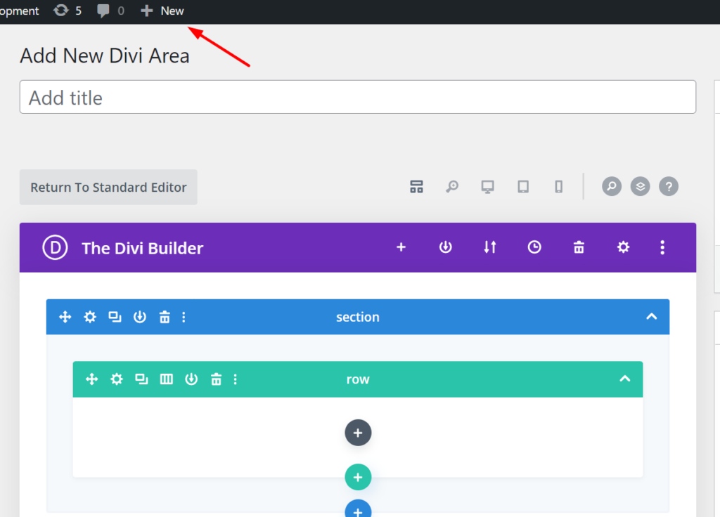
Create the Fly-In Area
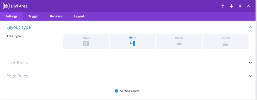
Start by designing a fly-in area. In your WordPress admin dashboard, navigate to ‘+’ and choose the ‘Area’ option.
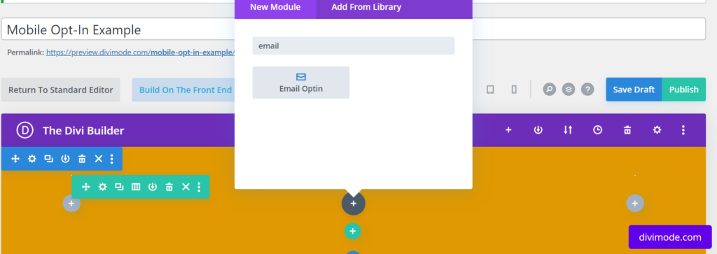
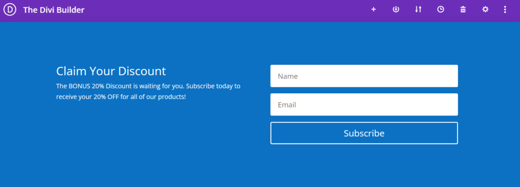
Within the Area, insert an email opt-in and customize the title, texts, colors, as well as your preferred design to match with the rest of the page.
In the Divi Area settings, choose the ‘Fly-In’ option to proceed further. Click on ‘Save’ afterward.
Create the Trigger Button
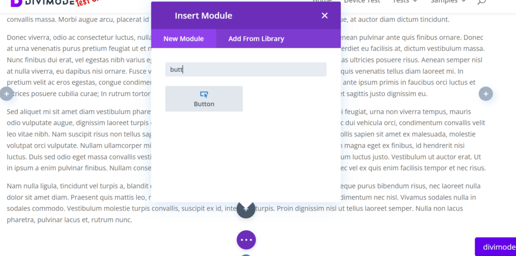
Next, head to the page where you want to use the fly-in. For this purpose, we’ve created a sample page with a lorem ipsum copy only for demonstration. Next, we insert a ‘Button’ at the bottom of our page.
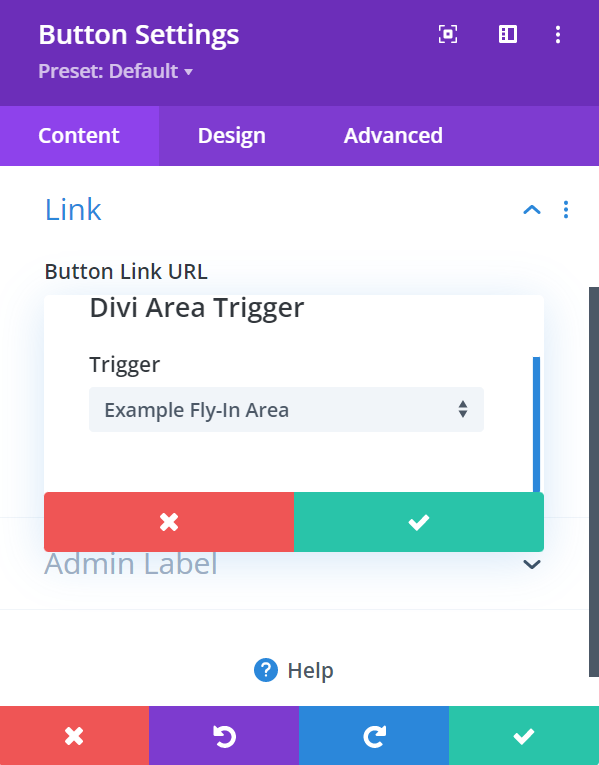
This button should trigger the fly-in option that we want to create. Inside the button settings, go to the ‘Link’ option, choose ‘Divi Area trigger’ as the trigger, and then choose the name of the Area that you’ve created previously. Make sure to save your page afterward.
Check If The Trigger Works
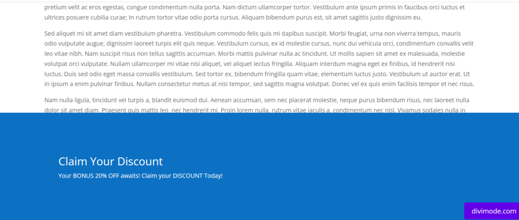
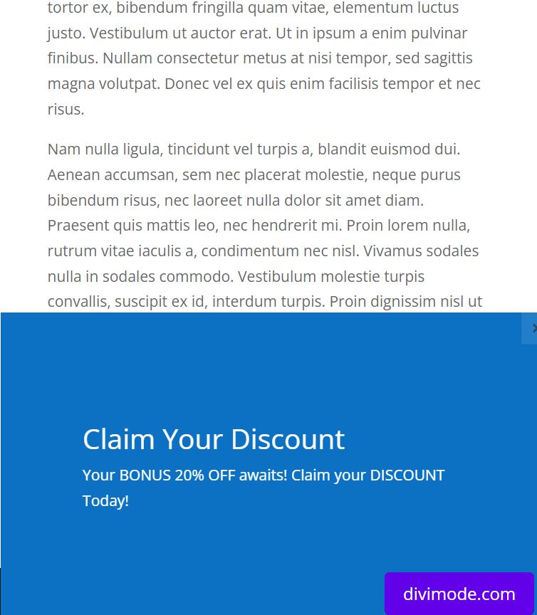
Preview the changes and make sure that the fly-in area works after clicking the button. In our fly-in example, the email form fields are only missing because we haven’t linked our provider, which you can do when you’re setting up your email opt-in module.
Ensure Button Works
Now, our next step will be to ensure that this button is displayed perfectly on mobile devices.
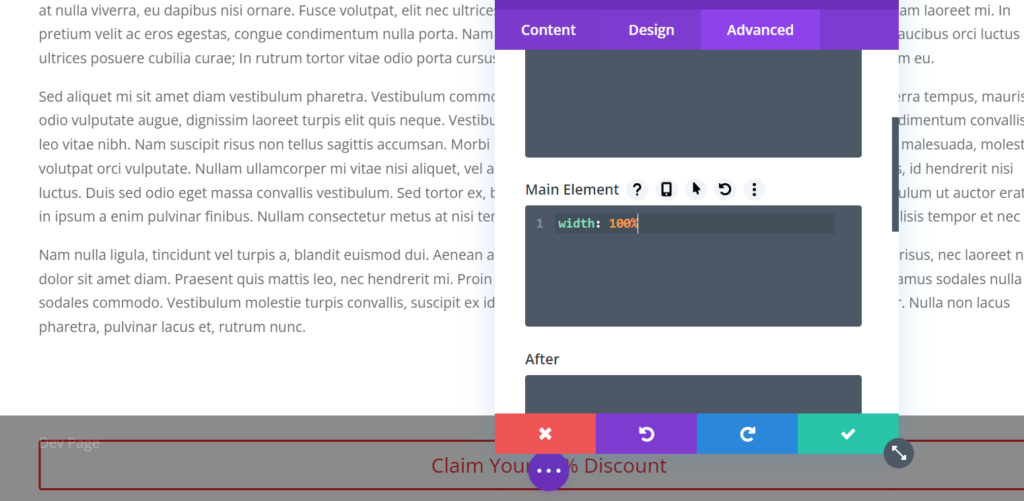
To test this, on your example page, create a new section, place the button element there, and make sure that the entire section is only visible on mobile devices.
The other thing you’d want to do is reduce the padding at the top and the bottom, as well as on the left and right. Finally, click on ‘Save’ and proceed further to reloading the test page.
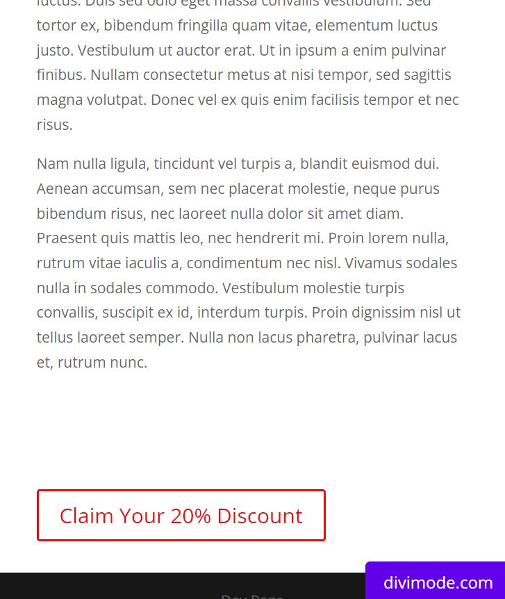
When you preview the page, you’ll now notice that the button that activates the fly-in is no longer visible on desktop or laptop screens.
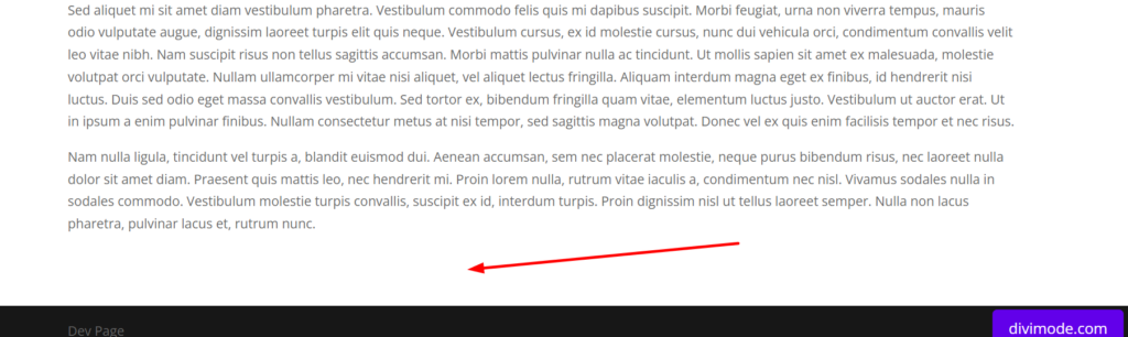
However, once you enable the mobile preview, the button should be visible, as we’ve defined previously in the settings.
Now, make sure that the fly-in can be triggered on mobile devices.
Style for Appearance
Now, let’s proceed towards styling the button for a slightly better appearance.
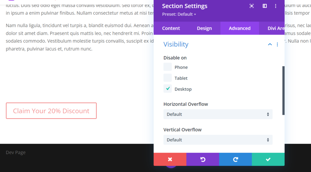
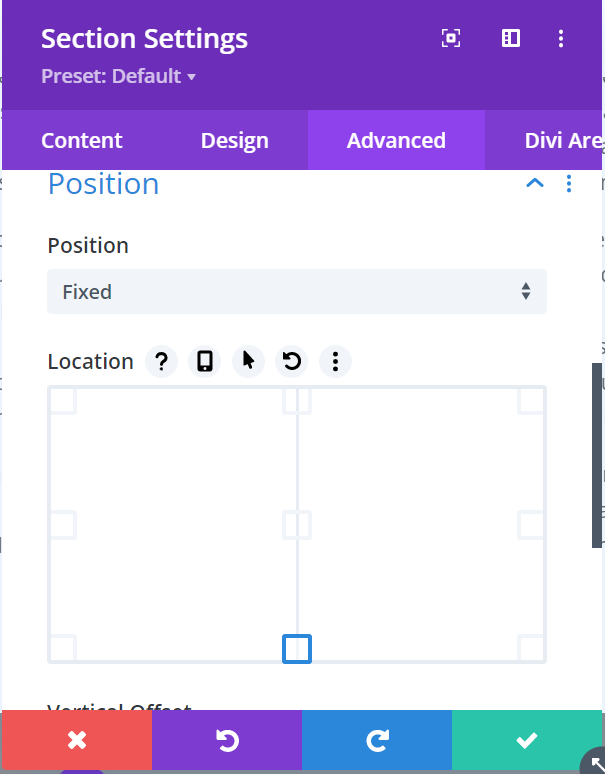
Navigate to the Section settings and change the Position to ‘Fixed’ at the bottom, with a Z Index of 100, to make it appear above the text in the other sections.
You can also customize the button further by playing around with the alignment, as well as changing the size and width.
Save your changes, reload the page, and test it again on desktop and mobile views to make sure the fly-in can only appear on mobile devices.
Wrapping Up
There you have it! Your mobile-responsive opt-in form will now show up whenever users click on the button of your page on their smartphone and trigger it.
Once you create the mobile opt-in form, you can also use Divi Areas Pro to set up other marketing campaigns for your Divi website targeted toward desktop or mobile users.
Now, you know exactly how to use our plugin to create mobile opt-in forms, and they should work perfectly for any mobile screen size.
If you want to learn more, read our blog regularly for more tutorials, and if you’ve liked the article, make sure to follow our LinkedIn page as well for more free articles.
Try Divi Areas Pro today
Sounds interesting? Learn more about Divi Areas Pro and download your copy now!
Many pre-designed layouts. Automated triggers. No coding.
Click here for more details
More Articles You Will Like


