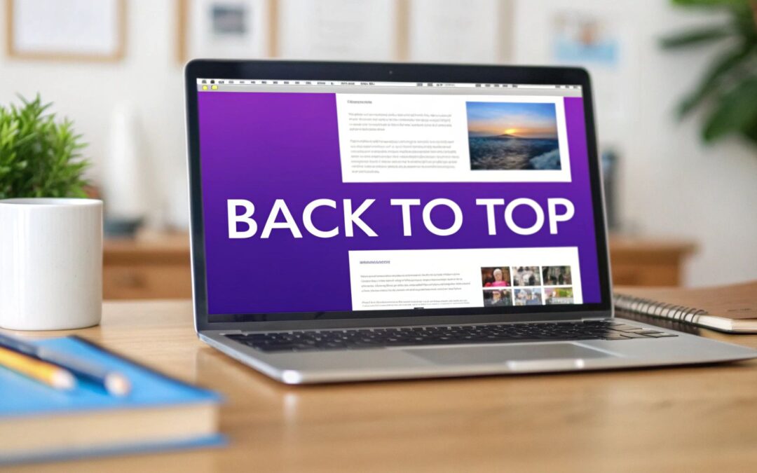
A back to top button is one of those small, thoughtful details that makes a big difference. It’s a simple, persistent icon that lets visitors jump straight back to the top of a page with a single click. For long pages, this little feature is a game-changer, saving users from the dreaded "scroll fatigue."
Why a Back to Top Button Matters for Your Divi Site
It’s easy to overlook something as small as a back to top button, but its impact on user experience (UX) is huge. Think about it: a potential client is scrolling through your massive portfolio or a deep-dive case study. The further they go, the more of a chore it becomes to get back to your main navigation. That little bit of friction can be enough to make them lose interest.
This is especially true on mobile. We've all been there, endlessly swiping to get back to the top of a page on a small screen. It's annoying, and research consistently shows that features like this are critical for keeping mobile visitors happy. With a huge chunk of web traffic coming from phones, a one-touch button isn't just a nice-to-have; it's essential. Without it, you risk users simply giving up and leaving.
A great user experience doesn't happen by accident. It happens by design. Adding a back to top button is a small design choice that shows you respect your visitor's time and attention.
Enhancing Site Navigation and Engagement
Putting this feature in place does more than just add convenience—it genuinely improves how people interact with your site. When you make it easier for visitors to move around, you'll see a positive effect on your key metrics.
- Reduces Bounce Rate: If users can easily find their way back to your menu or a call-to-action, they’re far less likely to leave out of frustration.
- Increases Session Duration: A smooth, easy experience encourages people to stick around and explore more of your content, keeping them engaged for longer.
- Improves Usability: It offers a clear, predictable way for users to reorient themselves on a long page, which is a cornerstone of good web design.
Making sure your Divi site follows user-friendly principles is a must, and this simple addition aligns perfectly with modern web development best practices. Whether you're just starting out or have been using Divi for years, understanding what the Divi theme is and all its capabilities is the first step toward building a site your audience will love. A simple back to top button is a perfect example of a small tweak that delivers a big return on UX.
So, you want to add a back-to-top button to your Divi site. Smart move. You’ve got two main paths you can take: the old-school custom code route or the more visual, feature-rich plugin approach.
Which one is right for you? It really boils down to your comfort level with code and what you need the button to do.
If you're a performance purist who wants total control and zero plugin bloat, the custom CSS method is your best bet. It's incredibly light, ensuring you’re only adding the bare minimum to your site. The catch? You'll need to be comfortable pasting and maybe tweaking a few snippets of CSS and JavaScript.
On the other hand, if the thought of touching code makes you break out in a cold sweat, a plugin like Divi Areas Pro is the way to go. You get a friendly interface where you can style your button, set display rules, and even add fancy triggers—all without ever leaving the Divi Builder.
The Performance and Customization Trade-Off
Let's be clear: the CSS approach is the undisputed champion of speed. It adds virtually no weight to your pages, making it a favorite for developers who want a direct, no-fuss solution.
But where plugins really shine is in their convenience and power. Imagine showing the button only after a user has scrolled 75% down a specific blog post, or having it appear with a unique animation. This level of dynamic control is where a plugin saves you a ton of time and opens up creative possibilities.
The image below really drives home how a simple 'quick return' feature can make a huge difference, especially for mobile users scrolling through long pages.
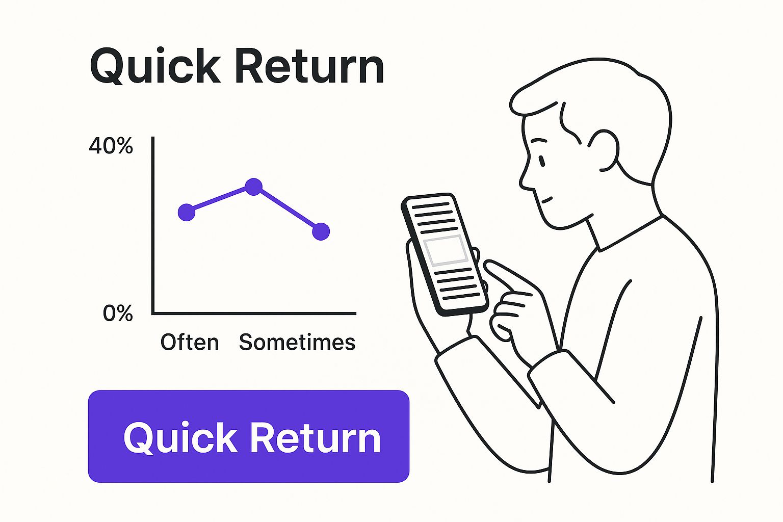
This really highlights the core benefit here: reducing friction for your visitors. Whether you code it yourself or use a plugin, the end goal is a seamless experience. And remember, the design and behavior of your button are just as important as its existence, which ties directly into the art of crafting high-converting CTA buttons.
To make the choice even clearer, let's break down the pros and cons of each method side-by-side.
Comparison of Methods CSS vs Plugin
| Factor | Custom CSS Method | Plugin Method (e.g., Divi Areas Pro) |
|---|---|---|
| Ease of Use | Requires basic knowledge of CSS/JS. You'll be copying and pasting code. | Very user-friendly. Visual, click-based interface inside Divi. |
| Performance | Excellent. Extremely lightweight with minimal impact on site speed. | Good. Well-coded plugins are optimized, but still add more code than the CSS method. |
| Customization | Highly customizable, but all changes must be done through code. | Extensive visual options for styling, animations, and icons. |
| Advanced Features | Limited to basic show/hide functionality based on scroll position. | Advanced triggers (exit-intent, time delay) and display conditions (specific pages, user roles). |
| Maintenance | Set it and forget it, unless a major Divi update requires a code tweak. | Requires regular plugin updates to ensure compatibility and security. |
| Best For | Developers, performance enthusiasts, and those needing a simple, fast solution. | Beginners, agencies, and anyone wanting advanced features without writing code. |
Ultimately, there's no single "best" answer—only the one that's best for your project. If you just need a simple, functional button and know your way around the Divi Theme Options, the CSS method is a fantastic choice. But if you want to create a more dynamic, visually engaging experience for your users with just a few clicks, a plugin is well worth the investment.
How to Build a Button with Custom CSS and JavaScript
For those who like getting their hands dirty and want maximum control with zero site bloat, building your own back to top button with custom code is the way to go. This approach lets you skip installing another plugin and gives you a lightning-fast feature that's tailored exactly to your needs.
We're going to use a single Divi Code Module to house everything—the HTML, the styling, and the functionality.
This isn't just a copy-and-paste job, though. I want you to understand how the pieces work together. By breaking down each part, you'll feel confident making your own tweaks to colors, positioning, or animations down the road.
Adding the Code Module
First things first, you need to add this code somewhere global so it shows up on every page. The best place for this is almost always your Divi Theme Builder’s global footer.
Just edit your global footer layout, add a new Code Module, and you'll paste the complete HTML, CSS, and JavaScript snippet into it.
This keeps everything neatly packed in one place, which makes future updates a breeze. Once you save the module and your Theme Builder changes, the button will be live across your entire site.
The Complete Code Snippet
Here is the all-in-one code you need. It includes the HTML for the button itself, the CSS to style and position it, and the JavaScript to control its visibility and smooth scrolling behavior.
Pro Tip: See that
window.scrollY > 300line in the JavaScript? That determines how far a user has to scroll before the button appears. You can adjust this 300 pixel value—make it bigger to have the button appear later, or smaller to make it show up sooner.
This snippet is a complete, self-contained solution. The HTML creates a simple link with an arrow. The CSS pins it to the bottom-right of the screen and makes it invisible by default. Finally, the JavaScript listens for a scroll and smoothly fades the button into view, then handles the click to send the user back to the top.
Feel free to change the background hex code in the CSS to match your brand's color palette
While tinkering with CSS is a great way to get a lean, no-frills solution, sometimes you just need more power without having to write a single line of code. This is exactly where plugins come in, giving you a completely visual and user-friendly way to create a dynamic back to top button packed with features that would otherwise require some serious coding chops.
I've found that a tool like Divi Areas Pro completely changes the game. It turns a potentially tedious task into a simple, click-based process right inside the familiar Divi Builder. Instead of fussing with code snippets, you can design your button visually—just like any other module—and then dial in its behavior with some surprisingly powerful rules.
The real magic of using a plugin isn't just the convenience; it's the advanced targeting and triggers. You can go way beyond a simple scroll-activated button and create something that feels truly integrated into the user's journey.
Unlocking Advanced Display Rules
Let's say you only want your back to top button to show up on long-form blog posts—maybe anything over 1,500 words, where it’s actually needed. With a plugin, that’s incredibly easy to set up. You can create display conditions that target specific post types, categories, or even individual pages.
This level of control allows for a much more thoughtful user experience. You can also trigger the button based on how people are actually using your site:
- Scroll Depth: Make the button appear only after a user has scrolled 75% of the way down the page.
- Time on Page: Have the button gently fade in after someone has been on the page for 30 seconds.
- Exit Intent: You could even display a uniquely styled button when a user's cursor moves toward the close button, as a last-ditch effort to keep them engaged.
This method is about more than just convenience; it’s about creating intelligent, context-aware interactions that improve site navigation without manual coding or complicated setups. You design it once, and the plugin handles all the logic behind the scenes.
The popularity of this approach speaks for itself. For example, the 'Smooth Back To Top Button' plugin is currently active on over 27,000 live websites around the world. This shows just how many designers and site owners prefer a ready-made solution for this essential feature. You can see more stats on this plugin's widespread adoption over on BuiltWith.com.
The Time-Saving Advantage
At the end of the day, using a plugin is a massive time-saver. You can build, style, and deploy a sophisticated back to top button in a fraction of the time it would take to code it from scratch. For agencies and freelancers, that efficiency is pure gold. It allows you to deliver a polished, professional feature without getting bogged down in the technical weeds.
You get a better, more dynamic result with far less effort, freeing you up to focus on the other critical parts of your Divi website.
Design Tips for a User-Friendly Button
Throwing a back-to-top button on your page is the easy part. The real challenge is designing it so it’s genuinely helpful and not just another annoying distraction getting in the way. Your goal is a button that feels like it’s part of the design—visible when you need it, but out of sight, out of mind when you don't.
Stick with convention here. The bottom-right corner of the screen is the standard, most intuitive spot for this button. It keeps it out of the main content area but still well within reach, especially for the thumbs of right-handed mobile users. People just expect it to be there, so there's no reason to get clever and move it.
Finding the Right Balance
When it comes to the actual design, think clarity and function above all else. A simple, universally understood icon like an upward-facing arrow (↑) or a chevron (^) is always the right call. It tells the user exactly what the button does in a fraction of a second, no text needed.
As you get into the styling, keep these points in mind:
- Size: Make it big enough to be tapped easily on a phone—think around 40-50 pixels wide. You don't want it so big that it starts covering up your content, but it shouldn't be a frustratingly small target either.
- Contrast: The button has to be visible. Make sure its color stands out enough against your site's background. If you're not sure, run it through a color contrast checker to stay on the right side of accessibility.
- State Changes: A little feedback goes a long way. Add a subtle hover effect, like a slight color shift or a soft shadow, so users know the button is interactive. It's a small detail that makes the experience feel much more polished.
A well-designed back to top button should be like a quiet assistant—there when you need it, but never in your face. Its job is to reduce friction, not create it.
This principle of being helpful without being intrusive is something we talk about a lot, especially when it comes to things like popups. Both elements can kill the user experience if they're not handled with care, which we explore in our guide on the dos and don'ts for popups.
One last tip, specifically for anyone using the CSS method: add a smooth scroll animation. Instead of an abrupt, jarring jump to the top, the page will glide up gracefully. You can achieve this with a simple jQuery snippet instead of the basic JavaScript click handler. It’s a tiny tweak that elevates the entire feel of your site.
Frequently Asked Questions
Even with a pretty straightforward feature like a back-to-top button, a few questions always seem to pop up. Let's run through the most common ones I hear to clear up any lingering confusion and get you on the right track.
Will a Back to Top Button Slow Down My Divi Website?
This is a totally valid concern, but you can breathe easy on this one. If you go the custom CSS and JavaScript route, the impact on your site’s speed is practically zero. We’re talking about just a few lightweight lines of code.
Even a well-coded plugin like Divi Areas Pro is built with performance in mind and should have a negligible effect. Honestly, the user experience boost you get from the button almost always outweighs any tiny, theoretical performance hit.
Can I Show the Button Only on Certain Pages?
Absolutely. This is where you can get really smart about improving the user experience on specific parts of your site.
- Using a Plugin: This is the easy way. Tools like Divi Areas Pro come with display conditions baked right in. You can target specific pages, posts, or even entire categories with just a few clicks—no code needed.
- Using CSS: If you're using the code method, you can add a unique CSS class to the
bodytag of the pages where you want the button to appear. Then, you just tweak your CSS selector to target that specific class. It gives you complete control over where it shows up.
How Do I Hide the Back to Top Button on Mobile Devices?
Hiding the button on smaller screens is a piece of cake with a simple CSS media query. It's a common move, especially if you feel the button is just cluttering up the interface on a phone.
You just need to wrap your button's styling in a rule that tells browsers to hide it below a certain screen width. Something like this does the trick: @media (max-width: 767px) { .your-button-class { display: none; } }.
The best icon for a back-to-top button is one that instantly communicates its purpose. Clarity trumps creativity here. A simple, upward-facing arrow (↑) or a chevron (^) is universally understood and easily the most effective choice.
Sticking with one of Divi's built-in icons is a great way to maintain visual consistency and ensure fast loading times. I’d advise against using overly complex or abstract icons that might leave users guessing what the button actually does.
Ready to unlock advanced features without having to touch a line of code? Divimode makes it simple. Check out our powerful plugins, including Divi Areas Pro, to create dynamic popups, fly-ins, and user-friendly back-to-top buttons with ease at https://divimode.com.
More Articles You Will Like