 Alex Martin
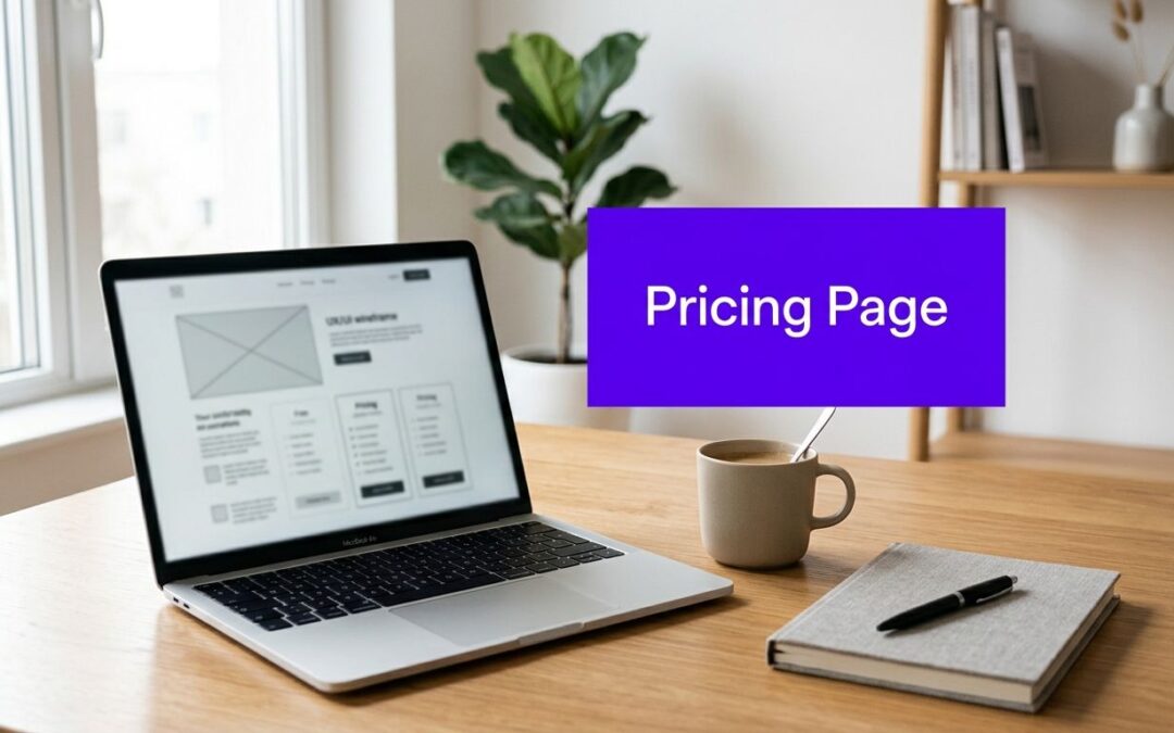
If you've ever opened a Divi page, stared at three pricing cards, and wondered why nobody's clicking the button, you're in the right place. Pricing pages look simple on the surface, but in practice they're where buyers decide whether your offer feels clear, credible, and worth the next step.
On a good SaaS or service site, the pricing page isn't just a list of numbers. It's a high-intent decision page that often gets more serious attention than you might expect, which is why small design choices can have an outsized effect on revenue and lead quality.
Why Pricing Page Design Matters
Pricing pages sit in a strange but valuable part of the funnel. Visitors usually aren't browsing casually, they're checking whether the offer fits, whether the tiers make sense, and whether the site feels trustworthy enough to move forward.
That's why the page can outperform a generic landing page when it's built well. One benchmark says the median SaaS landing page converts at 3.8%, while optimized pricing pages can convert at 8% to 12%, which is roughly 2x to 3x higher, according to the benchmark summarized in DesignRevision's pricing page analysis.
The traffic mix matters too. Pricing pages reportedly receive 14% to 25% of total website traffic, and a large B2B SaaS study cited by the same source found pricing pages accounted for 16.5% of all website visits with a 39% bounce rate versus a 59% sitewide average. That's a huge concentration of visitors who are already close to a buying decision.
For Divi sites, the implication is simple. A pricing page that removes uncertainty can influence a very valuable slice of traffic, while a weak one can leak leads every day.
Practical rule: treat the pricing page like a decision interface, not a brochure. If a visitor has to decode your offer, they'll often leave before they ask a question.
Structure and UX Patterns for Pricing Pages

A pricing page works best when it feels like a guided path, not a pile of options. In Divi, that usually means building the page as a sequence of decision cues, starting with a short hero, then moving into the plans, then supporting the choice with comparison content and trust elements.
Build the page in decision order
The hero should do one thing fast, state what the product or service helps people do. A Text module paired with a clear Button module is usually enough, because the goal is orientation, not persuasion overload. If the visitor already knows they're in the right place, they'll scroll.
Next comes the pricing menu. Divi's Pricing Tables module can handle the plan cards cleanly, but the visual hierarchy matters more than the module itself. One plan should stand out as the recommended choice, while the others stay easy to compare.
After that, use a feature comparison area to reduce uncertainty. A Table module or a carefully structured row of Blurb modules works well when you need to show what's included, what's excluded, and where the core differences sit. Buyers stop guessing here.
Trust signals belong close to the decision points, not buried at the bottom. Short testimonials, payment reassurance, and support notes can all live near the buttons, and Divi makes it easy to combine them in a single section without making the layout feel crowded.
People don't need more information at this point. They need the right information in the right order.
FAQs are the final layer. Keep them short, direct, and tied to actual objections, such as setup time, billing terms, scope boundaries, or what happens after purchase. A clean Toggle module is often enough, because it keeps the page scannable while still answering the questions that block action.
Picking Pricing Tiers and Strategies

The biggest mistake I see is overcomplicating the choice. When a page shows too many plans, people spend their energy comparing the cards instead of evaluating the offer, and that friction lowers the chance they'll commit.
Keep the plan count disciplined
Industry guidance consistently points to three to four tiers maximum, and a source summarizing ProfitWell and Price Intelligently research reports that three-tier pricing structures outperform five-plus-tier layouts by 20% to 30% in conversion rate. That matches how real buyers behave, because simpler tiering usually makes the value difference easier to understand, according to Alex Berman's pricing page notes.
In Divi, that means resisting the urge to turn every feature into its own package. Use the Pricing Tables module for the headline comparison, then keep edge cases in supporting copy or a FAQ. If your offer needs more nuance, separate the presentation, not the decision.
Choose the model that fits the buying logic
Freemium works when you need low-friction entry and the paid tiers clearly provide more serious capability. Tiered SaaS works when buyers have different use cases or team sizes and need a visible path upward. Annual and monthly billing toggles work best when the difference between commitment and flexibility is made obvious, not hidden in fine print.
A clean pattern is to default the annual option to the more economical choice, then show monthly as the flexible alternative. That keeps the page honest while still guiding the buyer toward the commitment structure that supports your business goals.
If you want a practical example of how pricing structures, labels, and value framing affect conversion work, Boocoo's approach to improving conversions is worth reading alongside your own page notes.
Crafting Copy and Calls to Action
Words do more work on a pricing page than most designers expect. The layout can be solid, but if the labels are vague or the CTA sounds generic, the page still feels unfinished.
Write for certainty, not hype
A headline should name the result or the fit, not perform excitement. “Choose the plan that matches your team” is clearer than a vague promise about transformation, because it gives the visitor a simple job to do. The same logic applies to plan names, feature labels, and billing notes.
Microcopy matters in small places. A short line under the CTA can clarify what happens next, whether that's starting a trial, booking a setup call, or getting instant access. If the offer has a threshold like “starting at,” say that plainly instead of making the visitor hunt for context.
Make the button language concrete
Button copy should reflect the actual action. “Get Started” works when the next step is obvious, but “View Plans,” “Start My Setup,” or “Claim the Annual Option” can be better when you want to match the decision. Divi's button styling makes the visual hierarchy easy to control, but the text itself does most of the conversion work.
You can also use short trust snippets near the CTA to soften hesitation. “No hidden fees” or “Cancel anytime” only works if it's true, so keep it specific and avoid overclaiming. A simple pricing page often beats a clever one.
For button structure, spacing, and visual emphasis, the guide on high-converting CTA buttons in Divi is a useful implementation reference.
Copy rule: if the visitor has to infer the next step, the page is already losing momentum.
Optimizing Responsive and Accessible Designs

Mobile pricing UX has a different problem than desktop. The challenge isn't just fitting cards onto a smaller screen, it's preserving decision clarity when tiers, features, and fine print compete for attention.
Use progressive disclosure instead of shrinking everything
A recent guide on pricing page behavior says mobile layout is not optional and recommends vertical stacking plus accordions, which lines up with the practical need to avoid horizontal scrolling on smaller screens, as noted in Wildcore Studio's pricing page guidance. That approach gives buyers a clean scan path, then lets them open the details they care about.
Divi's Accordion and Toggle modules fit that pattern well. Put the headline price, the core benefit, and the CTA in the visible stack, then tuck advanced feature lists, footnotes, and comparison extras behind collapsible sections. That way the page stays readable without stripping away useful detail.
Make accessibility part of the layout, not an afterthought
Accessible pricing pages need predictable structure. Screen reader users should be able to move through plan names, prices, inclusions, and actions without guessing where the important information lives.
That means keeping headings in logical order, writing descriptive button labels, and making sure hidden content in accordions is still understandable when expanded. The responsive design notes in Divi Mode's mobile best practices guide are a practical reference for this kind of implementation.
Divi Areas Pro can also help when you need contextual overlays, tooltips, or targeted guidance that reduces clutter on the page itself. Used carefully, that keeps the main layout clean while still giving mobile visitors a way to inspect the details that matter before they click.
A B Testing Analytics and Divi Integration

A pricing page should never be treated like a finished artifact. It's a working sales surface, and every meaningful change, from headline to tier order, should be measured against how buyers behave.
Track the signals that reveal friction
Start with the basics. Bounce, CTA clicks, and completed orders or form submissions tell you where the page is leaking attention. If the page loads slowly, the page itself may be part of the problem, since experts recommend pricing pages load under 3 seconds and stay limited to three or four tiers, with trust signals near the CTA and the annual option set as the default when appropriate, according to Landy AI's pricing page guidance.
From there, test one variable at a time. A headline test can show whether buyers respond better to a benefit-led statement or a more direct product descriptor. A layout test can tell you whether the recommended plan needs more emphasis or less.
Use Divi to run cleaner experiments
Divi makes it practical to swap sections, duplicate pricing cards, and test alternative button language without rebuilding the page from scratch. If you're new to the process, Divi Mode's A/B testing guide gives a solid starting point for structuring simple experiments.
Divi Areas Pro adds another layer of control when you need triggered offers, exit-intent popups, or contextual messages that depend on behavior. That's useful on pricing pages because you can test whether a hesitant visitor responds better to a tooltip, a short clarification popup, or a cleaner card layout before the CTA.
Testing rule: don't change the page because it feels nicer. Change it because you want a measurable answer about what buyers need to see.
The best teams treat analytics like a feedback loop. The page tells you where the confusion sits, the experiment tests a fix, and the next revision removes one more bit of friction.
Next Steps for Your Pricing Page Design
A strong pricing page usually comes from subtraction, not decoration. Remove extra plans, tighten the labels, make the CTA obvious, and push the essential details into the right order so the page reads like a decision path instead of a catalog.
If you're working in Divi right now, start with the highest-friction section first. That's usually the tier structure, the CTA wording, or the mobile layout, and those changes are easier to ship than a full redesign.
Then add one layer of support, not five. A small FAQ, a comparison table, or a targeted tooltip can solve real hesitation without turning the page into a wall of copy.
The quickest wins usually come from clarity, not volume. Build for the visitor who's already interested, and the page will do a much better job of turning attention into action.
Divimode builds tools that help Divi users add popups, tooltips, fly-ins, and targeted content without cluttering the page. If you're refining a pricing page and want more control over how visitors see offers, comparisons, and calls to action, visit Divimode and explore what the plugin set can do in a real Divi workflow.
More Articles You Will Like