 Alex Martin
You're usually asked for “a maintenance page” when the actual requirement is broader. The client wants to protect trust, keep support tickets down, avoid wrecking conversions, and make the interruption feel managed instead of chaotic.
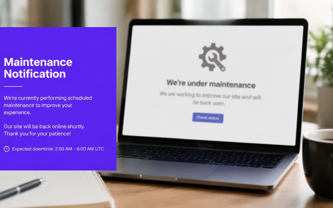
That's why a basic splash page rarely solves the problem on its own. A proper maintenance notification strategy lets you warn the right visitors early, escalate visibility as the window gets closer, and leave critical journeys alone when they shouldn't be interrupted. In Divi, that means thinking beyond a single page template and building targeted notification layers that match the situation.
Why a Simple Maintenance Page Is Not Enough
Most maintenance failures don't start with the outage itself. They start with silence.
A team schedules backend work at night, assumes traffic will be light, and flips on a generic maintenance page. The next morning, support gets messages from logged-in users who lost access mid-task, customers complain they had no warning, and the brand takes the hit for something that could have felt routine if it had been communicated properly. In telecom and ISP support threads, users report exactly this kind of breakdown, where scheduled downtime happens with zero advance notice and the issue isn't always the maintenance itself, but the failure to deliver the notification to the right people at the right time.
A plain maintenance page is still useful in some cases. If the whole site is unavailable, you need a clear fallback. But for many real-world updates, only part of the experience is affected. Maybe account pages are unavailable, maybe subscription management is paused, maybe a product filter is being rebuilt, or maybe an API-backed dashboard is flaky for a short window. In those cases, replacing the whole site with one static screen is clumsy.
The bigger issue is business impact. Fortune Global 500 companies collectively lose $1.5 trillion annually to unplanned downtime, representing about 11% of yearly turnover, according to Infodeck's maintenance analysis. That number belongs to large operations, but the lesson applies to smaller WordPress builds too. If downtime is expensive, poor communication about downtime makes it worse.

Where basic maintenance mode falls short
A single full-site page usually fails for four reasons:
- It treats every visitor the same. Anonymous readers, paying customers, admins, and support staff all see one message, even though they need different instructions.
- It arrives too late. If the first notice appears only when the outage starts, users can't plan around it.
- It interrupts the wrong flows. You don't want to block a healthy checkout because a members area is under maintenance.
- It feels reactive. Users are more forgiving when the site clearly communicates timing, purpose, and next steps.
Practical rule: If users can still complete some tasks safely, don't take the entire front end hostage.
That's the primary limitation of relying only on Divi's equivalent of a coming soon or maintenance page. Those tools are fine as a sitewide fallback, and if you need one, this guide to a coming soon page with Divi covers the basics well. But a professional maintenance notification system is layered. It uses targeted banners, timed popups, and conditional messaging so the interruption feels controlled.
What users actually remember
Users rarely remember that maintenance happened. They remember whether your site respected their time.
If they got a clear notice before the event, saw a reminder close to the window, and understood what would and wouldn't work, the experience feels organized. If they got blindsided by a blank screen, they assume the site is unstable. That distinction matters more than many teams realize.
Designing Your Maintenance Message and UI
The message comes first. The display method comes second.
Teams often spend too long choosing between a banner and a popup before they've written the copy. That's backwards. If the wording is vague, no UI pattern will save it. The strongest maintenance notification answers the user's immediate questions in plain language and does it without sounding defensive.
Build the message before you build the area
A solid framework comes from a simple four-step process outlined by Alert Software's scheduled maintenance email guidance: identify the purpose, determine the audience, gather the necessary details, and write the notice in clear, jargon-free language.
That framework works just as well inside Divi as it does in email or intranet messaging. In practice, I reduce it to five user-facing answers:
- What's affected: name the feature, section, or service.
- When it happens: give the start time clearly.
- How long it should last: be specific if you know, cautious if you don't.
- Why it's happening: explain the maintenance in plain English.
- What the user should do: wait, save work, avoid a task, or come back later.
Here's the difference between weak and useful copy.
“Scheduled maintenance tonight. Some disruptions may occur.”
That tells the user almost nothing.
A better version looks like this:
“Account billing and subscription changes will be unavailable from 10:00 PM to 11:30 PM. We're applying backend updates to improve account stability. Please complete billing changes before the window begins.”
Short. Specific. Actionable.
Match the UI to the level of disruption
Once the message is clear, choose the least disruptive UI that still gets seen. That's where many builds go wrong. Developers often overuse modals because they're visible, but visibility isn't the same as fit.
Choosing the Right Notification UI
| UI Type | Best For | Pros | Cons |
|---|---|---|---|
| Top banner | Advance notice for planned updates, partial service impact | Low friction, easy to keep visible across pages, good for repeated reminders | Easy to ignore if styling is too subtle |
| Modal popup | Important reminders close to the maintenance window | Strong visibility, good for logged-in users, works well with short action-oriented copy | Can annoy users if shown too often or on every page |
| Full-screen takeover | Actual outage state or high-impact maintenance affecting core functionality | Impossible to miss, useful for critical instructions | Too aggressive for minor issues, can block unaffected journeys |
A practical way to choose
Use a banner when the maintenance is upcoming and users need time to plan. Use a modal when the event is close enough that a reminder matters. Use a full-screen takeover only when users cannot continue the task they're attempting.
A WooCommerce example makes this easier:
- Banner across account pages several days in advance.
- Modal shown to logged-in customers the day before.
- Full-screen notice only inside the affected account section if the maintenance is active.
- No interruption on product pages or checkout if those flows still work.
Good maintenance UX doesn't shout first. It escalates only when needed.
Keep the design calm and obvious
The UI should feel deliberate, not alarming. Use strong contrast, a short heading, one body paragraph, and one obvious action if needed. That action might be “Dismiss,” “View status details,” or “Go back later.” Avoid clutter like countdown gimmicks, multiple buttons, or stock apology language.
A maintenance notification is one of those moments where clarity does more for your brand than cleverness. If users can understand the message in a glance, you've done the hard part correctly.
Configuring Advanced Triggers and Targeting
Showing the same maintenance notification to every visitor is the fastest way to make a professional site feel amateur.
The whole point of using a more advanced setup in Divi is precision. You want account holders to see one message, admins another, and casual visitors maybe nothing at all. That's where triggers and conditions do their essential work.

Start with the affected journey
Before you touch any settings, define the exact user path that's impacted.
For example, say a client needs to update WooCommerce subscriptions, customer account endpoints, and a connected billing tool. The product catalog still works. Checkout still works. Blog content still works. In that case, the maintenance notification belongs around account-related pages, not sitewide.
That gives you a much cleaner setup:
- Show on account-related pages where users manage subscriptions or billing
- Hide on checkout so you don't spook ready-to-buy customers
- Exclude public marketing pages unless the maintenance affects them too
- Create a separate admin-only notice for internal testing and verification
This is the difference between informing users and spraying alerts everywhere.
Use conditions before you use aggressive triggers
A common mistake is focusing on how the popup appears before deciding who should see it. Conditions should come first.
For maintenance notifications, the most useful filters are usually:
- User role targeting for administrators, editors, customers, subscribers, or logged-out visitors
- Page-level rules for account areas, dashboard templates, product pages, or support sections
- Device targeting when mobile users need a shorter message or a different layout
- Login state so member-facing notices don't clutter the public site
If you need a refresher on logic-based display control, this walkthrough on Divi conditional logic is worth reviewing before you build the campaign.
A client setup that works in practice
For membership and WooCommerce sites, I usually break maintenance messaging into separate areas instead of trying to make one giant universal popup do everything.
One area handles advance notice for logged-in customers. Another handles active maintenance messaging on the account section. A third area is limited to administrators so the team can confirm content, timing, and styling before the public ever sees it.
That approach avoids tangled condition stacks. It also makes rollback easier because you can disable one layer without touching the others.
A clean targeting pattern
Create one area for advance notice
Keep this lightweight. A top banner usually works best.Create one area for active impact
This can be a modal or full-page overlay, but only on affected templates.Create one hidden test variant
Restrict it to administrators or another internal role.Exclude protected flows
If checkout, lead forms, or other revenue-critical actions still work, leave them alone.
The best maintenance notification is often the one most users never need to see.
Don't forget alert suppression during planned work
This matters more for complex builds than most front-end developers expect. If the client uses on-call tooling, uptime monitoring, or event-based alerts, planned maintenance can trigger internal panic unless those alert rules are adjusted.
Incident.io notes that 40% of on-call alerts during planned windows are misrouted due to undefined condition groups in maintenance window configurations, according to their maintenance window documentation. The front-end lesson is simple. If your site displays “planned maintenance” while internal systems still fire crisis-level alerts, the operation looks disorganized from both sides.
That's why I like pairing front-end notification rules with a quick internal checklist:
- Confirm the monitoring team knows the window
- Suppress or reroute planned alerts where possible
- Match wording across public and internal notices
- Document which services are intentionally degraded
A short demo helps when you're mapping these conditions into a real build:
Device-specific adjustments save layouts
Don't assume your desktop design survives on mobile. A banner with two lines of text and one action button might be perfect on a laptop and unusable on a phone.
For mobile visitors, shorten the headline, trim the explanation, and keep the close behavior obvious. If the notice is important enough to interrupt, it also needs to be easy to dismiss or understand with one thumb. Small implementation details like this prevent the maintenance notification from becoming the thing that creates the bad experience.
Scheduling and Automating Your Notifications
Manual toggling is where maintenance plans start to wobble. Someone forgets to publish the notice on time, someone else leaves it live after the maintenance ends, and the site looks sloppy in both directions.
Automation fixes that. Once the messaging is written and the targeting rules are clear, scheduling turns your maintenance notification into a timed sequence instead of a last-minute task.

Use a tiered timeline instead of one announcement
A single notice isn't enough for most planned work. Users need an early heads-up, then a stronger reminder closer to the window.
The timing guidance from SnapComms on scheduled maintenance messages is practical: notify users about major outages at least one week in advance, communicate minor maintenance a few days before, and use a highly visible popup shortly before the start. That rhythm works well on websites because it mirrors how people pay attention. Early messages help with planning. Late messages help with action.
Build separate areas for each stage
Don't try to make one area change behavior over time. It's cleaner to create separate notification assets for each phase.
A typical sequence looks like this:
Early notice banner
Use this for the planning window. Keep it polite and persistent.Short-term reminder modal
This appears closer to the event and targets the users most likely to be affected.Start-time alert
Use a stronger format right before the maintenance begins, especially if users should save work or avoid a specific action.
This setup is easier to debug because each area has one job.
A practical automation pattern
For a client maintenance window on Friday night, I'd usually set the campaign like this:
- Publish the banner to start automatically well ahead of the maintenance window.
- Schedule a modal reminder to appear later, only for logged-in users on affected pages.
- Set the final alert to activate shortly before the work begins.
- Give each area a clear end time so nothing lingers after the window closes.
That's the “set it and forget it” version of maintenance communication. It removes the need for someone to be in the dashboard at exactly the right moment.
If you want to wire those behaviors into event-based displays, the documentation on automatic triggers is a useful reference.
Schedule the message to disappear too. Old maintenance notices make users question whether the site is actually healthy again.
Keep fallback timing realistic
This is also where judgment matters. If the maintenance could overrun, don't promise a precise return unless the client can support it. It's better to say the feature is expected back after the planned window than to post an exact minute and miss it.
For active notices, I prefer copy that separates the planned window from the restoration language. Example:
“Maintenance is currently in progress on account billing. We expect the work to finish within the planned service window. Please check back shortly.”
That keeps expectations grounded. It also prevents the site from making promises the ops team can't guarantee.
Upholding Accessibility and SEO Standards
A maintenance notification shouldn't create a second problem while solving the first. I've seen sites communicate downtime clearly but break keyboard navigation, trap focus badly, or replace indexable content when they only needed a partial notice.
Those are avoidable mistakes if you treat maintenance UX as part front-end pattern, part technical hygiene.

Use the right intervention for the real outage
If only one part of the site is affected, an on-page maintenance notification is usually the better option. It preserves the rest of the site experience and avoids turning a local issue into a full-site outage from the visitor's perspective.
If the whole site is unavailable, that's when a dedicated maintenance mode and correct server-level unavailable response become important. But for partial disruptions, replacing every page with a sitewide block is usually too blunt. It can also create unnecessary SEO and UX fallout because search engines and users lose access to pages that were functioning normally.
Accessibility rules that matter in real use
Banners and modals are easy to build and easy to get wrong. For accessibility, focus on behavior more than decoration.
What to check before publishing
- Announce urgent notices properly so assistive technology can detect them. If a modal is critical, use an appropriate alert dialog pattern.
- Move keyboard focus deliberately when opening a modal. Don't leave focus behind the overlay.
- Return focus on close so keyboard users can continue where they were.
- Make dismissal obvious with a clear close control and usable button text.
- Avoid motion-heavy effects that make the notice harder to process.
A maintenance notice should be understandable with a screen reader, keyboard, and reduced-motion preference. If it isn't, some users are being excluded from the same operational information everyone else gets.
SEO and accessibility support the same goal
Both disciplines reward restraint. If the site can keep serving useful pages, keep serving them. If the notice is important, make it visible without wiping out healthy content. If a modal is required, make it operable without a mouse.
A good maintenance notification tells users what changed without taking away everything that still works.
That's the balance worth aiming for. You protect the user experience, preserve discoverability where possible, and avoid turning routine maintenance into a sitewide usability problem.
Final Testing and Safe Deployment
The last mile is where small mistakes become public ones. Wrong audience, wrong timing, wrong page scope, stale copy, broken dismiss button. None of these are hard problems, but they're expensive to discover after the notification goes live.
Testing is what prevents that. And the logic for testing isn't just common sense. Data-driven maintenance decisions outperform experience-based approaches by 25%, as noted earlier in the maintenance data. The point is simple: verification beats guesswork.
Test privately before the public sees anything
The safest way to review a maintenance notification is to limit visibility during testing.
A few reliable options:
- Restrict the draft notice to administrators so only internal users can see it on the live site.
- Use a hidden condition or controlled preview path if your workflow supports it.
- Duplicate live areas before editing so you always have a working version to revert to.
That lets you test on the actual site with the actual theme, templates, and user states, without exposing unfinished messaging.
Run a short deployment checklist
I like a simple pass that addresses failure points commonly overlooked by many:
Check audience rules
Confirm the notice appears only for the intended roles, devices, and pages.Check timing windows
Review start and end times carefully, especially if the team is coordinating across time zones.Check message accuracy
Make sure affected services, user actions, and wording still match the maintenance plan.Check close behavior and focus handling
Test with keyboard navigation, not just a mouse.Check rollback
Know exactly which setting disables the notice immediately if something goes wrong.
Don't treat rollback as a rescue plan. Treat it as part of the build.
Publish like you expect change
Maintenance windows move. Scope changes. A subsystem comes back early, or an external dependency delays the whole job. Your notification setup should assume that conditions may shift after launch.
That's why separate areas, clear labels, and restrained logic matter so much. If you need to change one message quickly, you shouldn't have to untangle an all-in-one popup that controls everything. Clean structure makes emergency edits calm instead of risky.
A maintenance notification doesn't need to be complicated. It needs to be deliberate, testable, and easy to reverse. That's what keeps a planned interruption from turning into a trust problem.
If you want better control over targeted popups, scheduled notices, conditional display rules, and other advanced Divi interactions, Divimode is a strong place to start. Its tools and tutorials are especially useful when a client asks for something more polished than a generic maintenance page.
More Articles You Will Like