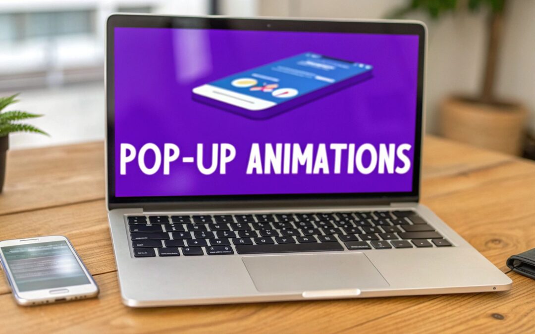
Pop up animations are the dynamic visual effects that control how a popup appears on a web page and, just as importantly, how it leaves. Instead of a static box just flashing into existence, animated popups use motion—like sliding in from the side, fading into view, or zooming in—to create a much smoother and less jarring experience for your visitors.
The Power of Motion in Pop Up Animations
Think about a skilled salesperson in a retail store. They don't just materialize in front of you out of thin air; they approach gracefully, catch your eye at just the right moment, and then offer to help. The best pop up animations work the same way. They aren't interruptions; they're helpful guides that appear at the perfect time.
Motion is a seriously powerful tool in web design because it has one primary job: to direct attention. A subtle slide-in from the corner of the screen can introduce a helpful tip without yanking a reader out of their flow. On the flip side, a bold zoom-in effect for a limited-time offer immediately signals importance and urgency, pulling the user's eye exactly where you want it.
This intentional use of movement reframes a popup from a simple, blunt notification into a seamless, valuable part of the user's journey. It adds a layer of professionalism and polish that just makes your Divi website feel more alive and responsive.
Why Motion Is More Than Just Decoration
Look, effective motion isn't just about making things look cool; it’s a form of communication. The right animation can accomplish a few key things:
- Guide the User’s Focus: Directional animations, like a slide-in, literally create a visual path for the user’s eye to follow.
- Establish a Visual Hierarchy: More dramatic animations can signal higher-priority messages, like a critical alert or an exciting sale.
- Improve User Experience: Smooth transitions feel more natural and less disruptive than abrupt changes, making the whole interaction feel polished and professional.
This principle is having a massive impact on digital advertising. The global animation market hit USD 371.85 billion in 2024 and is projected to climb to USD 590.85 billion by 2033, with advertising being the fastest-growing segment. This shows that eye-catching motion isn't just a design choice; it’s a proven revenue driver. You can learn more about the growth of the animation market at Market Data Forecast.
The core purpose of a popup animation is to manage a transition. It gracefully moves the user from one context (viewing your page) to another (interacting with your popup) without causing confusion or annoyance.
When you bring in tools like Divi Areas Pro, you get incredibly precise control over this whole experience. You can decide exactly how an element enters the screen, how long it takes, and what kind of feeling its motion conveys. This is how you transform a basic popup into a sophisticated interaction that elevates both your site's feel and its effectiveness.
Core Principles of Effective Pop Up Animation
Before we dive into the nitty-gritty of how to build these animations, it helps to understand the foundational ideas that make them work. I've found that a few core principles separate the great animations from the annoying ones.
Here's a quick summary of what you should always keep in mind:
| Principle | Description | Impact on User |
|---|---|---|
| Subtlety | Avoid overly fast or complex animations. The best motion is often the one you barely notice consciously. | Prevents distraction and cognitive overload, making the interaction feel smooth and natural. |
| Purpose | Every animation should have a reason. It should guide the eye, provide context, or reinforce an action. | Makes the interface feel intentional and logical, reducing user confusion. |
| Performance | Animations must be lightweight and optimized. A stuttering animation is worse than none at all. | Ensures a smooth, professional experience that doesn't slow down the website. |
| Responsiveness | The animation's speed and style should feel connected to the user's action (e.g., a click). | Creates a satisfying sense of direct manipulation and control, improving engagement. |
| Consistency | Use a consistent set of animation styles and timings across your site to build a cohesive visual language. | Establishes familiarity and predictability, making the site easier and more pleasant to navigate. |
Keeping these five principles in your back pocket will help you make design choices that not only look good but also genuinely improve the user's experience on your site.
Key Animation Styles and Their Strategic Uses
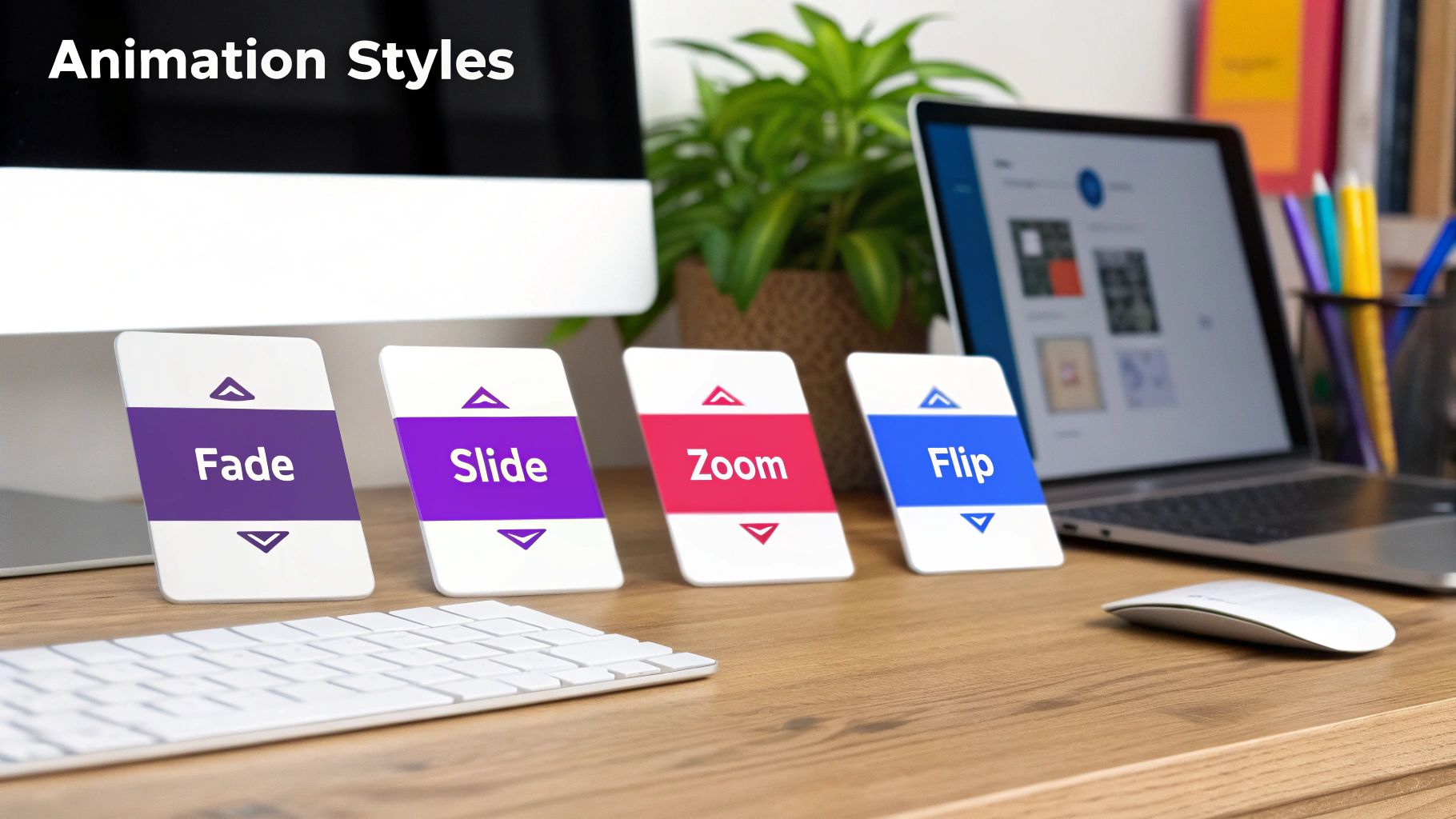
Choosing the right animation is a lot like picking the right tone of voice. A whisper is perfect for sharing a secret, while a shout gets the job done for an urgent warning. The same logic applies to your popups—the motion you choose should directly support the message you're trying to deliver.
Instead of just running through a list of technical names, let's explore these styles based on their strategic purpose and the psychological effect they have on your visitors. This approach will help you create popups that don't just look good but actually work toward a specific conversion goal.
The Subtle Approach with Fades
A fade-in animation is the digital equivalent of a polite cough. It’s gentle, professional, and doesn’t startle your user. The popup gracefully emerges from being invisible to fully visible, making it a fantastic choice for low-priority notifications.
Because fades are so unobtrusive, they work perfectly in situations where you need to inform without interrupting. They don’t scream for immediate action, which is a great way to respect the user's focus.
- Best Use-Case: A cookie consent banner tucked at the bottom of the screen.
- Divi Scenario: Using Popups for Divi to create a simple, elegant notice that appears a few seconds after someone lands on your site. The subtle fade-in feels like a natural part of the page load, which cuts down on annoyance.
Guiding the Eye with Slides
Slide animations are brilliant for creating a sense of connection between the popup and the rest of the page. When a notification slides in from the right, for example, it subtly implies it’s related to something on that side of the screen, like a shopping cart icon.
This directional movement is a powerful visual cue that guides the user’s eye, making the whole interface feel more intuitive. It tells a tiny story about where the information is coming from and why it's appearing.
A well-executed slide animation doesn't just appear; it arrives. This sense of arrival gives the popup context and purpose, making it feel like a logical part of the user experience rather than a random interruption.
- Best Use-Case: A "product added to cart" confirmation or a live chat window popping up.
- Divi Scenario: In Divi Areas Pro, you could trigger a small fly-in that slides in from the top right after a user clicks "Add to Cart" on a WooCommerce product page. The motion directly links the action to the result.
Demanding Attention with Zooms
When your message is urgent and absolutely cannot be missed, a zoom animation is your best friend. The popup scales up from the center of the screen, rapidly growing to command the user’s full attention.
This effect creates a sense of immediacy and importance. It’s a bold move, so you'll want to save it for high-value offers or critical alerts where you need to stop the user in their tracks and present a clear call to action. To get a better feel for how different offers perform in popups, this Dollar Off Vs Percentage Popup Offers Case Study offers some great real-world data.
Adding Personality with Flips and Bounces
Finally, we have animations that are all about personality. A flip or a bounce effect is playful and energetic, instantly breaking the static feel of a webpage. These are fantastic for grabbing attention in a fun, memorable way.
These dynamic effects can make your brand feel more human and engaging. For example, flipbook-style animations are making a comeback, tapping into a retro charm that works incredibly well on mobile. This simple, cost-effective style drives high engagement and is even projected to see the fastest growth in the global animation market.
- Best Use-Case: An exit-intent popup with a final, can't-miss offer to win back a visitor.
- Divi Scenario: Imagine using Divi Areas Pro to trigger an exit-intent popup on your checkout page. Applying a subtle bounce effect can recapture a user's attention just as they're about to leave, potentially saving a sale and reducing cart abandonment.
This is where we separate the delightful pop-up animations from the downright annoying ones. It’s one thing to choose a style like a slide or fade, but it's the subtle details—the physics and rhythm of the movement—that truly define the user's experience. Getting this right is what makes your popups feel helpful instead of intrusive.
Think of it like a natural conversation. A smooth, well-paced discussion feels engaging, while an abrupt, jarring interruption is off-putting. The same goes for motion. The goal is to create movement that feels organic and intuitive, guiding the user's attention without yanking it away.
Finding the Right Rhythm with Timing and Duration
The duration of an animation is simply how long it takes to complete, usually measured in milliseconds (ms). This single value has a massive impact on how a popup feels. Too fast, and it's a jarring flash. Too slow, and it feels sluggish, making the user wait.
The sweet spot depends entirely on the context:
- Quick Feedback (200-300ms): For small, quick interactions like a tooltip appearing or a success message after a form submission, faster is better. The animation should feel nearly instantaneous, providing immediate confirmation of an action.
- Larger Modals (400-500ms): For full-screen overlays or bigger promotional popups, a slightly longer duration is more graceful. This gives the user's eye a moment to adjust to the significant change on the screen, preventing disorientation.
Getting these timings right is fundamental. For a deeper dive into making your pop-ups visually appealing and intuitive, it's worth reviewing some essential UI design best practices.
The Secret Sauce of Easing Functions
If duration is the how long, easing is the how. An easing function controls the rate of speed throughout an animation. In the real world, objects don't just start and stop moving instantly; they accelerate and decelerate. Easing brings this natural law of physics to your pop-up animations.
A linear easing function (constant speed) feels robotic and unnatural. Instead, functions like ease-out (starts fast, then slows down) are perfect for elements entering the screen, creating a responsive and energetic feel. Conversely, ease-in (starts slow, then speeds up) works well for elements leaving, as if they are being pulled away.
Think of easing as the personality of your motion. An
ease-out-backmight create a slight overshoot for a playful bounce, while a simpleeaseoffers a smooth, professional acceleration and deceleration, making it a great all-purpose choice.
Below is a quick cheat sheet to help you pair the right timing and easing with common popup scenarios.
Animation Timing and Easing Cheat Sheet
| Animation Use Case | Recommended Duration | Recommended Easing | Example |
|---|---|---|---|
| Quick Confirmations | 200-250ms | ease-out |
A "Message Sent!" notice. Fast and reassuring. |
| Standard Modal | 350-450ms | ease-out-quint |
A newsletter sign-up form. Smooth and professional. |
| Full-Screen Overlay | 400-500ms | ease-in-out |
A welcome mat or age gate. Graceful and not startling. |
| Playful Notification | 350-400ms | ease-out-back |
A "You've unlocked a badge!" popup. Adds a fun bounce. |
| Dismissing a Popup | 250-300ms | ease-in |
Clicking "close." The popup quickly gets out of the way. |
This table serves as a solid starting point. Don't be afraid to tweak these values to perfectly match the feel of your brand and the specific interaction.
Ensuring Performance and Accessibility
Two critical topics often get overlooked in the creative process: performance and accessibility. Thankfully, with modern web design, you don't have to compromise on either.
A common fear is that adding motion will slow down a Divi site. This is largely a myth. Today's popup animations are built with CSS, which is hardware-accelerated by the browser. This means they are incredibly efficient and have a negligible impact on page speed. The real performance drains come from unoptimized images or heavy scripts inside the popup, not the animation itself.
Equally important is respecting user preferences. Some individuals experience motion sickness or vestibular disorders and set their devices to prefers-reduced-motion. Your animations must respect this setting. By using a simple CSS media query, you can disable complex movements and replace them with a simple, gentle fade for these users. This ensures a comfortable and accessible experience for everyone. This isn't just a best practice; it's a cornerstone of inclusive design. For more practical advice on building user-friendly popups, check out our guide on tips for better Divi pop-ups.
The rise of slick web interactivity mirrors trends in the broader animation world. The 3D animation market, valued at USD 22.67 billion in 2023, is expected to more than double by 2030. Within this, computer-generated animations—the same technology that powers smooth popup transitions—already made up 85% of the global animation industry in 2022. For Divi developers, this translates directly to results; dynamic popups can boost conversions by up to 15% because motion holds attention far better than static visuals. By mastering timing, easing, and accessibility, you can craft popup animations that are not only beautiful but also effective and inclusive.
How to Get Pop-up Animations Working in Divi
All that theory is great, but now it's time to roll up your sleeves and bring these ideas to life. In this section, I’ll walk you through two hands-on tutorials for creating beautiful pop up animations right inside your Divi website. We'll kick things off with a simple and effective method using a free tool, then move on to a more advanced technique with a premium plugin.
By the time you're done, you'll have a fully functional, animated popup that you built yourself, ready to grab your visitors' attention.
Method 1: Create a Simple Fade-In with Popups for Divi
For our first go, we'll use the free Popups for Divi plugin. It’s a fantastic starting point because its built-in settings make creating a basic animation dead simple. Our goal here is to create a clean newsletter signup form that gently fades into view after a few seconds, avoiding a jarring experience for the user.
Let's walk through the steps to get this set up.
Step-by-Step Guide
Install and Activate the Plugin: First things first, head to your WordPress dashboard, go to Plugins > Add New, search for "Popups for Divi," and get it installed and activated.
Design Your Popup in the Divi Library: Next, jump over to Divi > Divi Library and create a new Layout. This is where you'll design your newsletter form, just like any other Divi section. My advice? Keep it clean and focused on a single call to action.
Configure the Popup Trigger: Now, go to the page where you want the popup to show up and open the Divi Builder. Add a new module and find the "Popup" module. In its settings, select the layout you just designed in the library. For the trigger, we’ll choose "On Page Load" and set a "Trigger Delay" of 3000ms (that's 3 seconds).
Select Your Animation Style: This is where the magic happens. In the same Popup module settings, find the "Animation" toggle. You'll see a dropdown menu with a bunch of preset options. For our goal, just select "Fade In." You can tweak the animation duration here, too, but the default usually feels pretty good for a simple fade.
And that's it! In just a few clicks and without touching a line of code, you've got a professional-looking popup that uses a subtle fade-in animation to appear gracefully on the screen.
Method 2: Build an Advanced Bounce Effect with Divi Areas Pro
Ready to kick things up a notch? Now we'll use Divi Areas Pro to create a much more dynamic animation. We're going to build an exit-intent popup that uses a subtle "bounce" effect to recapture a user's attention right when they're about to leave your site. This one requires a tiny bit of custom CSS, but the payoff is far more creative control.
This visual flow chart breaks down the core elements we'll be playing with: Timing, Easing, and Duration.
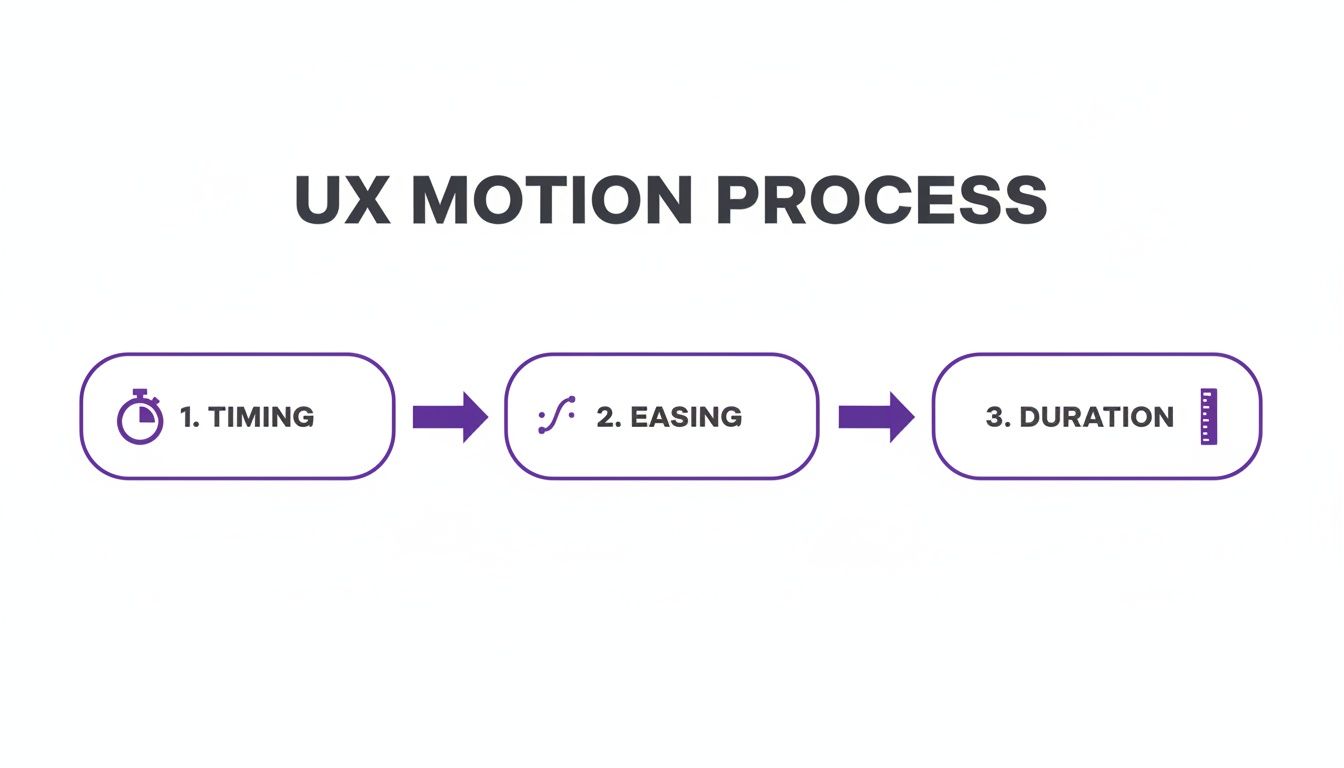
This process shows that getting motion UX right is all about balancing these three pillars to create an effect that feels both intentional and natural.
The Bounce Animation Breakdown
To pull off a custom bounce, we need to define its movement using CSS @keyframes. This lets us control the popup's appearance at different moments during the animation, which is how we create that signature bounce.
First, let's create our Divi Area.
- Head over to Divi > Divi Areas and click "Add New."
- Design your exit-intent offer inside the Divi Builder. Remember to make the offer compelling!
- In the "Divi Areas" settings box (usually below the editor), go to the "Trigger" tab. Select "On Exit Intent" as your automatic trigger.
- Next, click over to the "Popup" tab in the same settings box. You can set the width, position, and overlay styles here. For now, leave the "Animation" setting on "None"—we're about to add our own custom magic.
Adding the Custom CSS
Now it's time to add our custom CSS to create the animation and apply it to our Divi Area. Go to Divi > Theme Options > General > Custom CSS and paste in the following code.
/* 1. Define the bounce-in animation */
@keyframes bounceIn {
0% {
opacity: 0;
transform: scale(0.3);
}
50% {
opacity: 1;
transform: scale(1.05);
}
70% {
transform: scale(0.9);
}
100% {
transform: scale(1);
}
}
/* 2. Apply the animation to Divi Areas Pro popups */
.da-popup-container.da-popup-effect-show.bounce-me {
animation-name: bounceIn;
animation-duration: 0.8s;
animation-fill-mode: forwards;
}
This CSS does two key things:
@keyframes bounceIn: This is the recipe for the animation itself. It starts the popup small and invisible (scale(0.3)), makes it slightly larger than its final size (scale(1.05)), pulls it back in a bit (scale(0.9)), and finally settles it at its normal size (scale(1)). This sequence is what creates the bounce..da-popup-container...: This CSS rule tells Divi to apply ourbounceInanimation to any Divi Area popup that we give the custom classbounce-me.
Applying the CSS Class
The final step is just to tell our specific Divi Area to use this new animation we just created.
- Go back to edit the Divi Area you made earlier.
- In the "Divi Areas" settings box, go to the "Advanced" tab.
- In the "Custom CSS Class" field, just type
bounce-me.
Save your changes, and you're all set! Now, when a visitor goes to leave your site, your offer will appear with a captivating and attention-grabbing bounce. This custom approach really opens up a world of possibilities for creating unique pop up animations. For more advanced users who want to trigger animations with JavaScript, you can learn more about initializing Area animations with JS in our knowledge base.
By combining the powerful targeting of Divi Areas Pro with custom CSS animations, you can design interactions that are not only visually interesting but also strategically timed to maximize conversions.
These two methods give you a solid foundation for implementing pop up animations in Divi. Whether you prefer the simplicity of built-in settings or the flexibility of custom code, you now have the tools to make your popups move with purpose.
Using Advanced Triggers for Smarter Animations
Making a slick animation is only half the job. The real magic happens when you show that animation at just the right moment. This is where we go from just making popups to creating smart, timely interactions that feel genuinely helpful, not annoying. By combining the right animation with the right trigger, you can craft experiences that truly adapt to what your visitor is doing.
Picture someone deep in a long blog post. A jarring zoom-in popup would completely shatter their focus. A much smarter play is to use a time-delayed trigger paired with a gentle, slow fade-in animation. This combo respects the reader's concentration while subtly presenting a related article or offer. It feels like a natural part of the browsing session, not an interruption.
Think of it this way: the animation you pick should be a direct response to the trigger that launches it. The trigger provides the context, and the animation delivers the message with the perfect tone.
Matching Animation to User Intent
Inside Divi Areas Pro, you’ve got a whole toolkit of triggers you can pair with your pop up animations to create incredibly specific and effective interactions. The secret is to put yourself in the user’s shoes at the exact moment the trigger fires.
For instance, an exit-intent trigger goes off at a make-or-break moment—the user is literally heading for the virtual door. This is your last shot to grab their attention. A timid, slow animation just won't do the trick. Instead, you need something with more punch:
- Animation: A quick, attention-grabbing
bounce-inor a sharpzoom-in. - Why it Works: The dynamic movement breaks their pattern of leaving and snaps their eyes to your final offer, giving you the best possible chance to win them back.
On the flip side, a scroll-depth trigger, which activates after a user scrolls a certain percentage down the page, signals deep engagement. They’re clearly hooked on your content.
- Animation: A smooth
slide-in from rightor a subtlefade-in. - Why it Works: The user is already invested. The goal isn’t to startle them, but to offer something that complements their interest, like a free download or a related product.
The trigger is the "why," and the animation is the "how." A scroll-depth trigger says, "Because you're engaged," and a slide-in animation responds, "I'll present this offer respectfully."
Advanced Targeting for Personalized Motion
You can get even more granular than just user behavior. Tailoring animations based on user roles, device types, or specific pages makes every interaction feel personal and relevant. A returning customer, for example, could see a totally different animated popup than a first-time visitor.
Think about these strategic combos:
- User Role Targeting: Show logged-in members a quick, efficient slide-in notification about a new feature. For new visitors, a welcoming, slightly slower fade-in for a discount offer feels much more appropriate.
- Device-Specific Animations: On a phone, where screen space is precious, a
slide-in from bottomanimation feels native and familiar, just like a mobile app. But on a huge desktop monitor, a centered zoom or fade can deliver a much bigger impact. - Page-Context Animations: Trigger a bold, exciting animation for a popup on your main sales page. But on a more reflective "About Us" page, a simple, elegant fade feels more on-brand.
This level of control lets you design a cohesive experience where the motion itself reinforces the message. If you want to dive deeper into the basics of how these triggers work, our detailed guide explains Divi popup triggers like click and hover in depth.
Ultimately, smart triggers transform your pop up animations from a blunt, one-size-fits-all tool into a responsive system. By paying attention to user cues—how they scroll, where they click, and when they decide to leave—you can deploy the perfect animation at the perfect time. This thoughtful approach is what separates a generic popup from a high-impact conversion tool.
Common Questions About Pop Up Animations
As cool as pop up animations are, they definitely bring up some practical questions. If you're a Divi user, you're probably wondering about the real-world impact of adding motion to your site. It’s smart to think through these details before you dive in.
This section tackles the most frequent concerns head-on. We'll give you clear, straightforward answers about performance, what actually converts, and how to keep things accessible. The goal is to give you the confidence to use animations the right way.
Will Adding Pop Up Animations Slow Down My Divi Website?
This is a totally valid concern, but the short answer is no—as long as you do it correctly. Most modern popup animations are built with CSS transitions and keyframes, which browsers are highly optimized to handle.
These CSS animations are "hardware-accelerated," meaning your device's graphics card (GPU) does the heavy lifting. This makes them incredibly efficient and the impact on your site's performance is usually negligible. The real trouble starts when you use clunky, old-school JavaScript libraries for what should be simple visual effects.
Plugins like Divi Areas Pro are built with performance in mind from the get-go, using optimized CSS for all their animation effects.
The biggest performance hits almost always come from unoptimized content inside the popup—like huge image files or heavy scripts—not the animation itself. Always optimize your popup's content just as you would any other part of your page.
So go ahead, use those animations. Just remember to keep the content inside the popup lean and clean.
What Is the Best Animation for Converting Users?
Sorry to say, there's no single magic animation that works every time. The most effective choice really depends on your brand's personality, your audience, and the urgency of your offer. But here’s a great rule of thumb: match the animation's energy to your call-to-action.
- For Urgent Offers: Got a flash sale or a limited-time deal? You need to create a sense of excitement. A quick "Zoom In" or a subtle "Bounce" effect can grab immediate attention and signal that this is important.
- For Softer Asks: For something less urgent, like a newsletter signup or a cookie notice, a smooth "Slide In from Bottom" or a gentle "Fade In" feels more professional and a lot less intrusive.
The key is to be intentional. The animation should support your message, not distract from it. A jarring, aggressive animation for a simple "thank you" message would just feel weird and out of place.
To figure out what really clicks with your audience, you've got to test it. With a tool like Divi Leads, you can run an A/B test on two different entry animations for the same offer. See which one gets more clicks or signups. This data-driven approach takes all the guesswork out of it.
How Do I Make My Pop Up Animations Accessible?
Making your site accessible isn't just a "nice-to-have"—it's essential for creating an online experience that works for everyone. This is especially true when it comes to motion.
The single most important thing you can do is respect a user's preference for reduced motion. Many people with vestibular disorders or motion sensitivity will enable this setting in their operating system. You can easily cater to them with a simple CSS media query:
@media (prefers-reduced-motion: reduce)
Inside this query, you can turn off your animations or swap them out for a simple fade effect. This ensures everyone has a comfortable and safe experience on your site.
Beyond the animation, don't forget about the accessibility of the popup itself:
- Keyboard Navigation: Can users get to and from the popup using only their keyboard? They should be able to.
- Clear Close Button: The "X" or "close" button needs to be obvious and easy to click or select.
- ARIA Attributes: Use the right ARIA roles to tell screen readers that a dialog has appeared, what it's for, and how to use it.
By keeping these points in mind, you can create pop up animations that are both beautiful and accessible to your entire audience.
Ready to create stunning, high-converting popups with complete control over triggers and animations? With Divimode, you can build everything from simple notices to advanced, dynamic user experiences.
Explore Divi Areas Pro and start building smarter popups today!
More Articles You Will Like


