
 Alex Martin
If you want to make a mobile site that actually performs, you have to completely flip your design process on its head. It’s time to move away from the old "desktop-first" model and fully embrace a mobile-centric strategy. This isn't just about making your desktop design shrink down; it's about rethinking the entire experience for a smaller screen, prioritizing speed, and designing for thumbs right from the start.
Why a Mobile-First Divi Site Is Non-Negotiable

Before we jump into Divi's responsive settings, we need to get one thing straight: building for mobile first isn't just a trendy best practice. It’s a core business strategy. The days of mobile being a secondary thought are long gone. Today, the mobile experience is the primary way customers judge your brand's credibility.
A clunky, slow, or hard-to-navigate mobile site doesn't just annoy people. It actively drives them away and shatters their trust in your business.
The Modern Mobile User's Expectations
Let’s be honest—mobile users have zero patience. They expect pages to load instantly, navigation to be effortless, and content to get straight to the point. When you just cram a desktop site onto a small screen, you fail on all three counts.
If a visitor has to pinch-to-zoom to read your text or fumbles to tap a tiny button, they're not just inconvenienced. They're gone. And they probably aren't coming back.
This frustration directly tanks your most important business metrics:
- Bounce Rates: A terrible mobile experience is the #1 reason for high bounce rates. If users can't find what they need in seconds, they hit the back button without a second thought.
- Session Duration: Good design keeps people around. Bad design cuts their visit short, killing any chance for them to engage or convert.
- Conversion Rates: Every single action, from filling out a form to making a purchase, becomes a chore on a poorly optimized site. This friction is a direct roadblock to making money.
The table below breaks down the key differences in how users behave on mobile vs. desktop, highlighting why your Divi strategy needs to adapt.
Mobile vs Desktop User Engagement Key Differences
| Metric | Mobile User Behavior | Desktop User Behavior | Divi Strategy Implication |
|---|---|---|---|
| Session Length | Shorter, goal-oriented sessions (1-3 mins) | Longer, more exploratory sessions (5-10+ mins) | Mobile design must prioritize clear CTAs and quick access to information. |
| Navigation | Thumb-driven, relies on simple menus/icons | Mouse-driven, accommodates complex mega menus | Design thumb-friendly navigation. Test button sizes and spacing rigorously. |
| Attention Span | Highly distracted, multi-tasking environment | More focused, single-tasking environment | Keep content concise. Use bold headlines and short paragraphs to grab attention. |
| Load Time Patience | Extremely low; expects pages to load in <3 seconds | More tolerant but still expects speed | Optimize images, leverage caching, and minimize code to ensure lightning-fast loads. |
| Primary Goal | Task completion (find a number, get directions) | Research and comparison (read articles, compare products) | Mobile content should be actionable. Desktop can support more in-depth content. |
This data shows a clear divide. Trying to serve both audiences with a single, desktop-focused design is a recipe for failure on mobile.
Data-Driven Reality
The shift to mobile isn't just a trend; it's the new standard. As of mid-2025, mobile devices drive roughly 64.35% of all global website traffic. That’s a seismic shift in how people get online.
And it gets even more definitive: nearly all internet users (96%) now use a mobile phone to go online. You can find more details on this data at aboutchromebooks.com. Ignoring this audience means ignoring the vast majority of your potential customers.
A mobile-first strategy isn't about making your website work on phones. It's about designing an experience that is superior on phones because that’s where most of your audience lives.
Ultimately, every setting we tweak and every design choice we make in this guide is grounded in this truth. To build a mobile site that actually wins, you have to make the mobile user your absolute priority, not an afterthought. This mindset transforms a simple technical checklist into a powerful strategy for business growth.
Architecting a Thumb-Friendly User Experience
Before you even think about firing up the Divi Builder, the real work begins. A high-performing mobile site isn't just a shrunken-down desktop version; it's a completely reimagined experience, built from the ground up for a totally different context.
To truly connect with mobile users, you have to think like one: impatient, easily distracted, and navigating the world with one thumb.
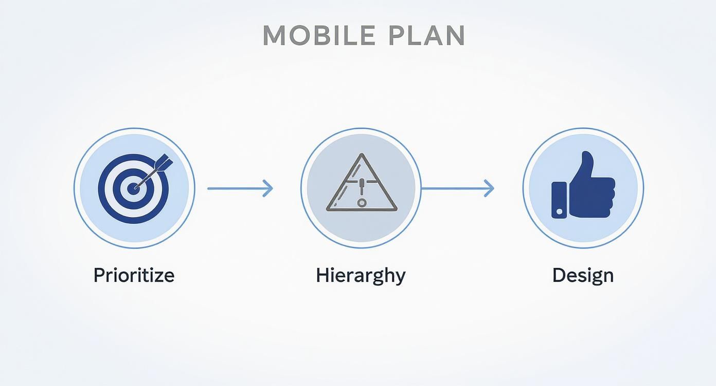
Forget trying to cram every single feature from your desktop site onto a smaller screen. The name of the game is ruthless prioritization. What are the absolute, must-have actions a visitor needs to take? Is it to call you? Find your location? Buy a product?
Pinpoint the top three to five user goals and build your entire mobile journey around making those tasks ridiculously easy. Everything else is just noise and can often be tucked away or removed completely to slash the clutter.
Define Your Mobile User Journey
Once you know what you want users to do, you need to map out the path of least resistance to get them there. This means establishing a crystal-clear content hierarchy, where your most important information and calls-to-action (CTAs) are impossible to miss.
A mobile user's attention span is short. Your main value proposition and primary CTA have to be visible "above the fold"—the part of the screen they see without having to scroll.
Think of it this way: if someone landed on your site while waiting in line for a coffee, could they figure out what you do and take the next step in less than five seconds? If not, you’ve got some work to do on your hierarchy.
The secret to a killer mobile experience is designing for intent, not just for a smaller screen. Figure out what your user needs in that specific moment and give it to them instantly. Don't make them hunt for it.
Designing for Thumbs, Not Cursors
Desktop design is all about precision, guided by a tiny mouse cursor. Mobile design? It's messy, controlled by thumbs of all shapes and sizes. This one difference should change everything about your layout choices. Nothing sends a mobile user running faster than frustrating mis-taps.
Here are a few hard-and-fast rules for building a thumb-friendly interface:
- Generous Button Sizes: Every interactive element—buttons, links, icons—needs a minimum tap target size of 48×48 pixels. This gives even the clumsiest of thumbs a fighting chance to hit the right spot.
- Strategic Spacing: Don't cram your buttons and links together. Add plenty of padding and margin around them to create a buffer zone. This simple step is your best defense against accidental clicks.
- Respect the "Thumb Zone": Most people hold their phone with one hand and scroll with their thumb. This creates a natural arc across the screen where it's easiest to reach. Place your most critical navigation items and CTAs right inside this zone for maximum ease of use.
This planning phase is where the mobile battle is truly won or lost. By prioritizing core actions, creating a smart visual hierarchy, and designing for the physical reality of how people use their phones, you're laying the foundation for a site that just works. This prep ensures that when you finally open Divi, you’re not just winging it—you're executing a well-thought-out plan for a truly superior mobile experience.
Alright, with a solid mobile-first plan in place, it's time to roll up our sleeves and dive into the Divi Builder. This is where the strategy becomes reality, and thankfully, Divi gives us an incredible set of tools to work with.
We're not just shrinking a desktop design here. We're crafting a genuinely unique experience for smaller screens.
Your command center for all of this is the responsive view switcher, those three little icons—desktop, tablet, and mobile—tucked away at the bottom left of the Divi Builder.
The concept is beautifully simple: any design value you set in one view applies only to that view and any smaller devices, unless you tell it otherwise. For instance, if you tweak the font size in tablet view, it will affect tablets and phones, but your desktop design stays exactly as you left it.
Fine-Tuning Spacing and Typography
One of the first things you'll notice on mobile is wonky spacing. A section that looks perfectly balanced on a big monitor can suddenly feel way too cramped or have massive, awkward gaps on a phone.
This is where Divi’s responsive controls are a lifesaver. Just pop into the mobile view, find the module, section, or row you want to fix, and open its design settings. You can now adjust margins and padding just for mobile without messing up your desktop layout.
The same logic applies to text. That big, bold headline in your hero section might look fantastic on a desktop, but on a phone, it can look ridiculous and push all the important stuff below the fold.
Here’s the fix:
- Click the mobile phone icon in the view switcher.
- Jump into the Text module's "Design" tab.
- Hover over an option like "Heading Text Size" until you see the little mobile icon appear. Click it.
- Now you can set a completely separate, smaller font size just for mobile.
This level of control is what separates an "okay" mobile site from one that feels truly polished and professional.
Advanced Visibility Controls
Sometimes, a simple adjustment isn't going to cut it. That complex, multi-column section with stunning high-res images might be a showstopper for desktop users, but it's a performance killer on mobile.
Instead of trying to cram it onto a small screen, Divi lets you just hide it.
Head over to the "Advanced" settings tab of any section, row, or module, and you'll find the "Visibility" options. From here, you can disable the element on phones, tablets, or desktops. This is an absolute game-changer for mobile design.
Let's imagine a real-world scenario:
- On Desktop: You feature a detailed contact form with tons of fields and fancy conditional logic.
- On Mobile: You hide that beast of a form. Instead, you show a super-simple version with just "Name," "Email," and "Message" fields, alongside a big, thumb-friendly "Call Us Now" button.
This isn't just about making things fit; it's about tailoring the experience to the user's context. Strategically showing and hiding content is a core part of building a mobile site that actually gets results.
Reconfiguring Column Structures
Divi is smart enough to stack columns vertically on mobile, which is usually what you want. The problem is, it stacks them from left to right, and that can sometimes create a really illogical flow.
Think about a classic two-column layout: image on the left, descriptive text on the right. On mobile, the image will appear first, pushing your important text down. What if you need people to read the text first?
While you can't reorder columns on a per-device basis directly, there’s a clever workaround I use all the time:
- Create two separate rows.
- In the first row, build your normal two-column layout for desktop and tablet. Then, set this entire row to be hidden on phones.
- In the second row, create a simple one-column layout. Place your text module first, followed by your image module. Now, set this row to be hidden on desktops and tablets.
Boom. You now have a content order that makes perfect sense on every device. For a deeper dive into tricks like this, check out our guide on key tips for better Divi mobile responsiveness.
The goal is to move from a mindset of "shrinking" a design to "rebuilding" it for a new environment. Use Divi's responsive tools to make deliberate choices for your mobile users, not just accept the defaults.
This isn't just a "nice to have" skill anymore. The data is staggering. Back in 2011, mobile traffic was just 6.1% of the global total. Fast forward to 2025, and projections show it hitting nearly two-thirds (62.66%).
This shift means a bad mobile experience can lead to bounce rates as high as 60%, far worse than on desktop. You can discover more insights about these digital trends from DataReportal.
By truly mastering Divi's responsive settings, you're building a site that respects how most people browse the web today. It’s the foundational skill for any modern, high-performing website.
Building a Mobile Header That Actually Converts
On a desktop, you've got all the room in the world for navigation. But on a mobile device, every single pixel is precious, and your header is the most valuable real estate you have. Wasting this space with a clunky, desktop-style menu is a massive mistake if you want to make a mobile site that actually drives action.
This is where the Divi Theme Builder becomes your secret weapon. It lets you completely ditch the default Divi header and build a lean, high-impact mobile header designed for one purpose: conversions. Forget just listing your pages; we're building a navigation system that actively guides users toward your most important goals.
Choosing the Right Mobile Menu Style
That classic three-line "hamburger" icon is universally recognized, but it's not your only play. The right choice depends entirely on your site's complexity and, more importantly, what you want users to do.
- Hamburger to Slide-In: This is a fantastic choice for most websites. It keeps the main navigation tucked away until it's needed, which frees up prime real estate for a big, juicy call-to-action (CTA). When tapped, a menu elegantly slides in from the side.
- Full-Screen Overlay: If your site has more complex navigation or you're going for a bold design aesthetic, a full-screen overlay can be incredibly effective. Tapping the menu icon reveals a beautifully designed overlay with clear, easy-to-tap links.
- Bottom Bar Navigation: This is straight out of the mobile app playbook. Placing a few key icons at the bottom of the screen puts them directly in the user's thumb zone. It's perfect for e-commerce sites (think Home, Shop, Cart, Account) or service businesses where key actions are limited.
There's no single "best" style. The key is to pick the one that presents the clearest path for your users while keeping things as uncluttered as possible.
Prioritizing a Clickable Call-to-Action
Your mobile header should do more than just help people find your "About Us" page. It needs to be a conversion machine. This means your primary CTA has to be visible, obvious, and ridiculously easy to tap.
Instead of burying your phone number on a "Contact" page, put a bold "Call Us" button right in the header. If you're a local service business, this one change can dramatically increase inbound leads. For consultants or SaaS companies, a "Book a Demo" or "Get Started" button is non-negotiable.
Ultimately, the goal of your mobile site is to drive conversions. This is explored in much greater detail in a practical guide on how to improve website conversion rates. A well-placed CTA in your header is the first and most critical step in that process.
Don't make users hunt for the action you want them to take. Put it front and center in your mobile header. If the goal is a phone call, make the button a phone number. If it's a booking, make it a "Book Now" link.
Implementing a Sticky Header for Maximum Impact
A sticky header is one that stays fixed at the top of the screen even as the user scrolls down the page. On mobile, this is an incredibly powerful feature. By making your header sticky, you ensure your logo and—most importantly—your primary CTA are always visible and accessible.
Imagine a user reading a long blog post or service page. When they finally decide to take action, they don't have to scroll all the way back to the top to find your contact button. It's right there, waiting for them. This simple tweak removes friction and makes the whole experience smoother.
You can easily set this up in the Divi Theme Builder:
- In your custom header layout, open the main Section settings.
- Navigate to the Advanced tab.
- Under Scroll Effects, set "Sticky Position" to "Stick to Top."
This small adjustment keeps your conversion goal in sight at all times, subtly guiding visitors toward the finish line. For a more detailed walkthrough of the Theme Builder, you can explore the basics of building website headers with Divi.
By combining a strategic menu style with a clear CTA and a sticky implementation, you transform your mobile header from a simple navigation tool into your site's hardest-working conversion asset.
Optimizing Your Divi Site for Speed and SEO

Let's be honest: a beautiful mobile design is completely worthless if it takes forever to load. Performance isn't just a nerdy detail for developers; it's the very foundation of a good user experience and a hard requirement for Google's mobile-first indexing. When you make a mobile site, speed is the most important feature you can build.
The reality is, a slow site costs you money. It's that simple. Mobile devices now drive about two-thirds of all web traffic worldwide. With mobile ad spending projected to hit a staggering $402 billion by 2025, a sluggish site means you're just watching potential revenue disappear.
Mastering Mobile Image Optimization
Images are almost always the number one performance killer on any website, but it's especially brutal on mobile. Trying to force a massive, high-res JPEG designed for a 27-inch monitor onto a 6-inch phone screen is a recipe for disaster. It chews through mobile data and makes your pages crawl at a snail's pace.
Here’s how to fix it:
- Serve Next-Gen Formats: Ditch the old JPEGs and PNGs and start converting your images to modern formats like WebP. It offers far better compression, resulting in file sizes that are often 25% smaller without any noticeable loss in quality.
- Implement Responsive Sizing: This is non-negotiable. Use a plugin or custom code to serve different image sizes depending on the user's screen. A mobile user should download a small, properly sized image, not the full-resolution beast you're using on the desktop view.
- Lazy Loading is a Must: Don't make visitors download every single image on a page just to see the top part. Enable lazy loading. This simple trick defers the loading of images "below the fold" until the user actually scrolls down to them, which makes your initial page load feel lightning-fast.
Caching and Code Minification
Beyond images, the code that builds your Divi site can also be a source of bloat. Caching and minification are two of the most powerful tools in your arsenal for trimming the fat and getting your content delivered faster.
Caching is like creating a snapshot of your page. Instead of the server rebuilding it from scratch for every single visitor, it serves up a pre-built, static version. A good caching plugin, like WP Rocket, can slash your Time to First Byte (TTFB).
Minification, on the other hand, strips out all the unnecessary characters from your CSS and JavaScript files—things like comments, whitespace, and line breaks that browsers don't need. This makes the files smaller and quicker to download and process.
For a deep dive into Divi-specific speed tweaks, you'll want to check out our complete guide on how to speed up your Divi website.
Your mobile site's speed isn't just about passing a test. It's about respecting your visitor's time. A fast site feels professional and trustworthy, while a slow one feels broken and careless.
Auditing for SEO and Core Web Vitals
Google is obsessed with user experience, and its Core Web Vitals (CWV) are the metrics it uses to quantify it. For mobile SEO, these are everything.
- Largest Contentful Paint (LCP): This is about loading speed. You need to be under 2.5 seconds.
- First Input Delay (FID): This measures how interactive your site is. Aim for under 100 milliseconds.
- Cumulative Layout Shift (CLS): This tracks visual stability (i.e., does stuff jump around as the page loads?). Your score should be 0.1 or less.
Run your URLs through Google PageSpeed Insights. It will give you a straightforward report on your CWV scores and tell you exactly what to fix, with recommendations like "Eliminate render-blocking resources" or "Properly size images."
Finally, make the "Mobile Usability" report in Google Search Console your best friend. This tool will alert you to any pages with frustrating errors like "Text too small to read" or "Clickable elements too close together." Fixing these issues is absolutely critical for showing Google your site is truly mobile-friendly and deserving of a high rank.
To really get ahead, it's worth exploring more advanced website performance optimization strategies that can give your Divi site an extra edge.
Your Essential Mobile Pre-Launch Test Plan
Launching a site without proper testing is like flying blind. It's a rookie mistake. You simply can't assume your Divi mobile site works perfectly just because it looks good in the Visual Builder—you have to prove it on real devices, in real-world conditions.
This final pre-launch audit isn't just about catching a few stray bugs. It's about validating the entire user experience you've worked so hard to create.
Go Beyond the Simulator
Sure, browser developer tools are fantastic for a quick check of different screen sizes. I use them all the time. But they only tell part of the story. Simulators can't replicate the quirks and limitations of a real device, like network lag, different processor speeds, or even just how a clumsy thumb interacts with a tiny touchscreen.
To really put your site through its paces, you need to get your hands on actual physical hardware. Grab an iPhone. Find a couple of popular Android phones, like a Samsung Galaxy and a Google Pixel if you can. This is where you'll get a true feel for the experience.
It's on these real devices where you'll spot the subtle but critical issues that simulators always miss:
- Touch Target Accuracy: Are buttons, links, and form fields easy to tap without accidentally hitting something else? This is probably the #1 failure point I see that simulators just can't catch.
- Form Usability: Try filling out a contact form or completing a checkout. Is it a smooth process, or do you have to deal with frustrating zoom-ins and a clunky keyboard that covers up the fields?
- Performance on Real Networks: How does the site feel on a spotty 4G connection compared to your blazing-fast office Wi-Fi? This reality check is absolutely crucial.
Get the Final Technical Green Light
Once you’ve manually tested the user journey and are confident in the experience, it's time for one last technical stamp of approval. Before you even think about flipping the switch, run your site through Google’s Mobile-Friendly Test.
This free tool is non-negotiable. It analyzes your URL and gives you a definitive yes or no on whether Google considers your page mobile-friendly. Getting a passing grade here is a massive signal that you've handled the technical side correctly, which is vital for ranking well in mobile search results.
This simple check gives you the confidence that your efforts to make a mobile site have paid off. When you combine hands-on, real-world device testing with Google's technical validation, you can be sure the mobile experience you've built is truly ready for prime time.
Before you push that launch button, running through a structured checklist is the best way to ensure nothing falls through the cracks. It helps you systematically verify every critical aspect of the mobile experience, from the big picture down to the tiny details.
Essential Mobile Site Pre-Launch Testing Checklist
| Test Area | What to Check For | Common Tools |
|---|---|---|
| Visuals & Layout | All elements render correctly without breaking. No horizontal scrolling. Text is legible and appropriately sized. Images are not distorted. | Physical Devices (iOS/Android), BrowserStack, CrossBrowserTesting |
| Navigation & Menus | The mobile menu opens and closes smoothly. All links are tappable. Menu items are easy to read and select. | Physical Devices, Browser DevTools |
| Touch Interaction | Buttons and links have adequate spacing (no "fat finger" issues). All interactive elements (sliders, accordions, tabs) work as expected. | Physical Devices |
| Forms & CTAs | Forms are easy to fill out without excessive zooming. Keyboard doesn't obscure fields. CTA buttons are highly visible and easy to tap. | Physical Devices, Hotjar (for user recordings) |
| Performance | Page loads quickly on a simulated 3G/4G connection. Core Web Vitals scores are in the "Good" range. | Google PageSpeed Insights, GTmetrix, WebPageTest |
| SEO & Technical | The site passes Google's Mobile-Friendly Test. The viewport meta tag is configured correctly. Structured data is error-free. | Google's Mobile-Friendly Test, Schema Markup Validator |
Using a checklist like this turns a potentially chaotic process into a methodical review, giving you the final confidence boost you need before sharing your work with the world.
Got Questions About Divi Mobile Design?
Even the best-laid plans can hit a snag when you're deep in the Divi mobile editor. It happens. Here are some quick-fire answers to the most common headaches I see Divi users run into.
How Do I Fix Text That's Suddenly Tiny on Mobile?
This is a classic. You've set a fixed pixel size for your text on the desktop view, and now it looks microscopic on a phone. While the "pro" move is using responsive units like VW (viewport width) for headlines and REM for body text that scale beautifully, there's a much faster fix right inside Divi.
Just pop into the module's design settings, find the text size option, and click the little mobile phone icon. Now you can crank up the font size just for mobile. It’s a simple override that leaves your desktop design completely untouched.
My Beautiful Multi-Column Layout Is a Mess on Phones. Help!
You've probably noticed that Divi stacks columns from left to right by default when it collapses for mobile. This can create a really bizarre and illogical flow. An image that was on the left now sits awkwardly on top of the text that was meant to be beside it.
Don't try to wrestle with custom CSS to fix this. The most reliable and stress-free solution is to build two separate rows:
- Desktop/Tablet Row: This is your original multi-column layout. Jump into the row's "Advanced" settings, go to "Visibility," and simply check the box to disable it on phones.
- Mobile-Only Row: Now, create a new single-column row right below it. Drag copies of your modules into this new row, but this time, arrange them in the exact top-to-bottom order you want for mobile. Finally, go into this row's visibility settings and disable it on desktop and tablet.
My Two Cents: Fighting Divi's default stacking order is a losing battle. Creating a dedicated mobile row gives you absolute control over the story you're telling on smaller screens. It's a few extra clicks, but it saves a world of frustration.
Should I Hide Stuff on Mobile, or Just Make It Fit?
This is a great question, and the answer comes down to one thing: purpose. Before you decide, ask yourself, "Is this element absolutely critical for a mobile user trying to get something done?"
- Restyle it: If it's your main call-to-action, a key piece of information, or a navigation element, you have to make it work. Restyle it, resize it, simplify it—whatever it takes to make it fit and function perfectly.
- Hide it: If the element is purely decorative—like a background video that just eats up data, a super complex form, or a huge image gallery that slows everything to a crawl—hiding it is often the smartest move. You can always replace it with a simpler, faster alternative, like a static image or a button.
Ready to create mobile experiences that go way beyond just being responsive? Divimode offers Divi Areas Pro, the ultimate tool for building targeted popups, slide-ins, and dynamic content that adapts perfectly to any device. Take control of your mobile conversions with Divi Areas Pro.
More Articles You Will Like