Ever seen an image change or come to life when you move your mouse over it? That's an image rollover effect. It’s a simple, classic web design trick, but it's a powerhouse for adding interactivity and visual feedback to your website. Done right, it makes your site feel more dynamic and responsive to your visitors.
The Power of an Image Rollover Effect
A good image rollover is more than just eye candy. It's a strategic design element that can subtly guide your users and improve their entire experience. It's a small but clear signal that says, "Hey, this is interactive!" which naturally encourages clicks and exploration. This little bit of interaction makes your website feel polished, professional, and alive.

This effect isn't new. It goes way back to the mid-1990s, powered by the 'onmouseover' JavaScript method. By the late '90s, it was everywhere—over 70% of commercial websites were using it. This one change boosted user interaction by as much as 30% compared to websites with completely static menus. It was a game-changer that paved the way for the modern interactive web we know today.
Why This Effect Still Matters
Decades later, the core idea is as relevant as ever. A thoughtful rollover can serve all sorts of practical purposes depending on what you're building:
- E-commerce: You can show a different product angle, reveal an alternative color, or switch to a photo of a model wearing the item.
- Portfolios: On hover, you can reveal project titles, client names, or a short description of the work.
- Team Pages: This is a classic. Hover over a photo to display a team member’s name, their job title, or even social media links.
- Galleries: Offer a quick zoom on an image or show its metadata without forcing the user to click.
This simple interaction bridges the gap between a static design and an engaging user experience. It tells the user, "This is clickable," without needing explicit instructions, improving usability and guiding them toward key actions.
Think about how far this concept has come. Today, we have things like a virtual clothing try-on app where users can see styles on themselves in real-time. That's the ultimate evolution of dynamic image manipulation, and it all started with the simple rollover.
Before we jump into the "how-to," getting this "why" is key. It's what helps you create effects that aren't just cool to look at, but are genuinely functional and purposeful.
Create Rollovers with Native Divi Modules
You don't need to be a code wizard or hunt for extra plugins to add a clean, effective image rollover effect to your Divi site. Believe it or not, Divi’s native modules are surprisingly powerful and come packed with built-in hover options. This makes creating these interactive elements pretty straightforward for just about anyone.
The real magic happens right inside the module settings, tucked away in the Design tab. You’ve probably noticed that tiny cursor icon next to almost every design setting. Clicking it reveals a second tab labeled "Hover," which lets you define a completely different style that only kicks in when a user’s mouse passes over the element. This simple feature opens up a world of possibilities without ever having to leave the visual builder.
Building a Simple Hover Effect
Let's walk through a classic example using the Image module. Imagine you're building a team page with headshots. Your goal is to make the image slightly transparent and apply a color overlay on hover, giving a clear visual cue that it’s interactive.
First, drop in an Image module and upload your picture. Head over to the Design tab and find the Overlay section. Go ahead and enable the "Use Overlay" option and pick a color—let's say it's your brand's primary blue. By default, this overlay is always visible. To hide it, just slide its color transparency down to 0% in the "Default" state.
Now for the fun part. Click the little cursor icon next to the overlay color to switch to the "Hover" state. In this tab, dial the transparency up to something like 70%. And that’s it! When a user hovers over the image, your blue overlay will fade in smoothly.
A great user experience often comes from subtlety. An effect that is too jarring can be distracting. Instead of a dramatic change, aim for a gentle transition that guides the user without overwhelming them.
Combining Effects for a Polished Look
Why stop at one effect? You can stack multiple hover styles on a single element for a much more refined and professional result. For instance, in addition to the color overlay, maybe you want the image to scale up just a bit.
To pull this off, just pop over to the Transform settings in the Design tab. You guessed it—you'll see that same cursor icon.
- Default State: Leave the Transform Scale settings right where they are (at 100%).
- Hover State: Click the cursor icon, switch to the Hover tab, and bump the Scale for both the X and Y axes to 105%.
Now, when someone hovers, the image gets a color overlay and simultaneously grows larger, creating a much more dynamic and engaging image rollover. This same principle applies to filters, box shadows, and borders. If you want to dive deeper, you can learn more about how to create a variety of different interactions in our complete guide to Divi hover effects.
When Divi's built-in hover options just aren't enough, custom CSS is your ticket to total creative freedom.
This is where you can move beyond simple color shifts or scaling effects. Think unique animations, revealing hidden text, or even crafting a slick 3D card-flip effect. This is the stuff that makes a site feel custom-built.
Getting started is surprisingly straightforward. Find the Divi module you want to customize, pop open the Advanced tab, and head to the CSS ID & Classes section. In the "CSS Class" field, give it a unique name you'll remember, like custom-image-hover. This class is now your hook, letting you target this specific module with your own CSS.
So, when do you stick with Divi's tools versus jumping into CSS? This decision tree lays it out pretty clearly.
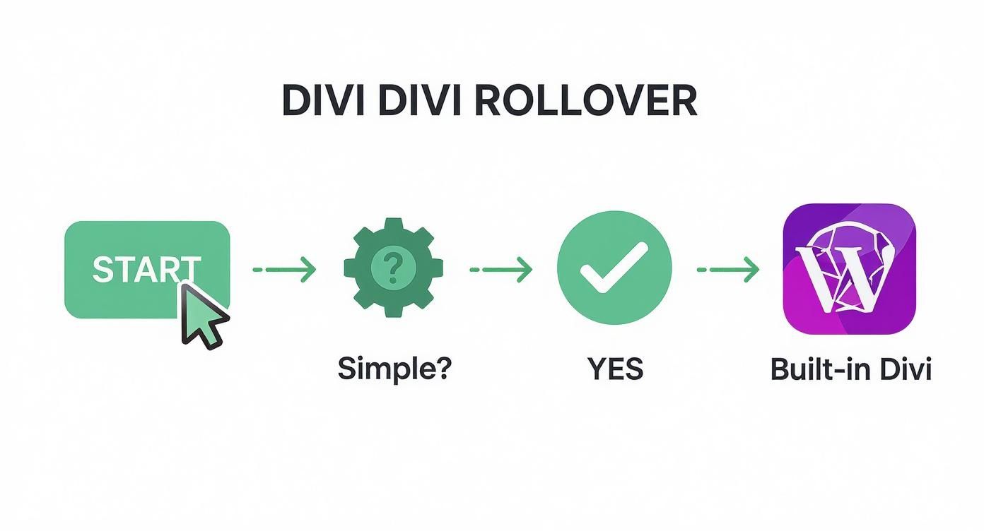
As you can see, for quick and simple effects, Divi's native options are perfect. But for anything more complex or unique, custom code is definitely the way to go.
To make the choice even clearer, let's break down the two approaches.
Choosing Your Divi Rollover Method
| Feature | Native Divi Method | Custom CSS Method |
|---|---|---|
| Speed | Fast to implement, great for quick changes. | Slower initial setup, but fast to replicate. |
| Complexity | Best for simple effects (color, scale, shadow). | Can create anything from zoom/fade to 3D flips. |
| Control | Limited to the options in the Divi Builder. | Total control over every aspect of the animation. |
| Maintainability | Changes must be made module-by-module. | Update the effect site-wide by editing one CSS rule. |
| Skill Level | Beginner-friendly, no code required. | Requires basic knowledge of CSS. |
Ultimately, both have their place. The native Divi method is great for rapid development, while custom CSS is the go-to for creating a signature look that you can easily manage across your entire site.
Crafting a Unique Zoom and Overlay
Let's walk through a real-world example. Imagine you want an image to zoom in smoothly while a dark overlay with text fades in on top. This is a classic effect you see on portfolio or gallery sites, and it's tough to nail without a little CSS. You can bring this to life by adding a few lines of code in your Divi > Theme Options > Custom CSS panel.
With your custom class applied, the CSS snippet you write will handle a few key things:
- Set up the transition: This is what makes the animation smooth instead of jerky. Something like
transition: all 0.4s ease-in-out;is a solid starting point. - Define the initial state: Before the user hovers, the overlay text needs to be invisible. We'd do this with
opacity: 0;. - Create the hover state: When someone mouses over your
.custom-image-hoverelement, the image scales up (transform: scale(1.1);), and the overlay text becomes visible (opacity: 1;).
By separating the structure (the Divi module) from the presentation (your CSS), you unlock incredible flexibility. Need to tweak the effect later? Just edit the CSS once, and it updates everywhere, no need to touch individual modules again.
The shift to modern CSS for these kinds of effects was a huge leap for web performance. Using pseudo-classes like :hover and transition properties lets us create fluid animations that are much lighter than the old JavaScript methods. In some cases, this can improve page load times by up to 50% on sites with lots of interactive images.
If you want to dive deeper, we have a complete guide on how to create a CSS overlay on images that provides more detailed code snippets and instructions to help you master the technique.
Use Plugins for Complex Animations
While Divi's built-in tools are great and custom CSS offers a ton of control, sometimes you just need maximum impact with minimal effort. This is exactly where specialized Divi plugins come into play. They brilliantly bridge the gap between simple hover states and truly complex, interactive experiences—often without you ever having to touch a line of code.
These aren't your average add-ons. They're designed to take the image rollover effect to a whole new level. Instead of just tweaking a color or scaling an image, you can trigger entire layouts or reveal a wealth of detailed information on hover. Plugins like Divi Areas Pro are built specifically for this kind of dynamic content, making advanced interactions accessible to everyone.
Triggering Pop-ups and Modals
A perfect real-world example of this is an e-commerce product grid. Imagine a potential customer browsing your online store. With a plugin, hovering over a product image could instantly trigger a "quick view" modal.
This pop-up isn't just a fancy effect; it's a functional part of the user's journey. It could contain:
- A larger product image or a full gallery.
- Key product details and pricing information.
- An "Add to Cart" button for immediate action.
This approach dramatically reduces friction in the buying process. Customers get the info they need without ever leaving the main shop page, which is a proven way to improve conversion rates by creating a faster, more intuitive browsing experience.
Trying to build this kind of functionality with native Divi tools alone would be incredibly difficult, if not impossible. A good plugin handles all the heavy lifting—the triggers, the pop-up creation, and the display logic—letting you focus on designing the content that goes inside the modal.
Building Hover Areas with Ease
Beyond modals, many of these plugins introduce concepts like "Hover Areas." This feature lets you design a complete section right in the Divi Library and then set it to appear when a user hovers over a specific element.
For instance, you could create a detailed team member bio that slides into view next to their headshot on hover, complete with text, social media icons, and even a contact button.
This method saves a tremendous amount of time and opens up a world of creative possibilities that would otherwise require some serious custom development. If you're looking to explore this, you can learn more about how to get started with Hover Areas and template library support to see just how powerful this technique can be for your Divi website.
Design Rollovers That Actually Work
It's one thing to create an image rollover effect, but making it an effective part of your design is a whole different ballgame. A flashy, over-the-top animation that slows your page down or just confuses people is going to do more harm than good. The real goal is to design an effect that actually improves the user's experience, gives them clear feedback, and fits right in with your brand.
From my experience, the best rollover effects are both subtle and fast. An animation that drags on for too long just feels sluggish and can be genuinely frustrating for a user. You should aim to keep your transitions under 300 milliseconds—that's the sweet spot for a buttery-smooth feel that doesn't get in the way.
This isn't just about making things look nice; speed has a direct impact on engagement. I’ve seen studies showing that e-commerce product thumbnails using simple rollovers had an 18-25% higher click-through rate. And get this: sites that implemented subtle, fast hover animations saw engagement boosts of up to 40%. If you want to see the data for yourself, you can discover more insights about these findings and see what a difference it makes.
Key Design Principles
To make sure your rollovers are helping and not hindering, stick to these core principles. I've learned these the hard way over the years.
- Performance First: Always, always use optimized images. A slick rollover effect is completely worthless if it kills your page load speed and tanks your performance score.
- Accessibility Matters: This is a big one. Remember that hover effects are useless on touch devices. Any information you reveal on hover absolutely must be accessible with a simple tap as well.
- Stay On-Brand: The animation style needs to feel like it belongs on your site. A playful bounce effect might be great for a creative portfolio, but it will feel totally out of place on a serious corporate website.
A successful image rollover should feel like a natural extension of the user's action. It’s a quiet confirmation that the element is interactive, guiding them toward the next step without being a distraction.
Finally, while you're focused on the design, don't forget about search engines. Balancing a great user experience with technical SEO is key. To get a better handle on optimizing your visuals, I'd recommend digging into the relationship between Images and SEO. It’s a crucial piece of the puzzle.
Got Questions About Rollovers? We've Got Answers
Even with the best tools in your back pocket, you're bound to hit a few snags or have some questions when you're setting up an image rollover effect. Let's walk through some of the most common challenges I see designers run into.
Will It Work on Mobile? And Will It Slow Down My Site?
One of the first questions that always comes up is about mobile performance. This is a big one. Standard hover effects just don't translate to touch devices because, well, there's no cursor to hover with. A user's first tap usually registers as a click, which means they blow right past your cool rollover effect.
A smart way around this is to set it up so the first tap triggers the "hover" state, and a second tap actually follows the link. That way, mobile users get the full experience.
Another major concern is site speed. Can these flashy effects bog down your website? The short answer is yes, if you're not careful. A classic mistake is loading huge, unoptimized images for both the default and the hover state. That's a surefire way to increase your page load times.
Always prioritize performance. That means optimizing your images without fail and sticking to efficient, CSS-based transitions instead of getting tangled up in complex JavaScript. A snappy user experience is every bit as important as a slick visual effect.
Accessibility is just as critical. Any text or links that pop up on hover need to be reachable for people using keyboard-only navigation or screen readers. Using the right HTML elements (like actual links and buttons) and adding ARIA attributes when needed makes sure your interactive content is for everyone.
Finally, let's clear up some lingo. People often wonder if there’s a real difference between a "rollover" and a "hover effect." They're often used interchangeably, but "hover effect" is the umbrella term for any change that happens when a cursor moves over an element. An "image rollover," on the other hand, specifically refers to a hover effect where an image gets swapped out or its look changes dramatically.
Ready to build advanced popups, tooltips, and dynamic content without the headache? Divimode makes it simple. Discover how Divi Areas Pro can transform your site at https://divimode.com.
More Articles You Will Like