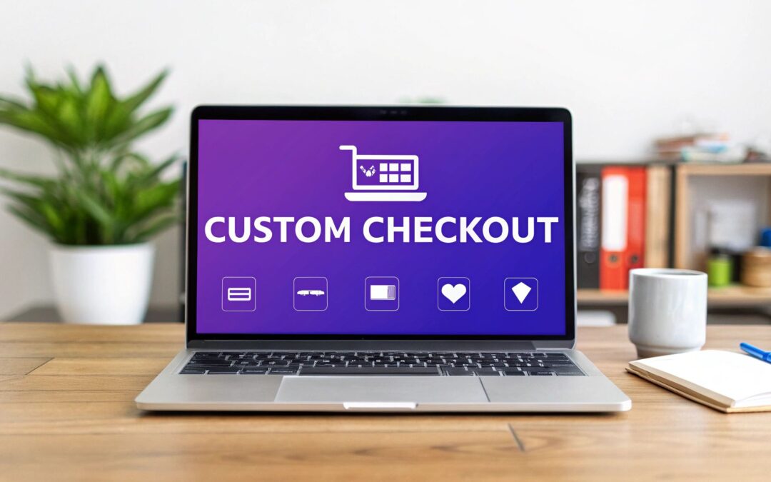
When it comes to customizing your WooCommerce checkout page, the easiest route by far is using a theme builder like Divi paired with a powerhouse plugin like Divi Areas Pro. This combo lets you visually craft a completely new layout, tweak form fields, and inject custom content—all without touching a single line of code. It’s the difference between the standard, rigid checkout and a fully branded, conversion-focused experience.
Why Your Default Checkout Is Losing You Money
Let's be honest. The standard WooCommerce checkout page is built for one thing: function. It processes orders reliably, but it does absolutely nothing for conversions. Its generic, one-size-fits-all design creates friction at the most critical moment of the customer journey.
Put yourself in your buyer's shoes. They’ve browsed your store, found something they love, and are ready to pull out their credit card. Then they hit a wall—a cluttered, uninspiring page that feels totally disconnected from the rest of your beautifully designed brand.
This disconnect isn't just a cosmetic problem; it has a very real impact on your bottom line.

Unnecessary Fields and Friction
Out of the box, the default layout is often loaded with fields that are completely irrelevant for many businesses. Why ask a customer buying a digital download for their full shipping address? It just adds unnecessary steps and breeds confusion. Every single extra field is another chance for a customer to second-guess their purchase or just give up.
For instance, most B2C stores have no use for a "Company name" field, yet there it is, cluttering up the form. Simply removing it is a small change that instantly streamlines the process and shows you respect your customer's time.
Weakened Brand Trust
A generic checkout page can single-handedly erode the trust you've worked so hard to build. When that final step looks like a generic third-party form, it can make your whole operation feel less professional.
On the other hand, a checkout that mirrors your site's branding—using the same colors, fonts, and logos—reassures customers that they're in the right place and that their payment information is secure.
A checkout page is your final sales pitch. If it looks untrustworthy or is difficult to use, you're essentially telling the customer you don't value their business enough to perfect the final step.
This is exactly why the industry is moving toward block-based, drag-and-drop customization tools. It's a recognition that empowering store owners to create personalized experiences is non-negotiable for growth. This trend helps combat the staggering global cart abandonment rate, which sits around 70%, by building trust right where it matters most. You can dive deeper into these 2025 WordPress and WooCommerce trends on cospark.com.
Taking control of your checkout design with Divi isn't just about making things look pretty. It’s a strategic business decision to stop leaving sales on the table and start delivering a seamless, trustworthy experience that encourages not just first-time purchases, but repeat business too.
If you want to truly customize the WooCommerce checkout page, you're going to need a few powerful, flexible tools. While there are a lot of plugins out there, my personal go-to combo for achieving complete control is the Divi theme builder paired with our Divi Areas Pro plugin. This setup isn't about making small tweaks; it lets you rebuild the entire checkout experience from the ground up.

The reason this duo works so well together is that Divi provides the visual builder, and Divi Areas Pro is the key that unlocks the ability to inject that custom-designed content into protected WooCommerce pages. Normally, areas like the checkout are locked down tight, but this approach completely bypasses that limitation, effectively giving you a blank canvas to work with.
The Power of This Combination
When you put these tools together, you gain a massive advantage. You're no longer stuck with the rigid, cookie-cutter structure of the default checkout template. Instead, you can design any layout you can dream up, drop in any Divi module, and style every single element to perfectly match your brand's look and feel.
This freedom is absolutely critical for building trust and standing out. With over 6 million active stores, WooCommerce commands a massive 38.76% of the market, making it an eCommerce powerhouse. This popularity just highlights how vital a unique, branded checkout page is for differentiating your store and boosting conversions.
The real magic happens when you turn your checkout page from a boring payment form into a dynamic, conversion-focused asset. Think about it: you can add testimonials, trust seals, or even a quick FAQ section right into the layout where your customers need them most.
Before we dive into the fun part, let's take a quick look at the differences between a standard checkout and what you can build.
Standard WooCommerce Checkout vs Custom Divi Checkout
This table really drives home the limitations of the default setup and the massive potential you unlock by building your own.
| Feature | Default WooCommerce Checkout | Custom Divi Checkout |
|---|---|---|
| Layout & Design | Rigid, single-column layout with very limited styling options. | Complete freedom. Any layout, any Divi module, fully branded to your store. |
| Content | Limited to the default fields. Cannot add extra content easily. | Add testimonials, security badges, FAQs, or any custom content you need. |
| User Experience (UX) | Can feel generic and disconnected from the rest of the site. | Create a seamless, on-brand journey that builds trust and reduces cart abandonment. |
| Conversion Tools | Lacks built-in conversion optimization elements. | Easily add trust signals, upsells, or countdown timers to encourage completion. |
| Responsiveness | Basic responsiveness, but limited control over mobile-specific design. | Full control over desktop, tablet, and mobile layouts for a perfect experience. |
As you can see, going custom isn't just about looks—it's about creating a smarter, more effective checkout process that actually helps you sell more.
Your Prerequisite Checklist
Before we get our hands dirty with the build, let's make sure your website is primed and ready. This method requires a specific set of tools to work its magic. Double-check that you have the following installed and activated on your WordPress site:
- WooCommerce: The core eCommerce engine for your store.
- The Divi Theme: Your foundational theme and visual builder.
- Divi Areas Pro: The plugin that makes all the custom content injection possible.
And if you want to take your checkout capabilities even further, a solution like the Blockbee WooCommerce Plugin with checkout integration can be an excellent addition to your toolkit.
With these three prerequisites in place, you've got everything you need to transform that standard checkout into a high-converting, custom-branded experience. This setup is the foundation for all the cool customizations we'll cover next. It's the difference between just painting the walls and completely remodeling the house.
Designing Your Custom Checkout Layout in Divi
Alright, now for the fun part—let's actually build your new checkout page. This is where we move past the theory and get our hands dirty with Divi and Divi Areas Pro to truly customize the checkout page in WooCommerce. The end goal is a clean, on-brand, and intuitive layout that feels like a seamless part of your store, not a clunky afterthought.
First up, you’ll need to create a new Divi Area. Think of this as a reusable content block that you can place pretty much anywhere on your site. Once you've got a new Area set up, you’ll assign it to the "WooCommerce Checkout Page" location inside the Divi Areas Pro settings. That one simple move swaps out the default, rigid template for your very own custom-built Divi layout.
Structuring the Page for Clarity
From my experience, the most effective checkout pages are often the simplest. I almost always recommend a clean, two-column layout because it creates a logical separation of information that just makes sense to the customer.
- Left Column: This is where you’ll put the main checkout form itself.
- Right Column: This side is perfect for the order summary, maybe some trust badges, and the payment options.
To get this done, just add a two-column row in the Divi Builder. The real magic, though, is the [woocommerce_checkout] shortcode. Drop a Text or Code module into your main column (I usually use the left one) and paste that shortcode inside. This single bit of code is what actually pulls in all the essential checkout fields, payment gateways, and the core WooCommerce functionality.
The
[woocommerce_checkout]shortcode is your foundation. Your Divi design is the beautiful, high-converting framework you build around it. You're not replacing WooCommerce's functionality, just its default presentation.
With that shortcode in place, the rest of the design process is all about using the standard Divi modules you already know and love. It’s a visual process that, as you can see in the image below, really comes down to adding your fields and elements, styling the page, and then testing everything thoroughly.

This workflow shows just how streamlined the process can be, proving that a powerful, custom checkout is totally achievable. This structure is a great starting point, and if you're building a complete store from the ground up, our guide on how to create an online store with Divi and WooCommerce provides the full roadmap.
Styling Elements to Match Your Brand
Now that the structure and shortcode are set, you can start styling every single element using the Divi Builder. This is where your brand identity really gets to shine. As you design, it’s vital to apply a solid understanding user experience (UX) and user interface (UI) principles to make sure the page isn’t just pretty, but also incredibly easy for customers to use.
Jump into the Design tab and start adjusting:
- Fonts: Make sure your headings, labels, and input fields match the typography you use across the rest of your site. Consistency is key.
- Buttons: Customize the color, size, and hover effects for the "Place Order" button. It needs to be an unmistakable call-to-action.
- Backgrounds: You can set a subtle background color or even an image for the entire section or for individual columns to create some visual depth and hierarchy.
The Divi Builder gives you incredibly fine-grained control over every little detail. Your checkout page can, and should, have a high level of polish.
Streamlining Your Checkout With Custom Fields

A beautiful layout is a fantastic start, but now we need to talk about the actual information you collect from customers. This is where you can truly fine-tune the checkout experience to cut down on friction and make the buying process feel effortless. The goal here is simple: only ask for what you absolutely need.
Think about it—every extra field is a tiny speed bump between your customer and a completed purchase. By thoughtfully trimming, adding, or just rearranging fields, you're not just organizing a form; you're respecting your customer's time and smoothing out their path to conversion. And the best part? You don't need a separate field editor plugin for this. The combo of Divi and some simple custom code gives you all the control you need.
For instance, if you're selling directly to consumers (B2C), that "Company name" field is often just clutter. Removing it instantly makes the form look cleaner and less intimidating. On the flip side, if you sell products that are frequently bought as gifts, adding an optional "Gift message" field is a powerful, personal touch that genuinely improves the experience.
Practical Field Customization Examples
Let's get practical. Beyond just removing fields, you can add new ones that bring value to both you and your customer. This kind of personalization is quickly becoming a must-have for standing out from the crowd.
A few ideas from my own projects include:
- Adding a "How did you hear about us?" field: This gives you priceless marketing data straight from the source.
- Including a "Delivery instructions" text area: This is a lifesaver for your fulfillment team and delivery partners, cutting down on support tickets and failed deliveries.
- Creating an optional "Gift wrapping" checkbox: A simple yet incredibly effective upsell that adds real value.
These aren't just cosmetic tweaks; they are functional upgrades that make your store work smarter. Deep personalization—like adding text inputs for custom engravings or date pickers for scheduled deliveries—has been shown to make a real impact on sales. In fact, some studies show this level of checkout customization can boost conversions by 10-30%. You can dig into more insights about product personalization over at wpdesk.net.
Styling Your New Fields With Divi
Once you've added your new fields using a functions.php snippet, the final piece of the puzzle is making them look like they belong. Nothing screams "amateur" like an unstyled field sticking out like a sore thumb, ruining the slick design you've worked so hard on. Luckily, Divi makes this part a breeze.
You can use Divi’s built-in CSS options to target these new fields directly. Just head into your Divi Area's settings, pop open the "Advanced" tab, and drop in your custom CSS.
Pro Tip: Your browser's "Inspect" tool is your best friend here. Use it to find the specific CSS classes or IDs for your new fields. This lets you apply laser-focused styling—like adjusting margins, fonts, and colors—to make them blend perfectly with the rest of your Divi-designed form.
By pulling together a clean layout with thoughtfully curated and styled fields, you create a checkout experience that isn't just nice to look at, but is also incredibly efficient. This attention to detail is what separates a good checkout page from a great one that drives sales and builds lasting customer loyalty.
Advanced Strategies to Boost Checkout Conversions
Getting your custom checkout layout built is a huge win, but your work isn't done just yet. Now comes the fun part: fine-tuning your design with conversion-focused elements that build trust and stamp out any last-minute hesitation. This is where we turn a good-looking page into a genuine sales machine.
A major reason customers abandon their carts is a sudden wave of uncertainty. You can fight this by strategically placing trust signals right where they’re most effective. The good news is, you can do this easily with standard Divi modules inside your new Divi Area.
For instance, you could drop an Image module into your sidebar to show off security badges. Think SSL certificates or familiar payment logos like Visa, Mastercard, and PayPal. This small visual cue instantly tells shoppers their financial info is in good hands.
Key Insight: Your checkout page isn't just a form; it's the final sales pitch. Elements like a money-back guarantee or a customer testimonial don't just fill empty space—they actively dismantle a buyer's natural skepticism at the most critical moment.
Create a Distraction-Free Checkout
One of the most powerful moves you can make is to create a completely distraction-free checkout. The whole point is to remove every single link or element that could possibly lure a customer away from completing their purchase. That means hiding your website’s main header and footer.
Divi Areas Pro makes this incredibly simple to pull off.
- Head over to your custom checkout Area’s settings.
- Click on the Behavior tab.
- Just enable the options to Hide Site Header and Hide Site Footer.
By toggling these two settings, you immediately focus the shopper's attention on the one thing that matters: filling out the form and hitting "Place Order." We know from countless studies that a confusing or lengthy checkout is a top reason for cart abandonment, and stripping away unnecessary navigation is a direct fix.
Proactively Address Customer Questions
What happens when a customer has a last-second question about shipping times, your return policy, or a product detail? If they can’t find an answer fast, they’re gone. You can get ahead of this by building support elements right into your checkout layout.
A simple trick is to add an FAQ section using a Divi Toggle module. Preload it with answers to your top three most common pre-purchase questions. This keeps the customer on the page and gives them the confidence boost they need to move forward. You could also add a simple Text module with a link to your support chat or contact page, giving them an immediate outlet for trickier questions.
Another smart tactic is leveraging popups to solve problems before they happen. For example, an exit-intent popup offering a small discount can be a fantastic way to recover someone who's about to leave. If you want to dive deeper into this, we have a whole guide on how to increase ecommerce sales with popups. These advanced strategies are what ensure your efforts to customize the WooCommerce checkout page actually translate into more sales.
Whenever you start tweaking something as critical as your store's checkout page, a few questions inevitably pop up. It's completely normal. Getting these technical and strategic points sorted out upfront will make the whole process feel less daunting and give you the confidence that you're making the right moves for your business.
Let's walk through some of the most common questions I hear from Divi users.
One of the first things people want to know is if they can build a slick, one-page checkout using Divi and Divi Areas Pro. The answer is a big, emphatic yes. You simply embed the [woocommerce_checkout] shortcode into your custom Divi layout, and just like that, you've combined the cart, customer details, and payment options onto a single, streamlined page. This is a fantastic way to slash the number of steps a customer has to take, which can give your conversion rate a very nice boost.
Will My Payment Gateways Still Work?
This is a big one. People worry if their existing payment gateways—like Stripe or PayPal—will break. You can relax. They will work perfectly.
The [woocommerce_checkout] shortcode is the engine that pulls in all of your core WooCommerce functionality, and that absolutely includes the payment processors you’ve already set up. Your slick new Divi design is just a much nicer-looking "wrapper" for these essential functions. As long as your gateways are configured correctly in your main WooCommerce settings, they'll show up and work just fine on your new page.
The key thing to remember is that this method neatly separates design from function. Divi and Divi Areas Pro are in charge of the "look and feel," while WooCommerce keeps handling the mission-critical backend tasks like payment processing and order creation.
A common "what if" scenario I get asked about is what happens if you ever deactivate Divi Areas Pro. No sweat. If you turn the plugin off, your site will just fall back to the standard WooCommerce checkout template. Your store stays open for business, and you won't lose any data. You can always reactivate the plugin later to bring your custom design right back.
How Can I Safely Test My New Checkout?
And finally, the million-dollar question: how do you test all this without messing things up for your live customers? The gold standard here is to use a staging site.
A staging site is just a private copy of your live website where you can break things without consequence. Most quality web hosts offer one-click staging environments these days. This lets you build, tweak, and test your new checkout design completely risk-free. Once you're 100% happy with how it looks and functions, you can push the changes over to your live site with a click.
This process ensures your hard work leads to a better user experience, not a frantic support ticket. And if you're looking for more ways to engage customers, check out our guide on how to use popups for sales promotions. It’s a great way to complement a frictionless checkout.
Ready to take full control of your checkout and every other part of your website? Divimode is your toolkit for building more engaging, higher-converting websites with Divi.
Discover Divi Areas Pro and transform your site today at Divimode!
More Articles You Will Like