Before you even think about opening the Divi builder, let's get one thing straight: dedicated landing pages will always outperform generic website pages. It’s a foundational principle. Sending your campaign traffic to a super-focused page with a single, clear goal is the fastest route to boosting conversions. Sending them to a homepage with a dozen different links? That's just a recipe for distraction and confusion.
Why Focused Landing Pages Win
Think of your website's homepage like a bustling city square. You've got streets leading everywhere—to your blog, your about page, your services section. It’s incredibly easy for a new visitor to get lost or sidetracked.
A landing page, on the other hand, is a straight, well-lit path leading to a single destination. Its entire purpose is to guide a visitor toward one specific action. This makes the decision to convert feel natural and frictionless.
I’ve personally seen marketing campaign results double, sometimes even triple, just by switching from sending traffic to a homepage to a dedicated landing page. This isn't about flashy design; it's pure strategic focus. When you strip away the main navigation, the footer, and all those other outbound links, you effectively plug any "leaks" and keep your visitor locked into the conversion journey you've meticulously designed for them.
The Power of a Single Goal
Every single element on a great landing page—from the headline and the hero image right down to the button text—works in harmony to support one objective. This laser-focus creates a powerful, persuasive argument that a general-purpose page simply can't match. The clarity it brings makes it dead simple for visitors to understand what you're offering and say 'yes'.
The real magic of a high-converting landing page is its simplicity. By presenting one clear offer and one clear action, you eliminate decision fatigue. You make it incredibly easy for your audience to convert.
Just look at the kind of performance metrics you can expect from a well-optimized landing page.
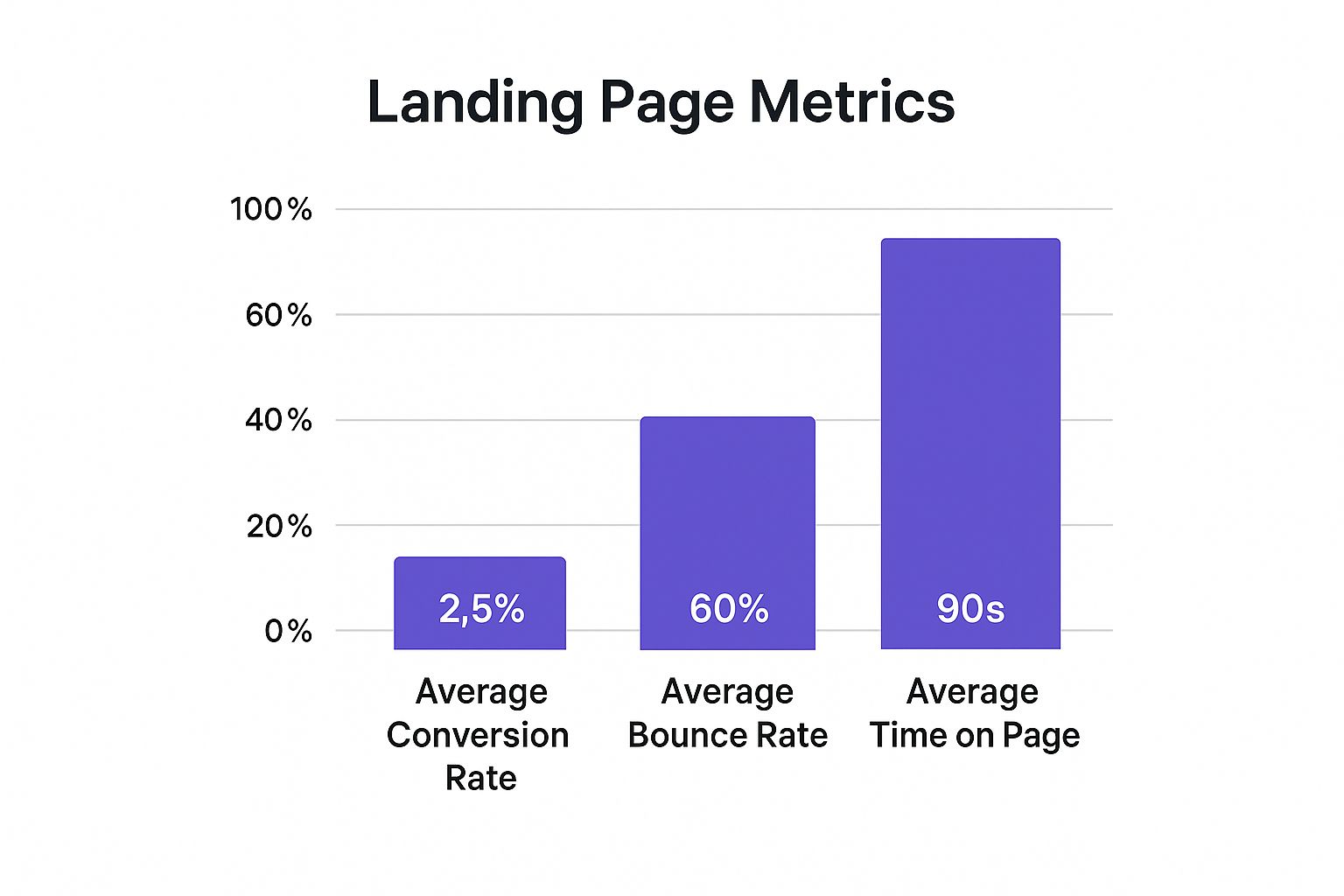
These numbers tell a clear story. While bounce rates can sometimes be high, the visitors who do stick around are far more engaged and much more likely to take that final step.
The data doesn't lie. Below is a simple comparison that really drives home why this focused approach is so critical for lead generation.
Conversion Rate Comparison by Form Type
This table illustrates the superior performance of dedicated landing pages compared to other common lead capture methods.
| Form Type | Average Conversion Rate |
|---|---|
| Dedicated Landing Page | 26% |
| Pop-up Form | 3% |
| Standard Website Sign-up Box | 2% |
This massive difference highlights why learning how to build landing pages the right way is such a crucial skill for any digital marketer or business owner. It's not just a minor improvement; it's a complete game-changer for your campaign's ROI.
If you're looking for more guidance, be sure to check out our article covering 4 tips to create the perfect landing page.
A landing page that actually converts is built on a solid strategy, not just a slick design. Before you even think about dragging and dropping modules in Divi, you need a blueprint. This is where the real work happens—the stuff that sets the stage for every single design choice you’ll make down the line.
It all starts with one crystal-clear, non-negotiable goal. What's the one thing you need a visitor to do? Request a demo? Download your new guide? Snag a seat for your next webinar? This isn't a wish list. It's a single objective that will dictate every word, every image, and every button on the page.
If the goal is a demo request, the whole page needs to build a compelling case for seeing your product in action. If it's a guide download, your focus shifts to the incredible value and knowledge inside. Trying to cram both onto the same page just muddies the waters and leaves visitors confused. And confused visitors don't convert.
Digging into Your Audience's Mind
Once your goal is set in stone, it’s time to get inside your ideal customer's head. A truly powerful landing page speaks directly to a visitor's problems, not just your product's features. You have to ask the hard questions:
- What specific pain point does my offer solve for them, really?
- What frustrations are they dealing with right now that my solution completely eliminates?
- What's the end result they're actually dreaming of?
Let's say you're selling project management software. Don't just list "task tracking" as a feature. That's boring. Instead, hit them where it hurts: "Stop letting important deadlines slip through the cracks." See the difference? You've just shifted from a dry feature to a benefit that resonates on an emotional level.
Thinking about your audience also means seeing how this page fits into the bigger picture. A solid SaaS marketing plan is all about turning strangers into loyal customers, and this landing page is one of the most critical steps in that entire journey.
Drafting Your Core Message
With a clear goal and audience insight, you can finally start writing. This is the part where you hammer out the core message before getting sidetracked by fonts and color palettes in Divi.
The most beautiful landing page on the planet will fall flat if the message doesn't connect. Your headline and core copy are responsible for 80% of the conversion power; the design is there to support and amplify it.
Start with your headline. It needs to be a showstopper—something that grabs them by the collar and immediately communicates your value. From there, draft your benefit-driven subheadings and punchy bullet points, all tying back to the pain points you uncovered earlier. This messaging framework is the real skeleton of your page. It ensures that every design decision you make serves one purpose and one purpose only: getting that conversion.
Bringing Your Page to Life With Divi
Okay, the blueprint is solid and your message is locked in. Now for the fun part: translating that vision into a real, live landing page. This is where we get our hands dirty inside of Divi. We're not using a pre-made template here; we're starting from scratch to build a layout that strategically pulls your visitor's eye exactly where you want it to go.
The first—and I'd argue most critical—piece of the puzzle is your hero section. This is the prime real estate "above the fold," the very first thing people see. Get this wrong, and you've lost them before they even scroll.
Constructing a Compelling Hero Section
Your hero section has one job with three parts, and it needs to do it all in about five seconds: grab attention, clearly state your value, and show them what to do next (the CTA). This isn't the place for complex, artsy designs. Clarity is king.
Fire up a new standard section in Divi. Inside that, pop in a row and start adding your core modules. A classic, high-converting hero section almost always contains:
- A Headline Module: For that big, bold, attention-hooking headline.
- A Text Module: For the subheadline that adds context and support.
- A Button Module: Your main Call-to-Action. Make it obvious.
- An Image or Video Module: A powerful visual that reinforces your message.
My biggest tip here? Be generous with whitespace. A cluttered hero is an overwhelming hero. Give every element room to breathe. All that negative space acts like a spotlight, pushing the user's focus right onto your headline and that all-important CTA button.
Structuring the Narrative Flow
With the hero section built, the rest of your page needs to tell a story. Each section is like a chapter, logically guiding the reader from their initial problem toward the only sensible conclusion: clicking your button.
I’ve found this flow to be incredibly effective time and time again:
- The Problem: Start by poking at the pain point. Show them you understand the struggle they're dealing with.
- The Solution: This is where you introduce your offer as the clear, obvious answer, but focus on the benefits (what their life looks like after) not just the features (what your thing does).
- The Proof: Back it up. Use testimonials, case studies, or client logos to build trust and squash any skepticism.
- The Final Push: End with a strong, final call-to-action. Don't be shy about asking for the click one last time.
Divi’s visual builder makes arranging this story a breeze. You can literally drag and drop entire sections until the flow just feels right. A clean, organized layout like the one below is what you're aiming for.
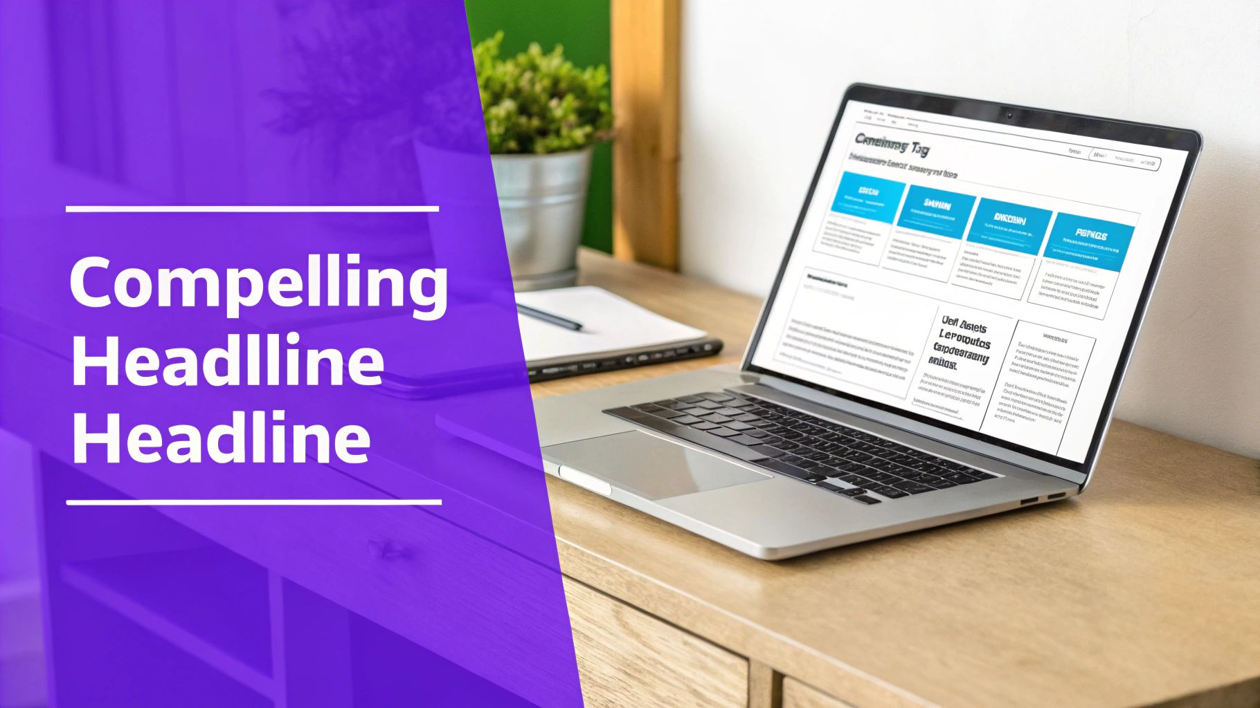
This example gets it right. Strong visuals, clear headings, and plenty of whitespace—it all works together to create an experience that feels professional and easy to digest.
Leveraging Core Divi Modules
Your journey learning how to build landing pages with Divi really comes down to mastering a handful of key modules. Divi is packed with options, but you don't need most of them for a high-performing landing page.
A great landing page isn't about using the most modules; it's about using the right modules to their fullest potential. Focus on tools that directly support your single goal.
These are the workhorses you'll come back to again and again:
- Form Module: Absolutely essential for lead generation. Keep it simple—only ask for the information you truly need.
- Button Module: The heart of your page. Use a color that pops against the background and write action-oriented text ("Get My Free Guide" vs. "Submit").
- Testimonial Module: The quickest way to drop in social proof without needing to custom-style anything.
- Blurb Module: Fantastic for listing out benefits. Pairing an icon with a short block of text makes your points scannable and visually engaging.
By combining a powerful hero, a logical story, and these core Divi modules, you'll be well on your way to turning that strategic plan into a conversion machine.
Alright, you've got the bones of your landing page in place. The wireframe is solid. Now it's time to get into the nitty-gritty, the stuff that separates a page that looks good from a page that actually converts.
This is where we fine-tune the details that work on a psychological level—the small tweaks that build trust, create urgency, and make clicking that button feel like a no-brainer. This is how you go from getting traffic to getting customers.
One of the most powerful changes you can make is also deceptively simple: get rid of your website’s main navigation and footer.
Seriously. On a regular website, they're essential for navigation. But on a landing page? They're conversion killers. Every link to your "About Us" page or blog is an escape hatch, pulling visitors away from the one action you need them to take. By removing them, you create a focused, distraction-free environment.
Engineering A Compelling Call-to-Action
Your Call-to-Action (CTA) isn't just a button. It's the grand finale of your page's entire pitch. Getting it right is about so much more than picking a bright color. The best CTAs use language that is clear, action-oriented, and packed with value.
- Ditch the generic words: "Submit" and "Click Here" are lazy. They don't inspire anyone.
- Talk like your visitor: "Get My Free Guide" almost always beats "Get Your Free Guide." It feels more personal.
- Promise a specific outcome: "Start My 14-Day Free Trial" is way more enticing than a vague "Sign Up."
The data backs this up. Across countless industries, personalized CTAs have been shown to convert a staggering 42% more visitors than generic ones. It's a tiny copy change with a potentially massive impact. If you're hungry for more, our complete guide is packed with tips to create a high-converting Divi website.
Building Unshakable Trust With Social Proof
Every visitor lands on your page with a healthy dose of skepticism. Your first job is to tear that wall down, and social proof is your best tool for the job. It's the digital version of a trusted friend's recommendation.
People don't trust marketers; they trust other people. Strategically placed testimonials, reviews, and trust badges are your proof that you deliver on your promises.
Make sure to place these trust-builders near your CTA. Seeing a 5-star review right next to the "Buy Now" button can be the final push a hesitant prospect needs to feel confident in their decision. To really nail this, look into the best practices for testimonial website design to see how you can maximize credibility and drive action.
Creating Genuine Urgency and Scarcity
Let's be honest: if you give people a chance to "think about it," they probably will… and then forget. You need to give them a reason to act now. Urgency and scarcity are powerful psychological triggers that combat procrastination.
You can easily bake this into your Divi page with things like:
- Countdown Timers: Perfect for limited-time offers or webinar sign-ups.
- Stock Counters: "Only 7 spots left!" creates an immediate fear of missing out.
- Time-Sensitive Bonuses: "Sign up today and get our bonus checklist for free."
This isn't just a gimmick; it works. Studies have shown that shorter landing pages with clear, urgent CTAs can outperform longer, more passive versions by up to 13.5%. When you combine a focused layout with these powerful conversion elements, you’re not just asking for a conversion—you're earning it.
Advanced Engagement With Divi Areas Pro
A static landing page can certainly get the job done, but a dynamic page—one that intelligently reacts to your visitor's behavior—is where the real magic happens. This is your chance to layer in automated, interactive elements using Divi Areas Pro. And I'm not talking about flashy, distracting effects. These are strategic tools designed to capture attention at the most critical moments, giving your conversion potential a serious lift.
Think of it as adding a safety net for your conversions. One of the most powerful examples I've seen in action is the exit-intent popup. The moment a visitor’s cursor moves towards the back button or to close the tab, you can trigger a last-ditch offer. Maybe it’s a special discount, a bonus resource, or a simple invitation to chat. This single feature can rescue otherwise lost leads by giving them a compelling reason to stick around.
Subtle Nudges and Personalized Content
Now, not every interaction needs to be as bold as a full-screen popup. Sometimes, a gentle nudge works far better. This is where slide-in notifications really shine.
For instance, you could set a slide-in to appear after a visitor scrolls past a certain point—say, 50% of the page. This is the perfect time to subtly reinforce a key benefit or remind them of your core value proposition without completely derailing their reading flow. It’s less aggressive but incredibly effective at keeping your main offer top-of-mind.
You can design and trigger all these interactive Areas right from the familiar Divi Builder interface, which is a huge time-saver.
The real power is tucked away in the "Display" and "Triggers" tabs. This is where you get to define exactly when and how your interactive content appears.
The most advanced technique here is creating conditional inline sections. Imagine a section of your page that only appears if a visitor clicked through from a specific ad campaign, or if they have a certain product in their WooCommerce cart. This kind of personalization makes your message feel incredibly relevant, showing the visitor that you genuinely understand their context. You can dig into all the possibilities by exploring the powerful features within Divi Areas Pro and see how they can improve your site.
Using dynamic content isn't about adding complexity for the sake of it. It's about delivering the right message to the right person at the exact right time. It transforms a one-size-fits-all page into a personalized experience.
Here are a few practical scenarios where I've seen these dynamic elements make a huge difference:
- Exit-Intent Popup: Offer a 15% discount code to visitors who are about to abandon their cart.
- Slide-In Notification: After a user scrolls past your pricing table, a slide-in appears with a testimonial from a happy customer, reinforcing social proof.
- Conditional Section: Show a special "Welcome Back!" message and a unique offer for returning visitors who have been to the page before.
By mastering these advanced engagement tactics, you’re no longer just building a static landing page. You're engineering a responsive conversion system that adapts to each visitor, dramatically increasing your chances of success.
Launch, Test, and Improve Your Page

Alright, you’ve built your page, and it looks great. Time to hit "publish" and watch the leads roll in, right? Not so fast.
Hitting publish isn't the finish line; it’s really just the starting gun. A truly high-converting page is one that evolves based on what real people do, not just on our best guesses. It's a living document. Honestly, this is the stage most people skip, and it’s where the biggest wins are almost always hiding.
The secret is to get into an iterative mindset. You launch, you watch the data, you tweak, and you do it all over again. Each cycle gets you closer to an unbeatable conversion machine. This is how you go from building a landing page to building one that actually works.
The A/B Testing Framework
A/B testing, also called split testing, is your best friend here. The concept is refreshingly simple: you create a second version of your page (the "B" version) where you've changed just one key thing. Then, you show each version to half of your visitors. The good news? Divi has a built-in split testing feature that makes setting this up a breeze.
You'll want to start with the elements that have the biggest potential impact on a user's decision. Based on my experience, this is the testing hierarchy I follow:
- The Headline: It’s your first impression. A stronger, clearer headline can slash your bounce rate.
- The Call-to-Action (CTA): What does the button say? What color is it? Where is it on the page? Test it.
- The Hero Image: Does a slick product shot work better than an image of a happy customer? You won't know until you test.
- The Form: Could you get more sign-ups just by asking for less information? Test a version with fewer fields.
The golden rule of A/B testing is to only test one variable at a time. If you change the headline and the button color, you’ll never know for sure which change was responsible for the lift in conversions.
Monitoring Key Metrics
To figure out what to test, you need to understand how people are behaving on your page. This is where your analytics come in. After your page is live, setting up robust Google Ads conversion tracking is non-negotiable if you want to accurately measure performance and make smart optimizations.
Once that's all hooked up, keep a close eye on a few key metrics:
- Bounce Rate: If this is high, it's a huge red flag that your headline or hero section isn't connecting with the audience you're sending to the page.
- Average Time on Page: Are people bailing immediately, or are they actually scrolling and reading? A low time-on-page tells me the copy isn't engaging enough.
- Conversion Rate: This is the big one—your ultimate success metric. It’s the raw percentage of visitors who are doing the thing you want them to do.
When you combine the "what" from your A/B tests with the "why" from your analytics, you create a powerful feedback loop. This data-driven approach takes all the guesswork out of the equation, letting you systematically improve your page until it's converting at its absolute peak.
Common Landing Page Questions Answered
https://www.youtube.com/embed/eiIhTbFP0ls
As you get your hands dirty building landing pages, you'll find a few questions pop up again and again. Getting solid answers to these can help you sidestep common roadblocks and really cement the core ideas we've covered in this guide. Think of this as your quick-reference cheat sheet for building with confidence.
Let's start with one of the most common debates: page length. The truth is, there's no magic number. It all comes down to the complexity of your offer.
How Long Should My Landing Page Be?
The length of your page should directly match the level of commitment you're asking for. A simple ask deserves a simple page.
For something low-commitment like a newsletter signup, a short, punchy page is perfect. You can often get the job done almost entirely within the hero section with a single form. Since the ask is small, the pitch can be brief.
But what if you're selling a high-ticket service or a complex piece of software? That's when you need more room to build your case. A longer page becomes essential for detailing benefits, showcasing robust social proof like case studies, and addressing every potential question in a thorough FAQ. You need that extra real estate to build enough trust to justify the bigger commitment.
Another point that often trips people up is site navigation. It seems like a small detail, but it has a huge impact.
The single biggest mistake you can make on a landing page is giving visitors an easy way out. Your goal is one action, and every link that doesn't lead to that action is a distraction.
Should I Hide the Navigation Menu?
Yes, always. The entire point of a landing page is to funnel a visitor toward a single conversion goal. Your website's main navigation menu—with all its links to Home, About, Blog, etc.—presents a dozen different choices that pull visitors away from that goal.
By removing the header navigation and the footer links, you create a focused, high-intent environment. This simple change is one of the most effective ways to keep users on the path you've designed, which almost always results in a higher conversion rate.
Finally, when it's time to start improving your page, knowing where to start is key.
What’s the Most Important Element to A/B Test First?
Always, always begin by split-testing your headline. It's the very first thing a visitor reads, and it carries about 80% of the weight in their split-second decision to stay or bail. A powerful headline that instantly communicates your core value proposition can have the single greatest impact on your page’s performance.
Once you’ve nailed down a winning headline, the next logical element to test is your primary Call-to-Action (CTA). This isn't just the button copy; it also includes its color, size, and placement on the page.
Ready to build interactive, high-converting landing pages with ease? Divimode provides the tools and expertise you need. Elevate your Divi site today with Divi Areas Pro and start turning more visitors into customers.
More Articles You Will Like