It happens all the time – people click on ads and ‘land’ on a familiar page only to discover that what initially motivated them to click is not there, or even worse, it’s there, but they cannot find it.
A landing page is a promise that you make to your target market. And it’s a promise that you must keep if you don’t want to hand out customers to your competitors. When users open the page, you need to ensure that the offer is compelling and site elements are effective enough to make them opt for the offer.
But, having a compelling offer is just the tip of the iceberg. Without further ado, let’s outline the four key tips to create the perfect landing page.
Table of Contents
- 1. Have a Prominent Headline
- 2. Hook Above the Fold
- 3. Write a Clear and Relevant Copy
- 4. Incorporate Engaging Media
- Wrapping Up
1. Have a Prominent Headline
When speaking about headlines, David Ogilvy has famously said:
“On the average, five times as many people read the headline as read the body copy. When you have written your headline, you have spent eighty cents out of your dollar.”
This quote is from ages ago, but it still resonates with how powerful headlines are today!
The headline is the first thing that users see when they click on the landing page, and it’s what motivates them to sign up for the product at hand. Even though the landing page headline consists of only a few words, it must be prominent and powerful enough to ignite a strong interest within the users.
The following are the key aspects of a powerful landing page headline:
- Didactic: It’s informative and lets users know what the product is about.
- Evident: It’s clear, and there’s nothing vague about it.
- Relevant: It delivers the promise that you’ve made with your advertisement.
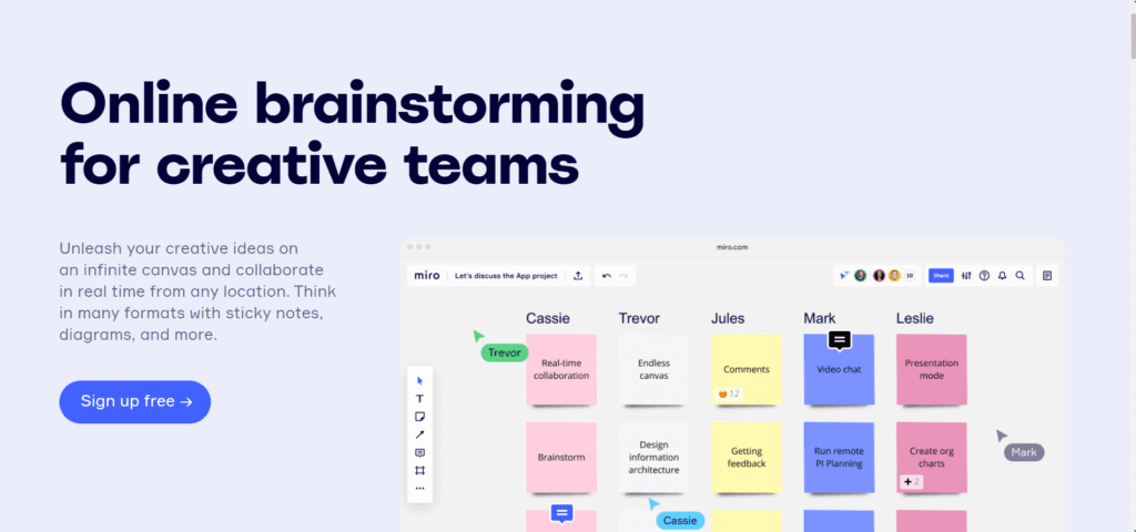
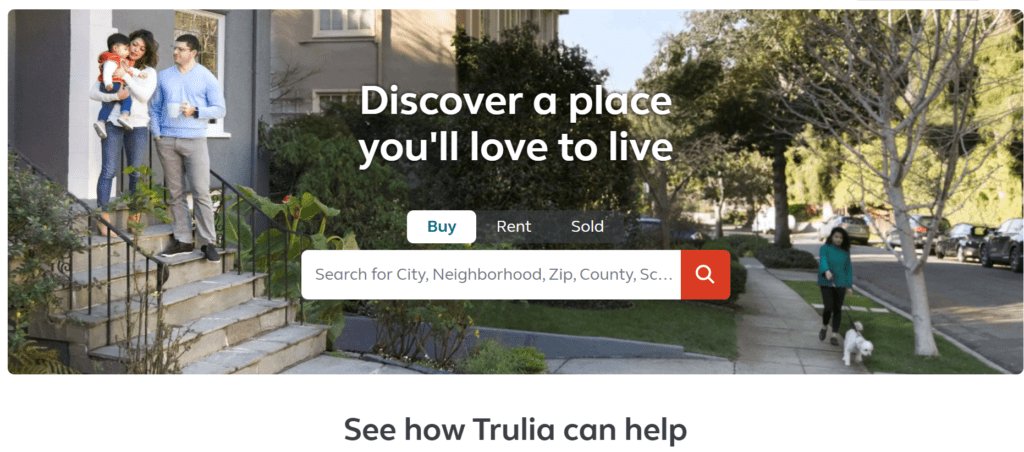
The following is an example of a landing page that applies each of the headline aspects above:

This is concise and direct, capitalizing on what users need and how that will be delivered to them by clicking the CTA button.
Furthermore, you need to put sub-headlines to the test by adding a couple of extra sentences below your main headline that reinforce the benefits that you provide.
Here’s another example of a landing page that includes both an effective main headline and sub-headline below it:
The sub-headline is also compelling and is slightly more detailed than the main headline.
The following is an example of Mailchimp’s landing page that includes headline and sub-headline as well:
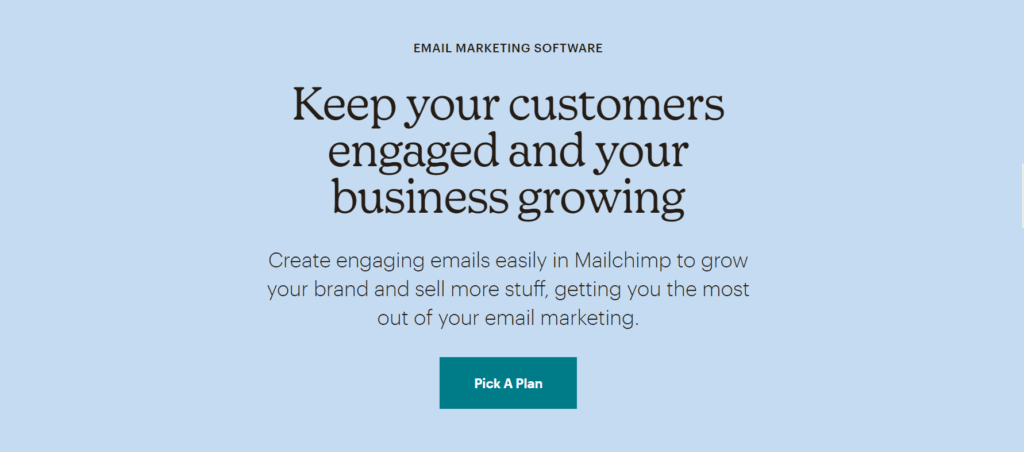
When the main headline captures users’ attention, the sub-headline should make them interested further. Simultaneously, they improve the landing page’s power.
2. Hook Above the Fold
According to a study conducted by Nielsen Norman Group regarding users’ online browsing practices, it was uncovered that users scroll the pages, but only if they like what’s above the fold and if it encourages them to scroll further.
This is why most of the high-converting landing pages are structured to make the best impact above the fold and include the key information there.
Thus, for an improved landing page performance, it is best if you place your main call-to-action and the sign-up form above the fold, or in other words, at the page’s top segment where users can see it right away, without having to scroll down for more.
Of course, if you want to include more information on your landing page, you’ll need to incorporate extra CTAs that are below the fold, so the users won’t miss the opportunity when scrolling to learn more.

3. Write a Clear and Relevant Copy
Writing the landing page copy is perhaps the most challenging step towards optimizing the page, simply because it reinforces the promise that you’ve made to your potential customers. The copy’s main goal is to ensure that target customers convince themselves to click on the CTA.
When it comes to landing pages, there isn’t a definite rule about how many words you should use on the page. However, you need to use as many as necessary to make your point and explain the perks of choosing your product.
For example, with the “Want to be your own boss? Start today.” copy on their landing page, Uber competitors Lyft illustrate what they want their target users to achieve.
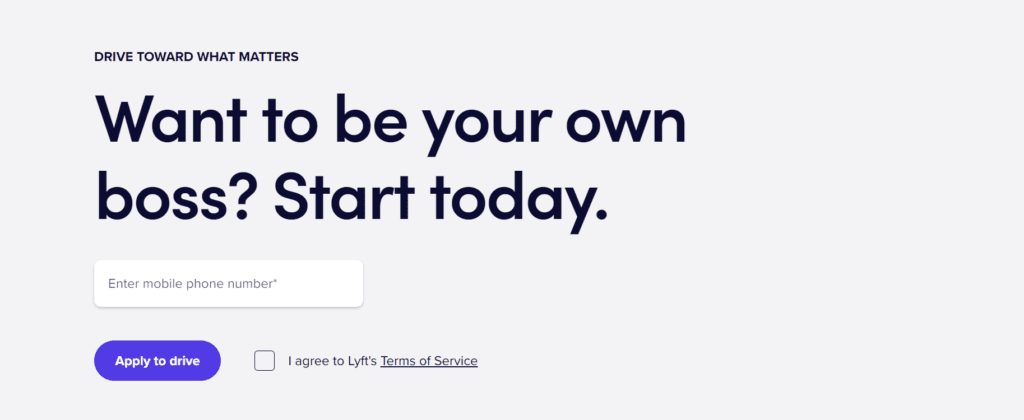
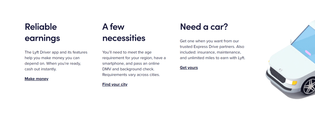
This addresses the target audience’s desires and motivates them to use this opportunity. The following section answers an additional set of questions that prospective Lyft drivers might have:
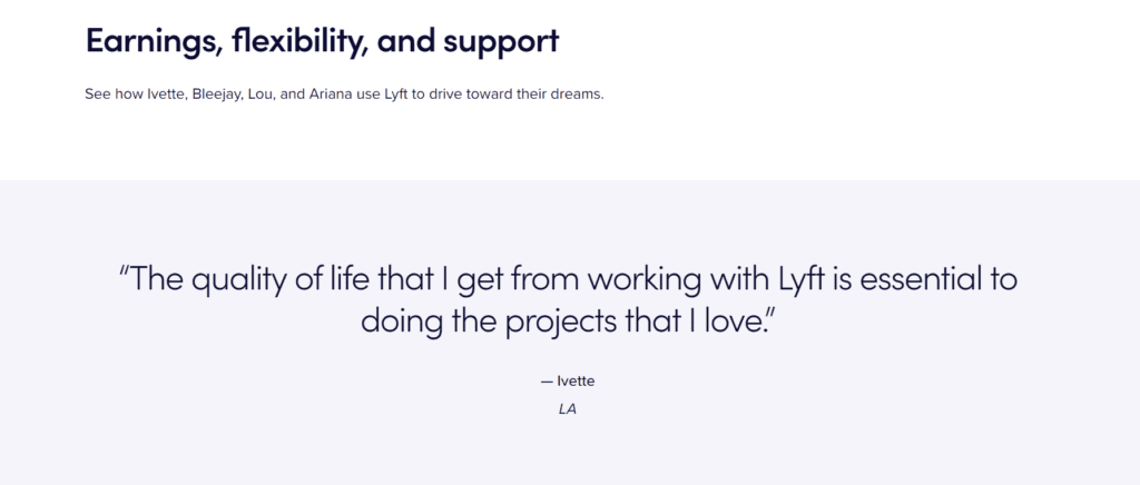
Following the social proof and video testimonial, at the end of the landing page, a brief copy segment bolsters the brand’s message further.
Making people feel good when they open and read the landing page copy. Let them know what your product represents. Whatever the benefits you provide, make sure that you’ll write that in the copy.
4. Incorporate Engaging Media
A landing page without captivating visuals is boring and ineffective. This is why imagery, video, and additional media elements matter and must be incorporated into the design.
Now, if you want to incorporate a video next to your CTA, keep in mind that the video must be short, relevant, and engaging. It must tell a story quickly and provide value to potential customers.
Most high-converting landing pages begin with large and beautiful imagery to point out exactly what the product is about.
Whenever you have the opportunity, you need to include videos or photographs from real people that use your product. That will help future customers connect with your brand on a more personal level, increasing the likelihood that they’ll become your customers afterwards.
Look for media elements that support your landing page copy. There’s a high chance that most users will focus on the visual elements more than the copy, so you need to make sure that you illustrate your story in a visual manner via images, videos, and illustrations.
Choose media that looks appealing, and make sure that the images or videos are properly sized and formatted for your Divi site to load them.
Wrapping Up
The above are the most critical aspects to consider if you want to encourage users to act towards your product when creating your Divi landing page. Don’t let your advertising efforts to go to waste.
Wondering how you can make the performance of your landing page even more stellar? Consider the following additional tips:
- Landing Page ≠ Homepage: A dedicated landing page can always perform better in turning leads into customers than your homepage where the users are yet to explore your product.
- Eliminate Extra Navigation: Your landing page should serve one purpose alone – to keep users interested until they act towards your product. Don’t introduce them to other paths in the meantime.
- Have a Clear Goal: Make it clear what you want users to do. Make sure that the goal and your CTA are crystally clear to the visitors.
- Create Less Friction: Don’t inhibit users’ attention by including too much information or distracting media. Make the path clear for the users to choose themselves what they’ll do on your landing page.
Try Divi Areas Pro today
Sounds interesting? Learn more about Divi Areas Pro and download your copy now!
Many pre-designed layouts. Automated triggers. No coding.
Click here for more details
More Articles You Will Like