
 Alex Martin
In a world glued to smartphones, having a mobile-friendly website isn't just a "nice-to-have" anymore. Let's be blunt: it's the absolute bedrock of your online presence. If your site is a clumsy, pinch-and-zoom nightmare on a phone, you're not just inconveniencing visitors—you're actively shoving potential customers out the door and telling them you don't care about their experience.
Why Mobile-Friendly Design Is Non-Negotiable
It's tempting to think, "Yeah, yeah, more people use phones, I get it." But that statement doesn't even begin to cover the damage a bad mobile site can do. A poor experience isn't a minor annoyance; it's a source of genuine frustration. When someone lands on your site and has to fight with tiny buttons or text that runs off the screen, they don't just leave. They remember that feeling of annoyance, and it becomes part of your brand's story in their mind.
This isn't just a trend; it's a fundamental shift in how people find and interact with businesses. The numbers speak for themselves.
We're at a point where the majority of online activity is happening on a small screen. To get a clearer picture of this shift, let's look at a few key differences between mobile and desktop users.
Mobile vs. Desktop: A Quick Comparison
| Metric | Mobile User Behavior | Business Implication |
|---|---|---|
| Traffic Share | 59.7% of all global traffic in early 2025 comes from mobile. | You're building your "storefront" for the minority if you design for desktop first. |
| User Intent | Often looking for quick answers, directions, or immediate purchases. | A slow or confusing site leads to instant abandonment and lost sales. |
| Patience Level | Extremely low. Users will bounce in seconds if a site is difficult to use. | High bounce rates signal to Google that your site is low-quality, hurting your SEO. |
| Interaction | Touch-based, which requires larger tap targets and simpler navigation. | Small, hard-to-tap links frustrate users and can make your site feel broken. |
These aren't just abstract statistics; they represent real people with real problems you can solve. Ignoring this mobile-first reality is like building a beautiful retail store but locking the front door for two out of every three people who try to come inside.
The True Cost of a Poor Mobile Experience
The fallout from a bad mobile site is swift and painful. It hits you in multiple ways:
- Damaged Brand Credibility: A clunky website sends a clear message: you're either out of touch or don't invest in your customer experience. Neither is a good look.
- Sky-High Bounce Rates: Mobile users have zero patience for friction. If your site is a hassle, they're gone in a flash, probably straight to a competitor.
- Plummeting Search Rankings: Google's mobile-first indexing isn't a suggestion. It means Google primarily judges your entire site based on its mobile version. A bad mobile experience is a direct penalty to your SEO.
A mobile-friendly design isn't a feature you tack on at the end. It's a core business strategy that shows your audience you respect their time and are dedicated to giving them a great experience, no matter what device they're on.
Ultimately, it all comes down to meeting your customers where they are—and they are on their phones. By prioritizing a website design that is mobile friendly, you're making a smart, foundational investment in the health and future of your business.
And if you're using Divi, you're in luck. The journey to a fully responsive site is more straightforward than you might think. Our in-depth guide walks you through exactly how to make a mobile-friendly website with Divi, breaking down the essential tools and techniques you need to get it right.
Getting Your Hands Dirty with Divi’s Responsive Tools
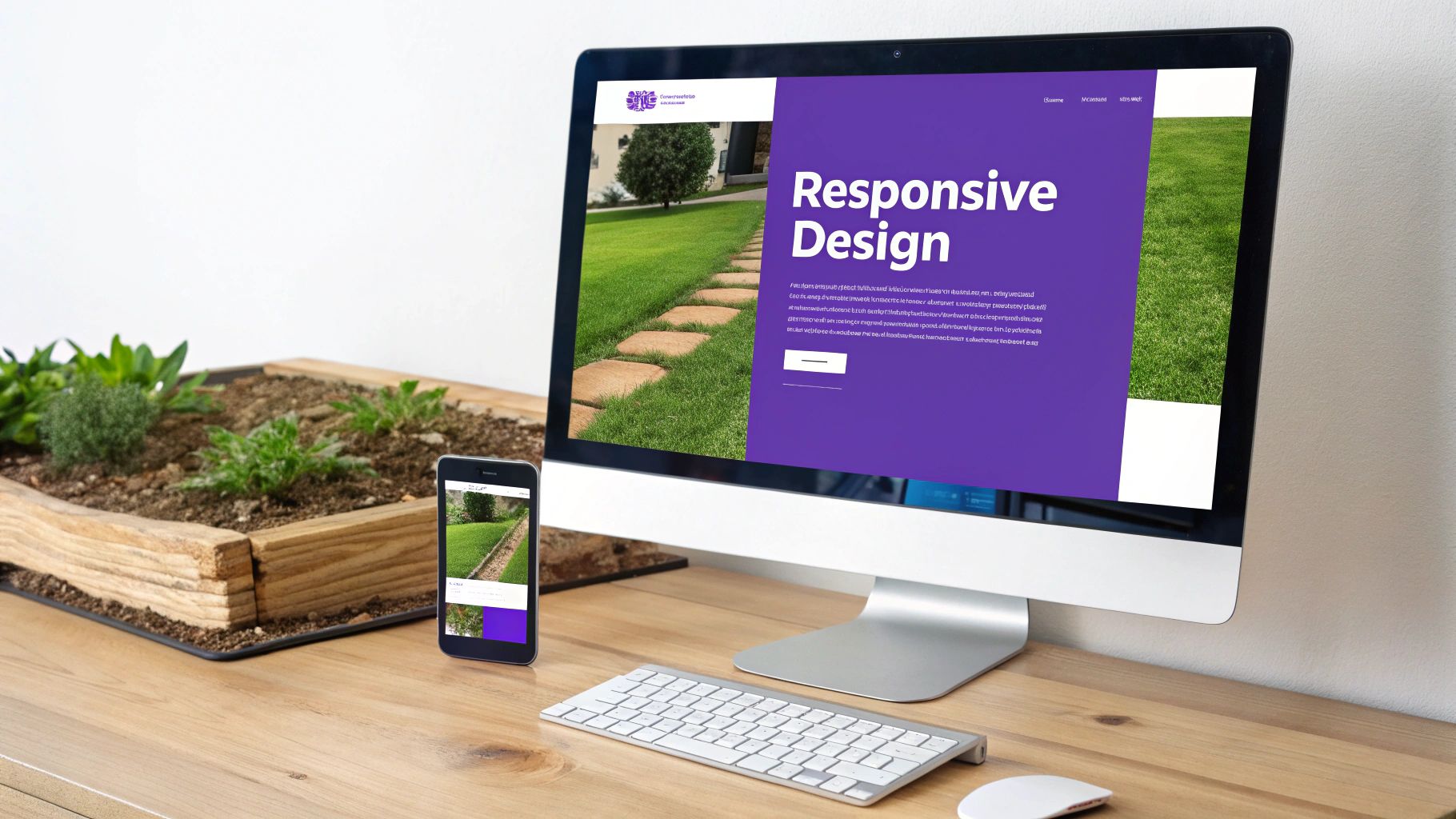
When you jump into Divi, you're getting a powerful set of responsive tools right out of the box. The trick is to stop seeing them as a final "sanity check" and start weaving them into your design process from the very beginning.
The most basic of these are the device previews. Down in the bottom left of your Divi Builder interface, you'll spot icons for Desktop, Tablet, and Mobile. Clicking these instantly reflows your design to show you how it'll look on each device, giving you that immediate feedback you need.
Forget about building a complete desktop page and then switching to mobile to wrangle the chaos. A truly solid website design mobile friendly workflow actually flips that script and starts on the smallest screen first.
Nail Your Spacing and Text with Responsive Values
Ever craft a gorgeous desktop layout, only to find the text is enormous and spilling out of its box on a phone? Or those two buttons, perfectly spaced on a big screen, are now awkwardly kissing each other? This is exactly where Divi's responsive values become your secret weapon.
Almost every single design setting in Divi—from margins and padding to font sizes and letter spacing—can have a different value for each device. Just hover over a setting's title, and you'll see a little phone icon pop up. Click it, and you get separate tabs for Desktop, Tablet, and Mobile.
This is huge. It lets you dial in specific styles that only apply to that particular view.
- The Problem: Your desktop heading is a punchy 72px, but on mobile, it’s a monstrosity.
- The Fix: Click the responsive icon next to "Heading Font Size," hop over to the Mobile tab, and dial it down to a much more sensible 32px. Divi now handles the heavy lifting, serving the right font size to the right user.
The same logic works for spacing. That section with 150px of top padding for a dramatic desktop entrance? You can squash that down to a practical 50px on mobile to conserve precious screen real estate.
When you design for mobile first, you're forced to prioritize what's truly important. It's all about the core content and clear calls-to-action. Scaling that clean, lean design up for larger screens is a whole lot easier than trying to cram a complex desktop layout onto a tiny phone.
A Real-World Tweak for Mobile Layouts
Let's say you have a classic two-column row—an image on the left, text on the right. It looks fantastic on a desktop. On mobile, Divi smartly stacks these columns, which is usually exactly what you want.
But now, the image and text might be too close for comfort, making things feel cramped. Here’s how to fix that in seconds:
- Pop open the settings for the top column (the one with your image).
- Head to the Design tab and find the Spacing section.
- Hover over Margin and click that responsive phone icon.
- Make sure you're on the Mobile view.
- Now, just add a 30px bottom margin.
That one tiny adjustment adds a bit of breathing room that only appears on mobile devices. Your layout now looks clean and intentional on every screen. By making these small, device-specific tweaks as you build, you end up with a polished experience that feels custom-crafted for every visitor, no matter how they find you.
Advanced Mobile Design Techniques in Divi

Getting your responsive values dialed in for text and spacing gets you 90% of the way to a solid website design mobile friendly layout. But what about that final 10%? This is where you go from a site that’s merely functional on a phone to one that feels truly exceptional.
It’s about more than just making things fit. True mobile mastery means creating experiences specifically for the mobile user's context. This often involves strategically showing or hiding certain elements to slash clutter and sharpen focus. Divi’s built-in Visibility settings make this surprisingly easy to pull off.
Control What Appears with Divi's Visibility Settings
Picture this: you have a complex, data-heavy graphic or an elaborate background video that looks incredible on a desktop. On a phone, though, it’s probably a nightmare—unreadable, slow, and just plain overwhelming. Instead of wrestling with it, just hide it from your mobile visitors.
This powerful little feature lives in the Advanced tab of any Section, Row, or Module. Just look for the Visibility toggle. From there, you can check boxes to disable an element on Phone, Tablet, or Desktop.
A classic and highly effective move is to create mobile-specific calls-to-action.
- For Desktops: You might have a detailed contact form with multiple fields.
- For Mobiles: Hide that form and show a simple, bold button that says "Tap to Call Us."
This small change is a huge win for usability for someone on the go. You’re not just making the design responsive; you’re responding to what the user actually needs in that moment.
Using Simple Custom CSS for Fine-Tuning
Sometimes, the Divi builder's toggles and sliders just can't quite get you the exact look you're after. Maybe you need to tweak the line height of some text only on mobile, or you want to reverse the order of stacked columns. For those moments, a tiny snippet of custom CSS is your best friend.
You don't need to be a coding guru to do this. Divi lets you pop custom CSS right into the Advanced tab of any element.
Don’t let CSS intimidate you. A single line of code can often solve a nagging mobile design problem that the visual controls can't quite fix. It's the key to unlocking total control over your mobile layout.
Think about a row with two columns. On mobile, they stack, with the left column appearing on top by default. What if the right column's content makes more sense to show first on a phone? A quick line of CSS can flip that order, creating a much more logical flow for smaller screens.
This level of detail is what separates a good mobile experience from a great one. And the data backs this up—over 84% of visitors now prefer mobile sites to their desktop versions. What's more, 75% of users are more likely to come back to a site that offers a smooth, mobile-optimized visit, which directly impacts loyalty. You can dig into more of these trends and what they mean for design in these web design statistics at Hostinger. Your attention to these advanced techniques is what solidifies your brand's reputation for quality.
Optimizing Mobile Performance for Speed and SEO

A beautiful mobile layout is a great start, but it's only half the battle. If your site takes an eternity to load on a phone, that gorgeous design might as well not exist. When we talk about a mobile-friendly website design, performance isn't just a technical detail—it's everything.
Speed is a massive part of the user experience and, not surprisingly, a major ranking factor for Google. Every extra second a user has to wait for your page to load dramatically increases the odds they'll just hit the back button and visit a competitor.
The data backs this up. Extensive research shows that a staggering 53% of mobile users will ditch a website if it doesn't load within three seconds. Flip that around, and a well-optimized site can boost the likelihood of a purchase by up to 67%. The business case is crystal clear: faster sites simply make more money.
Squeeze More Speed from Your Images
Images are usually the main culprits behind slow mobile load times. That huge, uncompressed photo that looks so crisp on a 27-inch monitor will absolutely cripple a mobile connection. Your first line of defense has to be aggressive image optimization.
Start by resizing your images to the maximum dimensions they’ll actually be displayed at on your site. There’s zero reason to upload a 4000px wide image for a space that’s only 800px wide. Before you even upload them to WordPress, run them through a compression tool like TinyPNG.
Then, it's time to embrace modern image formats.
- Use WebP: This next-gen format offers much better compression and quality than old-school JPEGs and PNGs. Nearly all modern browsers support it, and plugins can serve WebP images while keeping JPEGs as a fallback for the rare older browser.
- Leverage Divi’s Lazy Loading: You can find this under Divi > Theme Options > General > Performance. Enabling "Lazy Load Images" stops off-screen images from loading until the user actually scrolls down to them. This one change can make a huge difference in your initial page load time.
Trim the Fat from Fonts and Requests
Images get a lot of attention, but other elements can bog down your mobile site, too. Every single font, script, or stylesheet your site has to load is another request to the server. For a user on a spotty mobile network, dozens of these requests can add up to a painfully slow experience.
Think of each server request as a separate trip to the store. Making one trip for ten items is far more efficient than making ten separate trips for one item each. Minimizing these requests is key to a zippy mobile site.
Take a hard look at your fonts. Are you using multiple font families and weights? Try to consolidate down to just one or two essential fonts. Better yet, consider using system fonts (like Arial or Helvetica) for body text, since they're already on the user's device and don't require an extra download.
By focusing on these performance tweaks, you aren't just making your site faster. You're improving your SEO, lowering your bounce rate, and creating a much better experience that keeps people engaged. For a deeper dive, our comprehensive guide offers even more tips for optimizing Divi for mobile devices, covering everything from basic settings to advanced speed enhancements.
Just because your design looks sharp on your desktop screen doesn’t mean it will deliver a flawless experience in a user's hand. That's a lesson you learn quickly in this business.
While Divi's built-in device previews are fantastic for quick sanity checks while you're building, they're only the first step. To guarantee your website design is mobile friendly in the wild, you have to move beyond emulation and into real-world testing.
Divi's previews are great for spotting obvious layout breaks, but they simply can't mimic the quirks of different mobile browsers, spotty network speeds, or the actual feel of a touch interface. They show you a perfect, controlled environment. The mobile web is anything but.
Going Deeper with Browser Developer Tools
Your next line of defense is using the developer tools built right into browsers like Google Chrome. Just right-click anywhere on your page, select "Inspect," and toggle on the "Device Mode." This gives you a much more accurate simulation of various phone and tablet models than Divi's preview alone.
Here, you can play with different screen sizes, resolutions, and even network conditions. For instance, you can test how your site loads on a sluggish "Slow 3G" connection. This is hugely valuable for understanding what users on less-than-perfect Wi-Fi are experiencing, helping you pinpoint performance issues you'd otherwise completely miss.
From my own experience, I can tell you that what looks perfect in the builder can hide some nasty flaws under real-world pressure. I once had a client's site where a crucial button was completely unusable on older iPhones because of a weird browser bug. It was an issue we only caught through this kind of rigorous testing.
Nothing Beats a Physical Device
Emulators and dev tools are powerful, but they’ll never fully replace testing on an actual, physical phone. This is the ultimate proof of concept for your mobile-friendly design.
So, grab your own phone. Borrow one from a friend or colleague. If you can get your hands on a slightly older model, even better.
When you test on a real device, you move from theory to reality. You get a true feel for the site's performance and usability. Here’s a practical checklist of what I always look for:
- The "Fat Finger" Problem: Are your links, buttons, and menu items actually easy to tap? If they're too small or crammed together, you're just creating frustration.
- Text Readability: Is the body font large and clear enough to read comfortably without pinching to zoom? Also, check your headings and subheadings for awkward line breaks that can make them hard to scan.
- Horizontal Scrolling: Does any element stretch the page wider than the screen, creating that dreaded horizontal scrollbar? This is a dead giveaway of a non-responsive element.
- Interactive Elements: Do your pop-ups have an obvious and easy-to-tap close button? Are sliders and carousels responding smoothly to swipe gestures?
- Form Usability: Try filling out a contact or checkout form. Mobile keyboards can often cover up input fields, making for a clunky and annoying experience if the form isn't designed with that in mind.
By methodically running through these checks on real hardware, you’ll catch those subtle yet critical issues that separate a website that just works from one that's genuinely a pleasure to use.
Common Divi Mobile Design Mistakes to Avoid
Knowing what to do is half the battle. Knowing what not to do can save you from countless headaches and get you to a great mobile design even faster. I've seen even seasoned Divi pros fall into these common traps, leading to frustrating user experiences that are completely avoidable.
Let's walk through some of the biggest offenders I see time and time again.
Using Fixed Widths and Ignoring Typography
One of the most frequent errors is locking elements into fixed pixel widths instead of using relative units like percentages. A section set to a rigid 800px width might look fantastic on your big desktop monitor, but it will instantly shatter your layout on a phone, creating that awful horizontal scrollbar nobody wants to see.
Always, always use percentages for widths. This ensures your layout can breathe and adapt fluidly to any screen it's viewed on.
Another huge issue is forgetting about typography on small screens. Tiny font sizes that are perfectly legible on a desktop become an unreadable mess on a phone, forcing users to constantly pinch and zoom. That’s a one-way ticket to a high bounce rate.
As a personal rule of thumb, I never let body text go smaller than 16px on mobile. It's the baseline for readability.
Overlooking Touch Targets and Popups
A mistake that directly torpedoes usability is designing links or buttons that are too small. You’ve probably heard this called the "fat finger" problem, and it's incredibly real. When touch targets are tiny or crammed together, users will inevitably tap the wrong thing, leading to immense frustration.
For reference, Apple's own guidelines recommend a minimum target size of 44×44 points for any interactive element. Keep that number in mind.
Intrusive popups are another mobile design disaster. A popup that's easy to dismiss on a desktop can become an inescapable prison on a mobile screen if the close button is microscopic, hidden, or positioned off-screen. This doesn't just annoy your visitors; it can also get you dinged by Google with SEO penalties for using intrusive interstitials.
The real goal of mobile-friendly design isn't just shrinking everything down. It's about completely rethinking the interaction for a touch-based device. Prioritizing clear navigation and easy-to-tap elements is simply non-negotiable.
The stats don't lie. Getting your mobile design right has a direct, measurable impact on key metrics like traffic share, load times, and user engagement.
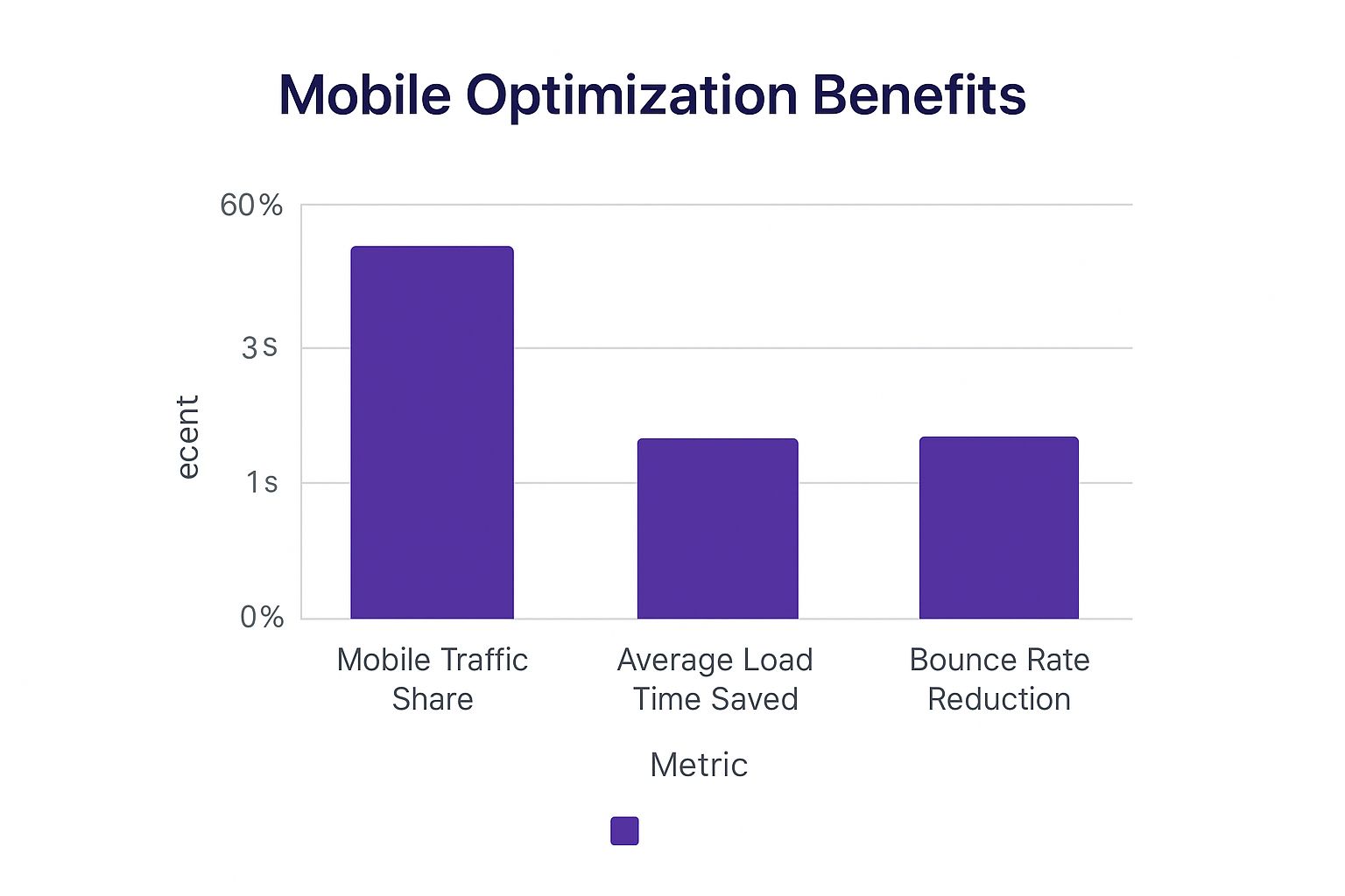
This data makes it crystal clear: a thoughtful mobile strategy isn't just about catering to the majority of web traffic. It directly boosts site performance and keeps people on your pages longer.
To help you keep these best practices top-of-mind, here’s a quick-reference table.
Divi Mobile Design Do's and Don'ts
| Best Practice (The Do) | Common Mistake (The Don't) | Why It Matters |
|---|---|---|
Use relative units like % or vw for widths. |
Using fixed px values for containers. |
Ensures your layout is fluid and adapts to all screen sizes, preventing horizontal scroll. |
| Keep body text at 16px or larger on mobile. | Using tiny font sizes that are hard to read. | Improves readability and stops users from needing to pinch-and-zoom, which is a poor user experience. |
| Design large touch targets (min. 44×44 points). | Creating small, tightly packed buttons or links. | Prevents the "fat finger" problem, reducing user frustration and incorrect taps. |
| Make popup "close" buttons obvious and easy to tap. | Hiding or shrinking the close button on mobile popups. | Avoids trapping users and prevents potential SEO penalties from Google for intrusive interstitials. |
| Design with a mobile-first approach. | Building the desktop site first, then "fixing" mobile. | Forces you to prioritize essential content and results in a leaner, more focused, and better-performing site. |
Think of this table as a checklist. Before you publish, a quick scan can help you catch common errors before your users do.
Ignoring Mobile-Specific Workflows
Perhaps the single biggest mistake is treating the mobile view as an afterthought. So many designers build out the entire desktop site in all its glory and only then switch to Divi's mobile preview to "fix" what’s broken. This reactive approach is inefficient and almost always leads to a compromised, patched-together result.
If you're looking for more on this, we've shared some key tips for better Divi mobile responsiveness that really drive home the importance of a proactive mindset.
Adopting a mobile-first workflow, where you actually design for the smallest screen first and then scale up, is a game-changer. It forces you to prioritize your most important content and creates a leaner, more focused experience right from the get-go.
By consciously steering clear of these common blunders—fixed widths, tiny fonts, small touch targets, and desktop-first thinking—you’ll be well on your way to crafting a truly effective and professional mobile site with Divi.
More Articles You Will Like