
An exit-intent popup is your last-ditch effort to grab a visitor's attention. It's a marketing tool that triggers when a user's mouse movements signal they're about to click away from your site. Think of it as a final, compelling offer to win them back before they're gone for good.
Why a Popup on Exit is a Game-Changer

Before we start building, let's get the strategy straight. An exit-intent popup isn't just another ad; it's your final chance to connect with someone who's already heading for the door. Get this one tool right, and it can make a massive difference to your website's goals.
Picture it as a helpful store assistant who pops up at the perfect moment. For an e-commerce store, that might mean offering a last-minute discount to a shopper who's hesitating over their cart, turning a lost sale into a conversion. On a blog, it could be a free guide offered to a reader, capturing a lead you would have otherwise lost forever.
The Real-World Impact
The psychology here is pretty powerful. These popups intervene at a critical decision point, but they do it without disrupting the user’s initial browsing session. That timing is key—it makes them way more effective than those annoying popups that appear the second you land on a page.
I've seen them used for all sorts of goals, but here are the big ones:
- Slash Cart Abandonment: Present a coupon or free shipping offer right when they're about to leave the checkout page.
- Grow Your Email List: Offer a genuinely valuable lead magnet—an ebook, a checklist, a template—in exchange for an email.
- Guide the User Journey: Point visitors to other popular articles or related products to keep them clicking around your site longer.
The core idea is to provide genuine value, transforming a potential bounce into a lasting connection or a sale. By understanding how to properly use exit-intent popups to boost sales, you can create a positive final impression.
And the data doesn't lie. Studies have shown that a well-implemented exit-intent popup can salvage up to 15% of visitors who would have otherwise bounced. Better yet, popups that throw out a discount can convert around 7% of abandoning shoppers and recover as much as 13.5% in otherwise lost sales.
Your First Divi Exit-Intent Popup Setup
Ready to build your first exit-intent popup? We’ll kick things off with the free Popups for Divi plugin. It’s a fantastic starting point because it gets the job done quickly and, best of all, doesn’t cost a dime. The tool integrates right into your WordPress dashboard, which makes getting set up a breeze.
The first thing you’ll need to do is install the plugin. Just head to your WordPress admin area, go to Plugins > Add New, and search for “Popups for Divi.” Once you install and activate it, you’re ready for the fun part: creating the content for your popup. The plugin cleverly works by letting you design any layout you can dream up in the Divi Library and then telling it to behave like a popup.
Creating and Triggering Your Popup Layout
With the plugin ready to go, it's time to build the visual part of your popup. Navigate over to Divi > Divi Library and create a new Layout. This is home base—you can use the Divi Builder you already know and love to design anything from a special discount offer to an email signup form or a quick feedback survey. This separation of design from function is what makes the whole process so flexible.
After you’ve nailed the design, you need to set the trigger. Go to Popups > Add New. Here, you’ll give your popup a name and start configuring its behavior. Think of this as the control panel where you connect your design to a specific user action.
Here's a look at the Popups for Divi settings screen:
From this screen, you’ll select the Divi Library layout you just made and choose “On exit intent” as the trigger. Simple as that.
The real power here is in its simplicity. You're not wrestling with complicated settings or custom code. You design in the familiar Divi Builder, then just tell the plugin when to show it—in this case, the moment a user heads for the exit.
This free method is just one of several ways to get started. If you're curious about other tools and techniques, you can learn more about how to add popups in Divi with six different options in our detailed guide. But for now, this simple setup is all you need to launch a functional and effective exit-intent popup.
Designing a Popup That People Actually Like

A functional popup on exit is one thing, but a popup that actually converts? That's a whole different ballgame. The secret ingredient that separates a welcome offer from an annoying interruption is simply great design. Now that you've got the trigger mechanics sorted, let's jump into the Divi Builder and craft something that grabs attention for all the right reasons.
The goal isn't just to stop a user in their tracks. It's to present them with an offer so compelling they’re actually glad you did. Your popup is basically a miniature landing page with just a few seconds to make its case. Let's make it count.
Crafting a Magnetic Headline and Offer
Honestly, your headline is 80% of the battle. It has to immediately answer the visitor’s silent question: “What’s in it for me?” Vague pleas like “Wait!” or “Before You Go…” just don’t cut it anymore. You need to be direct and show the value right away.
Let's look at a few real-world scenarios I've seen work time and time again:
- For an E-commerce Cart: Instead of a generic "Don't Leave," a headline like "Get 15% Off Your Order Instantly" is specific, valuable, and adds a little urgency.
- For Lead Generation: "Subscribe to Our Newsletter" is a tough sell. Try "Download Your Free SEO Checklist" instead. You're giving them a tangible asset, not just another email to clutter their inbox.
- For a Service Business: "Contact Us" feels like a commitment. Something like "Schedule a Free 15-Minute Consultation" is far more concrete and feels like less of a hurdle.
The copy that follows your killer headline needs to be just as punchy. Use short sentences or bullet points to get the benefits across fast. Nobody is going to read a dense paragraph on a popup.
A well-crafted popup on exit is a masterclass in copywriting efficiency. You have a tiny window to present a problem the user has (e.g., high price) and offer an immediate solution (e.g., a discount code).
Designing an Irresistible Call to Action
The CTA button is the final, crucial step. It needs to pop visually and use language that motivates action. Ditch generic words like “Submit” or “Download.”
Instead, try phrases that reinforce what the user is getting. Think “Claim My 15% Discount” or “Get My Free Checklist.” This small tweak frames the click as a direct benefit for them, not something they're doing for you.
A high-converting popup on exit isn’t an accident; it’s the product of thoughtful design and a crystal-clear value proposition. The best ones I've built often hit a 5% conversion rate or higher, turning would-be bounces into customers and leads. Your Divi design is what will get you to those numbers. You can find more exit popup benchmarks at bdow.com to see how you stack up.
Advanced Targeting with Divi Areas Pro
While the free plugin is a fantastic starting point, Divi Areas Pro is where you unlock surgical precision. A generic, site-wide popup on exit gets the job done, but a personalized one truly performs. This is where you graduate from a one-size-fits-all approach to showing the right message, to the right person, at the exact right moment.
With Divi Areas Pro, you can create specific rules to control who sees your popup and where. Imagine displaying a special discount offer, but only on the checkout page for users who are about to leave. Or perhaps showing a unique message to returning customers versus first-time visitors. This level of control is what turns a good popup into a high-impact conversion machine.
When to Upgrade to Pro
The jump from the free "Popups for Divi" to Divi Areas Pro makes strategic sense when your goals become more specific. You should consider upgrading if you need to:
- Target by Page or Post: Show an offer for a specific product only on that product's page.
- Target by User Role: Display a unique message for logged-in subscribers or members.
- Target by Device: Create different popups optimized for desktop and mobile users.
- Target by Referral Source: Show a special welcome message to visitors arriving from a specific social media campaign.
This level of detail is essential for maximizing relevance. The data below shows just how impactful a well-timed popup strategy can be on key metrics like bounce rate and email signups.
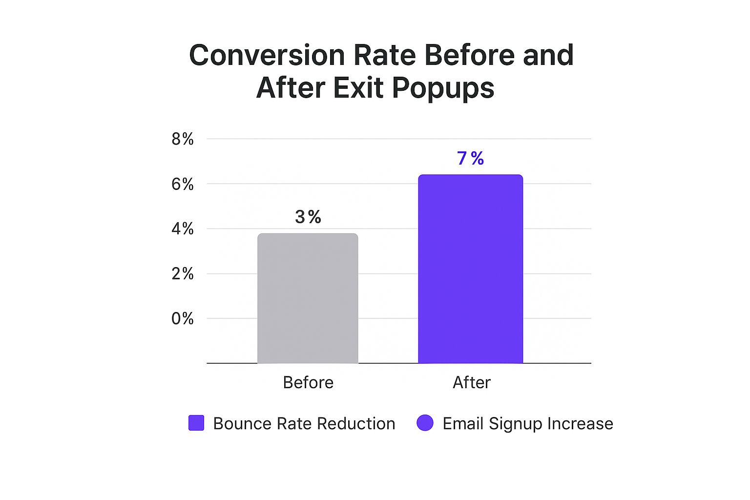
As you can see, strategic implementation leads to significant gains, turning leaving visitors into engaged leads and customers.
The core benefit of Divi Areas Pro is moving beyond basic triggers. You can layer multiple conditions to create hyper-targeted campaigns that feel personal and genuinely helpful to the user.
A cart abandonment popup, for instance, can be incredibly effective. The numbers show that these specialized popups can boost e-commerce conversion rates by up to 20%, with cart abandonment popups specifically boasting a 17.12% conversion rate. You can discover more insights about these conversion metrics at botsify.com to see the full financial impact.
If you're ready to explore these advanced features, you can learn how to use Divi Areas Pro to design dynamic content in our comprehensive guide. This is how you take your exit-intent strategy from a simple tool to a powerful, revenue-driving asset.
Common Popup Mistakes and How to Avoid Them

A poorly executed popup on exit can backfire spectacularly. Instead of being a helpful final touchpoint, it becomes an annoying obstacle that frustrates users and can even tarnish your brand's reputation. I've seen it happen. But by sidestepping a few common pitfalls, you can turn that potential annoyance into a conversion machine.
One of the absolute biggest mistakes I see is making the popup a pain to close. If someone has to hunt for a tiny, cleverly hidden "X," you've already lost. You're not trying to trap them on your page; you're trying to make one last, valuable offer. My rule of thumb is simple: always make sure the close button is clearly visible and instantly accessible. No games.
Another frequent flub is the weak, generic offer. A popup that just says "Don't Go!" is completely useless. It adds zero value and just feels desperate.
Making Your Offer Count
Your popup's entire purpose is to give the user a compelling reason to stick around for a moment longer. That means you need to get specific and offer something genuinely helpful.
Think about the difference between these two approaches:
- Vague Offer: "Join Our Newsletter." (Why should I?)
- Strong Offer: "Get a Free PDF Checklist: 10 Ways to Speed Up Your Divi Site." (Oh, that's actually useful!)
See the difference? We've shifted from a generic ask to a tangible benefit that solves a real problem for a Divi user. That’s the key.
A great exit popup is a final act of service. It should feel like a helpful suggestion, not a desperate plea. Test different copy and designs to see what resonates with your audience.
Finally, a major oversight is completely forgetting about mobile users. While traditional "mouse-leaving-the-screen" exit-intent triggers don't work on touch devices, that doesn't mean you should ignore that audience. With a tool like Divi Areas Pro, you can set up smart mobile triggers, like showing a popup after a certain scroll percentage or a time delay. Ignoring mobile means leaving a huge chunk of potential conversions on the table.
Even with the right tools in hand, you've probably got a few questions rattling around. Let's tackle the big ones I hear all the time about using exit popups with Divi so you can move forward with confidence.
Will a Popup on Exit Hurt My SEO?
This is a huge concern for a lot of people, but the short answer is: probably not.
Google's primary beef is with those annoying popups that block content the second you land on a page, especially on mobile. But an exit-intent popup is different. It only shows up when someone is already on their way out. Because it doesn't mess with that initial user experience, it's generally considered fair game.
Just make sure your popup is super easy to close, and you'll stay on Google's good side.
How Can I Tell if My Popup Is Actually Working?
You can't just set it and forget it. The key metric to watch is your conversion rate—what percentage of people who see the popup actually do the thing you're asking them to do?
Premium plugins like Divi Areas Pro make this a breeze with built-in analytics.
I tell my clients to aim for a conversion rate between 2-5%. That's a solid benchmark. If you're falling short, it's time to start testing. Tweak your headline, switch up the offer, or change the color of your call-to-action button. Small changes can make a huge difference.
What Can I Use a Popup For Besides Discounts?
Discounts are the go-to for e-commerce, and for good reason—they work! But exit popups are way more versatile than just coupon codes. Think about what your visitor might need in that "I'm about to leave" moment.
Here are a few ideas I've seen work wonders:
- Grow Your Email List: The classic. Offer a genuinely useful freebie like a checklist, template, or a short ebook.
- Gather Feedback: Leaving so soon? Ask why! A quick, one-question survey can give you invaluable insights into why people are bouncing.
- Boost Engagement: Don't let them leave just yet. Guide them to another popular or related article on your site.
- Build Community: Invite visitors to follow you on social media. It's a low-commitment way to stay connected.
Ready to build popups that actually convert? At Divimode, we don't just sell plugins like Divi Areas Pro; we provide the expert guidance to turn your Divi website into a real marketing asset. Check out our tools and tutorials today at https://divimode.com.
More Articles You Will Like


