 Alex Martin
You're probably staring at the same problem most Divi builders hit sooner or later. The header is already busy, the mobile menu is tighter than it should be, and you still need room for account links, a cart summary, notifications, quick actions, or a compact secondary navigation.
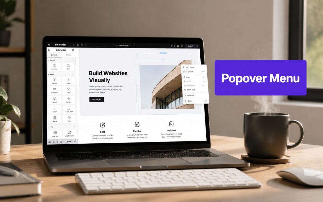
A popover menu solves that neatly. It gives you a small, anchored panel instead of a full popup, so people can open contextual content right where they need it and keep their place on the page. That sounds simple until you try to build one that also behaves correctly on click, closes when it should, stays aligned, and doesn't create keyboard-accessibility problems.
That's where the usual gap shows up. Native browser support for popovers has improved, but practical implementation still gets messy fast inside real Divi projects. If you want the result to feel polished, you need a workflow that handles layout, triggering, positioning, responsiveness, and accessibility without turning your header into a custom JavaScript maintenance job.
Why Use a Popover Menu in Divi
A popover menu is the right pattern when you need focused, secondary content attached to a specific trigger. In Divi, that often means an icon in the header, a profile button, a cart badge, a language switcher, or a “more” menu inside a WooCommerce product grid.
This isn't a niche UI choice. Over 70% of high-traffic websites use some form of floating overlay for navigation, tooltips, or quick actions according to Component Gallery's popover pattern reference. That tracks with what most of us see in production work every day. Users already understand the behavior.
Where it works best
Popover menus fit best when the content is:
- Contextual: Account links beside an avatar, cart contents beside a cart icon, or filters beside a filter button.
- Short and actionable: A few links, controls, toggles, or status items.
- Better anchored than modal: The user shouldn't lose page context just to open a small menu.
A full popup would be too heavy here. A standard dropdown often feels too limited once you need richer content. The popover menu sits in the sweet spot between the two.
Practical rule: If the content should feel attached to a trigger, not detached from the page, use a popover menu instead of a modal.
Why Divi users run into friction
Divi makes layout easy. The friction starts when behavior matters. You're no longer just styling a menu. You're handling open and close logic, placement, layering above the header, interaction on touch devices, and accessible focus behavior.
The native Popover API is a meaningful step for the web platform, but it doesn't automatically remove implementation work in real builds. Browser support improved quickly, and the API became usable in production across Chrome, Edge, and Safari by mid-2024, following its launch in Chromium 114 in May 2023, as described in Chrome for Developers' introduction to the Popover API. Even so, most Divi professionals don't want to stitch together browser attributes, custom selectors, and fallback behavior every time a client asks for a compact header menu.
That's why the better route in Divi is usually to treat the popover content like a normal Divi layout, then attach it cleanly to a trigger. You get a visual workflow, reusable content, and a much lower chance of shipping a menu that looks fine in the builder but breaks in the header.
Building Your Popover Content with Divi Areas
The cleanest way to build a popover menu in Divi is to start with the content itself. Don't think about the trigger yet. Don't think about where it opens. Build the panel as a small Divi layout first.
That approach keeps the work modular. You're designing a self-contained content area that can later be attached to a button, icon, or text link anywhere on the site.

Start with a new Area
Inside WordPress, create a new Divi Area and open it in the Divi Builder. At this stage, treat it like a mini page section.
For a typical header popover menu, I usually keep the structure simple:
- A section or row with tight padding
- One column
- A stack of modules such as Text, Button, Icon, Image, or Blurb
That gives you full control without overbuilding the panel.
Good content patterns for popover menus
Some layouts consistently work better than others:
- Account menu: Avatar image, user name, short divider, account links, logout button
- Mini cart panel: Product summary, subtotal text, cart button, checkout button
- Notification panel: Short list of updates, timestamps, “view all” link
- Utility menu: Language links, support link, dark mode toggle, contact action
Keep the content focused. A popover menu shouldn't become a hidden full page.
Here's the key point. Everything inside the Area is built with the same Divi modules you already use elsewhere. You're not switching to a separate UI system or learning a custom markup pattern just to make the panel work.
If you want a quick reference for how these reusable content blocks are displayed, Divi users can review how to display content using Divi Areas Pro.
Design it as a panel, not a page
Many builders overdesign the first draft. A popover menu needs clarity more than decoration.
A few practical choices help:
- Use compact spacing: Reduce row and module padding so the panel feels intentional.
- Keep line length short: Long labels make narrow menus feel cramped.
- Build a clear click path: Primary actions should be easy to spot without scrolling.
- Add visual grouping: Dividers, background contrast, and icon alignment make short menus easier to scan.
Small menus need stronger hierarchy than large menus. Users decide faster, so weak spacing shows immediately.
A short walkthrough helps if you want to see the workflow in motion:
What to avoid in the content Area
A few things tend to create trouble later:
| Choice | Why it causes issues |
|---|---|
| Very tall content blocks | They're harder to position cleanly near small triggers |
| Too many nested rows | They make small panels heavier to manage and style |
| Large images at the top | They push useful actions below the fold on mobile |
| Vague button labels | They slow interaction in a UI pattern meant for quick decisions |
If I'm building a popover menu for a header, I also test the Area content at narrow widths before touching trigger settings. That catches spacing problems early, when they're still easy to fix.
Configuring the Trigger and Position
Once the content exists, the core behavior work starts. The trigger decides when the popover menu opens. Position settings decide whether it feels attached to the interface or awkwardly floating beside it.
In Divi projects, the trigger usually lives in the header. That could be a Button module, an Icon module, a Text module, or even a custom element that acts like a utility control.

Pick the right trigger
Edit the page, Theme Builder template, or header layout where the trigger element lives. Open that module and go to the Divi Areas Pro options in the Advanced tab.
For most popover menu use cases, the right trigger type is On Click. That's the safest default for both desktop and touch devices.
Hover sounds tempting, but it often creates more problems than it solves. On desktop it can feel twitchy. On mobile, hover patterns don't translate cleanly at all.
A reliable trigger usually has these traits:
- Clear affordance: Users should know it opens something
- Adequate tap target: Tiny header icons cause misses on phones
- Visible active state: If possible, the trigger should feel engaged when the menu is open
Connect the trigger to the Area
After choosing the trigger behavior, select the Divi Area you built earlier. That binds the trigger to the content panel.
This setup is much cleaner than hand-rolling popover logic with custom scripts. Native browser popovers have improved, but implementation details still matter. The HTML spec notes a specific pitfall here: using manual instead of auto can reduce the success rate of transient menus by 35% because outside clicks no longer close the menu the way users expect, as documented in the WHATWG popover specification.
That's exactly the kind of practical failure point that gets missed in custom builds. The menu technically works, but the interaction feels wrong.
If a transient menu doesn't close when people click away, they assume the site is broken before they assume the pattern is custom.
Position the popover menu so it feels anchored
The positioning controls are where the popover stops feeling generic. Set the panel relative to the trigger. Typical options are below, above, left, or right, then refine alignment and spacing.
For most Divi headers, these combinations work well:
- Below + right aligned: Good for account icons and utility actions near the top right
- Below + centered: Better for standalone buttons in content areas
- Right side placement: Useful for in-card action menus or admin-style interfaces
- Above placement: Reserved for cases where the trigger sits low in the viewport
A small offset usually helps. If the menu touches the trigger edge with no breathing room, it can look cramped.
For more detailed placement control, Divi users can review how to change the position of a popup.
A quick positioning checklist
Before you call it finished, test the menu in these real conditions:
Header near the browser edge
Open it from the far right and far left.Sticky header active
Scroll, then trigger the menu again and confirm it still aligns well.Longer content labels
Watch for accidental wrapping that changes the panel width.Touch interaction
Test on an actual phone, not just a desktop emulator.
What works and what doesn't
Here's the practical difference between stable and fragile setups:
| Works well | Usually fails later |
|---|---|
| Click trigger on a clear icon or button | Hover-only triggers in headers |
| Small, intentional offset from trigger | Zero spacing with cramped edges |
| Width sized to content purpose | Extra-wide menus with scattered links |
| Position tested on sticky headers | Placement only checked in the builder preview |
I've found that header popovers almost always need one extra round of refinement after the first live test. Not because the tool is difficult, but because a menu that looks balanced in the builder can feel slightly off once it's competing with a real logo, nav, announcement bar, and sticky behavior.
Advanced Styling and Responsive Behavior
Once the popover menu opens in the right place, styling decides whether it feels native to the site or bolted on afterward. Subtle choices, not flashy ones, matter more.
A good popover should read as part of the same design system as your header, buttons, and cards. It needs enough contrast to stand above the page, but not so much visual weight that it feels like a modal.
Style the panel like a component
Start with the container itself. Focus on the basics first:
- Background: Match your UI surface color, not necessarily pure white or pure black
- Border or shadow: Use one to separate the panel from the page. You usually don't need both to be aggressive.
- Corner radius: Keep it consistent with the rest of the site
- Internal spacing: Tight enough for a menu, loose enough to avoid accidental taps
An arrow pointer can help when the menu needs a stronger visual link to its trigger. In cleaner interfaces, skipping the arrow often looks better.

Use motion carefully
Entrance animation should support clarity, not draw attention to itself. Short fades and slight directional movement work well because they reinforce where the panel came from.
What usually works:
- Fade with short upward or downward motion
- Fast duration
- Consistent easing with the rest of your UI
What usually doesn't:
- Large slide distances
- Bouncy effects
- Slow exit animations that make the interface feel laggy
If your header already has sticky transitions, keep the popover animation restrained so the two effects don't compete.
Motion should confirm placement. It shouldn't become the main event.
Handle mobile overflow before it becomes a support ticket
This is the part many tutorials skip. Mobile popovers can be cut off by screen edges or become difficult to use when the viewport is short. That's not a fringe problem. It's one of the most common failure points in production. The issue is well recognized in UX guidance, including Eleken's discussion of mobile popover overflow challenges.
The fix starts with design discipline, not heroic patching later.
Use these checks:
- Reduce width on smaller devices: Wide desktop panels often need a narrower mobile version.
- Trim nonessential content: Secondary text that helps on desktop may just add height on mobile.
- Adjust typography responsively: Divi's built-in responsive controls are enough for most menu text and spacing changes.
- Test vertical fit: If the panel can grow tall, make sure the key action appears early.
A lot of the same logic applies across CMS ecosystems. If you work across platforms, these web design practices for Sitecore and SharePoint are a useful parallel reference because they reinforce the same responsive discipline needed in constrained interface components.
A better responsive mindset
Don't ask, “Does the popover shrink?”
Ask these instead:
| Better question | Why it matters |
|---|---|
| Can the user reach every action on a small screen? | Visibility alone isn't enough |
| Does the panel still feel anchored to the trigger? | Poor placement breaks context |
| Are text links still easy to tap? | Dense menus fail on touch devices |
| Did we remove decorative clutter on mobile? | Space is limited and priorities change |
A polished desktop popover menu is only half the job. The mobile version is where implementation quality becomes obvious.
Ensuring Performance and Accessibility
Many popover builds often fall apart here. They may look finished, but the interaction breaks for keyboard users, screen reader users, or anyone moving quickly through a real interface.
The native Popover API helps with basic behavior, but there's a known implementation gap around accessibility guidance. MDN's documentation makes clear that the API doesn't provide inherent semantics, and practical implementations still need role="menu" plus dynamic aria-expanded handling for WCAG compliance. It also leaves a major gap around complete focus-trap and focus-restoration guidance without custom JavaScript, as noted in MDN's guide to using the Popover API.
That gap matters in production. A menu that opens visually but loses focus context is not finished.

Accessibility behavior that has to work
A professional popover menu should support these behaviors consistently:
- Keyboard entry: Focus should move into the popover when it opens
- Keyboard cycling: Tab and Shift+Tab should stay logical within the menu
- Escape close: The user needs a predictable way out
- Focus return: Closing should send focus back to the trigger
Those aren't “nice to have” details. They're baseline interaction requirements for this pattern.
If you want a broader accessibility checklist for Divi projects, review these website accessibility best practices.
Performance matters too
Popover menus feel lightweight, but bad implementations can still create avoidable overhead. The worst versions rely on too much custom scripting, delayed measurements, or DOM work that fires after the user interacts.
Wikimedia's engineering notes on popover performance best practices) point to a more disciplined approach: measure placement inputs synchronously at the event phase, avoid unnecessary parsing, and create the DOM efficiently. That's the kind of work most Divi builders don't want to hand-maintain just to open a compact menu beside an icon.
Accessibility and performance are linked. If a menu opens late, shifts after rendering, or steals focus unpredictably, users experience it as broken regardless of how good it looks.
What good implementation feels like
You can usually tell a solid popover build by using it for ten seconds:
- Click or tap the trigger
- The panel opens where you expect
- Focus stays coherent
- Escape closes it cleanly
- The page doesn't feel heavier because the menu exists
That last point gets overlooked. A popover menu should feel immediate. If the interaction introduces lag, layout jumps, or focus confusion, the build is carrying too much complexity for what should be a small UI component.
Common Issues and Quick Fixes
Even a solid setup can need a final adjustment or two. Most popover menu issues in Divi come down to layering, closure behavior, or sizing.
The popover appears behind the header
That's almost always a z-index conflict. Sticky headers, announcement bars, and transformed containers often create stacking contexts that hide the panel behind other elements.
Raise the popover's z-index in the Area settings and test again with the sticky header active. Don't just test at page load.
The menu stays open after clicking a link inside it
This usually happens when the link should act like a close action as well as a navigation action. Assign the class da-close to the relevant element inside the Area.
That works especially well for utility links like “Log Out,” “View Cart,” or “Continue to Account,” where the menu shouldn't remain visible after interaction.
The popover feels too large on mobile
Don't try to save an oversized desktop panel with one CSS tweak. Tighten the internal spacing, shorten labels, and remove any nonessential module from the mobile version. If needed, create a cleaner mobile-specific content arrangement inside the same Area using Divi's responsive visibility controls.
A good final check is simple: open the menu one-handed on a phone and try to complete the main action without zooming, scrolling awkwardly, or tapping twice. If that flow feels natural, the popover is ready for production.
If you want a faster way to build polished popover menus, fly-ins, tooltips, and targeted interactive content in Divi, Divimode is worth a close look. It gives Divi professionals a practical toolkit for advanced interactions without turning every small UI pattern into a custom-code project.
More Articles You Will Like