 Alex Martin
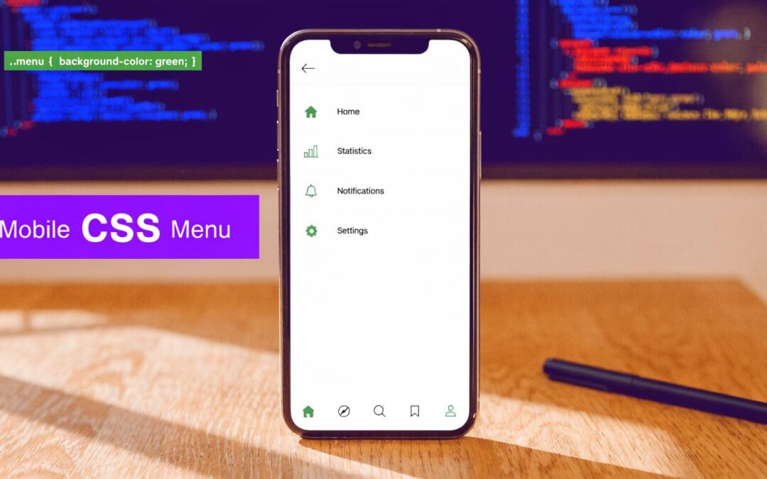
You're probably in one of two situations right now. Either Divi's default mobile menu feels too limited for the header you designed, or you've already hacked together a menu that looks fine until you test it on a phone and notice awkward spacing, clipped panels, or weak keyboard support.
That's where most mobile navigation work gets real. A good mobile css menu isn't just a hamburger icon and some hidden links. In production, it has to fit Divi's header structure, behave predictably across breakpoints, stay fast, and avoid accessibility shortcuts that become painful later.
The playbook below is the one I'd use on an actual Divi build. It starts with the structural basics, then moves into copy-paste patterns you can adapt for Divi Theme Builder headers and Divi Areas Pro layouts.
Mobile Menu Foundations for Divi Users
A mobile menu matters because mobile browsing isn't a side case anymore. Mobile devices account for approximately 58-60% of global web traffic as of 2025, which is why responsive navigation has become standard practice, and CSS media queries are the mechanism that makes that switch possible via the @media rule in CSS3, often around breakpoints such as 768px for tablet-to-desktop transitions, as outlined in freeCodeCamp's guide to media queries and breakpoints.
In Divi, the mistake I see most often is starting with styling before deciding how the menu should behave. That usually creates brittle CSS because the desktop menu gets squeezed down until it breaks. A better route is mobile-first CSS. Build the small-screen menu as the default, then layer in desktop styles when the viewport allows it.
Start with semantic structure
Even when Divi generates parts of your header, your custom menu pattern should still respect basic navigation markup:
- Use
<nav>for the container so browsers and assistive tech can identify the navigation region. - Use a real
<button>for toggles when the menu opens and closes on the same page. - Use
<ul>and<li>for the links because a navigation list is still a list.
That foundation helps with styling, but it also keeps your header easier to maintain. If you ever replace Divi's native menu output with a Code Module or a custom Theme Builder layout, clean markup saves time.
Practical rule: If an element changes state on the page, use a button. If it takes the user to another page, use a link.
Use breakpoints as layout decisions
A breakpoint shouldn't exist because a specific phone exists. It should exist because your menu layout stops working at a given width.
The common ranges many developers work from are:
| Range | Typical use |
|---|---|
| 320px to 480px | Standard mobile devices |
| 481px to 768px | Tablets and iPads |
| 769px to 1024px | Small screens and laptops |
For Divi builds, that usually translates into one mobile pattern below the tablet or desktop breakpoint, then a visible horizontal nav above it.
A clean base pattern
Here's the mental model I use:
- Default state is the mobile menu.
- The menu is hidden or collapsed until triggered.
- At a larger breakpoint, the toggle disappears.
- The nav list becomes visible and horizontal.
That's the same logic behind strong responsive systems more broadly. If you want a wider design perspective, Kogifi's piece on expert strategies for enterprise DXPs is worth reading because it treats responsiveness as a system problem, not just a CSS trick.
For Divi-specific inspiration before you code, this walkthrough on mobile menu design in Divi is a useful visual reference for how navigation choices affect usability.
Building a Simple Pure-CSS Toggle Menu
If the job is a small brochure site, a temporary campaign page, or a low-complexity header, a pure CSS toggle can be enough. It's quick, light, and easy to drop into a Divi Code Module.

The basic pattern uses a hidden checkbox. When it's checked, sibling selectors reveal the menu panel. The flyout itself is typically hidden with position: fixed and translate: -100vw 0, and a key implementation detail is setting pointer-events: none on the hidden panel so it doesn't intercept taps, while keeping the toggle on a higher stacking level, as shown in Mads Stoumann's CSS flyout menu pattern.
Copy and paste HTML
<nav class="mobile-nav" aria-label="Mobile navigation">
  <input type="checkbox" id="menu-toggle" class="menu-toggle">
  <label for="menu-toggle" class="menu-button">
    <span></span>
    <span></span>
    <span></span>
    <span class="screen-reader-text">Open menu</span>
  </label>

  <div class="menu-panel">
    <ul class="menu-list">
      <li><a href="/">Home</a></li>
      <li><a href="/services/">Services</a></li>
      <li><a href="/about/">About</a></li>
      <li><a href="/contact/">Contact</a></li>
    </ul>
  </div>
</nav>
Copy and paste CSS
.mobile-nav {
  position: relative;
}

.menu-toggle {
  position: absolute;
  opacity: 0;
  pointer-events: none;
}

.menu-button {
  width: 44px;
  height: 44px;
  display: inline-grid;
  align-content: center;
  gap: 6px;
  cursor: pointer;
  position: relative;
  z-index: 1001;
}

.menu-button span {
  display: block;
  width: 24px;
  height: 2px;
  background: #111;
  margin-inline: auto;
}

.menu-panel {
  position: fixed;
  inset: 0 auto 0 0;
  width: min(85vw, 320px);
  padding: 5rem 1.25rem 2rem;
  background: #fff;
  box-shadow: 0 0 20px rgba(0,0,0,.12);
  translate: -100vw 0;
  transition: translate .3s ease;
  pointer-events: none;
  z-index: 1000;
  overflow: hidden;
}

.menu-list {
  list-style: none;
  margin: 0;
  padding: 0;
}

.menu-list a {
  display: block;
  padding: .875rem 0;
  text-decoration: none;
  color: #111;
}

.menu-toggle:checked ~ .menu-panel {
  translate: 0 0;
  pointer-events: auto;
}
Where this pattern works
This approach is useful when you need:
- Minimal overhead and don't want script running just to open a panel.
- A quick prototype for a Divi header concept.
- Simple link lists without nested interaction logic.
Hidden menus still need
overflow: hiddenon the right container. Without it, translated content can leak into view on some devices.
Where it falls short
The checkbox pattern is clever, but it isn't my default for client work anymore. It doesn't manage focus well, and once you add nested submenus or more demanding accessibility requirements, the workaround stack gets ugly fast.
That doesn't make pure CSS wrong. It just means it has a ceiling. For production sites where keyboard support and state management matter, a small amount of JavaScript is the cleaner choice.
Creating a Fully Accessible JavaScript-Powered Menu
A professionally built mobile menu should do more than open and close. It should tell assistive technology whether the menu is expanded, place keyboard users in a predictable flow, and let people close it without hunting for the trigger again.

The hamburger icon is the de facto standard for mobile navigation, but visual familiarity isn't enough. A JavaScript-enhanced menu can properly manage focus, which is a critical accessibility requirement that many visual-only tutorials skip, as noted in this mobile menu overview.
The markup that scales better
Replace the checkbox with a real button:
<nav class="site-nav" aria-label="Primary navigation">
  <button
    class="menu-toggle-btn"
    aria-expanded="false"
    aria-controls="mobile-menu"
    aria-label="Open menu"
  >
    <span></span>
    <span></span>
    <span></span>
  </button>

  <div id="mobile-menu" class="mobile-menu-panel" hidden>
    <ul class="mobile-menu-list">
      <li><a href="/">Home</a></li>
      <li><a href="/shop/">Shop</a></li>
      <li><a href="/blog/">Blog</a></li>
      <li><a href="/contact/">Contact</a></li>
    </ul>
  </div>
</nav>
This does three important things. It uses the right element, exposes a relationship between the button and the controlled panel, and gives you a clean hook for script.
The CSS stays simple
.menu-toggle-btn {
  width: 44px;
  height: 44px;
  border: 0;
  background: transparent;
  display: inline-grid;
  align-content: center;
  gap: 6px;
  cursor: pointer;
}

.menu-toggle-btn span {
  width: 24px;
  height: 2px;
  background: #111;
  display: block;
  margin-inline: auto;
}

.mobile-menu-panel {
  background: #fff;
  padding: 1rem 0 0;
}

.mobile-menu-list {
  list-style: none;
  margin: 0;
  padding: 0;
}

.mobile-menu-list a {
  display: block;
  padding: 1rem;
  color: #111;
  text-decoration: none;
}
The JavaScript earns its place
<script>
document.addEventListener('DOMContentLoaded', function () {
  const button = document.querySelector('.menu-toggle-btn');
  const menu = document.getElementById('mobile-menu');

  if (!button || !menu) return;

  const focusableSelector = 'a, button, [tabindex]:not([tabindex="-1"])';

  function openMenu() {
    menu.hidden = false;
    button.setAttribute('aria-expanded', 'true');
    button.setAttribute('aria-label', 'Close menu');

    const firstLink = menu.querySelector(focusableSelector);
    if (firstLink) firstLink.focus();
  }

  function closeMenu() {
    menu.hidden = true;
    button.setAttribute('aria-expanded', 'false');
    button.setAttribute('aria-label', 'Open menu');
    button.focus();
  }

  button.addEventListener('click', function () {
    const expanded = button.getAttribute('aria-expanded') === 'true';
    expanded ? closeMenu() : openMenu();
  });

  document.addEventListener('keydown', function (event) {
    if (event.key === 'Escape' && button.getAttribute('aria-expanded') === 'true') {
      closeMenu();
    }
  });
});
</script>
Why this is the professional standard
A little JavaScript solves problems CSS alone doesn't solve well:
- ARIA state stays accurate because
aria-expandedchanges when the panel changes. - Focus can move intentionally into the menu and back to the trigger.
- Escape closes the menu, which users expect in overlays and panels.
- Future submenu logic is possible without rebuilding the whole pattern.
If a menu can trap attention visually, it should also provide a reliable keyboard path out of that state.
Pure CSS still has a place. But for client projects, memberships, stores, and content-heavy Divi sites, I'd rather ship a tiny script than accept weak accessibility.
Implementing a Smooth Off-Canvas Fly-In Menu
A dropdown works. An off-canvas panel usually feels better in a custom Divi header because it gives the links room, makes room for contact info or buttons, and separates mobile navigation from the desktop layout cleanly.

Here's the pattern I use most often. The body gets a class when the menu opens. CSS handles the animation. JavaScript only toggles state.
HTML and CSS for the panel
<button class="flyin-toggle" aria-expanded="false" aria-controls="flyin-menu">
  Menu
</button>

<div class="flyin-overlay" hidden></div>

<aside id="flyin-menu" class="flyin-menu" aria-label="Mobile navigation" hidden>
  <button class="flyin-close" aria-label="Close menu">Close</button>
  <ul>
    <li><a href="/">Home</a></li>
    <li><a href="/services/">Services</a></li>
    <li><a href="/portfolio/">Portfolio</a></li>
    <li><a href="/contact/">Contact</a></li>
  </ul>
</aside>
:root {
  --menu-width: min(86vw, 360px);
  --menu-speed: .3s;
}

.flyin-menu {
  position: fixed;
  top: 0;
  left: 0;
  width: var(--menu-width);
  height: 100dvh;
  background: #fff;
  box-shadow: 0 0 20px rgba(0,0,0,.15);
  transform: translateX(-100%);
  transition: transform var(--menu-speed) ease;
  z-index: 1001;
  padding: 1.25rem;
}

.flyin-overlay {
  position: fixed;
  inset: 0;
  background: rgba(0,0,0,.45);
  opacity: 0;
  transition: opacity var(--menu-speed) ease;
  z-index: 1000;
}

body.menu-open .flyin-menu {
  transform: translateX(0);
}

body.menu-open .flyin-overlay {
  opacity: 1;
}
One modern detail matters here. For full-height panels on mobile, I prefer 100dvh over older viewport assumptions because dynamic browser chrome can cause clipping and awkward jumps with legacy sizing.
A visual walk-through helps if you want to compare this pattern to a popup-style implementation. This Divi-focused guide on creating a fly-in menu shows the same interaction pattern from a builder workflow angle.
The class toggle script
<script>
document.addEventListener('DOMContentLoaded', function () {
  const body = document.body;
  const openBtn = document.querySelector('.flyin-toggle');
  const closeBtn = document.querySelector('.flyin-close');
  const menu = document.getElementById('flyin-menu');
  const overlay = document.querySelector('.flyin-overlay');

  if (!openBtn || !closeBtn || !menu || !overlay) return;

  function openMenu() {
    menu.hidden = false;
    overlay.hidden = false;
    body.classList.add('menu-open');
    openBtn.setAttribute('aria-expanded', 'true');
  }

  function closeMenu() {
    body.classList.remove('menu-open');
    openBtn.setAttribute('aria-expanded', 'false');

    setTimeout(function () {
      menu.hidden = true;
      overlay.hidden = true;
    }, 300);
  }

  openBtn.addEventListener('click', openMenu);
  closeBtn.addEventListener('click', closeMenu);
  overlay.addEventListener('click', closeMenu);

  document.addEventListener('keydown', function (e) {
    if (e.key === 'Escape' && body.classList.contains('menu-open')) {
      closeMenu();
    }
  });
});
</script>
This video shows the interaction style in motion before you adapt it to your own header:
Why this pattern holds up in Divi
- The panel lives outside the normal flow, so it doesn't fight row and section sizing.
- Transforms animate smoothly and don't trigger the same layout churn as height-based reveals.
- The overlay clarifies state for users and gives you a large click target for closing.
For premium-feeling mobile navigation, this is usually the pattern I reach for first.
Pro Tips for Performance and Accessibility
Once the menu works, the next step is making it feel polished. At this point, many mobile navs either become pleasant to use or mildly annoying every single time someone taps them.
For touch interaction, the baseline is clear. Touch targets should be at least 44×44 pixels, and developers should support users who prefer less animation by implementing prefers-reduced-motion: reduce, which matters for approximately 8-10% of users in major Western markets, according to BrowserStack's guide to breakpoints and responsive behavior.
A short refinement checklist
- Make every interactive item easy to hit. That includes the menu button, close button, submenu toggles, and any icon-only controls.
- Animate
transformandopacityinstead of layout-heavy properties likeheight,top, ormargin. - Use fluid spacing so the menu doesn't feel cramped on one phone and oversized on another.
- Remove hover dependence on mobile because touch users won't discover hidden hover-only submenu states.
Good spacing without breakpoint clutter
clamp() is useful in mobile menus because it smooths out spacing and text sizing between screen widths.
.mobile-menu-list {
  display: grid;
  gap: clamp(0.5rem, 2vw, 1rem);
}

.mobile-menu-list a {
  padding-block: clamp(0.875rem, 2.5vw, 1.125rem);
  padding-inline: 1rem;
  font-size: clamp(1rem, 2.2vw, 1.125rem);
  min-height: 44px;
  display: flex;
  align-items: center;
}
This keeps the menu flexible without piling on breakpoint overrides.
Respect reduced motion
If your menu slides, fades, scales, or staggers links into view, add this:
@media (prefers-reduced-motion: reduce) {
  .flyin-menu,
  .flyin-overlay,
  .mobile-menu-panel,
  .menu-button span {
    transition: none !important;
    animation: none !important;
  }
}
Motion should add clarity, not force every user through an effect they may actively avoid.
A practical QA pass
Before pushing a Divi menu live, I check four things manually:
| Check | What to look for |
|---|---|
| Tap test | Can you open and close the menu one-handed without mis-taps? |
| Keyboard test | Can you Tab through links and close the menu cleanly? |
| Viewport test | Does the panel fit short screens without clipping key actions? |
| Scroll test | Does opening the menu create background scroll problems? |
Those checks catch more real-world issues than staring at CSS for another hour. In client work, the final quality jump usually comes from these small adjustments, not from adding more visual flair.
Integrating Custom Menus with Divi and Divi Areas Pro
Custom code often integrates with the Divi stack. If you're using Theme Builder headers, custom sections, or popup-driven navigation, the cleanest move is usually to disable or hide the default mobile behavior and replace it with a menu you fully control.

Hiding Divi's default mobile toggle
If your custom header includes its own toggle button, start by suppressing the native mobile icon in the affected header layout.
@media (max-width: 980px) {
  .et_pb_menu .et_mobile_nav_menu {
    display: none !important;
  }

  .et_pb_menu .et_pb_menu__menu {
    display: none !important;
  }

  .custom-mobile-menu-trigger {
    display: inline-flex !important;
    align-items: center;
    justify-content: center;
    width: 44px;
    height: 44px;
    cursor: pointer;
  }
}
That snippet belongs either in Divi Theme Options custom CSS, the page-level settings for a controlled test, or your child theme stylesheet if this pattern is site-wide.
A practical Divi setup that works
For a custom mobile css menu inside Divi, I usually use this structure:
- Theme Builder header row with logo, desktop menu, and a custom mobile trigger.
- Desktop menu visible above the chosen breakpoint.
- Custom mobile trigger visible below it.
- Separate mobile menu markup inserted via Code Module or a triggered content area.
That keeps the desktop navigation clean while giving you a mobile panel that isn't constrained by the Menu Module's built-in presentation.
Using a triggered layout instead of hardcoded markup
On more advanced projects, a triggered panel is easier to maintain than hand-editing every link in a code block. In these situations, tools built for Divi become practical rather than decorative. Divimode provides Divi Areas Pro, which lets you build the mobile menu layout in the Divi Builder, then display it as a fly-in, popup, or targeted content area based on device conditions and trigger settings.
That changes the workflow in a useful way. Instead of styling a raw unordered list only with CSS, you can build a complete mobile panel visually with buttons, CTAs, WooCommerce links, icons, contact details, and even conditional content.
A lean trigger pattern for Divi headers
If your header contains a custom trigger element, use a class you can target consistently:
<button class="custom-mobile-menu-trigger" aria-label="Open mobile menu" aria-expanded="false">
  <span></span>
  <span></span>
  <span></span>
</button>
.custom-mobile-menu-trigger {
  border: 0;
  background: transparent;
  padding: 0;
  gap: 5px;
  flex-direction: column;
}

.custom-mobile-menu-trigger span {
  display: block;
  width: 24px;
  height: 2px;
  background: #111;
}
If you're switching entirely different navigation systems by device, this tutorial on showing a different Divi navigation menu on desktop, tablet, and phone is a strong reference for structuring the header logic.
What works better in real Divi projects
A few practical choices tend to hold up:
- Keep the trigger in the header itself so users always know where the menu opens from.
- Build the panel separately so mobile navigation isn't trapped inside the row dimensions of the header.
- Avoid fighting the native module when your design has already outgrown it.
- Use visual builder content for editable menus when clients need to maintain promo blocks, buttons, or utility links.
The result is a mobile menu that feels custom because it is custom, but it still fits a maintainable Divi workflow.
If you want to build this kind of navigation inside Divi without patching together unrelated plugins, Divimode is a practical place to start for tutorials, builder-driven interaction patterns, and tools for fly-ins, popups, and custom menu behavior.
More Articles You Will Like


