
 Alex Martin
When you're ready to write CSS media queries for mobile, the only way to start is with a mobile-first approach. This isn't just a trendy buzzword; it's a practical strategy that completely changes how you build responsive sites for the better.
The whole idea is to write your base styles for the smallest screens first. From there, you use min-width media queries to add or adjust styles as the screen gets bigger. The result is cleaner, more efficient, and far less frustrating code.
Why a Mobile-First Approach Is Non-Negotiable
Let's get practical. For any modern Divi project, thinking "mobile-first" is absolutely essential. By designing for the smallest viewport and scaling up, you create a solid, universal foundation that prevents you from fighting with your own CSS later on.
This method also keeps your stylesheets lean, which is a direct performance win. Mobile users, who are often on slower connections, get a huge benefit because their browser only has to download the essential CSS needed for their device. They aren't stuck loading a bunch of complex desktop styles that are just going to be overridden anyway.
The Problem with Desktop-First Design
When you start with a desktop design, you're building for the most complex scenario first. You write intricate styles for large screens, and then you have to use max-width media queries to undo or completely change those styles for smaller screens. This almost always leads to bloated, repetitive CSS filled with overrides.
Think about it: you might set a beautiful three-column layout for a desktop. Then, you have to write specific rules to stack those columns on tablets, and then maybe tweak them again for phones. You end up in a messy cascade, constantly battling the styles you wrote in the first place.
The Simplicity of Mobile-First CSS
In contrast, the mobile-first approach is purely additive. You begin with a simple, single-column layout that works universally on any screen. Then, as you get more screen real estate, you introduce more complexity.
By writing your base styles for mobile, you guarantee a functional, accessible experience for every single user from the get-go. Larger screens simply receive enhancements, not fixes. This leads to a stylesheet that's easier to maintain and performs way better.
There's a reason this has become the industry standard. It gives you much cleaner control over the CSS cascade, since your base styles apply everywhere and require far fewer overrides. It also delivers a massive performance advantage by cutting down the initial code mobile visitors have to download.
Plus, let's not forget about SEO. A well-optimized mobile experience is a critical ranking factor for search engines like Google. Making sure your site loads quickly and displays correctly on all devices has a direct impact on your visibility. For a deeper dive, our guide on the impact of mobile optimization on WordPress SEO provides some valuable context.
Before you write a single line of code, it really helps to grasp the core concepts. Take some time to read through a clear explanation of responsive web design to solidify that foundational knowledge. It makes all the difference.
Choosing Breakpoints That Reflect Real-World Users
Forget trying to target specific devices like the "iPhone 14" or "Samsung Galaxy." I see this all the time, and it's an outdated approach that quickly turns into a maintenance nightmare. A much smarter strategy is to design for common viewport width ranges, ensuring your site looks fantastic for the vast majority of your actual audience.
The key here is letting data guide your decisions. Modern analytics show clear patterns in how people browse the web. For instance, viewports with widths of 360px and 375px consistently account for a massive slice of global mobile traffic. We're also seeing a trend towards wider premium smartphones, with viewports from 390px to 412px becoming more and more common.
Knowing these numbers is a game-changer. It allows you to set up your media queries with confidence, especially when you're using tools like Divi Areas Pro to ensure your popups and fly-ins are perfectly formatted for the most widely used mobile devices.
The data also clearly shows why a mobile-first approach is the superior strategy for CSS efficiency. It just makes sense.

As you can see, starting with your base mobile styles and adding complexity for larger screens results in a much cleaner, more performant codebase. You're not overriding styles; you're progressively enhancing them.
Common CSS Media Query Breakpoints for Responsive Design
While every project has its own unique needs, I've found that starting with a solid framework of breakpoints saves a ton of time and ensures a consistent experience across devices. The table below outlines a reliable, mobile-first set of breakpoints that I use as a starting point for most Divi projects.
| Device Category | Breakpoint (min-width) | Typical Targets |
|---|---|---|
| Small Mobile | Base styles (no query) | Most smartphones in portrait mode; default single-column layout. |
| Large Mobile / Small Tablet | 480px |
Larger phones, small tablets in portrait. A good point to introduce slightly more complex layouts. |
| Tablet (Portrait) | 768px |
Standard tablets like iPads. Often where a two-column layout becomes viable. |
| Tablet (Landscape) / Small Desktop | 981px |
A common breakpoint that aligns well with Divi's own responsive settings. |
| Standard Desktop | 1280px |
Layouts designed to take full advantage of wider screens. |
This table provides a great foundation, but remember, these are just guidelines. The real test is your own content.
My Pro Tip: Let your content dictate your breakpoints. If your design looks awkward or text feels cramped at a certain width, that's your signal to add a new breakpoint—not some generic device width you found online.
Improve Accessibility with em Units
Here's a technique that can make a huge difference: write your media queries using em units instead of pixels. An em is a relative unit, which means it scales based on the user's default browser font size.
This has a massive accessibility benefit. If a user with low vision zooms in on their browser, your em-based breakpoints will adapt right along with the text, allowing the layout to reflow correctly. Pixel-based queries, on the other hand, are absolute and can cause layouts to break when zoomed.
Making the switch is straightforward. You just divide your target pixel value by 16 (the default browser font size). So, a breakpoint of 768px becomes 48em (768 / 16 = 48). It's a small change that makes your site more robust and user-friendly for everyone. For a deeper dive into this and other CSS techniques, check out our guide on responsive design with CSS.
Writing Your First Mobile Media Queries in Divi
Okay, with the theory out of the way, it’s time to get your hands dirty and actually write some code. The heart and soul of any responsive design is the @media rule. Think of it as a conditional gatekeeper for your CSS, telling your styles to apply only when specific criteria are met.
The syntax is surprisingly straightforward. You start with @media, tell it the media type (which is almost always screen for websites), add the and keyword, and then wrap your condition in parentheses. This condition is where the magic happens, defining your breakpoint, like (min-width: 768px).
Finally, you wrap the specific CSS selectors and rules you want to apply inside a set of curly braces {}. Any styles you put inside that block will only kick in when the browser's viewport is 768 pixels wide or wider. This is the core principle of a mobile-first design—you start with the basic mobile styles and progressively add more complex ones as the screen gets bigger.
Structuring Your First CSS Media Query
Let's walk through a practical example. Say you've built a Divi section with a custom CSS class of .service-grid. On phones, your base styles make each column a simple, full-width block. But on tablets, you're aiming for a slick two-column layout.
Your media query would look something like this:
/* Tablet Styles /
@media screen and (min-width: 768px) {
.service-grid .et_pb_column {
display: flex;
width: 48% !important; / Overrides Divi's inline styles */
margin-right: 4%;
}
.service-grid .et_pb_column:nth-child(2n) {
margin-right: 0;
}
}
This snippet targets the columns inside your .service-grid, but only on screens that are at least 768px wide. Because we're using a mobile-first approach, smaller devices never even have to load this more complex layout CSS, which is a nice little performance win.
Where to Add Your Custom CSS in Divi
Knowing how to write the code is half the battle; knowing where to put it is the other. Divi gives you a few excellent options, each with its own best-use case.
- Divi Theme Options > General > Custom CSS: This is a decent spot for global media queries that need to apply across your entire site. The only downside is that it can get messy on larger projects.
- WordPress Customizer > Additional CSS: This is my go-to for global styles. The live preview you get while coding is a massive time-saver, letting you test your breakpoints in real-time without constantly refreshing.
- Module Settings > Advanced > Custom CSS: For styles that are specific to a single module on a single page, this is the place to be. It keeps your CSS perfectly organized and tied directly to the element it affects.
For sitewide responsive rules, I almost always use the WordPress Customizer. The live preview saves countless hours of refreshing pages and clearing caches. It makes the workflow so much more efficient when you're dialing in your media queries css mobile adjustments.
Let's try another common, real-world task. Maybe you want to bump up the body font size on larger desktop screens to improve readability. Just hop into your Customizer's "Additional CSS" panel and add a simple rule like this:
/* Larger font size for desktops */
@media screen and (min-width: 1280px) {
body {
font-size: 18px;
}
}
It's clean, easy to find, and only applies where you want it to—on large screens. By being strategic about where you place your code, you ensure your Divi site stays organized and easy to maintain, even as it grows.
Using Advanced Queries Beyond Screen Size

While screen width is the cornerstone of responsive design, today’s best websites adapt to the user’s entire environment. CSS media queries have grown up. They've moved far beyond just targeting screen sizes and now let us tap into device capabilities, user preferences, and even environmental conditions. This shift allows for a much smarter and more refined user experience.
These modern features mean we can detect things like device orientation, color schemes, and even a user's preference for reduced motion. We can also check for hover capabilities and pointer precision, which is a game-changer. For a deeper dive into how we got here, check out this great overview on the evolution of CSS media queries on mimo.org.
Targeting Device Orientation
One of the simplest yet most powerful queries is orientation. This lets you apply different styles depending on whether a device is in portrait or landscape mode. It's a lifesaver for optimizing images or adjusting multi-column layouts when a user simply rotates their phone.
Think about a full-screen Divi hero section. It looks amazing in portrait, but flip the phone sideways, and your beautiful image gets awkwardly cropped. A quick media query can fix that.
/* Adjust hero section padding for landscape mode */
@media (orientation: landscape) {
.hero-section .et_pb_row {
padding-top: 5vh !important;
padding-bottom: 5vh !important;
}
}
This little snippet reduces the vertical padding in landscape mode, making sure the content stays visible without forcing the user to scroll.
Accounting for High-Resolution Screens
So many modern devices now boast high-resolution displays—you probably know them as "Retina" screens. These screens pack in more pixels, which can make standard-resolution images look a bit fuzzy. We can use the resolution media feature to serve up sharper, higher-quality images specifically for these devices.
By targeting high-resolution screens, you provide a crisper, more professional visual experience for users on premium devices without penalizing users on standard screens with larger image downloads.
Here are the common ways to target these screens:
min-resolution: 2dppx: This targets screens with at least two device pixels for every one CSS pixel.min-resolution: 192dpi: This is just an alternative using dots per inch, where 192dpi is the equivalent of2dppx.
Differentiating Hover and Touch Interactions
A classic mistake in responsive design is leaving hover effects active on touch devices. You’ve seen it before—you tap a button, and it gets stuck in its "hover" state. It’s awkward. The hover media feature is the perfect solution, letting you apply hover styles only to devices that can actually hover, like a desktop with a mouse.
/* Apply hover effect ONLY on devices that can hover /
@media (hover: hover) {
.divi-button:hover {
background-color: #7a5cdd; / A different background color on hover */
transform: translateY(-2px);
}
}
This ensures your cool interactive effects improve the desktop experience without creating a clunky one on mobile. By combining these advanced media queries css mobile techniques, you can build a truly context-aware Divi site that feels like it was made just for the device in your user's hand.
Bringing Your Media Queries into Divi and Divi Areas Pro
Knowing how to write a media query is half the battle. The other half? Figuring out exactly where and how to apply it within the Divi ecosystem to get the results you want. This is where you can take a good site and make it truly great, especially when you start combining your CSS skills with a powerhouse plugin like Divi Areas Pro.
You have a few options for where your custom CSS can live in Divi. Choosing the right spot from the get-go will save you headaches down the road.
For responsive tweaks that affect your entire site, the WordPress Customizer > Additional CSS section is your best bet. If you’re just styling a single element on one page, it’s much cleaner to add the CSS directly into that module’s Advanced > Custom CSS tab.
The real magic happens, though, when you use media queries to build smarter, device-aware interactive elements.
Supercharging Divi Areas Pro with Media Queries
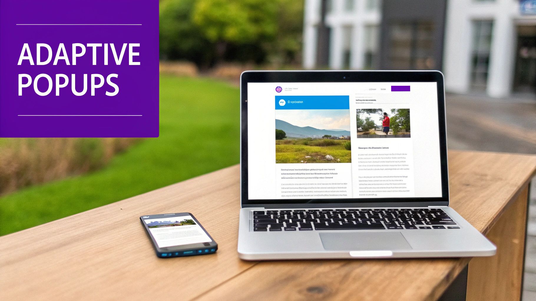
Divi Areas Pro is my go-to for creating popups, fly-ins, and other dynamic content that grabs a user's attention. By injecting your own media queries css mobile rules, you can make these interactive elements look perfect on any device.
Picture a contact form popup: on a desktop, it has a beautiful two-column layout with plenty of white space. But on a phone, that same layout would be a squished, unusable mess. Media queries are the answer. With just a few lines of targeted CSS, you can ensure every visitor gets the best possible experience.
Let’s dive into a real-world example of how I’d style a Divi Area being used as a popup.
Real-World Example: A Responsive Opt-In Popup
Let's say you've built a Divi Area and given it the custom CSS class .responsive-optin. Inside, you’ve designed a slick two-column row—an image on the left, an opt-in form on the right. It looks fantastic on a big screen, but we both know it’s going to be a disaster on mobile.
First, we need to apply our mobile-first styles. By default, the columns should stack nicely on top of each other.
/* Base styles for our responsive opt-in /
.responsive-optin .et_pb_column {
width: 100% !important; / Forces columns to stack on mobile */
}
Easy enough. Now, we’ll bring in a media query to create the two-column layout, but only for screens that are tablet-sized or larger (768px and up).
/* Two-column layout on larger screens /
@media screen and (min-width: 768px) {
.responsive-optin .et_pb_row {
display: flex; / Aligns columns side-by-side */
align-items: center;
}
.responsive-optin .et_pb_column_1_2 {
width: 48% !important;
margin-right: 4%;
}
.responsive-optin .et_pb_column_1_2:last-child {
margin-right: 0;
}
}
With that simple addition, the popup just works. Mobile users get a clean, single-column form that’s a breeze to fill out. Desktop users see the full, engaging two-column design you originally intended. If you want a more detailed walkthrough, you can learn exactly how to create a mobile opt-in form with Divi Areas Pro in our dedicated guide.
By combining the flexibility of Divi Areas Pro with your own custom CSS media queries, you move beyond simple responsive design. You start building interactive experiences that are truly optimized for every user’s context, which is key to boosting engagement and conversions.
Common Media Query Questions Answered
Even when you've got a handle on the basics, you're going to hit a few snags with media queries. It just happens. Let's walk through some of the most common questions I hear, especially from Divi users, so you can troubleshoot with confidence and get back to building.
Where Should I Add My Media Query CSS in Divi?
Knowing where to put your code is half the battle for a clean, manageable site. Divi gives you a few great options, and the best choice really boils down to how far and wide your new styles need to reach.
- For Site-Wide Styles: My go-to is nearly always the WordPress Customizer (Appearance > Customize > Additional CSS). The live preview feature is a game-changer, letting you test breakpoints and tweak global rules on the fly without mashing the refresh button.
- For Theme-Specific Rules: If you're comfortable with them, a child theme’s
style.cssfile is the most professional, bulletproof method. This keeps all your custom code completely separate from the parent theme, so you never have to worry about a Divi update wiping out your hard work. - For Element-Specific Styles: Got a style that only applies to a single button on a single page? Use that module's Advanced > Custom CSS tab. It keeps the CSS perfectly contained and scoped right where it's needed.
As a rule of thumb, I try to keep global styles truly global (in the Customizer or a child theme) and use the module-specific CSS sparingly. It’s a simple discipline that prevents your stylesheets from becoming a chaotic mess down the road.
Why Isn't My Media Query Working?
We’ve all been there. You write the code, you save it, you refresh, and… nothing. It's frustrating, but before you get too discouraged, run through this quick checklist.
- Check for Syntax Errors: A missing curly brace
}or a simple typo is the culprit 90% of the time. Seriously. Comb through your code one more time, character by character. - Inspect for Specificity Conflicts: Pop open your browser's developer tools and inspect the element. It’s highly likely a more specific Divi selector is simply overriding your custom code. You might need to beef up your selector's specificity or, as a last resort, use
!important. - Clear All Caches: This is a big one. Always clear your Divi cache, any caching plugin you're running (like WP Rocket), and your browser cache. There's a good chance you're just looking at an old, cached version of your stylesheet.
The number one reason I see media queries fail is a specificity war with Divi's default styles. Adopting a mobile-first approach from the start drastically reduces these conflicts, as you're adding styles progressively rather than fighting to override existing ones.
Can I Target a Specific Device Like an iPhone?
Technically, yes, you can write a media query that targets the exact screen dimensions of a specific iPhone model. But you absolutely shouldn't.
This is an old, brittle practice that creates a maintenance nightmare. New phones with slightly different resolutions are released every single year. Chasing specific device models will have you updating your CSS constantly.
Instead, you should always be designing for viewport ranges using min-width and max-width breakpoints. This device-agnostic approach creates a truly fluid and flexible layout that will look great on the devices we have today and whatever new ones come out next year.
Ready to take your responsive designs from functional to exceptional? With Divimode, you can build dynamic, high-converting popups and interactive elements that are perfectly optimized for every screen. Check out our powerful plugins and tutorials at https://divimode.com.
More Articles You Will Like


