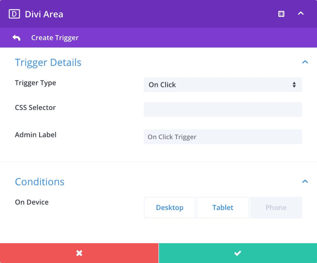
The automatic hover triggers can be defined in the Trigger Tab of Divi Areas.
🤓 Only Repeated Triggers
A repeated trigger will display the Area every time the trigger event happens. While other layout types can define one-time triggers (such as “After Delay”), Hover Areas are displayed every time the specific input event happens, such as clicking a button or hovering a menu item.
Also, Hover Areas cannot use the “Keep Closed” option to permanently close them.
Trigger Editor
Only for: Hover Areas
A trigger dialog lets you create or edit automatic triggers in an easy and intuitive way.

Trigger Details
Trigger Type
Choose the event that triggers the Area. Any Popup, Fly-In or Inline Area can use all automatic triggers (only Hover Areas have a different set of triggers).
Options:
On Click- Triggers the Area when a specific CSS selector is clicked.
– Additional options: CSS Selector
– This is a repeated trigger On Hover- Triggers the Area when the mouse enters a specific CSS selector.
– Additional options: CSS Selector
– This is a repeated trigger
CSS Selector
Define the element that triggers the Area. You can specify multiple selectors that are separated by a line break (or comma).
Most common selectors are the class selector (prefixed with .) and the ID selector (prefixed with #), but you can use any valid selector.
Basic samples:
.section1→ Class selector. Matches an element with the CSS class “section1”#cta-button→ ID selector. Matches an element with the CSS ID “cta-button”
Advanced samples:
a[href*="#"]→ matches all links that have an anchor tag in the href URL.menu-item-25 > a→ matches the link of the menu item for post_id 25#footer img:first-child→ matches the first image tag in the page footer
Admin Label
Here you can enter a custom label for the trigger. It has no function other than helping you organize and recognize your triggers.
Conditions
On Device
With this toggle control you can disable a trigger on certain device types. By default a new trigger is enabled on all device sizes.
🤓 How it works
Device detection is handled by the JS API (in the browser) and applies the same logic as Divi uses to toggle between responsive layouts:
The API measures the width of the viewport and categorizes the device as a Desktop (981 pixel or larger), Tablet (less than 981 pixel), or Phone (less than 768 pixel).