
 Alex Martin
Building a mobile-friendly website really just comes down to one thing: responsive design. This isn't about creating a separate mobile site. Instead, it's about building a single, flexible layout that fluidly adapts to any screen, from a huge desktop monitor right down to the smallest smartphone. The whole point is to give every visitor a seamless experience, making sure your site is easy to read and use, no matter what device they're on.
Why a Mobile-First Approach Is Non-Negotiable
Treating mobile design as an afterthought is one of the biggest mistakes you can make. It's not some "nice-to-have" feature anymore; it’s the very foundation of your online presence. The way people browse the web has completely changed, and your strategy has to change with it.
The numbers don't lie. Mobile devices now account for over 55% of all global website traffic, and that trend is only going up. For most businesses, this means the majority of your audience will first meet your brand on a small screen.
And these users have high expectations. A staggering 53% will bounce if a site takes longer than three seconds to load. If you're curious, you can dig deeper into mobile website design trends and see just how much they impact user behavior.
The Impact on Your Business and SEO
This massive shift isn't just about keeping users happy—it directly hits your bottom line and search rankings. Google now uses mobile-first indexing, which is a game-changer. It means Google predominantly uses the mobile version of your website to index and rank its pages.
To put it simply: if your mobile site is slow, a pain to navigate, or missing content that your desktop version has, your overall search rankings will take a hit. The quality of your mobile experience is now the main lens through which Google judges your entire website.
The link between mobile usability and SEO is direct and unforgiving. A bad mobile experience leads to high bounce rates and low engagement, signaling to Google that your site isn't delivering value. This can cause a serious drop in organic traffic, making it much harder for new customers to find you.
What Makes a Website Mobile-Friendly?
To really nail a mobile-friendly website, you have to do more than just shrink your desktop design. It’s a complete strategic rethink of your layout, content, and functionality.
To create a mobile friendly website, focus on these key areas. This table summarizes the essential components we will cover in this guide.
Core Pillars of a Mobile-Friendly Website
| Component | Why It Matters | Key Action in Divi |
|---|---|---|
| Responsive Layout | Ensures content is readable and usable on any screen size without horizontal scrolling. | Use Divi's responsive editing controls to adjust column stacking, spacing, and element visibility for Desktop, Tablet, and Mobile views. |
| Optimized Performance | Mobile users expect lightning-fast load times. Slow sites lead to high bounce rates. | Compress images, enable Divi's performance options (like static CSS generation), and use a good caching plugin. |
| Touch-Friendly Navigation | Fingers are less precise than a mouse cursor. Elements must be easy to tap. | Increase the size of buttons and links. Add sufficient padding and margins to create space between tappable elements. |
| Readable Content | Prevents users from having to pinch and zoom, which is a major friction point. | Use legible font sizes (at least 16px for body text) and break content into short, scannable paragraphs for on-the-go reading. |
Throughout this guide, we'll dive deep into each of these pillars, showing you exactly how to implement them in Divi for a flawless mobile experience.
Mastering Divi's Built-In Responsive Controls
If you really want to create a mobile-friendly website in Divi, your first stop has to be its most powerful feature: the built-in responsive controls. These tools give you the power to make precise, granular adjustments for different screen sizes, all from right inside the Visual Builder. No code required.
At its core, Divi’s responsive system lets you assign different values for almost any design setting based on the device. When you hover over a setting like Margin, Padding, or Font Size, a little phone icon pops up. Clicking it reveals tabs for Desktop, Tablet, and Mobile views. This is where the magic happens.
Customizing Styles for Each Device
Let's say you've designed a stunning hero section with a big, bold headline. It looks incredible on a desktop, but on a phone, the text is just way too big and pushes all the important content off the screen. Instead of settling for a medium font size that looks "okay" on all devices, you can set specific values for each one.
You might have the headline at 80px on desktop, then click the tablet tab and shrink it to 50px. For mobile, you could take it down to a much more manageable 32px. Divi handles the rest, automatically serving the right style to the right visitor.
This isn't just for text, either. You can fine-tune almost anything:
- Spacing: Got a section with 150px of top margin on desktop? Dial it back to a more compact 40px on mobile to reduce all that extra scrolling.
- Column Layouts: A four-column row on desktop will stack into a single column on mobile. That’s standard. But you can use responsive padding to add just the right amount of breathing room between those stacked items so they don't feel cramped.
- Element Sizing: You can even set a different
max-widthfor an image on mobile versus desktop. This ensures it fits neatly without causing any annoying horizontal scrollbars.
Here's the key takeaway: stop thinking about a single design. With Divi, you're actually creating three distinct (but connected) layouts at the same time. Getting into that mindset is the first real step toward building truly professional, responsive websites.
A Practical Example: Transforming a Layout
Picture a classic "About Us" section—image on the left, text on the right. On desktop, maybe you added a -80px left margin to the image to create a cool overlapping effect with the section above it. On mobile, that negative margin would be a disaster, probably pushing the image right off the screen.
No problem. Using the responsive controls, just switch to the mobile view for that image and set the left margin to 0px. Now, desktop users still get the dynamic overlap, while mobile visitors see a clean, perfectly aligned layout. This kind of granular control is what separates a truly polished mobile site from one that's just functional. For more deep dives on this, check out our complete guide on how to make a mobile-friendly website with Divi.
The image below shows how flexible elements resize to fit different screens, which is the heart of responsive design.
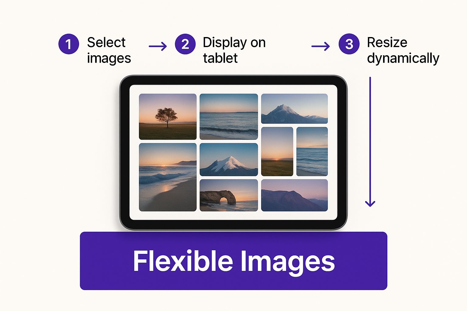
This process makes sure your visuals keep their punch without breaking the layout on smaller devices. And it's more important than ever. With mobile devices now driving roughly 59.7% of global website traffic, failing to get this right just isn't an option anymore.
Applying Advanced CSS for a Polished Mobile Layout

While Divi’s built-in responsive controls are incredibly powerful, there will be times when you need a level of precision they just can't offer. This is where a little bit of custom CSS becomes your secret weapon, allowing you to fine-tune every pixel for a truly polished mobile experience.
Custom CSS gives you the ultimate control to fix those small but frustrating design issues that can make a mobile site feel clunky. Think of it as the final 10% of effort that elevates your design from good to exceptional.
The primary tool for this job is the CSS Media Query. A media query is a simple but powerful rule that tells the browser to apply specific styles only when the screen is a certain size. It's the absolute foundation of advanced responsive design.
Targeting Specific Mobile Breakpoints
Divi has its own default breakpoints, but you can create custom rules for more granular control. For example, if you want to apply a style only to screens smaller than a typical tablet (basically, just smartphones), you would use a media query like this:
@media only screen and (max-width: 767px) {
/* Your mobile-specific CSS goes here */
}
This snippet tells the browser: "If the screen width is 767 pixels or less, apply the following styles." You can add this code right into your Divi Theme Options under "Custom CSS" or directly into a page's advanced settings for more targeted fixes.
The real power of CSS is its ability to override default behaviors. When you learn how to create mobile friendly website layouts, media queries are the key to unlocking design solutions that are impossible with builder toggles alone.
Practical CSS Snippets for Common Issues
Let's tackle some real-world problems. Divi’s built-in tools are great, but sometimes you have to get creative, especially when dealing with complex layouts or third-party plugins. Speaking of which, if you're adding dynamic popups or fly-ins, you can explore the features of Divi Areas Pro that improve your business website, as those elements also benefit from responsive CSS tweaks.
Here are a few copy-and-paste solutions I find myself using for frequent mobile headaches:
Hiding a purely decorative element: Sometimes an element that looks great on desktop just adds clutter to a mobile screen. First, give the element a unique CSS Class in its Advanced settings, like
hide-on-mobile. Then, add this CSS:@media only screen and (max-width: 767px) {
.hide-on-mobile {
display: none !important;
}
}Fixing awkward text overflow: Ever had a headline break in a weird spot on mobile? You can prevent it from wrapping to a new line. Just assign a class like
no-wrap-textto the text module.@media only screen and (max-width: 480px) {
.no-wrap-text h2 {
white-space: nowrap;
}
}Reversing column stacking order: By default, Divi stacks columns from left to right. If you need the right column to appear first on mobile, you can use Flexbox. Add a class like
reverse-stackto the parent row.@media only screen and (max-width: 980px) {
.reverse-stack .et_pb_column {
display: flex;
flex-direction: column-reverse;
}
}
These snippets are just the beginning, of course. By understanding the logic behind media queries and simple CSS properties, you gain the ability to solve virtually any responsive design challenge Divi throws your way.
Optimizing Images and Media for Mobile Speed
A perfectly responsive layout doesn't mean much if your website takes forever to load on a mobile connection. Performance isn't just a technical detail; it's a huge part of the user experience. When people are on the go, they expect speed, and heavy, clunky media files are usually the biggest culprits slowing things down.
Large images and videos can absolutely cripple mobile load times. The data doesn't lie: 40% of users will abandon a site if it takes more than three seconds to load. This makes media optimization one of the most impactful things you can do to build a mobile-friendly website that actually works.
Compressing Images Without Sacrificing Quality
The goal here is to find that perfect sweet spot between a tiny file size and crisp visual quality. Let's be honest, you don’t need a massive, high-resolution image designed for a 27-inch monitor to be served to a 6-inch smartphone screen. This is where modern image formats and smart compression come into play.
- Embrace Modern Formats: Whenever you can, use next-gen image formats like WebP. It offers way better compression and quality compared to old-school JPEGs and PNGs. We're talking files that are often 25-35% smaller with no visible difference.
- Use Compression Tools: Before you even think about uploading an image to your Divi Media Library, run it through a compression tool first. I personally love services like TinyPNG; they can dramatically shrink file sizes without you even noticing a drop in quality.
- Serve Scaled Images: This one is huge. Don't upload a 4000px wide image and just let Divi shrink it down visually. Resize the image to the actual maximum dimensions it will ever be displayed at on your site.
When you combine these techniques, you're making sure mobile visitors download the smallest possible files, which directly translates to a faster, less annoying browsing experience. For a deeper dive, the folks at Divimode put together a fantastic article covering how to optimize Divi for mobile devices.
Leveraging Divi’s Built-In Performance Features
Fortunately, Divi comes with some powerful tools designed to tackle slow load times, especially for pages loaded with media. You can find these settings right in your WordPress dashboard under Divi > Theme Options > Performance.
One of the most effective features is Lazy Loading. When you flip this on, Divi cleverly stops images and videos from loading until they are just about to scroll into the user's view.
Instead of forcing a visitor to download every single image on a long page at once, lazy loading defers the process. This dramatically speeds up the initial page load, which is that make-or-break moment for keeping a user's attention.
Enabling lazy load for images and videos is a simple toggle that can give you a massive performance boost with practically zero effort. It ensures that users on slower mobile networks aren't punished for content they might not even scroll down to see, creating a much leaner and faster experience right from the first click.
Don't Let Your Mobile Site Sabotage Your SEO
Getting a layout to look good on a phone is only half the battle. If you really want to build a mobile-friendly website that search engines actually like, you need to get familiar with a critical concept: content parity. This goes way beyond just design and cuts right to the heart of your SEO strategy.
The game fundamentally changed when Google switched to mobile-first indexing. This means Google now predominantly uses the mobile version of your site to index and rank your pages. In short, your mobile site is your primary site in Google’s eyes. This isn't a small detail; getting it wrong can have some pretty nasty consequences for your rankings.
This policy demands that the content on your mobile version is identical to what's on your desktop version. No exceptions. We're talking about:
- Main Body Content: All your text, articles, and product descriptions have to be there.
- Headings and Meta Tags: Your title tags, meta descriptions, and H1/H2 headings need to match up perfectly.
- Structured Data: Any schema markup you’re using for reviews, products, or events must be present on both versions.
- Internal Links: All the links that help Google crawl your site and spread authority must be consistent.
The Hidden Danger of Divi's Responsive Settings
One of the most common mistakes I see Divi users make is getting a little too happy with the responsive visibility settings. You might have a complex section that looks fantastic on a desktop but feels cluttered and clunky on a phone. The easy fix seems to be just hiding it on mobile, right?
Big mistake. A huge SEO mistake, in fact. If you hide a block of text containing your target keywords or important internal links on the mobile view, you’re basically telling Google that content doesn't exist. Since Google is looking at your mobile site first, that hidden content will never get indexed, and your rankings for those keywords could absolutely tank.
Instead of hiding content, your first instinct should always be to redesign it for mobile. Use Divi’s powerful responsive controls to stack columns, adjust font sizes, or reduce padding. The goal is to present the same information in a more compact and readable format, not to just get rid of it.
How to Quickly Check for Content Parity
Making sure your site maintains parity isn’t rocket science, but it does require a bit of attention to detail.
A super simple way to check is to just use your browser's built-in developer tools. Open your site, right-click anywhere on the page, and select "Inspect." From there, just toggle the device mode to simulate a smartphone.
Now you can do a side-by-side comparison of the simulated mobile screen with your desktop version. Ask yourself: Is any text missing? Are all the key headings there? Do the navigation links match? A thorough check like this ensures both your users and search engine crawlers are getting the same, complete experience. That's the real key to winning with mobile-first indexing.
Common Questions About Building a Mobile Friendly Website
Even with a powerhouse like Divi, you're bound to run into a few head-scratchers when you're deep in the trenches of a build. Getting these little details right is what really separates a decent site from a truly professional one. So, let's tackle some of the most common questions and challenges that pop up.
Responsive Versus Mobile Friendly Design
You’ll hear people toss these terms around like they’re the same thing, but they actually describe two very different philosophies.
A mobile-friendly site is one that simply works on a mobile device. This could be a totally separate, stripped-down version of your website, often living on an "m-dot" subdomain. It's an older approach and, frankly, a bit of a headache to maintain.
Responsive design, on the other hand, is the modern gold standard and exactly what Divi is built for. It uses one flexible layout that elegantly adapts to any screen size it encounters. This is worlds better for both your users and your SEO because you're only managing a single, unified website.
How to Properly Test Your Divi Website
So, how can you be absolutely sure your site is as mobile-friendly as you think it is? Start with Divi's built-in responsive previews inside the Visual Builder—they're perfect for quick, on-the-fly checks.
For a more accurate simulation, fire up your browser's developer tools (usually hitting F12 or right-clicking and selecting "Inspect"). This lets you mimic a whole range of devices, from various iPhones to Android models.
But here’s the real pro tip: nothing beats testing on actual, physical devices. Grab your phone, borrow a friend's tablet, and see how your site performs in the wild. Once you're done, run your URL through Google's Mobile-Friendly Test tool to get the official verdict from the search giant itself.
Hiding Elements on Mobile Without Hurting SEO
Divi’s visibility controls are a lifesaver, making it a breeze to hide certain elements on specific devices. This is brilliant for ditching purely decorative items that just add clutter or slow down the mobile experience.
Use this feature with caution, though. Hiding entire sections that contain important text, keywords, or crucial internal links can be an SEO disaster. Remember, Google's mobile-first indexing means that if it can't see it on the mobile version, it might as well not exist. Always try to redesign a clunky section for smaller screens before you even think about hiding it.
Beyond just the design, many people wonder about integrating other services. For instance, figuring out how to add payment features to a website is a common next step that absolutely requires a mobile-first mindset to get right.
Fixing Fonts That Are Too Big on Mobile
This is probably the number one issue every Divi designer runs into. A headline that looks majestic on a desktop screen can feel like it's screaming at you on a phone.
Thankfully, the fix is both simple and precise. In the design settings for any text-based module, just find the 'Font Size' option. As you hover over it, you'll see a small phone icon appear—click it.
That simple click opens up the responsive settings tabs. Now you can set a completely different, smaller font size just for tablet and mobile views, without affecting your desktop design one bit. This is the right way to handle typography across devices.
Ready to build advanced, responsive popups and interactive content that looks incredible on every device? With Divimode, you can create high-converting elements with Divi Areas Pro, taking your mobile-friendly website to a whole new level. Learn more about Divimode.
More Articles You Will Like