
 Ria du Plessis
Are you a Divi web developer wanting to make sure the websites you create are mobile-friendly and built with users in mind? Then this article is for you! As Divi web developers, we know that when you create a website there might be times when your column stacking is not what you want it to be. This is especially true when it comes to mobile devices.
In this article, we will show you how easy it is to control the Divi column stacking order on mobile. You can now ensure that your images and text are in the right order on mobile and other devices.
*New to Divi? – Try the Divi Theme NOW!
Table of Contents
- Control The Divi Column Stacking Order On Mobile in Easy Steps
- Manually Set The Divi Column Stacking Order
- Why Change The Divi Column Stacking Order On Mobile?
- As Easy As That!
Control The Divi Column Stacking Order On Mobile in Easy Steps

Step #1. Add 2 Lines Of CSS To Your Row Settings
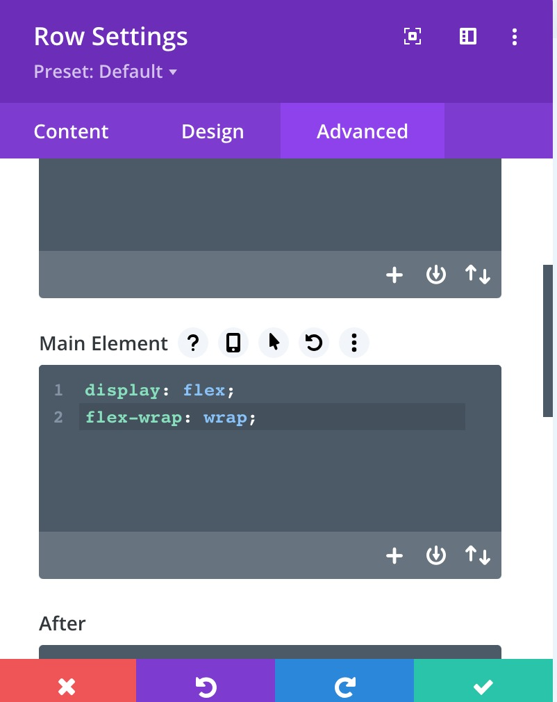
To control the stacking order of Divi columns on mobile, we must first add CSS to the Divi row settings. This CSS will instruct the columns within the row to display using flex. By doing this, we will be able to control the column stacking order on mobile.
Go to the Row Settings>Advanced Tab>Custom CSS toggle. Paste the following snippet of CSS there in the Main Element.
display: flex;
flex-wrap: wrap;
Manually Set The Divi Column Stacking Order
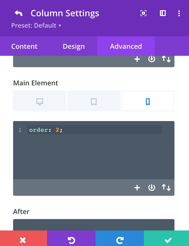
Step #2. Tell Each Column Which Order Number They Are
If you thought step #1 was easy, you are in luck. The last step is even easier, and a bit more fun as well.
Inside the row settings, you will see a list of your columns. Click on the settings icon and go to the column’s Advanced Tab>Custom CSS toggle.
For each column, you need to decide which order you want them to stack on mobile. All you have to do is add the words “order: 1;” and “order: 2” etc. to the columns. Write or paste those simple words into the Main Element of the device you want. For example, we wanted only to change the mobile order of the columns, so we only added the CSS to the mobile view of the main element.
Why Change The Divi Column Stacking Order On Mobile?
This is a great question! Well, it all comes down to mobile responsiveness for your brand and user-friendliness for your website. You don’t want the order of text and images on mobile devices to influence how people see or use your website.
As Easy As That!
It is so easy to change the Divi content stacking on mobile devices! As easy as only two steps! We hope this Divi Tutorial helped you today. Stay tuned on our Divimode.com website for loads of interesting articles coming your way every week.
Try Divi Areas Pro today
Sounds interesting? Learn more about Divi Areas Pro and download your copy now!
Many pre-designed layouts. Automated triggers. No coding.
Click here for more details
More Articles You Will Like


