You're probably at the point where your Divi menu stopped being a menu and started becoming a compromise. What used to be a neat row of links now hides key pages, stacks awkward dropdowns, and forces visitors to hunt for what should be obvious.
That's usually when people start searching for the best mega menu for Divi. Not because they want a flashy header, but because the site outgrew a basic navigation pattern. Stores need category depth. agencies need service paths. Corporate sites need to route different visitors to different sections without turning the header into clutter.
The good news is that Divi gives you more than one way to solve this. The better news is that the right answer depends less on feature volume and more on what kind of site you're building, who has to maintain it, and how that menu needs to behave on mobile.
Why Your Divi Site Needs a Better Navigation Strategy
A growing Divi site usually breaks in the same place first. Navigation gets overloaded.
You add a few service pages, then a resources section, then a shop, then landing pages for campaigns. Soon the header has too many top-level choices, and the dropdowns become long, brittle lists that nobody enjoys using. Visitors don't think, “this site has a lot of content.” They think, “I can't find what I need.”
That's why mega menus became such a practical pattern inside the WordPress ecosystem. WordPress powers 43.5% of all websites and holds about 61.3% of the CMS market according to Divi Life's note citing W3Techs. When that many sites rely on WordPress, navigation tooling around themes like Divi naturally becomes a serious category, not a niche extra.
When a standard dropdown stops working
A normal dropdown still works for small brochure sites. It falls apart when the information architecture gets wider and deeper.
Typical examples include:
- E-commerce stores with many product categories and subcategories
- Agency sites that need to group services, case studies, industries, and contact paths
- Publisher or blog sites with topic clusters, featured content, and archive routes
- Corporate sites serving different visitor intents such as support, sales, careers, and investor content
A mega menu gives those destinations structure. Instead of one long descending list, you can group links by topic, priority, or user intent.
A good mega menu doesn't add more choices. It organizes existing choices so people can scan them faster.
The real job of a mega menu
The core value isn't visual complexity. It's clarity.
For Divi users, that means choosing a solution that fits your site's content model and your editing workflow. Some teams need a lightweight native setup. Others need visual layouts, rich content blocks, or role-based targeting. If mobile is a big part of your traffic, it also means not treating the desktop menu as the default design and shrinking it later.
That's where broader usability thinking matters. If you want a useful companion read on touch behavior and small-screen interaction, SmashPops' mobile UX insights are worth reviewing before you lock in a menu pattern.
Key Criteria for Choosing a Mega Menu Solution
The wrong way to choose a Divi mega menu is to ask which plugin has the longest feature list. The right way is to ask what your visitors need, what your editors can realistically manage, and what your header should do on mobile.

Here's the short comparison I use before I install anything:
| Option | Best for | Main strength | Main limitation |
|---|---|---|---|
| Divi built-in mega menu | Simple multi-column link menus | Lightweight and native | Limited styling and content flexibility |
| Dedicated mega menu plugin | Rich dropdown layouts | Visual building and menu-focused workflow | Another plugin to maintain |
| Multi-purpose interaction tool | Advanced menus plus overlays and conditional content | Flexible triggering and broader use cases | More capability than some sites need |
Builder integration matters more than marketing
If a menu tool works naturally inside the Divi Builder, teams use it. If the workflow feels bolted on, they avoid editing it until the menu becomes outdated.
Look for:
- Editing comfort. Can your team build menu content visually, or do they need menu-screen workarounds and custom CSS?
- Assignment workflow. Is it obvious how a menu layout gets attached to a trigger item?
- Reusable structure. Can you update one menu area cleanly without digging through multiple settings panels?
For non-developers, friction in the editing experience often matters more than raw power. For developers and agencies, a more structured system may be worth the extra setup if it gives cleaner control later.
Mobile behavior should decide more of the choice
This is the criterion people underrate most.
Research referenced by Divi Supreme's discussion of mobile mega menus points to a familiar problem: mobile navigation remains a frequent usability pain point, and the visually richest mega menu is not always the best one. On small screens, a simpler or two-step navigation can outperform a full mega menu in clarity and task completion.
That changes how you should evaluate every option.
- Tap targets need to be easy to hit
- Hover-dependent patterns need an alternative
- Dense layouts often need a different mobile version
- Overlays and expanded states need to feel predictable
If you're refining the wider user experience around navigation, content, and interaction patterns, these UX principles for better Divi websites are a useful benchmark.
Practical rule: if the desktop menu looks impressive but the mobile version feels cramped, the menu isn't finished.
Performance and restraint
A mega menu can hurt usability when it tries to function like a homepage inside a dropdown. That usually shows up as too many columns, too many visual treatments, and too much competing content.
The best setups stay disciplined:
- Group by intent, not by internal org chart
- Feature selectively, not everywhere
- Keep top-level labels obvious, because clever wording slows scanning
- Reduce mobile complexity, even if desktop stays richer
That's what separates a menu that looks advanced from one that helps people move.
Understanding Divi's Built-In Mega Menu Feature
A lot of Divi users skip the native option because they assume “mega menu” automatically means “plugin.” That's not true.
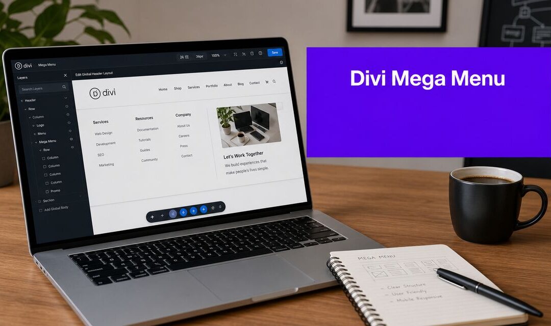
Divi includes a built-in mega menu capability, and for the right project it's enough. The activation method is straightforward: add the CSS class mega-menu to a top-level menu item in WordPress, and Divi can render that item as a multi-column dropdown. The documented native structure supports up to 4 parent links under the trigger item, which gives you a simple column layout without needing a third-party plugin, as shown in this Divi mega menu walkthrough.
Where the native option works well
The built-in approach makes the most sense when the menu is mostly links and the layout doesn't need custom content blocks.
Good fits include:
- Corporate sites with grouped page links
- Content-heavy blogs that need topic clusters in the header
- Lean brochure sites where the owner wants fewer plugins
- Performance-conscious builds where simplicity matters more than decoration
In practice, it's a solid baseline because the workflow is clean. Build the WordPress menu correctly, apply the class, and let Divi handle the multi-column dropdown behavior.
Where it starts to feel limiting
The limitation isn't that it fails. It's that it stays narrow.
You're working with a menu structure first, not a visual content canvas. That means it's less suitable when you want product callouts, custom module layouts, mixed media, promotional panels, or conditional display logic. Styling can also become more CSS-heavy than many site owners expect.
If your menu only needs organized links, the native Divi option is often the smartest choice. If you want the menu to behave like a designed content surface, you'll hit the ceiling quickly.
That ceiling is exactly why dedicated Divi mega menu plugins became popular. They don't replace a broken native system. They expand on a native system that was intentionally simple.
Comparing Dedicated Divi Mega Menu Plugins
Once the native setup feels too rigid, dedicated plugins become the logical next step. Users searching for the best mega menu for Divi often reach this point. They don't need “a mega menu.” They need a menu that can carry real layout work.

Here's the practical comparison early, before the nuance.
| Tool type | Workflow style | Best fit | Watch out for |
|---|---|---|---|
| Divi Mega Pro | Structured, content-model driven | Agencies, larger builds, repeatable systems | Slightly more setup overhead |
| Divi Engine's Divi Mega Menu | Simpler visual workflow | Site owners, freelancers, content-led menus | May feel less structured on complex builds |
| Divi Supreme style approach | Design-led menu enhancement | Users focused on visual effects and richer presentation | Mobile simplification still needs deliberate planning |
Divi Mega Pro
Divi Mega Pro is built for people who want more than a dropdown editor. Its documented approach uses custom post types and supports unlimited mega menus along with mega tooltips, which immediately tells you what kind of user it serves: someone managing multiple menu experiences across a site or across client sites. That positioning is described in Divi Life's Divi Mega Pro product page.
Core philosophy: model the menu as a reusable content object, then connect it to triggers with more deliberate control.
That's useful for agencies. It's also useful for WooCommerce stores where different navigation sections may need their own layouts and maintenance workflow.
The trade-off is setup complexity. This isn't difficult, but it's less “click and go” than a simpler menu builder. If your client edits menus rarely, the extra structure can be a benefit. If they want everything to feel immediate, it can feel like overkill.
Divi Engine's Divi Mega Menu
Divi Engine's approach is easier to recommend to users who want rich layouts without feeling like they're building a mini content system.
The plugin emphasis is on responsive, content-rich layouts with no coding required, and that's a meaningful distinction. In real projects, less setup friction means fewer maintenance mistakes later. Editors are more likely to update menus that feel visually familiar.
This is usually the better fit when:
- A freelancer wants a polished menu without added content modeling
- A small business owner edits the site directly
- A portfolio or services site needs visual richness, not advanced behavioral logic
The trade-off is subtle. Simpler workflows are often easier to maintain, but they may offer less structure for teams that want many distinct menu instances and stricter content organization.
What the shared pattern tells you
Both Divi Mega Pro and Divi Engine's Divi Mega Menu lean into Divi Builder-based visual construction. The difference isn't one having “features” and the other not. It's workflow philosophy. Divi Mega Pro leans toward deeper content modeling, while Divi Engine leans toward simpler editor flow, as summarized in this roundup of third-party Divi plugin options.
Most buyers compare mega menu plugins as if they're shopping for a checklist. In practice, they're choosing how the team will maintain navigation six months from now.
Which project type fits which plugin
A quick practitioner view:
| Project type | Better fit | Reason |
|---|---|---|
| WooCommerce store | Divi Mega Pro | Better when menus need many reusable structures |
| Agency site | Either one | Depends on whether the team values structure or editing simplicity |
| Portfolio site | Divi Engine | Easier path to visually rich but manageable navigation |
| Developer-managed client fleet | Divi Mega Pro | More systematic for repeatable implementations |
Divi Supreme belongs in the broader conversation because it speaks to the same market need. But the main lesson from the dedicated plugin category is this: choose based on maintenance style, not just front-end potential.
Divi Areas Pro The All-in-One Power Solution
Some sites outgrow the “menu plugin” category entirely. They need navigation, yes, but they also need overlays, conditional content, user-based targeting, and reusable interactive layouts. That's where a broader tool can make more sense than a dedicated mega menu product.

Divi Areas Pro fits that category. Instead of thinking in terms of “build menu, style menu, assign menu,” the workflow is closer to “build a Divi layout area, then trigger it where needed.” For advanced sites, that's a very different mental model.
Why this approach changes the design ceiling
A traditional mega menu plugin usually starts with navigation and expands outward. An area-based system starts with layout freedom and then lets navigation become one trigger among several.
That matters because you can use the full Divi Builder mindset inside the dropdown experience. The menu can include product highlights, forms, images, promotional blocks, dynamic sections, or other content patterns that don't fit neatly into a standard menu hierarchy.
This is especially useful when the header is doing more than navigation, such as:
- Segmenting visitors by role or intent
- Promoting selected products or services
- Showing different content based on page context
- Consolidating tools that would otherwise require separate popup and menu plugins
The hidden advantage is targeting
For advanced builds, targeting often matters more than layout.
A standard mega menu shows the same dropdown to everyone. A more flexible interaction system can support different displays based on context. That's valuable for agencies, membership sites, WooCommerce projects, and marketing-led builds where one static menu is too blunt.
The practical result is better alignment between the navigation surface and the visitor's current state. Logged-in users may need shortcuts. New visitors may need orientation. Product-category pages may need different supporting navigation from top-level service pages.
For a deeper look at that feature set, Divi Areas Pro's feature overview lays out how the tool handles interactive content beyond menus.
A flexible area system isn't the right answer for every site. It is the right answer when the menu is only one piece of a broader interaction strategy.
Who should consider it
This approach makes the most sense for:
| User type | Why it fits |
|---|---|
| Agencies | One system can cover mega menus, popups, and targeted content |
| Power users | Greater freedom to design non-standard navigation experiences |
| WooCommerce managers | More room for promotional and context-aware menu content |
| Developers | Cleaner path when a site needs custom interaction logic |
It's not the automatic recommendation for a simple brochure site. That would be unnecessary complexity. But for large Divi builds, it can replace several narrower tools with one more adaptable workflow.
How to Choose The Right Mega Menu for Your Project
The best mega menu for Divi depends on what the site needs, who edits it, and how much complexity you want to own later. Most bad menu decisions happen because people buy for possibility instead of fit.

The fastest decision framework
Use this if you want the shortest path to a solid decision.
- Choose Divi's built-in option if the job is mostly grouped links in columns. This is the cleanest answer for simple corporate navigation, content directories, and plugin-light builds.
- Choose a dedicated mega menu plugin if the menu itself is the main requirement. That fits sites that need richer layouts but don't need broader behavior like popups or conditional experiences.
- Choose an area-based interaction tool if navigation is only one part of a larger UX system. That usually points to agencies, advanced marketers, membership sites, and stores with segmented user journeys.
Match the tool to the site type
A use-case lens works better than feature shopping.
| Site type | Recommended direction | Why |
|---|---|---|
| E-commerce | Dedicated plugin or area-based system | Product-heavy navigation often needs richer content and stronger control |
| Portfolio | Dedicated plugin | Visual presentation matters, but the content model is usually manageable |
| Corporate | Built-in or dedicated plugin | Often better to keep navigation clear and restrained |
| Agency | Dedicated plugin or area-based system | Agencies often need flexibility and repeatable workflows |
Match the tool to the person maintaining it
This matters just as much as project type.
Beginner
A beginner usually does better with the native Divi option or the simplest visual plugin workflow. Too much control creates maintenance anxiety, and menus get neglected.
Freelancer
A freelancer often benefits from dedicated plugins because they deliver rich results quickly and still feel handoff-friendly to clients.
Developer
A developer may prefer more structured systems or broader interaction tools because they scale better across custom builds and unusual requirements.
Don't choose a menu system your client won't touch. A slightly less powerful tool that gets maintained is better than a powerful one everyone avoids.
My practical default
If a site only needs order, I'd stay native. If it needs designed dropdown content, I'd move to a dedicated plugin. If the menu also needs targeting, promotional behavior, or overlap with popup-style interactions, I'd stop thinking in “menu plugin” terms and choose the broader system.
That's the difference between buying a feature list and solving the navigation problem you have.
Frequently Asked Questions
Will a mega menu slow down a Divi site
It can, but the cause usually isn't the concept of a mega menu. It's the way people pack too much into it.
A menu stays manageable when it uses lean layouts, avoids unnecessary media, and keeps each panel focused. Native Divi menus are naturally lighter because they're simpler. Rich plugin-based menus need more discipline in layout and content choices.
Which option gives me the most design freedom
A dedicated plugin gives far more freedom than the native Divi menu. An area-based system goes further if you want menu-like experiences built from broader Divi layouts and triggers.
The right question isn't “which one can do the most.” It's “how much freedom does this project need before editing gets messy.”
Can I use Divi Builder modules inside a mega menu
With dedicated Divi-focused menu tools, visual builder integration is the point. That's why they exist. The native Divi mega menu is more limited because it starts from the WordPress menu structure rather than a fully open visual layout model.
What's the biggest mobile mistake
Trying to preserve the desktop mega menu on mobile with only minor spacing changes.
That usually creates dense tap targets, confusing expansion behavior, and poor scanning. A simplified mobile path often works better than trying to compress every desktop choice into one touch overlay.
How do I make a mega menu more accessible
Start with basics that many builds skip:
- Keep labels clear so users understand where links go
- Support keyboard navigation for people who don't use a mouse or touch
- Use visible focus states so active items are easy to track
- Avoid hover-only logic because touch users need explicit click behavior
- Test the reading order if the menu contains complex layout blocks
Accessibility problems usually come from overdesigned menus, not simple ones. If a menu requires users to guess how it opens, closes, or moves focus, it needs another pass.
If you want a more flexible way to build interactive Divi navigation, overlays, and targeted content from the same workflow, Divimode is worth a look. It focuses on practical Divi tools and guidance for sites that need more than a standard dropdown.
More Articles You Will Like