 Alex Martin
You're probably in the middle of the same typography mess most Divi builders hit sooner or later. The desktop layout looks polished, the tablet version feels a little cramped, the mobile popup suddenly looks oversized, and after a browser zoom test the whole hierarchy starts to wobble.
That usually happens because the font sizes weren't really calculated. They were picked.
A solid system for how to calculate font size does more than make headings look balanced. It keeps body text readable, respects user settings, scales cleanly across breakpoints, and gives you a repeatable way to style Divi pages, WooCommerce templates, and interactive elements like popups and fly-ins without guessing every time.
Foundations of Web Typography Units and Sizing
Open a Divi page on desktop, then check the same layout inside a fly-in on mobile. If the type feels stable in one place and awkward in another, the problem is usually the sizing unit behind it.
Font size is not just a design choice. It is a system choice. The unit you pick determines whether text respects user settings, scales cleanly across modules, and holds up when the same content appears in page sections, popups, forms, and WooCommerce templates.

What each unit does in practice
Here is the version that matters during a build.
| Unit | Relative To | Primary Use Case |
|---|---|---|
| px | A fixed pixel value | Precise UI details, borders, occasional one-off controls |
| rem | The root HTML font size | Scalable typography and spacing across a full site |
| em | The current element's parent or inherited size | Component-level scaling where nested relationships matter |
| pt | Physical point sizing | Print design and physical documents |
| vw/vh | Viewport width or height | Fluid sizing tied to screen dimensions |
px gives tight control. That makes it useful for borders, icon sizing, and small interface adjustments. It becomes a problem when used for the whole type system, because fixed text sizes are harder to scale across breakpoints and less forgiving when users change browser defaults.
rem is the best base for site-wide typography on most Divi projects. It ties every text value back to the root size, so body copy, headings, buttons, blurbs, and form labels can scale together instead of drifting apart.
em is powerful inside components, especially when a child element should grow in proportion to its parent. It also compounds in nested structures. In Divi, that matters because modules often sit inside rows, columns, and specialty sections with inherited styles. A small em decision can snowball fast.
vw and related viewport-based units help with fluid sizing, but they need guardrails. Left on their own, they can make text too small on narrow screens and too large on ultrawide ones. They work best when paired with limits, which is why clamp() becomes so useful later.
Practical rule: Use
remfor the main type system. Useeminside self-contained components. Usepxfor UI precision, not body copy. Use viewport units only when you also control their minimum and maximum size.
Why the browser default matters
Browser defaults are part of the typographic system whether a designer plans for them or not. On the web, body text commonly starts from a browser default that maps 16px to 1rem, 1em, or 100%. That baseline also helps with form usability on mobile, where undersized text fields can trigger unwanted zoom behavior.
If the root is 16px, then:
- 1rem maps to the base reading size
- 1.125rem creates a modest increase
- 0.875rem can work for labels or metadata, but usually not for long-form reading
- headings can be calculated from a stable reference instead of guessed in isolated modules
That is why rem holds up so well in Divi. It gives a shared sizing logic across pages, Theme Builder templates, and overlays. If the client later needs larger default text, the system is easier to adjust because the hierarchy already has a common base.
Font size still does not work in isolation. Pairing matters too. A clean scale will fall apart if the chosen faces fight each other in weight, width, or x-height. If that part still feels fuzzy, this guide on pairing the right fonts for your Divi website is worth reviewing before you lock in sizes.
Where print units still fit
Designers who came from print often reach for pt, and there is a place for it. Points still make sense in PDFs, print stylesheets, and physical documents where output size is fixed.
On the web, pt adds confusion more than control. Screens do not behave like paper, and browser rendering is built around CSS pixels and relative sizing. For responsive sites, rem and controlled fluid values are far more dependable.
Viewing context still matters. Physical display text follows very different sizing rules than interface text, which is why signage guidance from James Madison University's School of Media Arts & Design does not translate directly to websites. The useful takeaway is simpler. Font size only makes sense in relation to distance, device, and reading conditions.
The unit stack that holds up in real projects
A lot of fragile typography systems come from mixed units with no clear reason behind them. A heading in pixels, paragraph text in em, promo copy in vw, and popup buttons in another fixed size will usually create inconsistencies once the layout starts shifting across breakpoints.
A cleaner setup looks like this:
- Root and body text in
rem - Headings in
rem - Fluid type handled with
clamp()orcalc()where it solves a real scaling problem emused inside isolated componentsptkept for print workflows
This approach gives Divi builders something better than a pile of font values. It gives them a sizing model. That is the difference between text that merely fits and text that stays readable, proportional, and accessible everywhere it appears.
Designing a Harmonious Typographic Scale
Most bad typography systems don't fail because the designer chose ugly fonts. They fail because every text size was chosen one screen at a time.
That creates visual drift. The blog module gets one body size, the sidebar gets another, the product tabs use a third, and the popup headline suddenly looks like it came from a different site.
Start with the body size, not the headline
A strong type scale begins with body text because body text does the essential work. It carries paragraphs, product descriptions, FAQs, and forms. If that size is off, no heading system can rescue the reading experience.
For digital reading, the safest base is 16px, and the broader readability range for body copy typically sits around 16px to 20px, with 17px often cited as a strong starting point for modern responsive layouts. The line-length guidance that supports this is the classic 50 to 75 characters per line range.
That doesn't mean every Divi site should default to the same body size. A portfolio with short blurbs can feel tighter. A content-heavy site or older audience often needs more room. The key is to choose the base intentionally, then scale everything else from it.
Think of your scale like musical intervals
A typographic scale works like a rhythm system. You choose a base size, then step upward for headings in predictable intervals. The exact ratio can vary, but the purpose stays the same. Each step should feel related to the next.
That gives you three benefits:
- Consistency across templates and modules
- Hierarchy that users can scan quickly
- Fewer design arguments because the system answers the size question
Random heading sizes usually look fine in isolation. They break when a site grows.
A practical workflow inside Divi is to define a small set of text roles first:
- body
- small text
- h6 through h1
- button text
- form text
- promo or banner text
Once those roles exist, assign sizes from a scale instead of eyeballing each one in the Visual Builder.

A practical way to build the scale
You don't need a complicated formula to calculate font size for a usable hierarchy. You need a repeatable decision process.
Try this:
- Pick the base first: For general web body copy, start at the accessible baseline and adjust upward only when the content demands it.
- Set reading context: Long-form articles need a calmer scale than marketing hero sections.
- Choose a moderate ratio: Avoid huge jumps unless the design is editorial or highly promotional.
- Apply the scale globally: Use the same heading roles in blog posts, landing pages, archives, and WooCommerce areas.
A useful cross-check is whether an h2 still feels like an h2 when it appears in three different contexts: above a paragraph, inside a card, and within a popup. If not, your scale probably relies too much on local overrides.
Hierarchy isn't only size
Designers often overcorrect by making every heading much larger. That doesn't always create better hierarchy. It often creates noise.
Hierarchy also comes from:
- weight
- line height
- spacing above and below
- width of the text block
- contrast against surrounding content
If you're refining the broader feel of your type system, this guide to pairing the right fonts for your website in Divi is a useful companion because size and font pairing shape each other.
What works better than random tweaking
The simplest senior-level typography habit is this. Don't ask, “What size should this heading be?” Ask, “Where does this heading sit in the system?”
That shift matters.
When you calculate font size from a defined body base and a stable scale, your site starts to feel designed instead of assembled. You spend less time fixing one module at a time, and the typography survives future edits from clients, marketers, and content teams far better.
Mastering Fluid Typography with CSS clamp and calc
Media-query-only typography is where a lot of responsive systems start to feel clunky. Text jumps at breakpoints instead of scaling naturally. The headline is fine at one width, slightly awkward at the next, and too big or too small in between.
That's where clamp() earns its place.
The core idea behind clamp
clamp() lets you define three values in one line:
- a minimum size
- a preferred fluid size
- a maximum size
The browser uses the preferred value when there's room to scale, but it won't go smaller than the minimum or larger than the maximum.
A typical pattern looks like this:
h1 {
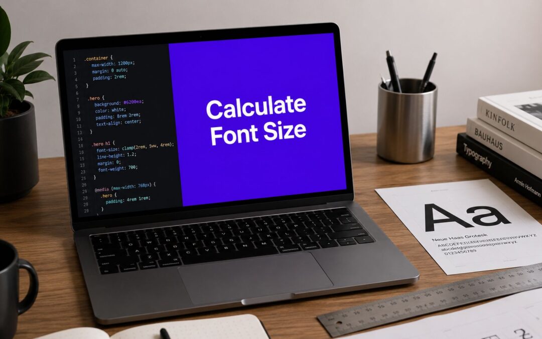
  font-size: clamp(2rem, 1.5rem + 2vw, 3.5rem);
}
That tells the browser:
- never go below
2rem - try to scale with
1.5rem + 2vw - stop growing at
3.5rem
This is one of the cleanest ways to calculate font size across a responsive range without writing a stack of breakpoint overrides.
Why this beats breakpoint whack-a-mole
With breakpoints alone, you might write one size for desktop, another for tablet, another for mobile, then patch edge cases. That works, but it's maintenance-heavy.
Fluid sizing gives you a smoother response between device widths. It also fits naturally with the broader principles in responsive design with CSS, especially when you want type and layout to move together instead of snapping at arbitrary points.
The best fluid typography feels invisible. Users don't notice the scaling. They only notice that the text always feels proportionate.
How to build a clamp value that makes sense
The trick is not memorizing a magic formula. It's choosing reasonable boundaries.
Start with these questions:
- What's the smallest readable version of this text role?
- What's the largest version that still fits the layout?
- How aggressively should it scale between those points?
For body text, the min and max should stay fairly tight. For display headings, you can allow more range.
Here's a practical setup:
:root {
  --step-body: clamp(1rem, 0.95rem + 0.3vw, 1.125rem);
  --step-h3: clamp(1.5rem, 1.2rem + 1vw, 2rem);
  --step-h2: clamp(2rem, 1.5rem + 1.8vw, 2.75rem);
  --step-h1: clamp(2.5rem, 2rem + 3vw, 4rem);
}

body {
  font-size: var(--step-body);
}

h3 {
  font-size: var(--step-h3);
}

h2 {
  font-size: var(--step-h2);
}

h1 {
  font-size: var(--step-h1);
}
This works well because it centralizes the scale. You can tune the whole site by editing custom properties instead of hunting through module settings.
Where calc fits in
calc() is still useful when you want to combine values directly, especially for spacing and line-height relationships. But for font sizing, clamp() usually gives you the full responsive behavior with fewer moving parts.
You might still combine the two in more advanced patterns, but most Divi projects don't need that complexity. They need a system that another developer can understand six months later.
Common mistakes with fluid type
Fluid typography is powerful, but people break it in predictable ways.
- Oversized viewport influence: If the
vwportion is too strong, text balloons on large screens. - No minimum safeguard: Without a real floor, text can shrink too far on narrow devices.
- Mixing fixed and fluid scales randomly: If one heading uses
clamp()and another uses a hard pixel value, the hierarchy drifts. - Ignoring line length: A fluid font still fails if the text container becomes too wide.
A better way to think about the preferred value
The middle value is not “the exact font size.” It's the scaling behavior.
If you want gentler growth, keep the viewport contribution smaller. If you want bolder expansion for hero text, increase it, but test how that interacts with line breaks and surrounding content.
Here's a good review process:
- Set the min value by actual readability
- Set the max by layout fit
- Adjust the middle value until the scaling feels calm, not dramatic
- Test in a real browser, not just a code playground
That last part matters. Fluid type always needs visual review in context. A beautiful formula can still produce ugly wraps in a narrow Divi column or a WooCommerce product summary.
Implementing Responsive Fonts in Divi and Divi Areas Pro
The gap between “good typography advice” and “a working Divi build” is where most systems fall apart. Divi gives you plenty of control, but if you set type module by module, the site becomes hard to maintain fast.
A better approach is to define the system at the global level, then use local overrides only when the component specifically needs them.

Set the foundation in Divi first
Inside Divi, start with your global typography settings rather than styling every Text Module individually. The exact interface can vary by version, but the principle stays the same. Set your body font, your heading fonts, and your default sizing logic in one place.
A practical sequence looks like this:
- Define the body baseline in global typography settings.
- Assign heading roles so
h1throughh6reflect your chosen scale. - Keep module overrides rare and reserve them for exceptions such as hero banners or microcopy.
- Use custom CSS for fluid sizing when Divi's built-in controls become too rigid.
If the site has blog templates, product pages, marketing pages, and account areas, consistency matters more than one perfectly styled landing page.
Add site-wide fluid type through custom CSS
Divi handles a lot visually, but fluid typography usually works best when you add it as global CSS. That gives you one source of truth.
You can place root variables and type rules in your preferred global CSS location, then let modules inherit them. That approach keeps the builder cleaner and reduces one-off adjustments.
For interactive layouts and content injections, the implementation details matter even more. If you're working with triggered content, this walkthrough on displaying content using Divi Areas Pro helps frame where those dynamic regions live in the build.
Popups and fly-ins need their own font logic
At this point, generic tutorials usually stop being helpful.
Existing guidance often skips Divi-based interactive elements entirely. General guidance may suggest 30px to 50px for desktop headers, but it doesn't explain how to calculate readable font sizes inside popups and fly-ins that appear during scroll depth triggers or exit intent interactions. It also leaves out the fact that these interactions can appear at a viewing distance roughly 10cm to 15cm closer than standard browsing, which changes how aggressive your hierarchy should feel, as noted in Learn UI Design's font size guidance.
That matters in real work. A popup headline doesn't need to shout as loudly as a hero heading because the user is already focused on an isolated panel.
In popups, reduce theatrical scaling and increase clarity. The closer context does part of the work for you.
A practical sizing approach for dynamic Divi elements
For popups, fly-ins, and tooltips, I'd treat typography as a separate interaction context rather than a copy-paste version of the page scale.
Use these rules:
- Body copy should stay comfortably readable: Don't shrink popup body text just because the panel is smaller.
- Headings should step down one role from page-level equivalents: A popup title often performs better when it behaves like a strong section heading, not a hero.
- Buttons should prioritize tap clarity over elegance: Compact buttons may look neat, but they often weaken the call to action.
- Line breaks need manual review: Popup containers expose awkward wraps faster than full-width sections do.
After you've built the interaction, test it in motion and not just in the editor.
The Divi workflow that scales best
If a junior designer asked me where to put the logic, I'd keep it simple:
- global body and heading defaults in Divi
- global fluid custom properties in CSS
- local exceptions only for true component differences
- separate review for triggered elements such as fly-ins, popups, and tooltips
That workflow gives you a typography system you can maintain. Beyond that, it gives you one you can explain to a client or teammate without opening twenty modules to prove how it works.
Auditing for Accessibility and Final Readability Checks
A typography system proves itself at the point where a real visitor changes the conditions.
The common failure looks like this. The site feels polished at default settings in the Divi builder, then body copy becomes cramped at zoom, a popup headline wraps badly, or a form field triggers awkward mobile behavior because the text was set too small. Final review needs to catch those cases before launch, especially on responsive Divi builds where modules, overlays, and triggered elements all compress space in different ways.
Start with the required checks
Body text should start from a readable baseline. In practice, that usually means keeping paragraph text at 16px equivalent or higher, then confirming that form inputs follow the same rule so mobile users are not punished for trying to complete a task.
Use a final audit to answer three direct questions:
- Is the default body size comfortably readable without zoom?
- Do inputs, selects, and textareas keep readable text on mobile?
- Does the layout still work when users zoom the page or increase text size in the browser?
If any answer is no, the system needs revision. Pretty type scales do not matter much if user settings break them.

The audit that catches what mockups miss
Static review is not enough. Open the finished site in a browser and test the behavior.
I run these checks on every handoff:
- Zoom test: Increase browser zoom and confirm content remains readable and usable, with no clipped text, hidden controls, or broken overlays.
- Browser text preference test: Raise the default font size in the browser and confirm
rem-based text scales in a controlled way. - Line-height review: Paragraphs need enough vertical space to breathe. Tight leading often looks refined in a mockup and feels tiring in real reading.
- Measure review: Long-form copy should avoid lines that stretch too wide, especially on desktop article templates.
- Contrast review: Check text against every background state, including buttons, links, banners, popups, and fly-ins.
The goal is simple. Readers should not have to fight the interface to read, scan, or act.
Why rem-based systems usually hold up better
The value of implementation choices is evident. A type system built with rem tends to respond more predictably when users increase browser text size. A system hard-coded in pixels often needs more overrides, and those overrides are usually where Divi sites start to crack. Buttons overflow. Headings wrap too early. Sidebar modules suddenly feel disconnected from the main scale.
That matters even more in products where clarity affects decisions, completion rates, or trust. Teams working on patient portals, booking flows, or account areas need readable text that survives real-world conditions. If you work in that category, this guide to improving healthtech interfaces through accessibility design is worth reading because it ties accessibility choices to task completion and user confidence.
If a visitor zooms in and the layout falls apart, the issue is in the CSS and typography system, not in the visitor's behavior.
A final launch checklist for Divi builders
Check these in the browser, not only in Visual Builder preview:
- Desktop content pages: Read full paragraphs and inspect line length, spacing, and heading rhythm.
- Mobile forms: Tap every input and confirm text stays readable and stable.
- Popup and fly-in states: Trigger each one manually. Review title size, body copy, button labels, and wrap points.
- WooCommerce templates: Product titles, prices, variation labels, tabs, and notices often expose weak sizing decisions fast.
- Keyboard focus states: Focused links, buttons, and form controls need clear text contrast and obvious state changes.
That is the last filter before launch. On a well-built Divi site, calculated font sizes are not just mathematically tidy. They stay readable under zoom, respect user preferences, and keep working inside the smaller, tighter spaces where typography usually fails.
If you want better control over interactive typography on Divi sites, Divimode gives you the tools and tutorials to build popups, fly-ins, tooltips, and dynamic content areas without turning your layout into a maintenance headache.
More Articles You Will Like