A great popup strategy is built on just that—strategy—not just fancy tech. The real goal is to create interactions that feel helpful and timely. You want to turn what could be an interruption into a genuinely valuable moment that helps your visitors and, in turn, helps your business grow.
Laying the Groundwork for Effective Popups
Before you even think about opening the Divi Builder, the most important work needs to happen. Seriously. A well-planned popup can feel like a welcome guide for your visitors, while a poorly planned one is just annoying noise. The difference comes down to really understanding your goals and your audience’s journey.
Nailing this foundation ensures your popups add genuine value instead of just getting in the way. It’s also smart to think about how they fit into a broader conversion rate optimization strategy. This isn't about just slapping an element on a page; it's about making it part of a system designed for growth.
What's the Point? Defining Your Core Purpose
First things first: why do you need a popup? If you don't have a crystal-clear answer, you're just shooting in the dark. Every single popup should have one, measurable objective. I always recommend starting with your main business goal and working backward from there.
Some of the most common objectives I see are:
- Growing an Email List: This is the classic. You offer a lead magnet—an ebook, a checklist, an exclusive discount—in exchange for an email.
- Slashing Cart Abandonment: Someone is about to leave the checkout page? Hit them with a last-minute coupon or a free shipping offer to sweeten the deal.
- Guiding New Visitors: Welcome first-timers with a quick tour, a special introductory offer, or a helpful pointer to your most popular content.
- Promoting Key Content: Got a new blog post, a killer case study, or an upcoming webinar? A popup is a great way to drive traffic where you want it.
A popup without a clear goal is like a signpost with no destination. It creates a distraction but offers no direction, frustrating users and failing to deliver business value.
Getting your goals, audience, and offer figured out before you build is the bedrock of any successful popup campaign.
This simple flow chart breaks down the process perfectly. You start with the Goal, which tells you who to target (Audience) and what to give them (Offer).
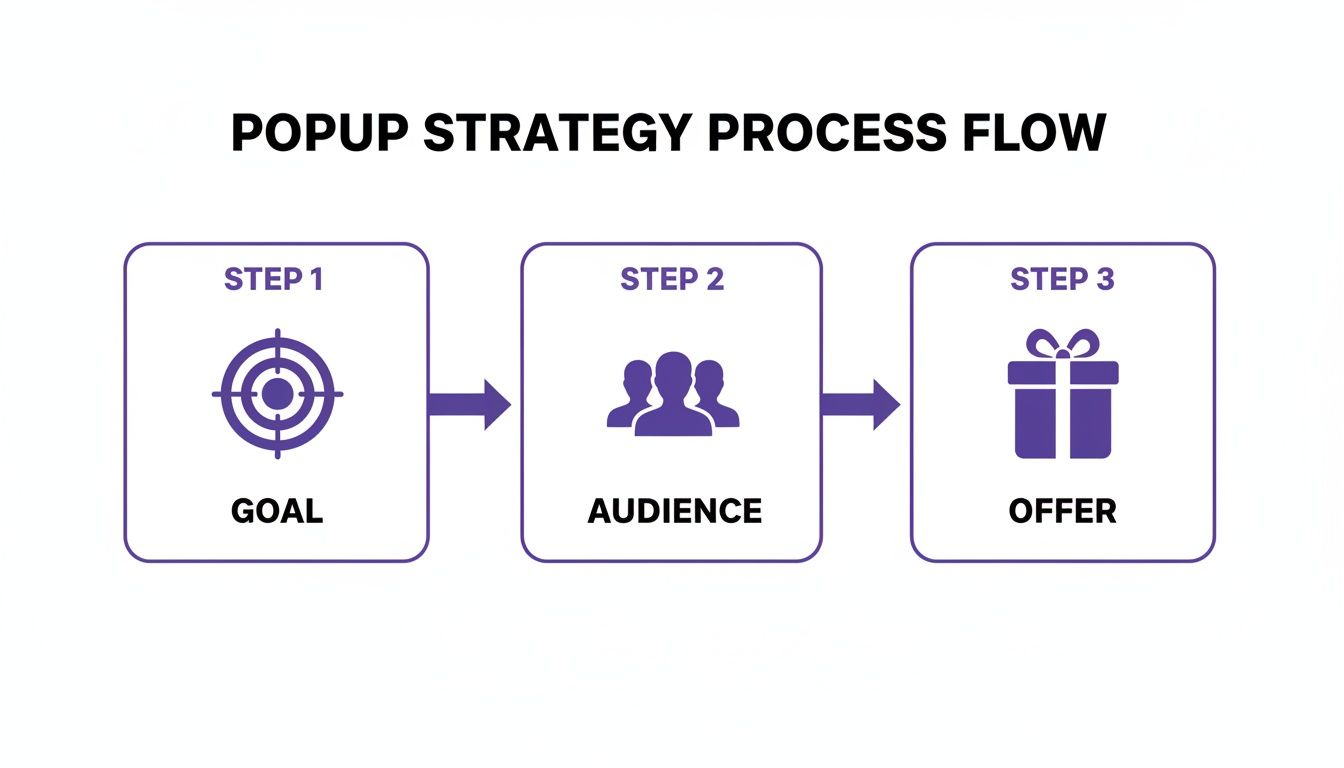
As you can see, it all flows from a clear business objective. Get that right, and the rest starts to fall into place.
Mapping the Audience Journey
Once you know what you want to achieve, the next question is when and where to show your popup. This is all about mapping the typical paths visitors take on your site. A brand new visitor browsing your blog has completely different needs than a loyal customer who's about to complete a purchase.
Think about these key moments:
- Entry: The second a user lands on your site.
- Engagement: After they've spent some time on a page or scrolled a certain percentage down.
- Decision: Right when they add an item to their cart or check out your pricing page.
- Exit: As their mouse cursor drifts up toward the browser's back button or close tab icon.
Pinpointing these moments lets you deliver the right offer at the perfect time. This is how you make your popups feel intuitive and genuinely helpful, not intrusive. And the data backs this up: popups are a powerhouse for conversions. The average popup conversion rate hit 4.82% in 2026, a steady climb from 4.65% the year before, based on an analysis of over a billion displays.
This is exactly why tools like Divimode's Divi Areas Pro and the free Popups for Divi are such game-changers for anyone using Divi. They give you the control to make this kind of strategic targeting happen.
Here’s a quick reference table I put together to help connect the dots between your goals, offers, and targeting.
Popup Goal and Offer Planning Matrix
A quick reference guide to align your business goals with effective popup offers and targeting strategies.
| Business Goal | Recommended Popup Offer | Primary Target Audience | Suggested Trigger |
|---|---|---|---|
| Grow Email List | Free ebook, checklist, or guide download | New visitors on blog posts or resource pages | Time on page (30 seconds) or scroll depth (50%) |
| Reduce Cart Abandonment | 10% discount code or free shipping offer | Users on the cart or checkout page | Exit-intent (cursor moves to close tab) |
| Boost Product Sales | Limited-time flash sale or bundle deal | Returning visitors viewing specific product categories | On page load (for seasonal sales) or on-click |
| Gather User Feedback | Quick survey or feedback form | Customers who have just completed a purchase | On the order confirmation page ("Thank You" page) |
This matrix isn't exhaustive, of course, but it gives you a solid framework for thinking through your own campaigns. The key is to always start with the "why" and let that guide your decisions on the "what," "who," and "when."
Alright, with our strategy mapped out, it's time to roll up our sleeves and get building. This is where the theory becomes reality, and we get to jump into the Divi Builder to create our first popup. We'll start with a classic: a welcome popup that offers new visitors a discount. It’s a tried-and-true method for growing an email list or snagging those crucial first-time sales.
The whole process kicks off by creating an "Area," which is the special post type Divi Areas Pro uses to house your popups, fly-ins, and other dynamic content. Just think of an Area as a blank canvas where you can build literally anything with the same Divi modules you use every day. That’s a huge plus—no need to wrestle with a separate, clunky interface.
Setting Up Your First Area
Once you have the plugin installed and running, you'll spot a new "Divi Areas" menu in your WordPress dashboard. Head over to Divi Areas > Add New to get started. I always recommend giving your Area a clear, descriptive title like "Welcome Discount Popup." It might seem minor now, but you'll thank yourself later when you're managing a dozen different campaigns.

This initial setup screen is where you'll configure the core settings that dictate how the popup behaves. Don't sweat the triggers and targeting conditions just yet; we'll dive deep into that in the next section. For now, we just need to get the basics in place.
- Type: Go ahead and select "Popup" from the dropdown. This tells the plugin what kind of Area we're creating.
- Position: This is where you decide where it appears on the screen. "Center" is a solid, go-to choice for most welcome offers. You can't go wrong with it.
- Size: You have full control over the width and height. As a rule of thumb, I usually start with a max-width of around 600px. That’s large enough to make an impact on desktop but won't overwhelm the screen.
Once those are set, click "Save Draft" and then hit that big purple "Use Divi Builder" button. Just like that, you’ll be dropped right into the familiar visual builder, exactly as if you were editing a standard page or post. If you need a refresher, we've got a full walkthrough on how to install and activate Divi Areas Pro.
Designing Inside the Divi Builder
Now for the fun part. Inside the Divi Builder, you can let your creativity run wild, mixing and matching any modules you want. For a welcome offer, however, simple and direct almost always wins. I find a single-column row with just a few key modules works best.
Here's my typical recipe:
- An eye-catching Image module: Kick things off with a strong visual that connects with your brand or the discount itself.
- A punchy Text module for the headline: This needs to grab attention. Something like "Get 15% Off Your First Order!" is clear and compelling.
- Another Text module for the body copy: Keep it brief. Explain the value and maybe add a touch of urgency.
- An Email Optin module: This is the heart of the operation. You’ll hook this up to your email marketing service to capture those leads.
- A final Text module for a "no thanks" link: This is non-negotiable for a good user experience. Always give people an easy way to say no and close the popup.
Finalizing the Look and Feel
With your modules in place, it's time to put Divi's design settings to work. Tweak the fonts, colors, and spacing to make sure everything is perfectly on-brand. Pay special attention to the button in your Email Optin module—it needs to pop, so give it a high-contrast color that begs to be clicked.
Before you call it a day, head back to the Area's settings and check out the animation options. A subtle "Fade In" or "Slide In" animation can make the popup's arrival feel much smoother and less abrupt.
Pro Tip: I can't stress this enough: always design for mobile. Use Divi's built-in responsive views to see how your masterpiece looks on tablets and phones. You'll likely need to adjust font sizes or spacing. Nothing kills conversions faster than a popup that breaks the layout on a small screen.
Once you’re happy with how everything looks and feels, go ahead and hit "Publish." And just like that, you've built your first popup! The next step is where the real power lies: telling Divi Areas Pro exactly when and where to show it. That's where triggers and targeting come into play.
Mastering Popup Triggers and Targeting
A slick-looking popup is worthless if it shows up at the wrong time or to the wrong person. This is where you graduate from simply having a site with popups to building a site with smart popups. Getting the triggers and targeting right is what separates a welcome interaction from an annoying interruption.
With Divi Areas Pro, you can pinpoint the exact moment to display your message, making it feel genuinely relevant and helpful. This isn't about guesswork; it's about using visitor behavior to your advantage. Let's dig into the most effective ways to make your popups appear at the perfect moment.

Timing Is Everything with Time-Delayed Popups
One of the simplest yet most effective triggers is the good old time delay. Instead of ambushing a visitor the second they land on your page, a time-based trigger waits for them to show a little interest first. This small courtesy can make a huge difference.
Put yourself in the user's shoes. When you land on a new site, you need a moment to get your bearings. A popup that appears immediately is just a roadblock. By setting a delay of 15 or 30 seconds, you give visitors enough time to read your headline, understand what your page is about, and decide they want to stick around.
We dive deeper into the nuances of this approach in our guide on the secret of time-based triggers.
Engaging Users with Scroll Triggers
Another one of my favorite triggers is based on scroll depth. This method activates your popup only after a user has scrolled a certain percentage down the page, which is a fantastic indicator of genuine engagement. It’s a powerful signal that they find your content valuable.
I use this all the time for blog posts or long-form sales pages. If someone has scrolled 70% of the way down a detailed article, they are clearly invested. That’s the perfect moment to offer them a related lead magnet, like a checklist or an ebook that expands on the topic.
Setting this up in Divi Areas Pro is a breeze:
- For Blog Content: Trigger a popup offering a "content upgrade" after a 60-75% scroll.
- For Product Pages: Show a popup with customer reviews or a special discount once they've scrolled past the main product features.
This approach makes sure your offer complements their journey rather than derailing it.
Recapturing Visitors with Exit-Intent
Exit-intent is arguably the most valuable trigger in your toolkit, especially for e-commerce sites. This tech detects when a user's cursor moves towards the top of the browser—a clear sign they're about to leave—and presents a popup at that critical moment. It's your last chance to change their mind.
This isn't just a clever trick; it delivers real results. Exit-intent popups can be a savvy tactic for recapturing abandoning visitors, converting 4-8% on average and recovering 7-10% of abandoned carts during checkout. Those are vital stats for anyone using Divi and WooCommerce.
An exit-intent popup is the digital equivalent of a friendly store employee asking, "Did you find everything you were looking for?" as you head for the door. It's a final, helpful attempt to provide value and keep a potential customer engaged.
Precision Targeting for a Personalized Experience
Beyond triggers, Divi Areas Pro lets you get incredibly specific with who sees your popups. This is where you can craft a truly personalized experience that resonates with different visitor segments. You're no longer shouting the same message at everyone.
Here are a few powerful targeting rules you can start using right away:
- Page-Level Targeting: Show a unique popup for a specific product category or service page to make highly relevant offers.
- Device Targeting: Create different popups for mobile and desktop users. A mobile popup, for instance, should be more compact and thumb-friendly.
- User Role Targeting: Offer a special discount exclusively to logged-in customers, or hide sign-up forms from users who are already subscribed.
By combining these targeting rules with behavioral triggers, you create a dynamic and intelligent system. For example, you could show an exit-intent popup offering a 10% discount, but only on the checkout page, and only to first-time visitors who aren't logged in. This level of precision is what turns a generic site with popups into a high-performing conversion machine.
Boosting Sales with WooCommerce Popup Strategies
If you're running an e-commerce store on Divi, you need to think of popups as more than just a marketing gimmick. They're a direct line to your bottom line. When you strategically pair popups with WooCommerce, you can turn casual window shoppers into paying customers and gently nudge them to spend a little more. These aren't just annoying interruptions; they're timely, relevant interventions that are laser-focused on driving sales.
The real magic happens when you move past generic "Sign Up!" boxes and start creating popups that solve specific e-commerce headaches. Think of them as your store's best salesperson—the one who knows just when to step in to close a deal, suggest the perfect accessory, or stop a customer from walking out the door.
Recover Lost Revenue with Cart Abandonment Popups
One of the most frustrating leaks in any online store is cart abandonment. A shopper fills their cart, heads to checkout, and then…poof. They're gone. This is where an exit-intent popup becomes your most valuable player. Just as their cursor drifts towards the "close tab" button, you can hit them with a last-minute offer that’s too good to pass up.
A simple discount can be incredibly effective here. Imagine a popup that appears saying, "Leaving so soon? Here's 10% off to complete your order now!" It’s a small gesture, but it’s often just enough to overcome that last bit of hesitation.
With Divi Areas Pro, setting this up with surgical precision is a breeze:
- Trigger: Go with the "Exit Intent" trigger.
- Targeting: Make sure the popup only shows up on your Cart and Checkout pages.
- Rule: Add a condition so it only fires if the customer's cart isn't empty.
This targeted approach means the offer is always relevant and won't bug people who are just browsing your blog. We dive even deeper into this in our guide on how to transform abandoned carts into sales with popups.
Increase Order Value with Upsells and Cross-Sells
Another killer strategy is using popups to bump up the value of each sale. An upsell nudges a customer toward a better, more expensive version of a product, while a cross-sell suggests a related item that complements their purchase. When done right, it feels less like a pushy sales pitch and more like a helpful recommendation.
Let's say a customer adds a new camera to their cart. A perfectly timed popup could suggest:
- An Upsell: "Upgrade to the Pro model for just $50 more and get a better lens and extended warranty!"
- A Cross-Sell: "Don't forget the essentials! Add a memory card and camera bag to your order."
Popups for upsells and cross-sells are most effective when they feel like they know the customer. By triggering them based on the specific product someone is viewing or has just added to their cart, you're adding genuine value that actually improves their shopping experience.
To really make these popups work, you need a compelling call to action. A strong CTA is what turns a suggestion into a sale. If you need some inspiration, there are tons of powerful call to action strategies you can explore to sharpen your copy.
Drive Urgency with Flash Sales and Shipping Thresholds
Nothing motivates a purchase quite like a ticking clock. Limited-time offers create a sense of urgency that gets people to act now. A site-wide popup, like a "fly-in" or a notification bar at the top of the page, is perfect for announcing a flash sale. It keeps the offer in sight without hijacking the entire screen.
Free shipping is another huge psychological win for online shoppers. If you offer free shipping on orders over $75, you can set up a popup that appears when a user's cart total is, say, between $50 and $74.99. The message is simple: "You're only $25 away from FREE shipping! Add one more item to qualify."
This gentle nudge is often all it takes to get customers to add another item to their cart, boosting your average order value while making them feel like they got a great deal. Each of these WooCommerce strategies helps turn your site with popups into a smart, automated sales machine.
Optimizing Your Popups for Performance and Compliance
A slick popup that shows up at the perfect moment is great, but if it drags down your site's performance or ignores legal rules, you’re creating more problems than you’re solving. A truly successful site with popups is not just strategic but also technically sound and legally responsible. This means nailing two crucial areas: speed and compliance.
Getting this right isn't just about ticking boxes. It ensures a smooth experience for your visitors, builds trust, and keeps your site on the right side of privacy laws. Let's break down how to build popups that are fast, accessible, and compliant.

Keeping Your Site Fast and Lean
Popups, especially those loaded with large images or complex animations, can add serious weight to your pages. Since site speed is a massive factor in both user experience and SEO, building lightweight popups is completely non-negotiable.
Here are a few practical tips I’ve learned to keep popups from becoming a performance bottleneck:
- Compress Your Images: This is the single biggest win. A huge, unoptimized PNG file can absolutely kill your load speed. Always run your images through a compression tool like TinyPNG before you even think about uploading them to your Divi popup.
- Use WebP Format: The WebP image format is a game-changer. It offers much better compression and quality compared to old-school formats like JPEG and PNG. Most modern browsers support it, and the file size savings are significant.
- Limit Complex Animations: A subtle fade-in is classy. Heavy, resource-intensive animations that require a lot of JavaScript to run? Not so much. Divi Areas Pro offers simple, effective animations that get the job done without the lag.
- Avoid Loading Heavy Scripts: Be really mindful of what you’re embedding. Third-party scripts or videos can add precious seconds to your load time. If you absolutely must include a video, try using a lightweight thumbnail that opens the full video in a lightbox only when a user clicks it.
Ensuring Accessibility for All Users
An accessible popup is one that everyone can use, including visitors who rely on screen readers or can't use a mouse. This isn't just a "nice-to-have" practice; it's essential for an inclusive experience and often a legal requirement under laws like the Americans with Disabilities Act (ADA).
A popup that can't be easily closed is a trap. It creates a frustrating, and sometimes impossible, barrier for users with disabilities, effectively locking them out of your content.
Here’s how to make your popups WCAG (Web Content Accessibility Guidelines) compliant:
- Enable Keyboard Navigation: Users must be able to navigate to every interactive element (like form fields and buttons) and, most importantly, close the popup using only their Tab and Enter keys.
- Provide a Clear Close Button: That little "X" has to be easy to see, click, and understand. It also needs a proper ARIA label for screen readers, something like
aria-label="Close dialog". - Use High-Contrast Text: Make sure the text in your popup has sufficient color contrast against its background. This is a must for users with visual impairments.
- Trap Focus: When a popup is active, keyboard focus should be "trapped" within it. This is a critical step that prevents users from accidentally tabbing to links on the page behind the popup, which is incredibly disorienting.
Navigating GDPR and Consent
Privacy laws like the General Data Protection Regulation (GDPR) in Europe have very strict rules about collecting user data. If your popup contains an email opt-in form, you absolutely must obtain clear, affirmative consent before adding someone to your list.
This means your form cannot have pre-checked consent boxes. The user has to actively check a box to agree. Your consent language needs to be simple and direct, clearly stating what they are signing up for. On top of that, you have to provide an easy way for them to unsubscribe in every single email you send.
By prioritizing performance, accessibility, and compliance, you're building a popup strategy that is not only effective but also ethical and user-friendly.
Got Questions About Divi Popups? We've Got Answers.
Even with the best tools, jumping into the world of popups can feel a bit tricky. You might be wondering about performance, SEO, or just what actually works. You're not alone. I've been there, and I've heard these same questions from countless Divi users.
Let's clear up some of the most common points of confusion. Getting these details right is what separates a popup that annoys visitors from one that drives real results.
Will Popups Tank My Website’s SEO?
This is the big one, and for good reason. The short answer? They absolutely can hurt your SEO, but only if you're careless. Google's main beef is with what they call "intrusive interstitials," especially on mobile. Think of those aggressive popups that block the entire screen the second you land on a page from a search result. That’s a huge red flag for search engines.
To keep Google happy and avoid any ranking penalties, just follow a few common-sense rules:
- Don't Ambush Mobile Visitors: Never, ever show a full-screen popup immediately to someone coming from a Google search on their phone. It's the fastest way to get on Google's bad side.
- Trigger on Engagement: Instead, use triggers that show the user is already engaged. Exit-intent, a time delay of at least 15-20 seconds, or scroll-depth triggers are all much safer bets from an SEO standpoint.
- Make Escape Easy: The close button ('X') has to be obvious and easy to tap on any device. If your popup feels like a trap, you're signaling a poor user experience, which is exactly what Google is trying to penalize.
From my experience, exit-intent popups are the safest you can get. Since they only show up when someone is already heading for the door, they don't get in the way of the content experience Google cares so much about.
With a tool like Divi Areas Pro, you have the fine-tuned controls to set up these kinds of responsible, SEO-friendly popups without any guesswork.
What's the Best Way to Collect Email Addresses with a Popup?
When it comes to pure lead generation, my go-to strategy is the two-step opt-in combined with a seriously valuable lead magnet. Instead of just throwing an email form in someone's face, you start with a simple choice.
Picture a popup that asks, "Want my free checklist for speeding up your Divi site?" It has two buttons: "Yes, Send It Over!" and a cheeky "No, I like my slow website." That initial, low-effort "yes" is a micro-commitment that gets the user invested.
Once they click that "Yes" button, a second, smaller popup appears with the actual email form. This little bit of psychology taps into our desire to be consistent and almost always converts better than a single, direct form. The secret, of course, is that the freebie you're offering has to be genuinely useful and solve a real problem for your audience.
How Can I A/B Test My Divi Popups to Get More Conversions?
You can't improve what you don't measure. A/B testing is how you stop guessing and start making data-driven decisions to optimize your popups. While Divi Areas Pro doesn’t have a built-in A/B testing feature, you can still run perfectly effective tests manually. It just takes a little organization.
Here’s a straightforward way to do it:
- Duplicate Your Popup: Start by building two separate 'Areas' for your popup. You'll have 'Version A' (your control) and 'Version B' (your variation).
- Change Just One Thing: This is critical. In Version B, only change a single element. Maybe it's the headline, the button color, the image, or the offer itself. If you change more than one thing, you won't know what actually made the difference.
- Run Version A: Activate your control version and let it run for a set period—say, two weeks or until it hits 1,000 views. Track its conversion rate (e.g., sign-ups divided by impressions) meticulously.
- Swap in Version B: Once the time is up, deactivate 'Version A' and immediately activate 'Version B.' Let it run for the exact same amount of time or number of impressions.
- Declare a Winner: Now, compare the conversion rates. The one that performed better is your new champion. You can make it the new control and start testing another variable against it.
Sure, this manual approach requires a bit of hands-on work, but it gives you the hard data you need to systematically dial in your popup's performance over time.
Ready to build smarter, higher-converting popups on your Divi site? Divimode provides the tools and expert guidance you need. With Divi Areas Pro, you can create everything from exit-intent offers to advanced mega menus, all within the familiar Divi Builder. Discover what you can build with Divimode.
More Articles You Will Like