 Alex Martin
Let's be honest, a standard dropdown menu just doesn't cut it for a content-heavy website. It quickly becomes a cluttered mess, forcing your visitors to hunt and peck for what they need. Divi mega menus are the answer, transforming that clunky navigation into a clean, multi-column layout that feels intuitive. The result? Visitors find what they're looking for faster, stick around longer, and are gently guided toward your most important pages.
Why Your Divi Site Needs a Better Mega Menu
Think of a basic navigation menu as a simple table of contents—it works, but it’s not exactly inspiring. For a site with any real depth, like an e-commerce store with dozens of categories, a design agency with a huge portfolio, or a blog with years of content, it's a major bottleneck. Visitors get stuck in a frustrating game of "guess the right dropdown," which often ends with them bouncing right off your site.
A well-designed Divi mega menu, on the other hand, is more like a visual dashboard for your entire website. It lays everything out in an organized, easy-to-scan format. Imagine a visitor hitting your online store. Instead of a single "Shop" link, they're greeted with a beautiful mega menu showcasing categories with thumbnail images, featured products, and even current promotions—all in one place.
This approach pays off immediately in a few key ways:
- A Better User Experience: People can see the breadth of what you offer at a glance. Navigation becomes intuitive and fast, not a chore.
- Smarter Conversion Paths: You can strategically place calls-to-action, highlight your best-sellers, or point users to cornerstone content right from the main menu.
- A More Professional Look: A custom mega menu instantly makes your site feel more polished and high-end. It signals that you've put thought into how your users interact with your brand.
The real magic is turning navigation from a boring list of links into a rich, interactive experience. You're transforming a potential point of frustration into a moment of discovery.
What’s interesting is that many Divi users jump straight to third-party plugins without realizing Divi has a built-in way to create mega menus. While plugins certainly offer more bells and whistles, Elegant Themes actually built a native feature that lets you create multi-column layouts just by structuring your menu items correctly and adding a simple CSS class.
This built-in option is perfect for showcasing featured services or content without the extra weight of another plugin, which is great for site speed and easier maintenance. As more designers catch on, we're seeing this native feature used more and more. Before you decide if a powerful plugin is the right move, it’s worth understanding Divi’s native mega menu capabilities. Having that foundational knowledge is key.
Choosing Your Tools for the Perfect Menu
While Divi gives you a decent starting point for menus, dedicated plugins are where the real magic happens. They’re what let you transform a basic navigation bar into a rich, interactive experience. Picking the right tool from the get-go is critical—it will shape your creative freedom and determine what features you have at your fingertips.
For this guide, we're going all-in with Divi Areas Pro. Why? Because it fully integrates the Divi Builder directly into your menu creation process. If you can build it on a page, you can put it in a mega menu. Think video players, contact forms, or even dynamic product grids. It’s a level of customization that Divi’s built-in tools just can't touch.
Our Recommended Tool: Divi Areas Pro
With Divi Areas Pro, you're not just making a menu. You're designing a fully interactive "Area" that gets triggered by a menu link. This simple but powerful approach gives you total control over how your mega menu looks and behaves.
Here’s why it’s our top pick:
- Full Divi Builder Integration: Use any Divi module you know and love. No more being boxed in by simple text links.
- Advanced Triggers: Go beyond basic hover effects. You can make your divi mega menus appear on a click, which is a must-have for a good user experience on tablets and phones.
- Seamless Setup: Connecting an "Area" to a menu item is incredibly simple. You won't need to write custom code or figure out complicated workarounds.
By using the Divi Builder, you’re tapping into a workflow you already know. This means you can design a pixel-perfect, feature-rich mega menu in a fraction of the time it would take with custom CSS hacks.
Divi Mega Menu Tool Comparison
Choosing the right tool is the first step. While Divi offers a basic way to handle menus, plugins like Divi Areas Pro unlock true creative freedom. This table breaks down the key differences to help you decide.
| Feature | Native Divi Menu | Divi Areas Pro |
|---|---|---|
| Content Creation | Limited to standard menu items & CSS | Full Divi Builder integration (any module) |
| Layout Control | Basic columns via CSS classes | Complete visual control over rows, columns, and design |
| Interactive Elements | No (text links only) | Yes (forms, videos, sliders, product grids, etc.) |
| Trigger Options | Hover only | Click, Hover, and other advanced triggers |
| Mobile Experience | Standard dropdown | Fully customizable mobile-specific layouts |
| Ease of Use | Requires some CSS knowledge | Intuitive, visual, and code-free |
For simple navigation, Divi's native menu works fine. But for building a truly impressive and functional mega menu, a dedicated plugin like Divi Areas Pro is a clear winner.
Free Alternatives and Other Solutions
Of course, you don't always need a premium plugin. For simpler projects, Popups for Divi is a fantastic free alternative. You can design a popup using the Divi Builder and trigger it from a menu link, which works just like a "click-to-open" mega menu. It doesn't have all the advanced positioning and trigger options of its pro sibling, but it's a solid way to get started without spending a dime.
Looking beyond our own tools, other great third-party solutions are out there. A popular one is the Supreme Mega Menu plugin by Divi Supreme, which offers a ton of customization, including over 30 menu animations and tight WooCommerce integration. It even lets you embed a live cart icon and products right into your dropdowns, making it a powerful choice for e-commerce stores.
To see what else is available, it’s worth exploring the best Divi menu plugins to find the perfect fit for your specific needs.
Ultimately, the best tool comes down to your project's complexity and budget. But if you want maximum power and flexibility, Divi Areas Pro provides the robust foundation needed to build truly exceptional divi mega menus.
Alright, with the right tools in our toolkit, it's time to shift from theory to practice. Let's get our hands dirty and build the visual foundation of your very first Divi mega menu. This is where the real fun begins. Since we're using Divi Areas Pro, we'll be tapping into the full power of the Divi Builder you already know and love.
To make this feel real, we'll tackle a common scenario: building a "Services" mega menu for a digital marketing agency. The goal is to create a clean, multi-column layout that shows off different service categories, each with a short description and a can't-miss call-to-action.
Creating Your First Divi Area
The core idea behind Divi Areas Pro is wonderfully simple. Instead of wrestling with the clunky WordPress menu editor, you build a piece of content—an "Area"—using the familiar Divi Builder. Then, you just hook that Area up to your menu item.
First things first, head over to Divi > Divi Areas in your WordPress dashboard and hit "Add New." This will launch an interface you'll recognize immediately: the Divi Builder. It’s a good idea to give your Area a clear title, something like "Services Mega Menu Layout," so you can easily find it later.
From here, you’re in your element. You can add a new section, drop in a row with your preferred column structure (let's go with a three-column layout for this example), and start filling it with modules. This is a massive improvement over the standard menu system, which usually involves clumsy CSS workarounds. If you want to dive deeper into the old-school methods, you can check out our guide on how to create a mega menu.
The entire workflow is pretty intuitive, as you can see in this diagram.
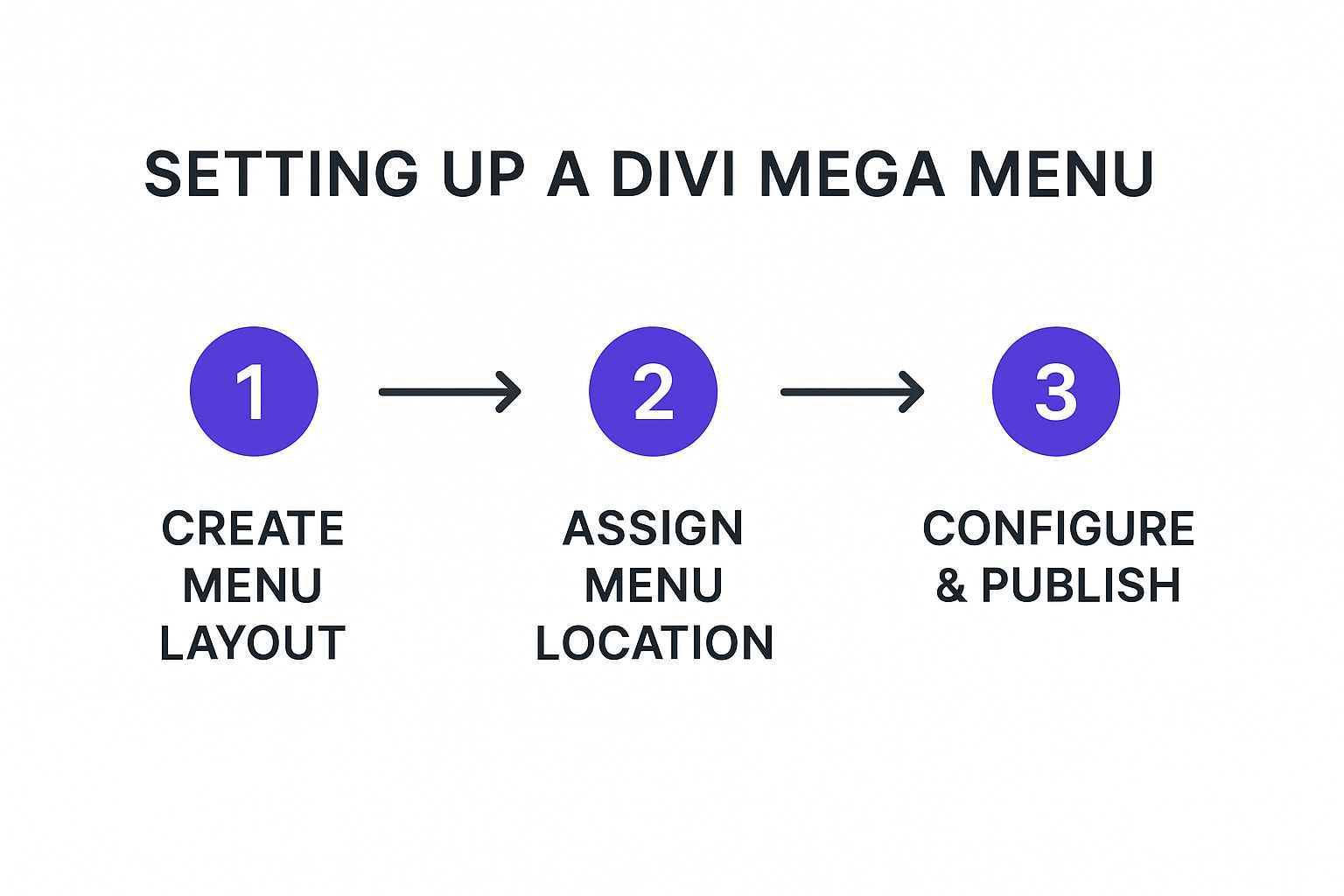
It really breaks the process down into three key phases, showing how creating the layout is the essential first step before you can assign it and configure the menu triggers.
Populating the Layout with Content
Now, let's bring our three-column "Services" menu to life. In each column, you can layer different modules to create a rich, informative block. A great starting point is an Image module for an icon, a Text module for the service title and a quick blurb, and a Button module for that "Learn More" link.
- Column 1: "SEO Services," complete with a brief description and a button pointing to the main SEO page.
- Column 2: "PPC Management," with its own unique description and call-to-action.
- Column 3: "Content Marketing," following the same tried-and-true pattern.
The best part? You have total design freedom. Tweak the fonts, play with colors, adjust spacing, and add animations just like you would on any other Divi page.
This method completely changes how you should think about navigation. Your menu stops being a simple list of links and becomes an interactive, visually engaging part of your website's content, built with the tools you've already mastered.
The ability to use the Divi Builder this way was a game-changer for Divi users. The release of powerful plugins around 2022 was a key moment, as they finally integrated the builder's modules directly into the creation of Divi mega menus. This brought a familiar drag-and-drop interface and support for dynamic content like posts and WooCommerce products, solving a huge pain point for the community.
Want to take it even further? You could add a video module in a fourth column or feature a dynamic post feed that pulls in your latest case studies. The possibilities are practically endless. This hands-on approach is the best way to grasp the core mechanics of building interactive and engaging Divi mega menus that genuinely help your visitors find what they need.
Connecting Your Design to the Main Navigation

A beautifully designed layout is only half the battle. To bring your new Divi mega menu to life, you need to connect that "Area" you just built to your website's main navigation. This step is what bridges the gap between your design and its real-world function, turning a static layout into a fully interactive menu.
The good news is that the process is surprisingly straightforward. You’ll be working within the familiar WordPress menu editor, which you can find under Appearance > Menus in your dashboard. This is where you'll pick a menu item to act as the "trigger" for your stunning new mega menu.
Assigning Your Area to a Menu Item
First, you'll need to identify the top-level menu item you want to use. Let's stick with our "Services" example. In your menu structure, find the "Services" item and click the small arrow on the right to expand its options.
You'll immediately notice a new section added by Divi Areas Pro—this is where the magic happens. A dropdown list will appear, letting you select the specific Area you just created. Simply choose your "Services Mega Menu Layout" from the list, and you've made the connection.
That’s it. No complicated code or wrestling with custom fields. This simple assignment tells Divi Areas Pro, "When a user interacts with this 'Services' link, show them the Area I designed."
It’s a clean and intuitive system. While this method offers incredible flexibility for headers, it’s worth remembering other parts of your site, too. For instance, knowing how to properly add menus to your Divi footer can help create a more consistent user experience across your entire website.
Choosing the Right Trigger: Hover vs. Click
With your Area linked, the next crucial decision is how users will activate it. Divi Areas Pro gives you two primary options for your divi mega menus: hover or click.
- Hover: The mega menu appears as soon as a user's cursor moves over the menu item. This feels fast and fluid on desktops.
- Click: The menu only appears after a user actively clicks the menu item. This is essential for touch devices where "hover" simply doesn't exist.
So, which one should you choose? For years, "hover" was the standard, but user behavior has shifted. A "click" trigger is now often the safer, more accessible choice. It prevents the frustrating experience of a menu flashing open and closed as a user's mouse accidentally passes over the navigation.
More importantly, it ensures your menu is fully functional on tablets and smartphones.
Creating a Fallback for Accessibility
Here’s one last, vital tip: set a proper URL for the parent menu item. Don't just use a "#" as a placeholder. Instead, link it to your main "Services" landing page.
Why is this so important? Divi Areas Pro is smart enough to prevent the link from firing when clicked, showing the mega menu instead. However, this fallback URL ensures that if JavaScript ever fails to load, or for users with certain accessibility tools, the link remains a functional part of your site.
It’s a small detail that guarantees your website remains navigable for 100% of your visitors, no matter what.
Fine-Tuning Your Design and Optimizing for Mobile
Once you have your Divi mega menu wired up and working, it's time for the fun part: adding the professional polish that makes it look incredible. This is where we’ll dive into advanced styling and, most importantly, mobile optimization. After all, a menu has to look great and work flawlessly for every single visitor, no matter their device.
A subtle entrance animation can make a world of difference to the user experience. It helps the menu feel smooth and intentional, rather than just abruptly appearing on the screen. Inside the Divi Areas Pro settings for your Area, you can easily apply built-in animations like "Fade In" or "Slide In Down." These small details are what make a design feel truly refined.
Precise Menu Positioning
One of the most powerful features in Divi Areas Pro is the ability to control exactly where your mega menu appears. By default, it will pop up right below the menu item you clicked, but you can fine-tune this with the position settings for pixel-perfect alignment.
For instance, you might want your mega menu to align perfectly with the very bottom of your entire header, creating a clean, seamless line. The "Position" settings let you anchor the Area to the trigger item and then add a custom offset. This level of control is incredibly useful for achieving that polished, seamless look that clients love.
Adding Custom CSS for Unique Designs
While Divi Areas Pro gives you immense control right inside the builder, sometimes you need a specific touch that only custom CSS can deliver. It's easy to add a unique CSS class to your Area in its settings, which lets you target it with surgical precision.
Imagine you want to add a small triangle pointer above the mega menu, visually tethering it to the link that triggered it. A little bit of CSS aimed at your custom class can create this elegant effect, helping your design stand out.
/* Example for a custom pointer / .my-custom-mega-menu::before { content: ''; position: absolute; top: -10px; left: 50%; transform: translateX(-50%); width: 0; height: 0; border-left: 10px solid transparent; border-right: 10px solid transparent; border-bottom: 10px solid #ffffff; / Match your menu's background */ }
This little snippet shows just how easy it is to add those unique flourishes that aren't available in standard module settings. It’s these small, custom touches that truly elevate your Divi mega menus.
Critical Mobile Optimization Strategies
Let's be honest: a huge, multi-column mega menu that looks fantastic on a desktop can be an absolute usability nightmare on a smartphone. A great user experience demands a mobile-first approach, and thankfully, Divi Areas Pro provides all the tools you need to handle this gracefully.
The golden rule of mobile navigation is simplicity. A user on a phone needs to get to their destination quickly without wrestling a massive layout designed for a wide screen.
You have two main strategies for tackling mobile:
- Create a Separate Mobile Area: This is my preferred method. Design a second, much simpler "Area" specifically for mobile. This could be a clean, single-column list or a compact slide-in menu. Then, in the Divi Areas Pro visibility settings, just set your desktop menu to hide on mobile/tablet and your new mobile menu to show only on those devices.
- Disable and Defer to Divi's Default: For a simpler solution, you can just disable your mega menu entirely on smaller screens. This allows Divi’s default hamburger menu to take over, giving users a clean and familiar mobile navigation experience without any extra work.
The right choice really depends on your site's complexity and how deep your navigation goes. For a masterclass in responsive design best practices, I highly recommend checking out our ultimate guide to optimizing Divi for mobile devices. It’s packed with actionable tips that apply perfectly to menus and beyond.
By combining elegant animations, precise positioning, and a rock-solid mobile strategy, you can ensure your Divi mega menus are both beautiful and universally functional.
Got Questions? We've Got Answers
Jumping into a powerful new plugin like Divi Areas Pro is exciting, but it's natural for a few questions to pop up along the way. I've been there! Here are some of the most common questions I get about building Divi mega menus, along with my go-to solutions.
Can I Use Dynamic Content in My Menu?
You absolutely can, and honestly, this is where a tool like Divi Areas Pro really shines. It's designed to integrate seamlessly with Divi's own modules.
This means you can drop a native Blog module or your favorite WooCommerce product grids right into your "Area" layout. Imagine your menu automatically pulling in your latest articles or featured products. It keeps your navigation fresh and relevant without you having to lift a finger—a massive time-saver for any busy site owner.
How Do I Fix a Broken Mobile Menu?
This is probably the #1 issue people run into. A complex, multi-column mega menu that looks fantastic on a desktop is almost guaranteed to look like a mess on a phone. The fix is simpler than you think.
The best practice here is to hide your desktop mega menu on smaller screens. You can do this easily using the built-in visibility settings in Divi Areas Pro.
Once that's done, you have a couple of solid options:
- Build a second, mobile-specific "Area" that’s configured as a clean slide-in or a simple popup.
- Just let Divi’s default responsive menu do its job. It provides that familiar hamburger icon and a clean dropdown that mobile users already know how to use.
A quick pro-tip from experience: Always double-check your visibility settings. Check them in the "Area" options and within the Divi section and row settings you used to build it. A little diligence here ensures a perfect experience on every device.
Will a Complex Mega Menu Slow Down My Site?
It’s a valid concern. A heavy menu can impact performance, but Divi Areas Pro is built to prevent that. The key is that the content of your "Area"—your mega menu—isn't loaded when the page first loads. It only loads when a user actually interacts with it, like on a click or hover.
To keep things snappy, stick to good habits: always compress your images, try to avoid embedding heavy modules like complex sliders, and design your menu layouts for efficiency. A fast website is non-negotiable, and with these practices, your beautiful new menu won't get in the way of performance.
Ready to build menus that actually impress and convert? It's time to unlock the full power of the Divi Builder. With Divimode, you can create stunning, interactive Divi mega menus using Divi Areas Pro.
More Articles You Will Like