 Alex Martin
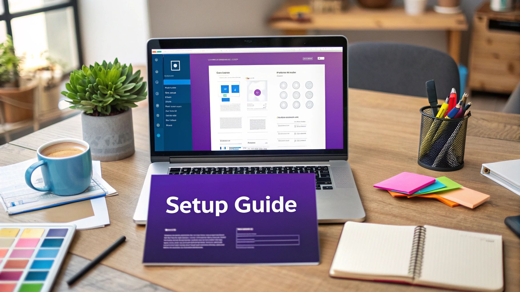
Table of Contents
- Why Your Divi Site Desperately Needs a Mega Menu
- Native Divi vs Plugins: Choosing Your Mega Menu Path
- Building Your First Mega Menu with Pure Divi Magic
- Advanced Styling That Makes Visitors Stop and Stare
- Mobile Optimization Without Compromising Your Vision
- Solving Problems Before They Drive You Crazy
- Maintaining Your Mega Menu for Long-Term Success
Why Your Divi Site Desperately Needs a Mega Menu
Let’s be honest: if you’re using a standard dropdown menu on a content-heavy Divi site, you might be creating a frustrating experience for your visitors. Standard menus often become long, unwieldy lists that force users to scan meticulously. This can lead to choice paralysis and send your bounce rates climbing. A mega menu in Divi isn’t just a stylistic upgrade; it’s a strategic tool for improving user experience (UX) and guiding visitors effectively.
The core issue with traditional menus is their one-dimensional nature. They can’t visually communicate hierarchy or group related items in a way that makes sense at a glance. Imagine trying to find a specific product in a large online store through a single, endless dropdown. It’s inefficient. Mega menus solve this by acting like mini landing pages within your navigation, using layouts, icons, and images to present options clearly. This visual approach helps users find what they need faster, which is a significant win for engagement.
When Do Mega Menus Make the Most Impact?
While not every website needs one, a mega menu becomes a game-changer in specific situations. Consider these real-world scenarios:
- Large E-commerce Stores: Displaying product categories with accompanying images or featured products directly in the menu can significantly boost click-through rates to key product pages.
- Service-Based Businesses: Instead of just listing services, you can group them by audience or problem, adding brief descriptions and a compelling call-to-action for each.
- Content-Rich Sites: For blogs or news portals, you can showcase recent posts, popular articles, or content categories with thumbnails, turning your menu into a discovery engine.
The standard WordPress menu system, while functional, wasn’t built for this level of complexity. Given that WordPress powers about 43.6% of all websites, and Divi is a top theme choice for its builder, the demand for better navigation is immense. This popularity has driven the need for advanced solutions like a mega menu in Divi to handle the sophisticated sites people are building. By organizing complex navigation into a digestible format, you transform your header from a simple list of links into a powerful tool that actively helps users and supports your business goals.
Native Divi vs Plugins: Choosing Your Mega Menu Path
When you decide to build a mega menu in Divi, you’re at a crossroads with two main paths ahead. You can either stick with Divi’s built-in tools or bring in a specialized plugin. The best choice really depends on your project’s needs, how comfortable you are with a bit of code, and your long-term goals. Many are surprised by what the native Divi Builder can do on its own, but it’s important to know its limits.
A well-designed mega menu isn’t just about looks; it has a real impact on how users interact with your site.
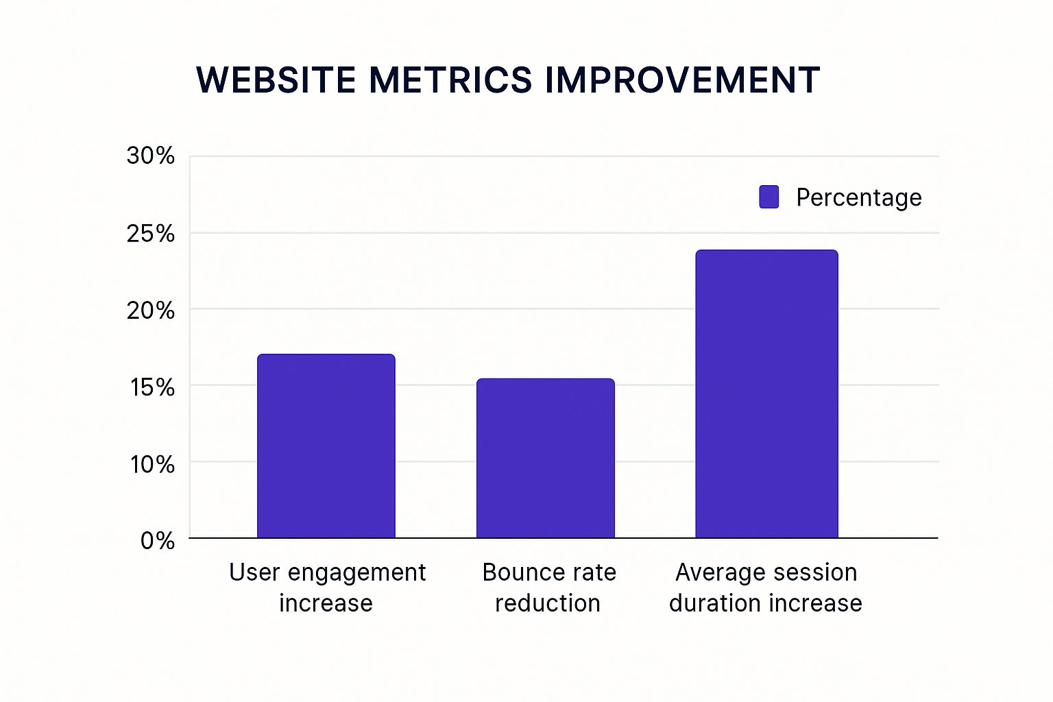
These numbers show that improving navigation keeps visitors on your site longer and encourages them to explore your content more deeply. It’s a change that directly contributes to better engagement.
The Native Divi Builder Approach
Creating a mega menu using only the Divi Builder is completely doable and often a great pick for simpler requirements. The general idea is to build a layout in the Divi Library and then use custom CSS to make it appear when a user hovers over a menu item.
This method has its upsides. It’s free since it uses tools you already have, it doesn’t add another plugin to your site, and you get complete design control with the familiar Divi Builder interface. However, it requires a good grip on CSS to handle positioning, hover triggers, and mobile responsiveness. Things can get complicated, especially when you run into z-index stacking issues or want to create smooth animations.
The Specialized Plugin Route
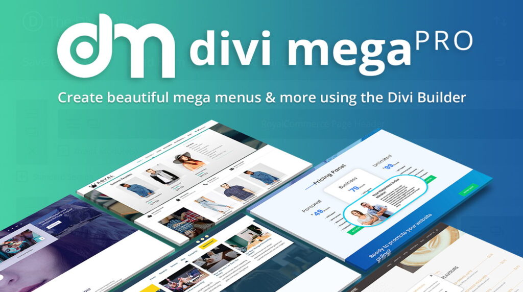
For more complex or feature-rich menus, a plugin is usually the smarter way to go. Specialized plugins emerged to simplify what used to be a very technical job. For instance, early plugins like Divi Mega Pro were developed to solve the very problem of manually wrangling CSS for these advanced menus. You can read more about how these tools evolved to meet user needs and made life easier for designers.
Modern plugins like our own Divi Areas Pro take this a step further. They integrate the menu-building process into a visual, click-based interface. Instead of fighting with code, you design your menu content as a “Divi Area” and then assign it to a menu item with a few clicks. This method offers some clear advantages:
- Ease of Use: You don’t need to write any custom code for the core functionality.
- Advanced Triggers: You can go beyond simple hovers and use click-triggers, which are often much better for mobile user experience.
- Streamlined Workflow: It dramatically reduces development time and makes future updates much simpler.
To give you a clearer picture, let’s compare the two approaches side-by-side. This table breaks down the key features and helps you decide which path is the right fit for your specific project.
| Feature | Native Divi Builder | Specialized Plugins | Best For |
|---|---|---|---|
| Cost | Free (included with Divi) | Paid (one-time or subscription) | Native: Budget-conscious projects. Plugins: Projects where time-saving and advanced features are a priority. |
| Setup Time | High (manual layout creation, CSS coding) | Low (visual setup, no code required) | Plugins: Rapid development and quick turnarounds. |
| Ease of Use | Low (requires CSS knowledge) | High (intuitive UI, guided setup) | Plugins: Beginners or designers who want to avoid code. |
| Trigger Options | Limited (hover-based with CSS) | Advanced (click, hover, timed, scroll) | Plugins: Creating a more interactive and mobile-friendly user experience. |
| Maintenance | Moderate (manual updates to CSS/layouts) | Low (easy to edit/update via plugin UI) | Plugins: Sites that will need frequent menu content updates. |
| Performance | Good (no extra plugin overhead) | Varies (well-coded plugins are highly optimized) | Both: A well-built native menu can be very light. Good plugins are designed for performance. |
| Support | Community forums, self-help | Direct developer support, documentation | Plugins: Users who want dedicated support when they run into issues. |
Ultimately, while the native method is a solid option for basic menus, plugins provide a more powerful and scalable solution for building a professional mega menu in Divi. For anyone starting out, you can see the process in action by checking out our guide on how to create a mega menu. It offers a great overview of the steps involved, no matter which path you choose.
The Best Mega Menu Plugins for Divi
If you decide to go the plugin route (which we recommend for most cases), then you’ll need to choose between the two best options for Divi Mega Menu plugins. Below I’ll discuss the pro and cons for each one:
Divi Mega Menu Pro (by Divi Life)
Divi Mega Menu Pro by Divi Life is the original mega menu plugin for Divi, dating back to 2018. It’s been used by thousands of Divi users, and it’s been continuously improved over time. It’s now compatible with Divi 5 too!
Pros:
- Purpose-built for mega menus – streamlined setup specifically for menus.
- Simpler UI – fewer options = easier for beginners to grasp.
- Hover or click triggers for menu content.
- Prebuilt animations and transitions make menus feel polished out of the box.
- Lower learning curve if you’re just doing basic mega menus.
- Can also create hover tooltips (“mega tooltips”)
- Fully rebuilt for Divi 5!
Cons:
- Not a multi-purpose plugin like Divi Areas Pro (limited to mega menu and hover popups)
- Doesn’t offer advanced conditional logic (e.g. show menu only to logged-in users). Although those features are coming soon.
- Less extensible for custom behavior or marketing automation.
Divi Areas Pro (by Divimode)
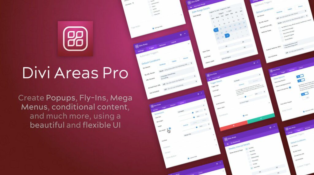
Divi Areas Pro is our very own plugin here at Divimode. It was originally created to be the premium version of our extremely popular Popups For Divi plugin (over 100,000 active installs!), but we extended the scope to go beyond popups. Divi Areas Pro enables you to create advanced popups, fly-ins, mega menus, conditional content, content injection, and more!
Pros:
- Multi-purpose plugin – mega menus, popups, fly-ins, banners, tooltips, and more.
- Advanced triggers – click, hover, exit-intent, scroll, delay, and even back button.
- Powerful targeting logic – show/hide by page, device, user role, login status, time/date, etc.
- Works great with mobile-first behavior (toggle menus, click triggers).
- One plugin to replace multiple solutions (great for performance-conscious sites).
Cons:
- More complex interface – takes longer to learn because it’s feature-rich.
- Slightly more setup time for a simple mega menu compared to Divi Mega Pro.
- Because it’s not mega-menu-specific, it may feel “overkill” if that’s all you need.
- Not yet compatible with Divi 5
Both options are outstanding and used and loved by thousands of Divi users across the world. Whichever option you choose, you will be able to create fantastic mega menus with Divi.
Now, if you don’t want to use a plugin, we’ll teach you how to build a mega menu with Divi with just Divi’s built in features and some custom CSS.
Building Your First Mega Menu with Pure Divi Magic
Let’s get our hands dirty and build something impressive using only the tools already inside Divi. The native approach, while requiring a bit more effort, gives you complete control and avoids adding another plugin to your site. We’ll walk through this process with a real-world scenario: creating a mega menu in Divi for a business that offers multiple services, like web design, SEO, and content marketing. The goal is to group these services visually, making them easy for potential clients to explore.
Structuring Your Menu in the Divi Library
The main idea behind a native Divi mega menu is to build the dropdown content as a standalone layout. You don’t build it directly in the menu settings. Instead, you create it as a Section in the Divi Library. Think of this Section as a blank canvas where you can use any Divi module you want.
For our multi-service business example, you’d start by creating a new Section in your Divi Library. Inside this section, you might use a three-column row.
- Column 1 (Web Design): Add a Blurb module with a “Web Design” title, a short description, and an icon. Below that, you could add a Button module linking to your portfolio.
- Column 2 (SEO): Repeat the process for your SEO services. You could add a small image here instead of an icon to create some visual variety.
- Column 3 (Content Marketing): For this one, you might include a Testimonial module showcasing what a happy client said about your content services.
This approach lets you mix and match content types in a way that’s impossible with a standard dropdown. You’re basically building a mini-page that will function as your menu.
Connecting the Layout with CSS
Once your layout is saved in the Divi Library, the real “magic” happens with CSS. You’ll need to assign a custom CSS Class to the parent menu item (e.g., “Services”) in the WordPress Appearance > Menus screen. This class acts as the trigger. Then, you’ll add custom CSS that tells the browser to hide your Divi Library section by default and only show it when someone hovers over the menu item with your specific class. This is what a final, polished mega menu can look like when executed well.
The key to making this work smoothly is managing the positioning and z-index. Your CSS needs to ensure the mega menu appears above all other page content. This is where most people get stuck, but with careful targeting, it’s a solvable problem. It’s also worth noting that this technique can be adapted for other interactive elements; for example, you can learn more about how to create a responsive Divi popup menu using similar principles. By mastering this method, you gain the ability to create a truly custom mega menu in Divi without relying on third-party tools.
How to Create a Mega Menu in Divi Using the Native Builder (No Plugin)
Step 1: Create Your Mega Menu Layout in the Divi Library
-
- Go to Divi > Divi Library in your WordPress dashboard.
- Click “Add New”, and name it something like “Mega Menu – Services.”
- Choose Layout as the type, and select Section.
- Build your mega menu content inside the section:
- Use a multi-column row (e.g. 3 columns).
- Add Blurb modules, Icons, Text, Buttons, or Images in each column.
- Keep it clean and scannable.
Step 2: Assign a CSS Class to Your Menu Item
- Go to Appearance > Menus.
- Enable CSS Classes in the top-right “Screen Options” if it’s not showing.
- Locate the parent menu item (e.g., “Services”) and add a class like:
mega-menu-trigger
Step 3: Add the Mega Menu Section to the Footer (Hidden by Default)
To make the layout accessible on every page (but hidden), do the following:
- Go to Divi > Theme Builder and edit the Global Footer.
- Add a Code Module, and insert this shortcode:
[insert page=’mega-menu-services’ display=’content’]
(Use a plugin like Insert Pages or your builder’s shortcode method.) - Wrap the shortcode in a <div> with a unique class, e.g., mega-menu-content.
Step 4: Add Custom CSS to Control the Behavior
Paste this into Divi > Theme Options > Custom CSS or in your child theme:
/* Hide mega menu by default */
.mega-menu-content {
display: none;
position: absolute;
top: 100%;
left: 0;
z-index: 9999;
background: #fff;
width: 100%;
padding: 20px;
box-shadow: 0 10px 30px rgba(0, 0, 0, 0.1);
}
/* Show on hover */
.mega-menu-trigger:hover + .mega-menu-content,
.mega-menu-content:hover {
display: block;
}
/* Ensure parent menu is positioned correctly */
.et_menu_nav > li {
position: relative;
}
Step 5: Style & Test
- Tweak styles (spacing, width, mobile responsiveness).
- Check on desktop and mobile.
- Use DevTools (right-click > Inspect) to test hover states and stacking.
Pro Tip: Want this to trigger on click instead of hover (better for mobile)? You’ll need a bit of JavaScript — or just use Divi Areas Pro which makes this drag-and-drop easy.
Advanced Styling That Makes Visitors Stop and Stare
A functional mega menu gets the job done, but a beautifully styled one creates an experience. Let’s move beyond the basic structure and talk about the advanced styling that can make your mega menu in Divi a truly memorable part of your site’s design. This isn’t about adding flashy gimmicks; it’s about using subtle effects and thoughtful layouts to improve usability while reinforcing your brand.
One of the first places to add a touch of class is with hover effects and transitions. Instead of the menu just popping into existence, you can use CSS to add a gentle fade-in or a subtle slide-down effect. This small detail makes the interaction feel much smoother and more professional. You can do this by setting an initial opacity of 0 and a slight vertical offset on your menu, then transitioning those properties on hover. It creates a polished feel that really sets your site apart.
Crafting Engaging Layouts
Why stick to a boring old grid? A mega menu in Divi gives you the freedom to create asymmetrical layouts that guide the user’s eye and highlight what’s most important.
- Featured Content: Try dedicating a larger column to showcase a new product, a featured blog post, or a special offer. Using a background image in just that column can make it really stand out.
- Mixed Content: Combine different Divi modules for a richer experience. You could pair an icon list of key features right next to a video thumbnail or a customer testimonial.
- Dynamic Information: Use plugins or custom code to automatically pull in dynamic content, like your latest blog posts or best-selling products. This keeps your menu fresh and relevant without needing constant manual updates.
Incorporating Dynamic and Interactive Elements
Mega menus have come a long way, especially with features designed to improve navigation and user engagement. Since the early 2020s, plugins have introduced options like ‘Mega Drop-Downs’ and ‘Menu Popups’ that have become standard practice. For instance, with a tool like Divi Areas Pro, you can set your mega menu to trigger not just on hover, but also on a click—a much more reliable interaction on touch devices. This simple change makes your menu significantly more accessible for mobile users.
You can explore the features that enhance Divi mega menus to get a better idea of how these tools can be applied to your own site.
Ultimately, great styling is about purpose. Use a background image that reflects your brand’s aesthetic. Choose animations that feel responsive, not distracting. A well-styled mega menu does more than just display links; it communicates professionalism, guides user journeys, and can even become a powerful tool for conversions.
Mobile Optimization Without Compromising Your Vision
This is the moment of truth for any mega menu in Divi: how it performs on a smartphone. A rich, expansive desktop menu can quickly become a cluttered, unusable nightmare on a smaller screen. The biggest challenge isn’t just making it fit; it’s preserving its powerful functionality without overwhelming the user or killing your site’s performance.
The first instinct might be to simply hide the complex mega menu on mobile and switch to a standard, stacked list. While that’s an option, it means mobile visitors miss out on the curated experience you designed. A better approach is to adapt the menu’s structure. Think in terms of accordions or collapsible toggles. The main menu items remain, but tapping one reveals the sub-categories within, keeping the interface clean and manageable. This preserves the hierarchy and visual grouping that makes the menu effective in the first place.
For better results though, we recommend Divi Mobile Menu plugin. It allows your to create a custom mobile menu experience for your visitors, rather than trying to adapt a desktop mega menu for mobile. This is how the big brands do it, and now you can do it too.
Performance and Core Web Vitals
Here’s the part many people overlook: a poorly optimized mega menu can seriously damage your Core Web Vitals scores. The complex layouts, multiple images, and extra code can increase your Largest Contentful Paint (LCP) and contribute to Cumulative Layout Shift (CLS) if elements load in late and move content around. This is especially true for mobile devices, which often have slower network connections.
To combat this, lazy loading images within your mega menu is a must. There’s no reason to load a dozen product thumbnails if the user never even opens that part of the menu. Additionally, minifying the specific CSS and JavaScript that controls the menu helps reduce its weight, leading to faster load times. Making your mega menu look and work perfectly across all devices requires sticking to proven responsive web design best practices. Following these guidelines is key to creating an experience that feels intentionally designed for mobile, not just squeezed into it.
A Practical Checklist for Mobile Performance
Keeping your mobile mega menu fast and functional is an ongoing process. To help you prioritize, here’s a checklist of key techniques, their impact on performance, and how difficult they are to implement. Focusing on the right optimizations can make a huge difference in both site speed and user happiness.
| Optimization Technique | Performance Impact | Implementation Difficulty | Priority Level |
|---|---|---|---|
| Use Click Triggers | Improves touch interaction, reduces accidental triggers. | Low (easy with plugins like Divi Areas Pro) | High |
| Lazy Load Images | Reduces initial page load time and LCP. | Medium (can be done with plugins or attributes) | High |
| Create Collapsible Sections | Better UX, less overwhelming for users. | Medium (requires some CSS/JS or plugin features) | High |
| Minify Menu-Specific CSS/JS | Decreases file size for faster loading. | Medium (often handled by caching plugins) | Medium |
| Use a CDN | Delivers menu assets faster to global users. | Low (typically a web host or CDN service setting) | Medium |
| Test on Real Devices | Identifies real-world usability issues. | Low (time-consuming but not difficult) | High |
This table shows that high-impact optimizations like using click triggers, lazy loading images, and creating collapsible sections should be your top priorities. While some require a bit more setup, the payoff in user experience and speed is well worth the effort. Testing on real devices is a simple but critical final step to catch any issues you might miss on a desktop emulator.
Solving Problems Before They Drive You Crazy
Let’s be real, building a mega menu in Divi can sometimes feel like you’re wrestling with code. Even with great tools, you’ll hit a snag that makes you question all your life choices. From what I’ve seen, the most common headaches pop up from unexpected CSS conflicts, stubborn responsive issues, and caching plugins that just won’t play nice. Knowing what to look for can turn hours of frustration into a quick fix.
The very first thing I do when something goes wrong is open the browser’s developer tools. This is your best friend for diagnosing problems. If your menu isn’t showing up or looks like a Picasso painting, just right-click on the troublesome spot and select “Inspect.” This opens a window that lets you see the applied CSS, and more often than not, it points right to the culprit—like another plugin’s stylesheet overriding your hard work with a more specific selector. This happens all the time when you have multiple plugins trying to control the same styles.
Common Issues and Quick Fixes
When you start troubleshooting, focus on these usual suspects. They account for the vast majority of problems I see people run into when building a mega menu in Divi.
- Content Overflow: Your beautiful multi-column layout looks perfect on a big screen, but on a smaller one, the content is spilling out everywhere. The fix is usually to adjust the
widthormax-widthof your menu container inside a media query for smaller screens. Whileoverflow: auto;can be a quick patch, properly adjusting the widths is the correct long-term solution. - Z-Index Stacking Problems: Your mega menu is hiding behind other page content. This is a classic z-index issue. The solution is to give your mega menu container a very high
z-indexvalue (I usually start with something wild likez-index: 99999;) and double-check that its parent element has apositionproperty set to something other thanstatic(likerelative). - Caching Conflicts: You’ve made changes to your menu, but they refuse to show up on the live site. Nine times out of ten, this is aggressive caching. The first move is to clear all caches—your Divi static CSS file cache, your caching plugin (like WP Rocket), and your browser cache. This simple step solves the problem more often than you’d think.
By methodically checking for these common issues, you can debug your mega menu with confidence. Start with the developer tools to find the conflict, then apply these targeted fixes. This systematic approach will save you a ton of time and help you build more reliable and robust navigation for your sites.
Maintaining Your Mega Menu for Long-Term Success
Launching a beautiful mega menu in Divi is a fantastic start, but the real work begins after it goes live. A website is a dynamic thing—as your content grows and your business changes, your navigation has to keep up. Without a plan, even the most thoughtfully designed menu can become a cluttered, outdated mess that confuses visitors more than it helps. This is where a little bit of content governance goes a long way.
Planning for Scalability and Relevance
Think of your mega menu not as a static feature, but as a living part of your user experience. When you add new product lines, services, or blog categories, you need a strategy to fit them in without creating an overwhelming wall of links. A great habit to get into is scheduling quarterly reviews of your menu’s content. During these check-ins, ask yourself:
- Are all these links still pointing to relevant content?
- Do our analytics show that certain sections are being ignored?
- Does the current structure still make logical sense for our offerings?
This proactive approach prevents what I like to call “menu bloat.” It keeps your mega menu in Divi a sharp, focused tool that guides users effectively. To make sure your menu stays in top shape, it’s helpful to follow a broader maintenance routine. This ultimate website maintenance checklist is a solid resource for building that habit.
Performance Audits and User Feedback
Beyond the content itself, you have to keep an eye on technical performance. Regular audits are key to catching problems before they affect your users. Check your menu’s load times to make sure it remains snappy and responsive, especially after any Divi or WordPress updates. Pay close attention to user behavior in your analytics, too. A high exit rate from a specific menu item could be a red flag for a broken link or a confusing label.
Ultimately, your users are the best source of truth. Think about adding a simple feedback form or running a user survey every now and then. Asking direct questions like, “Could you easily find what you were looking for?” can provide priceless insights. This constant loop of auditing, analyzing, and adapting is what will ensure your menu remains a powerful asset. For those looking to build a truly adaptable menu from the start, check out the powerful features in our Divi Areas Pro plugin.
More Articles You Will Like


