 Alex Martin
So, what exactly are WordPress menu plugins?WordPress menu plugins are specialized tools that extend the platform's native navigation capabilities, allowing you to build anything from simple dropdowns to complex mega menus. These plugins offer enhanced design flexibility, better mobile responsiveness, and advanced features that improve user experience and site organization.
Why Your Default WordPress Menu Is Not Enough

Let's be honest, the standard WordPress menu feels like a basic roadmap in a world that needs a high-tech GPS. It gets the job done for simple blogs and brochure websites, but its limitations become glaringly obvious as your site grows in complexity and ambition.
Think of it like the difference between a small town's street signs and a major city's subway map. The first is fine for getting to a few local spots, but the latter is essential for navigating a sprawling, multifaceted environment. The default menu just wasn't built for the demands of a modern website.
Common Frustrations with Standard Menus
It doesn't take long for site owners to hit a wall, finding that the built-in menu system stifles creativity and hurts the user experience. These pain points are exactly why developers turn to advanced WordPress menu plugins. The most common issues I see are:
- Limited Design Options: You’re pretty much stuck with your theme's predefined settings. This makes it incredibly tough to create a unique navigation experience that actually matches your brand.
- Poor Scalability: As soon as you start adding more pages and categories—especially for large e-commerce stores or content-heavy sites—the standard menu devolves into an unmanageable, messy list. It just lacks the structure to organize a ton of information logically.
- Clunky Mobile Navigation: While most themes try to make the default menu responsive, the result is usually a generic "hamburger" icon that hides everything away. There's rarely much thought put into mobile user flow or engagement.
The core problem is this: A default menu is a static list of links. An advanced menu is an interactive tool designed to guide users, showcase content, and drive conversions.
Ultimately, sticking with the default system can lead to a disjointed user journey and lost opportunities. Upgrading your site’s navigation isn't just a cosmetic tweak; it’s a critical investment in a better user experience, improved engagement, and higher conversion rates.
Exploring the Different Types of Menu Plugins
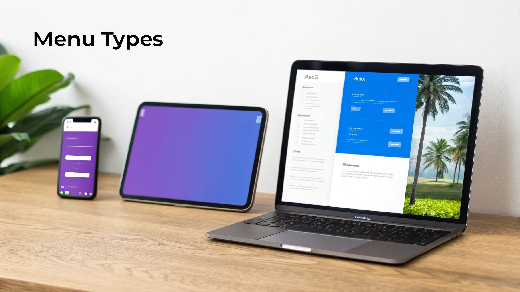
Diving into WordPress menu plugins is like swapping out a basic filing cabinet for a state-of-the-art library. You’re moving way beyond a simple list of links. Each type of plugin gives you a totally different way to organize your site and guide visitors, and figuring out which one is right for you is the first step toward a killer navigation strategy.
This whole world of advanced menus really took off with the rise of online shopping. With WooCommerce now powering over 33% of the entire eCommerce market, store owners suddenly needed a better way to show off massive product catalogs. A simple dropdown just wasn't going to cut it anymore.
Mega Menus: The Department Store Approach
Think of a mega menu as the big, helpful directory you see when you walk into a department store. Instead of a single, boring column of text links, it opens up a huge panel. Inside, you can have multiple columns, images, icons, and even little product carousels. It’s the perfect solution for content-heavy sites, like a bustling online magazine or a massive eCommerce shop.
A retailer like Best Buy, for example, uses a mega menu to lay out everything from "Computers & Tablets" to "TV & Home Theater" all at once. They use icons and clear sub-categories so you never feel lost. It gives visitors a bird's-eye view of everything on offer, which makes finding things a whole lot easier.
Off-Canvas Menus: The Hidden Valet
Off-canvas menus—you probably know them as slide-in or "hamburger" menus—are like a valet who only shows up when you need them. They stay tucked away off-screen until a user clicks an icon, and then they glide smoothly into view. This is the go-to for clean, minimalist designs and has become the absolute standard for mobile navigation.
By keeping the main menu hidden, you free up all that precious screen real estate for your actual content. And on a phone, every single pixel counts.
An effective menu isn't just a list of pages; it's a strategic tool that directs user flow. Off-canvas menus excel at this by providing a comprehensive navigation experience without cluttering the primary interface.
Sticky Menus: The Ever-Present Assistant
A sticky menu is that helpful assistant who stays right by your side as you browse a long page. It "sticks" to the top of the screen when a user scrolls down, making sure the main navigation links are always just a click away. It's a simple trick, but it can make navigating a long, scrolling page so much less frustrating.
In fact, usability studies have shown that sticky navigation can make it up to 22% faster for visitors to get around a site. That's a huge win for user experience.
Mobile-First and Fly-Out Menus
These last two are all about saving space and creating more targeted interactions.
- Mobile-First Menus: These are designed from the ground up for small screens. They often use clever accordion or tabbed layouts to organize deep navigation structures without overwhelming the user on their phone.
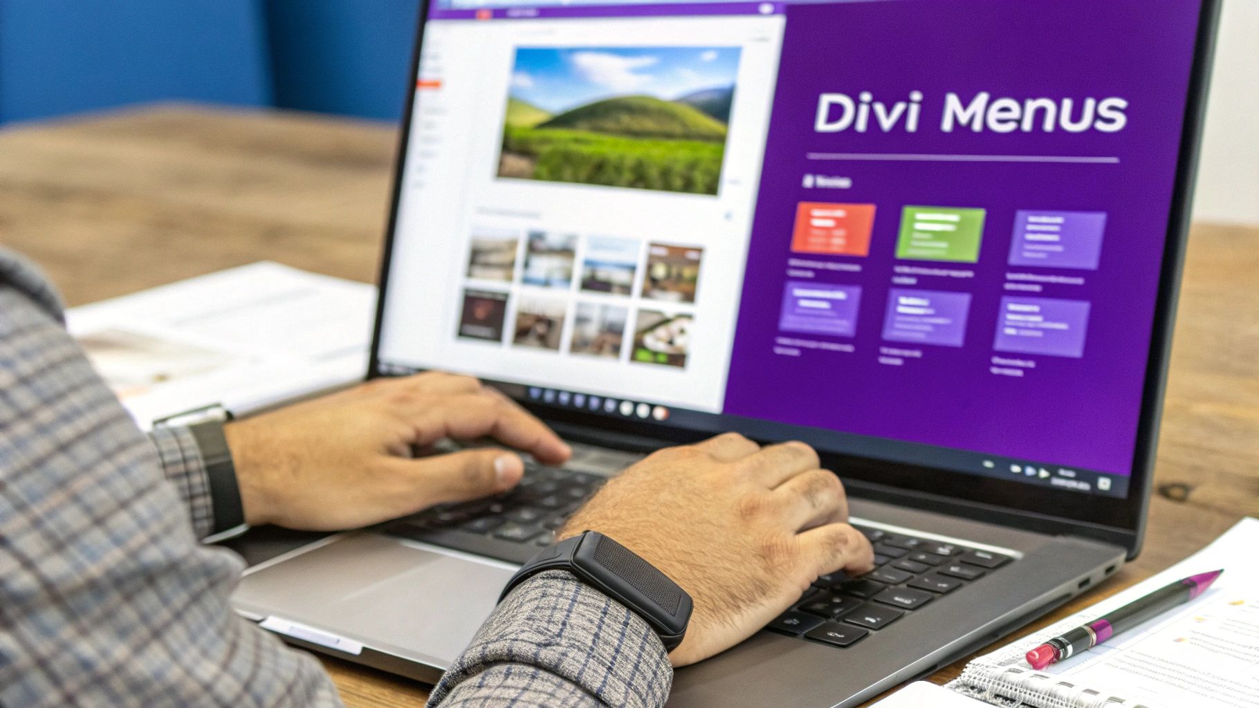
- Fly-Out Menus: Sometimes called fly-ins, these are smaller menus that slide out horizontally, usually from the side. They’re great for secondary navigation or for pushing users toward specific actions. You can even create a custom fly-in menu in Divi to highlight a special offer or guide visitors to your most important pages.
How to Choose the Right WordPress Menu Plugin
With what feels like a million WordPress menu plugins out there, picking the right one can be a real headache. It’s about more than just slick animations and a long feature list. The best plugin is one that feels like it belongs on your site—serving your visitors without tanking your performance.
Think of it like choosing tires for a car. You wouldn't slap massive off-road tires on a Formula 1 race car, right? The same logic applies here. The menu plugin you choose has to match your website's purpose and its technical foundation. A super-powerful, feature-packed plugin is totally useless if it slows your site to a crawl or makes users want to throw their phones across the room.
To cut through the noise, let's focus on the criteria that really matter.
H3: Performance and Site Speed
Before you even glance at the cool features, you have to think about performance. A bloated menu plugin can be a real boat anchor, adding extra CSS and JavaScript files that slow down every single page. This hits your Core Web Vitals hard, which is bad news for both user experience and your SEO rankings.
Look for plugins that brand themselves as "lightweight" or "performance-focused." Dive into their documentation and hunt for features like conditional asset loading. That’s a fancy way of saying the plugin only loads its code on pages where it’s actually needed, preventing unnecessary drag on the rest of your site.
H3: Accessibility Compliance
Your menu is the main roadmap for your website. It absolutely must be usable by everyone, including people who rely on screen readers and other assistive tech. An inaccessible menu can make your site completely unusable for a huge chunk of your audience.
Make sure any plugin you consider follows the Web Content Accessibility Guidelines (WCAG). Here are the non-negotiables:
- Full Keyboard Navigation: Can a user tab through every single link and submenu without ever touching a mouse? They should be able to.
- ARIA Roles: The plugin needs to use proper ARIA (Accessible Rich Internet Applications) roles. This helps screen readers understand what they’re looking at and how it works.
- Clear Focus States: When a keyboard user tabs to a menu item, there must be a clear visual indicator—like an outline—so they always know where they are.
H3: Seamless Divi and WooCommerce Integration
If you’re building with Divi, compatibility isn't just a nice-to-have; it's a dealbreaker. A great menu plugin should feel like a native part of the Divi Builder, not some clunky, bolted-on afterthought. You want something that lets you build and style your menus using the familiar Divi controls you already know and love.
For anyone running an e-commerce site, deep WooCommerce integration is just as critical. The plugin should be smart enough to automatically pull in your product categories, show what’s in the cart, and maybe even let you feature specific products right in the menu. This creates a much more fluid shopping experience for your customers.
A plugin’s true value isn't just in its features, but in how well it disappears into your existing workflow. The goal is to enhance Divi and WooCommerce, not fight with them.
When you're choosing a WordPress menu plugin, remember it's a key piece of your site's overall user experience strategy. For a more holistic approach, you might want to explore professional website design and development services.
H3: Advanced Targeting and Mobile Responsiveness
Finally, a modern menu plugin should give you surgical control over who sees what, and when. Look for advanced display rules that allow you to show different menus based on criteria like:
- User roles (e.g., showing a special menu for logged-in members)
- Specific pages or posts
- Device type (desktop, tablet, or mobile)
And speaking of devices, perfect mobile responsiveness is an absolute must. The plugin can't just shrink your desktop menu and call it a day. It needs to provide dedicated options for creating a touch-friendly, intuitive mobile navigation experience. The best way to check this? Test the plugin's demo on your actual phone and see how it feels.
Implementing and Optimizing Your New Menu
Picking the right plugin is a huge win, but your work isn't quite done. Now comes the fun part: integrating your new navigation system and making it a genuinely seamless part of your user's experience. A little thought during implementation makes all the difference and ensures your new menu pulls its weight from day one.
First things first: preparation. Before you even think about installing a new plugin—especially one as critical as your site's main navigation—create a full backup of your website. Seriously. This is your safety net, your "undo" button that lets you instantly restore your site if anything goes sideways.
Once the plugin is installed and activated, fight the urge to just copy your old menu structure. This is the perfect opportunity to rethink your site’s information architecture. Think logically about how you can group pages and posts. Your goal is to create an intuitive flow that guides visitors exactly where they need to go, without making them think.
Best Practices for Menu Optimization
A well-implemented menu is more than just pretty; it's fast, SEO-friendly, and works flawlessly on any device. To get there, let's focus on a few key optimization strategies that pack a real punch.
- Improve Loading Speed: A massive, complex mega menu can sometimes be a drag on your site's speed. Look for plugins with performance settings, like lazy loading for menu images. This keeps your menu from hurting your Core Web Vitals.
- Boost Your SEO: Use clear, descriptive link text (or anchor text) in your menu items. Instead of a generic term like "Services," get specific with something like "Divi Web Design Services." It gives both users and search engines much better context.
- Prioritize Mobile Testing: Don't just check the desktop view and call it a day. Grab a few real phones and tablets and put your menu through its paces. Make sure it's easy to tap, navigate, and read on those smaller screens. For more tips, check out our guide on mobile menu design.
This decision tree breaks down the core things you need to consider when choosing a plugin that nails performance, accessibility, and compatibility.
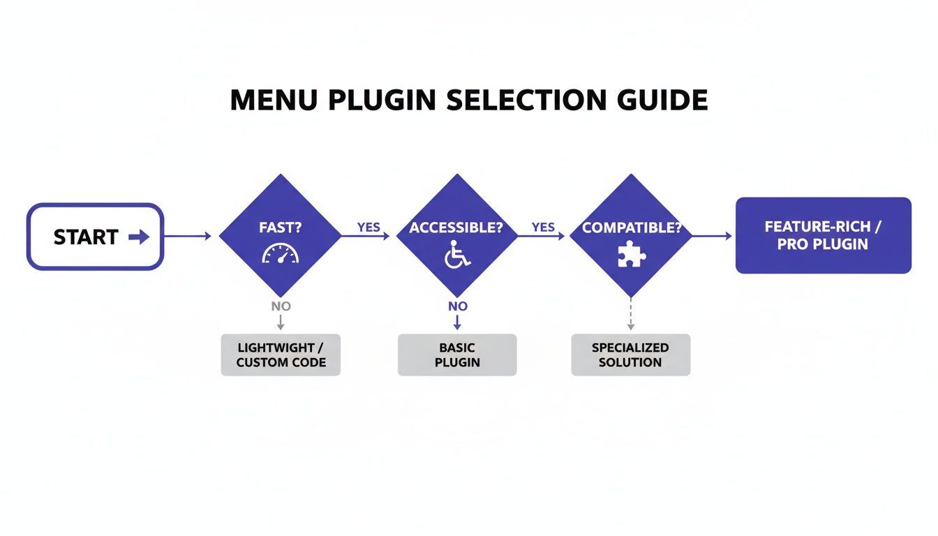
As the chart shows, it all comes back to a solid foundation of speed, accessibility, and theme compatibility. Get those right, and you're well on your way.
Avoiding Common Implementation Mistakes
It's easy to fall into a few common traps when setting up new WordPress menu plugins. A cluttered mega menu, for instance, can be just as confusing as a disorganized default menu. Keep your design clean and resist the temptation to overwhelm visitors with a wall of options.
The growth of menu plugins has been incredible, mirroring WordPress's own expansion—it's expected to hit 43.6% market share by 2025. This demand, especially from the 9% of all websites using WooCommerce, has led to some incredibly powerful tools that require a careful hand during setup.
Remember: The goal of a new menu is to bring clarity, not complexity. Every single link in your navigation should serve a clear purpose and help create a better user journey.
After you've launched your new menu, ongoing site care is what keeps it—and the rest of your site—secure and performing well. Consider looking into professional WordPress website maintenance services to ensure everything stays optimized. A great launch is just the beginning of keeping a high-performing website.
Building Advanced Menus with Divi Areas Pro
Theory is great, but seeing a powerful tool in action is what really makes things click. To show you how a single, well-built plugin can solve a ton of navigation headaches, let's walk through a real-world example using Divi Areas Pro. This tool was made specifically for the Divi ecosystem, so it turns all those abstract ideas we've talked about into tangible results.
Instead of juggling a handful of different WordPress menu plugins for your popups, another for mega menus, and yet another for conditional rules, Divi Areas Pro wraps it all up into one cohesive package. This doesn't just clean up your plugin list; it guarantees everything plays nicely together, boosting both performance and reliability.
Building a Dynamic Off-Canvas Menu
Let's kick things off with a classic: a sleek off-canvas menu for a modern, minimalist site. Forget being stuck with your theme's default hamburger icon. You can hop into the Divi Builder and design a totally custom button—maybe something with a slick hover animation—and set that as your trigger.
When a visitor clicks it, a beautifully designed panel slides into view. And this isn't just a basic list of links. You can build this "Area" with any Divi module you want. Drop in a contact form, social media icons, or even a personalized welcome message for users who are logged in.
Creating a Conditional Promotional Bar
Okay, now let's say you're running a sale just for your registered members. With Divi Areas Pro, you can create a sticky bar or a "fly-in" that anchors to the top of the page. Then, you just add a simple rule to show this Area only to users with a "Customer" or "Subscriber" role.
This level of control transforms your navigation from a static site map into a dynamic marketing tool. It allows you to deliver targeted messages to the right audience at the right time, directly within your site's navigation structure.
This conditional logic is incredibly powerful. You can trigger content based on the page someone is visiting, the device they're using, or even if they're about to leave the site (exit-intent). The possibilities go way beyond simple menus. If you're curious, you can explore the full range of Divi Areas Pro features every web designer should know.
Designing a WooCommerce Mega Menu
For any decent-sized WooCommerce store, a standard dropdown menu just doesn't cut it. Using Divi Areas Pro, you can build a true mega menu that gives customers a rich, visual overview of your product categories.
Here’s a quick breakdown of how it works:
- Create Your Menu Layout: First, design a multi-column layout inside a Divi Area. You can use image modules for category thumbnails and text modules for all the sub-category links.
- Assign the Trigger: Next, head over to the standard WordPress menu settings. Find a top-level item like "Shop" and link it to trigger your new Area on hover.
- Add Featured Products: Why stop there? You can even drop a WooCommerce module right into the Area to show off a carousel of your best-selling products, all within the navigation itself.
This approach creates an intuitive shopping experience that gets customers where they need to go faster, breaking free from the rigid confines of default menus.
Where Do We Go From Here?
Your website's navigation is so much more than a list of links—it's the central nervous system of your entire user experience. As we've seen, the default WordPress menu has some pretty clear limits, but the world of WordPress menu plugins gives you a powerful way to solve almost any challenge you might run into. Picking the right tool is the first, most important step in turning a basic site map into an intuitive guide that actually helps you convert visitors.
This shift from a static menu to a truly interactive system is still unfolding. The next wave of innovation is already washing up on our shores, and it’s all about hyper-personalization. Think about menus that use AI to reorder links on the fly, based on a visitor’s past behavior or even their location. Or imagine navigation that works seamlessly with voice search, letting users just ask for what they need.
A well-designed menu is a cornerstone of great user experience and conversion optimization. It’s not a feature you set and forget, but an evolving tool that should adapt to new technologies and user expectations.
When you start thinking about your navigation this way, you can move past the idea of just linking to pages. You're building a smarter, more responsive experience that not only meets today's demands but is also geared up for whatever comes next.
Frequently Asked Questions
Whenever you start looking into WordPress menu plugins, a few questions pop up time and time again. Let's cut through the noise and tackle the big ones so you can feel confident in your choice and avoid any nasty surprises down the road.
Will a Menu Plugin Slow Down My Website
That’s a fair question. We’ve all seen a poorly coded plugin bring a site to its knees, and load time is everything. A top-tier menu plugin, however, should barely make a dent. The good ones are built with performance in mind and use smart tricks like conditional asset loading—meaning they only load their scripts and styles on pages where they're actually needed.
To stay in the clear, keep an eye out for plugins described as "lightweight" and definitely scan the user reviews for any chatter about speed. The whole point is to add cool features without bogging down your site and ruining the user experience.
Can I Use a Menu Plugin with Any WordPress Theme
For the most part, yes, but compatibility is king—especially if you're working with a page builder like Divi. The best WordPress menu plugins are designed to play nice with popular themes and builders. They often go the extra mile by adding their own modules or settings right into the theme’s interface, making them feel like they belong there.
Before you pull the trigger, always check the plugin’s documentation. Look for a compatibility list or specific notes about your theme. For Divi users, it's a no-brainer to pick a plugin built for Divi, like Divi Areas Pro. That’s how you guarantee a smooth, bug-free experience.
The best menu plugins don't just work with your theme; they feel like a natural extension of it. This deep integration is key to building a cohesive and professional website.
How Do I Make My Website Menu Accessible
This isn't just a "nice-to-have" anymore; it's a must. An accessible menu means everyone, including people with disabilities, can navigate your site without a hitch. Here’s what to look for in a plugin that takes accessibility seriously:
- Keyboard Navigation: Can users tab through every single link and submenu item without ever touching a mouse? They should be able to.
- ARIA Labels: These are little helpers for screen readers, explaining what menu elements are and what they do.
- Visible Focus States: When a user tabs to a menu item, there should be a clear visual outline showing them exactly where they are.
Your best bet is to choose a plugin that follows the Web Content Accessibility Guidelines (WCAG). It's the simplest way to make sure your navigation is built for everyone.
Ready to build smarter, more dynamic menus in Divi? Divimode offers the tools you need. Explore Divi Areas Pro to create stunning mega menus, targeted popups, and more. Visit us at https://divimode.com to get started.
More Articles You Will Like