
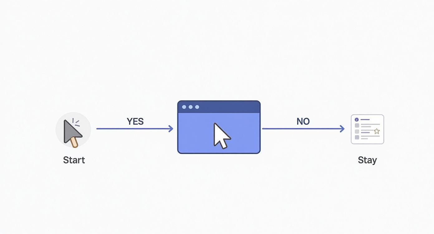
A pop up on exit is your last-chance offer. It shows up the moment a user’s mouse suggests they're about to leave your site. Think of it as an automated safety net, designed to re-engage visitors, capture that lead, or save a sale at the most critical moment. It's not meant to be an interruption; it's a final, helpful nudge.
Why Exit-Intent Popups Are Your Secret Weapon

Before we jump into the Divi Builder, it’s worth taking a moment to appreciate the strategic power you're about to unlock. An exit-intent popup isn't just a static banner; it's a smart tool that reacts to user behavior. The second a visitor's cursor drifts up towards the close button or browser tabs, the technology triggers your message. This is your final shot to make a connection.
This isn't about being annoying. It’s about providing real value at the exact moment of disengagement. For example, an e-commerce store can flash a last-minute discount code to someone abandoning their cart. A blog can offer a super-relevant case study download in exchange for an email. These aren't random interruptions—they're context-aware solutions.
Scenarios Where Exit Popups Excel
The real magic of this strategy is its versatility. You can tailor your message to fit all sorts of user actions and business goals.
- Cart Abandonment Recovery: For online stores, this is a total game-changer. A simple message like, "Wait! Get 15% off your order" can be the final push a hesitant buyer needs to complete their purchase.
- Lead Generation: This is classic, and for good reason. Capture email addresses by offering something genuinely useful. A visitor reading your blog post on marketing might see a popup offering a free "Ultimate Marketing Checklist."
- Visitor Feedback: Ever wonder why people are leaving? Use an exit popup to ask them. A short, one-question survey can give you incredible insight into user experience problems or content gaps you never knew you had.
- Content Navigation: If a user is about to leave a product page, you can use a popup to guide them toward a comparison guide or customer testimonials, keeping them engaged and moving them further down the funnel.
The goal is to reframe the exit-intent popup. It’s not an obstacle; it's a helpful assistant that anticipates a user's needs and serves up a solution right before they're gone for good.
The Impact on Conversions
The data speaks for itself—this tactic works. Exit-intent popups are a staple in digital marketing because they catch users at that peak moment of indecision. Good research shows that well-crafted popups can recover 10–15% of abandoning visitors, with average conversion rates falling somewhere between 2% and 5%. You can dig into the full exit popup research to see just how big the potential impact is.
This isn't a minor tweak. It's a significant lever you can pull to directly improve your site's performance.
Preparing Your Divi Environment for Popups
Before we dive into building your first pop up on exit, we need to get the groundwork right. A little prep work goes a long way and ensures your Divi site is ready for the smart functionality we’re about to add.
This isn't just about installing a plugin, though. It's about strategy. Take a moment and get crystal clear on what you want this popup to accomplish. Are you trying to capture email subscribers with a juicy lead magnet? Or maybe you want to slash your cart abandonment rate with a last-chance discount code?
Nailing down this goal from the start will shape every single design and targeting choice you make down the line.
Choosing the Right Tool for the Job
There are a few popup tools for Divi out there, but they definitely aren't all built the same.
The free Popups for Divi plugin is a fantastic place to start if you just need simple popups triggered by a click or a timer. But for the intelligent, behavior-driven magic of exit-intent, you’re going to need something with more horsepower.
That’s where Divi Areas Pro steps in. It's the premium big brother that unlocks the advanced triggers you need for a killer exit-intent strategy, like detecting when a user’s mouse leaves the page or when they hit the back button. For this guide, we'll be working exclusively with Divi Areas Pro because it offers the precision and control essential for creating a high-converting pop up on exit.
The screenshot above gives you a peek at the deep feature set in Divi Areas Pro. It goes way beyond just popups, letting you create tooltips, fly-ins, and other kinds of dynamic content.
Installation and First Steps
Once you’ve grabbed your copy of Divi Areas Pro, getting it installed is a breeze. Just download the plugin file from your Divimode account, then head over to your WordPress site and navigate to Plugins > Add New > Upload Plugin. Upload the file you just downloaded and hit "Activate."
With the plugin running, you'll see a new Divi Areas menu item in your WordPress dashboard. This is your command center for everything. Before you jump into building, I recommend poking around the plugin's settings to see what global options are available. It’s always good to know your tools.
The most important step you can take is setting a clear goal. Don't just build a popup because you can—build one to solve a real problem, whether that's capturing leads or saving sales.
If you're completely new to our plugins, our guide on how to install Popups for Divi covers the basic installation process, which is nearly identical for the Pro version. Getting this foundational work done right ensures your tech is perfectly aligned with your marketing goals from the get-go.
Alright, with the strategy mapped out, it’s time to roll up our sleeves and bring your first exit-intent popup to life. We’re officially moving from theory to practice, building a popup from scratch with the Divi tools you already know and love.
The process kicks off by creating what’s called a "Divi Area." Just think of this as your popup's blank canvas. It’s a special post type that Divi Areas Pro adds to your site, letting you jump into the standard Divi Builder for total creative freedom over the look and feel.
Creating the Popup Canvas
First things first, head over to Divi Areas > Add New in your WordPress dashboard. You'll want to give your new Area a clear, descriptive name—something like "10% Discount Exit Offer"—so you can easily find it later. Then, just click "Use Divi Builder" to launch the familiar design interface.
Now for the fun part. You get to build your popup just like any other Divi page. For this walk-through, we'll put together a simple but effective layout designed to snag an email address in exchange for a sweet discount.
- Add a new Section: Start with a single-column row. Nice and simple.
- Insert a Text Module: This is for your headline. Craft something compelling that stops them in their tracks, like, "Wait! Don't Leave Without Your 10% Discount." It gets straight to the point and immediately shows the value.
- Add an Image Module: A slick product photo or even a relevant icon can make the whole offer feel much more tangible and appealing.
- Use the Email Optin Module: This is the heart of your popup. Hook it up to your email service provider and customize the fields and button text. Make that call-to-action impossible to ignore—"Get My Code!" works way better than a generic "Submit."
You have the full power of Divi here, so play around! Tweak the colors, fonts, and spacing to perfectly match your brand's style. The goal is to create something that feels like a seamless part of your site, not a jarring interruption.
A well-designed popup feels like a natural extension of your website, not a third-party advertisement. Use your brand's fonts and color palette to build instant trust with the visitor.
Setting the Exit-Intent Trigger
Once your design is looking sharp, the next step is the most important one: setting the trigger. This is the bit of magic that transforms a regular Divi layout into a smart pop up on exit. Go ahead and save your design and exit the Divi Builder.
Just below the main editor, you'll spot the Divi Areas Pro settings box. This is your command center for all the popup's behavior. Click on the "Trigger" tab to see all the options that control when your masterpiece will appear.
Find the "On Exit Intent" trigger and just flick the switch to enable it. That one click tells the plugin to start monitoring the user's mouse movements. The moment their cursor darts toward the top of the browser window—the classic sign they're about to leave—your beautifully designed offer will spring into action.
Fine-Tuning Trigger Sensitivity
Divi Areas Pro gives you a crucial setting here: Sensitivity. This slider lets you control just how aggressively the plugin detects that "I'm outta here" mouse movement.
Here's how it breaks down:
- Low: This setting requires a quick, direct mouse movement toward the top of the screen. It’s the least likely to trigger by accident.
- Medium: This is the Goldilocks setting and a great place to start. It offers a good balance between being responsive and not being overly jumpy.
- High: This will trigger the popup with even a slight or slower drift toward the browser's top bar. You'll get more impressions, but it might feel a little too sensitive for some visitors.
For most websites, starting with Medium sensitivity is a solid bet. It gives you a reliable trigger without making your users feel like you’re watching their every move.
After you've set that, the only thing left to do is hit "Publish" on your Divi Area. And just like that—congratulations! Your first exit-intent popup is live and ready to start winning back visitors.
Advanced Targeting and Trigger Rules
Building a generic, site-wide pop up on exit is a decent first step. But the real magic—the stuff that actually drives conversions—happens when you start thinking like a surgeon instead of swinging a sledgehammer.
A targeted popup feels helpful, almost like you're reading the visitor's mind. A generic one? It’s just an interruption. This is where Divi Areas Pro really shines, letting you turn a simple offer into a precision-guided marketing tool with its advanced display conditions.
Instead of blasting the same message at everyone, you can create rules that only show your popup when very specific conditions are met. This is what separates a popup that gets ignored from one that actually works. The goal is to perfectly match your message to the visitor's immediate context and what they're trying to do.
Contextual Targeting for Maximum Impact
The single most effective way to make a popup feel relevant is by targeting specific pages or user actions. A visitor reading your latest blog post is in a completely different headspace than someone on your checkout page. Your popups need to respect that.
Think about it: someone is on your checkout page, credit card halfway out, and then they hesitate. Their mouse drifts towards the close button, triggering the exit intent. This is your moment. A generic newsletter signup would be a total waste here. Instead, you hit them with an offer they can't refuse:
- Free shipping: "Wait! Complete your order now and get free shipping."
- A last-minute discount: "Having second thoughts? Use code SAVE10 for 10% off right now."
- Some social proof: "Join 5,000+ happy customers. Finish your order with our 30-day guarantee."
This kind of logic is what makes exit-intent so powerful when done right.
The popup becomes the last, perfectly timed action you take right before a user is gone for good, giving you one final shot to win them over.
Layering Rules for Smarter Triggers
This is where you can get really creative. Divi Areas Pro lets you stack multiple conditions to create incredibly specific triggers.
For example, you could combine an exit-intent trigger with a scroll-depth condition. The popup would only fire if a user is about to leave and has already scrolled at least 50% down the page. This is brilliant because it filters out the casual bouncers and targets only the visitors who have shown genuine interest in what you have to say.
By combining triggers, you move from just detecting an exit to understanding the context of that exit. An engaged reader leaving is a much warmer lead than someone who bounces after two seconds.
Divi Areas Pro Targeting Rules and Use Cases
To really nail your strategy, you need to know which tools to use and when. I've put together a quick table of the most common targeting rules in Divi Areas Pro and where I've found them to be most effective.
| Targeting Rule | Description | Best Use Case Example |
|---|---|---|
| Page/Post Targeting | Show or hide an Area on specific URLs, post types, or categories. | Displaying a "Related Products" popup only on blog posts in the "Product Reviews" category. |
| User Role | Target visitors based on their WordPress user role (e.g., guest, subscriber, customer). | Hiding a promotional "10% Off" popup from logged-in wholesale customers who already get a discount. |
| Referrer URL | Trigger an Area based on the website the visitor came from. | Showing a special welcome message popup to visitors arriving from a specific partner's website. |
| Date & Time | Schedule an Area to appear only during a specific date range or on certain days of the week. | Running a "Black Friday Sale" popup that only appears from Thanksgiving Day through Cyber Monday. |
| Device Type | Show different content based on whether the user is on a desktop, tablet, or mobile device. | Displaying a "Download Our App" popup that only shows up for mobile visitors. |
These rules are powerful on their own, but when you start combining them, you can create campaigns that feel incredibly personal and relevant to each visitor.
User-Based Rules and Frequency
Another critical layer of control comes from user-based conditions. You can—and should—tailor the experience based on who is visiting. This is key to not annoying your most loyal fans and customers.
- Target New Visitors: Show a special welcome discount only to people visiting your site for the very first time.
- Exclude Logged-In Users: Hide general promotional popups from existing members or customers who are already part of your community.
- Control Frequency: Nothing screams "annoying" like a popup that appears on every single page load. You can easily prevent this fatigue by limiting how often a user sees a specific offer. We have a whole guide on how to display a popup only once per day that dives deep into this.
This kind of segmentation makes a massive difference in user experience. While the global average for a standard exit-intent popup conversion rate hovers between 2% and 5%, the numbers for highly targeted campaigns tell a different story. According to popup conversion statistics, cart abandonment popups can see an average conversion rate of 17.12%. That's the power of showing the right message, to the right person, at the perfect time.
Design Best Practices for High-Converting Popups

Getting your popup to appear at the perfect moment is only half the battle. If the design is weak, you'll get clicks, alright—on the close button. The truth is, the visual experience of your pop up on exit is just as critical as the trigger you spent time perfecting.
A clean, professional-looking popup builds instant trust. A cluttered, confusing one does the opposite.
Your goal is to grab attention without being obnoxious. It’s a delicate balance, and every single element—from the headline down to the button color—needs to work together to guide the user toward one simple, clear action.
Crafting a Compelling Message
You have about three seconds to make your case before the user’s cursor moves to that little 'X'. Your copy has to be sharp, concise, and laser-focused on what the user gets out of it.
- Powerful Headline: Forget vague invitations. Your headline needs to stop them in their tracks. Instead of "Join Our Newsletter," try something irresistible like "Get 15% Off Your First Order."
- Benefit-Driven Body Copy: Keep it short and sweet. One or two sentences are plenty. Focus on the outcome, not the process.
- Clear Call-to-Action (CTA): This is where the magic happens. Use action-oriented text that feels like a win for the user. Think "Get My Discount" or "Download the Guide" instead of a lifeless "Submit."
A great popup answers the user’s silent question: “What’s in it for me?” If your headline and copy don’t provide a compelling answer in under three seconds, you’ve already lost.
The psychology behind your visual choices can also give you a serious advantage. Dive into our guide on color psychology in popups to see how different hues can subtly influence user decisions and emotions.
Strategic Layout and Placement
You might not think placement matters that much, but it really does. A poorly placed popup feels intrusive, while a well-positioned one can feel like a helpful, last-minute offer.
Data from recent studies backs this up. Popups placed in the bottom-center position achieved the highest conversion rate at 12.88%. It's also worth noting that mobile popups often outperform their desktop cousins, with some platforms reporting conversion rates as high as 11.07%.
To really get the most out of your popups, you need to see them as part of a bigger picture. Understanding broader marketing principles is key. These 9 Conversion Rate Optimization Best Practices for 2025 will help you build a more effective overall strategy, ensuring every element on your page works together seamlessly.
Got a few lingering questions about setting up your Divi exit popup? It's a common feeling, even with a step-by-step guide. Let's walk through some of the most frequent questions I hear to make sure you're all set for a smooth launch.
Can I Make an Exit Popup with Just the Free Divi Theme?
This is a big one. While the standard Divi theme is a powerhouse, it doesn't have a built-in exit-intent trigger. You can definitely create basic click-triggered popups using free tools like Popups for Divi, but that critical ‘on exit’ magic is almost always a premium feature.
To get the reliable cursor-tracking and behavior detection needed for a true exit-intent popup, you really need a dedicated tool. Something like Divi Areas Pro is built for this exact job, giving you the advanced triggers and sensitivity controls that a free plugin just can't offer.
Will an Exit-Intent Popup Tank My SEO?
Totally valid concern. The good news is, when done right, exit-intent popups are SEO-friendly. Google's main beef is with those annoying "intrusive interstitials" that block the page the second you land on it, especially on mobile. That's a terrible user experience, and Google penalizes it.
But an exit-intent popup is different. It doesn't interrupt the user's initial experience. Instead, it reacts to their behavior—the move to leave the page. As long as your popup is easy to close and offers genuine value, it’s seen as a helpful interaction, not a roadblock.
How Do I Make Sure My Popup Looks Good on Mobile?
Since Divi Areas Pro plugs right into the Divi Builder, making your popups responsive is a breeze. It’s the same process you already know. While you’re designing your Divi Area, just use the built-in responsive controls to toggle between desktop, tablet, and mobile views.
From there, you can fine-tune everything for smaller screens:
- Font sizes: Bump them up so they're easy to read.
- Spacing and padding: Add some breathing room so elements don't feel squished.
- Module layouts: A simple, single-column design is usually best for mobile.
My go-to practice is to create a more streamlined version specifically for mobile. Make that call-to-action button big and obvious, and ensure the close button is easy to tap with a thumb. Nailing the mobile experience is absolutely crucial for capturing those conversions on every device.
Ready to turn abandoning visitors into loyal customers? With Divimode, you can build intelligent, high-converting exit-intent popups with the power of Divi Areas Pro. Get started today and see the difference targeted engagement can make. Learn more at divimode.com.
More Articles You Will Like