The Layout tab allows you to customize the appearance of your Area. Options in this tab have no effect on the functionality of the Area.
Dimensions
For all Areas
Customize the size of the Area.
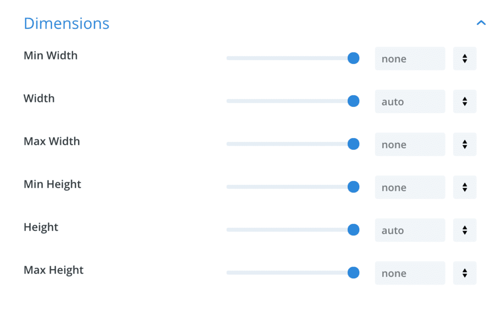
Options
Min Width
Set a minimum width of the Area to guarantee, that the Area will never be smaller than this value.
The min-width overrides the width if the width is lower than the declared min-width.
Width
Set a static width for the entire Area. When you set a value here, all Divi Sections inside your Area inherit this width.
Max Width
Limit the maximum width of the Area to this value. The Area will never be wider than the maximum width. The max-width overrides the width when the width reaches the max-width value.
Min Height
Set a minimum height of the Area to guarantee, that the Area will never be smaller than this value.
The Min Height overrides the height if the height is lower than the declared min-height.
Height
Set a static height for the Area. When the content requires more space, a scrollbar is displayed to scroll the contents.
Max Height
Limit the maximum height to this value. The Area will never be taller than the height specified here. When the content requires more space, a scrollbar is displayed to scroll the contents.
Notes
If you do not set any value here, the Divi Sections inside the Area define the actual dimensions. However, when any dimensions are set in these options will override eventual width/height options that you defined for your Section(s).
When you change any value here, the new layout is displayed in the Visual Builder. This makes it easy for you to understand, how the resulting Area will look like.
Min, Max, … what?
To understand how Min Width, Width, and Max Width work together, have a look at the following example:
Min Width: 200px
Width: 50%
Max Width: 400px
🤓 Pro-Tip
“Width” and “Min/Max Width” should not use the same unit. Usually, it’s a mix of one being relative and the other absolute.
The same principle applies to Height and Min Height/Max Height.
The browser will understand this: “Hey, browser. Please make the width of that Area 50% of the available space, but make sure that it will never be wider than 400px. And under no circumstances make the Area smaller than 200px“
Here’s what the browser does in different situations:
- Window width is 300px: Calculated width is 150px, but that’s less than min-width. So apply the min-width: 200px!
- Window width is 400px: Calculated width is 200px. No restriction forbids this width, so use 200px!
- Window width is 500px: Calculated width is 250px. No restriction forbids this width, so use 250px!
- Window width is 900px: Calculated width is 450px, but that’s greater than the max-width. So apply max-width: 400px!
Btw. the same logic also applies to the Min-Height, Height, and Max-Height options.
Available Units
All dimensions can define a length value using any of the following units:
%- (Unit) Percent, relative to the parent element size – more on MDN.
px- (Unit) Absolute pixel length – more on MDN.
vh- (Unit)
em- (Unit) Font relative, the calculated font size of the Area – more on MDN.
rem- (Unit) Font relative, the calculated font size of the documents root element. The root element is usually the
ex- (Unit) Font relative, the calculated height of a lowercase letter – more on MDN.
cm- (Unit) Absolute length in centimeters: 1/2.54th inch, or roughly 37.8 pixel – more on MDN.
mm- (Unit) Absolute length in millimeters: A tenth of a centimeter, roughly 3.8 pixel – more on MDN.
in- (Unit) Absolute length in inches: One inch is 96 pixel – more on MDN.
pc- (Unit) Absolute length in pica: 1/6th inch, or 16 pixel – more on MDN.
pt- (Unit) Absolute length in point: 1/72th inch, or roughly 1.3 pixel – more on MDN.
auto- (Keyword) Let the browser calculate a width for the element – more on MDN.
none- (Keyword) No value, i.e. no max-width
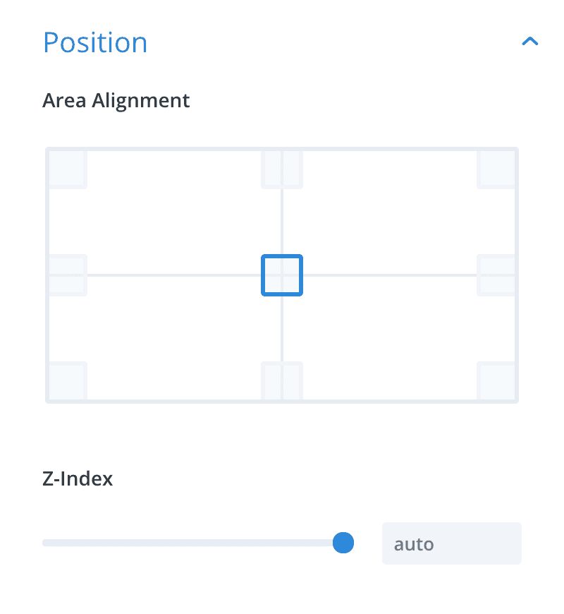
Position
Define the position of the Area on the screen.
Options
Area Alignment
Only for: Popups, Fly-In, Hover Areas
Define, where the Area should be displayed on the screen.
Popups and Fly-Ins
Those Areas are fixed in the viewport and stay at the same position even when the user scrolls the content behind the Area. The alignment option lets you define the edge or corner of the window where the Area should stick to.
Only Popups can be centered on the screen, Fly-Ins are always aligned to an edge or corner.
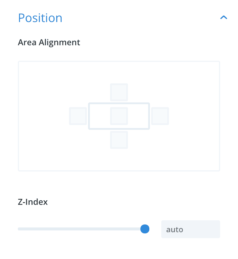
Hover Areas
Hover Areas are positioned relative to the trigger element. The Area can be aligned on either side of that trigger element (above, below, to the right or left side). The Area will move with that trigger element when the page scrolls or when the trigger element is resized.
The Area tries to center itself on the aligned edge. However, the Area will never flow outside the visible viewport and may not always be positioned in the exact center of the aligned edge.
Z-Index
Only for: Fly-In, Hover, Inline Areas
The z-index is a CSS property that defines which element is visible when some elements overlap on the screen. Elements with a higher z-index are positioned above elements with a lower (or no) z-index – more on MDN.
Define a custom z-index for the Area. The default z-index for Inline Areas is unset while other Areas have a z-index of 1000000 or higher.
🤓 Pro-Tip
Use z-index to position a Fly-In behind a Divi Section (that also has a z-index) or use a low z-index like “10” to position a Hover Area behind the main menu.
Design
For all Areas
General design options for all Areas.
Options
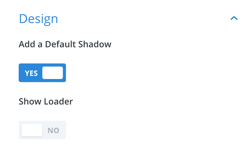
Add a Default Shadow
This option adds a box-shadow effect to the Area and is enabled by default. You should disable this flag, when you want to create a “flat” Area, or if you add a box-shadow to the contents using Divis Visual Builder.
Show Loader
The “Loader” is a particular background image in the Area container which shows a spinning animation.
This flag is intended for usage with an iframe or other dynamic content inside the Area: While the contents loads, the user will see the loading animation. Once the iframe (or other content) has loaded, it covers and hides the animation.
Note, that any background color or -image in your Divi Sections will hide the loading animation: If you use this loading animation, do not add any background to the section.
Close Button
For all Areas
This section is available, when the Area uses a close button (can be enabled in the Behavior tab).
Options
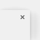
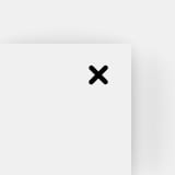
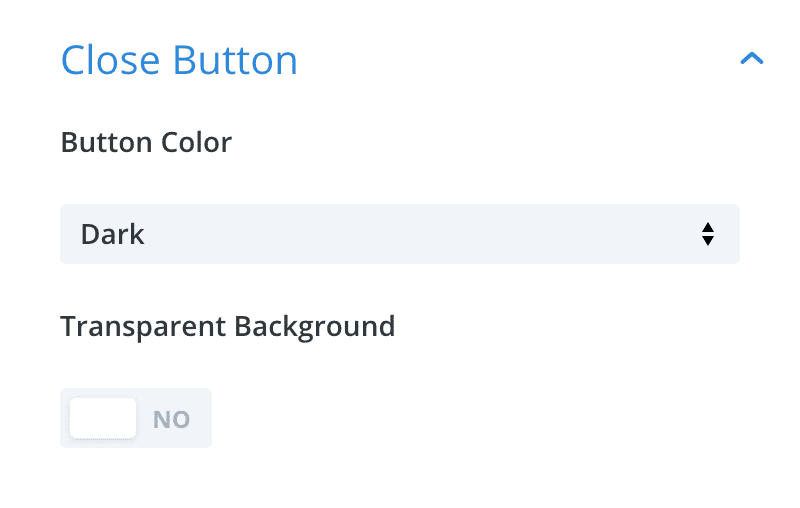
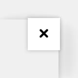
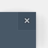
Button Color
Choose between a light or dark close button. Use this option to adjust the close button to the background color of your Areas contents.
Comparison of the light and dark close button styles – move your mouse over the image to see the hover effect:

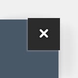
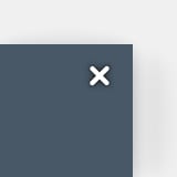
Transparent Background
The default close button has a square background that is visible in the hover state. If you do not want to display that background image, enable the transparent background layout to change the close button style.
Comparison of the light and dark close button styles with the transparent background flag – move your mouse over the image to see the hover effect: