 Alex Martin
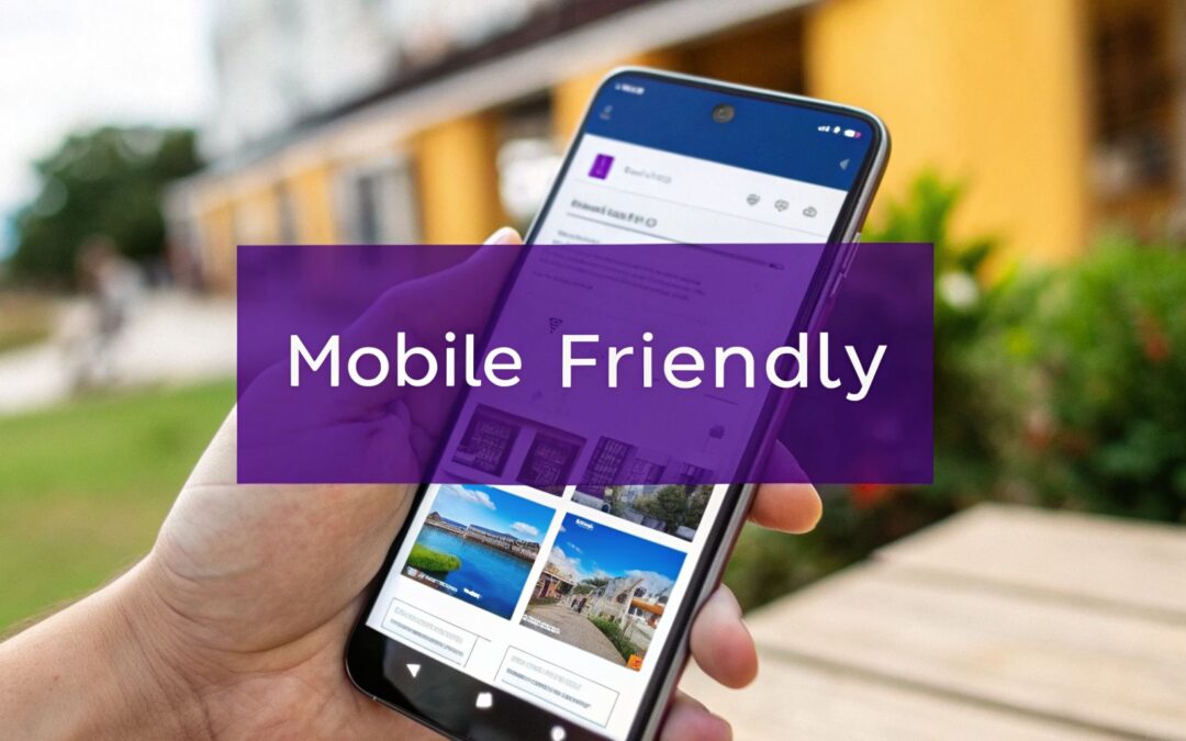
If you want your website to succeed, making it mobile-friendly isn't just a good idea—it's everything. At its core, it means your site uses a responsive design that automatically adjusts layouts, images, and text to look great on any screen. Since over 60% of all web traffic now comes from mobile devices, getting this right is non-negotiable.
Why a Mobile-First Mindset Is Your Biggest Asset
Let's be blunt: a mobile-friendly website is no longer a "nice-to-have." It’s the bedrock of your entire online presence, directly influencing sales, search rankings, and whether customers stick around. A clunky mobile experience doesn't just annoy people; it literally sends them straight to your competitors.
For anyone running a Divi or WooCommerce site, ignoring mobile is like locking the front door to most of your potential customers.

This isn't just some abstract concept. A bad mobile site costs you real money. When visitors are forced to pinch-and-zoom, fumble with tiny buttons, or stare at a loading screen, they bounce. That lost traffic is lost revenue, simple as that.
The Real Cost of a Bad Mobile Experience
The numbers don't lie. Mobile traffic now makes up 61.19% of all website visits globally, leaving desktop far behind at just 38.81%. Even more telling, a well-optimized mobile site can boost conversions by as much as 40%. Think about that.
This is where smart tools come in. For example, using a plugin like Divimode's Divi Areas Pro lets you create popups and fly-ins designed specifically for mobile screens, helping you capture that potential 40% lift instead of letting it slip away.
A truly mobile-friendly Divi website doesn't just look pretty on a phone; it's a powerful tool to engage users and dramatically improve website conversion rates. This isn’t a cosmetic tweak; it's a core business strategy.
Mobile vs Desktop: The Bottom Line
Understanding the fundamental differences in how people browse on mobile versus desktop is key to building a winning mobile-first strategy. It's not just about screen size; it's about context, intent, and patience.
| Metric | Mobile User Behavior | Desktop User Behavior | Key Takeaway for Divi Users |
|---|---|---|---|
| Attention Span | Short and task-oriented. Users want answers now. | More patient. Open to exploration and in-depth reading. | Get to the point immediately on mobile. Use clear headlines and prominent CTAs. |
| Primary Goal | Often looking for specific info (hours, location, contact). | Researching, comparing products, making complex purchases. | Prioritize essential information on mobile. Keep complex forms or data for desktop views. |
| Navigation Style | Tapping, swiping, and scrolling with a thumb. | Precise clicking with a mouse. | Design large, easy-to-tap buttons and links. Ensure there's enough space between elements. |
| Session Length | Shorter, more frequent sessions. | Longer, more focused sessions. | Optimize for quick interactions. Make sure key actions can be completed in just a few taps. |
| Connection Speed | Often on slower or less reliable Wi-Fi/cellular data. | Typically on a stable, high-speed connection. | Prioritize site speed. Compress images and minimize heavy scripts to ensure fast loading. |
Ultimately, the table above reinforces one critical idea: you're designing for two very different mindsets. Mobile is about speed and convenience, while desktop allows for more depth. A successful Divi site has to excel at both.
What Mobile-First Actually Means in Divi
Thinking "mobile-first" is a simple but powerful shift: you design for the smallest screen first and then scale up for tablets and desktops. Instead of trying to cram a complex desktop design onto a tiny screen, you start with a clean, focused mobile foundation and expand from there.
A mobile-first strategy isn't about compromise; it's about focus. It forces you to prioritize what's most important for your users, resulting in a cleaner, faster, and more effective website on every device.
The good news? Divi is built for this. Its responsive tools are incredibly powerful and give you all the control you need right out of the box.
Inside the Divi Builder, you can:
- Instantly preview your design on desktop, tablet, and phone views with a single click.
- Fine-tune settings like font sizes, margins, and padding specifically for each device.
- Control what shows up where, hiding heavy or complex modules on mobile to keep things clean and fast.
By really digging into these features, you can go from having a site that just "works" on a phone to one that absolutely shines.
Mastering Divi's Responsive Layout Controls
Okay, this is where the theory ends and the real work begins. Diving into the Divi Builder is how you’ll take your site from just “working” on mobile to actually looking great. The good news is, Divi’s built-in responsive controls are incredibly powerful and surprisingly intuitive, letting you get hands-on without touching a line of code.
The heart of Divi’s responsive system is right at the bottom of the builder interface: the three little device icons for Desktop, Tablet, and Phone. Clicking these instantly switches your editing view, giving you an immediate preview of how your layout will look on that screen size. This live feedback is absolutely essential for making quick, effective adjustments on the fly.
Your First Responsive Adjustments
Let's walk through a super common scenario. You've got a sharp-looking three-column layout on desktop, maybe showcasing your top services. It looks fantastic on a big screen, but you know it’s going to be a squished, unreadable mess on a phone.
This is where you'll make your first responsive tweak. Switch over to the Phone preview. Divi is smart enough to automatically stack columns vertically on mobile, but you'll almost always need to fine-tune the spacing to make it breathe.
Open any Section, Row, or Module settings and look for options like Spacing (for margins and padding) or Sizing. See that little mobile phone icon next to many of the settings? That’s your gateway. Clicking it opens up the responsive tabs, letting you punch in unique values for Desktop, Tablet, and Phone.
For our three-column example, you could:
- Shrink the top and bottom padding on the entire Section just for the mobile view to cut down on unnecessary scrolling.
- Add a 30px bottom margin to each of the three column modules, but only on the phone view. This creates some clean visual separation between the stacked items.
- Leave the desktop settings alone, so your wide-screen design stays exactly as you intended.
This simple act of applying device-specific styles is the core skill for building a truly polished mobile experience with Divi.
Transforming Layouts with Column Structures
Beyond just adjusting spacing, you can completely change the layout structure for mobile users. That complex, multi-column row that looks so good on desktop might be far more effective as a clean, single-column flow on a smaller screen.
While you can change the column structure in the Row settings, a more common and powerful technique is to control the Sizing of individual columns. Just go into a column's settings and set its width to 100% on mobile. This forces it to take up the full screen width, making the content inside large, legible, and easy to tap.
A great mobile experience isn't about shrinking your desktop site; it's about re-imagining it for a different context. Prioritize clarity and scannability over cramming everything into view.
Sometimes you run into trickier situations, like needing to reverse the order your columns stack in on mobile. For that, you’ll need a more advanced approach. We've got a full tutorial on how to control Divi column stacking order on mobile that walks you through it.
Using Visibility Controls for a Custom Experience
Let’s be honest: some elements that are brilliant on a desktop are just plain clunky on a phone. Think of a big interactive map, a background video, or a detailed pricing table. Trying to make them fit on a small screen often leads to a terrible user experience.
This is when Divi's visibility settings become your best friend.
Tucked away in the Advanced tab of any Section, Row, or Module, the Visibility settings let you flat-out disable an element on certain devices. You can choose to hide something on Phone, Tablet, or Desktop with a simple click.
Here's a practical way to use this:
- Find a "desktop-only" element, like a large, purely decorative image section.
- Jump into that Section’s settings, click the Advanced tab, and find Visibility.
- Check the boxes to disable it on Phone and Tablet. The section will immediately grey out in those preview modes, showing you it won’t even load for those visitors.
You can even take this a step further and create mobile-specific content. For example, you could build a simple, lightweight section with a static image and a clear call-to-action button, then set its visibility to show only on Phone. By hiding the complex desktop version and showing this streamlined alternative instead, you're creating a truly custom experience that respects the user's context.
Optimizing Images and Typography for Mobile Users
A visually stunning website that takes forever to load on a phone is a failed website. Mobile users are notoriously impatient; if they have to wait for heavy images or squint to read tiny text, they'll simply leave. This is why getting your site's visual elements—specifically images and fonts—right is non-negotiable for mobile.

Images are often the biggest culprits behind slow mobile load times. A high-resolution photo that looks gorgeous on a 27-inch monitor will absolutely cripple a smartphone's connection speed. You have to serve images that are appropriately sized and compressed for the smaller screen.
Taming Your Images for Peak Mobile Performance
The goal is to find that perfect balance between image quality and file size. A blurry, over-compressed image looks unprofessional, but a huge, uncompressed one will drag your site's performance through the mud.
Here’s how I approach image optimization in Divi:
- Compress Before You Upload: I can't stress this enough. Always run your images through a compression tool before you add them to the WordPress media library. It dramatically cuts down the file size without a noticeable drop in quality.
- Embrace Modern Formats: Whenever possible, use next-gen image formats like WebP. These formats offer far better compression than traditional JPEGs and PNGs, which means much smaller file sizes and faster load times.
- Enable Lazy Loading: This feature, found in Divi's theme options, stops images from loading until a user actually scrolls down to them. It makes a huge difference in the initial page load, which is critical for keeping mobile visitors from bouncing.
By combining these techniques, you ensure that mobile users get a fast, smooth experience without sacrificing your site's visual appeal. For a deeper dive, check out our ultimate guide to using images with Divi for more advanced tips.
Crafting Readable and Responsive Typography
Just as important as your images is your text. A font size that looks perfectly normal on a desktop can become an unreadable strain on a mobile device. One of the most common mistakes I see is relying on fixed pixel sizes for fonts, which leads to a terrible mobile reading experience.
Readability on mobile isn't a luxury; it's a core component of usability. If users can't comfortably read your content, your message is lost, no matter how great your design is.
To solve this, Divi lets you use responsive font units that scale gracefully with the screen size.
Using Responsive Font Units in Divi
Instead of static pixels (px), you should be using viewport-based units. You can access these right inside the Divi Builder's font size settings.
- VW (Viewport Width): This unit is a percentage of the viewport's width. For example,
2vwmeans the font size will be 2% of the screen's width. It's fantastic for headlines that need to scale down smoothly on smaller screens. - EM (Relative to Parent): An
emis a scalable unit that's equal to the current font-size of its parent element. It's great for maintaining a consistent typographic scale throughout your modules.
Here are some practical starting points for mobile typography:
| Element | Recommended Mobile Font Size | Responsive Unit | Why It Works |
|---|---|---|---|
| Body Text | 16px – 18px | px or em |
This range is widely considered the sweet spot for comfortable reading on a phone. |
| Headings (H1/H2) | 3.5vw – 5vw | vw |
Using viewport width makes your main headlines shrink automatically, preventing awkward line breaks. |
| Subheadings (H3) | 2.5vw – 3vw | vw |
Keeps subheadings proportional to the main headlines as the screen size changes. |
To implement this in Divi, just go to a text module's design settings, find the font size option, and type in your desired value with its unit (e.g., 4vw). Making this simple switch ensures your text is always perfectly readable, no matter the device.
Designing for Touch, Not Clicks
When we build for mobile, we're not just shrinking a desktop site. We're designing for a completely different kind of interaction. Forget the pinpoint precision of a mouse cursor; we're now working with the much broader, less exact tap of a human thumb. Getting this shift right—from clicks to touch—is the key to a site that feels natural and easy to use on a phone, instead of an exercise in frustration.
Picture your user for a second. They’re probably on the move, maybe holding their phone one-handed, trying to get something done fast. If they keep jabbing at the wrong link because your buttons are too small or crammed together, they’re not going to stick around.
Making Your Buttons and Links Thumb-Friendly
The classic mistake on sites that aren't properly mobile-optimized is tiny, tightly packed links. A mouse can hit a small target with no problem, but a thumb needs a much bigger landing pad. This is where you have to be deliberate about the size and spacing of anything a user might tap.
Best practices, backed by research from places like the MIT Touch Lab, tell us a touch target should be at least 44×44 pixels. This gives people a comfortable area to tap without having to aim perfectly.
Inside Divi, this is easy to manage:
- For Buttons: Jump into the Button settings and get generous with padding. For instance, adding 12px of padding to the top/bottom and 24px to the left/right creates a nice, big, tappable button.
- For Text Links: Don't just settle for an underline. Where it makes sense, turn important links into actual buttons. Or, at the very least, use Divi's design settings to add padding around the link itself, expanding its clickable area.
- Spacing is Everything: Just as vital as the size of your targets is the space between them. Use margins to ensure there's enough of a buffer between buttons, links, or menu items to prevent those annoying mis-taps.
Rethinking Mobile Navigation Menus
The "hamburger" menu (those three little lines) became a standard for a reason—it saves a ton of precious screen real estate. But it's not a silver bullet, especially for e-commerce sites where getting to product categories quickly is everything.
The real challenge is finding a balance between a clean look and easy navigation. You need users to find what they're looking for without having to tap through multiple layers of a hidden menu. That massive, beautiful mega menu from your desktop design? It's a complete usability nightmare on a phone. The data doesn't lie: 40% of users will bounce to a competitor after a bad mobile experience, so getting your navigation right is a massive deal. It's worth remembering that well-designed responsive sites consistently see higher engagement, as detailed in these user behavior statistics on Hostinger.
A great mobile menu isn't a shrunken desktop menu. It's a focused tool that prioritizes the most common user journeys. Figure out what most of your visitors want to do, and make those paths dead simple.
A Practical Example with Divi Areas Pro
This is where a tool like Divi Areas Pro really shines. Let's say you have a big WooCommerce store. On desktop, you’ve built a detailed mega menu with Divi Areas that shows off dozens of categories and featured products. It’s perfect for users who can hover and explore.
On mobile, though, that menu is just noise. Instead of trying to cram it all in, you can create a totally separate, touch-friendly menu just for smaller screens.
Here’s how you’d set that up:
- Build Your Desktop Mega Menu: First, create that elaborate mega menu in Divi Areas Pro and set it to trigger from a main menu link, just as you normally would.
- Design a Mobile-First Menu: Now, create a second Area. This one will be a simple, full-screen overlay. Inside, you'll use large, button-style links for your main product categories and add a prominent search bar at the top.
- Use Device Targeting: In the settings for your desktop mega menu Area, go to the device visibility options and set it to hide on phone and tablet. Then, for your new mobile overlay menu, set it to show only on phone and tablet.
The result? Desktop visitors get the rich, expansive mega menu. Mobile visitors get a clean, streamlined, and touch-optimized navigation system built just for them. It’s the best of both worlds, with zero compromise.
Boosting Your Divi Site's Mobile Speed
Once you've nailed down your layouts and visuals, the last hurdle is pure, unadulterated speed. On mobile, every millisecond is precious. A site that drags its feet isn't just a small hiccup; it's a direct blow to your sales and sign-ups. People want things now, and if your Divi site can't keep up, they're gone.
This is where performance optimization becomes a non-negotiable part of making your website mobile-friendly. It’s not just about looking good—it's about making sure that beautiful design loads in a flash, even on a shaky 4G connection.
Your Essential Mobile Speed Checklist
Getting a Divi site to fly on mobile usually comes down to a few key technical adjustments. The good news? Divi has some seriously powerful performance tools baked right into the theme options that can do most of the heavy lifting for you.
Here's a quick and dirty checklist to get you started:
- Enable Browser Caching: This clever trick tells a visitor's browser to store static files (like your logo, stylesheets, and scripts) on their device. When they come back, the page loads way faster because it doesn't have to download all that stuff again.
- Minify Code: Divi can automatically go through your CSS and JavaScript files and strip out all the junk that browsers don't need, like extra spaces and comments. This shrinks the file sizes, making them quicker to download.
- Defer Non-Critical CSS: This feature prioritizes loading the essential, "above-the-fold" content first. Your page will feel like it loads almost instantly while the less important styles are fetched in the background.
You'll find all of these settings under Divi > Theme Options > General > Performance. Just flipping these switches to "on" can deliver an immediate and noticeable boost to your mobile load times.
Diagnosing Speed Bottlenecks with Google PageSpeed Insights
You can't fix a problem you can't see. That's why a tool like Google PageSpeed Insights is your best friend. Just pop in your URL, and Google will spit out a detailed report card for both mobile and desktop, along with concrete steps to improve.
Don't get obsessed with chasing a perfect score of 100. The real value is in understanding what's holding your site back. The report will flag specific issues like:
- Render-Blocking Resources: These are files that are literally stopping your page from loading quickly.
- Large Next-Gen Images: It will point out opportunities to save a ton of data by converting images to modern formats like WebP.
- Unused JavaScript: It identifies scripts that are loaded but aren't actually needed for the initial page view.
By working through these suggestions one by one, you can make targeted fixes that directly tackle the things slowing you down.
Speed is the silent killer of mobile conversions. Data consistently shows that pages loading in under one second can achieve mobile conversion rates that are 3x higher than pages that take five seconds. For Divi sites, this is absolutely crucial, as over half of mobile visitors will abandon a page that takes longer than three seconds to load.
The Hidden Drag of Plugins and Scripts
One of the most frequent culprits behind a slow mobile site is "plugin bloat." It's so easy to add a plugin for every little feature you want, but each one adds more code that has to be loaded. This is especially true for third-party scripts, like those for live chat widgets, analytics tools, or social media feeds.
This infographic breaks down the crucial elements of mobile touch design, which are directly impacted by a site's performance and responsiveness.
It’s a great reminder that a user's physical interaction with the site—tapping buttons and navigating menus—is the final step. But that step is only successful if the site loads fast enough for them to interact with it in the first place.
Before installing a new plugin, always ask yourself: "Is this feature worth the performance hit?" Often, a more lightweight solution can get the job done without weighing down your site.
Do a regular audit of your plugins. If you're not actively using something, deactivate and delete it. This simple housekeeping can make a world of difference. For a deeper dive into performance, check out our guide on how to speed up your Divi website, where we cover these topics in much more detail.
Got Questions About Mobile Optimization?
Even with a powerful tool like Divi, you’re bound to hit a few snags when making your website look perfect on mobile. It happens to everyone. Let's tackle some of the most common questions Divi users have, so you can solve those nagging problems and get back to building.
What’s the Best Way to Test My Divi Site on Different Mobile Devices?
The live previews inside the Divi Builder are great for a first pass. That little trio—Desktop, Tablet, and Phone—is your best friend for making quick layout adjustments and seeing how things will generally stack up.
But they're just emulators. They can’t truly capture the quirks of a real device’s browser or a spotty 4G connection. To really know what your visitors are experiencing, you need to dig a little deeper.
- Test on Your Own Phone (and Tablet!): This is non-negotiable. It's the simplest and most important test you can do. Grab your smartphone, pull up your site, and actually use it. Click the buttons. Try to fill out a form. Navigate the menu. You'll immediately spot things that feel clunky or frustrating.
- Use Your Browser’s Developer Tools: Every modern browser has a built-in device emulator that's surprisingly powerful. In Google Chrome, just open "Developer Tools" and click the "Toggle device toolbar" icon. This lets you simulate dozens of different devices, from the latest iPhone to a Google Pixel, and you can even throttle the network to see how your site holds up on a slow connection.
- Go Pro with a Testing Service: For client projects or business-critical sites, you can't afford to guess. A service like BrowserStack is a game-changer. It gives you remote access to thousands of real devices, letting you test your Divi site on almost any phone, browser, and OS combination out there.
Think of Divi's previews as your blueprint, but testing on a real device is the final inspection. You wouldn't build a house without walking through it, and the same logic applies to your mobile website.
Should I Hide Content on Mobile or Try to Fit Everything?
This is the classic mobile design dilemma. The answer almost always boils down to one simple question: Is this content essential for the user to achieve their goal on this page?
If an element is purely decorative—like a subtle background animation or a secondary image that adds flavor but not information—hiding it on mobile is a smart move. It declutters the experience, helps the page load faster, and keeps the user focused on what matters. Divi’s visibility settings in the "Advanced" tab of any module make this incredibly easy.
But if the content is crucial, you should reformat it, not remove it. For example, a detailed pricing table shouldn't just vanish. Instead, you could rebuild it in a single, scrollable column or use an accordion module to keep the information tidy but accessible. The goal is to simplify the presentation, not gut the substance.
How Do I Fix Columns That Stack in the Wrong Order on Mobile?
By default, Divi stacks columns from left to right. So, in a two-column row, the left one will always appear on top when viewed on a phone. But what if your most important call-to-action is in the right column? You definitely don't want that buried at the bottom.
The most reliable fix for this is what I call the "duplicate and swap" method, using a mobile-only section.
Here’s how it works:
- Duplicate the Section: Start by cloning the entire section you need to reorder. Now you'll have two identical sections, one after the other.
- Create the Mobile Layout: In the second (duplicated) section, rearrange your columns in the order you want them to appear on mobile. Often this means creating a new row and just moving the modules into the right spots.
- Set Desktop Visibility: Go into the settings for your original section. Head to the Advanced > Visibility tab and check the boxes to disable it on Phone and Tablet. This section will now only show up on desktops.
- Set Mobile Visibility: Finally, go into the settings for your new section (the one you rearranged). In its Advanced > Visibility tab, check the box to disable it on Desktop.
This trick gives you total control over the stacking order, ensuring your most important content always gets the attention it deserves on smaller screens.
Ready to stop wrestling with mobile layouts and start creating truly seamless experiences? With Divimode, you can build stunning, high-converting popups, mega menus, and interactive content with Divi Areas Pro. It's time to build a site that engages visitors on every single device.
Explore Divi Areas Pro and other powerful plugins at Divimode
More Articles You Will Like