 Alex Martin
Think of your website's header as a digital handshake. It’s a clean, intuitive navigation bar that should prominently feature your logo, the most essential page links, and a very clear call-to-action. This is your best shot at building immediate trust and guiding your visitors where you want them to go.
A successful header is so much more than just pretty design; it’s a powerful tool for user engagement.
Why Your Header Design Is Crucial for First Impressions
Your header is both a welcome mat and a mission statement, all rolled into one. It’s the very first thing a visitor interacts with, and it instantly sets the tone for their entire experience on your site.
A clunky, confusing, or visually jarring header can send users scrambling for the "back" button before they even see your amazing content. On the flip side, a well-executed header acts as a trusted guide, making them feel right at home.
The impact of this first interaction is huge. Research has shown that a site's overall design accounts for a staggering 94% of a user's first impression, and those judgments are formed in as little as 0.05 seconds. Your header is the centerpiece of that split-second decision.
A strong header design isn't just a container for links. It's a strategic asset that has to accomplish several key goals at once.
Core Components of a High-Performing Header
To get your header working for you, it needs to balance three critical components. Each one plays a distinct role in building trust and helping users find their way around.
- A Clear and Recognizable Logo: Your logo is your brand's anchor. Sticking it in the top-left corner is a long-standing convention that users just expect, which makes your site feel familiar and professional. Make sure it links back to the homepage—it’s a simple, consistent way for visitors to reorient themselves from anywhere on your site.
- Intuitive Navigation Menu: This is the roadmap to your website. The menu should have links to your most important pages—think "Services," "About," "Blog," and "Contact." Try to avoid overwhelming visitors with too many options. A streamlined menu with clear, simple labels is always more effective than a cluttered one.
- A Compelling Call-to-Action (CTA): What’s the single most important action you want users to take? Whether it's "Request a Quote," "Sign Up," or "Shop Now," your CTA button absolutely needs to stand out. Using a contrasting color and punchy, action-oriented text is the best way to draw the eye and encourage clicks.
A great website header doesn't make the user think. It anticipates their needs and provides a clear, effortless path to the information they’re seeking, turning a fleeting first glance into a meaningful interaction.
When these three elements work together in harmony, they create a seamless and professional introduction to your brand. The header becomes more than just a functional bar at the top of the page; it’s your site’s digital handshake. This initial positive experience can dramatically reduce bounce rates by assuring visitors they've landed in the right place and making it dead simple for them to explore further.
Using a tool like Divi, you get fine-grained control over each of these elements, allowing you to build a header that is both visually striking and highly functional. For a deeper dive into header design concepts, check out our comprehensive guide on website header design.
Planning Your Header Layout and User Flow
Before you even dream of opening the Divi Builder, the most important work happens away from the screen. A thoughtful plan—even a quick sketch on a notepad—is the bedrock of a great website header. It transforms a simple navigation bar into a powerful tool that guides your visitors exactly where you want them to go. Skip this step, and you risk building something that looks nice but ultimately fails at its job.
The first question you have to answer is: what's the single most important action you want someone to take? Your answer will shape every single design choice from here on out.
- Running an e-commerce store? Your goal is to sell. That means your header needs a can't-miss "Shop" link, a prominent search bar for products, and a shopping cart icon that’s always in view.
- A service-based business? You're all about capturing leads. A bold "Request a Quote" or "Book a Consultation" call-to-action (CTA) button isn't optional; it's essential.
- Building a content-heavy blog or portfolio? Your mission is to make discovery effortless. The focus shifts to crystal-clear categories and maybe a "Subscribe" button to grow your audience.
Once that primary goal is locked in, you can start thinking about how people will actually move through your site.
Mapping the Essential User Journey
Put yourself in your ideal visitor's shoes. What do they need to see the second they land on your site to know they're in the right place? This simple exercise is key to trimming the fat from your navigation menu. One of the most common mistakes I see is a header crammed with too many links, which just leads to decision paralysis for the user.
A crowded header doesn't offer more value; it creates confusion. Your goal is to provide a clear, curated path to the most critical pages, not a sitemap of your entire website.
Stick to the absolute essentials. Most websites can effectively guide visitors with just four to six main menu items. Think "Home," "About," "Services" (or "Products"), and "Contact." Any link beyond that needs to earn its spot by directly supporting the user's journey. A "Blog" link is vital for a content site, but for a simple lead-gen page, it's just noise.
This image really drives home how crucial it is to balance font weights to create a clear visual hierarchy in your header design.
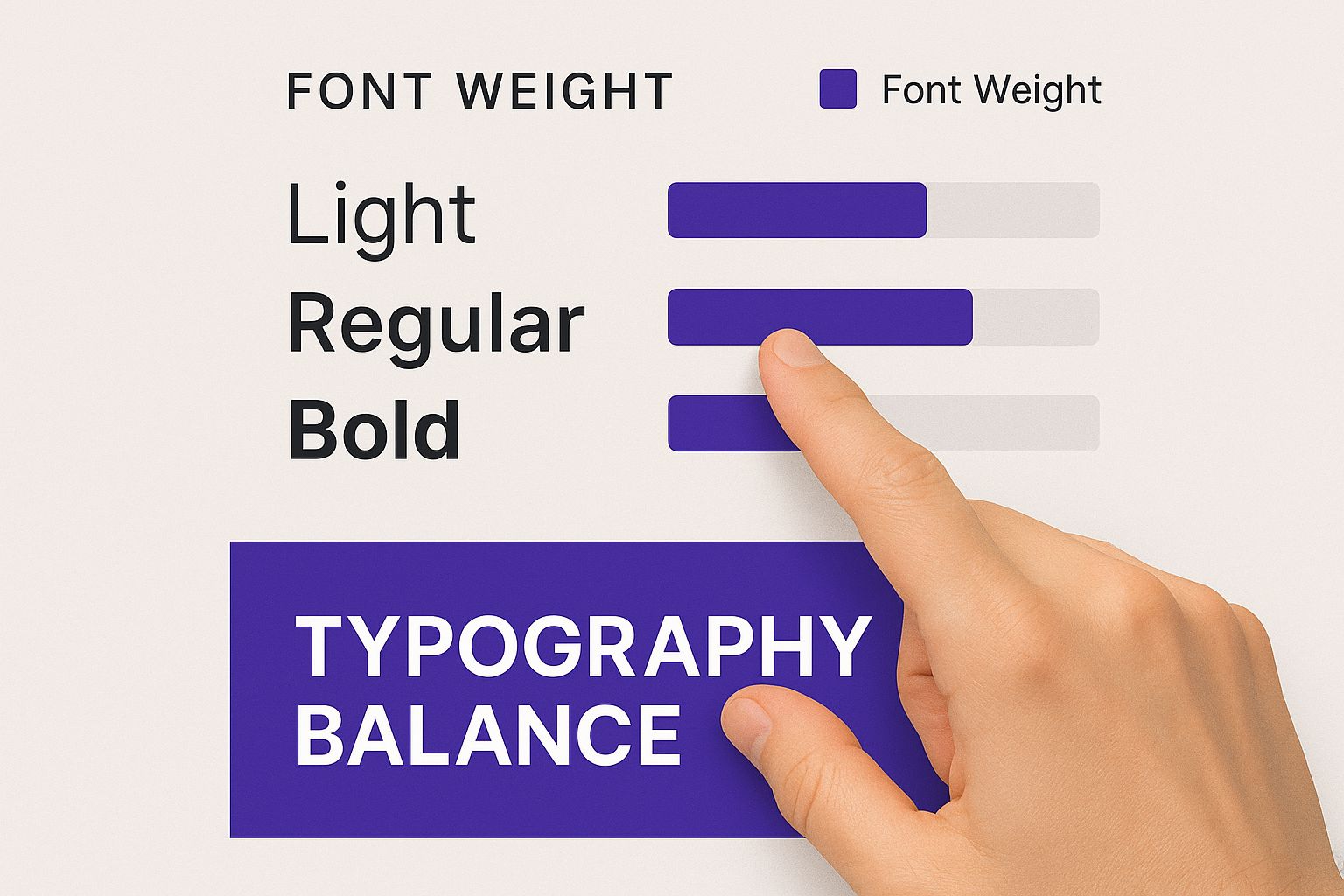
You can see how smart typography choices naturally pull the user's eye toward the most important elements, like your main CTA.
Choosing the Right Header Layout
With your goals and user flow mapped out, it's time to pick a structural layout. The right choice should feel like a natural extension of your brand's personality while also accommodating your site's complexity. A minimalist portfolio, for example, has completely different needs than a massive e-commerce marketplace.
To help you decide, let's break down the most common header layouts I've worked with over the years. Each has its strengths and weaknesses, so picking the right one is about aligning the structure with your specific goals.
Comparing Common Website Header Layouts
This table compares the pros, cons, and best use cases for different header layouts to help you decide which structure best suits your website's goals and content.
| Layout Style | Best For | Pros | Cons |
|---|---|---|---|
| Classic Horizontal | Most websites, especially corporate sites, blogs, and service businesses. | Instantly familiar to users, easy to scan, and works perfectly with a limited number of menu items. | Can feel cluttered on content-heavy sites and might lack a modern or unique feel. |
| Centered Logo | Brands aiming for a sophisticated, symmetrical look, like fashion or design portfolios. | Creates strong visual balance and puts your brand identity front and center. | Tricky to implement with long menu lists and can feel awkward on mobile devices. |
| Vertical Sidebar | Complex web apps, creative portfolios, and sites with tons of navigation categories. | Handles a large number of links without cluttering the main content area. | Unconventional for most users and eats up valuable horizontal screen space. |
| Minimalist (Hamburger) | Mobile-first designs, portfolios, and sites where the visual content is the star. | Maximizes screen real estate for your content, offering a clean, modern aesthetic. | Hides navigation, which can hurt discoverability (20% less discoverable on average). |
Ultimately, choosing the right layout comes down to your content and audience. What works for a high-fashion brand might be a disaster for a local plumbing company.
Your plan is your blueprint. By defining your goal, mapping the user journey, and selecting an appropriate layout before you start building, you ensure your time in Divi is spent effectively. This strategic groundwork is what separates a merely functional header from a high-performing one that actively drives your website's success.
How to Build Your Header in the Divi Theme Builder
Alright, with your strategic plan in hand, it's time to get our hands dirty and bring that vision to life inside Divi. This is where the magic happens, and the tool for the job is the Divi Theme Builder.
If you haven't spent much time here, the Theme Builder is a game-changer. It separates your header, body, and footer into manageable, site-wide templates. What does that mean for you? You design a header once, and it instantly appears across your entire website. Or, you can get fancy and assign different headers to specific pages. It’s incredibly powerful.
This whole process moves you away from tedious page-by-page edits and into a much smarter, global approach. Let's walk through building a polished, professional header from scratch.
Launching the Theme Builder and Setting Up
Your journey starts in the familiar WordPress dashboard. Head over to Divi > Theme Builder. This is your central command for managing all the global elements of your site. If it's your first time visiting this area, it’ll look like a blank canvas just waiting for your masterpiece.
To kick things off, click "Add Global Header," then select "Build Global Header." This fires up the Divi Builder, but with a crucial difference: you're not editing a single page. You're creating a standalone header template that, by default, will apply everywhere. It’s an important distinction to make.
Pro Tip: While a single global header is fantastic for brand consistency, don't forget you can create multiple header templates. I often design a more streamlined, minimalist header for landing pages and a different one for blog posts. You can manage all these variations from this one screen.
Structuring the Header Layout
Every design in Divi starts with the same basic hierarchy: sections, rows, and columns. For a standard header, you'll almost always use a single blue section with one green row nestled inside it.
The real decision-making comes down to the column layout within that row, as this defines your header's entire structure. Here are a couple of tried-and-true setups I use all the time:
- Two Columns (e.g., 1/4 + 3/4): This is the quintessential layout. It's perfect for placing your logo on the left and your navigation menu on the right. It’s a classic, balanced approach that visitors instantly understand.
- Three Columns (e.g., 1/5 + 3/5 + 1/5): This layout is my go-to for a centered logo. You can pop the logo in the middle column, put navigation links on the left, and reserve the right column for a call-to-action (CTA) button.
For this walkthrough, let's stick with the classic two-column layout. It gives us a solid, reliable foundation before we start dropping in the actual content modules.
Adding and Styling Essential Modules
With our structure in place, it's time to populate it with Divi's modules. These are the functional building blocks of your header, and you'll add them just like you would on any other Divi page.
- The Logo: In the left column, add an Image Module. In the settings, upload your logo file. Now, here's a critical step a lot of people miss: navigate to the "Link" tab and set the "Image Link URL" to your homepage address. This is a fundamental rule of good UX—clicking the logo should always take users home.
- The Navigation: Over in the right column, add a Menu Module. Under the "Content" tab, you'll see a dropdown where you can select the WordPress menu you want to show. This pulls from the menus you've already set up under
Appearance > Menus. - The CTA Button: Instead of adding a completely separate button module, a cleaner technique is to style the last menu item to look like a button. It creates a much more seamless and integrated feel. For a deep dive on this specific trick and other Theme Builder tips, check out our dedicated guide on how to create a global header with Divi.
Fine-Tuning Spacing and Alignment
This is the part that separates an amateur-looking header from a professional one. A common rookie mistake is forgetting to adjust the default spacing. A brand-new section in Divi comes with way too much top and bottom padding for a header.
Jump into the Section Settings (the blue gear icon), then go to Design > Spacing. Set both the Top and Bottom Padding to 0px. You’ll immediately see your header become more compact and sleek. You’ll likely want to adjust the row padding as well to fine-tune the vertical space around your logo and menu.
Next up is vertical alignment. You might notice your logo and menu aren't sitting perfectly centered with each other. There’s an easy fix for that.
Go into your Row Settings > Design > Sizing and flip on the "Equalize Column Heights" toggle. This forces both columns to be the same height, which is the secret to easy vertical alignment. From there, you can add a touch of custom padding to individual modules to get them perfectly centered.
Once you’ve placed your modules and dialed in the spacing, hit the purple save button inside the Divi Builder. Don't forget the final step! Click the green "Save Changes" button back in the main Theme Builder dashboard. Just like that, your new global header is live across your entire website.
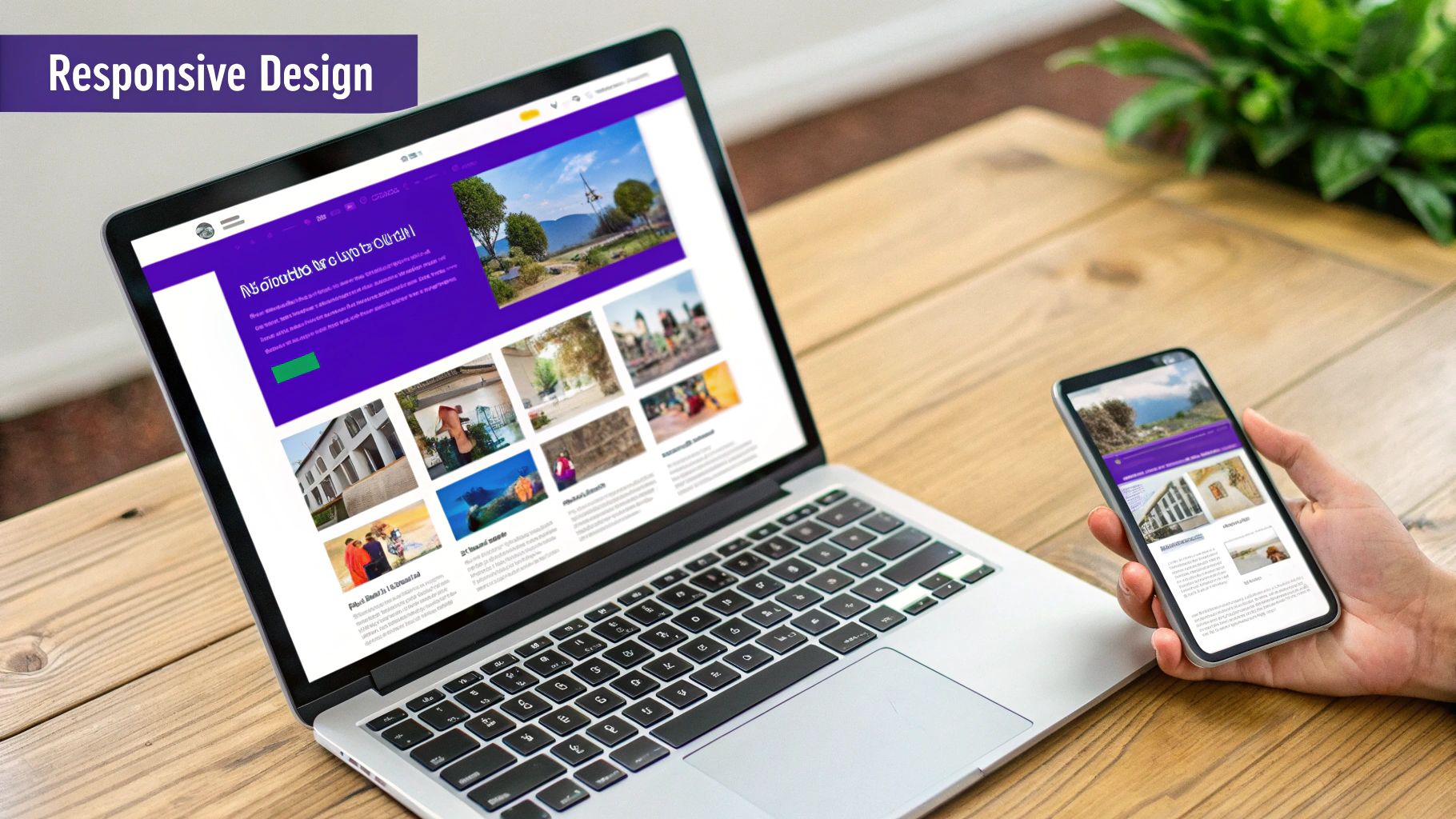
Making Your Divi Header Truly Responsive
Let’s be honest: a stunning desktop header can completely fall apart on a mobile device. What looks spacious and elegant on a big monitor often becomes a cramped, unusable mess on a small screen. This is where mastering Divi’s responsive tools becomes non-negotiable for a professional website.
If you don't have a solid mobile strategy, you’re choosing to alienate a huge chunk of your audience. The reality is, responsive web design is no longer a "nice-to-have"—it's the standard. Around 90% of all websites now use responsive layouts for a good reason: 62% of top-ranking sites put their mobile experience first. When you design a header, you have to think mobile-first from the get-go.
Jumping into Divi’s Responsive Editing Modes
Divi makes it incredibly easy to see exactly how your header will look on different devices. At the bottom of the Builder interface, you'll find three little icons: a desktop, a tablet, and a phone. Clicking these instantly switches your entire editing view, letting you make device-specific tweaks on the fly.
This is the heart and soul of responsive design in Divi. Any style change you make while you’re in "Phone View" will only apply to mobile devices. This gives you the power to fine-tune font sizes, adjust spacing, and even hide entire modules without messing up your desktop design.
The key to a great responsive header isn't just about making things smaller. It's about completely re-evaluating the user experience for a touch-based interface. What works with a mouse and keyboard often needs a total rethink for a thumb.
Transforming Your Navigation for Mobile
The most common—and effective—change for a mobile header is converting the traditional menu into a hamburger icon. A long list of horizontal links just won't fly on a narrow screen, and luckily, Divi’s Menu Module handles this transformation beautifully.
- Automatic Conversion: By default, Divi is smart enough to swap your menu to a hamburger icon when the screen width gets too small. You can even control this breakpoint right in the module settings.
- Styling the Mobile Menu: Once you're in the mobile view, you’ll unlock a new set of styling options. Head over to your Menu Module Settings > Design > Menu Text to adjust the mobile menu's text size and color. You can even style the hamburger icon itself under Design > Icons.
This one simple switch instantly cleans up your mobile header, replacing a cluttered navigation bar with a single, universally understood icon.
Adjusting Layout and Hiding Clutter
Beyond the menu, other elements need a little attention. Your logo, for instance, might look perfect on a desktop but completely dominate a mobile screen. It’s an easy fix.
While in Phone View, just open your Image Module Settings > Design > Sizing. From there, you can set a different Max Width specifically for mobile. From my own experience, reducing logos to somewhere between 100px to 150px usually results in a clean, balanced mobile look.
But what about elements that just create clutter on mobile, like a secondary call-to-action button? This is where Divi’s visibility settings are an absolute lifesaver.
- Open the settings for the module you want to hide (like a Button Module).
- Go to the Advanced tab and find the Visibility section.
- Here, you can simply disable the module on Phone, Tablet, or Desktop.
This feature is incredibly powerful. You can create a completely different, streamlined header for mobile users by strategically hiding any non-essential desktop elements. For those looking to push these responsive capabilities even further, understanding the fundamentals can be a huge help. You can learn more about responsive design with CSS in our detailed guide.
Taking Your Header From Static to Interactive with Divi Areas Pro
A responsive header is table stakes these days. But to create a truly modern website, your header needs to do more than just sit there—it needs to be interactive. While Divi’s built-in tools are great for building the structure, the Divi Areas Pro plugin is what really unlocks the magic, letting you trigger dynamic experiences right from your header without touching a single line of code.
Think about it. Instead of just linking off to another page, your header can become a launchpad for popups, slide-ins, and slick full-screen overlays. This is a game-changer for user experience because it keeps people on the current page, cutting out friction and making everything feel smoother and more connected. Your header stops being just a menu and becomes an active part of your conversion strategy.
Trigger Popups and Slide-Ins Directly from Header Links
One of the most powerful moves you can make is turning a simple header button into a lead-generating machine. Let’s take the classic "Request a Quote" button. The old way? Click the button, wait for a new contact page to load, and hope the user doesn't lose interest along the way.
With Divi Areas Pro, that click can instantly bring up a sleek popup form.
- Build the Popup First: You'll start by creating the form inside a "Divi Area," using the same Divi Builder you already know and love. Design it however you want.
- Set Up the Trigger: Next, hop over to your header layout and give your CTA button a unique CSS ID or class. Something memorable like
quote-popup-triggerworks perfectly. - Connect the Dots: Finally, in the Divi Areas settings for your form, you just tell the plugin to launch that Area whenever an element with your chosen ID or class is clicked. It's that simple.
This exact same process works beautifully for things like slide-in promotions. Imagine a "Special Offers" link in your header. When clicked, a subtle panel slides in from the side showcasing your latest deals. The user stays engaged with the page content but is presented with a timely offer they can act on immediately.
The real win here is immediacy. By launching a form or promotion in a popup, you capture the user's intent the moment they express it. This can massively boost conversion rates compared to the friction of redirecting them to a whole new page.
And you're not limited to just forms or promos. You could use this to trigger a video player, an image gallery, or a login form—all without forcing the user to leave the page they're on.
Craft a Custom Full-Screen Navigation Overlay
Hamburger menus are the go-to solution for mobile, but let's be honest, the default Divi mobile menu can feel a bit… basic. This is where Divi Areas Pro lets you completely reinvent the mobile experience by creating a custom, full-screen navigation overlay that looks and feels premium. It’s a technique you’ll spot on plenty of high-end design sites.
The process gives you complete creative control and is surprisingly straightforward.
- Design Your Overlay: First, build a new Divi Area. This is your canvas for the full-screen menu. Don't just stop at menu links—add your logo, social icons, a search bar, or even a featured product image. You design it visually, just like any other Divi layout.
- Configure the Area: In the Area's settings, set its type to "Fullscreen" or "Overlay". This tells it to take over the whole screen when triggered.
- Assign the Trigger: Just like with our popup form, you need to link this Area to a trigger. In this case, you'll target the hamburger menu icon in your header. Simply edit the Menu Module in your header, go to the Advanced tab, and add a unique CSS Class like
custom-mobile-trigger. - Hide the Default Menu: The last step is to add a quick snippet of CSS to hide Divi's default dropdown menu. This ensures that when the hamburger is tapped, only your beautiful, custom-designed overlay appears.
What you get is a seamless, branded mobile navigation that feels custom-built and far more sophisticated than the out-of-the-box solution. This simple touch turns a purely functional element into a memorable part of your site's design, seriously elevating the user experience on smaller screens.
You've designed, built, and tweaked your responsive header. Now comes the part that separates the pros from the amateurs: the final polish. This is where we run through some professional best practices to make sure your header doesn't just look good, but performs flawlessly for every single person who visits your site.
Think of it as your pre-launch checklist. These small details are what elevate a good header into a truly great one, ensuring it delivers a smooth, accessible, and fast experience from day one.
Weave in Modern Design Trends
To keep your header feeling current, it’s smart to look at what’s working well across the web right now. The biggest trends in website header design are leaning heavily into minimalism and bold typography.
Minimalism isn't just about looking clean; it creates clarity, which 76% of users say is the most important quality of a website. Bold typography, on the other hand, uses strong, eye-catching fonts to immediately grab attention—a huge advantage when 95% of first impressions are design-related. For a deeper dive, check out these modern website header designs and examples.
Pulling this off in Divi is pretty straightforward. You could simplify your menu to just the essentials, pump up the font weight on your main call-to-action button, or just add a little more breathing room around your logo. The idea isn't to chase trends for the sake of it, but to use these principles to sharpen your header's focus and impact.
Make Accessibility and Usability a Priority
A slick header design is totally wasted if a portion of your audience can't even use it. Accessibility isn’t some optional add-on; it's a fundamental part of professional web design.
Here’s what to check:
- Color Contrast: Text and buttons need to stand out clearly from the background. Grab a tool like the WebAIM Contrast Checker to make sure your color palette meets WCAG guidelines. It only takes a second.
- Keyboard Navigation: Can someone navigate every part of your header—logo, menu items, CTAs—using only the tab key? This is non-negotiable for visitors who use screen readers or can't use a mouse. Divi is pretty good about this out of the box, but you should always test it yourself.
- Focus States: When a user tabs onto a link, does it have a clear visual indicator, like an outline or a background change? That's called a focus state, and it’s critical for showing keyboard users where they are on the page.
A truly great header is one that everyone can use, regardless of their ability or the device they're on. Taking a few extra minutes to check for accessibility demonstrates a commitment to an inclusive user experience.
Run Your Final Performance and Testing Checks
Alright, last step. Before you call it done, you need to put your header through its paces. Don't just trust how it looks in the Divi Builder—the real world is where it counts.
- Test Across Browsers: Open your site in Chrome, Firefox, Safari, and Edge. You'd be surprised how tiny rendering differences can throw off alignment or create weird visual bugs.
- Test on Real Devices: Divi’s responsive mode is a great starting point, but nothing beats testing on actual phones and tablets. Real-world conditions can reveal all sorts of unexpected quirks you'd otherwise miss.
- Optimize Your Images: Your logo and any other header images need to be compressed. A heavy logo can be a lead weight on your site's load time. A tool like TinyPNG can slash file sizes without wrecking the quality.
- Check Sticky Behavior: If your header is sticky, scroll the page up and down, fast and slow. Does it appear and disappear smoothly? Does it ever cover up important content? Keep tweaking the animation and positioning until it feels completely seamless.
Nailing these final checks guarantees your header is tough, user-friendly, and ready for whatever your visitors throw at it.
Ready to create advanced popups, dynamic slide-ins, and stunning full-screen menus directly from your Divi header? Divimode provides the tools and expert guidance to build a truly interactive website. Unlock the full potential of your designs with Divi Areas Pro, and start creating high-performing user experiences today at https://divimode.com.
More Articles You Will Like