
 Philipp
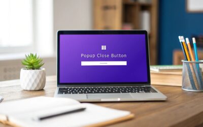
Today we’ll have a look at some ways to customize the default close button of any Divi Area. This tutorial works for Divi Areas Pro, as well as Popups for Divi.
What we will do
You can see the default close button in the top-right corner. It displays a black “x” icon and has a square outline. That square is best visible when you hover the close button.
Let’s have a look at the default close button, before we continue: Show Popup 1
We can change several aspects of the close button: The size, shape, colors. It’s even possible to customize the position and even replace the “x” with other text, like the word “close”.
🤓 Need more nerdy details?
Read the technical documentation here for an overview of CSS selectors and places to put your CSS code.
CSS: Round button
<style>
#et-boc [data-da-area] .da-close-wrap .da-close {
    border-radius: 20px;
    margin-right: -10px;
    margin-top: -10px;
}
</style>
See this CSS in action: Demo Popup 2
The button is round, but that’s a little hard to see, because of the semi-transparent background. So next, we’ll adjust the background color and transparency to make the button cleaner:
<style>
#et-boc [data-da-area] .da-close-wrap .da-close {
    border-radius: 20px;
    margin-right: -10px;
    margin-top: -10px;
    /* Added: */
    background-color: #FFFFFF;
    opacity: 1;
}
</style>
See this CSS in action: Demo Popup 3
CSS: Rounded Square
<style>
#et-boc [data-da-area] .da-close-wrap .da-close {
    border-radius: 5px;
    margin-right: 6px;
    margin-top: 6px;
    background-color: #FFFFFF;
    opacity: 1;
}
</style>
See this CSS in action: Demo Popup 4
CSS: Hover Effects
The following CSS adds two hover states to the close button: When you hover the Popup, the button turns white. When you hover the button, it turns blue.
<style>
#et-boc [data-da-area] .da-close-wrap .da-close {
    background-color: #e21;
    color: #fff;
}

#et-boc [data-da-area] .da-close-wrap .da-close:hover {
    background-color: #23d;
    color: #fff;
}

#et-boc [data-da-area]:hover .da-close {
    background-color: #fff;
    color: #444;
    opacity: 1;
}
</style>
See this CSS in action: Demo Popup 5
CSS: Bigger button
You can either use the transform: scale() to resize the entire close button, or font-size to change the size of the “x” icon. Of course, you can also combine both:
<style>
#et-boc [data-da-area] .da-close-wrap .da-close {
    transform-origin: top right;
    transform: scale(1.5);
    font-size: 32px;
}
</style>
See this CSS in action: Demo Popup 6
CSS: Outside button
Want to display a close button that’s fixed to the top right corner of the screen? Absolutely possible with the position: fixed style.
<style>
#et-boc [data-da-area] .da-close-wrap {
    position: fixed;
    top: 24px;
    right: 24px;
    left: auto;
    transform: none;
}

#et-boc [data-da-area] .da-close-wrap .da-close {
    font-size: 48px;
    width: 50px;
    height: 50px;
    line-height: 50px;
}
</style>
See this CSS in action: Demo Popup 7
CSS: Custom Text
It’s even possible to replace the default “x” icon with some custom text. This change has 2 steps:
- Hide the default icon by setting the font-size to 0 and the color to transparent.
- Add a custom label to the close buttons
:beforepseudo-element – remember to set a color and font-size to that label.
<style>
#et-boc [data-da-area] .da-close-wrap .da-close {
    color: transparent;
    font-size: 0;
    font-family: inherit;
    width: auto;
    padding: 0 10px;
    top: auto;
    bottom: 0;
}

#et-boc [data-da-area] .da-close-wrap .da-close:before {
    content: 'CLOSE';
    color: #333;
    font-size: 15px;
}
</style>
See this CSS in action: Demo Popup 8
Conclusion
We have looked at a variety of ways to customize the default close button of any Popup or Divi Area. It’s a straightforward process, as you can do almost anything with plain CSS.
You can also find additional tips and guidance in our knowledge base article How to customize the close button. That article also walks you through different places where you can insert your custom CSS code.
Even though we covered many different close button styles, it’s up to your imagination (and CSS skills) to come but with new, unique, and elegant designs for close buttons.
Want to share your custom designs? Send us a screenshot with your CSS code via the help button in the corner, and we’ll showcase your creation in our blog
More Articles You Will Like