 Alex Martin
If you've ever dropped a huge hero image into a Divi layout, watched it look perfect in the builder, then felt the site slow to a crawl on mobile, you already know the problem isn't just “the image is too big.” The harder question is whether you should resize the source file at all, or serve the right generated size and let WordPress handle the rest. That decision changes how you work in WordPress, in Divi, and in every WooCommerce or agency build that has to stay fast under real traffic.
WordPress has never been a single-file image system. It creates multiple renditions on upload, then lets the browser and theme choose among them, which is why the smartest wordpress resize image workflow is usually a mix of source preparation, native resizing, and responsive delivery. If you treat all three as the same thing, you end up with blurry thumbnails, oversized mobile payloads, or a library full of files nobody's using efficiently.

Why Resizing Images in WordPress Is More Than Just Scaling Pixels
A Divi user uploads a wide, polished hero image, drops it into a fullwidth section, and everything looks fine in the editor. On the front end, WordPress may still serve more image data than the layout needs, which makes the page feel heavier than it should. That gap is where the decision starts. In many cases, the question is not whether to resize the source file at all, but whether to use a better generated size or let responsive delivery handle the display.
WordPress already made more than one image
By default, WordPress generates Thumbnail (150×150 px), Medium (300×300 px max), Medium_Large (768 px wide max), Large (1024×1024 px max), and keeps the Full original upload unchanged, so one upload can exist in several usable dimensions at once (WP Engine's breakdown of image size generation). That is why a resize request often means choosing a different rendition, not editing the source file itself. It also explains why uploading a very large image and then only changing its display size in the editor does not automatically solve the underlying file-size problem.
Practical rule: If the image will appear in multiple contexts, think in terms of renditions first, source file second.
That mental model matters even more in Divi, because a hero, a card thumbnail, and a gallery tile can all point to the same upload but need different display behavior. WordPress's modern media workflow is built around responsive images, so the browser can receive an appropriately sized file based on the device and layout context (WordPress responsive images handbook). The platform also recommends uploading images around 1.5 to 2 times the width of the content area for sharper results on high-density screens (WordPress responsive images handbook).
The key decision is simple to state and easy to get wrong. If the file itself is too large, resize the source before upload or use a workflow that downsizes on upload. If the image is already in WordPress and the layout only needs a different rendition, choose the generated size. If the front end needs to stay fluid across breakpoints, let responsive delivery do more of the work.
Resizing Images Using the Media Library and Block Editor
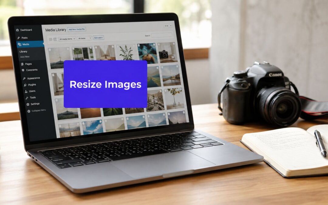
The native tools are still the fastest path for one-off fixes, especially when a client sends a massive JPG five minutes before launch. In the Media Library, WordPress gives you Edit Image and Scale Image, and that workflow is intentionally conservative, it downscales while preserving aspect ratio. Enter only a width or only a height, and WordPress recalculates the other dimension automatically (WordPress image resize reference).
Use Scale Image for downscaling, not correction
The important limitation is that the built-in editor is a downscaling tool, not an upscaler. If the uploaded asset is already too small, WordPress can't invent detail, so the right move is to export a larger original before upload. That matters in Divi builds where a designer wants a fullwidth image to look crisp on a large monitor, then later expects the Media Library editor to “fix” a low-resolution source file. It won't.
A clean workflow looks like this:
- Open the image in the Media Library.
- Click Edit Image.
- Enter a target width or height in Scale Image.
- Save the scaled version and reuse that asset where it fits the layout.
The Block Editor and Classic Editor are different from the Media Library because they focus on what gets displayed, not what gets stored as the source file. In an image block, you can choose a generated size such as Thumbnail, Medium, Large, or Full, then adjust width and height in the layout settings. That's useful when the file itself is acceptable but the rendered placement isn't.
WordPress users often ask to “resize an image” when the real issue is that they picked the wrong rendition for the container.
That distinction matters a lot in Divi because it's easy to confuse module sizing with file sizing. If you only need a narrower visual presentation inside a text column, changing the displayed width may be enough. If the asset is still too heavy for the page, you need a different upload or a generated variant with a smaller payload.
Image Resizing Techniques Inside the Divi Builder
Divi adds another control layer on top of WordPress, and that's where production sites either get clean, predictable images or drift into awkward overrides. The Image module lets you control width, max-width, and responsive behavior per breakpoint, which is powerful when you want a hero graphic to span a desktop section but stay constrained on tablet and mobile. Used carefully, that setup works with WordPress's responsive image system instead of fighting it.
Keep Divi responsive controls aligned with WordPress output
The mistake I see most often is a fixed pixel width that clashes with the content area. The image might look fine in the builder, but the front end can still serve a file that's too large for the slot or too small for the display. Divi's width controls should shape presentation, while WordPress should still supply the most appropriate source rendition behind the scenes.
For practical layouts, this usually means:
- Hero sections: set the module to behave fullwidth on desktop, then tighten the mobile width so the image doesn't dominate the viewport.
- Card and grid content: let the image stay within a predictable max-width so the layout remains consistent across posts and archives.
- Background-adjacent imagery: avoid forcing an oversized full file into a narrow visual container when a generated size would do the job better.
The other thing worth watching is the Force Fullwidth option. It can be useful in the right context, but it's also one of the easiest ways to create the illusion of consistency while still serving unnecessarily large assets. That's not a WordPress problem or a Divi problem on its own, it's a workflow problem.
The most useful mindset is to treat Divi sizing as a presentation layer. WordPress decides which image rendition exists. Divi decides how that rendition is displayed within the layout. When those two layers agree, the page feels fast and the image still looks intentional. For a deeper Divi-specific reference, this guide to using images with Divi is worth keeping close while you build.
Understanding Responsive Images and Custom Image Sizes in WordPress
Under the hood, WordPress serves images with markup that helps browsers choose a better fit for the current device and viewport. That's the point of srcset and sizes, they let the browser select from available renditions instead of blindly loading one oversized file for every visitor. The result is smarter delivery across desktop and mobile layouts, especially when the same image appears in different contexts.
When built-in sizes are not enough
WordPress's default sizes cover a lot of ground, but Divi child themes often need specific dimensions for portfolio grids, team cards, or product galleries. That's where custom image sizes come in. In a theme or child theme, you can register sizes with add_image_size(), then use those sizes in templates so WordPress generates the exact renditions your layout expects.
That approach is especially useful when your design system is stable. A portfolio grid that always crops to the same aspect ratio should not rely on a loose “Medium” setting and hope the front end sorts it out. A custom size gives you consistency, and consistency is what keeps Divi archives from looking uneven after a few months of content growth.
WordPress also only generates new sizes for future uploads, so changing image size settings doesn't fix the library you already have. That's why thumbnail regeneration becomes necessary after theme changes or after you add a new custom size. Without regeneration, older images may keep serving the wrong rendition while new uploads behave correctly.
For the technical side of this workflow, the image optimisation guide for WordPress is a useful companion when you're deciding whether to tune a theme, a module, or a source asset.
Source files, render sizes, and why both matter
The browser can only choose from what WordPress generated, so the source file still sets the ceiling for quality. Uploading images that are too small leaves you with soft results in larger modules, while uploading huge originals forces WordPress and your server to carry unnecessary weight. The sweet spot is a source file large enough for the intended display, then letting responsive delivery choose the right rendition for each device.
When to Use Plugins for Bulk Resizing and Regeneration
A site usually reaches the plugin stage after the image workflow stops being a one-off task and starts becoming maintenance. Hundreds of product photos, a large portfolio, or a redesign that changes the required dimensions all create the same problem, old uploads no longer match the current layout. That is where bulk resizing, regeneration, and upload-time automation become production tools instead of nice extras.
Compare the job, not just the plugin
Three situations usually justify a plugin. The first is a media library full of oversized uploads that need to be standardized after the fact. The second is a theme or layout change that altered the registered image sizes, which means older attachments need regenerated renditions. The third is a content workflow where future uploads should be constrained automatically so the same cleanup does not keep coming back.
An honest comparison looks like this:
- Manual native resizing: fine for a single image, slow for a library.
- Regeneration plugins: useful after theme or size changes, especially when older content needs matching renditions.
- Upload-time automation: best when oversized originals keep arriving from a team or client pipeline.
That third case comes up often in WooCommerce and agency work. Product grids expose inconsistency immediately, especially when thumbnails sit side by side. A plugin that downsizes on upload can reduce cleanup later, but it should not replace sensible source prep in Photoshop, Lightroom, or another editor. For teams that also want resizing tied to compression or format conversion, the image compression guide covers the next step in that workflow, and it fits neatly after the resize decision has been made.
If you build lots of related pages at scale, the same operational logic applies. WordPress mass page creation tips follow the same pattern, set the input once, then stop fixing the same problem manually across the library.

A plugin does not fix a layout decision. It does fix repeated mistakes across a large set of uploads. In practice, that means batch tools for old libraries, upload automation for new ones, and no plugin at all when the answer is choosing the right existing rendition in WordPress or Divi.
For teams that want a workflow where resizing happens before compression or format conversion, how to compress images for web is the next step to pair with a resize pass. Divimode's image optimization guidance follows that order, which suits production pipelines that need predictable output without reworking every asset by hand.
Performance Tips and Common Image Resizing Problems
Most image problems in WordPress are not mysterious. They come from picking the wrong rendition, overriding dimensions in the wrong place, or uploading a source file that was never ready for the layout in the first place. Once you separate those causes, the fixes get much easier to apply.

Fix the symptom you actually have
A blurry image in Divi usually means the layout is demanding more than the source or rendered size can provide. A distorted image usually means width and height were forced without preserving aspect ratio. A slow page often means the front end is still pulling a full original when a generated size would have done the job.
A good production checklist is straightforward:
- Match the rendition to the container: don't use Full when Medium or Large is enough.
- Preserve aspect ratio: avoid manual overrides that stretch the image.
- Check the original export: source files should be large enough for the intended display, not guessed after upload.
- Use a modern format when appropriate: WebP often makes sense in optimization workflows, while JPEG and PNG still have their places depending on the image type.
- Inspect what the browser receives: developer tools will show whether the site is serving the file you expected.
The overlooked question is whether to resize at all. Sometimes the front end doesn't need a source-file edit, it only needs the correct generated size or a responsive rendering decision. That's why so many “resize my image” requests turn into layout fixes once you inspect the actual output.
WordPress gives you the tools to handle this cleanly, but the workflow only works when source prep, generated sizes, and Divi module settings all agree. If you keep those layers separate in your head, you'll spend less time firefighting and more time building layouts that look good and load predictably.
If you want practical help tightening your Divi image workflow, explore the tutorials and tools at Divimode. The same discipline that keeps images lean also makes popups, layouts, and WooCommerce pages easier to manage at scale, and that's where the savings start to show up.
More Articles You Will Like