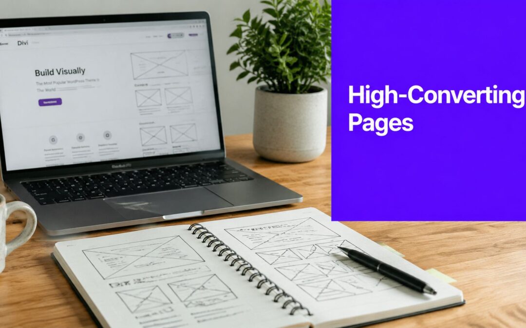
You built the page. The hero looks polished, the gradients are clean, the feature grid is tight, and the mobile layout doesn't break. Then the traffic lands and almost nobody starts the trial, books the demo, or requests access.
That result is common with software landing pages. The problem usually isn't that the page looks bad. It's that the page was designed like a website section instead of engineered like a conversion path.
For Divi users, that gap gets wider because Divi makes it easy to build attractive layouts fast. Easy design can hide weak strategy. A software buyer doesn't care that the section spacing is balanced if the headline is vague, the CTA competes with three other actions, and the page asks them to figure out whether the product fits their role.
Why Your Software Landing Page Is Failing to Convert
Software is hard to sell on a landing page because the visitor has to understand a product, trust the company, see the relevance to their job, and decide that the next step is worth the effort. That's a lot to ask from one screen.
The baseline is tougher than many teams expect. Software landing pages have a median conversion rate of about 3.8%, and complex software offers often land between 2% and 4%, while highly targeted pages can move above 7% to 8% according to this software landing page benchmark analysis. If your page is underperforming, that doesn't automatically mean your offer is broken. It often means your page is too broad.
Pretty pages lose when the message is blurry
A common Divi mistake is starting with layout before positioning. Designers open the Visual Builder, pick a strong-looking section pack, swap in product text, and ship it. The result feels complete, but it usually says too much and proves too little.
Visitors on software landing pages need four things fast:
- Clear relevance: They should know who the product is for.
- Fast comprehension: They should understand the outcome, not just the feature.
- Low friction: The next step should feel easy.
- Single direction: The page should point to one action, not several.
When those four aren't present, the page becomes a brochure. Brochures get skimmed. Conversion pages get acted on.
Practical rule: If your hero headline could work for five competing SaaS tools, it's too generic.
Generic templates create generic outcomes
The issue isn't Divi itself. It's using Divi like a visual layer only. Software offers usually need segmentation by audience, stronger message hierarchy, and tighter CTA control than a standard business landing page.
That's why generic advice often falls short for agencies and in-house teams building software pages inside WordPress. The work involves deciding what to remove, what to personalize, and what to make impossible to miss. If your team handles multiple client funnels, this broader guide on optimizing conversions for agencies is a useful companion because it focuses on process, not just design tweaks.
What usually goes wrong in Divi builds
A failing page often has familiar symptoms:
- Too many CTAs: “Start Trial,” “Watch Demo,” “See Features,” and “Contact Sales” all compete.
- Feature-first copy: The page explains the tool but never sharpens the business outcome.
- Uncontrolled length: Long sections stack up with no scan path.
- Weak form strategy: The form appears late, asks for too much, or feels disconnected from the pitch.
A converting software landing page doesn't try to show everything. It makes one next step feel obvious.
The Blueprint Before You Build in Divi
The strongest software landing pages are planned on paper before they're touched in Divi. That pre-build phase saves more time than any design shortcut because it forces decisions that the builder can't make for you.
Start with one conversion goal. Not two. If the page is meant to drive free trials, every section should support the free trial. If it's for demo requests, the page should qualify, reassure, and move the visitor to that form. Mixing goals usually creates hesitation.
Define the buyer, not just the audience
“Small businesses” isn't a landing page audience. “Operations managers at agencies who need to control on-site promos without developer help” is.
For software landing pages, role matters more than industry in many cases. A founder, marketer, developer, and procurement lead can all visit the same page and need different proof. Before building, write down:
- Primary role: Who is this page really for?
- Core pain: What is frustrating them right now?
- Desired outcome: What do they want the software to help them do?
- Likely objection: What makes them hesitate?
- Next-step tolerance: Will they start a trial, request a demo, or download a spec sheet?
A simple example: if you're selling a popup and conditional-content tool for Divi, a freelancer may care about speed of setup, while a developer may care more about targeting logic and API flexibility. Those are not headline twins.

Map the journey before the layout
Don't wireframe sections first. Wireframe decisions.
I use a simple flow for software landing pages:
| Visitor question | What the page must answer |
|---|---|
| What is this? | Clear headline and subheadline |
| Is it for me? | Role-specific framing and examples |
| Why should I care? | Outcome-driven benefits |
| Can I trust it? | Proof, screenshots, product detail |
| What do I do next? | One focused CTA |
That journey matters more than whether your CTA button is on the left or right.
For Divi users, the easiest way to stay disciplined is to sketch the page in low fidelity. Hero. Benefits. Product proof. Objection handling. CTA repeat. If you want a practical starting pattern, this guide on how to build landing pages in Divi is worth reviewing before you start placing modules.
Decide your module plan early
Divi gives you dozens of modules. That doesn't mean your page needs dozens of module types.
A software page usually needs only a controlled set:
- Hero section: Headline, subheadline, visual, CTA
- Blurbs or icon lists: Benefits and use cases
- Image or video module: Interface proof
- Accordion or toggle: Specs, integrations, technical detail
- Testimonials or logo row: Trust signals
- Email opt-in or form module: Main conversion action
A good wireframe removes decisions from the build phase. That's what keeps a landing page coherent.
If the blueprint is weak, the Divi build turns into rearranging sections until the page looks finished. If the blueprint is strong, the build becomes implementation.
Structuring Your Page for Maximum Persuasion
The structure of software landing pages matters more than is often acknowledged. Buyers don't read from top to bottom in a neat sequence. They scan, jump, compare, and hunt for the detail that matters to their role.
That means the page has to work in layers. The first layer grabs attention. The second makes the promise concrete. The third gives enough proof to justify action.

Build a hero that survives a fast scan
The hero section isn't the place for clever wording. It needs to answer the page's core question in plain English.
A strong software hero usually includes:
- A benefit-first headline: Say what changes for the user.
- A clarifying subheadline: Add context, audience, or mechanism.
- One primary CTA: The action should be unmistakable.
- A real product visual: Use interface screenshots, not decorative abstractions.
In Divi, this often means a two-column row with text and CTA on one side and a product screenshot or short video on the other. Keep the spacing generous, but don't turn the hero into a billboard with no informational density.
Turn long pages into guided pages
Complex software often needs more explanation. Security, integrations, workflows, deployment, pricing logic, and role-based use cases can't always fit into a short page. The trap is dumping all of it into one uninterrupted scroll.
A 2025 UX review of leading SaaS landing pages found that long-form pages often struggle with navigation fatigue on mobile, and highlighted the importance of anchored navigation blocks and collapsible sections for detailed specs in pages like these, as noted in HubSpot's review of landing page examples.
Use that insight directly in Divi with structure that reduces effort:
- Anchor links: Create jump links to features, integrations, pricing, and FAQs.
- Toggle modules: Hide dense technical detail until the visitor asks for it.
- Section labels: Help scanners know where they are on the page.
- Sticky elements carefully used: A compact CTA bar can help, but only if it doesn't crowd mobile.
A practical layout for complex offers
For long-form software landing pages, I like this section order:
- Hero with one CTA
- Outcome-focused benefit strip
- Product walkthrough or screenshot section
- Use cases by role
- Proof and trust signals
- Technical details in toggles or accordions
- FAQ
- Final CTA block
This order works because it moves from value to detail. It doesn't force technical visitors to wait too long, but it also doesn't open with implementation complexity.
Don't make every visitor pay the cognitive cost of your most technical buyer.
Features need translation
Most software pages list capabilities and stop there. “Conditional display rules.” “Advanced segmentation.” “Custom event triggers.” Those terms matter, but only after the visitor understands why they matter.
A better section pairs each feature with an outcome. For example:
| Feature | Better framing |
|---|---|
| Exit-intent triggers | Recover abandoning visitors before they leave |
| Device-based targeting | Show mobile visitors a simpler, faster CTA path |
| Role-specific content | Match the page to marketers, developers, or decision-makers |
In Divi, Blurb modules are ideal for this because they force concise presentation. Use them to keep claims scannable and avoid turning the mid-page into a text wall.
Writing Copy That Sells Your Software
Design gets attention. Copy gets commitment.
Most software landing pages lose people because the wording is too abstract. Teams write what the product is, not why the buyer should care right now. Then they soften the CTA until it sounds harmless and forgettable.
Message match is where conversion starts
When someone clicks an ad, email, or sponsored post, they arrive with a specific expectation. If the landing page headline shifts the promise, the visitor has to re-evaluate the page from scratch.
That's costly. Analyses of thousands of landing pages found that message match between ad copy and landing page copy increases conversion probability by 20% to 30% and reduces bounce by 10% to 20%, while minimal copy blocks help keep time-to-CTA under 10 seconds, according to TechnologyAdvice's landing page optimization guidance.
If your ad says “Create Advanced Popups in Divi Without Code,” the landing page shouldn't open with “Powerful Behavioral Engagement Tools for Modern Websites.” That may be accurate. It's still a mismatch.
Before and after copy examples
Here's what weak software copy often looks like:
| Weak version | Stronger version |
|---|---|
| Advanced Website Engagement Platform | Create targeted popups and on-page promos in Divi without custom code |
| Robust display logic for all campaigns | Show the right offer based on behavior, device, page, or referral source |
| Submit | Get Access |
| Learn More | See How It Works |
The stronger versions work because they remove interpretation. They tell the visitor what they can do and what happens next.
Write headlines with a result and a mechanism
A reliable formula for software landing pages is:
Get [result] with [mechanism]
Examples:
- Get more qualified leads with targeted on-site campaigns in Divi
- Launch role-specific software promos without rebuilding your site
- Personalize landing page content based on visitor behavior
That structure works because it balances aspiration with credibility. It doesn't sound like fluff, and it doesn't force the reader to decode jargon.
CTA copy should lower resistance
Buttons are often wasted space. “Submit” says nothing. “Request” can feel heavy. “Start now” can feel vague if the value isn't explicit.
Better CTAs name the next step:
- Start Free Trial
- Book My Demo
- Get Product Access
- See the Builder in Action
If you want a more detailed breakdown of button language and visual treatment in Divi, this walkthrough on high-converting CTA buttons is useful.
Good CTA copy finishes the sentence the visitor is already thinking: “Yes, I want to…”
A few copy rules that consistently help
- Lead with outcomes: The user wants fewer delays, better leads, cleaner workflows, or easier deployment.
- Use short blocks: Dense paragraphs slow software pages down.
- Name the audience when relevant: “For agencies,” “for developers,” or “for in-house marketers” can sharpen relevance.
- Keep proof close to claims: If you promise flexibility, show the interface or the trigger options nearby.
Generic copy tries not to exclude anyone. Strong copy intentionally resonates with the right visitor.
Boosting Conversions with Interactive Elements
Static pages leave insight unused. Visitors tell you things through their behavior long before they fill out a form. They scroll to technical sections, hesitate near pricing, return from a retargeting ad, or hit the page from a developer-focused article. If the page responds the same way to all of them, you're wasting context.
That's where behavior-driven layers become useful.

Many articles stop at “use a popup” or “try exit intent.” That's shallow advice. Research summarized by Insivia notes that personalized content can increase conversion rates by 5% to 15%, but most guidance doesn't give teams a framework for layering behavioral signals into dynamic software landing experiences in a controlled way, as discussed in this article on industry-tailored SaaS landing pages.
Use behavior to narrow the message
A good personalized interaction doesn't interrupt randomly. It appears when the visitor has earned a more specific message.
That could look like:
- A fly-in for technical users: Triggered after they reach the integrations or developer section.
- A softer CTA for cold traffic: Offer a walkthrough instead of a trial when the visitor arrives from broad awareness content.
- A return-visit prompt: Show a comparison guide or implementation note when someone comes back.
This is one place where Divimode fits naturally into a software landing page workflow. Its Divi Areas Pro plugin can display popups, fly-ins, injected content, and other targeted elements based on conditions like device type, referral context, scroll position, time delay, and exit intent inside the Divi environment.
A simple personalization framework
Don't start with five triggers at once. Start with one segment that has a clear intent signal.
For example, a developer-focused visitor might show these clues:
- They arrive from technical content.
- They scroll past the hero and feature overview.
- They spend time near implementation details.
That visitor probably doesn't need a generic “Book a Demo” popup. They may respond better to a fly-in that offers documentation, setup guidance, or a deeper product walkthrough.
A clean setup for that experience looks like this:
- Condition one: Only show on software landing pages tied to technical campaigns.
- Condition two: Only show after meaningful scroll depth.
- Condition three: Hide on pages where the visitor already converted.
- Offer: A technical asset or implementation-focused CTA.
That's not about being clever. It's about matching the ask to the stage of intent.
What to avoid
Behavioral targeting gets spammy fast when teams use it to force visibility rather than improve relevance.
Avoid these patterns:
- Immediate popups on arrival: They interrupt before the visitor understands the offer.
- Multiple overlapping promos: Popup, chat widget, sticky bar, and fly-in all at once.
- Same message for every segment: That isn't personalization. It's repetition.
- Aggressive mobile overlays: They can make the page harder to use than the problem they're meant to solve.
The point of interaction is timing, not noise.
A useful walkthrough can help clarify what this looks like in practice:
Where interactive elements work best on software pages
Interactive elements tend to perform best when they support friction points already present in the journey:
| Friction point | Better interactive response |
|---|---|
| Visitor hesitates near exit | Exit-intent prompt with one focused next step |
| Technical reader wants more depth | Scroll-triggered fly-in to docs or implementation content |
| Mobile visitor needs simpler action | Sticky CTA with compact copy |
| Returning prospect needs reassurance | Contextual trust or onboarding prompt |
Used carefully, these elements make software landing pages feel more relevant without becoming intrusive.
Optimizing Your Page for Peak Performance
A slow landing page burns the conversions your strategy already earned. Software buyers are often evaluating details quickly, across devices, while comparing alternatives. If your page drags, stutters, or shifts while loading, the pitch loses force before the copy even gets read.
Performance work isn't glamorous, but it changes outcomes.
Speed and focus affect conversion directly
Analyses cited by SEO Sherpa indicate that reducing load time to under 2.4 seconds can approximately double an 8% to 10% conversion rate, and one widely cited case found that removing the top navigation from a product trial landing page increased conversions by 100% according to this roundup of landing page statistics.
Those two ideas matter together. Fast pages reduce friction. Focused pages reduce distraction.

A Divi-focused performance checklist
For software landing pages in Divi, I'd work through this list before launch:
- Remove the main navigation: Landing pages should push one action. Keep visitors out of the header maze.
- Use real, compressed screenshots: Product visuals matter, but oversized assets drag down load time.
- Enable Divi performance options: Turn on the built-in settings that reduce unnecessary CSS and JavaScript.
- Audit your module usage: If a page only needs core layout modules, don't stack specialty effects that add weight.
- Limit third-party scripts: Chat tools, heatmaps, and embedded widgets can slow the whole page.
Keep the build lean
Divi can produce heavy pages when teams overbuild with rows inside rows, animation on every scroll event, and duplicate modules hidden by device settings. That style of build often feels harmless in the editor and expensive on the front end.
A lean software landing page usually has:
| Lean choice | Bloated alternative |
|---|---|
| One visual in the hero | Slider with multiple large images |
| Static proof row | Animated logo carousel with script overhead |
| Toggle for technical detail | Long always-open spec blocks |
| Single CTA path | Header nav plus multiple secondary actions |
Mobile performance deserves its own pass
Don't assume the desktop build scales down. In Divi, spacing, hidden elements, and image stacks can create much heavier mobile experiences than expected.
Review the page on mobile with a ruthless eye:
- Check visual hierarchy: The CTA should still appear early.
- Trim decorative spacing: Big desktop padding often becomes wasted vertical scroll.
- Test sticky elements: Useful on desktop can become cramped on smaller screens.
- Watch image behavior: Product screenshots should stay readable without dominating the viewport.
A landing page can be visually polished and still be operationally inefficient. Buyers feel that friction immediately.
From Launch to Mastery Through A/B Testing
A software landing page isn't finished when it goes live. Launch gives you a real audience, real friction points, and real behavioral signals. That's when the page becomes useful as an experiment.
Divi users already have a practical testing tool inside the ecosystem. Divi Leads lets you compare variants at the module, row, or section level, which is enough to test the parts of the page that most influence action.
Test what changes decisions
A lot of teams waste time testing cosmetic details before testing the parts that shape understanding. Start with bigger levers.
Good early tests include:
- Headline angle: Outcome-led versus feature-led
- Hero visual: Interface screenshot versus explanatory graphic
- Form placement: In hero versus after proof
- CTA wording: “Start Free Trial” versus “Get Access”
- Proof placement: Logos near the hero versus later on the page
That testing order matters because it reflects how people decide. They need to understand, trust, and act.
Build a feedback loop inside Divi
The most useful testing habit is simple: change one meaningful variable, observe behavior, keep the winner, and test the next friction point.
For teams launching a new SaaS offer or a fresh campaign, a broader process checklist like this guide to launching new products successfully can help you align the page with the rest of the rollout instead of treating it as an isolated asset.
If you want Divi-specific setup instructions, this tutorial on using Divi A/B testing to improve conversion rate covers the mechanics.
What mastery looks like
The best software landing pages don't stay static. They get clearer, tighter, and more role-aware over time. The page teaches you where your messaging is vague, where your proof is weak, and where visitors need a different next step.
That's the key shift. You stop building pages that look finished and start building pages that learn.
If you want to build more capable software landing pages inside Divi, Divimode offers plugins and tutorials for adding targeted popups, fly-ins, conditional content, and conversion-focused interactions without leaving the Divi workflow.
More Articles You Will Like