You’re probably dealing with one of two problems right now. Your Divi blog page looks fine, but it feels generic and doesn’t guide people anywhere. Or it looks custom, but the layout is doing too much, loads too slowly, and turns the archive into a design exercise instead of a content asset.
A strong divi blog page layout fixes both. It gives readers a clear path through your content, keeps the archive easy to scan, and supports the business goal behind the blog, whether that’s leads, product discovery, email signups, or authority. Good Divi work isn’t about adding more modules. It’s about deciding what belongs on the page, what should stay out, and what should happen when a visitor is ready for the next step.
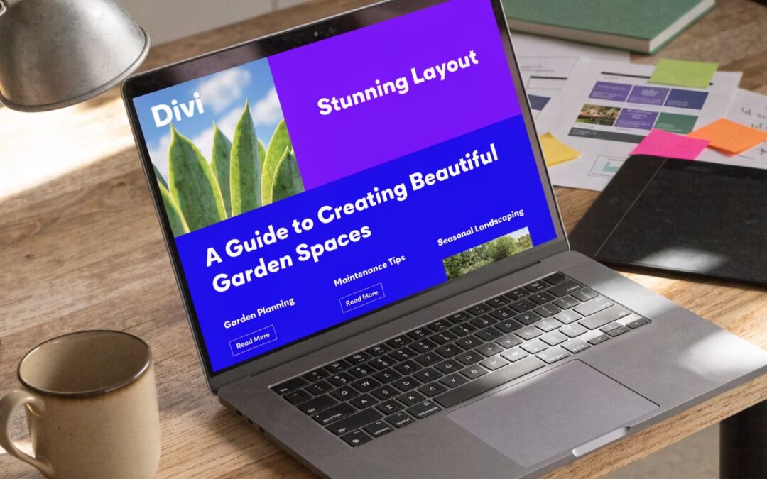
Planning Your High-Performing Divi Blog Layout
Most blog layout tutorials stay at the visual layer. They show cards, hover effects, and spacing tweaks, but they rarely deal with how layout choice affects engagement or conversions. That gap is worth paying attention to, especially if you build sites for clients who care about outcomes, not just appearance, as noted in this review of Divi blog layout content gaps from Divi Extended.
Start with the page goal
Before opening the Visual Builder, decide what the blog page is supposed to do. A blog archive can serve several jobs, but one job should win.
Use a simple priority order:
Lead generation
The archive should move readers toward email signup, consultation requests, or product interest. That means cleaner summaries, clearer category paths, and room for calls to action.Authority building
The archive should help visitors see depth fast. Category organization, strong post titles, and featured content matter more than clever animation.Content discovery
The archive should help people browse a large library without friction. In practice, that usually means pagination, filtering, and a predictable card structure.Commercial support
If the site also sells products or services, the blog page should bridge informational content to revenue pages without turning into an ad wall.
A layout that tries to do all four equally usually does none of them well.
Practical rule: If you can’t describe the archive’s main conversion action in one sentence, the page isn’t planned yet.
Sketch the hierarchy before the modules
The strongest blog pages have a visible reading path. Visitors should understand the site’s content structure within seconds.
That usually means defining three layers:
- Top layer with a page intro, featured topic, or category context
- Middle layer with the main post feed
- Support layer with filters, sidebar content, newsletter offers, or trust signals
General UX principles matter more than Divi settings. If you need a refresher on layout clarity, visual hierarchy, and content-first structure, this guide to essential website design best practices is a useful companion resource.
For Divi-specific inspiration, I also recommend reviewing examples of stronger blog structures before you build. These Divi blog design tips are useful for spotting what makes a blog page feel intentional instead of assembled.
Choose the right structure
Divi gives you several viable archive patterns, but they’re not interchangeable. The wrong one makes a good content library harder to use.
| Layout Type | Best For | Pros | Cons |
|---|---|---|---|
| Grid | Content-heavy blogs, marketing sites, category hubs | Easy to scan, strong visual rhythm, works well with featured images | Can look uneven if titles and excerpts vary too much |
| List | Editorial sites, tutorial archives, text-first blogs | Stronger readability, more room for metadata and descriptions | Fewer posts visible at once, weaker visual variety |
| Fullwidth | Magazine-style blogs, featured storytelling, low-volume archives | Gives each post more emphasis, useful for featured content | Slower browsing for large archives, less efficient for discovery |
| Masonry | Image-rich blogs, portfolios, mixed media content | Adds movement and variety, can feel modern and editorial | Harder to keep visually disciplined, can hurt consistency if content lengths vary |
What usually works in practice
For most business and content marketing sites, grid is the safest starting point. Divi’s Blog Module supports Grid, Fullwidth, and List layouts, and a grid with 6 to 12 posts per page plus pagination is the recommended pattern for scan-friendly archives that can still scale to thousands of posts without looking chaotic, according to Divi Life’s guide to building a Divi blog page.
That recommendation holds up in real projects because grid cards create predictable scanning behavior. Readers can compare titles quickly. Images support topic recognition. Pagination prevents the archive from becoming a long, heavy page.
List layouts still have a place. I use them when the title and summary do most of the work, especially on tutorial sites where users are searching for a specific answer. Masonry can work, but only when the brand and content justify a less rigid structure.
Planning mistakes that cost results
A few planning errors show up constantly:
Treating the archive like a gallery
Blogs aren’t portfolio pages. If every card fights for attention, nothing gets attention.Using categories without editorial intent
If your category labels don’t help a reader choose what to read next, they’re clutter.Hiding purpose behind style
A polished layout still fails if a visitor can’t tell what the site publishes and where to go next.
A good divi blog page layout starts on paper, not in the builder.
Building the Foundation with the Divi Theme Builder
A custom archive doesn’t belong on a normal page if you want consistency across blog, category, and archive views. It belongs in the Divi Theme Builder. That’s the part many users skip, and it’s also why so many custom blog designs break as soon as someone visits a category archive or a tag page.
Place the structure here first.

Create the right template, not just any template
In WordPress, go to Divi > Theme Builder. Then create a new template based on what you need the layout to control.
For blog work, these are the most common assignments:
- Blog page or posts index if your site uses a central archive page
- All posts when you’re building the single post experience
- Category archives when different content groups need different layouts
- Tag archives if tags play a real navigational role on the site
The main mistake here is assigning too broadly or too narrowly. If you create an archive design for one page but forget the category templates, visitors get a polished main blog page and then hit a default WordPress archive on the next click.
Build on a blank custom body
Once the template exists, open the Custom Body area and start blank. That matters because default layouts tend to encourage workaround design. A blank canvas lets you define your own structure for archive intros, post feeds, sidebars, and support modules.
A clean archive template often starts with:
- A top section for archive title, intro text, or featured category context
- A primary section for the Blog Module or looped post display
- A supporting section for sidebar, search, opt-in, or promotional content
This structure is simple, but it scales well across different archive conditions.
If the template assignment is wrong, the design quality doesn’t matter. Divi will render the wrong experience in the wrong place.
Pay attention to template conditions
Template conditions are where beginners usually get tangled. The issue isn’t the interface. It’s overlap.
If you assign one template to All Archives and another to a specific category, you need to know which one should take precedence. Keep your logic tidy:
- Use broad templates for the default archive structure
- Add category-specific templates only when content type justifies a different experience
- Name templates clearly so you can audit them later
A practical naming pattern helps more than people expect. Something like:
- Blog Archive Default
- Category Archive Tutorials
- Category Archive News
- Single Post Standard
That sounds basic, but once a site grows, clear naming saves time.
Prep the canvas for dynamic content
Before styling anything, decide which parts of the archive should populate automatically. With this decision, the Theme Builder transitions from merely a layout tool to your publishing system.
Later, when you add Blog Modules or dynamic archive elements, the template should already be ready for:
- Archive titles that change by category
- Post listings that populate automatically
- Supporting elements that can remain consistent across all archive views
If you want a visual walkthrough of the interface and template flow, this embed is a helpful reference before you wire up the archive logic:
Foundation decisions that prevent rebuilds
The best Theme Builder work feels invisible later because it prevents problems you’d otherwise solve with patches.
A few decisions are worth locking in early:
Use one archive framework first
Don’t create five different archive templates just because Divi allows it.Keep structural sections modular
Header area, post feed, and support area should be easy to swap or restyle independently.Avoid page-specific hacks
If you need custom CSS or code, tie it to classes and template logic, not one-off page fixes.
This part of the build isn’t glamorous, but it determines whether your divi blog page layout scales cleanly or becomes a maintenance problem.
Designing the Post Grid with the Divi Blog Module
A blog archive usually breaks down in the same place. The page looks fine in the builder, then publishing starts, image sizes drift, excerpts run long, and the grid turns into visual noise that loads too much and converts too little.
The Divi Blog Module is still the quickest way to build an archive feed inside Divi, but the default settings rarely produce a high-performing result. The goal is not just to show posts. The goal is to create a grid that helps visitors find the right article fast, keeps page weight under control, and moves the right readers toward a signup, click, or sale.

Set the post count based on content density
Post count is a usability decision first.
For most Divi blog archives, 6 to 12 posts per page is the range that holds up best in production. I stay closer to six when cards include larger images, longer excerpts, or stronger calls to action. I push toward nine or twelve when the layout is compact and readers are browsing by topic.
That range works for practical reasons:
- Too few posts can make an archive feel weak, especially on category pages
- Too many posts adds scroll fatigue and often increases image weight
- Pagination keeps archive pages easier to crawl and easier to scan
Infinite scroll can look modern, but it often weakens footer visibility, muddles analytics, and makes archive pages harder to control. Standard pagination is usually the better choice for SEO and performance.
Match the layout to reading intent
Divi gives you three common directions here: Grid, Fullwidth, and List. Each one shapes behavior differently, so the choice should reflect how visitors use the archive.
Grid
Grid works best for broad discovery. It gives each post a clear card, helps readers compare topics quickly, and supports categories with strong featured images.
Use it when:
- the archive needs fast visual scanning
- thumbnails carry real value
- readers browse several topics before choosing one
Fullwidth
Fullwidth layouts slow the pace down and give each post more room. They suit editorial blogs, branded publications, and lower-volume sites where each article needs a stronger pitch.
Use it when:
- article summaries need more context
- the archive has a magazine feel
- fewer, higher-value posts matter more than dense browsing
List
List layouts strip the archive back to utility. They work well for tutorial libraries, support content, and educational sites where visitors scan headlines for a specific answer.
Use it when:
- text matters more than imagery
- posts follow a repeatable educational format
- readers already know what they are looking for
A simple test helps here. If visitors are deciding with their eyes, use Grid. If they are deciding with headlines, use List. If they need more editorial framing before the click, use Fullwidth.
Remove anything that does not help the click
Many Divi blog pages look cluttered because every toggle stays on. That hurts scan speed.
Inside Content > Elements, review each option as if space is limited, because it is.
Featured image
Keep it for grid layouts when images are consistent and relevant. Turn it off if thumbnails are poor, mismatched, or decorative.Excerpt
Use it when titles alone do not sell the post. Skip it if the archive feels heavy or repetitive.Meta information
Show the date for time-sensitive publishing. Show the author only when author credibility matters. Categories can help if they support browsing.Read More button
Keep it only if it is styled with intent and supports the card hierarchy.Pagination
Leave it on for any archive expected to grow.
This is one of the easiest places to improve conversions. Cleaner cards reduce hesitation. They also keep the page from competing with itself.
Make the cards consistent before you make them decorative
The strongest Divi blog grids usually look restrained. They are built on repeatable rules, not on extra effects.
Start with the parts that affect readability and layout stability:
Use a consistent image ratio
Mixed thumbnail proportions make the archive look unedited. If the site accepts uploads from multiple authors, standardize featured image dimensions in the publishing workflow.Control title and excerpt length
Long headlines can break vertical rhythm fast. In client builds, I often shorten excerpts or remove them entirely when titles already carry enough context.Set reliable spacing
Padding, gutter width, and line height do more for card quality than shadows or hover animations.Keep CTA styling restrained
If every card shouts for attention, none of them does. Archive pages should support decision-making, not fight for it.
This is also where performance enters the design conversation. Large thumbnails, layered shadows, and aggressive hover effects can make a blog page feel heavier than it needs to. A cleaner grid usually loads faster and looks more credible.
Support the grid with secondary discovery paths
The main feed should do the primary job well, but it should not carry the whole archive alone. Category filters, featured sections, newsletter offers, and secondary post displays can all improve engagement when they are placed with intent.
One pattern I use often is a secondary carousel below the main archive or within category-specific layouts. It gives readers another path without disrupting the primary feed. If you want to add that behavior, this guide on displaying a carousel of related Divi blog posts shows a practical implementation.
What holds up in real projects
A few choices consistently produce better results:
Works well
Clean grid cards with one clear hierarchy: image, title, short excerpt or meta, then clickWorks well
Predictable image sizing and restrained metadataWorks well
Archive pages that reserve space for an email opt-in or category CTA without interrupting browsingWorks well
Pagination paired with a lightweight layout that stays fast as the archive grows
And a few choices create problems almost every time:
Usually underperforming
Oversized cards that show too little information above the foldUsually underperforming
Long excerpts on every card, especially on mobileUsually underperforming
Heavy animation, layered shadows, and decorative styling that adds weight without improving click-throughUsually underperforming
Archive layouts that ignore conversion paths entirely
A good divi blog page layout does more than present content attractively. It has to help the archive scale, keep load times reasonable, support search visibility, and give readers an obvious next step. The Divi Blog Module can do that well when the grid is treated like a publishing system, not just a design element.
Creating Dynamic Post Templates for Consistency
A polished archive only does part of the job. If a visitor clicks into an article and lands on a default single post template, the site loses continuity immediately. That’s why a strong divi blog page layout should be paired with a dynamic single post template inside the Theme Builder.

Build one system, not isolated pages
The professional workflow is simple. Design the archive to attract the click, then design the single post template to carry the same visual and structural logic forward.
Inside the Theme Builder, assign a template to All Posts or to specific post categories. Then use dynamic modules instead of static content.
The essential stack usually includes:
- Post Title Module for the article heading and optional metadata
- Featured Image when the visual lead matters
- Post Content Module so the body content pulls in automatically
- Author box, related content, or CTA area after the post body
That structure keeps publishing efficient. You don’t redesign each post. You publish into a system.
Dynamic content matters for archives too
Archive pages become much easier to manage when they’re driven by dynamic conditions rather than manually assembled sections. For scalable archives, creating an All Posts template and using Posts for Current Page plus post offsets prevents repeated content and keeps category and tag pages populated automatically. The same workflow is tied to stronger search visibility, with the source noting a 20 to 30% SERP visibility boost from dynamic content and indexing behavior in Mark Hendriksen’s Divi blog layouts guide.
That matters because static archive design doesn’t scale. As soon as the content library grows, manually curated archive sections become hard to maintain and easy to break.
Structure the single template around reading flow
Most single post templates work best when they follow a reading-first hierarchy.
Header area
The reader needs immediate context. Use the dynamic post title as the H1. Add the featured image only if it strengthens the article and doesn’t push the content too far down.
Body area
The Post Content Module should sit inside a width that matches the site’s content type. Tutorial and long-form posts usually benefit from a narrower reading measure than media-heavy brand content.
Closing area
This is the most underused part of the template. A strong closing section can include author information, related articles, a product nudge, or a lead capture step that fits the article topic.
Readers don’t experience your archive and your post template as separate projects. They experience one brand and one journey.
Use offsets and multiple modules carefully
If you want to feature a post at the top of an archive and then continue with the normal feed below, use multiple Blog Modules with offsets. This avoids duplication and gives you more control over hierarchy.
That approach also helps on category pages:
- one module for featured or top content
- one module for the regular feed
- optional supporting module for slider, sidebar, or promoted category content
The key is restraint. Dynamic systems are powerful, but they can get messy fast if every archive template starts using different logic.
What consistency actually buys you
A consistent dynamic template does more than save build time.
It gives you:
- Editorial control because every post follows the same structural rules
- Faster global updates when typography, spacing, or CTA placement needs revision
- Brand continuity from archive to article
- Cleaner QA because you’re testing one system instead of many one-off pages
When a site publishes regularly, this isn’t optional. It’s the difference between a blog that gets easier to manage over time and one that becomes harder with every new post.
Responsive Tweaks Performance and SEO Optimization
A good archive design can still fail in production. That usually happens in three places. The cards break on mobile, the page gets heavy as the archive grows, or the structure looks fine visually but doesn’t give search engines and users enough clarity.
Fix the layout on mobile before polishing desktop
Desktop is where most Divi archive designs are built. Mobile is where many of them get exposed.
Start with the post grid itself:
Reduce visual clutter on smaller screens
Mobile doesn’t need every meta field, long excerpt, and decorative effect.Check image crop behavior
If thumbnails feel cramped or awkwardly cropped, adjust image handling before changing card spacing.Watch tap targets
Category links, pagination controls, and read-more buttons need comfortable spacing.
A mobile archive should feel lighter than the desktop version, not like a scaled-down copy of it.
Solve uneven post heights
Uneven card heights are one of the oldest Divi grid problems. Titles vary. Excerpts vary. Suddenly the archive looks less professional than it should.
With Divi 5, fixing that became easier. Pro tutorials commonly recommend a simple JavaScript snippet to equalize preview heights across blog grids, which creates a cleaner and more polished user experience on high-traffic blogs, according to this Divi 5 video tutorial reference.
That kind of fix matters because visual inconsistency hurts trust faster than people think. The content may be strong, but the archive still feels unfinished.
Keep the correction small. You’re solving alignment, not forcing every card into the same content density.
Treat performance as part of layout design
A blog archive isn’t just a design surface. It’s a page type that can grow indefinitely, which means every decision compounds.
Performance work on archive pages usually comes down to restraint and configuration:
Images
Use properly sized featured images and keep image handling predictable. Inconsistent media is one of the easiest ways to slow and destabilize an archive.
Lazy loading
If the page carries multiple post thumbnails, lazy loading matters. It reduces the upfront burden of loading every image at once and helps the archive behave better on slower devices.
Divi performance settings
Use Divi’s built-in performance options thoughtfully. Disable what the page doesn’t need. Keep the CSS and scripts lean where possible. Archive pages often inherit unnecessary weight from broader site styling.
Pagination instead of excess loading
If you’re tempted to show too many posts on one page, that’s usually a content planning problem disguised as a UX choice. Controlled pagination is often the cleaner answer.
SEO structure is mostly about clarity
For blog archives and single post templates, SEO gains usually come from clean structure rather than tricks.
A few fundamentals matter:
- One clear H1 on the single post template
- Logical H2 and H3 hierarchy inside content
- Archive intros that explain the page topic
- Readable category structures that make sense to users first
- Consistent metadata display when date or author supports intent
Search visibility and usability tend to move together when the archive is well organized.
Accessibility and polish are connected
The same details that make a page easier to use also make it feel more professional.
Check these regularly:
- Color contrast between text and card backgrounds
- Button states so hover isn’t the only interaction cue
- Readable font sizes across breakpoints
- Spacing around linked elements for keyboard and touch users
- Alt text and meaningful image usage when featured images carry context
A polished divi blog page layout isn’t just attractive. It’s stable, legible, and easy to use on the devices people use.
Advanced Enhancements with Divi Areas Pro
Once the archive is fast, consistent, and easy to scan, the next job is behavior. A blog page that only lists posts is useful. A blog page that reacts to visitor intent becomes part of the funnel.
That’s where targeted overlays and injected content make sense. Used carefully, they turn the archive from a passive content feed into an active conversion surface.
Use behavior, not interruption, as the rule
Most blog conversion features fail because they appear too early, too often, or with the wrong offer. The issue usually isn’t the popup itself. It’s the trigger logic.
Better patterns include:
- Exit-intent offers on blog pages where readers are likely to leave after browsing
- Scroll-based prompts once a visitor has shown real interest
- Category-aware promotions that match the topic of the posts being viewed
- Injected CTAs placed inside the feed after a set number of posts instead of shouting from the top of the page
Those approaches feel more relevant because they respond to behavior.
Practical uses inside a blog layout
A few implementations work especially well on Divi sites:
Lead magnet popup on exit intent
Offer a guide, checklist, or newsletter signup only when the visitor is about to leave. That protects the reading experience while still creating a conversion opportunity.Inline CTA inside the archive feed
After several posts, insert a content block promoting a related service, product category, or email list. This works better than placing every call to action above the fold.Conditional messaging for WooCommerce blogs
On stores that use content marketing, show different prompts based on product relevance, page context, or device type.Returning visitor prompts
If someone has already engaged with the blog, you can show a more direct action than you’d show a first-time visitor.
Where Divi Areas Pro fits
One option for this kind of behavior is using Divi Areas Pro to design dynamic content. It supports popups, fly-ins, content injection, and targeting based on page context, device type, user behavior, and other conditions. That makes it suitable for turning a standard Divi archive into a more responsive marketing asset without rebuilding the page structure itself.
Don’t add overlays because you can. Add them when the blog has a defined next step and the trigger matches reader intent.
What to avoid
Even strong tools create weak outcomes when the logic is sloppy.
Avoid:
- immediate popups on page load
- unrelated offers on tightly themed category pages
- multiple competing overlays
- injected CTAs that interrupt the visual rhythm of the feed
The archive should still feel like a blog first. The enhancement layer should guide action, not overpower reading.
Frequently Asked Questions
How can I feature one post at the top of my blog page?
Use two Blog Modules. Set the first module to show just one post, either the latest post or one from a dedicated featured category. Style that first module differently so it reads like a hero item. Then place a second Blog Module below it and set the Post Offset Number to 1 so it skips the featured post and avoids duplication.
Can I have different layouts for different post categories?
Yes. In the Divi Theme Builder, create separate templates and assign them to specific categories. One category can use a tighter grid for tutorials, while another can use a more editorial layout for news or updates. This is one of the cleanest ways to make the blog feel customized without building one-off pages manually.
How do I add a sidebar to my blog layout?
Inside the template, add a two-column row. Put the Blog Module in the wider column and place a Sidebar Module in the narrower one. Then style the sidebar so it supports the archive rather than competing with it. Search, category navigation, newsletter signup, or popular posts usually work better than stuffing it with every widget available.
Should I use grid or list for a Divi blog page?
Grid is usually the better default when the archive needs to be easy to scan and image-led. List works better when visitors are reading titles and summaries to find answers quickly. The right choice depends on whether browsing behavior is visual or text-first.
If you want to turn your blog into more than a post archive, Divimode offers plugins and tutorials focused on interactive Divi builds, including popups, content injection, and behavior-based targeting for blog and WooCommerce sites.
More Articles You Will Like


