The absolute best images for sliders are the ones you get right before you even upload them to WordPress. Think high-quality, properly compressed WebP or JPEG files, already sized to the perfect aspect ratio.
Nine times out of ten, when a slider is dragging a website down, it’s because of massive, unoptimized images. This is the number one mistake we see, and it’s the primary reason sliders get a bad rap for slowing down websites, hurting both user experience and your hard-earned SEO rankings.
Why Your Slider Images Are Slowing Down Your Divi Site
Sliders are a powerful visual tool, but they can quickly become public enemy number one for your site's performance. The most common pitfall? Uploading huge, uncompressed photos straight from a camera or a stock photo service. A single 5MB image can bring a page to a screeching halt, especially for anyone not on a high-speed connection.
This directly tanks your Core Web Vitals, the metrics Google uses to judge whether your site offers a good experience. A slow-loading slider is a classic cause of a poor Largest Contentful Paint (LCP) score, which can definitely ding your search rankings. Learning how to reduce bounce rate is critical, and it starts with keeping visitors from leaving before your page even loads.
The Mobile Performance Problem
The damage from large slider images gets exponentially worse on mobile devices. It's 2026, and mobile traffic isn't just a piece of the pie—it's most of it, accounting for nearly 55% of all global web traffic.
This massive shift means your slider images absolutely must be built for responsiveness. For Divi builders, particularly those using tools like Divimode's Divi Areas Pro, this means creating sliders that adapt beautifully to any screen. Fail here, and you'll see why sites that load too slowly on phones face a staggering 88.5% bounce rate.
I once worked with an e-commerce store whose gorgeous hero slider, filled with heavy product shots, added a three-second delay on mobile. That tiny delay was enough to slash their mobile conversion rate almost in half. A simple round of image optimization fixed it.
Performance and design aren't enemies; they have to work together. A slow site is a bad design, no matter how good it looks.

By following the right steps for optimizing your images for sliders, you can turn a potential performance bottleneck into a fast-loading, engaging asset that helps, not hurts, your Divi website.
Choosing and Sizing the Perfect Images for Sliders
Picking the right visuals is only half the battle. How you size them is what truly makes or breaks your slider's performance and appearance. You can have a photo that perfectly captures your brand's vibe, but if it shows up blurry, gets cropped awkwardly on mobile, or takes an eternity to load, it’s not doing you any favors.
The secret? Prepare your images for sliders before they ever touch your WordPress media library.
This process starts with a solid grasp of your brand’s visual identity. Look for images with strong, clear focal points. Think about a photo of a team at a conference table; if the main action is centered, it’s going to look great on any screen. But if the most important person is way off to the side, they’ll probably get cut off on a phone.

Nail Down Your Dimensions and Aspect Ratio
Consistency is key for a slider that looks polished and professional. Every single image in a slider needs to have the exact same dimensions. This prevents those jarring layout jumps and resizing flickers as the slides transition.
The right dimensions depend entirely on where the slider will live on your Divi site. To get it right, you need to think in terms of aspect ratio—the relationship between an image's width and height.
- Fullscreen Sliders: These fill the entire viewport. A 16:9 aspect ratio is the gold standard here, making 1920px by 1080px an ideal starting point.
- Fullwidth Sliders: These stretch across the browser's width but don't take up the full height. They tend to be wide and short. Ratios like 3:1 are pretty common, so dimensions around 1920px by 640px usually work well.
- Content-Width Sliders: These are tucked inside your site’s main content area. The width is set by your Divi theme settings, but a popular size is 1200px by 675px, which is also a 16:9 ratio.
To make this even easier, here's a quick reference table I put together for common Divi slider setups.
Recommended Slider Image Dimensions for Divi
This table is a great starting point for sizing your slider images based on where they'll be used in your Divi layout.
| Slider Type | Aspect Ratio | Recommended Desktop Dimensions (Width x Height) | Notes |
|---|---|---|---|
| Fullscreen Hero Slider | 16:9 | 1920 x 1080 px | Standard for "above the fold" hero sections. |
| Fullwidth Content Slider | 3:1 | 1920 x 640 px | Great for panoramic shots or wide, short banners. |
| Standard Content-Width | 16:9 | 1200 x 675 px | Fits perfectly within a standard Divi content column. |
| Testimonial or Logo Slider | 2:1 or 3:2 | 800 x 400 px or 600 x 400 px | Smaller dimensions work best for inline carousels. |
Remember, these are guidelines. The best dimensions will always depend on your specific design, but this cheat sheet will get you in the right ballpark.
A simple rule I follow is to size the image for its largest possible container and then let responsive design handle the rest. Never upload a 4000px wide image just because you can; it's pure performance overhead with zero visual benefit.
Once you’ve settled on the perfect dimensions, use a tool like Photoshop, Affinity Photo, or a free online editor like Photopea to crop and resize your images with precision. For a much deeper dive into handling images in Divi, check out our complete guide on using images effectively with Divi.
And if you’re wondering whether sliders are still relevant, consider this: carousel posts have seen a 24% surge in popularity on social media, showing just how much people still connect with this format. This appeal translates directly to websites, where an incredible 93% of global web traffic comes from Google Search, Images, and Maps. Well-optimized slider images can absolutely capture some of those valuable clicks. You can find more stats like this in the State of Social Media Report on meltwater.com.
Optimizing Images for Maximum Performance and SEO
Once you've nailed down the perfect size for your slider images, the next mission-critical step is optimization. This is where the magic happens, turning a potentially heavy file into a lean, fast-loading asset that will make your website fly and even give your SEO a nice little bump.
Think about it: a stunning image that takes five seconds to appear isn't an asset; it's a liability.
The goal here is to shrink the file size of your images for sliders as much as humanly possible without any visible drop in quality. We'll do this through smart file format choices and compression. For businesses that depend on top-notch e-commerce website design, getting slider images right isn't just about looks—it's directly tied to a smoother user experience and better sales.
Choosing the Right File Format
The format you save your image in has a huge impact on its file size and what it can do. There's no single "best" format for everything; the right choice really depends on the image itself.
- JPEG (or JPG): This is your go-to for pretty much any photograph. It uses lossy compression, a clever process that sheds some image data to create a much smaller file. You can usually find a sweet spot between 70-85% compression that delivers a great balance of quality and file size.
- PNG: This format is best reserved for graphics with sharp lines, text, or those needing a transparent background, like a logo. PNGs use lossless compression, which means they keep all the original data. The trade-off? Much larger file sizes. Use them sparingly for sliders.
- WebP: The modern champion of the web. Developed by Google, WebP handles both lossy and lossless compression and can produce files that are 25-35% smaller than JPEGs with no visible difference. Honestly, it's the ideal format for almost all your slider images today.
For a much deeper dive into these formats and how they play out on your site, be sure to check out our detailed guide on optimizing images for WordPress.
Compression Tools and Automation
You don't need to be a Photoshop guru to get your images compressed effectively. There are a ton of incredible tools out there—both online and right inside WordPress—that can do the heavy lifting for you. Online tools like TinyPNG or Squoosh are fantastic for quick, one-off optimizations before you upload.
But if you want a truly hands-off approach within Divi, automation is your best friend.
Plugins like ShortPixel or Smush are absolute game-changers. They automatically compress every image you upload, convert them to the next-gen WebP format, and serve them up to compatible browsers. You set it up once, and every image from then on is perfectly optimized.
Don't Forget Alt Text for SEO
Optimization isn't just about speed; it's also about making sure Google can find you. Alt text (or alternative text) is a short, descriptive sentence that tells search engines and screen readers exactly what an image is about.
Writing good alt text is a simple but powerful SEO tactic. Instead of a generic description like "woman smiling," aim for something more descriptive: "A web designer smiling while working on a Divi website layout."
This gives context, improves accessibility, and helps your images for sliders show up in Google Images, which can drive a surprising amount of traffic to your site. A truly well-optimized image is fast, accessible, and an SEO powerhouse.
Advanced Techniques for Responsive and Accessible Sliders
Getting a single, perfectly optimized image ready is a fantastic first step. But modern web design demands a much smarter approach. If you want your images for sliders to truly shine on every device, you have to think beyond a one-size-fits-all solution and fully embrace responsive design. This is how you deliver a flawless experience to every single visitor, no matter their screen size.
One of the most powerful tools in your kit for this is the srcset attribute in HTML. Think of it as a menu of image options you offer the browser. Based on the user's screen size and resolution, the browser intelligently picks the best fit.
This means a mobile user gets a small, fast-loading file, while someone on a 4K display sees that gorgeous, high-resolution version they expect. It’s a win-win.
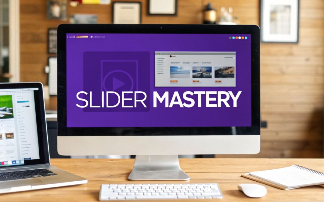
This diagram breaks down the core optimization process that sets the stage for advanced techniques like srcset.

Nailing this flow—from format choice to compression and SEO—is the foundation you'll build your responsive delivery on.
Implementing srcset in a Divi Environment
While Divi and WordPress handle a lot of the responsive image logic behind the scenes, you can get more granular control with a bit of custom code. For instance, you could use a Divi Code Module to implement a custom srcset for a critical hero image, ensuring it’s perfectly tailored for every breakpoint you care about.
A simple srcset looks something like this:

Here, you're telling the browser which image file to grab based on the viewport's width (that’s the w descriptor). This simple attribute prevents a small phone from needlessly downloading a massive 1500px desktop image. For mobile performance, that’s a game-changer.
Making Sliders Truly Accessible
Accessibility is so much more than just slapping some alt text on an image. A truly accessible slider ensures that all users, regardless of their abilities, can understand and interact with its content.
With a global web audience of 5.18 billion, building inclusive experiences isn't just a "nice-to-have"—it's an absolute must.
Make sure you’re considering these key accessibility features:
- Keyboard Navigation: Can users tab through your slides and controls using only their keyboard? They should be able to.
- Pause/Play Controls: Autoplaying sliders can be incredibly distracting or even problematic for users with cognitive disabilities. Always provide obvious controls to pause the animation.
- ARIA Labels: Use
aria-labelattributes to give screen readers context for controls, like "Next Slide" or "Previous Slide" for your navigation arrows.
This level of detail helps your sliders comply with Web Content Accessibility Guidelines (WCAG) and creates a more welcoming site for everyone. Many of the over 835 million WordPress sites use sliders for visual storytelling. By optimizing them for speed and accessibility, you’ll retain visitors who might otherwise leave. After all, users on a site like YouTube, with its 71.4 billion monthly visits, stick around because the experience is seamless.
As our Divimode tutorials often show, focusing on speed and usability helps you avoid becoming one of the 88.5% of users who abandon slow websites. You can find more of these powerful website statistics on diviflash.com.
Remember: An accessible slider is not a feature, it's a requirement. Building for inclusivity from the start respects your audience and often leads to a better, more user-friendly design for everyone.
Building High-Performance Sliders in Divi and Divimode
Alright, now that we’ve covered the theory, it's time to roll up our sleeves and get practical inside the Divi Builder. Crafting a slider that’s both fast and effective isn't just about picking great images; it’s about choosing the right tools for the job.
Within Divi, you have a couple of solid ways to approach sliders, and each comes with its own performance quirks and creative potential. The two main paths are using the native Divi Slider Module or building a "slider" using individual section backgrounds. Let's break them down.
The Slider Module is fantastic for getting a simple carousel up and running in minutes. The catch? It can sometimes try to load every single slide image on page load. If you have a bunch of high-quality images for sliders, this can be a serious performance killer.

Section Backgrounds for More Control
For maximum performance and design flexibility, my go-to method is often using a Divi section with a background image. By stacking multiple sections, each with its own background, you get way more control over lazy-loading and can build far more complex layouts on top of each "slide."
This approach essentially treats each slide as its own standalone hero section, which unlocks the full power of Divi's modules and opens up some cool visual tricks.
- Overlays Are Your Friend: Never put text directly on a busy image. It’s a readability nightmare. Instead, pop into the section's background settings and add a Gradient. A simple black-to-black gradient with the opacity dialed down to 40-60% creates a perfect overlay that makes white text stand out.
- Set a Focal Point: One of the most common headaches is when the best part of your image gets awkwardly cropped on mobile. Divi has a brilliant "Image Focal Point" feature in its background settings. Just click on the most important part of the image—like a person’s face or a key product detail—and Divi will do its best to keep that spot centered as the screen size changes.
Using section backgrounds instead of the Slider Module gives you a level of granular control that is essential for high-performance, custom designs. You can fine-tune every element without being limited by the module's structure.
Unlocking Advanced Sliders with Divimode
While Divi provides a great foundation, specialized tools can take your sliders from simple banners to interactive experiences. For anyone using Divimode tools, Divi Areas Pro opens up a world of possibilities that go way beyond a basic rotating image. It lets you build advanced, trigger-based sliders that can appear as popups, fly-ins, or even dynamic mega menus.
Just imagine what you could do:
- A user clicks a "View Gallery" button, and a gorgeous, full-screen product slider pops up.
- A visitor scrolls halfway down a blog post, triggering a subtle fly-in slider that showcases related articles.
- A user is about to leave the site, and a popup with a testimonial slider appears, offering a last-minute discount.
These aren't just sliders anymore; they're powerful marketing tools. You can build these right inside the Divi Builder and set precise triggers based on user behavior. This approach transforms your images for sliders from passive background decor into active, engaging elements that drive conversions.
If you want to explore more ways to build dynamic content, you can learn more about how to add a Divi carousel to a website using a variety of different tools and techniques.
Common Questions About Images for Sliders
Working with slider images can feel like a balancing act, especially in a powerful builder like Divi where you're juggling stunning visuals with rock-solid performance. I get asked about this stuff all the time, so let's clear up some of the most common questions with practical, no-fluff answers.
What Is the Best File Format for Slider Images in Divi
This one’s easy: the best format depends entirely on what’s in the image.
For nearly all photographs, WebP is the undisputed champion. It’s not uncommon to see a WebP file that’s 25-35% smaller than the same JPEG, with zero visible difference in quality. That’s a huge win for your page load times.
What about graphics with text, logos, or transparent backgrounds? PNG used to be the default choice here. But guess what? WebP also supports transparency and almost always produces a smaller file. So again, WebP often comes out on top.
The best part is you don't have to do much manual work. Modern optimization plugins like ShortPixel or EWWW Image Optimizer can automatically convert your JPEGs and PNGs to WebP and serve them only to browsers that support it. You get the best of both worlds without lifting a finger.
Should I Use the Divi Slider Module or a Section Background
For my money, using an image as a section background is almost always the smarter move, especially for performance and design freedom.
The native Divi Slider Module is fine for a quick and simple job, but it has a bad habit of loading all the slide images at once. If you’ve got a handful of high-resolution photos in there, you can kiss your page speed goodbye.
On the other hand, if you build your "slider" with separate, distinct sections—each with its own background image—you gain so much more control. This approach lets you create far more complex and unique layouts for each "slide" and it works much better with lazy-loading, so only the content currently in view is loaded.
The native module still has its place for a basic slider, but only if you've already squeezed every last kilobyte out of your images.
When it comes to a high-stakes hero section, I go with the section background method every single time. It gives me the granular control I need to nail the performance and ensure the design is pixel-perfect on any device, no compromises.
How Do I Make My Slider Text Readable on All Images
This is non-negotiable. If they can't read it, it doesn't exist.
The single most reliable way to guarantee readable text is to use an image overlay. Jump into Divi’s section or module settings and add a semi-transparent gradient background over your image. A subtle dark gradient—think black set to 40-60% opacity—will make white text pop without totally hiding the beautiful photo underneath.
Another pro-level strategy is to pick your images for sliders with your text in mind from the get-go. Actively look for photos that have natural "quiet spots" for text, like a clean patch of sky, a blurred background, or an empty wall. Placing your headline in those areas gives you built-in contrast.
Finally, a quick trick inside the Divi Builder is to add a very subtle text shadow. It doesn't need to be dramatic; just enough to lift the text off the background and give it that extra bit of clarity.
At Divimode, we build tools like Divi Areas Pro to help you create stunning, high-performance websites. Our plugins empower you to build advanced popups, fly-ins, and other dynamic content that will captivate your audience. See what you can build at https://divimode.com.
More Articles You Will Like