 Alex Martin
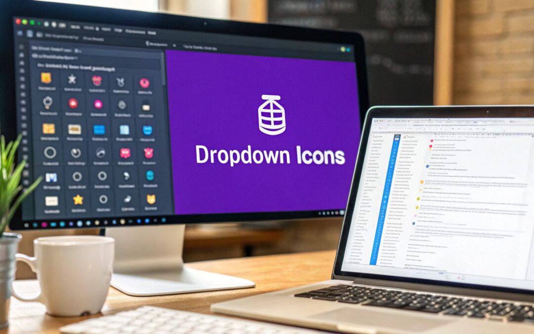
Adding a dropdown menu with icons is one of those small changes that makes a huge difference. It's a simple way to upgrade your Divi website's navigation, making it more visually engaging and a whole lot easier for visitors to find what they're looking for. You're essentially transforming plain text links into scannable visual cues that guide users to their destination faster.
Why Icons Supercharge Your Divi Menus
Let's look past the aesthetics for a moment and talk strategy. Integrating icons into your navigation isn't just about making things look pretty; it's a smart, tactical decision that directly impacts user experience and can lead to real business growth. A well-placed icon communicates an idea much faster than text ever could, cutting down the cognitive load on your visitors.
Put yourself in your user's shoes. When they see a gear icon, they instantly think "Settings." A shopping cart icon clearly means "View Cart." This kind of instant recognition makes navigating your site feel intuitive and effortless.
This is especially critical for e-commerce stores. A clear, visual path to products, categories, or promotions can significantly boost engagement and guide users through the sales funnel more effectively.
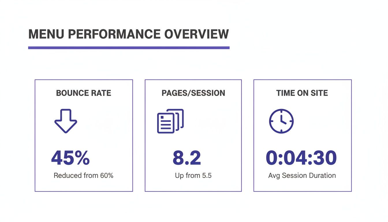
This chart breaks down the performance difference between standard text-only menus and those enhanced with icons.
The data doesn't lie. Adding these simple visual cues leads to lower bounce rates and keeps visitors on your site longer, encouraging them to explore more pages.
The Real-World Impact on Conversions
This isn't just theory; it's proven in the real world. I once worked on a WooCommerce site built with Divi that was struggling with a painfully high 63% bounce rate. Its minimalistic, icon-less dropdown menus were failing to capture user attention, causing visitors to leave almost as soon as they arrived.
By implementing an icon-enhanced mega menu—a setup you can create with tools like Divi Areas Pro—we completely transformed the user journey. The results were nothing short of dramatic.
Here's a quick look at the data, which speaks for itself.
Icon vs Text-Only Dropdown Performance
This table offers a quick comparison, highlighting the tangible benefits of integrating icons into your Divi menus based on real-world e-commerce data.
| Metric | Text-Only Menu (Before) | Icon-Enhanced Menu (After) | Performance Lift |
|---|---|---|---|
| Bounce Rate | 63% | 48% (15-point drop) | -24% |
| Pages per Session | 2.5 | 4.8 | +92% |
| Average Time on Site | 1 min 22 sec | 2 min 27 sec | +79% |
| Average Order Value | $85 | $145 | +71% (1.7x) |
| Products per Order | 2.1 | 3.0 | +43% |
These numbers show just how powerful a well-designed menu can be. We're talking about more than just better engagement; this is a direct line to increased revenue and customer loyalty.
This is where thoughtful design directly impacts your bottom line. An icon-enhanced dropdown menu isn't just a minor tweak; it's a powerful conversion optimization tool. To see these principles in action, check out some inspiring menu designs over at Muzli.
Gathering Your Tools and Icon Resources
Before we jump into the Divi Builder and start slinging code, a little prep work will make everything go much smoother. Trust me, getting your assets lined up first saves a ton of headaches later.
First things first, make sure your Divi theme and any related plugins, like Divi Areas Pro, are fully up to date. You always want to be working with the latest and greatest to avoid any weird compatibility bugs.
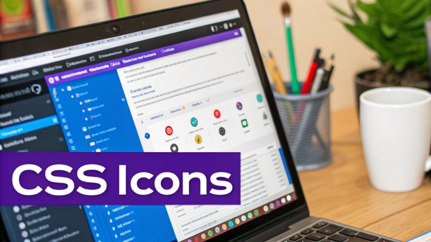
With your Divi environment good to go, it's time to think about the icons themselves. This is a bigger decision than you might think, as it affects both the look of your menu and how quickly it loads.
Choosing the Right Icon Library
There are a handful of excellent icon libraries out there, but a few have become my go-to's for Divi projects. Think of these as your toolkit for finding crisp, professional icons that will seriously elevate your site's navigation.
Here are the ones I recommend most often:
- Font Awesome: This is pretty much the industry standard, and for good reason. It has a massive library with different styles (solid, regular, light) and fantastic documentation, so finding the perfect icon is a breeze.
- Bootstrap Icons: If you're going for a clean, modern look, these are a great choice. They're designed as SVGs from the ground up, which is fantastic for keeping things sharp on any screen and good for performance.
- Flaticon: Need something specific or a bit more unique? Flaticon is an enormous resource with millions of vector icons. The only catch is you'll likely be managing individual icon files instead of loading a single, convenient library.
Most of the time, I find myself turning to Font Awesome. Their website's search and clear categorization just saves so much time compared to digging through less organized collections.
SVG vs. Font Icons: Which Should You Use?
As you start grabbing icons, you'll run into two main formats: SVG (Scalable Vector Graphics) and icon fonts. SVGs are essentially code-based image files, meaning they can scale to any size without losing a pixel of quality. Icon fonts, on the other hand, bundle icons into a single font file, just like the text you're reading now.
For pure performance and razor-sharp rendering, SVGs are technically the better choice. They often have smaller file sizes and just look cleaner. That said, icon fonts are incredibly convenient since you can style them with simple CSS like
colorandfont-size.
So, what's the verdict? Honestly, it depends on the project. If you're just adding a few icons to a menu, either format will work perfectly fine. But for more complex sites where every kilobyte counts, leaning into SVGs is a smart move.
While you're gathering your tools, it’s also a good idea to have a handy Rem Converter tool bookmarked. It's a lifesaver for making sure your icon sizes and spacing scale beautifully across different devices.
The Lightweight CSS Method for Adding Icons
If you'd rather not install another plugin just for some menu icons, the pure CSS method is your best friend. It’s a fast, lightweight, and surprisingly powerful way to get the job done right inside Divi. This approach is perfect for anyone who's comfortable with a little bit of code and wants to keep their site as lean and fast as possible.
The magic here is pretty simple, actually. We're going to combine two things: custom CSS classes, which we'll add in the WordPress Menu editor, and the ::before pseudo-element in our stylesheet. This combo lets us target specific menu items and pop an icon right in front of the text. It's a clean, elegant solution that doesn't clutter up your HTML.
Assigning Custom CSS Classes to Menu Items
First things first, we need a way to tell our CSS which menu item gets which icon. The cleanest way to handle this is by giving a unique CSS class to each menu link you want to style.
Head over to Appearance > Menus in your WordPress dashboard. Look for the Screen Options tab in the top right corner, click it, and make sure the "CSS Classes" box is checked. This adds a new input field to every single item in your menu editor.
Now, you can add a descriptive class name to your menu items. For a "Services" link, for instance, you could add menu-icon-services. The key is to keep them simple and consistent so you don't have to guess later.
- Be Specific: Use clear names like
menu-icon-homeormenu-icon-contact. - Be Consistent: Stick to a naming pattern (e.g.,
menu-icon-[item-name]). This will make managing your CSS so much easier down the road.
Once you’ve assigned classes to all the items that need an icon, just save your menu. This simple step is the foundation for all the styling we're about to do.
Crafting the CSS for Your Icons
With your classes in place, it’s time for the fun part. We're going to add a bit of custom CSS to place an icon before each of those menu items you just tagged. You can drop this code into the Divi Theme Options Custom CSS box or, if you're using one, your child theme's style.css file.
Let's say you're using Font Awesome for your icons. The secret ingredient is the icon's Unicode. When you're on a Font Awesome icon's page, you'll see a code like f015 for the home icon. That's what we'll use in the content property of our CSS.
Here’s a real-world example for a "Home" menu item that we gave the class menu-icon-home:
.menu-icon-home a::before {
font-family: "Font Awesome 6 Free"; /* Or your specific icon font /
font-weight: 900; / Use 900 for solid icons /
content: "\f015"; / The Unicode for the home icon /
margin-right: 8px; / Adds a little breathing room /
vertical-align: middle; / Helps with vertical alignment */
}
Pro Tip: Don't skip the
font-familyandfont-weightproperties! You have to declare the correct Font Awesome family, and the weight often determines the icon style (900is for solid,400is for regular). If you forget these, your icon will probably just show up as a blank square.
From here, you just repeat this CSS block for each menu item. Swap out the class name (like .menu-icon-contact) and find the right Unicode value (\f0e0 for an envelope icon, maybe). This method gives you pixel-perfect control over every single icon in your dropdown menu.
For more advanced styling tricks, diving into a good guide on responsive web design with CSS can open up a whole new world of possibilities. Ultimately, this pure CSS technique keeps your menu loading fast and looking sharp on any device.
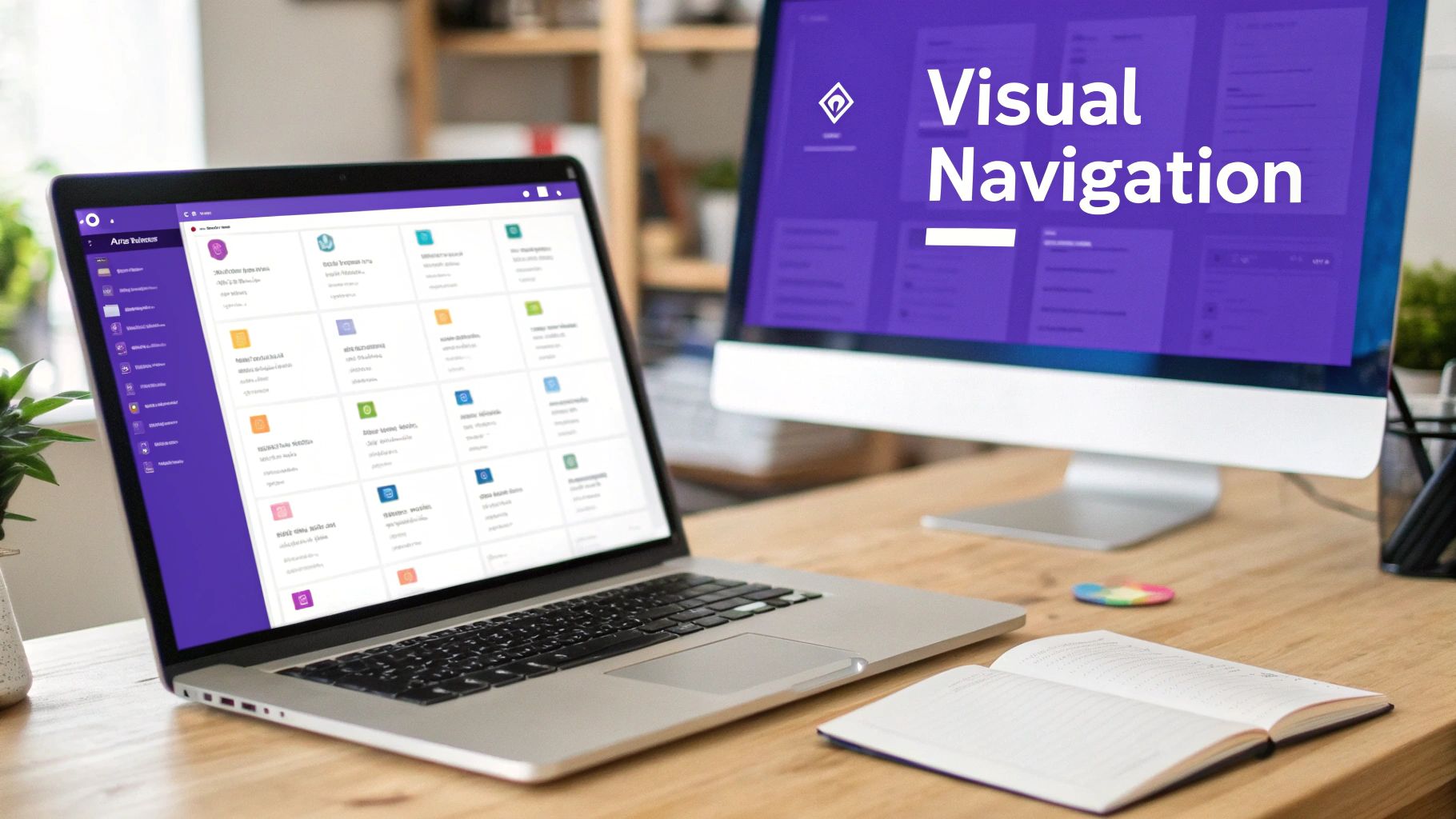
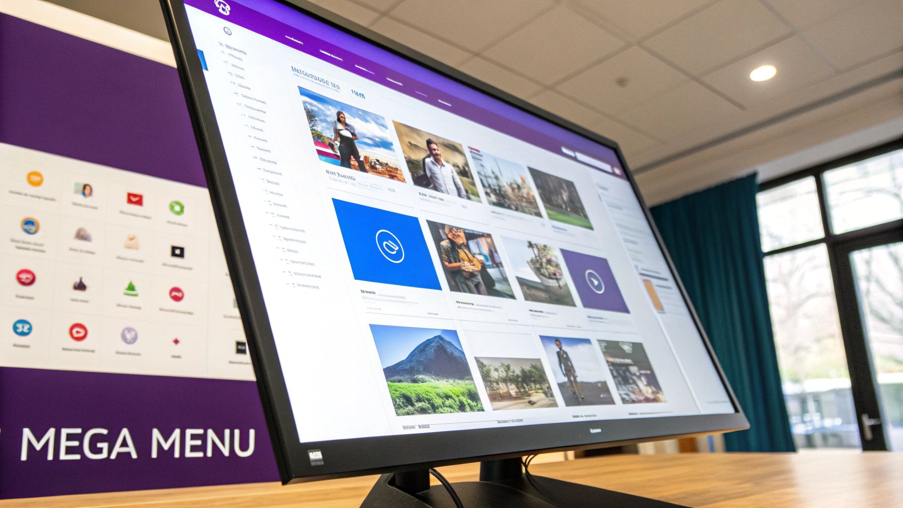
Building Advanced Mega Menus With Divi Areas Pro
While the pure CSS method is fantastic for adding simple icons, there are times you just need more firepower. When you want to build a truly immersive dropdown menu with icons, images, buttons, and even Divi modules, it's time to move beyond CSS and into a more powerful tool.
This is where plugins like Divi Areas Pro really shine. It transforms your standard dropdown into a fully-fledged mega menu. Instead of just placing a single icon next to some text, you can design an entire layout using the familiar Divi Builder and trigger it from a navigation link. This approach completely opens up the creative possibilities.
Unlocking Design Freedom With Divi Areas
The core concept is refreshingly simple: you create a "Divi Area," which is essentially a blank canvas you can design with any Divi modules you like. You can build complex, multi-column layouts, add promotional banners, showcase featured products from your WooCommerce store, or even embed a contact form directly into your navigation.
For e-commerce websites, this is a total game-changer. Imagine a "Shop" dropdown that doesn't just list text categories, but actually displays high-quality images of your best-selling products with their own "Add to Cart" buttons. A simple CSS solution could never get you that level of interactivity and visual punch.
As you can see, the plugin gives you incredibly granular control over how and where your custom menu content appears, moving you far beyond what basic dropdowns can do.
How to Trigger a Divi Area from Your Menu
Once you've designed your perfect mega menu layout inside a Divi Area, the next step is connecting it to your main navigation. Divi Areas Pro makes this process surprisingly straightforward.
You won't actually be using the standard WordPress menu dropdown functionality. Instead, you'll create a normal top-level menu item (like "Products") and use that link as a trigger.
Here’s the basic workflow:
- Create a New Divi Area: Jump in and build your custom dropdown content using the Divi Builder. Add your icons, images, text, blurbs—whatever you need.
- Configure the Area Type: In the settings, set the Area Type to "Tooltip." This tells the plugin you want the content to pop up relative to another element on the page.
- Set the Trigger: Next, you'll define a "Trigger" in the Area settings. You can set this to be a specific CSS class that you'll add to your menu item.
- Assign the CSS Class: Finally, just like in our pure CSS method, head to Appearance > Menus and add your unique trigger class (e.g.,
show-products-mega-menu) to the CSS Classes field on the menu link you want to use.
Now, when a user hovers over or clicks that menu item, Divi Areas Pro will automatically display your custom-built mega menu instead of a boring, text-based dropdown.
The real power here is in the limitless customization. You are no longer constrained by the default menu structure. If you can build it in Divi, you can put it in your dropdown menu.
For anyone looking to dive into this advanced functionality, you can learn more about its full capabilities on the official Divi Areas Pro product page. This method provides a level of dynamic control and user experience that simple code snippets just can't replicate, making it an essential tool for serious Divi developers and store owners.
Optimizing Your Menu for Mobile and UX
Creating a great-looking dropdown menu with icons is only half the job. If it's clunky, slow, or a pain to use—especially on a phone—all that design work is wasted. Real success comes from nailing the small details that create a smooth, intuitive user experience (UX) on every single device.
A big question I see a lot is about the trigger: should users hover or click to open a dropdown? It's a classic debate. Recent usability studies actually show that for desktop users, hover-to-open menus can be up to 28.57% faster for getting things done. This is especially true when icons give clear visual clues, letting users scan and "forage" for information without having to commit to a click.
But that speed advantage completely disappears on touch devices where "hover" isn't a thing. This is a perfect example of why thinking mobile-first is so critical for good UX.
Enhancing Mobile Tap Targets
There's nothing more annoying than trying to jab a tiny link with your thumb on a small screen. That's where generous padding and large tap targets become your best friends. Your icons and menu text need enough breathing room to prevent those frustrating accidental taps.
Here are a few practical CSS tweaks you can pop into your stylesheet to make your menu more touch-friendly:
- Increase Padding: Add more space inside your menu item links. Instead of just a few pixels, try something more generous like
padding: 12px 16px;. This makes the whole area clickable without making the text look crowded. - Set a Minimum Height: Enforce a minimum height on menu items with something like
min-height: 48px;. This guarantees every link is tall enough to be easily tapped, even if the text itself is short. - Enlarge Icon Size: Use a larger
font-sizefor your icons specifically on mobile. This makes them more prominent and easier to aim for.
Thinking beyond just mobile, it's always a good idea to brush up on the broader best practices for website navigation to ensure your menus are truly seamless.
The goal is to make interaction feel effortless. A user should never have to pinch-and-zoom just to accurately tap a navigation link. Ample spacing is one of the simplest and most effective ways to build a user-friendly mobile menu.
Prioritizing Web Accessibility
A great user experience has to be an accessible one. For someone using a screen reader, an icon without any context is just noise. It's so important to make sure your visual cues have a non-visual equivalent.
When you're adding icons with HTML, a simple way to do this is by including text that's visually hidden but still available to screen readers. You can achieve this by adding a <span> with a special CSS class.
For instance:<i class="fa fa-home" aria-hidden="true"></i> <span class="screen-reader-text">Home</span>
And the CSS to hide that text visually would be:
.screen-reader-text { position: absolute; left: -9999px; }
This simple addition makes your dropdown menu with icons usable for everyone, ensuring your beautiful design doesn't accidentally create barriers. For even more fine-tuned control, you can also learn how to show a different Divi navigation menu on desktop, tablet, and phone.
Common Questions About Divi Menus and Icons
Even with the best guide in hand, you’ll inevitably hit a few snags when you're deep in a build. Getting a pixel-perfect dropdown menu with icons can have its tricky moments, so let's walk through some of the most common questions and sticking points you might run into.
Think of this as your go-to reference for troubleshooting. Getting these little details right is what separates a good menu from a great one.
Why Are My Icons Showing Up as Empty Squares?
This is, without a doubt, the most common headache people run into, and it almost always points to the same culprit. If you're staring at blank squares where your beautiful icons should be, it’s a sure sign the browser can't find or render the icon font file.
Before you start pulling your hair out, run through this quick checklist:
- Font Family Mismatch: Did you declare the exact
font-familyin your CSS that your icon library requires? For example, it must be"Font Awesome 6 Free", not just "Font Awesome". Typos happen! - Missing Font Weight: This is a big one, especially with Font Awesome. Solid icons often need a
font-weight: 900;, while regular styles might use400. If that line is missing or incorrect, the icon simply won't show up. - Icon Library Not Loaded: Did you remember to enqueue or link to the icon library's stylesheet? Without it, the browser has no idea what a code like
\f015is supposed to be. It's just gibberish.
Nine times out of ten, a quick check of these three things will make those dreaded empty squares disappear.
Can I Add Icons to Divi's Mobile Menu?
Yes, you absolutely can—and you should! The same CSS ::before pseudo-element trick we've been using works just as well for the mobile menu. The only difference is that you'll likely need a more specific CSS selector to target the mobile menu items correctly.
The best way to find the right class is to use your browser's Inspect tool on the mobile view of your site. It's often something like .mobile_menu a. From there, your CSS would look something like this:
.mobile_menu .menu-icon-home a::before {
/* Your icon styles here */
font-family: "Font Awesome 6 Free";
content: "\f015";
margin-right: 10px;
}
Adding that extra layer of specificity ensures your icons show up consistently on every device, which is a small touch that really polishes the mobile experience.
Is It Better to Use CSS or a Plugin Like Divi Areas Pro?
Honestly, there's no single "best" answer here. It all comes down to what you're trying to achieve. It’s about picking the right tool for the job.
Think of it like this: CSS is a scalpel, perfect for precise, lightweight additions like a single icon next to text. Divi Areas Pro is a full workshop, letting you build complex, feature-rich mega menus with layouts, images, and buttons.
Go with the CSS method if your main goals are speed and simplicity. It's perfect for adding simple visual cues without any extra performance overhead. It's clean, efficient, and gets the job done.
Choose Divi Areas Pro when you need more than just a simple icon. If your vision is to create an immersive, interactive dropdown experience—like showing off products or embedding promotional content right in your navigation—then a plugin gives you the creative power that pure CSS just can't match.
Ready to build truly powerful, interactive menus that go far beyond simple icons? Discover what Divimode can do for your Divi website and explore the limitless possibilities with Divi Areas Pro. Learn more at divimode.com.
More Articles You Will Like


