
Let's be honest, nobody enjoys filling out long, generic forms. They feel like a chore. Forms with conditional logic completely change the game, turning a static, one-size-fits-all task into a dynamic, almost conversational experience.
Instead of hitting every visitor with the same wall of questions, these smart forms adapt in real-time based on what the user types or selects. They only show the fields that actually matter, which is a massive win for reducing friction and gently guiding people toward that final "submit" button.
Why Smart Forms Are No Longer an Option

Those old-school static forms are a relic from a less interactive web. They're notorious for creating a poor user experience, forcing people to sift through irrelevant questions. The result? Frustration and sky-high abandonment rates. Dynamic forms, on the other hand, create a clean, streamlined path for the user.
This isn't just about making things look nice; it's a strategy that directly impacts your bottom line.
- Reduces Form Fatigue: By showing fewer fields at once, you make the form feel less intimidating. This simple change encourages more people to start filling it out—and actually finish.
- Improves Data Quality: You get cleaner, more relevant information when you only ask questions that apply to a user's specific situation. A lead interested in "Web Design" is going to give you very different—and more valuable—data than one interested in "SEO."
- Boosts Conversion Rates: A simpler, more personal journey naturally leads to more submissions. It doesn't matter if it's for a lead magnet, a quote request, or a product purchase—the principle is the same.
Standing Out in a Competitive Space
In the Divi world, creating a superior user journey is how you get ahead. Divi powers over 2.1 million live websites globally, so we're talking about a massive community where users have come to expect advanced features. The data backs this up, too. Sites using conditional logic see major conversion boosts. For example, exit-intent popups with smart forms can recover up to 10-15% of abandoning visitors. You can dig deeper into Divi's market share over at BuiltWith.
By adapting to user input, you turn a monologue into a dialogue. The form listens and responds, making the user feel understood rather than interrogated. This small shift in interaction design is what separates a generic website from a high-performing conversion tool.
Sometimes, off-the-shelf form builders just don't cut it for complex business needs. In those cases, a bespoke software development service can deliver the exact functionality you're dreaming of.
For most Divi users, though, a powerful plugin is the perfect middle ground. You get deep customization without ever touching a line of code. This guide will show you exactly how to make it happen.
Now that we've covered the why, let's get our hands dirty with the how. This is where we build the engine that will power your forms with conditional logic. Getting started with Divi Areas Pro isn't just about installing another plugin; it's about putting a flexible system in place for any kind of conditional content you can dream up.
The concept is beautifully simple: you build your dynamic content inside what's called a "Divi Area," and then you can pop that Area anywhere on your site based on rules you get to define. This whole approach keeps your designs tidy and makes managing complex logic way less of a headache.
Choosing the Right Area Type
Your first big decision is picking the right type of Area for your form. This choice has a direct impact on how the user is going to interact with it, so choose wisely.
- Popup: This is your go-to for high-priority forms. Think lead magnets, newsletter sign-ups, or urgent announcements. It’s designed to grab a user's attention immediately.
- Fly-in: A much more subtle option that slides into view without taking over the whole screen. It works really well for related offers or secondary calls-to-action that shouldn't interrupt the main content.
- Inline Area: This is the most seamless of the bunch. An Inline Area appears right inside your page layout, making it perfect for multi-step forms or for progressively revealing questions as a user makes selections.
For most forms with conditional logic, you'll probably find that an Inline Area delivers the smoothest experience because it feels like a natural part of the page itself.
Key Settings to Configure
Once you create a new Divi Area, you'll find yourself looking at the familiar Divi Builder interface. You can design your form right here using Divi’s Contact Form module or whatever form builder plugin you prefer. But the real magic is in the Divi Areas Pro settings that wrap around your design—this is where you lay the groundwork for your visibility rules.
The web has come a long way, and tools like this have become essential. Since it hit the scene around 2019, Divi Areas Pro has been helping its 150,000+ users turn static Divi sites into dynamic, responsive experiences. This isn't just about bells and whistles; conditional forms have been shown to boost completion rates by as much as 25% simply by hiding irrelevant fields. On top of that, exit-intent popups can capture 7-10% more leads. You can learn more about the plugin on the official Divimode website.
My advice? Before you even touch the rules, focus on building the content you want to show or hide. Get the form looking absolutely perfect inside the Divi Area first. The logic can wait.
Think of each Divi Area as a self-contained Lego block of content, just waiting for a signal. By designing these pieces first, you can then switch gears and focus entirely on the trigger conditions later. It keeps your workflow clean and your sanity intact. For a deeper look at the initial setup, check out our guide on how to design dynamic content with Divi Areas Pro. Nailing this foundation makes building out even the most complex workflows much more manageable.
Building Your First Conditional Form Workflow
Theory is great, but there's nothing like getting your hands dirty to see how things really work. Let's walk through building a dynamic quote request form from the ground up. We'll use conditional logic to create a much smarter, more personalized experience for the user.
Our goal is simple: start with one key question and then reveal specific, relevant fields based on the user's choice. This is the best way to see how forms with conditional logic can turn a generic contact form into an intelligent lead-qualifying machine.
Starting With a Simple Choice
First things first, you'll need a new Divi Area and a basic form to work with. The most critical field at this point is the one that kicks everything off—a dropdown or a set of radio buttons that asks, "What service are you interested in?"
For our example, we’ll keep it straightforward with two options:
- Web Design
- SEO Services
This initial question is our trigger. The user's answer will determine which follow-up questions we show them. This simple step immediately makes the form feel more interactive and way less intimidating than just dumping every possible field on the screen at once.
This is the basic three-step process you'll follow when setting up a new area in Divi.
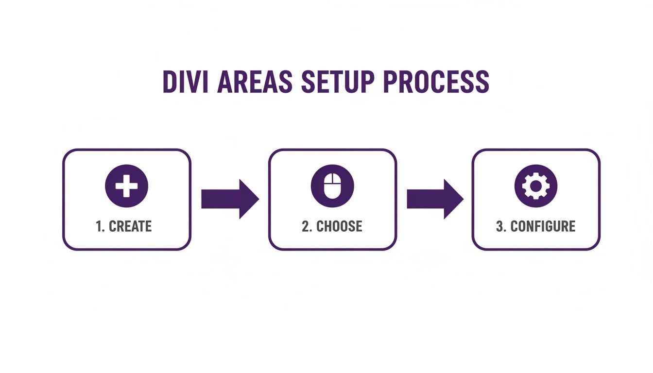
As you can see, the configuration happens after you've created and chosen the type of Divi Area. This keeps the design and logic phases separate, which makes for a much cleaner workflow.
Creating Conditional Content Sections
Now for the fun part. Inside that same Divi Area, create two separate Divi sections. Each section will hold the unique fields for one of our services. Think of them as containers that we can show or hide on command.
For the Web Design Section:
This section will contain fields that only make sense for a web design project. Good examples include:
- Number of Pages: A text field where the user can enter a number.
- E-commerce Features: A checkbox asking if they need an online store.
For the SEO Services Section:
This section is all about SEO-specific questions:
- Your Website URL: A field to grab their current site address.
- Target Keywords: A text area for them to list keywords they're hoping to rank for.
Pro Tip: By grouping related fields into their own Divi sections, you make it incredibly easy to manage visibility. Toggling an entire section is far more powerful and scalable than trying to show or hide individual fields one by one.
Configuring the Visibility Rules
With our content blocks ready, it’s time to wire up the logic in Divi Areas Pro. This is where you tell Divi when to show each section based on the user's initial choice.
You'll create a visibility rule for each of your new sections. It’s a simple "if-then" statement.
The rule for the "Web Design" section will be something like: "Only show this section IF the 'Service' field has a value of 'Web Design'." You'll do the exact same thing for the SEO section, just linking it to the 'SEO Services' option instead.
Once you hit save, the form becomes truly dynamic. By default, the user only sees that first, simple question. The moment they make a selection, the corresponding fields appear instantly, creating a smooth and intelligent interaction.
If you're looking for more ideas on form design, check out our guide on how to create a lead generation page using Divi's contact form module.
Common Conditional Logic Scenarios
To give you a better idea of how versatile this is, here are a few common scenarios where conditional logic really shines. This is just the tip of the iceberg, but it shows how you can adapt your forms to all kinds of user inputs.
| If a User… | Then Show a Field For… | Best Used In |
|---|---|---|
| Selects "Other" in a dropdown | A text box to specify their answer | Surveys, registration forms |
| Indicates they are a "Business" | Company Name and Job Title | Contact or lead gen forms |
| Chooses a specific country | State/Province dropdown list | Shipping or billing forms |
| Clicks a "Yes" radio button | An upload field for documents | Application or support forms |
| Enters a budget over a certain amount | A request to book a consultation call | High-ticket quote forms |
These examples show how you can gather more precise information without overwhelming users with irrelevant fields. It’s all about asking the right questions at the right time.
Unlocking Advanced Logic for WooCommerce

If you're running a Divi e-commerce store, integrating forms with conditional logic is a direct line to boosting your revenue. For WooCommerce shops, this technology elevates a simple form into a dynamic sales tool that reacts to what your shoppers are doing in real time. It's how you create those highly targeted offers that feel personal and perfectly timed.
Think about it: a popup with a special shipping offer that only appears once a customer's cart total hits $100. This is the kind of smart, automated nudge that gets shoppers to add just one more item to their cart, directly increasing your average order value with zero manual effort.
Triggering Offers Based on Cart Contents
One of my favorite ways to use this is to trigger conditional forms based on the actual contents of the cart. With a tool like Divi Areas Pro, you can set up rules that literally watch what customers are buying and respond with perfectly relevant upsells or cross-sells.
Let’s walk through a real-world scenario. A customer adds a new camera to their cart. Bam! A fly-in form instantly appears asking, "Need a memory card for your new camera?" This form can even display a few options to add related accessories straight to their cart. This is so much more effective than a generic "You might also like" section because it’s immediate and directly tied to the user's action.
By linking your forms to specific products or product categories, you create a guided shopping experience. It's like having a helpful salesperson who knows exactly what to suggest and when to suggest it, all powered by automated logic.
Serving Unique Content to Different User Roles
Conditional logic isn't just for guest shoppers—it’s also a game-changer for managing different customer segments, especially if you're in the B2B or wholesale space. You can use a user's role as a trigger to display completely different content or forms.
This opens up a world of possibilities for creating exclusive experiences:
- Wholesale Customers: Show a bulk order form or a special pricing inquiry form that is completely hidden from your regular retail visitors.
- Logged-In Members: Display a unique discount code or a feedback survey that only appears for your most loyal, logged-in customers.
- First-Time Visitors: Greet them with a popup offering a 10% discount on their first purchase—a form that vanishes once they become a registered customer.
These user-role conditions let you build a multi-layered site where the pricing, offers, and even the available forms change based on who is browsing. This level of personalization makes customers feel seen and valued, which is a massive driver for loyalty and repeat business.
To dive deeper into customizing your online store, check out our guide on using WooCommerce for Divi. When you combine Divi Areas Pro with WooCommerce, you stop having a static product catalog and start running a dynamic sales environment that actively works to increase your conversions.
Getting Performance and User Experience Right
So, you've built a form with some really clever conditional logic. That's a huge step, but it's only half the battle. If that form is slow, clunky, or confusing to use, all that hard work might as well go down the drain. A truly effective form has to be both fast and friendly, creating a seamless experience that actually encourages people to finish it.
When it comes to user experience (UX), the little details are everything. Think about it: when new fields appear based on a user's selection, they shouldn't just blink into existence. Using a subtle animation, like a gentle fade-in, gives the user a clear signal that the form has responded to their input. It's a small touch that prevents confusion and makes the whole interaction feel much more polished.
Another big UX killer is a jarring layout shift. You’ve probably seen it before—you click an option, and the whole page jumps around as new fields load in. It's disorienting and makes the user lose their place. A well-designed conditional form should feel stable and predictable, with new elements sliding or fading smoothly into the existing layout.
Keeping Your Forms Fast and Lightweight
Performance is just as critical as the visual experience. It's true that complex forms with conditional logic can add extra scripts and processing that might slow your page down. The good news is that well-built plugins, like Divi Areas Pro, are designed with performance in mind from the ground up.
Here are a few technical tips I've learned to keep things running smoothly:
- Efficient Script Loading: A good plugin loads its logic scripts efficiently so they don't block the initial page render. This keeps the performance impact to an absolute minimum.
- Keep Rules Simple: I know it’s tempting to build incredibly complex, deeply nested conditional rules. But in most cases, simpler is better. Overly complicated logic can increase the processing time on the user's end.
- Optimize Your Content: Remember, you’re often loading entire Divi sections. Before you even get to the logic, make sure any images or heavy modules inside those conditional areas are fully optimized for the web.
The real goal here is to find that perfect balance between powerful functionality and a responsive, snappy interface. A form that is both intelligent and fast is a form that actually converts.
If you want to really dig into what "converts" means and how to measure it, you need to understand your conversion rate. For a fantastic primer on this, check out this guide on What Is Conversion Rate in Marketing—it breaks down how to track and improve it.
Best Practices for a Smooth User Journey
Creating that great experience really comes down to a few core practices I always follow.
First off, always give clear feedback. If a selection needs a second to process before showing the next step, use a simple loading indicator. This tells the user the form is working and prevents them from getting impatient and clicking away. Also, make sure your form fields have crystal-clear labels and instructions, especially for any new fields that appear conditionally.
Finally, and I can't stress this enough, test relentlessly. Test on your phone. Test on a tablet. Test on your laptop. A conditional form that works perfectly on a big desktop monitor might feel awkward or even break on a mobile screen. You have to run through every possible path a user could take to ensure the experience is consistent and bug-free for everyone. That kind of attention to detail is what separates a pretty good form from a truly great one.
Your Burning Questions About Divi Conditional Logic
As you start digging into dynamic forms, a few questions always seem to surface. Getting those answered upfront can save you a ton of headaches and help you build with more confidence. Let’s tackle the most common ones I hear from Divi users about conditional logic.
Compatibility is usually at the top of the list. It’s a fair question—nobody wants to invest time in a system only to discover it won’t play nice with their go-to tools.
Can I Use Divi Areas Pro With Any Form Plugin?
Yes, you absolutely can. This is one of the biggest strengths of this approach. We designed Divi Areas Pro to be completely form-agnostic, meaning it works with just about any form plugin you throw at it.
That includes Divi’s built-in Contact Form module, heavy-hitters like Gravity Forms and WPForms, and pretty much anything else.
The magic is that our system doesn't mess with your form's internal fields directly. Instead, it controls the visibility of the entire Divi section, row, or module that holds your form. This gives you total freedom to use your favorite form builder while still wrapping it in powerful display rules.
Will Conditional Logic Kill My Site Speed?
Performance should always be a priority, and it's smart to question how any new feature will impact it. Good news: Divi Areas Pro was engineered from the ground up to be lightweight. The logic checks that decide whether to show or hide content are incredibly efficient and run in a flash.
In some cases, using conditional logic can even improve your initial page load times. Think about it: content is often loaded only when a specific condition is met, so not all assets have to be rendered right away. As long as you stick to best practices—like optimizing your images and avoiding crazy-complex nested rules—you can implement advanced logic without seeing a noticeable hit to your site speed.
The real power here is controlling entire content blocks, not just single form fields. While some form builders let you hide a text field, Divi Areas Pro lets you swap out entirely different forms, layouts, or calls-to-action based on what a user chooses.
What's the Big Deal About Hiding a Section vs. a Single Field?
This distinction is what separates a simple tweak from a powerful strategy. Hiding a single field is a minor adjustment. But showing or hiding an entire Divi section? That unlocks a world of possibilities for creating adaptive user journeys.
For instance, a simple "Yes/No" radio button could do much more than just reveal an extra text box. It could trigger a completely different multi-step qualification form to appear inside a popup.
This lets you funnel different user segments down entirely separate paths without ever forcing them to a new page. It’s the secret to building truly dynamic and personal interactions right on your website.
Ready to build smarter forms that actually convert? Divimode gives you the tools and expert guidance you need. Get started with Divi Areas Pro and see what a difference a truly dynamic user experience can make.
More Articles You Will Like


