 Alex Martin
Building a back button in CSS is more than just a styling exercise. It's about giving users a reliable, predictable way to navigate. While CSS handles the visuals—colors, icons, hover effects—it's the HTML structure and a bit of JavaScript that bring it to life and make it work for everyone.
Why Your Back Button Is a Critical UX Tool
That humble back button is one of the most powerful tools in a user's arsenal. It’s a safety net, letting them undo an action, retreat from a dead end, or just retrace their steps. When a site’s navigation gets confusing, the back button is the universal fallback.
And yet, this critical component is so often an afterthought in the design process.
Ignoring it leads directly to user frustration. Think about the last time you filled out a long form, accidentally clicked a link, and hit "back" only to find all your progress wiped out. That kind of friction kills trust and sends bounce rates soaring. A well-designed custom back button, powered by CSS and a fallback link, turns that potential disaster into a signal of reliability.
The Psychology of Going Back
There’s a surprising amount of anxiety tied to navigation. The browser's native back button is a heavyweight, accounting for a massive 43% of all user interactions on websites. But here’s the kicker: a study found that 65% of users hesitate before clicking it, especially in multi-step processes like checkouts, because they fear losing data or getting sent somewhere unexpected. You can read more about these fascinating back button UX insights on Smashing Magazine.
By providing a clearly visible, custom "Go Back" button, you’re not just offering a navigation path; you're offering reassurance. You’re telling the user, "It's safe to explore here. You can always return to where you were."
A Strategic Asset for Retention
It's time to stop thinking of the back button as a simple styled element and start seeing it as a strategic UX tool. This is non-negotiable for Divi and WooCommerce sites, where users are navigating complex product pages, categories, and checkout funnels. A dependable back button is an absolute must.
Beyond just the button's appearance, it's essential to understand why responsive web design is crucial for user experience, because it directly impacts how easily users can interact with your site—including their ability to go back. If you want a deeper dive into the fundamentals, our guide explains in detail what user experience design is.
This shift in perspective transforms a simple CSS element into a powerful tool for keeping users on your site.
Building an Accessible HTML Foundation
Before you touch a single line of CSS for your back button, we need to talk about its bones: the HTML. I've seen countless beautifully styled buttons that are completely useless to screen readers or that break the second a script fails to load. Getting the HTML right from the very beginning isn't just a best practice; it's non-negotiable for building something that actually works for everyone.
The first big decision you'll face is whether to use an <a> tag or a <button> tag. They might look the same after some CSS magic, but semantically, they're worlds apart. An <a> tag is for navigation—it takes the user to a new URL. A <button>, on the other hand, is for actions, like submitting a form or opening a popup on the same page.
For a back button, the <a> tag is almost always the right tool for the job. It properly signals a link to a previous location and, most importantly, gives us a built-in safety net.
Anchor or Button? The Right Choice
The core principle I always follow here is progressive enhancement. You should always provide a fallback href attribute on your anchor tag. Point it to a logical previous page, like a category archive or even the homepage. This way, if your JavaScript fails to load or is disabled by the user, the link doesn't just die—it remains a perfectly functional navigation tool.
A back button without a fallback
hrefis just a fragile component waiting to break. The goal is to create a resilient user experience that works under any condition, not just the ideal ones.
Nailing this accessible foundation is a huge part of meeting modern standards, like those outlined in the ADA compliant website requirements, and ensuring your site is truly usable. For a deeper dive on this, check out our comprehensive guide on https://divimode.com/website-accessibility-best-practices/.
This simple flowchart really drives home the point about a user's journey and what happens when a back button fails them.
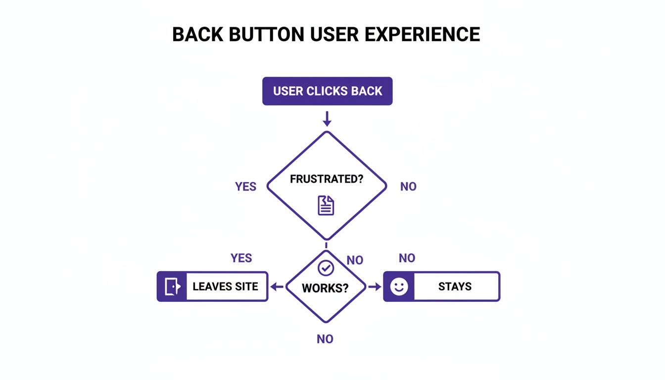
The takeaway is crystal clear: a functional, predictable back button keeps people on your site. A broken one is a one-way ticket to a higher bounce rate.
Essential HTML for Accessibility
Let's look at some real-world HTML snippets. If you're creating an icon-only button, the aria-label attribute is an absolute must. It provides a text description that screen readers can announce, giving context to users who can't see the visual icon.
- Icon-Only Button: When you nest an SVG inside an anchor tag, that
aria-labelis what tells assistive technologies what the button actually does. - Text and Icon Button: Combining text with an icon is my preferred approach. It offers the best of both worlds—a quick visual cue for sighted users and an explicit text label for everyone.
- Fallback URL: Notice the
hrefattribute. It points to a sensible backup location, ensuring the link works even if our fancyhistory.back()JavaScript fails.
By starting with semantic and accessible HTML like this, you create a solid, reliable foundation. Only after this is in place should you move on to styling your back button in CSS. This approach ensures your button is robust, user-friendly, and inclusive from the ground up.
Bringing Your Back Button to Life with CSS
Once your HTML is locked in, it's time for the fun part: making your back button look and feel like it belongs on your site. Styling a back button in CSS is about more than just picking a color; it's about crafting an experience and giving users clear visual cues that this is an element they can interact with.
We'll start with the basics. Things like padding give the text inside some breathing room, making the button feel less cramped. A touch of border-radius can soften the corners for a more modern, approachable look. Of course, background-color and color will set the default appearance, which you’ll want to match with your Divi theme's branding.
Crafting Interactive States for User Feedback
A static button is a missed opportunity. People expect things to react when they move their mouse or tab over to them, and CSS gives us some powerful pseudo-classes to make that happen. These aren't just for show—they're fundamental to good usability.
- :hover: This is the one everyone knows. When a user's cursor glides over the button, you want to signal that it's clickable. A simple change in
background-coloror textcolordoes the job perfectly. - :focus: Just as important, especially for accessibility. This state kicks in when someone uses their keyboard to navigate to the button. It's crucial to give them a clear visual indicator, like a bold
outlineor abox-shadow, so they know exactly where they are on the page. - :active: This state gives immediate feedback the moment a user clicks. A subtle
transform: scale(0.98)creates a satisfying "pushed in" effect, confirming the click was registered right before the page changes.
This isn't just a design opinion—it's backed by data. Nailing the CSS for your back button can have a measurable impact. Studies on major e-commerce sites have shown that clear hover states can boost click-through rates by as much as 22%. Users need that feedback. You can dive deeper into this by reading the full report on button state trends from DesignRush.
My personal rule of thumb is to never leave a button's
:focusstate to the browser default. Taking a few extra seconds to style a custom, on-brand focus ring maintains design consistency while dramatically improving the experience for keyboard navigators.
For a quick overview, here's a table of the pseudo-classes we're using to add that essential layer of interactivity.
CSS Properties for Interactive Button States
| Pseudo-Class | Purpose | Example CSS Properties |
|---|---|---|
| :hover | Provides visual feedback when the user's cursor is over the button. | background-color, color, box-shadow, transform |
| :focus | Indicates when an element is selected via keyboard navigation. Crucial for accessibility. | outline, box-shadow, border-color |
| :active | Gives instant feedback when the user clicks or taps the button. | transform: scale(0.98), background-color |
These properties are your go-to toolkit for creating buttons that feel responsive and professional, guiding the user through every interaction.
Achieving Smooth and Polished Transitions
To tie all these states together without any jarring, instant changes, the transition property is your best friend. Applying a transition to properties like background-color or transform tells the browser to animate the change smoothly.
I've found that a duration between 0.2s and 0.3s with an ease-in-out timing function usually hits the sweet spot—it feels responsive but not abrupt. It’s a tiny detail, but it elevates the entire feel of the interface.
For instance, if you have an SVG icon inside your button, you can change its color on hover using the fill property. By adding transition: fill 0.2s ease-in-out; to the SVG's style, the icon's color will fade smoothly right along with the button's background, creating a perfectly cohesive effect. Whether you're building a minimalist design or a vibrant, gradient-heavy site in Divi, these CSS techniques are what will truly bring your back button to life.
Making It Work with a Pinch of JavaScript
A stylish button is a great starting point, but let's be real—it's useless if it doesn't actually do anything. To bring our back button to life, we need a small, simple snippet of JavaScript. This taps directly into the browser's own navigation tools, making our button behave just like the real deal.
The magic ingredient here is the Browser History API, specifically the window.history.back() method. When you call this function, it's like telling the browser, "Hey, go back to the last page the user was on." It's the exact same command fired when someone clicks the native back button in their browser. Clean, simple, and incredibly effective.
Building a Bulletproof Back Function
The best way to tackle this is with a mindset of progressive enhancement. In plain English, that means we start with a basic, functional HTML link and then layer the fancy JavaScript on top. If for some reason the script fails to load, the user isn't left with a broken button; they still have a standard link that takes them somewhere logical. The experience gracefully degrades, but it never breaks.
Here’s a straightforward, copy-and-paste JavaScript snippet to get this done:
- Give it a Class: First, add a specific class to your back button's anchor tag, something memorable like
.js-back-button. - Add the Script: Next, drop the following JavaScript into your site. It automatically finds any element with that class and attaches the
history.back()function to its click event.
This script cleverly hijacks the link's default behavior. By calling event.preventDefault(), we stop the browser from actually following the href URL. Instead, it runs our history.back() command. If the script fails? No problem. The href is still there, ready to serve as a perfect fallback.
What about users who land directly on a page from Google or a bookmark? In that case, there's no "back" in their session history. This is where our fallback
hrefshines. Instead of a dead button, it provides a useful path, preventing a frustrating dead end for the visitor.
Where Should You Put the JavaScript?
If you're using Divi, the easiest spot is inside a Code Module on the page. For a site-wide button, you can place it in Divi > Theme Options > Integration. Dropping it into the <head> or just before the closing </body> tag works perfectly.
With this tiny addition, your styled element transforms into a fully functional and robust navigation tool, ensuring a smooth ride for every single visitor.
Supercharge Your Site with Advanced Back Button Triggers
If you're a Divi user, a slick-looking back button is really just the starting point. The real magic happens when you turn that simple navigation element into an intelligent tool that actively drives conversions. This is where a plugin like Divi Areas Pro comes into play, offering a unique trigger that detects the exact moment a user is about to hit their browser's back button.
Instead of just watching a potential customer walk away, you can intercept that action and present them with a perfectly timed, targeted message. We're moving beyond basic CSS and JavaScript here; this is about turning a reactive UI element into a strategic business asset.

Picture this: a customer is on your WooCommerce checkout page. Their cart is full, but they start having second thoughts. As their cursor drifts towards the back button, a clean, unintrusive popup appears offering a 10% discount to complete the purchase right now. This isn't one of those generic, annoying exit-intent popups that fires whenever a mouse moves toward the top of the screen. It's a precise intervention, triggered only by the specific intent to navigate backward.
Setting Up a Cart Abandonment Intervention
Getting this set up in Divi Areas Pro is surprisingly simple. First, you'll design your offer—a discount code, a free shipping reminder, maybe a helpful support link—using the Divi Builder you already know and love. Then, you just need to assign the trigger.
- Build Your Area: Start by creating a new Divi Area, which can be a popup, a fly-in, or another element that will contain your offer.
- Pick Your Trigger: Head over to the Area settings and find the Triggers tab.
- Select "Back Button": From the list of available triggers, just choose the "Back Button" option.
- Define Display Rules: To make sure your offer is hyper-relevant, set the Area to only appear on your WooCommerce cart and checkout pages.
That’s it. You’ve now effectively weaponized the back button to fight cart abandonment. By tapping into the user's intent to retreat, you get one last chance to make a compelling offer that keeps them right in your conversion funnel.
This kind of precise targeting is what makes the feature so incredibly effective. It's a smart way to tackle one of the hidden pains of e-commerce: form resubmissions. These can plague up to 28% of multi-page checkouts, leading to frustrating browser warnings and, ultimately, abandoned carts. By using the History API to display targeted offers before a page reload ever happens, tools like Divi Areas Pro have been shown to cut this issue by as much as 32%.
More Than Just Cart Recovery
While saving sales is an obvious win, this trigger has plenty of other powerful uses. Imagine a user lands on a detailed, complex service page and feels a bit overwhelmed. Just as they decide to leave, a back-button trigger could pop up a message offering to connect them with a live chat agent or guide them to a helpful FAQ section.
It’s also a fantastic tool for gathering valuable feedback.
- On a pricing page: "Before you go, would you mind telling us if our pricing was unclear?"
- On a long-form article: "Leaving so soon? Sign up for our newsletter to get the rest of this content delivered to your inbox."
By hooking directly into the window.onpopstate event, Divi Areas Pro gives you a direct line to your user's navigational intent. This opens the door to creating context-aware interactions that feel genuinely helpful, not intrusive. If you're looking for more ways to engage users, you can also check out our guide on Divi popup triggers like click and hover.
Common Questions About CSS Back Buttons
As we've walked through the HTML, CSS, and JavaScript for building a solid back button, a few questions always seem to surface. Let's tackle them head-on, because getting these details right is often what separates a good button from a great one.
Think of this as the practical advice that will help you sidestep common mistakes and build with more confidence.
Should I Use an Tag or a
This is easily the question I hear the most, and the answer boils down to one thing: reliability.
For any action that navigates a user, an <a> tag with a real href attribute is almost always the right tool for the job. It's semantically correct—it's a link, and "going back" is a form of navigation.
More importantly, the href provides a bulletproof fallback. If your JavaScript ever fails to load (and trust me, it can happen), the user is left with a working link, not a dead button. A <button> element, on the other hand, should really be reserved for on-page actions that don't change the URL, like submitting a form or toggling a modal.
Always start with a functional
<a>tag. It’s a core principle of progressive enhancement that ensures your back button works for everyone, under any condition. That makes your site more resilient and much more user-friendly.
How Do I Make My CSS Back Button Accessible?
Accessibility isn't an optional add-on; it has to be baked in from the start. Fortunately, it's pretty straightforward.
It all begins with using the right HTML, and as we just covered, a semantic <a> tag is your foundation. From there, it's all about adding the right details:
- Provide a Clear Label: Always include descriptive text like "Go Back" or "Return to Products." It leaves no room for confusion.
- Use
aria-labelfor Icons: If you decide an icon-only button fits your design better, you must include anaria-label="Go Back"attribute. This is how you give screen readers the context they need to understand the button's purpose. - Style the
:focusState: This one is crucial for keyboard navigation. A user tabbing through your site needs a clear visual cue. Make sure your button's:focusstate is impossible to miss—a customoutlineor abox-shadowthat fits your brand works perfectly.
How Can I Position a Back Button in Divi?
Inside the Divi ecosystem, you've got all the control you need. If you want a button that stays put while the user scrolls, a little custom CSS using position: fixed or position: sticky is your best friend.
The easiest way to get this up and running is to drop your HTML, CSS, and JavaScript into a Code Module. You can place this module anywhere on a page.
For site-wide consistency, the smarter approach is to add that Code Module to a global header or footer using the Divi Theme Builder. That way, your back button shows up exactly where you want it on every page, no copy-pasting required.
How Does Divi Areas Pro Detect a Back Button Click?
This is where things get really clever. Our plugin, Divi Areas Pro, doesn't just watch for a click on a specific back button you've created. Instead, it taps directly into the browser's native popstate event.
This event fires anytime the browser's active session history changes—like when a user hits the browser's own "back" or "forward" buttons.
By hooking into this fundamental browser event, Divi Areas Pro can trigger a predefined Area (like a popup or fly-in) at the precise moment a user signals they're about to leave. It allows for some incredibly timely and effective user interventions.
Ready to turn your Divi back button into a powerful conversion tool? At Divimode, we build the plugins and provide the tutorials you need to create more engaging and effective websites. Check out our solutions and start building smarter today at https://divimode.com.
More Articles You Will Like