 Alex Martin
Your Divi blog layout is so much more than a fresh coat of paint. Done right, it's a powerful tool that transforms casual visitors into a loyal audience, guiding them through your content and helping you hit your business goals. A truly strategic design keeps people on your site longer, makes it a joy to discover new content, and pulls its weight in your overall marketing strategy.
Why Your Divi Blog Layout Matters More Than You Think
Let's be honest, for many potential customers, your blog is the first real handshake they'll have with your brand. Just grabbing a generic, out-of-the-box template and calling it a day simply won't cut it anymore. Your layout is the silent narrator of your content—it directs the eye, makes complex information easy to digest, and subtly encourages readers to take that next step.
This is exactly where Divi's Theme Builder becomes your best friend. It lets you break free from the rigid confines of standard blog designs, giving you pinpoint control over every single element. You can build a completely custom experience, from the main blog archive all the way down to the individual post templates. The goal is to make sure every corner of your content hub is perfectly aligned with your brand and what you want to achieve.
More Than Just a Pretty Design
When you start thinking of your blog as a core business asset, the whole design conversation changes. It’s no longer about just making things look good; it's about driving performance. A well-thought-out layout can have a direct and measurable impact on your most important metrics.
- A Better User Experience (UX): When your layout is intuitive and navigation is a breeze, visitors can actually find what they're looking for. This simple act drastically reduces bounce rates.
- Longer Time on Site: By smartly showcasing related articles and creating clear paths to more content, you give people a reason to stick around and explore. Every extra minute they spend deepens their connection with your brand.
- Higher Conversion Rates: This is where the magic happens. Strategically placed calls-to-action (CTAs), lead magnets, and internal links can gently guide users toward your business goals, whether that's signing up for a newsletter or booking a demo.
To really grasp how crucial this is, think about how effective web design in marketing is at turning a website into a genuine sales tool. This mindset is absolutely vital, especially when you consider that WordPress—the platform Divi is built on—powers an incredible 43.5% of all websites. Optimizing your Divi blog isn't just a good idea; it's a competitive necessity.
Blueprint for a High-Performing Blog Structure
Before you even think about touching a single module in the Divi Builder, the single most important thing you can do is map out your blog’s architecture. A high-performing blog layout in Divi isn't just about looking pretty; it’s about creating a deliberate journey for your reader. Think of yourself as an architect designing a house—you wouldn't start laying bricks without knowing where the doors, hallways, and main rooms are supposed to go.
The first step is figuring out how visitors arrive and where you want to steer them next. Someone landing on a post from a Google search has completely different needs than a loyal subscriber clicking through from your weekly newsletter. Your layout has to serve both, and it has to do it well.
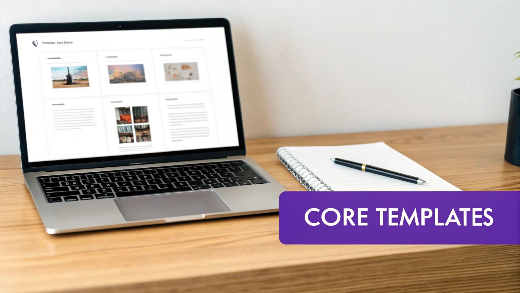
Defining Your Core Templates
That user journey is built on the back of a few essential templates. Sketching these out first, even on a piece of paper, will save you a ton of headaches later. A solid plan gives you consistency and creates a predictable, intuitive experience for your visitors.
You'll want to map out the big three:
- The Single Post Layout: This is the heart of your blog where your content lives. It needs to be incredibly readable with clean typography, and it should include key elements like social sharing buttons, an author bio, and a comments section to foster community.
- The Blog Archive Page: This is your main blog feed. How do you want to show off your articles? A classic list, a more modern grid, or maybe a mix of both? This page needs to make it dead simple for people to browse and find topics that grab their attention.
- Category and Tag Pages: These are so often overlooked, but they're critical for helping readers explore specific subjects. A well-designed category page acts as a mini-hub, encouraging people to dive deeper into your content library.
This whole process is about visualizing the strategic flow: guiding a user with clear navigation, engaging them with fantastic content, and ultimately converting them towards whatever your business goal is.
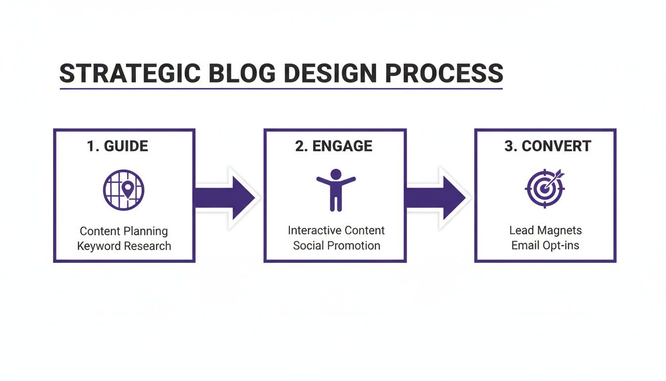
The key takeaway here is that every single design choice should have a purpose—to move the user smoothly from discovery to action.
Placing Strategic Elements
With your core templates defined, you can start slotting in the key functional pieces. This is where your layout shifts from being just a design to a high-performing marketing machine. Where you place these elements can have a massive impact on user behavior and your ability to hit your goals.
A common mistake I see all the time is treating the sidebar as a dumping ground. Don't do it. Use it strategically for a primary call-to-action, a prominent search bar, or links to your most valuable pillar content. Keep it clean and focused.
Think critically about where to put your most important calls-to-action (CTAs). Should a newsletter signup form go at the end of every post, or would it perform better in a sticky sidebar? For a deeper dive, you can find a ton of actionable blog design tips that cover everything from UX principles to conversion rate optimization.
Taking the time for this planning phase ensures every pixel on your blog layout Divi template has a clear job to do.
Alright, you've got your blog structure planned out. Now for the fun part: bringing that vision to life with the Divi Theme Builder.
This is where we move beyond editing one page at a time and start creating the core system for your entire blog. Forget manually styling every single post you write. We’re building a framework.
The real beauty of this approach is consistency. Once you set up a template for your blog posts, every new article you publish will automatically slip into that beautifully branded design. It’s a massive time-saver and guarantees a polished, professional look across your entire site. It's no wonder that over 2,158,247 live websites are powered by Divi, a testament to its flexibility and power in the WordPress world. You can dig into more numbers in this detailed WordPress statistics report.
Crafting the Single Post Template
If there's one template to obsess over, it's the single post template. This is where your readers will spend the most time, so getting the clarity and readability just right is non-negotiable.
Head over to the Divi Theme Builder, create a new template, and assign it to "All Posts." This is where the magic of Divi’s dynamic content comes into play. Instead of adding static text or images, you’ll be using special modules that pull in the content directly from each blog post.
- Post Title Module: This automatically grabs the H1 title for whatever post is being viewed.
- Featured Image Module: This pulls in the post's featured image. Simple as that.
- Post Content Module: This is the big one. It renders the entire body of your article—all the text, images, and formatting you’ve created in the WordPress editor.
By arranging these dynamic modules, you're not just building a page; you're creating a flexible container. You can design a unique post header, define your typography sitewide, and add other cool elements like an author bio or a "related posts" section that will show up on every article automatically.
The Divi Theme Builder interface gives you a bird's-eye view of your site's structure. You can see which templates are assigned to what—your blog posts, your homepage, your archive pages—all in one place.
This kind of centralized control is exactly what makes managing a growing blog so much easier.
Designing the Blog Archive Page
Next up, let's tackle your main blog page—the archive. Think of this as the storefront for all your awesome content. You’ll create another template in the Theme Builder, this time assigning it to your "Blog" page (or "All Archive Pages" if you want to cover categories and tags, too).
The star of the show here is the Blog Module. It’s an incredibly versatile tool for displaying a feed of your articles. You can go for a classic full-width layout or switch to a more modern, visual grid layout. The choice is yours.
Here’s a pro-tip from my own experience: dig into the Blog Module’s "Elements" settings. This is where you can show or hide things like the featured image, author, date, and excerpt. For a clean, minimalist grid, I often turn off everything except the featured image and the post title. It just looks cleaner.
This level of granular control lets you craft a browsing experience that truly matches your brand. And if you're looking to hit the ground running, checking out professionally designed templates for Divi can be a huge source of inspiration and a fantastic shortcut.
By combining Divi's powerful modules with dynamic content, you're well on your way to building a blog that's not just beautiful, but smart and scalable, too.
Using Interactive Elements to Boost Engagement

Let's be honest, a static blog layout is a huge missed opportunity. A clean design is great for readability, but the real magic happens when you can turn passive scrolling into an active experience. This is where interactive elements come into play, transforming your Divi blog from a simple content library into a tool that actively works toward your goals.
By adding smart, user-triggered content, you can dramatically increase session duration, capture more leads, and steer visitors toward your most valuable articles. The trick is to make these interactions genuinely helpful, not intrusive. We're moving beyond the annoying, generic popups of the past and creating experiences that feel like a natural part of the user's journey.
Implementing Smart Popups and Fly-Ins
One of the most powerful ways to boost engagement is with targeted popups and fly-ins. I’ve found that using a tool like Divi Areas Pro opens up a world of possibilities. You can design any layout you want in the familiar Divi Builder and then trigger it based on specific user behaviors, not just a simple timer.
Here are a few real-world scenarios you could build:
- The Exit-Intent Lifesaver: When a user's cursor drifts toward the close button, you can trigger a popup offering a valuable lead magnet, like an eBook or a discount code. This is your last, best shot to capture their email before they're gone for good.
- The Helpful Related Posts Fly-In: As a reader scrolls down an article—say, to 80% scroll depth—a subtle fly-in can appear in the corner suggesting other posts in the same category. It's a fantastic, non-aggressive way to keep them on your site longer.
- The Content Upgrade Offer: You can place a button inside your blog post that, when clicked, opens a popup containing a downloadable checklist or resource directly related to the article. This provides immediate value and is an incredibly effective list-building strategy.
The power here is in the context. You’re not just interrupting the user; you’re offering the right thing at precisely the right moment. I've seen this simple shift in strategy make a massive difference in conversion rates.
By thinking through your reader's journey, you can pinpoint the perfect moments to present these interactive offers, making them a welcome addition rather than a disruptive annoyance.
Adding Context with Tooltips and Hidden Content
Interactivity isn't just about big popups. It can also be used to make your content clearer and more accessible, which is a crucial part of a great blog layout Divi can help you create. If you write about technical topics or use industry jargon, a simple tooltip can be a game-changer for user experience.
For example, imagine placing a small icon next to a complex term. When a user hovers over it, a small tooltip appears with a plain-English definition. This simple trick prevents readers from having to leave your site to Google a term, reducing friction and keeping them locked into your content.
Here's a quick look at how you might use different interactive elements from a plugin like Divi Areas Pro on your blog.
Interactive Element Use Cases for Your Divi Blog
| Element Type | Primary Goal | Best Trigger | Example Implementation |
|---|---|---|---|
| Popup | Lead Generation | Exit-Intent | Offer a free PDF guide when a user is about to leave the page. |
| Fly-In | Content Discovery | Scroll Depth | Show related articles when a user scrolls 80% down a post. |
| Tooltip | Improve UX | On Hover | Define a technical term when a user hovers over an icon next to it. |
| Click-Trigger Area | Deliver Value | On Click | Open a "content upgrade" popup with a checklist when a user clicks a button. |
These small, thoughtful interactions add up quickly. They create a sophisticated and user-friendly blog that not only looks professional but also performs better. For a deeper dive, our guide on how to add interactive content on your Divi website explores these techniques in much more detail.
Optimizing for Mobile and Site Performance
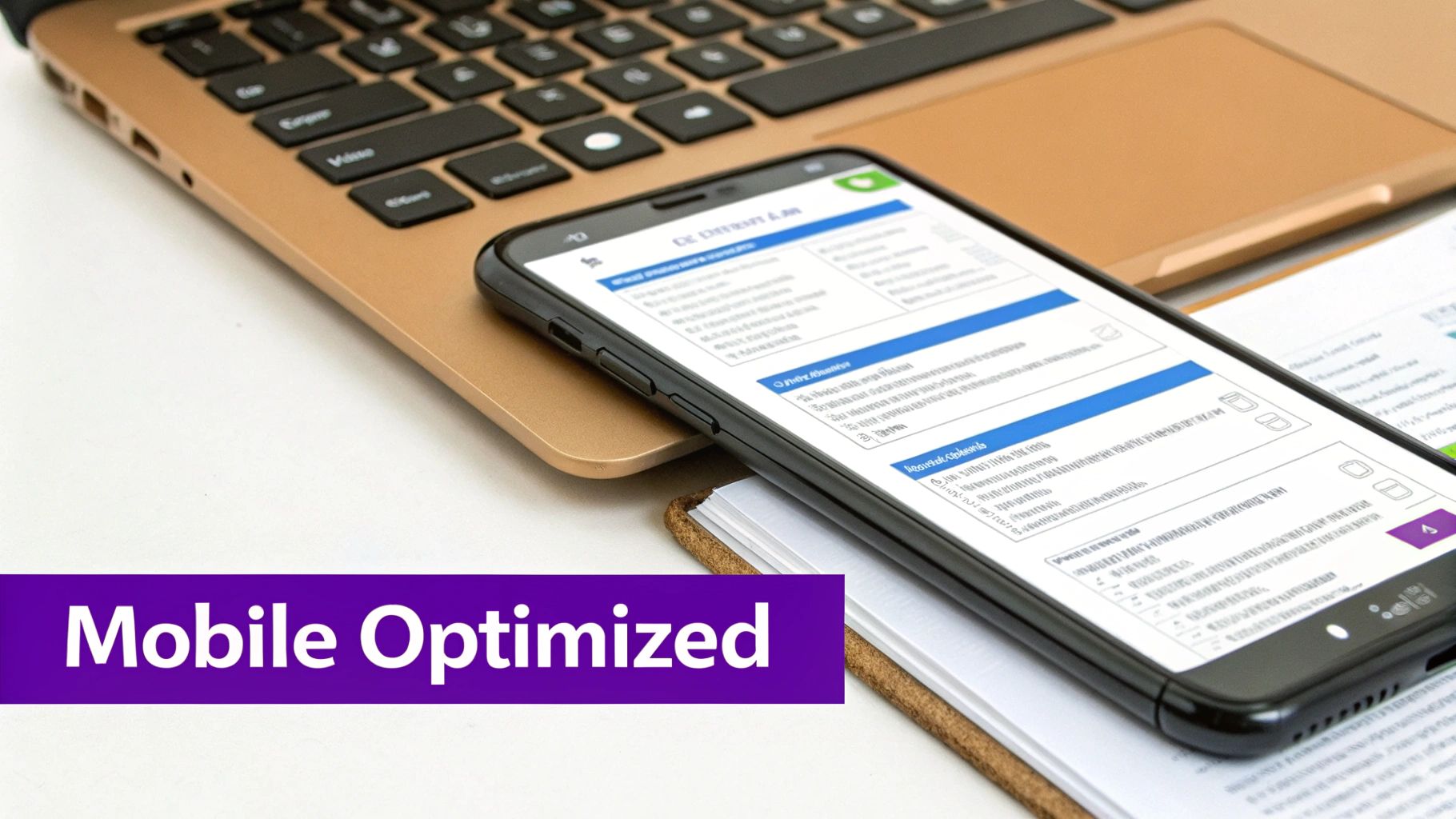
Let's be honest: a stunning desktop design means very little if it falls apart on a smartphone or takes an eternity to load. More than half of all web traffic now comes from mobile devices. That means a responsive, fast blog isn't just a "nice-to-have"—it's an absolute must for user experience and SEO.
The good news is that Divi gives you all the tools you need to get this right. Inside the Divi Builder, you’ll find responsive editing icons right next to most design settings. These are your secret weapons for fine-tuning your layout for desktop, tablet, and mobile, ensuring a pixel-perfect experience everywhere.
Mastering Divi's Responsive Controls
When you're optimizing your blog layout in Divi for mobile, don't just shrink everything down. You need to rethink the entire experience for that smaller screen. The best approach is to embrace mobile-first design principles, which ensures your blog is perfectly adapted from the ground up.
Here are a few adjustments I make on nearly every project:
- Bump Up Font Sizes: Text that looks great on a 27-inch monitor can be completely unreadable on a phone. Use the responsive toggles to increase your body text and heading sizes specifically for mobile.
- Tighten Up Spacing: All that beautiful whitespace on a desktop just wastes precious screen real estate on mobile. Drastically reduce your margins and padding on mobile for a much cleaner, more focused layout.
- Hide What Isn't Essential: Does that fancy, multi-column sidebar really add value on a tiny screen? Probably not. Divi lets you hide entire sections or modules on specific devices, which is perfect for decluttering the mobile view and putting the focus squarely on your content.
A common mistake I see is forgetting to check how elements stack on mobile. That perfect horizontal row of three service blurbs on desktop will stack vertically. Always, always preview your layout in the mobile view to make sure the new order still makes sense.
Boosting Your Site's Performance
Beyond just looking good on mobile, your site has to be fast. A slow-loading blog will send visitors bouncing and tank your search rankings. Luckily, Divi has some powerful performance features built right in.
Head over to Divi > Theme Options > General > Performance. This little section is your command center for speed.
One of the biggest wins here is enabling Static CSS File Generation. This feature takes all of Divi's dynamic CSS and bundles it into a single, clean file. The result is fewer server requests and a noticeable jump in speed.
You should also flip the switch on options like Defer Gutenberg Block CSS and Lazy Load Images. Lazy loading is especially crucial for blog archive pages loaded with images, as it prevents them from loading until a user actually scrolls to them.
Finally, a simple habit that pays huge dividends: always compress your images before you upload them. Use a tool like TinyPNG or an optimization plugin to shrink those file sizes without killing the quality. It's one of the easiest and most effective ways to make sure your beautiful Divi blog layout loads in a flash for every single visitor.
Got Questions About Your Divi Blog Layout?
As you start getting your hands dirty building the perfect blog layout in Divi, you’re bound to hit a few snags or wonder about the little details. It’s one thing to plan it all out, but moving from a sketchpad to the Divi Builder often brings up specific questions. This is where a good design starts to become a great one.
Let's tackle some of the most common questions I hear from Divi users. Getting these details right is what makes your blog not just functional, but flexible enough to scale as your content grows.
Can I Create Different Layouts for Different Blog Categories?
You absolutely can. In fact, this is one of the most powerful features baked right into the Divi Theme Builder, and it's a fantastic way to fine-tune the experience for your readers. You have the power to create totally unique templates and assign them to specific post categories.
For example, maybe your "News" category needs a clean, minimalist layout, but your "Case Studies" would benefit from a more visual design packed with project galleries. To make it happen, just create a new template in the Theme Builder. Then, in the template settings, you can assign it to apply only to the specific category you want.
This level of control is a total game-changer for organizing your content. It lets you build distinct content hubs right inside your blog, each with a look and feel that perfectly matches the subject matter. Your whole site instantly feels more intentional and thoughtfully designed.
How Do I Add an Author Bio Box to My Blog Posts?
Adding a dynamic author bio is a simple touch that adds a ton of personality and authority to your posts. The best part? You don't have to manually add it every single time. You can build it once, right into your single post template, and Divi will handle the rest.
Here’s a quick rundown on how to set it up:
- Drop in a New Row: In your post template, add a new row where you want the bio to live—usually right below the Post Content module.
- Add an Image Module: Place an Image module in the left column. Instead of uploading a static image, click the dynamic content icon (it looks like a little database cylinder) and select Author Profile Picture.
- Add a Text Module: In the right column, pop in a Text module. Use that same dynamic content icon again, but this time, choose Author Bio.
And that’s it. This setup automatically pulls the profile picture and bio from the WordPress user profile of whoever wrote the post. It’s a classic "set it and forget it" feature that gives every article a more personal, credible feel.
What Is the Best Way to Display Related Posts?
Keeping readers on your site is the name of the game, and showing them related posts is one of the surest ways to get them to click through to another article. The easiest and most effective way to do this is with Divi's own Blog module, placed directly within your single post template.
Just add a Blog module underneath your Post Content or author bio section. Jump into the module's settings, and under the Content tab, you'll see an option for Posts For Current Page. You'll want to enable that.
From there, set the included categories to Current Category. This simple instruction tells the module to only pull in other posts from the same category as the article the visitor is currently reading. It’s a smart, automated way to create super relevant pathways for your readers without any extra work on your end.
Ready to take your blog from static to truly interactive? With Divimode, you can build the dynamic popups, slick mega menus, and helpful tooltips we've been talking about. It’s time to unlock your Divi site’s full potential and create an experience that keeps your audience coming back for more.
More Articles You Will Like


