
 Alex Martin
A CSS responsive website is one that uses code to fluidly adapt its layout to any screen size, giving every user a perfect experience whether they’re on a desktop, tablet, or smartphone. This isn’t just a nice feature anymore; it’s the absolute baseline for modern web design. A site that isn’t responsive is basically invisible to a huge chunk of your audience—and to search engines like Google.
Why A CSS Responsive Website Is Now Standard Practice
Not too long ago, having a mobile-friendly website gave you a real competitive edge. Today, it’s a fundamental requirement just to stay in the game. The shift in user behavior is impossible to ignore; more people browse on their phones than on any other device. This isn’t some passing trend—it's the established norm, and it has massive implications for anyone building websites, especially with a powerful tool like Divi.
Ignoring this mobile-first reality means you’re consciously choosing to deliver a frustrating experience for the majority of your visitors. For a Divi builder, this can backfire in several painful ways:
- Lost Conversions: If your checkout form is a nightmare to use on a phone, you can bet it’s getting abandoned.
- Damaged Client Trust: Handing over a site that looks broken on your client's smartphone is a quick way to undermine your professionalism.
- Poor Engagement: Clumsy navigation or tiny, unreadable text will send users bouncing right off your site.
- Plugin Conflicts: A non-responsive layout can make interactive elements, like popups from Divi Areas Pro, feel intrusive and broken, completely derailing the user journey.
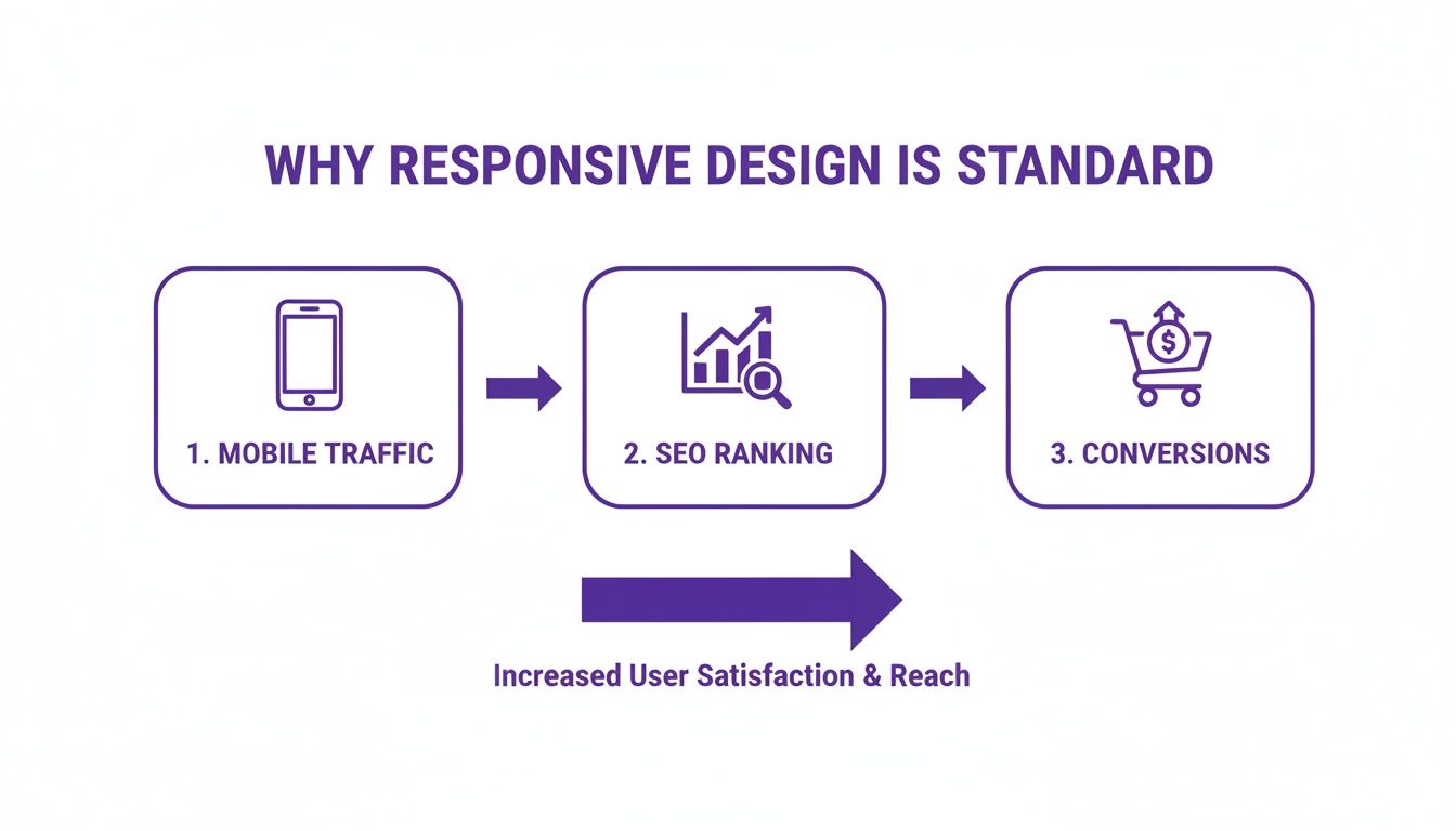
The Hard Data Driving The Change
The statistics paint a very clear picture. As of 2025, an estimated 90% of all websites are now responsive. This massive shift is driven by a simple fact: over 57.44% of global internet traffic now comes from smartphones.
Even Google has drawn a line in the sand. Since July 2024, they’ve stopped indexing sites that aren't mobile-friendly, making responsiveness a non-negotiable for SEO.
This isn’t just about pleasing search engines, either. It directly impacts your bottom line. Responsive sites see 11% more conversions on average and boost user engagement by 20%. It's not just about looking good; it's about getting results.
The data below breaks down exactly how these numbers translate into real-world business outcomes for anyone building with Divi.
How Responsiveness Impacts Your Divi Business
| Statistic | Impact on Your Divi Website |
|---|---|
| 57.44% of global traffic is mobile | The majority of your potential clients and customers will first see your Divi site on a phone. A poor experience here means losing over half your audience. |
| Google stops indexing non-mobile sites | Your site won't show up in search results. Period. All your SEO efforts will be for nothing if your site isn't responsive. |
| Responsive sites get 11% more conversions | A seamless mobile checkout, easy-to-use forms, and clear CTAs directly translate to more sales, sign-ups, and leads for your business. |
| Responsive sites see 20% higher engagement | When users can easily read and navigate your content, they stay longer, explore more pages, and are more likely to become loyal followers or customers. |
Simply put, the business case for a fully responsive website is undeniable. Every element, from a simple button to a complex mega menu, has to work perfectly on every device.
A responsive design ensures that your hard work translates into a seamless experience for every single visitor, regardless of how they access your site. It's the bridge between your design vision and your user's reality.
The financial and reputational costs of a non-responsive site are just too high to ignore. Mastering the CSS that powers this adaptability isn't just a technical skill; it's a core business strategy that protects your revenue, strengthens your brand, and keeps users happy. To see just how critical this is, check out these 8 undeniable benefits of responsive website design. This move from optional feature to mandatory standard is the single biggest shift in web design over the last decade, and embracing it is key to building successful, future-proof websites.
Mastering CSS Media Queries and Breakpoints in Divi
Think of CSS media queries as the secret sauce for truly custom responsive design. They're what let you step beyond Divi's built-in controls and tell your website exactly how to behave on different screen sizes. This is the core of building a professional, pixel-perfect CSS responsive website.
In simple terms, a media query is just a conditional rule. You're essentially telling the browser, "Hey, if the screen is at least this wide, apply these specific styles." This is how you prevent a massive desktop hero image from swallowing a mobile screen or make sure your text is perfectly readable everywhere.
It's this level of control that directly connects a great mobile experience to better SEO rankings and, ultimately, more conversions.
As you can see, getting mobile traffic is just the first step. A thoughtful, responsive design is what keeps users engaged, improves your search visibility, and drives real business results.
Setting Content-Driven Breakpoints
Back in the day, we used to design for specific devices—320px for an old iPhone, 768px for an iPad, and so on. That approach is completely outdated. Today, the best practice is to let your content dictate your breakpoints, not some arbitrary device width.
A breakpoint is simply the point at which your layout starts to look awkward and needs a new set of CSS rules to fix it.
Here’s the workflow I use on my projects:
- Start Mobile-First: Always design for the smallest screen first. This forces you to prioritize what's most important and builds a clean, solid foundation.
- Stretch the Browser: Open your site and slowly drag the edge of your browser window to make it wider. Chrome DevTools' responsive viewer is perfect for this.
- Find the Breaking Point: Watch closely. The exact moment your text lines become uncomfortably long, or elements start overlapping—that's your breakpoint. That's where you add a media query.
This method ensures your site looks fantastic on every screen, not just a handful of popular device sizes.
Practical Media Query Snippets for Divi
While Divi's responsive settings are great, sometimes you just need that extra bit of precision that only custom CSS can provide. You can drop these snippets into a few key places:
- Divi > Theme Options > Custom CSS for site-wide styles.
- The Page Settings > Advanced > Custom CSS tab for page-specific tweaks.
- An individual Module's Advanced Tab > Custom CSS for hyper-targeted changes.
Here are a couple of go-to snippets I use all the time, written with a mobile-first approach.
Tablet Styles (768px and up)
This query is perfect for when you're ready to move from a single-column mobile layout to a two-column design for tablets and larger screens.
/* Tablet and Up Styles /
@media screen and (min-width: 768px) {
.my-custom-class {
/ Your tablet-specific CSS goes here */
font-size: 18px;
}
}
Desktop Styles (981px and up)
Divi's standard desktop breakpoint kicks in at 981px. This is where you might introduce styles for wider screens, like showing a more complex navigation menu or adding larger padding.
/* Desktop and Up Styles /
@media screen and (min-width: 981px) {
.another-custom-class {
/ Your desktop-specific CSS goes here */
padding: 40px;
}
}
Pro Tip: Sticking with
min-widthis the bedrock of mobile-first development. You start with base styles for all devices and layer on more complex rules as the screen gets bigger. This leads to much cleaner, more efficient CSS.
For more advanced use cases, you can combine these principles with Divi's features to create entirely different experiences per device. A great example is learning how to show a different Divi navigation menu on desktop, tablet, and phone. Getting comfortable with media queries transforms CSS from a simple styling tool into your key for crafting flawless user experiences on any device.
Creating Modern Layouts with Flexbox and CSS Grid
While Divi’s row-and-column system is a solid foundation, there are times you need to break out of that box to build something truly modern and dynamic. This is exactly where Flexbox and CSS Grid come into play. These aren't just abstract coding concepts; they're your secret weapons for getting surgical control over alignment, spacing, and structure, making your CSS responsive website feel custom-built.
Think of it this way: Flexbox is the master of one-dimensional layouts—perfect for arranging items in a single row or column. CSS Grid, on the other hand, is built for the complex stuff, managing both rows and columns at the same time. Learning to use them inside Divi is the key to unlocking some serious design freedom.
Effortless Alignment with Flexbox
Flexbox is your best friend for solving those nagging alignment headaches that can be a real pain with Divi's default settings. Picture a header with a logo on the left, navigation in the middle, and a button on the right. Trying to get them to space out perfectly and stay vertically aligned can turn into a frustrating game of tweaking margins and padding.
With a few lines of CSS, Flexbox makes this effortless. By applying display: flex; to a parent container (like a Divi Row), you instantly give its children (the Columns or Modules) flexible properties.
This opens up some incredibly useful tools:
justify-content: This handles horizontal alignment. Usingspace-betweenwill push the first and last items to the edges and distribute the rest evenly in between.align-items: This manages the vertical alignment. A simplecenterwill perfectly center-align every single item in the row, no matter how tall they are.
Let's say you want to create a row of feature boxes that are perfectly centered and evenly spaced. Just add a custom class like perfect-flex-row to your Divi Row.
Then, pop this CSS into your page's Custom CSS area:
.perfect-flex-row .et_pb_column {
display: flex;
align-items: center;
justify-content: center;
}
This little snippet overrides Divi’s standard behavior, giving you a clean, professional alignment that looks great on any device.
Building Complex Structures with CSS Grid
When your design is more ambitious than a simple row of items, it's time for CSS Grid. Grid is engineered for creating those sophisticated, asymmetrical, and even overlapping layouts that used to require messy code hacks.
CSS Grid lets you define a container as a grid and then place child elements exactly where you want them. This is perfect for portfolio layouts, magazine-style blogs, or any design that breaks away from the standard top-to-bottom stack.
CSS Grid doesn't just stack blocks; it gives you a canvas to paint on. You can define columns and rows with precise or flexible units, allowing elements to span multiple tracks and create truly unique compositions.
For instance, you could design a hero section where a headline spans two columns while an image and a contact form sit neatly beside it in their own defined spaces. This is the kind of control that really lets your creativity shine.
To get started, you can define a grid on a Divi Section or Row:
.custom-grid-layout {
display: grid;
grid-template-columns: 2fr 1fr; /* Creates two columns; the first is twice as wide as the second /
gap: 30px; / Adds space between grid items */
}
By applying the .custom-grid-layout class to a Divi section and dropping your modules inside, they'll automatically fall into the grid cells you’ve defined. You’re no longer limited by Divi's standard structure.
Applying Custom Code in Divi
The best way to manage these custom CSS snippets is right inside Divi, which keeps everything organized and page-specific.
- Assign a Custom CSS Class: In the Section, Row, or Module settings, head to the Advanced tab and give the CSS Class field a unique name (e.g.,
flex-headerorcustom-grid-portfolio). - Add Your CSS: You have a couple of options for where to place the code:
- Page Settings > Advanced > Custom CSS: This is best for styles that only apply to the current page you're working on.
- Divi > Theme Options > Custom CSS: Use this for styles you want to apply globally across your entire website.
This approach keeps your custom code tidy and makes it easy to reuse layouts. If you’re looking for a jolt of inspiration, checking out a gallery of CSS Grid layout examples can spark some amazing ideas for your next project. By pairing Divi's user-friendly builder with the raw power of Flexbox and Grid, you can build a truly impressive and custom CSS responsive website.
Implementing Fluid Typography and Responsive Images
A truly responsive site does more than just shuffle boxes around. The real magic happens when the content inside those boxes adapts just as gracefully. This is where fluid typography and responsive images come in, turning a good layout into a genuinely great user experience.
You've probably seen it before: an otherwise solid mobile design broken by stiff, pixel-based fonts or images that are way too big for the screen. It’s a common pitfall.
When your text scales smoothly and your images load quickly without looking fuzzy, you create a seamless feel that keeps people on your site. For Divi and WooCommerce sites, this is non-negotiable—product images need to be crisp, and text has to be readable to drive sales.
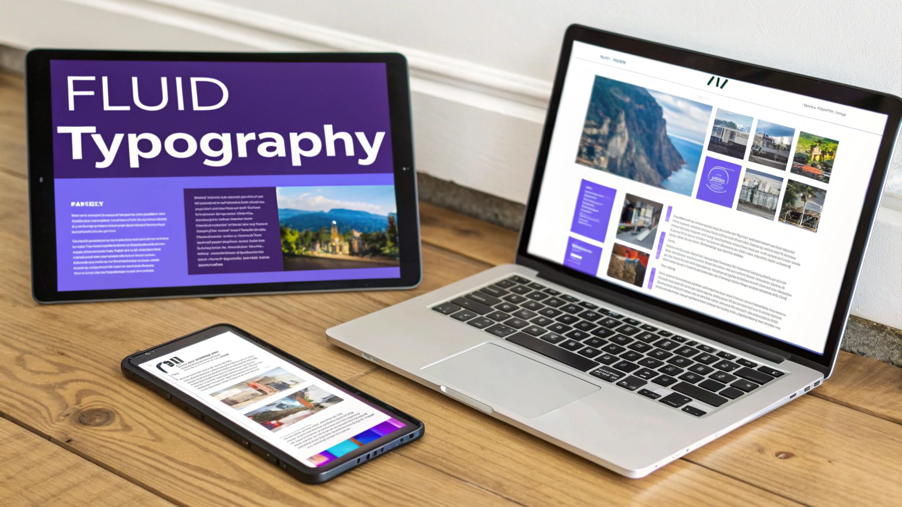
Crafting Scalable Text with The CSS Clamp Function
Static font sizes just don't cut it anymore. Sure, Divi’s responsive controls are helpful for setting different sizes for mobile, tablet, and desktop, but what about all the screen sizes in between? That’s where you get those awkward jumps in text size.
The modern fix for this is fluid typography, and the CSS clamp() function is the perfect tool for the job.
Think of clamp() as setting guardrails for your font size. It takes three values: a minimum size, a preferred (flexible) size, and a maximum size.
font-size: clamp(MINIMUM, PREFERRED, MAXIMUM);
- MINIMUM: The absolute smallest you ever want the font to be.
- PREFERRED: A flexible unit, usually viewport width (
vw), that lets the font scale up or down with the screen. - MAXIMUM: The absolute largest you’ll allow the font to get.
This one line of CSS can replace a handful of media queries, creating perfectly smooth scaling. Your headlines won't look ridiculously tiny on a small phone or comically huge on a 4K monitor.
Here’s a practical example you can drop right into Divi’s Custom CSS for your H1 tags:
h1 {
font-size: clamp(2rem, 5vw, 4.5rem);
}
With this simple rule, your main heading scales with the screen's width (5vw), but it will never shrink below 2rem or grow larger than 4.5rem. It's a fantastic set-it-and-forget-it solution for readable, responsive text.
Going Beyond Max-Width for Images
The classic max-width: 100%; trick is the first step in making images responsive, but it’s only half the story. All that rule does is stop an image from overflowing its container. It doesn’t solve the performance killer of a phone downloading a massive, desktop-sized image file.
In 2024, with 66% of global web traffic now coming from mobile devices, serving unnecessarily large files is a critical mistake. Sites that aren't properly responsive get penalized by Google's mobile-first indexing, and a poor mobile experience directly hurts rankings. In fact, 67% of consumers say they prefer to buy from mobile-friendly websites.
To really optimize a CSS responsive website, you need to use modern HTML attributes that let the browser pick the best image version for the user's screen.
Using
srcsetand<picture>isn't some advanced trick anymore; it’s standard practice for building professional, high-performing websites. It respects your user’s bandwidth and helps improve your site's Core Web Vitals.
Here’s how they work:
- The
srcsetAttribute: This lets you provide a list of different-sized image sources. The browser is smart enough to look at the user’s screen size and pixel density and pick the most appropriate one. - The
<picture>Element: For more granular control, like serving entirely different images or aspect ratios (often called "art direction"), the<picture>element is your best friend. You can define specific image sources for different media query breakpoints.
These techniques are fundamental for any site, but they're especially crucial for Divi builders. If you want to take a deeper dive into optimizing your visuals, check out our ultimate guide to using images with Divi. Getting this right ensures your images look sharp and load fast, protecting both your user experience and your bottom line.
How to Test and Optimize Your Responsive Divi Site
So, you've built a beautiful, responsive layout. That's a huge step, but the job isn't truly done until you've put it through its paces. Rigorously testing your work is what separates the hobbyists from the pros, ensuring your css responsive website works flawlessly everywhere. This is your guide to testing, debugging, and optimizing your Divi site before a single client or customer ever spots a bug.
The good news? You don’t need a huge budget or a room full of devices to get started. In fact, one of the most powerful testing tools you have is already on your computer: your web browser’s developer tools.
Using Browser DevTools for Initial Testing
Tools like Chrome DevTools or Firefox's Responsive Design Mode are your first line of defense. They give you a quick way to simulate how your site will look and feel across a massive range of screen sizes and resolutions.
Forget just clicking on the predefined device presets like "iPhone 14." The real magic happens when you use the responsive handle. Grab the edge of the viewport and slowly drag it from its narrowest width all the way to its widest. As you do, keep a close eye on your layout.
- Look for awkward text wrapping: Are your lines getting ridiculously long or uncomfortably short at certain widths?
- Check for element overlaps: Watch for buttons, images, or text boxes that start colliding.
- Verify spacing and padding: Does the white space feel balanced and intentional at every single size?
The moment you find a point where the layout "breaks," you've found the perfect spot to add a new media query. This content-driven approach ensures your site looks polished on every possible screen, not just the popular ones.
Simple Strategies for Real-Device Testing
Emulators are fantastic for quick checks, but nothing—and I mean nothing—beats testing on actual physical devices. You just can't simulate the feel of a touch target or see how your site truly performs on a mid-range Android phone.
But you don't need to go out and buy every new phone that hits the market. A more practical approach is to build a small, diverse device lab.
- Your Own Devices: Start with what you already have—your personal smartphone and tablet.
- Ask Around: Enlist friends, family, or colleagues. A quick five-minute look on their phones can uncover issues you would have completely missed.
- Older Models: It's a great idea to keep an older, less powerful phone on hand. This is invaluable for spotting performance bottlenecks you won't notice on a brand-new flagship device.
This simple mix of old, new, iOS, and Android devices will give you a solid baseline for catching the vast majority of responsive issues.
Testing on real devices isn't just about squashing bugs; it's about building empathy. It helps you understand the actual experience a user has, from how easy buttons are to tap to how quickly pages load on a spotty connection.
Performance Optimization for Responsive Sites
A critical part of optimizing any website involves knowing how to improve SEO for lasting B2B growth, and performance is a massive piece of that puzzle. A site that looks amazing but loads at a snail's pace is still a failure, especially on mobile where connections can be shaky.
One of the biggest culprits of slow mobile sites is unoptimized images. A phone shouldn't have to download a massive, 2000px-wide hero image that was designed for a desktop monitor. Using modern techniques like the srcset attribute tells the browser to only download an appropriately sized image for the user's screen, which can drastically improve your load times and Core Web Vitals.
Similarly, be mindful of dynamically loaded content from plugins like Divi Areas Pro. While they're incredibly powerful, loading a complex mega menu or a large popup that's hidden on mobile can still eat up resources. Use the built-in device visibility settings to make sure you aren't loading heavy assets unnecessarily on smaller screens. Every kilobyte you save adds up to a better, faster user experience.
Got Questions About Responsive CSS in Divi?
Even when you've got a handle on the theory, real-world questions always pop up during a build. I've been there. So, I’ve put together a quick rundown of the most common challenges Divi users run into with responsive CSS, complete with practical answers you can use right now.
Think of this as your go-to reference for solving those nagging issues that can make or break a design. Nailing these details is what separates a good site from a great one on every single device.
What Are the Best Breakpoints to Use for a Divi Website?
This is probably the number one question I hear, but the answer isn't a set of magic pixel values. Honestly, if you're still thinking in terms of "iPhone breakpoint" or "iPad breakpoint," it's time for a mental shift. It’s far better to let your content define the breakpoints, not outdated device specs.
Here’s the process I follow: Start with your mobile design. Then, open your browser’s developer tools and just… pull the screen wider. The exact moment your layout starts to look awkward or broken—that’s your breakpoint. It's the natural point where your content is screaming for a new CSS rule to keep things looking sharp.
Divi’s defaults (768px for tablets and 981px for desktops) are a decent starting point, but they're just that—a start. Letting your design tell you where it needs to adapt ensures a flawless look on every screen, not just the popular ones.
How Do I Make My Divi Areas Pro Mega Menu Responsive?
Making a Divi Areas Pro mega menu look great on mobile is a two-step dance. First, you handle the basics right inside the Divi Builder. Use all the built-in responsive settings for your columns, spacing, and font sizes to get the foundational layout sorted.
For the really slick stuff, you’ll want to jump into the Divi Area’s Advanced tab and add your own custom CSS media queries. This is perfect because it keeps all your responsive code neatly packaged with the menu it controls. For example, you could write a quick media query to stack a three-column desktop layout into a clean, single column on mobile, or even transform your menu links into a vertical accordion.
This targeted approach gives you pixel-perfect control, ensuring even the most complex mega menus feel intuitive and easy to use on a small touchscreen.
Can I Use CSS Flexbox or Grid with Divi Modules?
Absolutely. And let me tell you, it's a game-changer for creating advanced layouts that Divi can't produce out of the box. You can apply Flexbox or Grid to any section, row, or module by dropping a few lines of CSS into the Advanced > Custom CSS fields. This lets you bend Divi’s default structure to your will.
For instance, want to perfectly center columns vertically inside a row? It can be a real headache sometimes. But just add display: flex; align-items: center; to the Row's "Main Element" field, and you're done. It’s that simple. This is how you achieve that precise, modern alignment that really elevates a design.
By injecting Flexbox or Grid properties directly into Divi elements, you blend the builder's convenience with the raw power of modern CSS. This is the key to breaking free from standard layouts and building something truly unique.
My Fonts Look Too Big on Mobile. How Do I Fix This in Divi?
Ah, the classic "giant headline on mobile" problem. We've all been there.
For a quick fix, Divi’s built-in tools are your best friend. Head to any module’s Design tab and look for the little mobile icon next to the font size setting. Click it, and you can set different static font sizes for desktop, tablet, and mobile. Easy.
But if you want a truly fluid and professional solution, the CSS clamp() function is where it's at. A single rule like font-size: clamp(1rem, 2.5vw, 1.5rem); is incredibly powerful. It tells the browser to scale the font size based on the viewport width (2.5vw), but never lets it get smaller than a minimum (1rem) or larger than a maximum (1.5rem). No more unreadably tiny text or screen-swallowing headlines.
Just add this to your headings in Divi’s Theme Options > Custom CSS, and you get a beautiful, seamless typographic scale across every device imaginable. It's a "set it and forget it" technique that makes your final product feel so much more polished.
At Divimode, we build tools that empower you to create stunning, interactive, and high-performing websites with ease. Elevate your Divi sites with advanced popups, mega menus, and dynamic content using our powerful plugins and expert guidance. https://divimode.com
More Articles You Will Like