 Alex Martin
In a world where users switch between phones, tablets, and desktops seamlessly, a website that only looks good on one screen is a website that's failing. For Divi users, building a beautiful site is just the beginning; making it flawlessly responsive is what separates the amateur from the professional. True responsive design is more than just shrinking content. It's about creating a thoughtful, optimized, and accessible experience for every visitor, regardless of their device.
Getting this right means higher engagement, better search rankings, and a more professional final product. This guide moves beyond the basics, offering a comprehensive roundup of essential responsive design best practices. Each point is tailored with actionable steps and Divi-specific insights to help you build websites that are not just adaptive, but truly excellent everywhere.
We will explore crucial techniques, from implementing a mobile-first philosophy and fluid grid systems to optimizing images, typography, and navigation for any screen size. Studying existing responsive design themes can provide a solid foundation and inspiration, but mastering the underlying principles is what gives you full creative control.
This listicle will provide you with the practical knowledge to:
- Implement a strategic mobile-first workflow in Divi.
- Master flexible grids and breakpoint management.
- Optimize media and typography for performance and readability.
- Ensure your site is touch-friendly and thoroughly tested.
By applying these best practices, you can confidently deliver a superior user experience that works perfectly on every device, every time.
1. Embrace the Mobile-First Design Approach
The mobile-first design approach is a core tenet of modern responsive design best practices. Popularized by figures like Luke Wroblewski, this methodology flips the traditional desktop-first workflow on its head. Instead of designing for a large screen and then stripping away elements to fit a smaller one, you begin with the most constrained environment: the mobile viewport. This forces you to prioritize content and functionality from the very beginning, establishing a strong, lean foundation that can be progressively enhanced for tablet and desktop experiences.

For Divi users, this means making the Mobile view in the Visual Builder your starting point, not your final check. By designing for mobile first, you ensure a fast, accessible, and user-friendly experience for the majority of web traffic, which now originates from mobile devices. This approach aligns with Google's mobile-first indexing, potentially improving your site's search engine ranking.
How to Implement a Mobile-First Strategy in Divi
Adopting this mindset requires a practical shift in your design process. Instead of asking "What can we remove for mobile?" you'll ask "What is absolutely essential?"
- Start in Mobile View: Immediately switch to the Mobile view in the Divi Visual Builder before adding your first section or module. Design the entire page layout here, focusing on a single-column structure, clear typography, and touch-friendly navigation.
- Prioritize Content Hierarchy: On a small screen, content hierarchy is paramount. Decide what your visitors must see first and build your layout around that. Use Divi's drag-and-drop functionality to arrange sections and modules based on mobile priority.
- Use
min-widthMedia Queries: When you need to add custom CSS, favormin-widthmedia queries. This approach adds styles as the screen gets larger, which is the essence of progressive enhancement. For example, a style applied with@media (min-width: 981px)will only affect desktop screens and larger, leaving the mobile base untouched. - Scale Upward: Once your mobile design is solid, switch to the Tablet and then Desktop views. Use this opportunity to expand the layout, perhaps moving from a single column to a multi-column grid, increasing font sizes, and adding desktop-specific interactive elements. You can find more practical mobile-first techniques in DiviMode's key tips for better Divi mobile responsiveness.
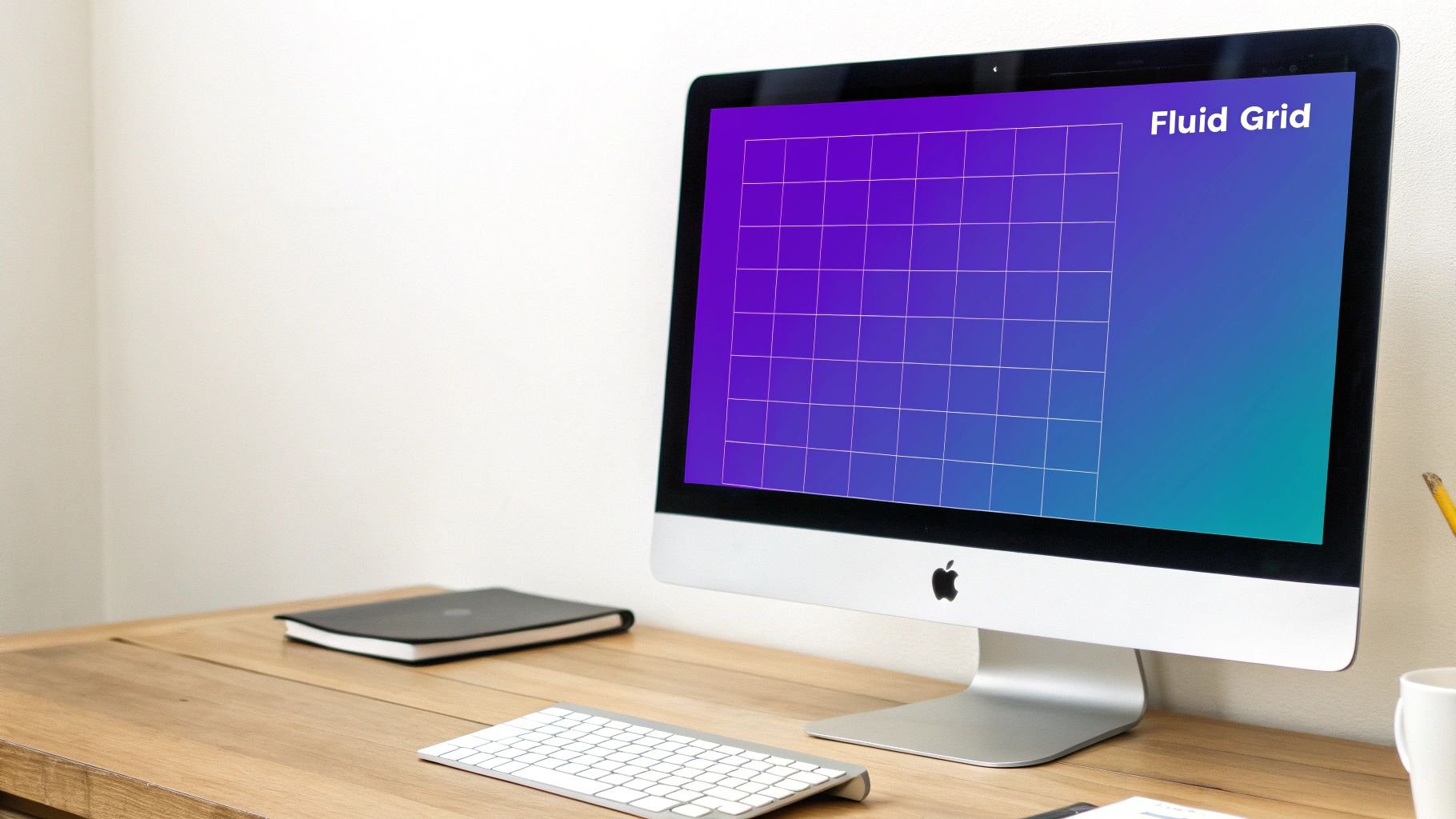
2. Flexible Grid Systems
At the core of any truly responsive design lies a flexible grid system. Unlike rigid, pixel-based layouts of the past, a flexible grid uses relative units like percentages, vw, vh, and fractional units (fr) to create a fluid foundation. This allows your layout to stretch or shrink gracefully, adapting its proportions to fit any screen size, from a small smartphone to a wide-screen monitor. Pioneers like Ethan Marcotte and the creators of frameworks such as Bootstrap championed this approach, which is now powered by modern CSS modules like Flexbox and Grid.
For Divi builders, this concept is already integrated into the platform's row and column structure. When you create a three-column row, Divi is using a flexible grid behind the scenes to manage the layout. Understanding this principle allows you to leverage Divi's tools more effectively and apply custom CSS to achieve even more sophisticated and resilient layouts. Implementing these responsive design best practices ensures a consistent user experience across all devices.
How to Leverage Flexible Grids in Divi
Mastering flexible grids means thinking in proportions, not pixels. It's about defining relationships between elements that hold true regardless of the viewport.
- Embrace Divi's Column Structure: Divi's built-in rows are your primary grid tool. Use them to define the main structure of your page. You can easily change column layouts for different devices directly in the Visual Builder. For instance, a four-column layout on desktop can be set to collapse into a two-column grid on tablets and a single column on mobile.
- Use Relative Units for Sizing and Spacing: When you need to set a custom width or padding, try using relative units. In Divi's module settings, you can enter values like
80%for width or5vwfor padding. This ensures that spacing and element sizes scale proportionally with the screen size. - Harness CSS Grid for Complex Layouts: For advanced, two-dimensional layouts that go beyond Divi's standard columns, CSS Grid is the ultimate tool. You can apply
display: grid;to a Divi section or module via the Advanced tab's Custom CSS area to create complex, overlapping, or asymmetrical designs that remain fully responsive. - Implement CSS Flexbox for Alignment: Flexbox is perfect for controlling alignment and distribution of items within a container. If you have a row of Blurb modules, you can add custom CSS to the row settings to ensure they are all equal height or perfectly aligned, using properties like
display: flex;andalign-items: stretch;.
To see how these powerful CSS properties work in practice, this video from Kevin Powell offers an excellent introduction to building responsive layouts.
3. Implement Responsive Images and Media
A visually rich website can quickly become a performance bottleneck on mobile devices if media isn't handled correctly. Sending a massive, high-resolution image designed for a 4K desktop monitor to a small smartphone screen wastes bandwidth, slows down page load times, and creates a poor user experience. Implementing responsive images is a crucial best practice that involves delivering media optimized for the user's specific context, such as their viewport size, screen resolution, and network conditions. This technique, championed by the Responsive Images Community Group, ensures fast load times and crisp visuals on every device.

The core principle is to provide the browser with multiple versions of an image, allowing it to select the most appropriate one. WordPress, and by extension Divi, automatically handles this to a large degree by creating several sizes of uploaded images and adding srcset attributes. This allows the browser to choose a smaller image file for smaller screens. However, a deeper understanding allows for more advanced optimization and control, which is a hallmark of professional responsive design. For example, The Guardian's website is a classic case study in using the <picture> element for "art direction," where a different crop of an image is shown on mobile to keep the subject in focus.
How to Optimize Images and Media in Divi
While Divi and WordPress provide a solid foundation, you can elevate your site’s performance with more deliberate strategies. These techniques ensure your media is as efficient as possible.
- Leverage WordPress's
srcset: Be aware that WordPress automatically generatessrcsetattributes for images added through the media library. To maximize this feature, ensure you upload high-quality source images so that WordPress can create useful, smaller versions. Avoid manually inserting images using a direct URL in a text module, as this can bypass thesrcsetfunctionality. - Utilize Modern Image Formats: Use Divi-compatible plugins or a CDN service to convert your JPEG and PNG images to next-gen formats like WebP or AVIF. These formats offer superior compression and quality, significantly reducing file sizes without a noticeable loss in visual fidelity. Divi's background image options often support these formats directly.
- Implement Lazy Loading: Divi has built-in lazy loading, but ensure it is enabled in Divi > Theme Options > General > Performance. This prevents images and videos that are "below the fold" (off-screen) from loading until the user scrolls near them, dramatically improving initial page load speed.
- Consider "Art Direction" with the
<picture>Element: For hero banners or critical marketing images where the subject might be lost on a narrow screen, use a code module to implement the<picture>element. This allows you to specify completely different image sources or crops for different breakpoints, giving you full creative control beyond simple resizing.
4. Touch-Friendly Interface Design
Designing for a responsive web means designing for touch. A touch-friendly interface is a critical component of responsive design best practices, ensuring that users on smartphones and tablets can interact with your site easily and accurately. This principle, pioneered by teams at Apple, Google (with Material Design), and Microsoft, acknowledges that fingers are much less precise than mouse cursors. Therefore, interactive elements like buttons, links, and form fields must be large enough and spaced appropriately to prevent accidental taps and user frustration.

For Divi builders, this goes beyond simple aesthetics; it's about usability and accessibility. A site that is difficult to navigate on a touchscreen will see higher bounce rates and lower conversions. Prioritizing touch targets ensures your meticulously crafted design is not only beautiful but also functional for the mobile-majority audience.
How to Implement a Touch-Friendly Interface in Divi
Building a touch-friendly site in Divi involves being mindful of size and space in your mobile and tablet views. It’s a deliberate design choice that enhances the user experience on touch-enabled devices.
- Enforce Minimum Touch Target Sizes: A widely accepted standard, recommended by Apple's Human Interface Guidelines, is a minimum touch target size of 44×44 pixels. When designing buttons, icons, or text links in Divi, ensure their clickable area meets this minimum. Use the Sizing and Spacing options in Divi's modules to set minimum heights and apply padding to increase the clickable zone without altering the visual design.
- Increase Spacing Between Elements: Tightly packed links or buttons are a recipe for "fat-finger" errors. Use Divi’s responsive spacing controls to add sufficient margin between interactive elements specifically for tablet and mobile views. This creates a clear separation, reducing the chance of users tapping the wrong item.
- Avoid Hover-Dependent Interactions: Many desktop designs rely on hover effects to reveal sub-menus or display information. These interactions do not translate to touchscreens. Ensure all crucial navigation and information are accessible via a direct tap. If you use hover effects for desktop, make sure there is a touch-friendly alternative for mobile users.
- Test with Real Fingers: The most important step is to test your design on actual mobile and tablet devices. A cursor in a browser's device emulator does not replicate the imprecision of a human finger. This hands-on testing will immediately reveal any buttons that are too small, links that are too close together, or gestures that feel unnatural.
5. Performance Optimization
Performance is not just a feature; it's a fundamental pillar of responsive design best practices. A responsive site that loads slowly, especially on mobile networks, fails its primary objective of providing a good user experience. Figures like Steve Souders and the Google PageSpeed team have championed the idea that speed is integral to design. This principle dictates that a website must be engineered to load quickly across all devices and network conditions, ensuring content is delivered efficiently to retain user engagement and satisfaction.
A slow website leads to high bounce rates, particularly for mobile users who expect near-instant access to information. Prioritizing performance means optimizing every asset and request, from images to scripts, to create a lean and fast experience. This directly impacts user perception, conversion rates, and even search engine rankings, as Google uses Core Web Vitals as a key ranking factor.
How to Implement Performance Optimization in Divi
Integrating performance optimization into your Divi workflow involves a strategic approach to asset management and loading priorities. The goal is to minimize the initial payload and render critical content as quickly as possible.
- Enable Divi's Performance Options: The first step is to navigate to Divi > Theme Options > General > Performance. Here, you can enable options like "Dynamic Module Framework," "Dynamic CSS," and "Dynamic Icons" to ensure Divi only loads the code and assets necessary for the modules used on a particular page. This significantly reduces bloat.
- Optimize the Critical Rendering Path: Use Divi's "Critical CSS" feature. This identifies the CSS needed to render the above-the-fold content and inlines it, allowing the browser to display the visible part of the page almost instantly while deferring the rest of the stylesheet.
- Leverage Modern Image & Media Formats: Convert images to next-gen formats like WebP, which offer superior compression. Divi supports WebP automatically if your server is configured for it. Furthermore, when embedding videos, remember that large media files can be a major bottleneck. Exploring techniques for optimizing video file sizes is crucial for maintaining fast load times.
- Monitor Core Web Vitals: Regularly use tools like Google PageSpeed Insights to monitor your site's Core Web Vitals (LCP, FID, CLS). These metrics provide direct feedback on your site's real-world user experience and highlight specific areas for improvement. You can find more comprehensive strategies in DiviMode's guide to Divi performance optimization.
6. Define a Content-Driven Breakpoint Strategy
A robust breakpoint strategy is a cornerstone of effective responsive design best practices, moving beyond a device-centric view. Instead of creating breakpoints for every popular phone or tablet, this approach, championed by pioneers like Ethan Marcotte, advocates for letting the content itself determine where the layout should adapt. The layout "breaks" when the content starts to look awkward or unreadable, not simply because you've crossed an arbitrary device-width threshold. This ensures a more fluid and resilient design that looks great on the vast spectrum of current and future screen sizes.
Adopting this strategy means you are designing for optimal user experience across all viewports. It prevents common issues like overly long lines of text on wide screens or cramped, unreadable elements on mid-sized devices that fall between standard phone and tablet breakpoints. For Divi users, this involves looking beyond the default Mobile, Tablet, and Desktop views and considering when a custom breakpoint is necessary to maintain design integrity.
How to Implement a Content-Driven Breakpoint Strategy
Shifting to a content-first breakpoint mindset involves observing your design's behavior and responding to its needs, rather than imposing preconceived device dimensions.
- Start with a Single-Column Layout: Begin with your mobile-first design as a single, flowing column. Slowly widen your browser window or use responsive design mode in your developer tools.
- Identify Natural Breaking Points: Watch your content closely as you resize the viewport. When does the text line length become too long for comfortable reading? When do images or UI elements look stretched or oddly spaced? These are your natural breakpoints. This is the moment to introduce a new media query to adjust the layout, such as introducing a second column.
- Use Divi's Custom Breakpoints: While Divi provides standard breakpoints, you can add your own custom ones via its theme options or custom CSS. Go to Divi > Theme Options > General > Custom CSS. Here, you can add
@mediarules for the specific widths you identified. For example, if your layout breaks at 800px, you can add@media (min-width: 800px) { /* Your styles here */ }. - Prioritize
emorremUnits: For maximum accessibility and scalability, define your media query breakpoints using relative units likeemorrem. This ensures that your layout adapts not only to the viewport width but also to the user's default font size settings, a key principle of inclusive design. Learn more about this technique from Brad Frost's insights on content-first breakpoints.
7. Master Responsive Typography Scaling
Responsive typography is a cornerstone of advanced responsive design best practices, ensuring text is not just legible but aesthetically pleasing and proportional on every device. Pioneers like Tim Brown and Jason Pamental have championed moving beyond fixed font sizes. Instead of abruptly changing text size at specific breakpoints, responsive typography uses fluid techniques to scale smoothly with the viewport. This creates a more harmonious and comfortable reading experience, as seen on platforms like Medium, where text is perfectly optimized for readability regardless of screen size.
This method ensures that your headlines, subheadings, and body text maintain their intended visual hierarchy and rhythm across the entire spectrum of devices. For Divi designers, mastering this means text flows and reflows gracefully, preventing awkward line breaks or text that is too large for a mobile screen or too small for a 4K monitor. It treats typography as a flexible element, just like your layout grids.
How to Implement Responsive Typography in Divi
True typographic control in Divi goes beyond setting different font sizes for Desktop, Tablet, and Mobile. It involves embracing fluid scaling for a seamless transition between those states.
- Utilize Viewport Units: For a basic fluid approach, use viewport width (
vw) units for your font sizes in Divi’s module settings. For example, setting a headline’s font size tofont-size: 5vw;will make it scale directly with the browser width. However, this can lead to text becoming too large or too small at extreme screen sizes. - Implement the
clamp()CSS Function: Theclamp()function is the modern, preferred solution. It allows you to set a minimum font size, a preferred (scalable) size, and a maximum size. You can add this to a module's Custom CSS tab or your site's main stylesheet. For example:font-size: clamp(1rem, 2.5vw, 2rem);tells the browser to keep the font size at2.5vw, but never let it shrink below1remor grow larger than2rem. - Maintain Vertical Rhythm: As your font sizes scale, your line height should adjust accordingly to maintain a consistent vertical rhythm. Use unitless values for
line-height(e.g.,1.6) in Divi’s design settings. This makes the line height proportional to the font size, ensuring readability is preserved as the text scales. - Test Readability Extensively: Always test your typographic scale on actual devices. A font that looks great on a desktop might feel cramped on a small mobile screen. Pay attention to line length (characters per line) and ensure it remains within the optimal range for reading (typically 45-75 characters). DiviMode provides excellent guidance on this, and you can explore more about font selection in their article on how to pair the right fonts for your website.
8. Adopt Adaptive Navigation Patterns
Navigation is the roadmap of your website, and on a responsive web, that map must adapt to its environment. Effective responsive navigation isn't just about hiding links behind a hamburger icon; it's a strategic approach to presenting the most relevant pathways to users based on their device context. This practice involves choosing and implementing navigation patterns that transform gracefully across screen sizes, ensuring usability and clarity from a wide desktop monitor down to a small mobile screen.
Think of how sites like Airbnb or GitHub restructure their navigation. On desktop, they might display a full header with multiple links. On mobile, this condenses into a streamlined, often icon-driven interface or an off-canvas menu that slides in when triggered. For Divi users, this means moving beyond the default header behavior and thoughtfully crafting a navigation experience that prioritizes user goals on every device, a key element of comprehensive responsive design best practices.
How to Implement Adaptive Navigation in Divi
Choosing the right pattern depends entirely on your site's complexity and user priorities. The goal is to reduce cognitive load and make finding information intuitive, regardless of screen size.
- Select the Right Pattern: Evaluate your site structure. For simple sites with few links, a "Top Nav" or "Footer Anchor" pattern might suffice. For more complex sites, consider an Off-Canvas Flyout menu (which slides in from the side) or a Priority+ pattern, where essential items remain visible and less critical ones collapse into a "more" dropdown.
- Prioritize Links for Mobile: Not every desktop navigation link is essential for a mobile user. Use Divi's responsive controls (
Disable on Mobile/Tablet/Desktop) to create separate menus. You could have a detailed primary menu for desktop and a separate, more concise menu specifically for mobile, showing only top-level pages like "Shop," "Account," and "Contact." - Use Clear Icons and Labels: The hamburger icon (☰) is universally recognized for "menu." Pair it with a label like "Menu" for enhanced clarity. In Divi's Theme Builder, you can use a Menu Module and style the hamburger icon's design, color, and size for each device view.
- Ensure Smooth Transitions: Animate your mobile menu's appearance to feel fluid and integrated. In Divi's Menu Module settings, you can customize the Dropdown Menu Animation to fade, expand, or slide, creating a more polished user experience. A well-executed transition makes the interaction feel seamless rather than jarring.
9. Test Across a Spectrum of Devices
Designing responsively is only half the battle; rigorous testing is what ensures your design actually works in the wild. A layout that looks perfect in a desktop browser resized to a mobile width can break in unexpected ways on a real device. This is why one of the most crucial responsive design best practices involves a comprehensive testing strategy across a wide array of devices, browsers, and screen sizes, a principle championed by usability experts like Tim Kadlec and Jason Grigsby.
Effective testing moves beyond simple browser resizing and emulators. It involves verifying functionality, layout integrity, and performance on actual hardware and specialized software to catch device-specific quirks related to touch targets, rendering engines, and operating system variations. This meticulous validation process guarantees a consistent and reliable user experience for everyone, regardless of how they access your site.
How to Implement a Robust Testing Strategy
A multi-layered testing approach combines emulators for speed with real devices for accuracy, ensuring no user is left with a broken experience.
- Start with Browser DevTools: Your first line of defense is the built-in device mode in Chrome, Firefox, and Edge. In Divi's Visual Builder, you can work in tandem with these tools to get an initial sense of how your layout adapts. This is excellent for quick checks on breakpoints and basic layout shifts.
- Utilize Emulators and Simulators: For broader coverage, services like BrowserStack or LambdaTest offer access to thousands of real device and browser combinations in the cloud. These platforms allow you to test your Divi site on specific iOS and Android versions or older browser models that you don't physically own.
- Prioritize Real Device Testing: Nothing beats testing on physical hardware. Create a small "device lab" with a few key devices representing your primary audience segments (e.g., a mid-range Android phone, a recent iPhone, and an iPad). This is essential for evaluating touch accuracy, scroll performance, and how the design feels in hand.
- Automate Where Possible: For larger projects, consider visual regression testing tools like Percy or Applitools. These services take screenshots of your site's pages and compare them against a baseline, automatically flagging any unintended visual changes that occur after a code or content update, which is a powerful way to maintain design consistency over time.
Responsive Design Best Practices Comparison
| Item | Implementation Complexity 🔄 | Resource Requirements ⚡ | Expected Outcomes 📊 | Ideal Use Cases 💡 | Key Advantages ⭐ |
|---|---|---|---|---|---|
| Mobile-First Design Approach | Medium – requires mindset shift and progressive enhancement | Moderate – focuses on mobile constraints primarily | Optimized mobile UX, faster load times on mobile | Mobile-focused projects, content prioritization | Enhanced mobile performance, content prioritization |
| Flexible Grid Systems | Medium to High – complex nested grids possible | Moderate – uses CSS Grid/Flexbox, testing required | Fluid and adaptive layouts across devices | Multi-device responsive layouts, fluid content | Seamless adaptation, easier maintenance than fixed layouts |
| Responsive Images and Media | High – complex image management and server processing | High – multiple resolutions and CDN use preferred | Reduced bandwidth, fast load, high-quality media | Media-heavy sites needing optimized delivery | Bandwidth savings, improved image quality on all devices |
| Touch-Friendly Interface Design | Low to Medium – design principles and sizing standards | Low – focus on UI element sizing and spacing | Improved usability and accessibility on touch devices | Mobile apps and touch interfaces | Reduced user errors, better accessibility |
| Performance Optimization | High – requires build process changes and monitoring | Moderate to High – tooling and additional processes | Faster load times, better SEO, lower bounce rates | Sites targeting speed and SEO performance | Enhanced user engagement, faster loads |
| Breakpoint Strategy | Medium – requires careful planning and testing | Low to Moderate – mainly CSS media queries | Flexible, future-proof responsive layouts | Content-driven responsive sites | Clean code, adaptable to new devices |
| Typography Scaling | Medium – involves CSS calculations and testing | Low – CSS-based with some testing | Consistent readable text across devices | Content-rich sites focused on readability | Improved accessibility and visual hierarchy |
| Navigation Patterns | Medium to High – complex adaptive behaviors | Moderate – UI development and testing | Efficient navigation on all screen sizes | Sites with complex menus, mobile-first navigation | Flexible use of screen space, consistent UX |
| Testing Across Devices | High – time-consuming with diverse tools/devices | High – device labs and testing services | Identifies issues, ensures consistent UX | Any responsive project in QA phase | Real-world validation, improved quality |
Build Your Next Responsive Masterpiece with Divimode
The journey through the world of responsive design is not about reaching a final destination; it's about embracing a continuous philosophy of adaptation and user-centricity. We've navigated the essential pillars that transform a standard website into a seamless, multi-device experience. From adopting a mobile-first mindset to architecting with flexible grids and optimizing responsive images, each practice serves as a crucial building block in your design arsenal.
Mastering these concepts means you are no longer just reacting to different screen sizes. Instead, you are proactively designing for them. You are thinking about how a user interacts with a touch-screen versus a mouse, how typography must scale for readability on a phone, and how navigation must be intuitive and accessible, regardless of the device. This comprehensive approach is what separates a functional site from a truly exceptional one.
From Theory to Tangible Results
The real power of these responsive design best practices comes alive when you integrate them into your daily Divi workflow. Let's distill the core action items from our discussion:
- Start Small, Think Big: Always begin your design process with the mobile layout. This forces you to prioritize content and functionality, leading to a cleaner, more efficient design that scales up gracefully.
- Embrace Fluidity: Move away from fixed pixel values. Utilize relative units like percentages, VW (viewport width), and VH (viewport height) for layouts, and REM or EM for typography to ensure your design flows naturally across all resolutions.
- Optimize for Performance: A responsive site is a fast site. Aggressively compress images, leverage modern formats like WebP, and lazy-load media to ensure your mobile users aren’t left waiting. Remember, performance is a cornerstone of a positive user experience.
- Test, Test, and Test Again: Your work isn't finished until you've tested it. Use Divi’s built-in responsive views, browser developer tools, and real physical devices to catch layout issues, check touch target sizes, and validate the overall user journey.
By internalizing these principles, you shift from a reactive mindset of "fixing" layouts for mobile to a proactive one of crafting intentionally adaptive experiences. You're not just building websites; you're engineering solutions that respect the user's context, device, and time.
The Future is Responsive and Interactive
Ultimately, responsive design is about empathy. It's about understanding that your audience will access your creation from an ever-expanding universe of devices and contexts. The principles we've covered, from strategic breakpoint management to implementing user-friendly navigation patterns, are your tools for building that empathetic bridge. They empower you to deliver a consistent, high-quality experience that builds trust and drives engagement.
The landscape of web design is constantly evolving, but the need for responsive, user-focused solutions will remain a constant. As you move forward, continue to challenge your assumptions, experiment with new techniques, and never stop learning. The skills you've honed by mastering these practices will not only make you a better Divi developer but also a more effective communicator in the digital realm. Go forth and build websites that don't just fit on a screen, but feel right at home on every device.
Ready to take your responsive designs to the next level with advanced popups, conditional content, and interactive elements? Divimode enhances Divi's responsive capabilities, allowing you to create device-specific campaigns and content that truly engage your audience. Explore what's possible and unlock a new dimension of creative control at Divimode.
More Articles You Will Like